My closet is suddenly filled with baby blue – here's how I am bringing this on-trend spring shade into my home too
Baby blue features in so many of my spring outfits, so I was intrigued if this color I was clearly loving so much would work in my home too

Design expertise in your inbox – from inspiring decorating ideas and beautiful celebrity homes to practical gardening advice and shopping round-ups.
You are now subscribed
Your newsletter sign-up was successful
Want to add more newsletters?
Baby blue, once reserved for nurseries and powder rooms, is suddenly everywhere. It was in my closet and accessories first, and now, it’s making its way into my home. Fresh, optimistic, and surprisingly sophisticated, it's a color with an enormous range.
If you flick through the pages of magazines or scroll through your social media feeds, you won't be able to help but notice that blue room ideas are everywhere. Decorating with blue, especially in its palest forms, is being frequently used by top interior designers to bring calm, clarity, and an easy breezy elegance that feels relaxed and soft, without sacrificing sophistication.
Once very much considered an overly sugary pastel hue, for many of us steeped in nostalgia, it's now stepping forward and having something of a design moment.
Article continues belowHere, I’ll explore why this color trend is working for me, both in my closet and my home.
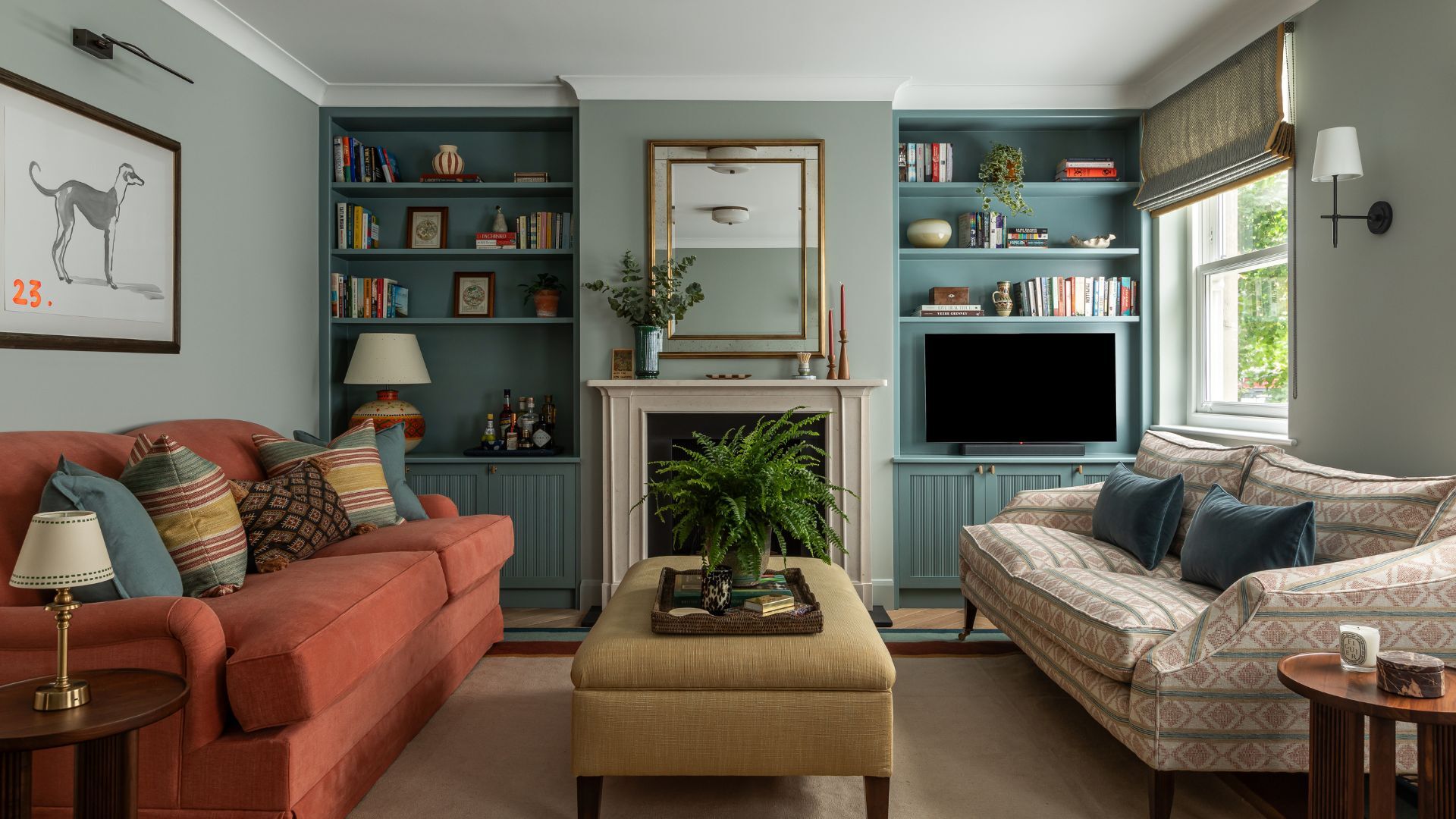
Interior design by Sean Symington
‘Decorating with baby blue does not need to be solely confined to a child’s nursery. It is a soft, calming shade that is just at home in a serene bedroom set up or in a sophisticated drawing room’ explains Alexandra Keith, Interior designer at Otta Design.
When it comes to bedroom design and choosing between bedroom color ideas, I can’t do white or neutrals. For me, a bedroom should either feel cozy and somewhat womb-like (move in deep red) or fresh and calm, depending on your homestyle. If the latter is more to your tastes, then I would suggest the perfect color is a soft, pale, baby blue. It feels fresh and clean, like crisp cotton sheets and a window thrown open to let in the morning air.
I particularly love shades like Farrow & Ball’s Lulworth Blue, which would be my pick for a period bedroom. For modern interiors, Farrow & Ball Hazy is just that bit cooler. Pale Wedgewood by Little Greene is utterly iconic, and if you have traditional furnishings and antiques, that would be my first pick.
Design expertise in your inbox – from inspiring decorating ideas and beautiful celebrity homes to practical gardening advice and shopping round-ups.
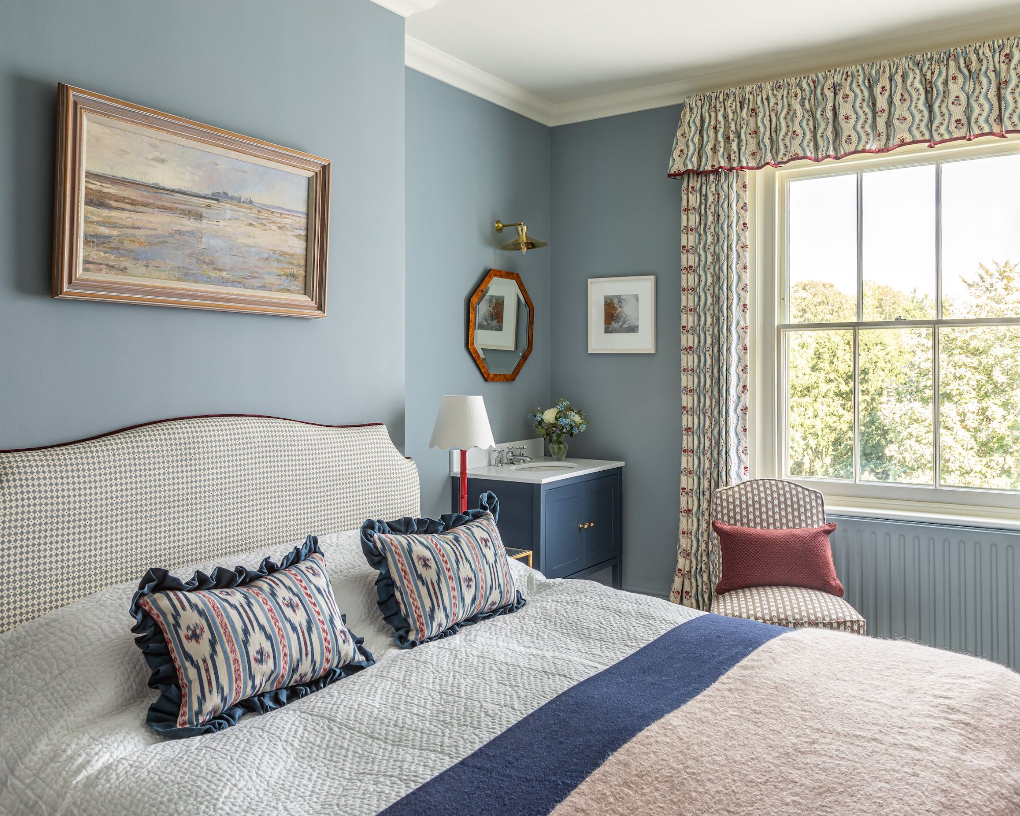
Interior design by Otta Design. Paint on walls Cerulian Blue, Edward Bulmer
When it comes to finding color combinations for rooms, pairing colors with baby blue is refreshingly easy. I’m always struck by its possibilities rather than its limitations. On the whole, it's an incredibly versatile color.
‘Paired with brown and tobacco hues, or accents of vibrant red, baby blue comes into its own,’ notes Alexandra. ‘We use baby blue in a lot of different rooms, and it’s the colors that you pair it with that will determine the overall effect. Soft shades of blues and greens create a sense of freshness and nature, and aubergines offer a more grown-up aesthetic that would work well in a formal dining or powder room.’
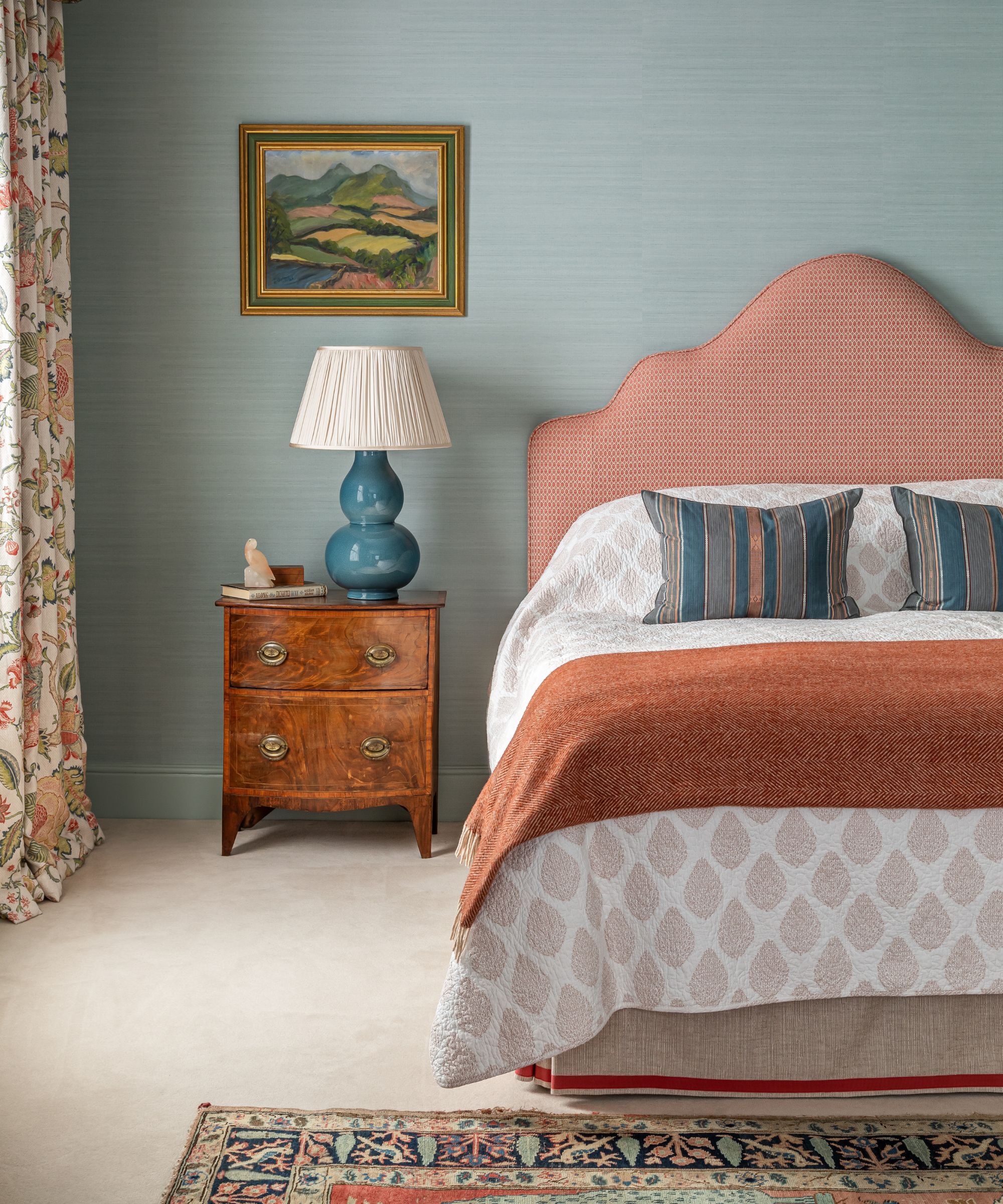
Interior design by Otta Design
'Baby blue is one of those colours I return to time and again, it brings such a calming, tranquil feeling to a space,' says UK-based interior designer Sean Symington.
'It’s surprisingly versatile too; with the right scheme, it can work beautifully in any room from kitchens to bedrooms to bathrooms. It depends on what you pair it with. I tend to use similar tones in fresh yellows, greens and corals that complement this lovely color. It’s especially lovely set against antique brown furniture. Used thoughtfully, it can help other tones in the palette sing, whether that’s crisp whites, warm neutrals, or bolder accents.'
If you’re looking to pair baby blue with a white on trims and woodwork, just be sure to pick a white paint with a warmer undertone to balance out the iciness of pale blue. Wimborne White by Farrow and Ball has a smidgen of yellow pigment, which ever so slightly warms the white, so the two together don’t feel jarring.
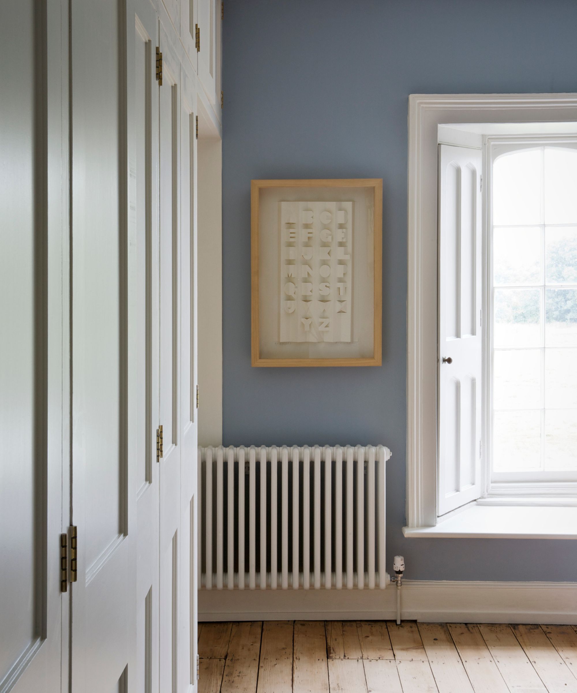
Walls in Lulworth Blue, Farrow & Ball. Trims in Wimborne White, Farrow & Ball
Baby blue can work in almost any room, but it's worth bearing in mind that it will be at its best when exposed to lots of light.
‘We would be wary of using baby blue in a north-facing room as it could read a little cold, but embrace using it throughout the rest of your home,’ advises Alexandra. If you do have a room drenched in natural light, baby blue will bounce the light around, making it feel more expansive, and as such, it's a wonderful color drenching idea, if you love that enduring paint trend.
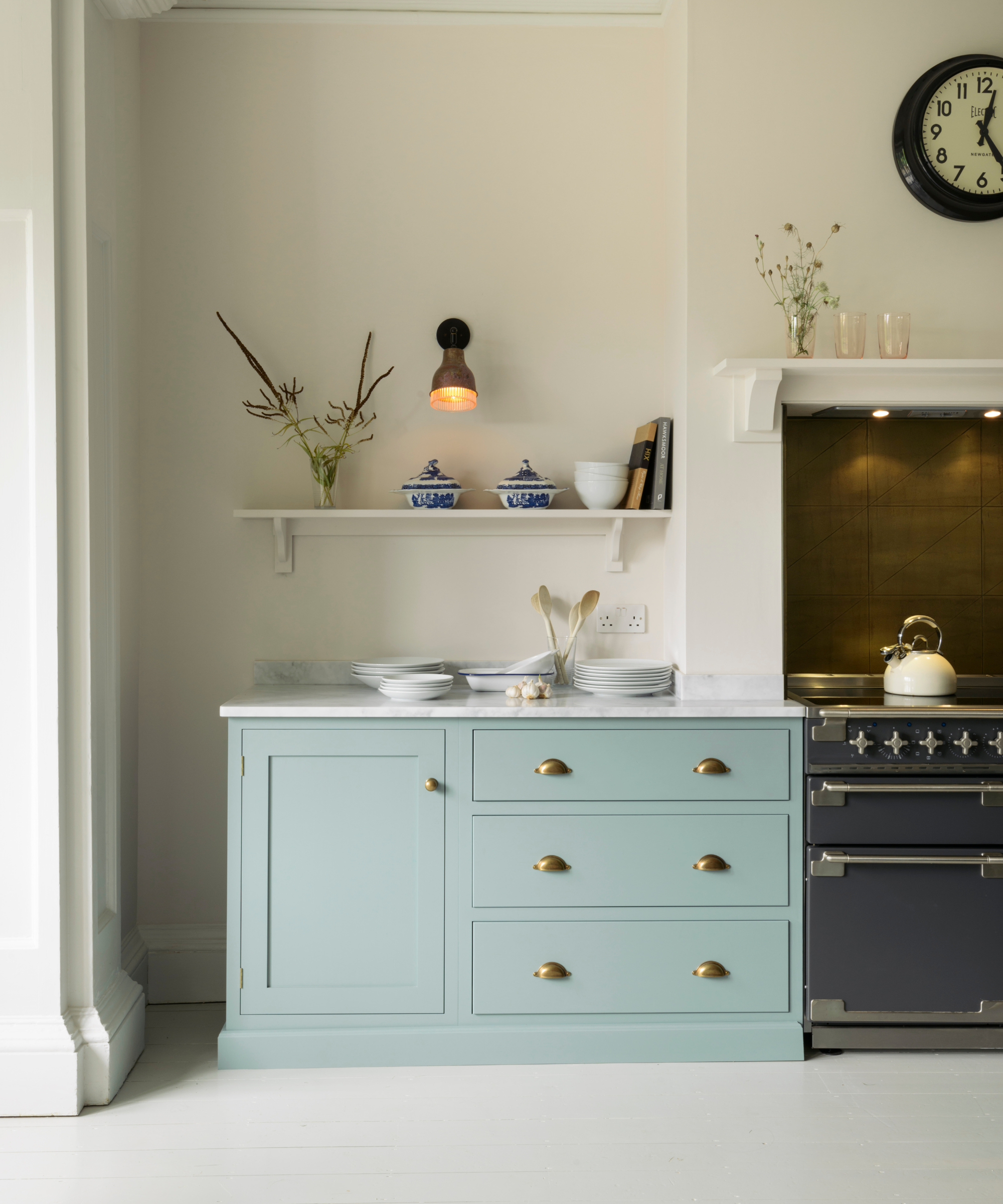
Paint on cabinets is 'Trinity Blue' by deVOL
Recently, I painted a section of my kitchen baby blue. It was the iconic kitchen designer deVOL that first laid the foundation of this idea, and quite quickly, the idea sprouted into action. Before I knew it, several kitchen drawers and a side table were drenched in baby blue paint.
Since then, not a single visitor has left my house without complimenting it, and I feel somewhat triumphant at this daring decision. I have long been outspoken about my dislike of gray paint. That is particularly true in kitchens, where I think it can make the space look very clinical, like an operating theatre.
But I do think there is a lot to be said for choosing a quiet, soothing, soft color in the kitchen, and as such, I think baby blue is the perfect alternative to the somewhat oversubscribed gray in so many modern kitchens.
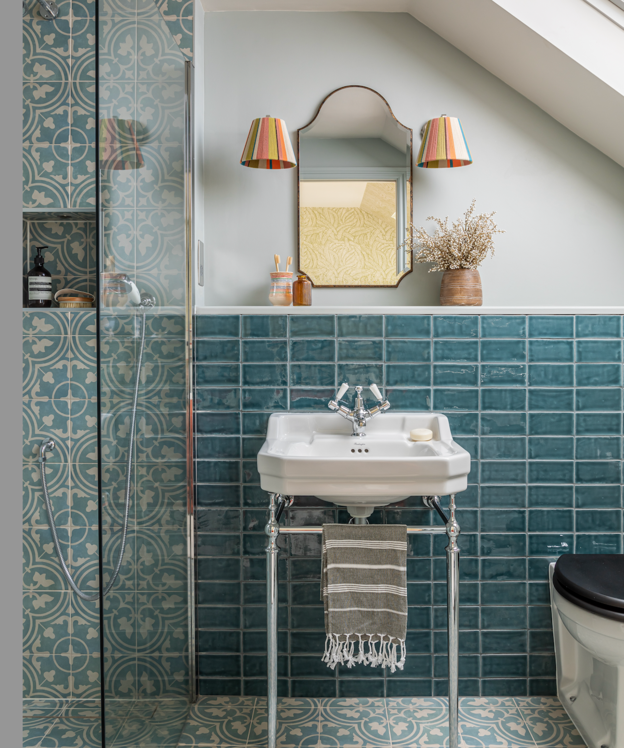
Interior design by Otta Design
Of course, bringing this spring color into your home doesn’t have to be with lashings of paint on walls. It's a color that works wonderfully in wallpaper, textiles, tiles, and smaller accents
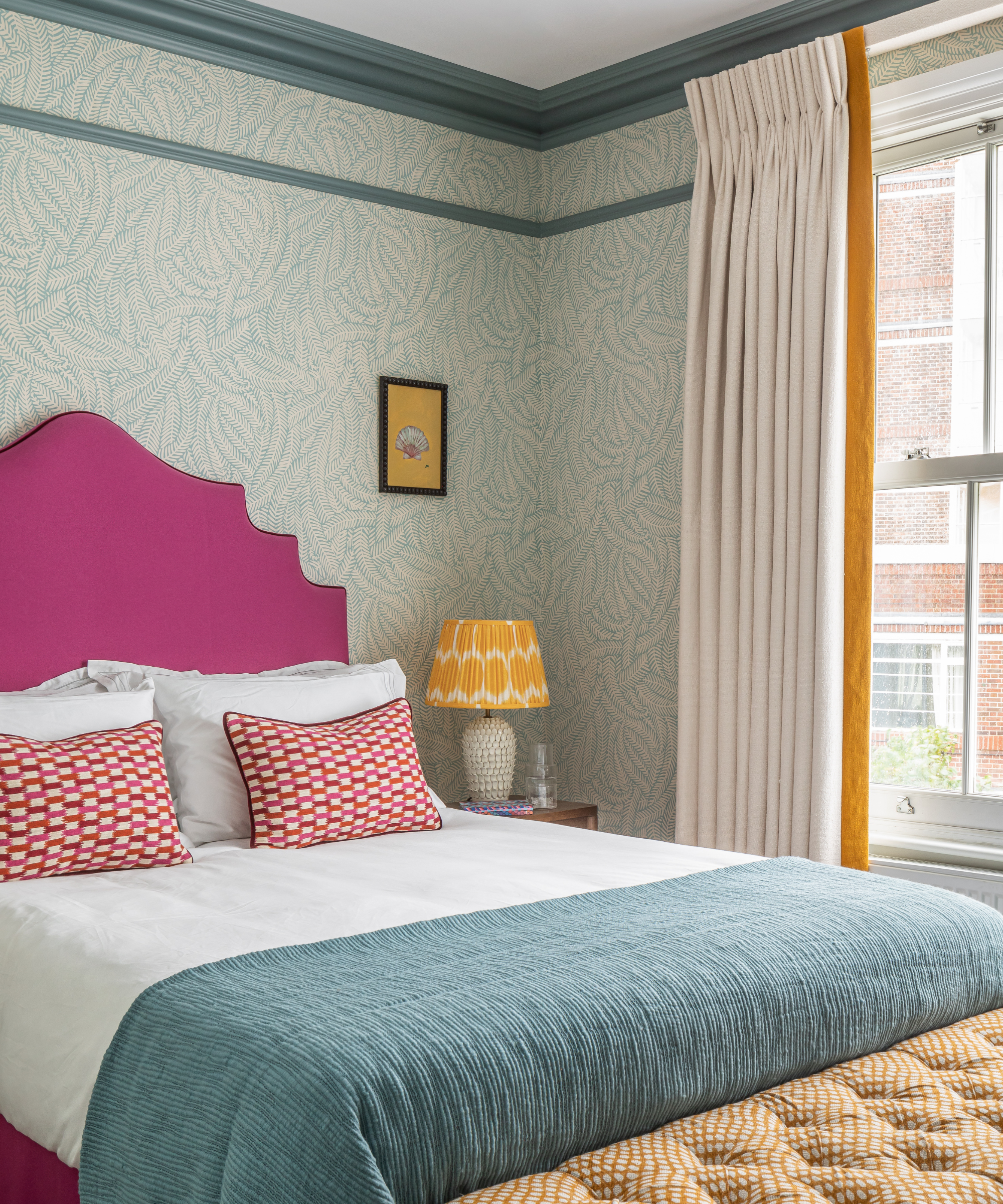
Interior design by Otta Design
When paired with strong, vibrant colors like bright orange or electric pink, baby blue can actually recede into the background, which allows for gentle visual layering.
Unlike white, which can make vibrant hues feel very overwhelming, baby blue creates a balanced backdrop to let those tones shine without totally dominating the space. If you love a room to have depth and color, the key lies in building the palette and adding layers of gentle color and texture, baby blue is a miracle worker in this sense, and can be used in a myriad of ways.
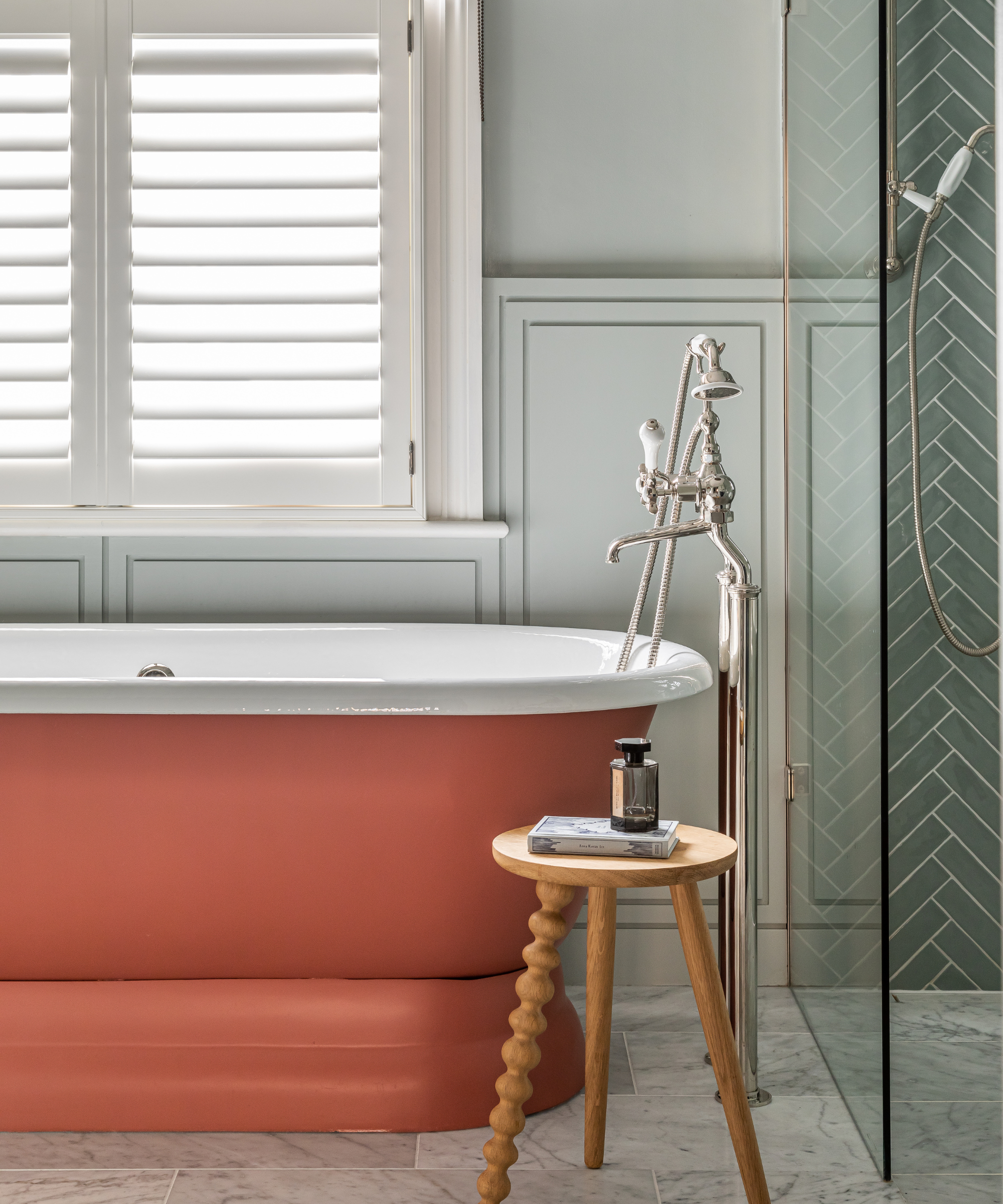
Interior design by Otta Design
When I first moved to my current home, I decided to change my front door color and go with a pale blue; it had previously been a smart and striking black, but I wanted a change. The soft baby blue feels fresh and inviting, and since it's one of the most welcoming front door colors for spring, it gives the exterior a modern lift without straying too far from a classic look.
If you're thinking of painting your front door baby blue, you may wish to steer clear of those hues with very cold gray undertones, and pick a baby blue with slightly more depth or pigment, like Brighton by Little Greene, or my personal favourite front door color by a long shot, Tea with Florence by Little Greene.
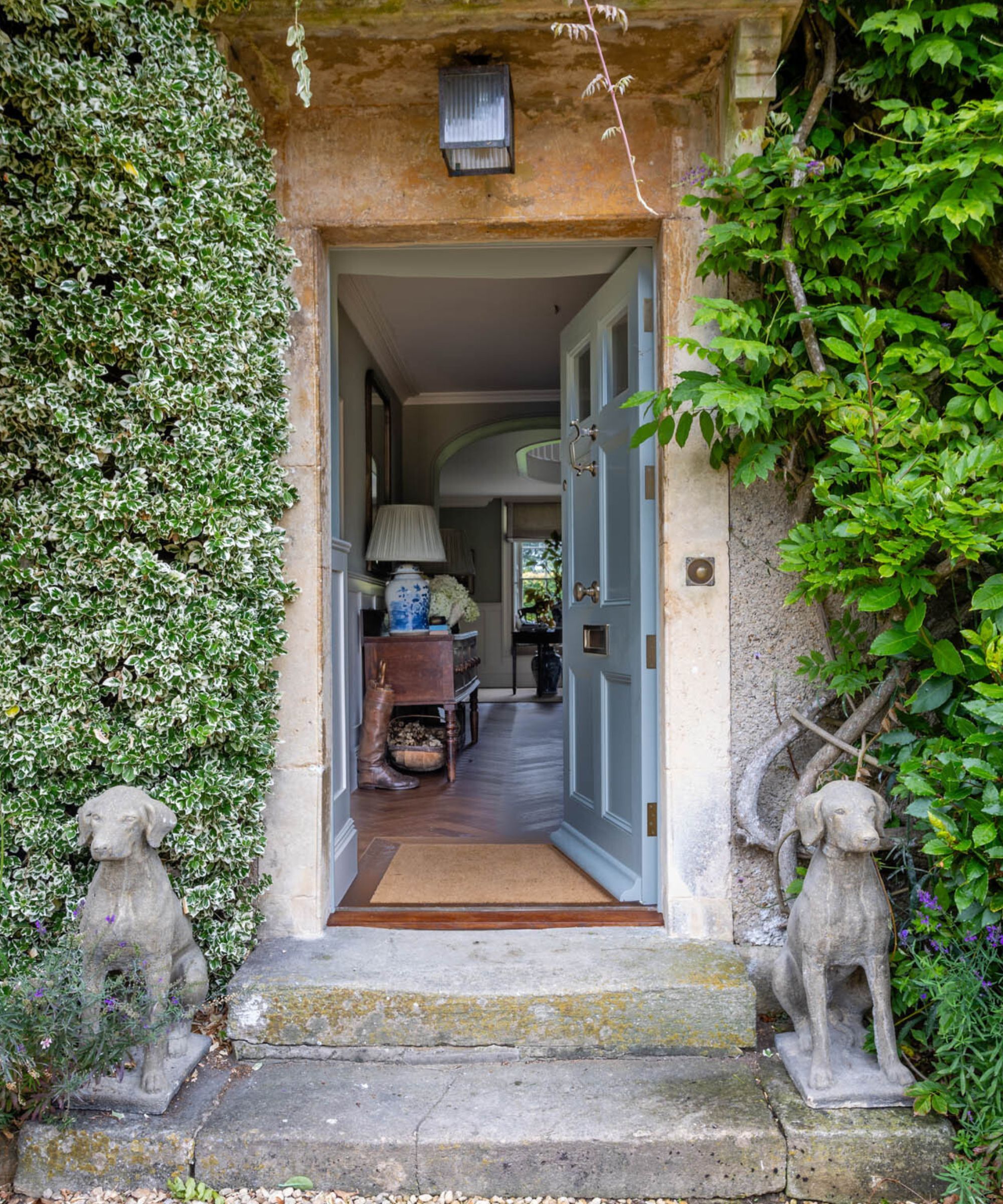
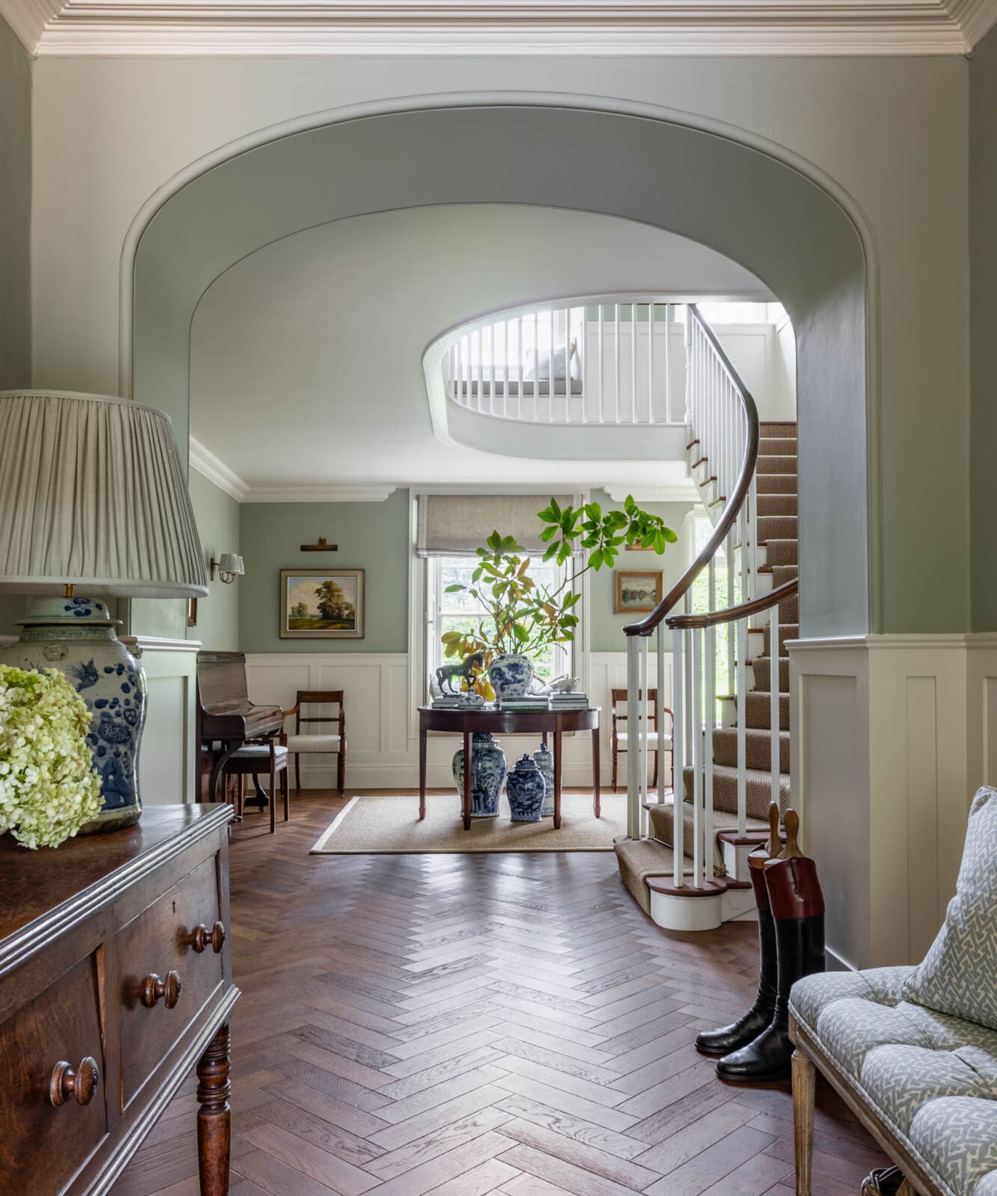
Interior design by Sean Symington
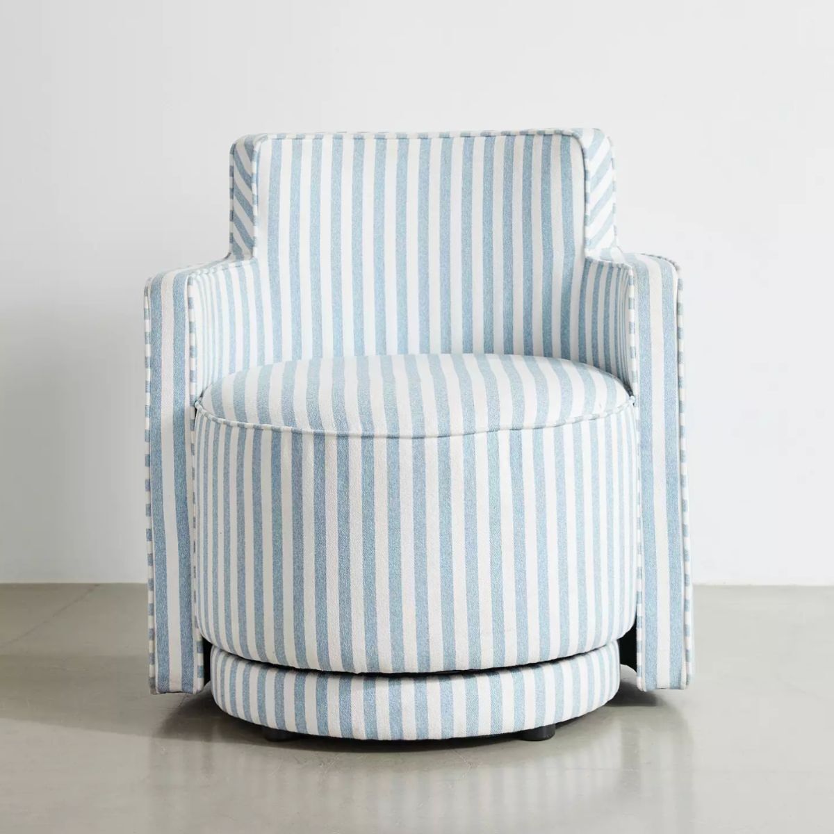
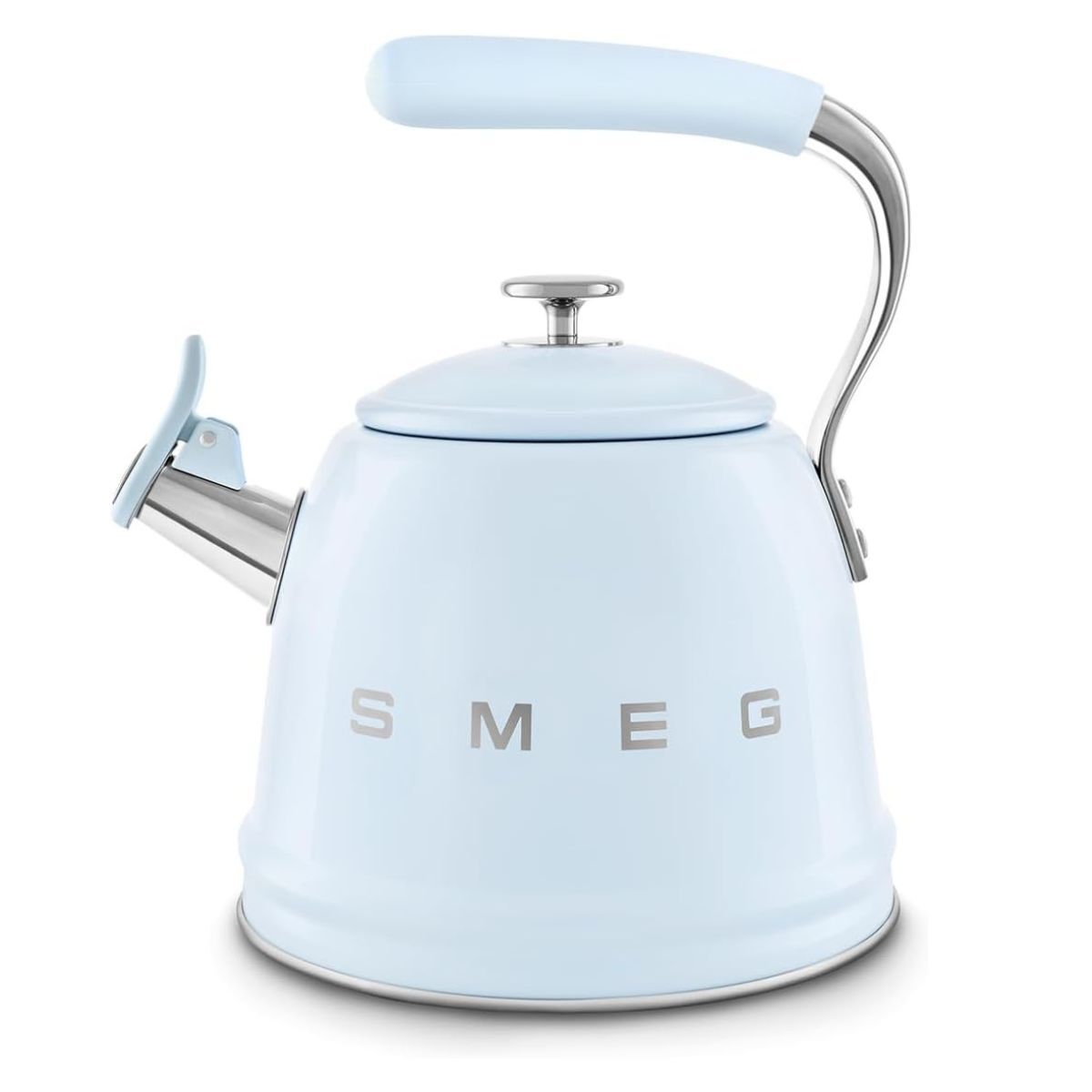
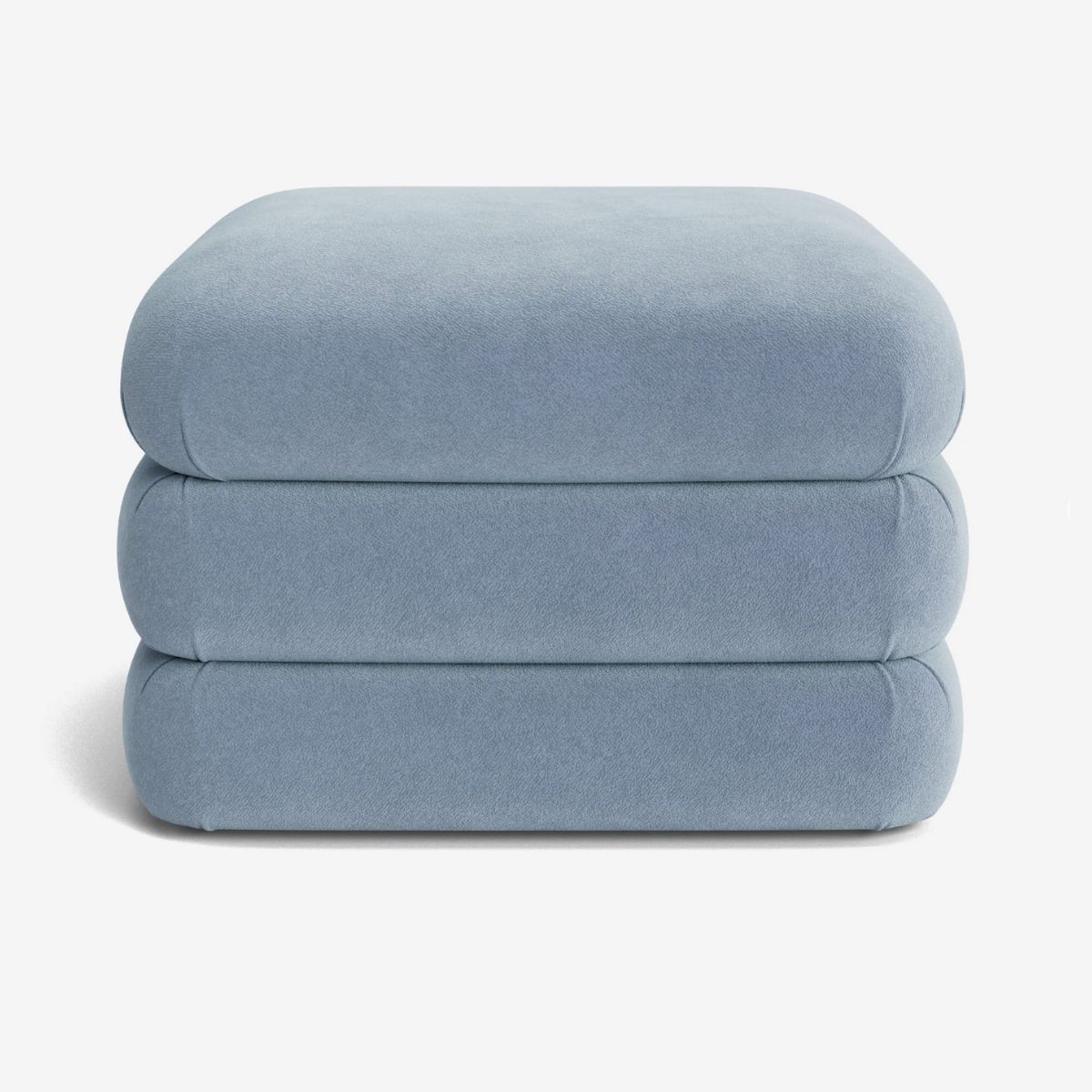
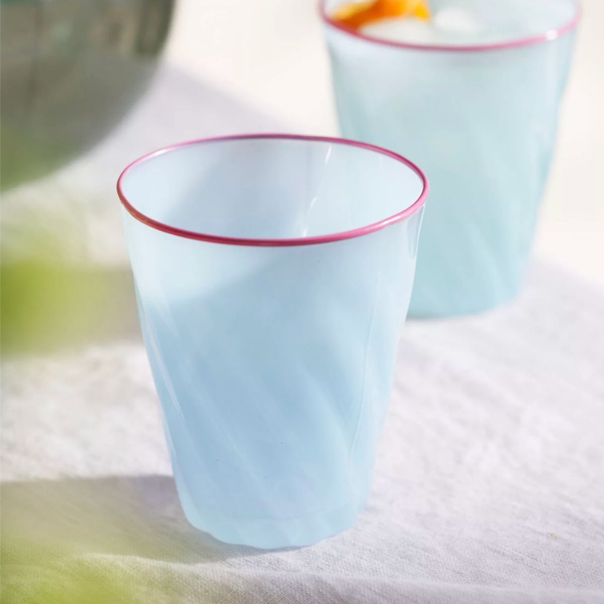
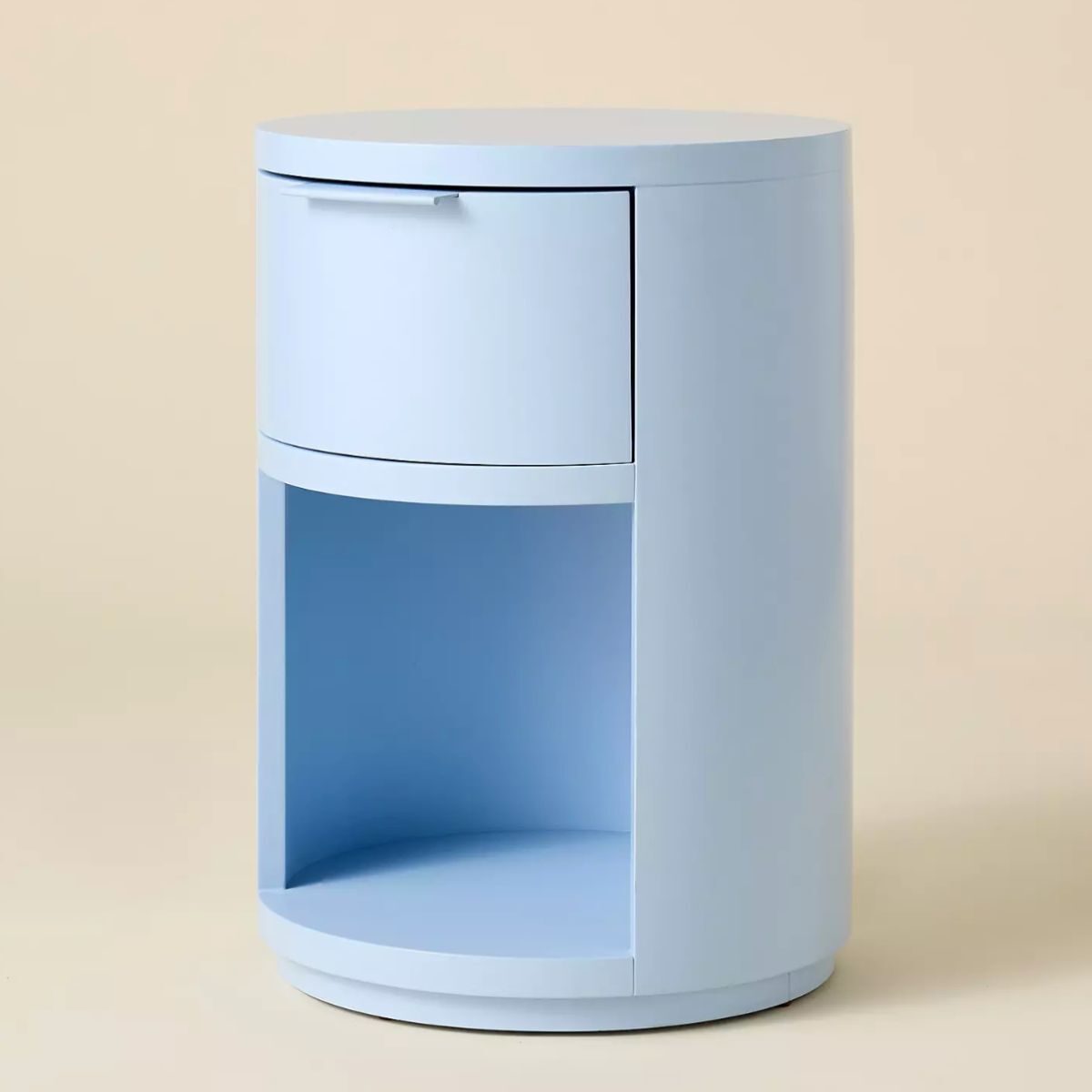
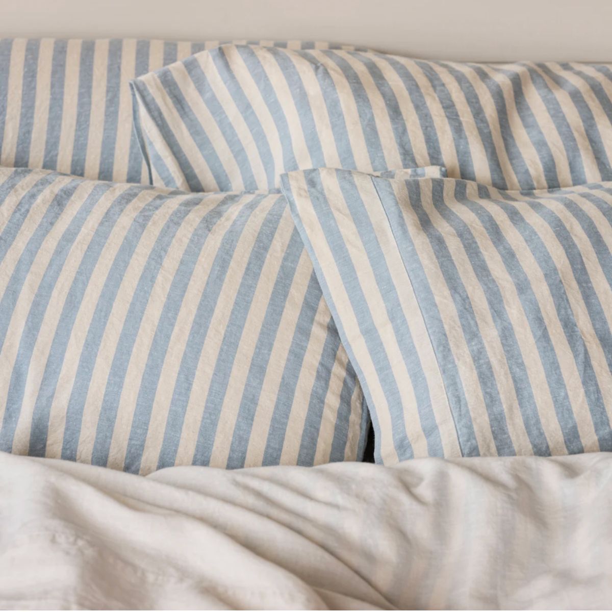
Bring baby blue into your home in smaller accents with these top picks
If, like me, baby blue has won you over and you're considering painting a room in this optimistic color, be sure to swatch several of the best pale blue paints before committing to one. That may seem like a sensible but obvious recommendation, but be sure to live with the swatches for several days, or if you can muster the patience, several weeks, to see how your feelings towards it change, or don't change over time.

Sophia Pouget de St Victor is the UK Content Editor at Homes & Gardens, bringing readers the latest trends, expert insights, and timeless design inspiration tailored to a UK audience. With a background in luxury interiors and a qualification in Garden Design from London, she has a passion for creating spaces with character and emotional depth. Sophia gravitates toward interiors that defy definition, valuing individuality and effortless elegance. She lives in West London with her partner, two mischievous terriers, and a plump cat named Lettuce.
