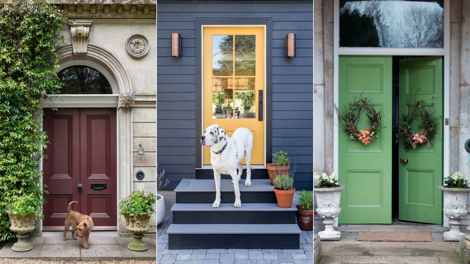
The 5 most welcoming front door colors for spring – these happy colors promise to invite joy into your home, according to experts
Making a front door look welcoming using clever color choices is a design goal everyone wants to achieve. We spoke to a few of our favorite interiors people to find out their paint color secrets

Design expertise in your inbox – from inspiring decorating ideas and beautiful celebrity homes to practical gardening advice and shopping round-ups.
You are now subscribed
Your newsletter sign-up was successful
Want to add more newsletters?
Your front door is one of the most seen parts of your home’s exterior and makes an important first impression, setting expectations for the interior beyond. Therefore, choosing the right front door color ideas is vital if you want to make your exterior look warm and welcoming.
It is not just about choosing front door colors that make a home look expensive, but it is crucial to source the most welcoming exterior paint colors if you want a home to feel happier at home.
The right color doesn't just have the power to upgrade a space with personality and create a long-lasting impression; it can also make a room look more welcoming, which is a big win if you want to create calm.
Article continues belowHere, designers, decorators, and color psychologists reveal how to approach choosing a welcoming front door color, from using Feng Shui front colors that follow the principles of this ancient Chinese practice, which has its roots in early Taoism, to using biophilic colors that chime with nature.
The most welcoming front door colors for spring
A front door is the opening statement to any property and color is as crucial as design. The best color trends and calming colors can refresh the exterior of a home, add the most curb appeal, and might even increase a home’s value.
Bear in mind that your front door design will affect which front door paint ideas suit, as well as the period of your home and the color of paintwork visible from the street and your front porch ideas. It's also worth noting the front door colors to avoid (and why) before deciding on a hue that gives off the wrong first impression.
1. Go for a nature-inspired green – the most harmonious color in the world
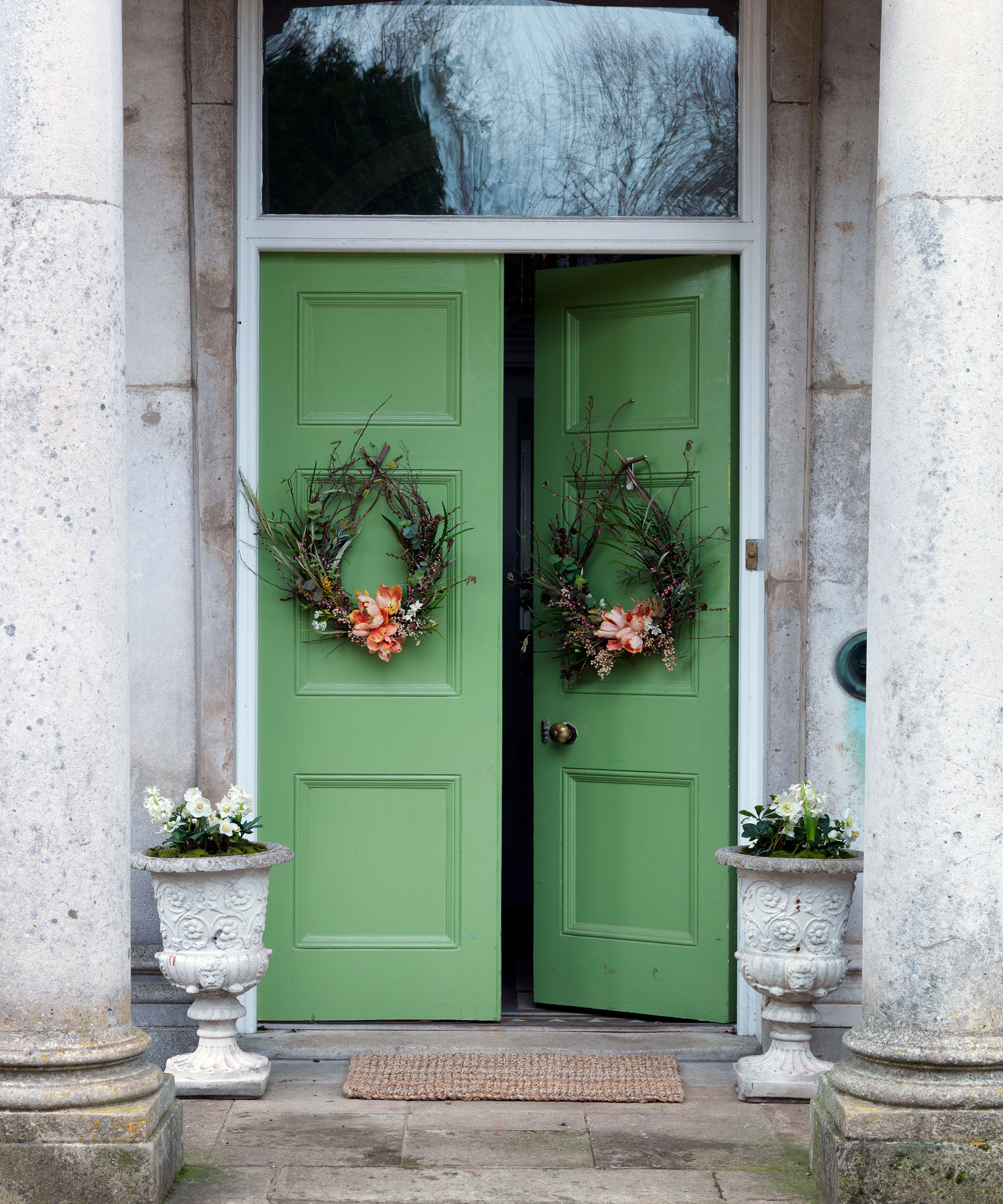
Glorious green has the ability to soothe, inspire, and excite, but it is equally warm and welcoming. In fact, I think people use green for the front doors way too little, and I've never quite understood why. Green is such a calming, restorative color which is rooted in nature – it makes perfect sense to sit at number one on my list of welcoming front door colors.
Design expertise in your inbox – from inspiring decorating ideas and beautiful celebrity homes to practical gardening advice and shopping round-ups.
Green is, in general, a calming and relaxing color. Being the color that represents nature, it’s one that makes us feel good and positive. ‘The poet and philosopher Goethe used to describe green as a useful color, a good color to have around,’ explains Francesca Wezel, founder of Francesca’s Paints.
Green is a great choice for a front door – particularly one that offers views of the front garden beyond. ‘If you think of the color green in garden, it’s the backdrop for the whole setting – the foliage, grass and trees,’ explains Emma Deterding, founder and creative director of Kelling Designs. ‘You can really see why it is a welcoming and grounding color for the exterior of the home. It adds a freshness and provides a base from which personality can shine through, setting the tone for the rest of the home beyond.’
If you love heritage paint colors, Farrow & Ball's Sap Green is my ideal choice. It is timeless, sophisticated and will endure beyond spring 2025.
2. Introduce sunshine with yellow – a color guaranteed to bring joy
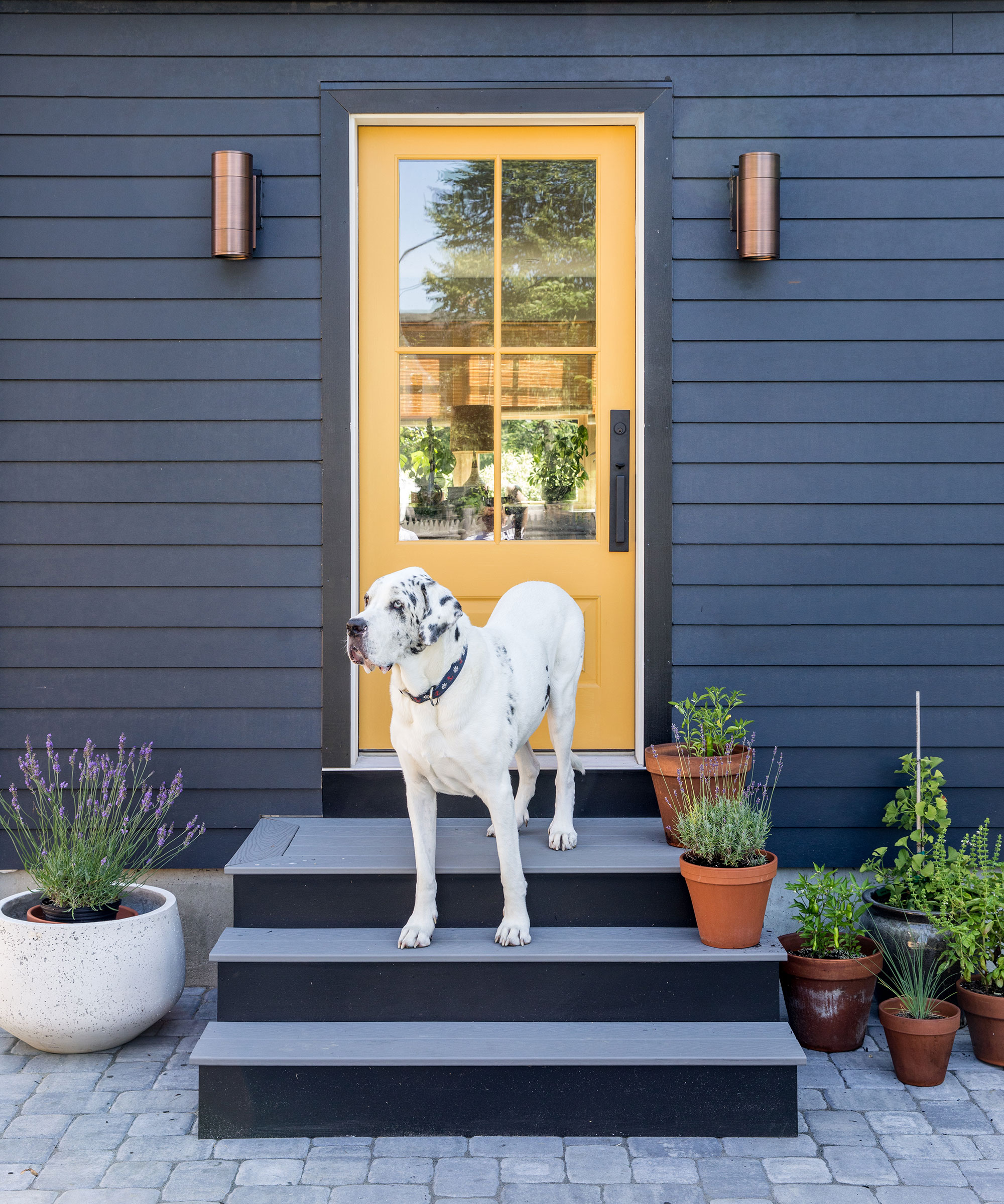
In Feng Shui philosophy, yellow is a color of optimism. It's warm, welcoming and positive. It's my color of choice for spring/summer 25.
The use of yellow can create a mellow and uplifting exterior. It transports us back to long, lazy, sun-drenched days in the Mediterranean and can brighten us up on gloomy days. Who wouldn't want to enter a home that reminded them of a summer vacation?
For a calming and balanced exterior paint color scheme, opt for sandy yellows or ochres and pair with blues. ‘As a warm and vibrant tone, yellow creates an emotional response that is both joyful and evokes energy in a space.
'Representing stability, harmony and rootedness, yellow is connected to the earth element. But yellow can be a tricky color to master,' says Mike Fisher, creative director and founder of Studio Indigo.
'In particular, bright primary yellow as it can be quite harsh and childlike despite its sunny and positive connotations.' He likes to use darker yet richer fall versions of yellows in an ochre or saffron hue, which work particularly well as a welcoming front door.
If this is too bold for the front of your home, try it on your home's back door instead.
3. Warm up with deep reds – a passionate color that is playful yet sophisticated
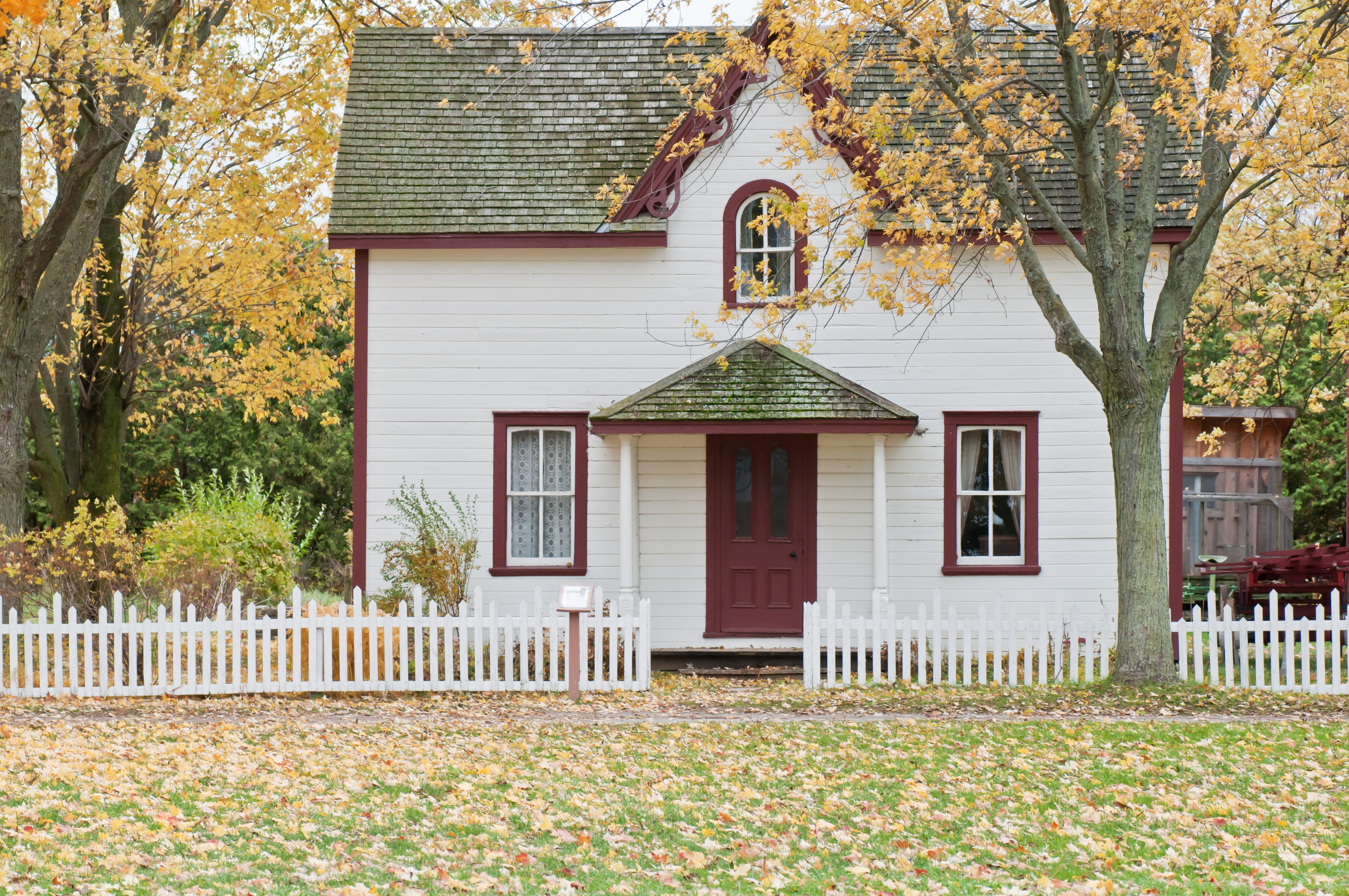
One of the most passionate and life-enhancing colors to use in a decorating scheme, red offers a luxurious bank of positive energy when used on a front door.
Historically, red has associations with wealth and status. In the 17th century, flashes of red dye were used on the soles of shoes worn by aristocratic courtiers to Louis XIV, while the use of a VIP red carpet goes back to Ancient Greece. Perhaps a present-day example of this might be the eye-catching interior design trend to use red in high gloss or lacquered finishes on woodwork. The Unexpected Red Theory – the idea that introducing just a hint of red can have an uplifting, mood-boosting effect is often heralded as a game-changer.
But often people are afraid to use this color on the exterior of their home, but red, especially on the darker spectrum, is naturally welcoming and cozy.
‘We have been using red to decorate the walls of our homes from the beginning of human existence,’ explains Marianne Shillingford, creative director of Dulux. So why not use it on our exteriors too?
'Red has the longest visual wavelength of any color, which makes it the most impactful, and it is famous for stimulating the appetite, good conversation, and love, making it an enduring favorite in the dining room and the bedroom,’ she continues.
‘When using red in an exterior color scheme, it’s best to choose shades that are rich and warm rather than loud and insistent. Maroon, burgundy and rosehip work brilliantly, while deep pinky-reds are very adaptable and blend well with brickwork or stone. Dark reds pair best with gold metallic hardware and carry a degree of heritage, especially when mixed with dark wood,’ says Simon Temprell, head of interior design at Neptune.
Benjamin Moore's Sunny Days is my perfect choice of yellow. It will instantly lift your mood, and the mood of those around you.
4. Excite with burgundy tones – this popular color is not just for winter
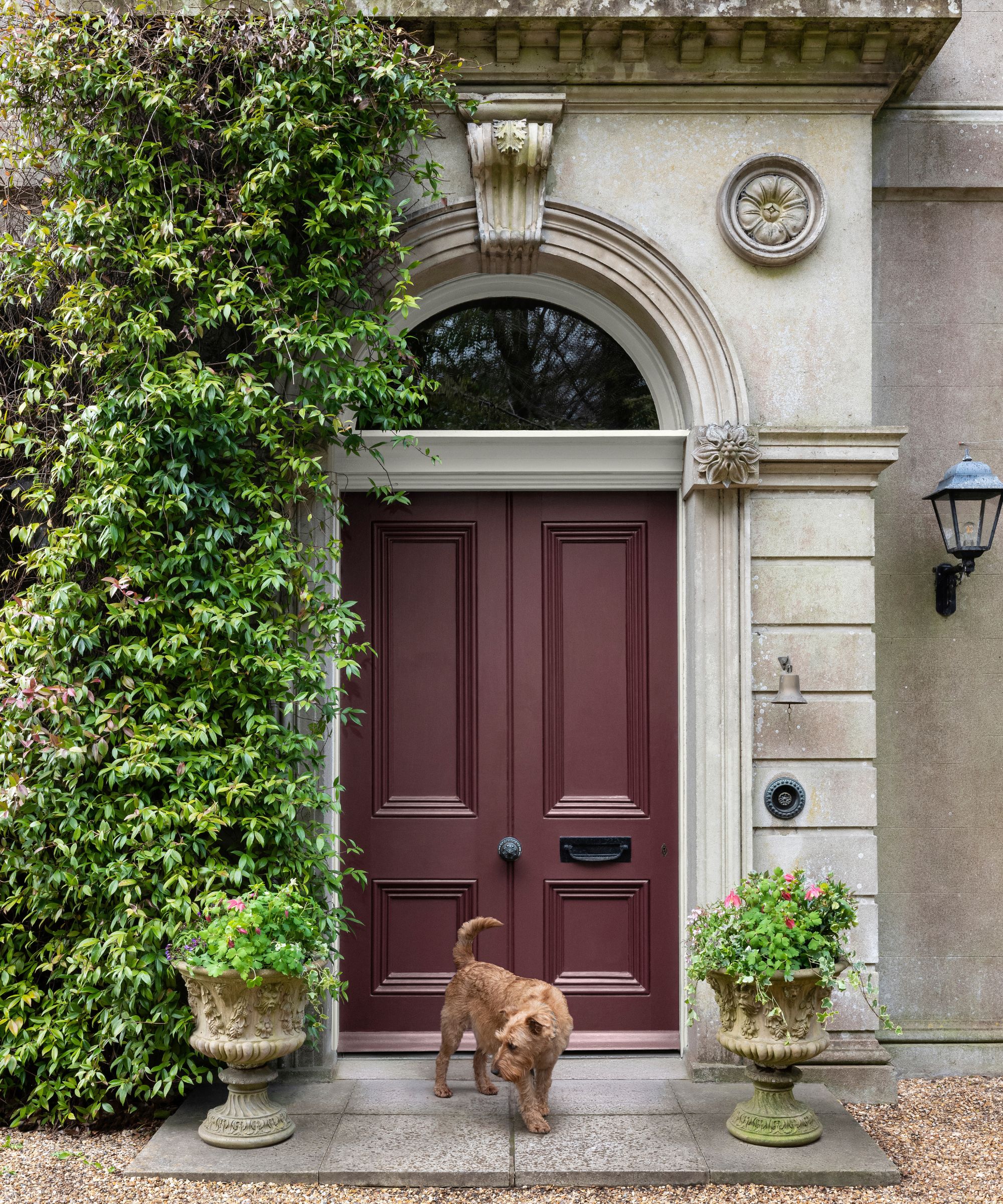
Dethroning lilac from its long-standing reign as the most desirable purple, burgundy is tipped as this season’s top color choice. With its roots in 1970s design – a trend set to dominate through 2025 – this rich, versatile hue is making waves.
Burgundy might be a traditional winter color, but no more. This color truly shines in spring and summer. I always stop to admire every time I see a burgundy-painted front door. It's bold, sophisticated, cocooning, and incredibly welcoming. It is a color that looks wonderful against the glow of summer sunshine, and it is a shame that we rarely use it outside of fall and winter.
'It evokes a feeling of coziness and quiet glamour without being garish – perfect for a distinctive front door. It is definitely a color you can be bold with,' says Henry Prideaux, founder, Henry Prideaux Interior Design. It is one you'll wish you tried sooner.
5. Blue – paint with pale, sky blues for a breath of fresh air
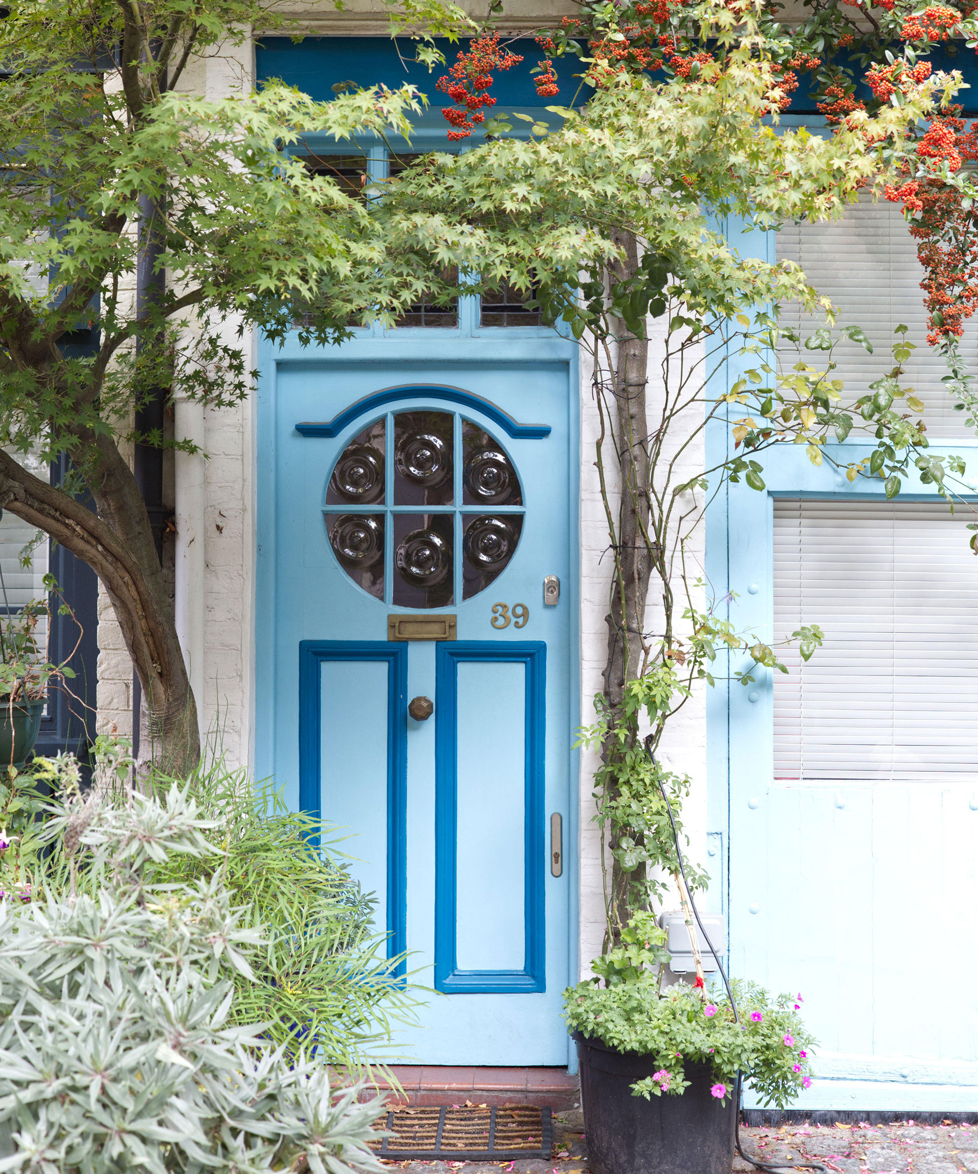
Used in decorating for centuries, serene sky blues are enduringly popular, harmonizing with many hues for gloriously diverse results. I must admit, blue is not my favorite color, but there is something rather lovely about a blue-painted front door.
The sight of the sea is always an anticipated source of excitement. Whether it’s approaching the Californian coastline for an old-fashioned seaside break, or as you fly to a far-off destination, there’s nothing quite like catching that first glimpse of vast blue waters to get you in the holiday mood. This is how I feel when I catch a glimpse of a blue front door – it calls to me.
Samantha Todhunter, founder of Samantha Todhunter Designloves to decorate with blue – both inside and out.
'I don’t think there are any hard and fast rules about blue,' says Samantha Todhunter, founder of Samantha Todhunter Design. 'Some feel it has a froideur about it, but I disagree. Working with blue is endlessly interesting and playing with tones and textures can change it from a vibrant jewel box to subtle and serene.'
Naturally soothing, but equally energizing and hopeful, a sky blue shade promises to bring the outside in to enhance well-being. Long gone are the days when we thought blue was cold and clinical; today, blue can be undeniably welcoming and mood-boosting. It tells me that the homeowner is up for a good conversation.
My neighbor has just painted their front door in Farrow & Ball's Lulworth Blue. It is a classic choice – like a breath of fresh air.
Once you've decided on your welcoming front door color, consider upgrading the smaller details to complete the look.
Don’t forget the finishing touches: a new coat of paint for your fence, front gate, and metal hardware can make all the difference to create a warm and welcoming exterior.

Jennifer is the Digital Editor at Homes & Gardens, bringing years of interiors experience across the US and UK. She has worked with leading publications, blending expertise in PR, marketing, social media, commercial strategy, and e-commerce. Jennifer has covered every corner of the home – curating projects from top interior designers, sourcing celebrity properties, reviewing appliances, and delivering timely news. Now, she channels her digital skills into shaping the world’s leading interiors website.