6 calming colors to create an instantly more restful scheme
The calming color schemes design experts say we all should know about to create a tranquil home – and what to avoid

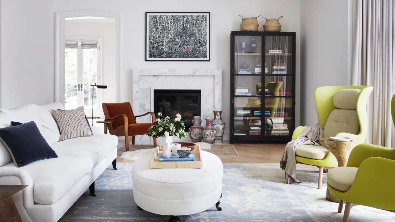
A home that's elegantly put together with calming color schemes at its heart will not only look good but will also help to promote a sense of relaxation and overall well-being. Amazingly these benefits can reach far beyond our living space into other areas of our lives too, so once you start to incorporate calming color schemes in your interior design you'll soon discover their positive effects and see how décor can boost your mood.
Interior designers have been extolling the virtues of calm colors for years and we've managed to persuade some of them to share their secrets and advice on the most calming color schemes to help bring a little tranquility to our homes.
Introducing a calming color scheme needn't be a complicated or time-consuming task. Paint colors can be refreshed in a day and other furnishings and accessories can gradually be replaced as and when you're ready to complete the scheme. However you choose to bring calming color schemes into your home it's a decision you won't regret.
What are the most calming color schemes?
There are numerous options for calming color schemes to suit all rooms in the house, but which are the most effective?
To help answer that question we asked interior design experts how they put together their calming color schemes. They've shared their advice and some of their favorite calming color combinations below. From peaceful living room themes to tranquil bedroom color schemes, there's something for every room in the house. We've got some great paint color recommendations, plus we also reveal the colors to avoid – the complete no-nos for a calm space.
1. Choose soft, pale colors for a calm scheme
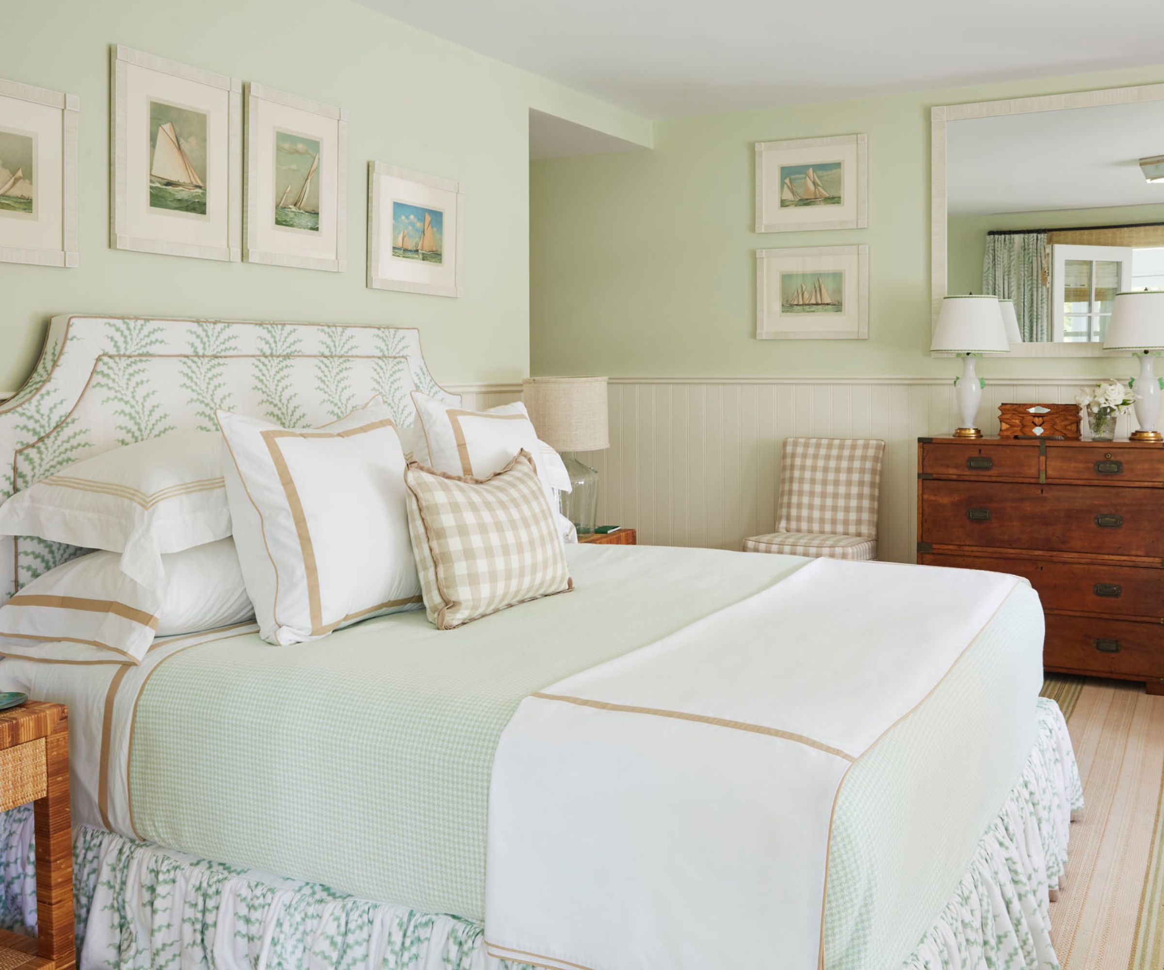
Soft, pale colors are most people's first choices for calming color schemes, and for good reason. Easy on the eye and creating a restful backdrop for everyday living, pale blues and soft greens are classic shades that work well in calming color schemes, typically as part of cool color schemes. For schemes with a little more warmth, the gentlest hints of yellows might fit the bill.
Interior designer Liz Williams of Atlanta GA firm Liz Williams Interiors agrees and says her go-to shades are subtle and light blues and greens. 'I find that a combination of soft colors creates a calming space,' she says.
Design expertise in your inbox – from inspiring decorating ideas and beautiful celebrity homes to practical gardening advice and shopping round-ups.
In the restful bedroom scheme pictured above, designer Gary McBournie brought a fresh pale green to his Nantucket home redesign.
Design duo Lathem Gordon and Cate Dunning of GordonDunning recommend learning how to use a color wheel to help inform your calming color scheme choices. 'Since contrast creates energy in a space, using adjacent colors on the color wheel always helps bring a sense of calm,' they add.
Some of our favorite pale paints include: Morning Sky Blueand Heaven on Earth in the blues; Light Pistachio and Par Four soft greens; and Old Straw Hat, which is a very soft yellow; all Benjamin Moore paints.
And what of the old adage 'blue and green should never be seen'? Well, we disagree. Pale blues and soft greens can make great companions in calming color schemes.
2. Use white and cream, but add texture too
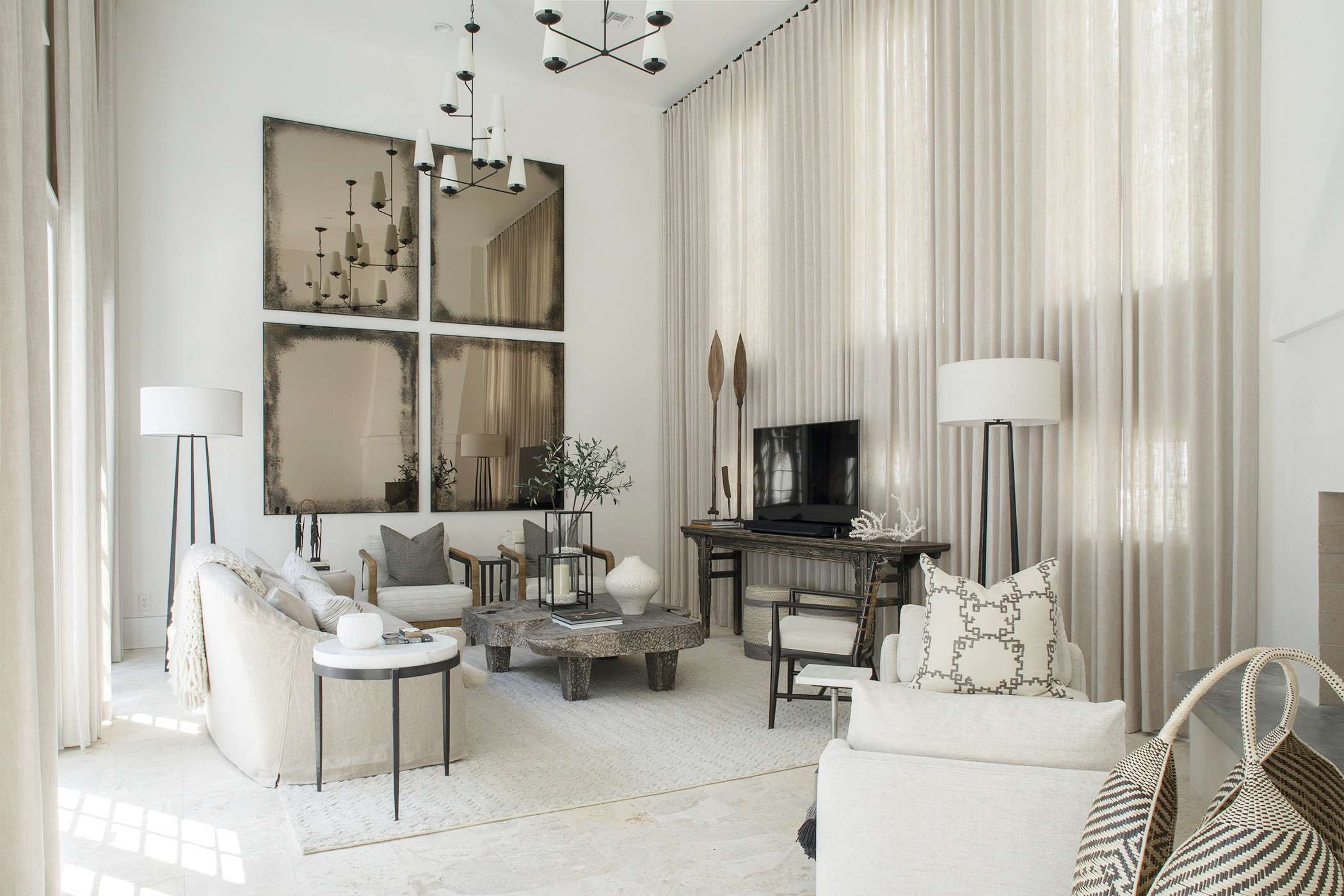
White and cream might not seem the most imaginative options, but they are the most universally popular choices for calming color schemes.
Keeping to an all-white or all-cream palette will be effective in creating a relaxing, uncluttered space free of visual 'noise', but it's important to make sure it doesn't feel too empty and one-dimensional.
Juliette Spencer, founder of Atelier RO studio in New York, agrees and says: 'I always skew on the whites and creams for calm, but you should inject texture so it doesn't become sterile. You can achieve this in the textiles, rugs, and wall finishes.'
This is great advice, as texture is a key part of any well-rounded room scheme. Layer on interesting and varied materials in throws, pillows, and rugs and you'll lift your white living room ideas to another level. Go-to textures include velvet, linens, chunky knits, and cashmere for pillows and furnishing fabrics, along with bouclé for accent chairs, and pale coir or sisal for flooring, all would work equally well as white bedroom ideas. The luxuriously layered all-white living room, pictured above, is one of Nashville, TN-based designer Brad Ramsey's creations.
Looking for white paint color suggestions? Check out the following winning whites: White Snow, Natural White, both from Sherwin Williams. Edging towards creamier tones, we like the brand's Sanctuary and Dover White.
3. Try blush or coral for a warmer scheme
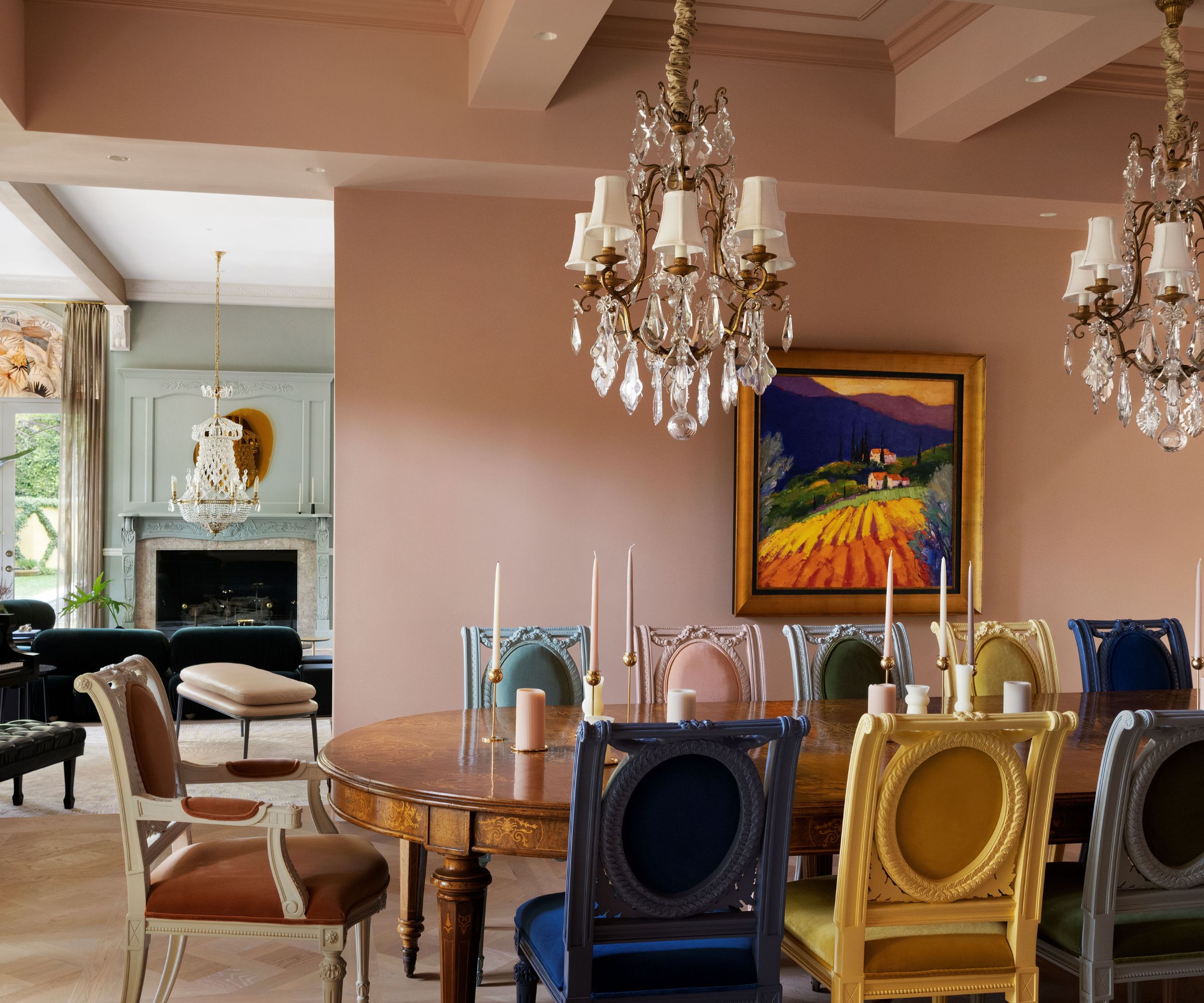
There's no reason why some warm color schemes can't also double up as calming color schemes. Designer Liz Williams is a big fan of the warmer pastel shades and suggests pairing soft pinks or pale purples with white and soft neutrals to create a calm environment with colorful character.
Lathem Gordon and Cate Dunning say, 'We typically avoid warm colors when seeking calm, but a light coral or blush really does bring a sense of calm and cozy into a space.'
We love to see these pink room ideas used in bedrooms or living rooms, but coral or blush tones can work really well in dining room ideas too. In Maison Vilucchi's sophisticated redesign of a 1980s LA home, pictured above, the plaster-colored walls were created bespoke working from a modified base of Vintage by Benjamin Moore.
4. Reflect nature's calming shades of green
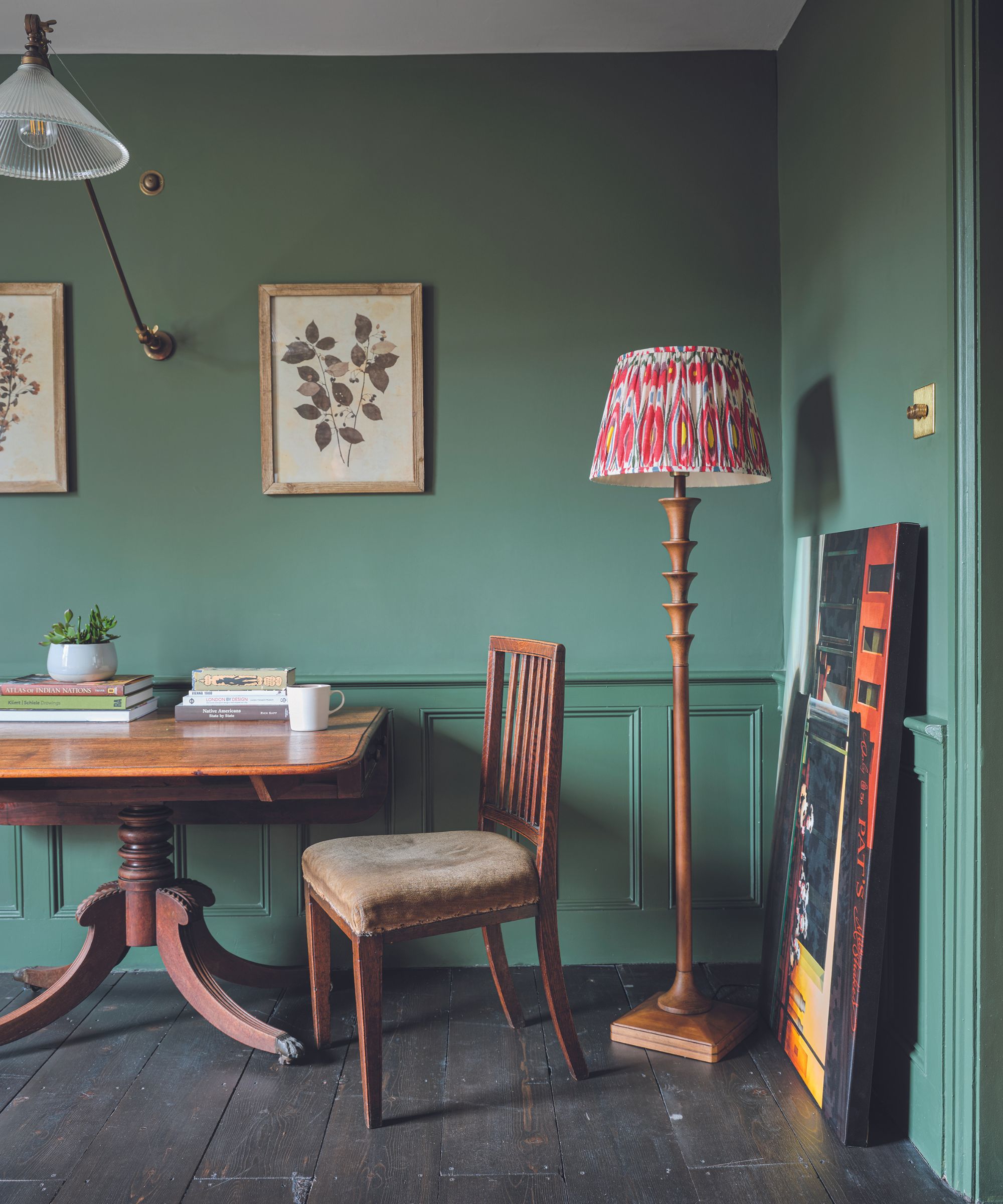
We've already looked at calming pale green paint ideas above, but since greens of all hues are having a moment right now, it's worth knowing that darker shades have a restful effect too.
'Green can be very calming,' agrees Juliette Spencer. 'It dosn't have to just be on the walls, but green can be bought in through furniture, textiles and rugs for a vey calming room.'
Interior designer Heather Hilliard, whose studio is in San Francisco, singles out sage green for a special mention. 'It's a very calming color that reflects nature,' she says. 'An organic color that we like to bring inside. I like to pair it with natural woods and linens.' When you consider the calming effects of spending time outdoors in green spaces, it makes perfect sense to continue the effects inside by bringing those leafy green shades into the home.
Try Benjamin Moore's Sage, or Secret Garden for darker green options.
5. Try darker shades for a cozy twist on calm
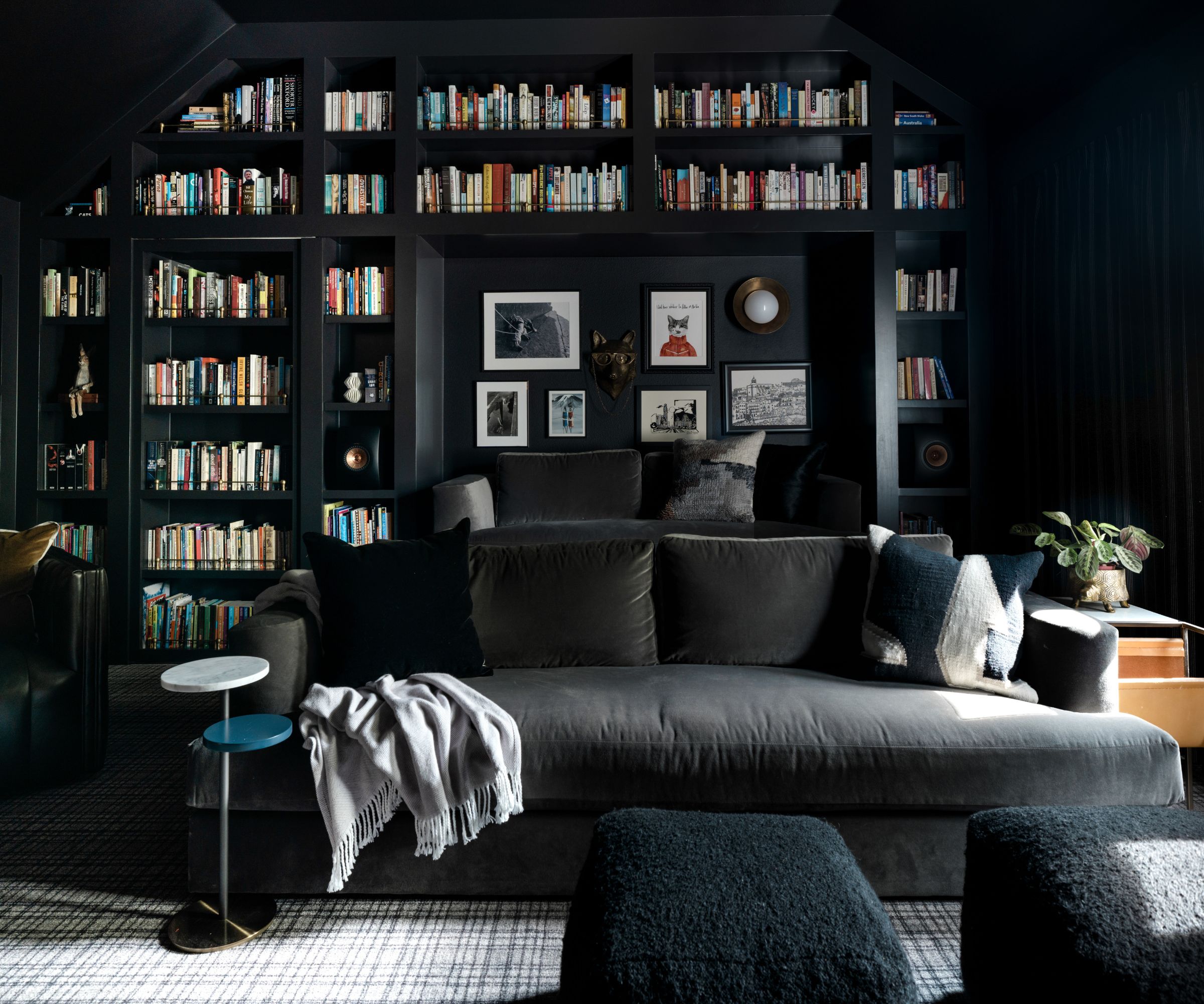
This may seem counterintuitive, but dark colors can also create calming color schemes. If you want a more cocooning style of room, rather than a wide, open light space, then dark living room ideas might be right for you.
Interior designer Heather Hilliard favors this approach and says: 'I find that enveloping a room in a dark, moody shade – painting the trimming, walls and any built-ins the same shade – can create a sense of calm and coziness.'
Darker colors work particularly well in dens and media rooms, the ultimate indulgent and relaxing spaces, so consider them as part of your den ideas.
Designer Judi Fuller created the media room pictured above for a Texas home, using Caviar by Sherwin Williams on all the walls, built-ins and ceiling and says 'It is to date one of my favorite rooms I've designed.' Using wrap-around dark walls in this way does indeed create a restful space, particularly welcome for tired eyes.
6. Avoid these shades in calm schemes
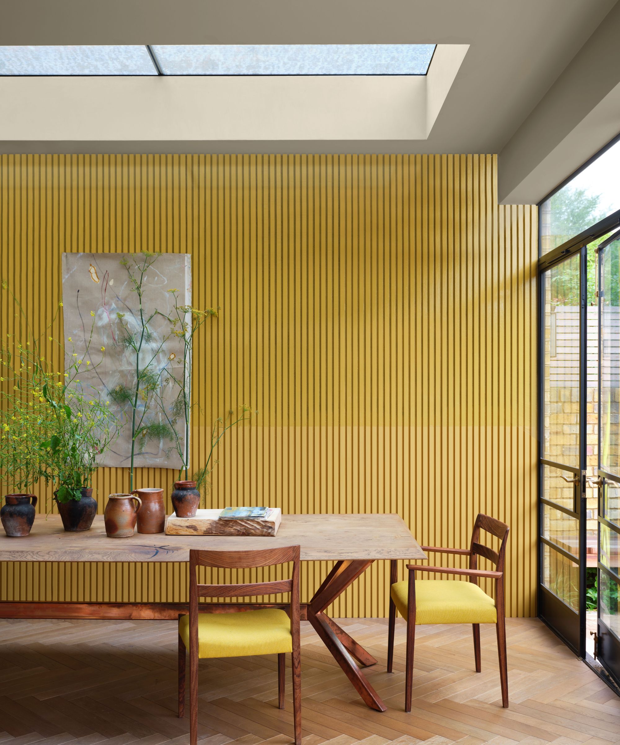
Having discussed the shades that work well for calming color schemes, what about the colors to avoid? The designers we spoke to were unanimous. If you want to create a haven of calm and tranquility, then steer clear of vibrant brights at the hotter side of the color wheel.
'The colors to avoid are red and orange,' says Juliette Spencer. 'They're very fiery colors, so while they can make you feel courageous and create positive feelings, calming is not one of them.'
'Bright colors like red, yellow and orange tend to be more active and energetic colors,' agrees Liz Williams. 'They certainly have their place, but do not work well if the goal is a calm space.'
While Lathem Gordon and Cate Dunning add 'We avoid any saturated reds or oranges when seeking calm.'
Incidentally, we love Farrow & Ball's vibrant yellow shade, Babouche, pictured above. It's a feast for the eyes in this smart kitchen-diner, and will create a stimulating, sociable space perfect for family meals or entertaining, but as a more fiery shade it's best avoided if you're looking to create a calming color scheme.
Equal caution is needed with some white shades, which may not create the calming color schemes you're looking for. Designer Heather Hillard's advice is to 'stay away from anything that is too stark. White shades that are void of any warm properties should be avoided in bedrooms.'
There's much more to choosing paint colors than meets the eye. Take your time to make the right decision, and try sample pots and fabric swatches in situ, in the actual room you're updating. That way you get a good idea of how the natural light will affect the colors you've chosen and you'll be able to judge whether they'll create the calming color scheme you're hoping for.
Karen sources beautiful homes to feature on the Homes & Gardens website. She loves visiting historic houses in particular and working with photographers to capture all shapes and sizes of properties. Karen began her career as a sub-editor at Hi-Fi News and Record Review magazine. Her move to women’s magazines came soon after, in the shape of Living magazine, which covered cookery, fashion, beauty, homes and gardening. From Living Karen moved to Ideal Home magazine, where as deputy chief sub, then chief sub, she started to really take an interest in properties, architecture, interior design and gardening.
