How to choose paint colors – 10 steps experts take to successful schemes
Top experts advise on choosing paint colors and picking a palette to suit your style – and your rooms


Design expertise in your inbox – from inspiring decorating ideas and beautiful celebrity homes to practical gardening advice and shopping round-ups.
You are now subscribed
Your newsletter sign-up was successful
Want to add more newsletters?
Choosing paint colors correctly can make or break a room. Paint colors can transform a space, whatever its size, shape or aspect. It can set a mood, from calm serenity to warmth and joy, and make all the difference to the success of your interior project.
While it always makes sense to choose paint colors that appeal to you personally, there are factors that will affect your view of a particular hue. Natural light, for example, varies according to the way your room faces, and to the time of day. Some areas of your room will be brighter, others dimmer, while your furniture, rugs and other soft furnishings can also affect how you see the shade.
If you are finding it difficult to choose a paint color because you can't imagine how the color will look in your space, use a tester pot to create a swatch, preferably on a large sheet of lining paper, moving it around your room over a few days to see if you like its look.
Article continues belowHere, interiors experts advise on how to choose paint colors, so that your paint ideas come to life in the way you want them to.
How to choose paint colors
Whether you are looking for living room paint ideas or bathroom paint ideas, your dilemmas and solutions will be the same. Whether you are looking to paint a room in its entirety or just to paint a wall, or simply want to create interest with paint tricks, choosing the right paint colors will be key to success. Bear in mind, though, that different paint finishes will change how paint colors look, so always experiment carefully first.
1. Choose the right white paint color
Ever popular for creating a fresh, light feel, there are a surprising number of shades which can create a subtly different effect, from space-boosting cooler tones to warm whites than can be used to introduce a softer feel. ‘A combination of whites creates a gentle contrast within a room, while keeping the design classic and timeless,’ says interior designer Emma Sims-Hilditch, founder and creative director of Sims Hilditch, who uses Farrow & Ball white paint.
‘We like to use a darker white, such as Farrow & Ball Shaded White, on the walls or a chimney breast and a fresher, brighter shade on the mantelpiece and woodwork. A good option here might be Farrow & Ball’s School House or All White.’
Design expertise in your inbox – from inspiring decorating ideas and beautiful celebrity homes to practical gardening advice and shopping round-ups.
2. Pick bold paint colors with confidence
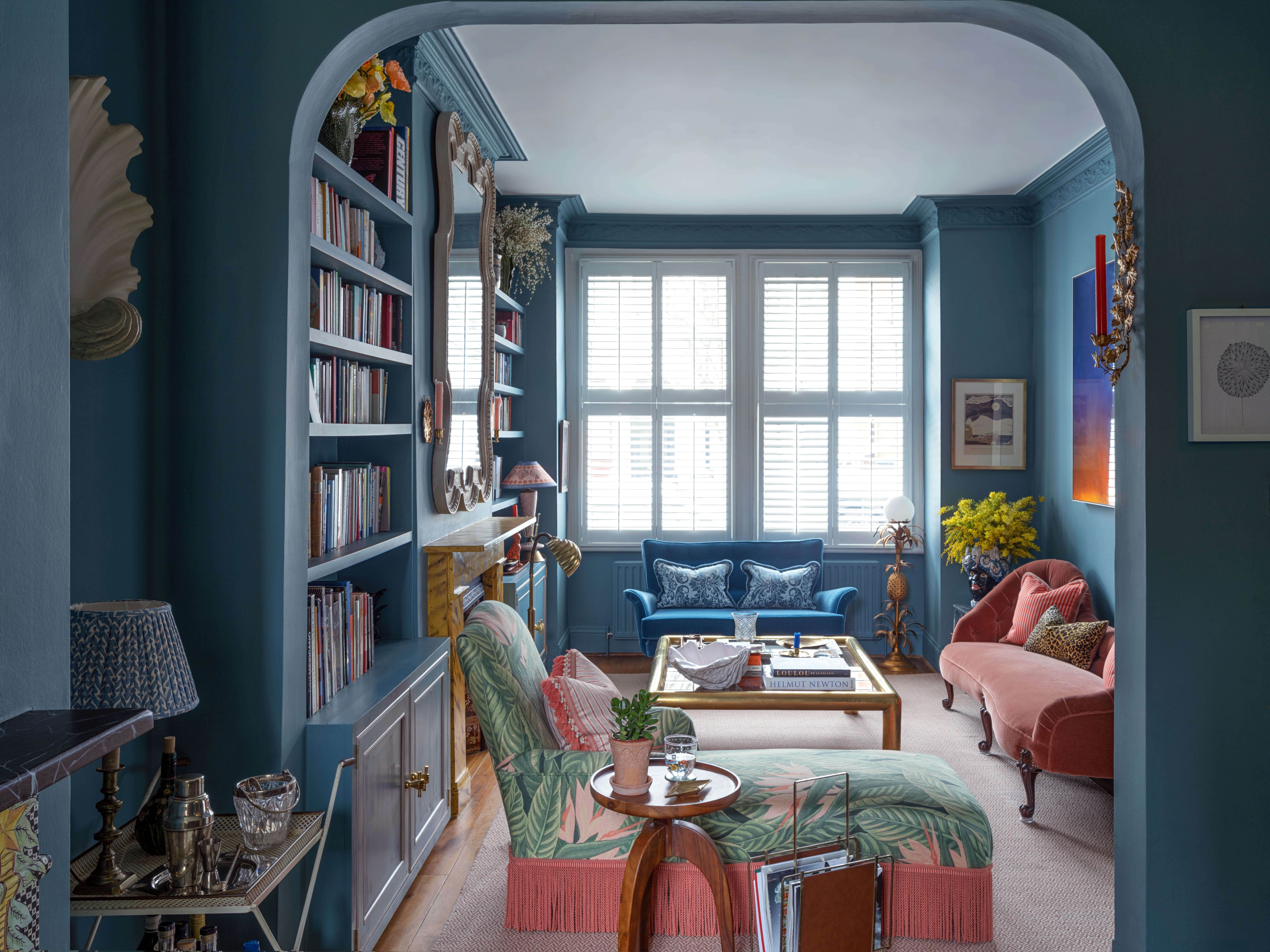
‘Bold tones can make a space feel warmer and cozier, but only if you use the right lighting,’ advises interior designer Stephanie Barba Mendoza, who particularly likes to use such colors in living rooms, hallways and powder rooms for the sense of atmosphere that they can create.
‘I lean towards using low-level and candle lighting when using a rich tone, which helps create an intimate ambience in the evening. But bold tones also have a wonderful way of transitioning throughout the day: if you have a good source of natural light, they feel energetic during the day and then they melt into the evening when paired with clever lighting.’
3. Choose paint colors to suit a room's temperature
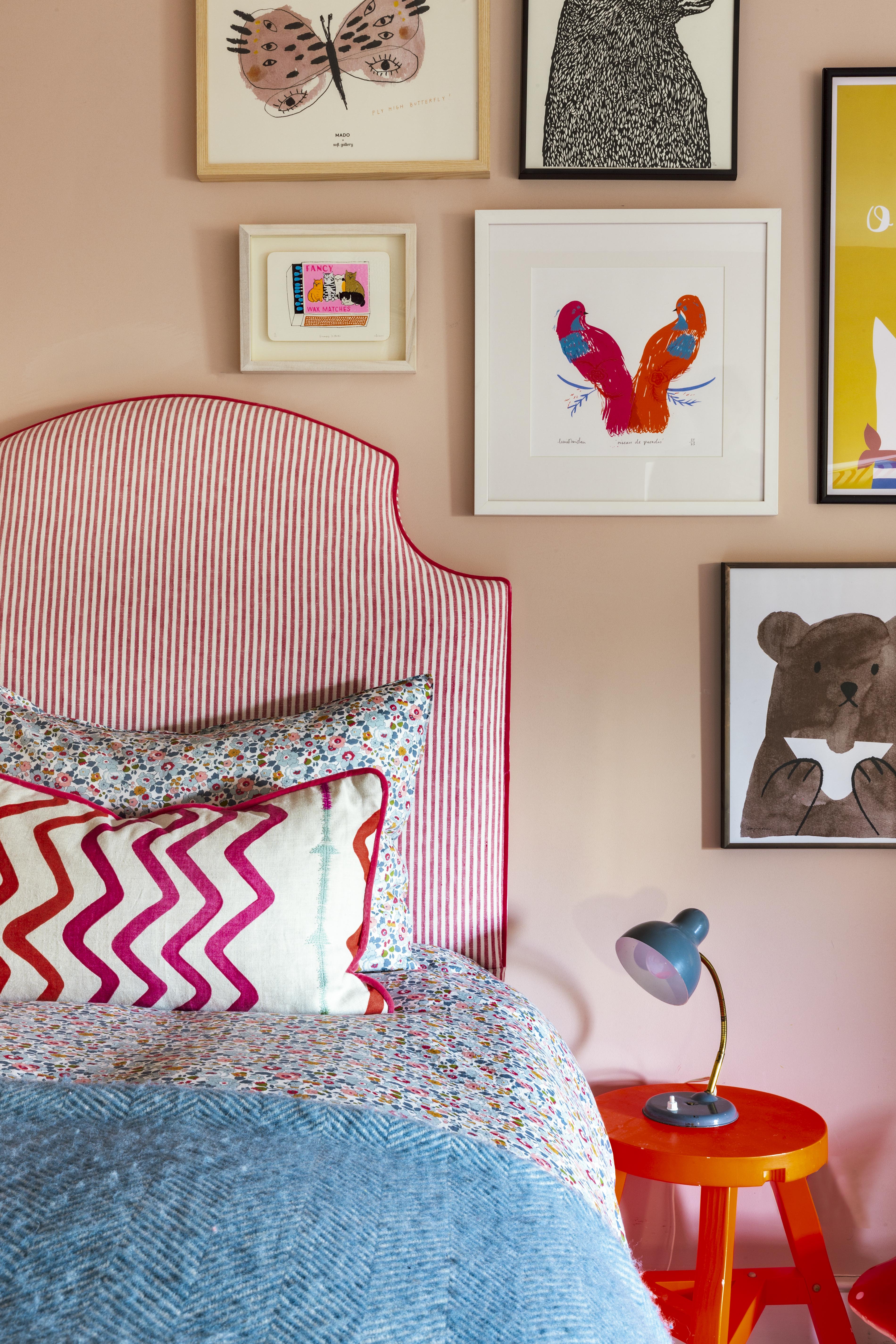
Colors are classified by their temperature, from warm to cool. Warm colors include reds, oranges and yellows on one side of the color wheel, while cool colors run from green to blue to violet.
‘Warmer colors work really well when you want to create a cozier feeling and to draw people into a room,’ advises interior designer Annabel Grimshaw. ‘Cooler colors can be more restful, so blues and greens, for example, work well in bedrooms. They also give more of a feeling of space.’
4. Find cool-toned paint colors that won't feel cold
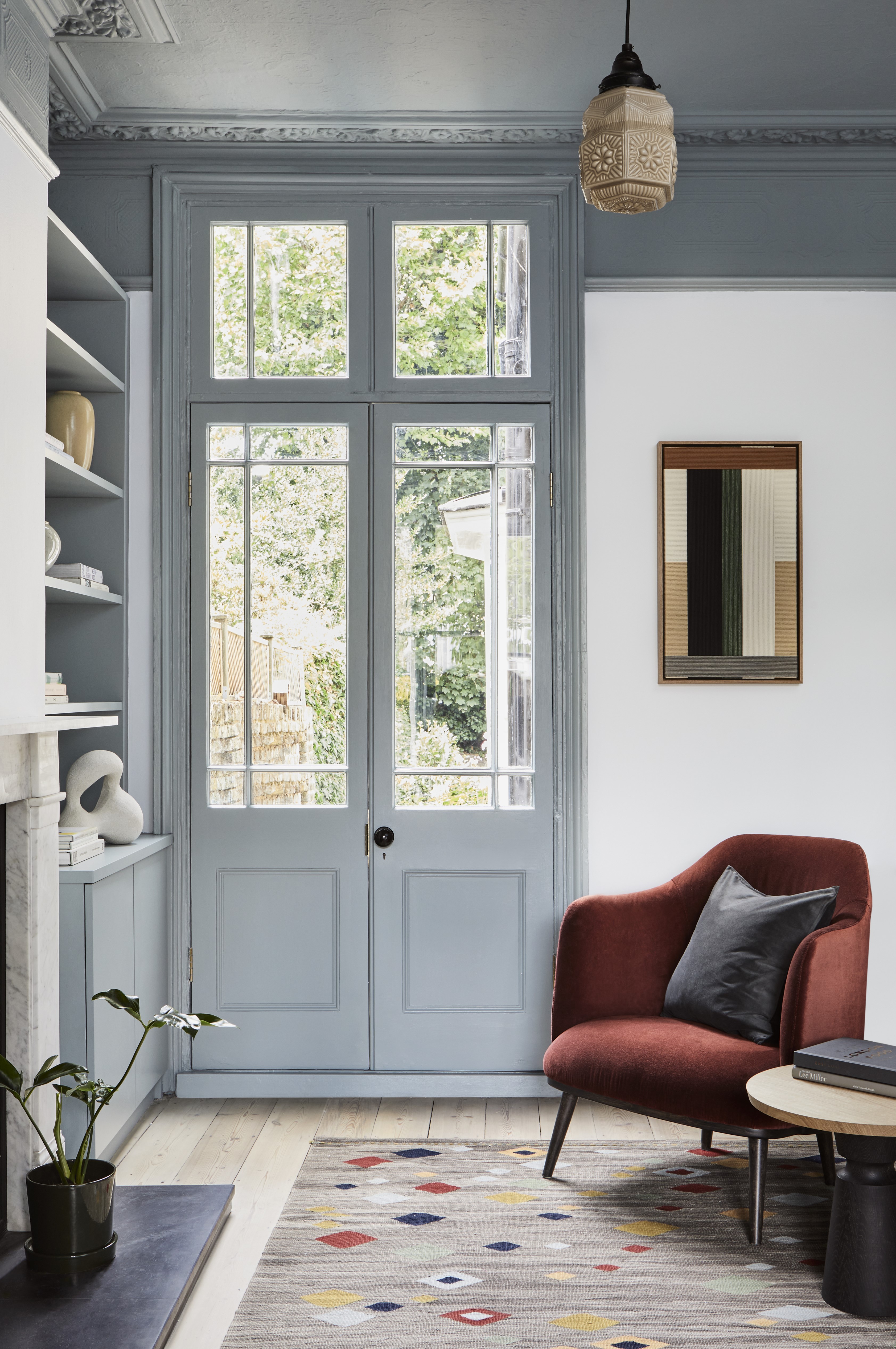
Known for their calming qualities, cool colors tend to recede, making rooms feel more spacious – so adding to their serene feel. Here, Myland's Walpole, an off-white with soft blue-green tones, is teamed with woodwork in Long Acre, a deeper grey blue, to create a gentle scheme.
Cool colors can be used in rooms with plenty of natural light, like this one, to add character without overwhelming the space. Pops of warm red, in the armchair and rug, add a touch of warmth.
5. Pick the right bright paint colors as accents
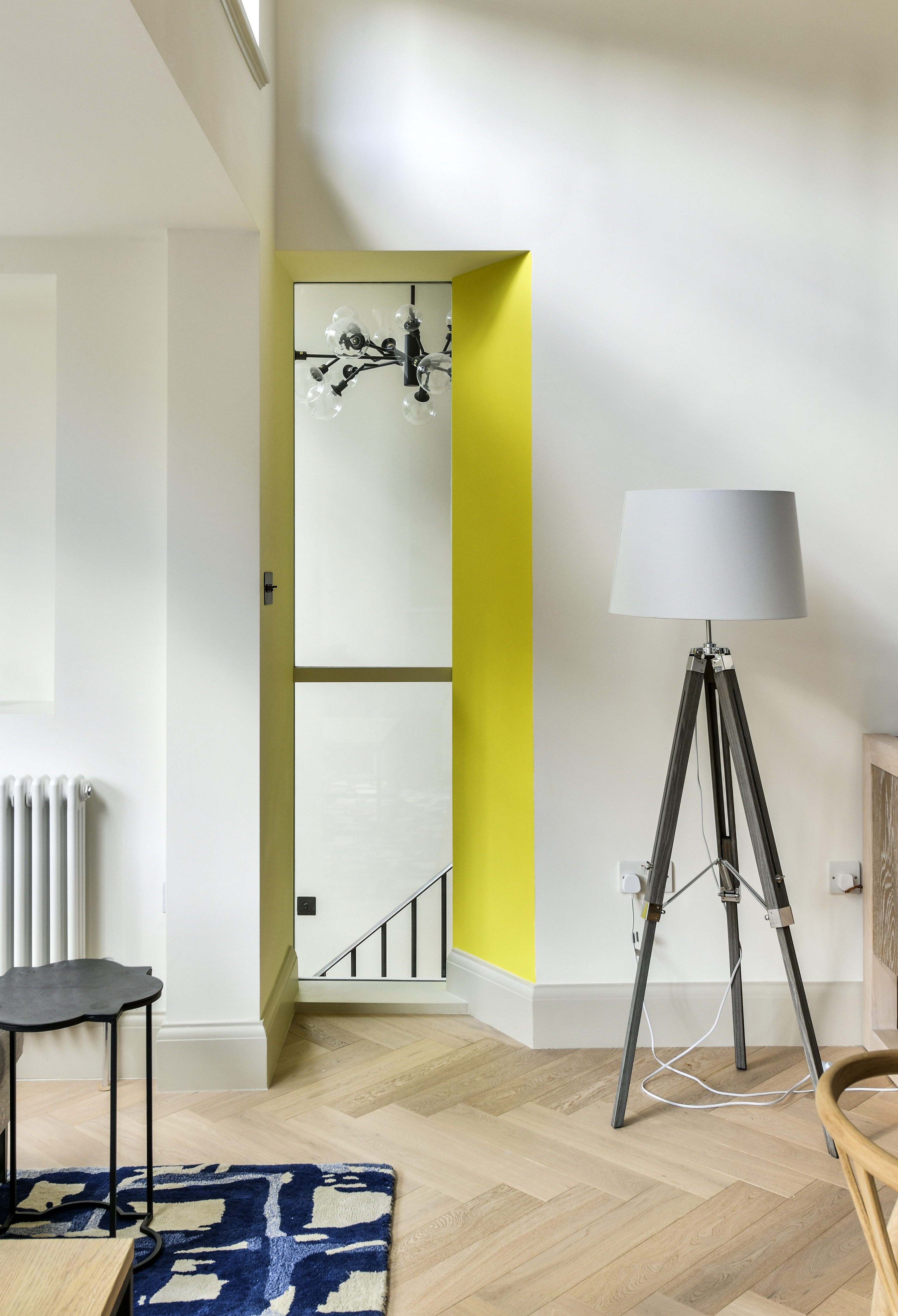
Accent color ideas can be limited in the area they cover, but boundless in their effect. Painting one wall in a contrasting color can add impact and interest to a room scheme and draw the eye to a focal point, as interior designer Sarah Fox of Fox Interior Design explains.
‘Here we used a vivid color – Farrow & Ball’s Yellowcake – to frame the internal window, drawing light and a ray of sunshine into the room,’ she says. ‘It is an unexpected, zingy hue that brightens the scheme and draws your eye to the atrium beyond.’
6. Discover how to prepare a color palette
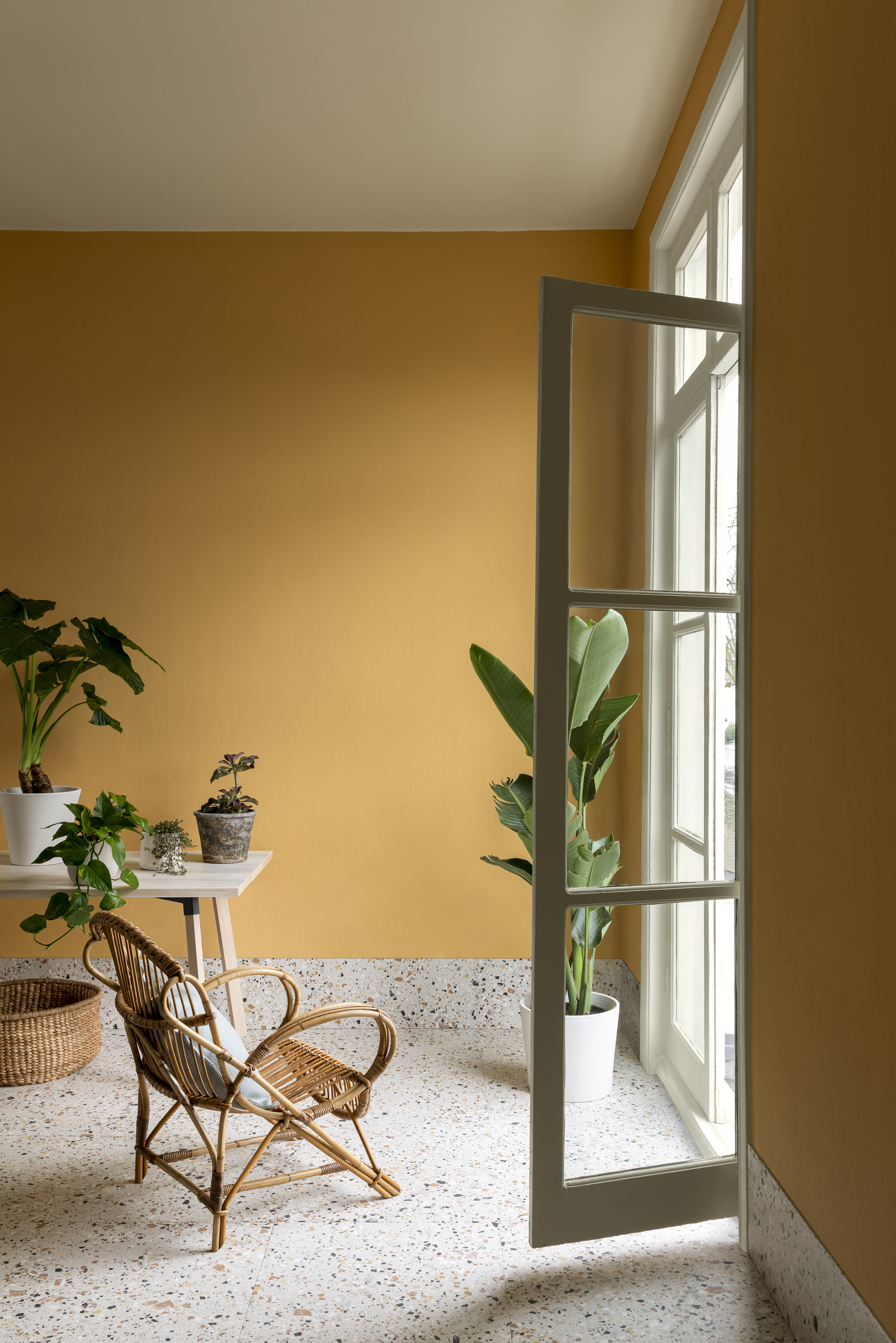
The color wheel can help you select hues for your scheme. Contrasting or ‘complementary’ colors (those that are opposite each other on the wheel) will energise each other, while harmonious ones (adjacent on the wheel) are aesthetically pleasing. Tonal colors are lighter and darker variants of the same color.
Here, bright yellow Paint & Paper Library Parasol walls are combined with leafy greens for natural harmony.
7. Create balance with paint colors
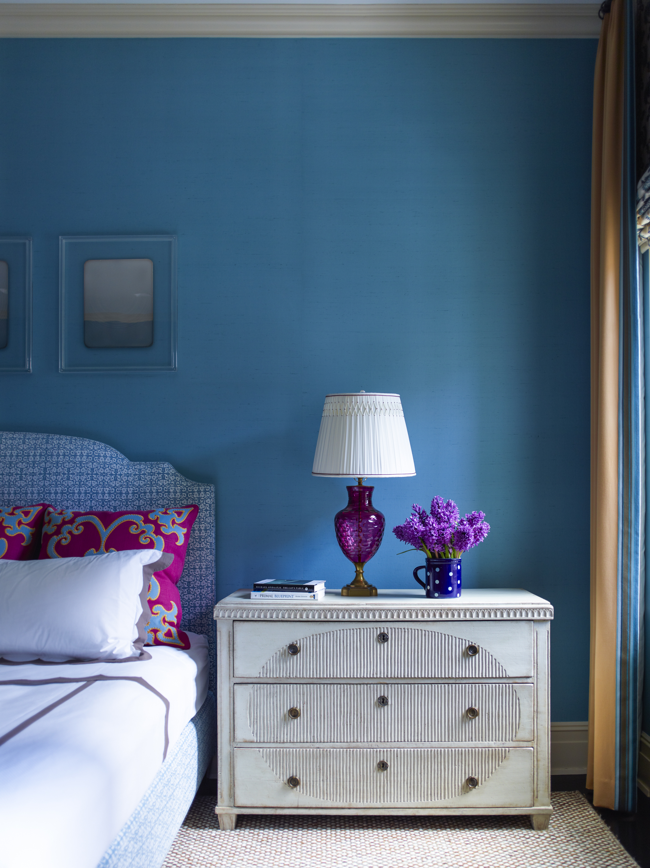
While joyous color can be uplifting and add plenty of personality to a room, too much can be overwhelming. One way to ensure success is to balance the bold color with soft hues, as interior designer Katie Ridder reveals in this elegant scheme.
‘A neutral ceiling and carpet are important calming factors that draw our eye to strong color elsewhere,’ she says.
8. Enliven ceilings with toning paint colors
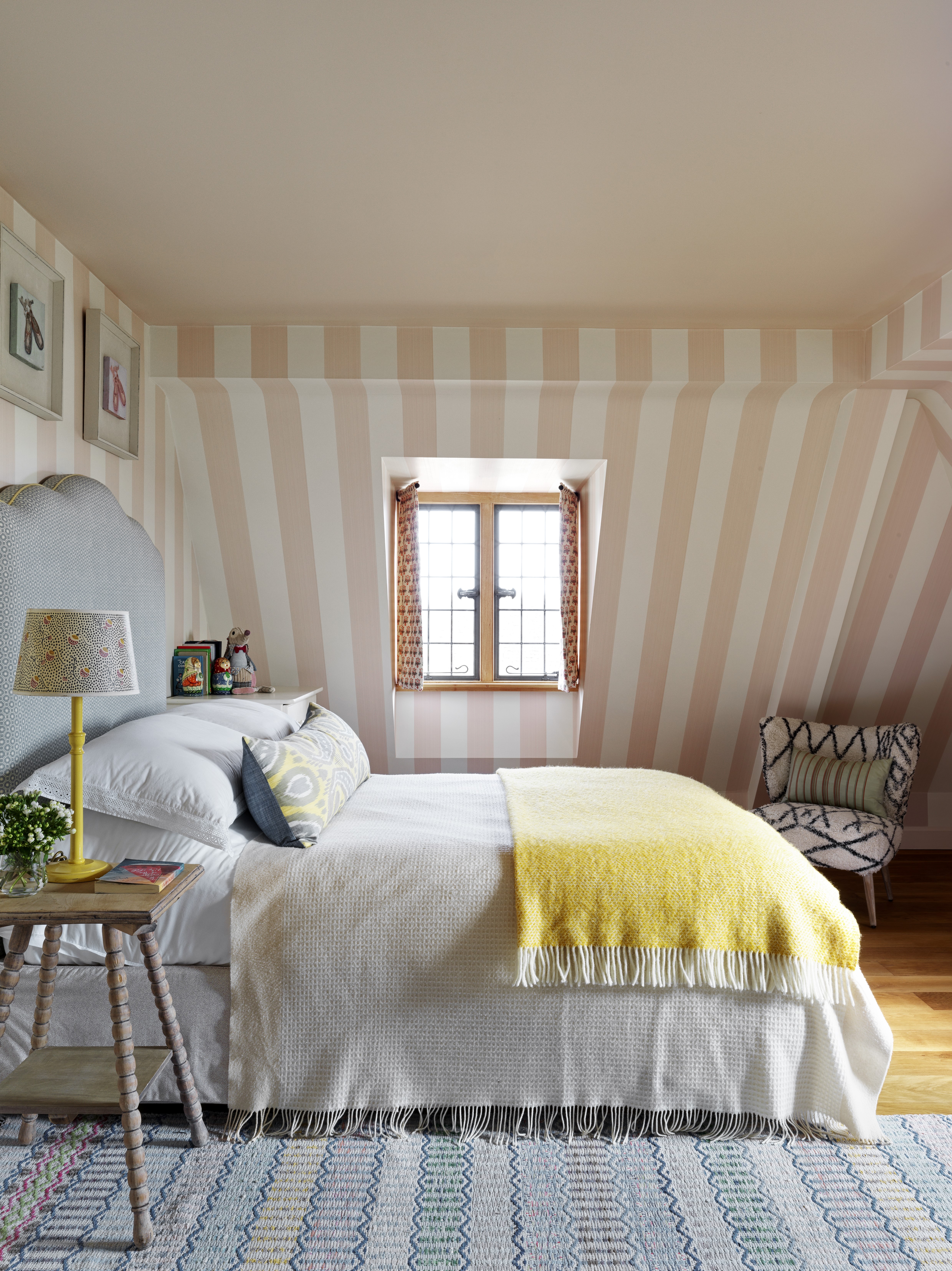
‘If you are painting the walls in an off white, then we suggest painting the ceiling in the same color as this will make the ceilings feel higher,’ explains interior designer Taline Findlater of Olivine Design.
‘If you have chosen a deeper color for the walls, such as Farrow & Ball Oval Room Blue or Green Smoke, then we suggest a warmer tone of white, such as White Tie, rather than a cool white, to soften the contrast between the walls and ceiling.’
In this pretty bedroom scheme, Olivine Design used Old Ochre from Fired Earth to create eye-catching ceiling ideas, echoing the pink of the striped wallpaper.
‘Of all the pinks available, this is an absolute favorite because it has a warm undertone from a tiny dose of yellow, rather than some with too much lilac.’
9. Choose paint colors to create contrast
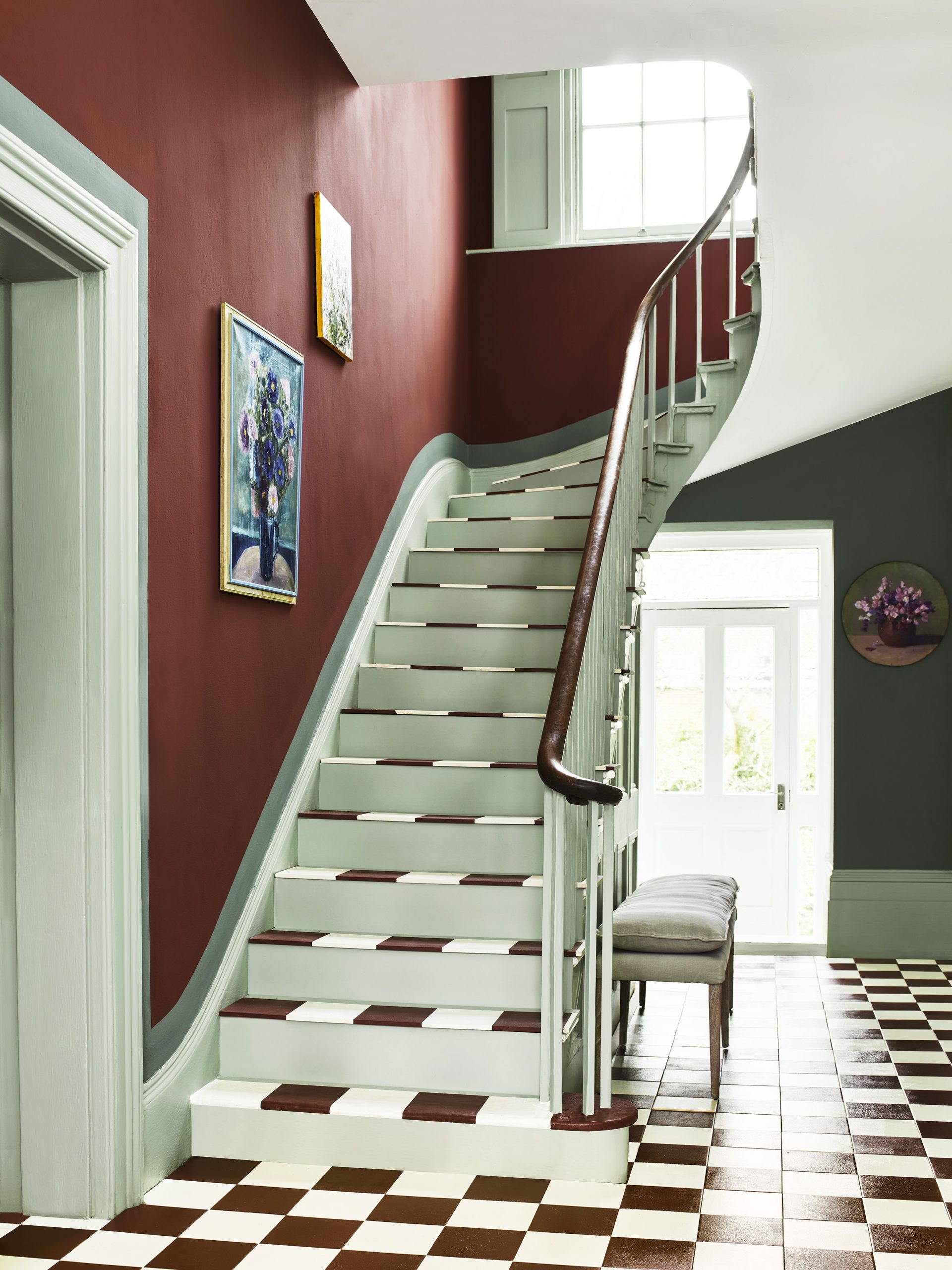
‘Red is a color with great joy and passion, the boldest of all the shades,’ says Annie Sloan, paint color expert and founder of Annie Sloan. ‘It brings great warmth, dynamism and personality to a space, so it’s a great choice for active areas, such as hallways.’
Here, walls in Primer Red are contrasted with Cambrian Blue for warm versus cool contrast, with border in Pemberley Blue, and a checkerboard floor in Chalk Paint Primer Red and Original for added impact.
10. Work with modern neutrals
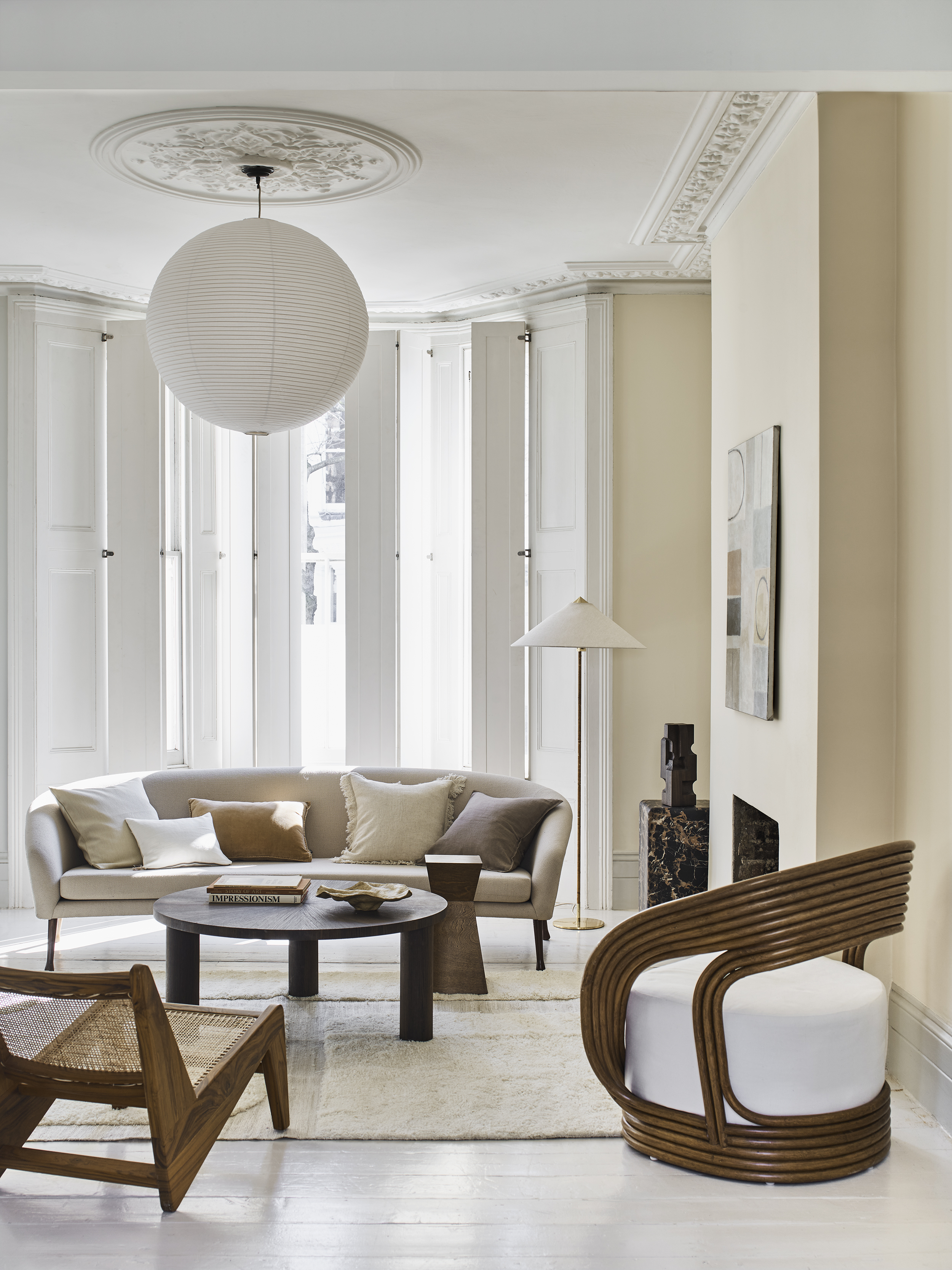
Neutral paint colors, from shades of white to creams, grays and taupes, can be easy to live with and make a soft backdrop to bolder colors – or be layered with other neutrals to create a sophisticated blend of texture and shade.
If you are finding it tricky to identify whether a particular color has a cool or warm base for your neutral room ideas, it may help to compare it with a chip of true (bright) white.
Here, walls painted in a soft cream, Valspar Biscuit Crumbs, are teamed with a warm white ceiling and trim, teamed with wooden furniture for added warmth. To avoid a bland result, a dark coffee table and sculpture add definition.
How do I pick the right paint color?
From the colors that naturally appeal to you, decide on the effect that you want to create, from cool restful to warm dynamic shades. Consider how the color will work with the room’s furnishings, and whether you want to create a simple backdrop to bold paintings, for example, or use vibrant color to create impact. Create a mood board (a collage of images and samples) to develop a contrasting scheme, if you wish, or do you prefer something more harmonious with layers of texture? Then paint a swatch and test your scheme to see that you like the result.

Amelia Thorpe is a specialist interiors and design journalist, covering every topic to do with homes from fabrics, furniture and lighting to surfaces, kitchens and bathrooms.
As the daughter of an antique dealer and a lifelong collector of old cookery books and vintage graphics herself, she also has a particular expertise in antiques, mid-century and decorative arts of all kinds.
Drawn to homes because of their importance in the happiness of our lives and the enjoyment they can bring, Amelia has been writing about the topic for more than fifteen years. She has interviewed some of the most influential designers of our time, from Piero Lissoni, Antonio Citterio, Jaime Hayon and Arik Levy to Nina Campbell and Robert Kime.