The best Farrow & Ball paints for kitchen cabinets – 10 timeless colors that are 'less about fashion and more about enduring style'
From cheerful yellows to timeless blues, these are the best Farrow & Ball paints for kitchen cabinets, inspired by real-life homes

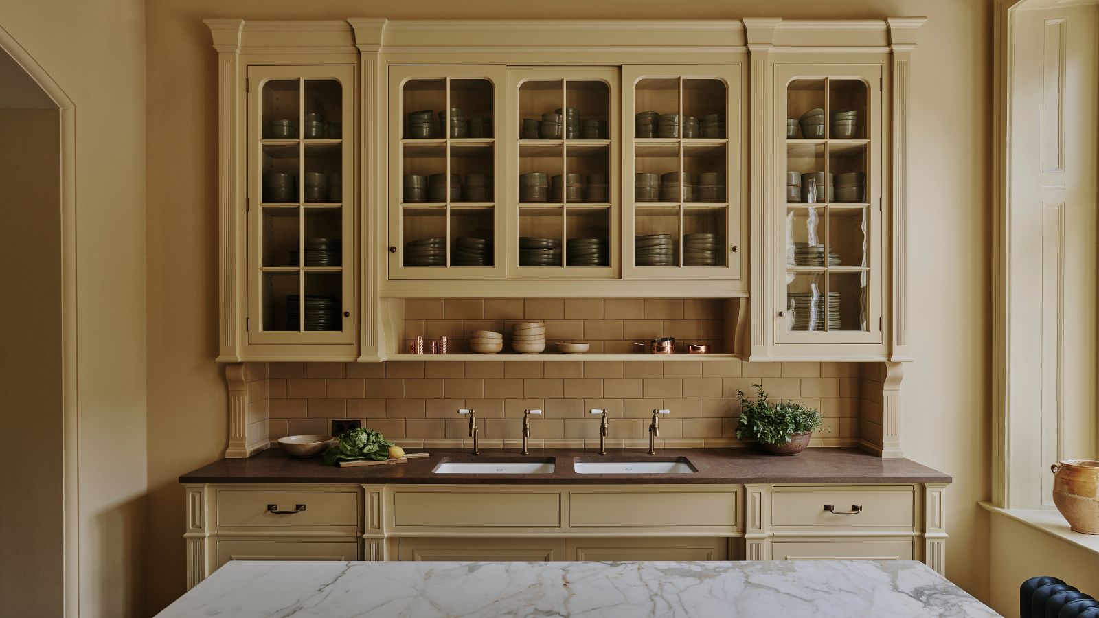
Known for their varied range of beautiful heritage colors, it's no surprise that designers head over to Farrow & Ball when selecting a kitchen cabinet shade. But with such a versatile selection of colors available at your fingertips, deciding on one timeless shade to adorn your cabinets is a big decision.
Here to inspire your kitchen cabinet colors, we've curated a list of the all-time favorite Farrow & Ball shades, as suggested by interior designers who have used them in their own homes and projects. Each is as timeless as the next, proving that no matter your kitchen style (be it modern farmhouse or minimalist), there's a Farrow & Ball shade that's just waiting to be applied to your cabinetry.
Acknowledging kitchen cabinet color trends from the ever-popular butter yellow to enduring greens, we've created a list to make the all-important kitchen cabinet color decision an inspiring and satisfying venture.
1. Hay
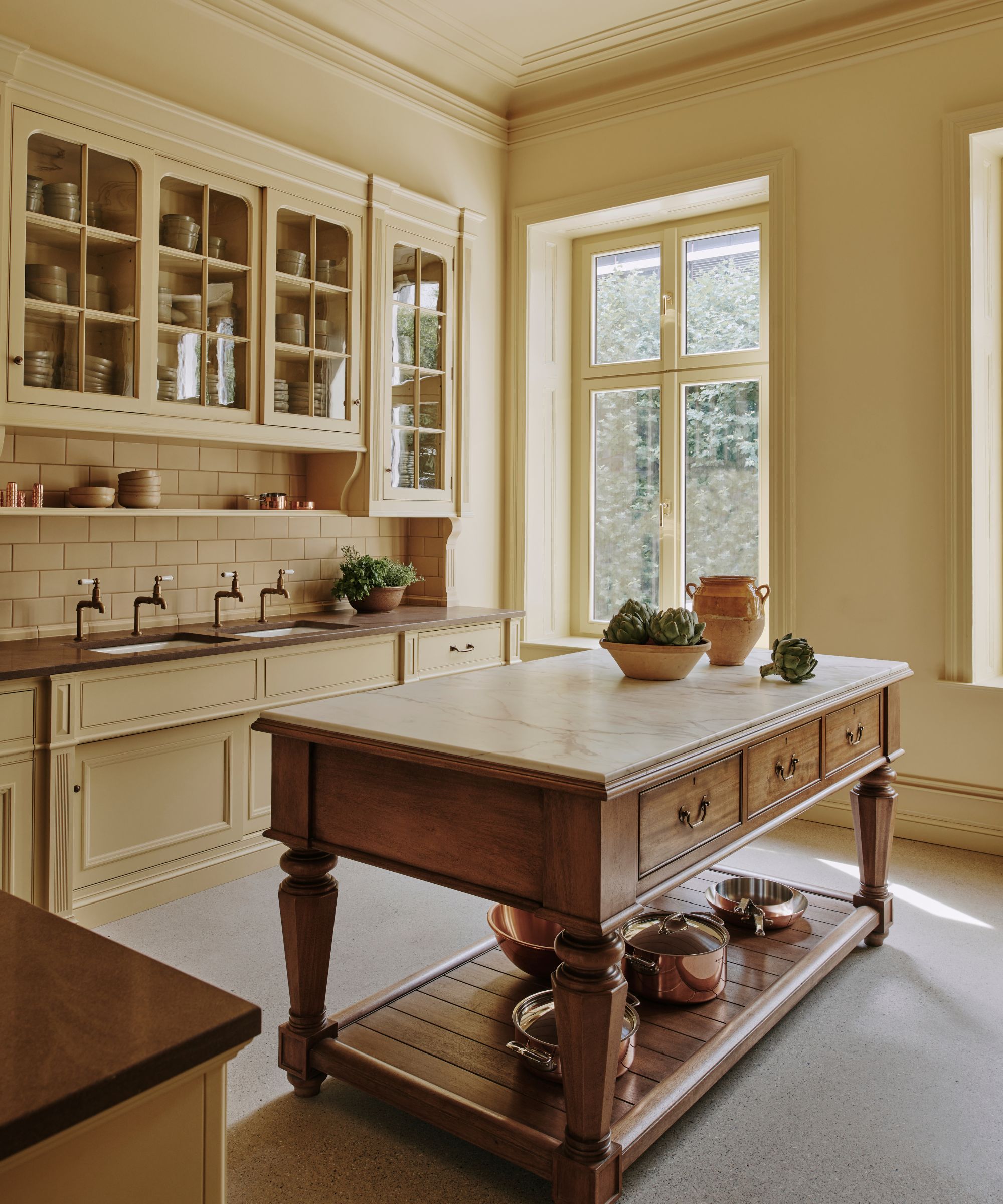
When you think of butter yellow, you are thinking of Hay. The perfect choice if you're looking to create a butter yellow kitchen.
You might think a yellow kitchen seems a little bold, but this farmhouse-style space designed by Artichoke proves otherwise. Doused from head to toe in Hay from the window frames to the cabinetry, the room feels vibrant and still refreshing, proving that a yellow can feel subtle even when you totally color drench a room. Even the subway tiles match the buttery hue to give the kitchen a seamless effect, balanced by the rustic wood countertops and island.
If you're looking to bring color into your kitchen but are fearful of going overboard, Hay is the perfect way to honor trends and still feel assured you're creating a timeless space that'll stand the test of time.
2. Light Blue
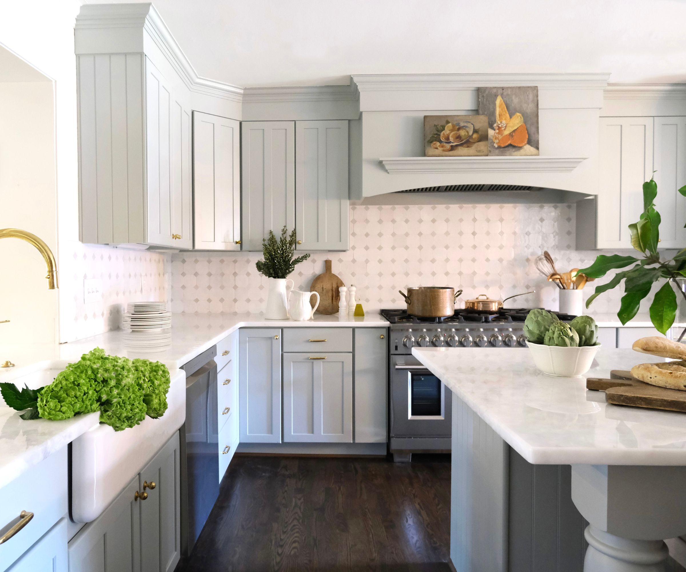
Seeing Farrow & Ball paint in real homes can make deciding on a kitchen cabinet color far easier. This farmhouse kitchen, designed by Virginia Nocharli, makes the case for a pale blue, a classic shade that's just slightly bolder than choosing a neutral.
Design expertise in your inbox – from inspiring decorating ideas and beautiful celebrity homes to practical gardening advice and shopping round-ups.
One of the best pale blue paints out there, Farrow & Ball's Light Blue is a refreshing yet subtle choice for kitchen cabinetry. Virginia says, 'When renovating this cottage-style kitchen, we knew it needed a palette that would honor its roots while ushering in a sense of quiet refinement. Enter: Farrow & Ball’s Light Blue.'
She adds, 'At first glance, Light Blue is a pale, silvery whisper of blue with the faintest green undertone. Spend a moment with it, and you begin to understand its subtle magic as it changes between blue and green and gray throughout the day. And while trends come and go, there’s something in this color that feels timeless, less about fashion and more about enduring style.'
Ideal alongside white kitchen ideas, Virginia says, 'It was the perfect complement to our palette of creamy whites, warm woods, and natural textures, grounding the space without overwhelming it. Farrow & Ball’s Light Blue created the exact feeling we wanted for this kitchen that’s meant to be lived in and loved.'
3. Bancha
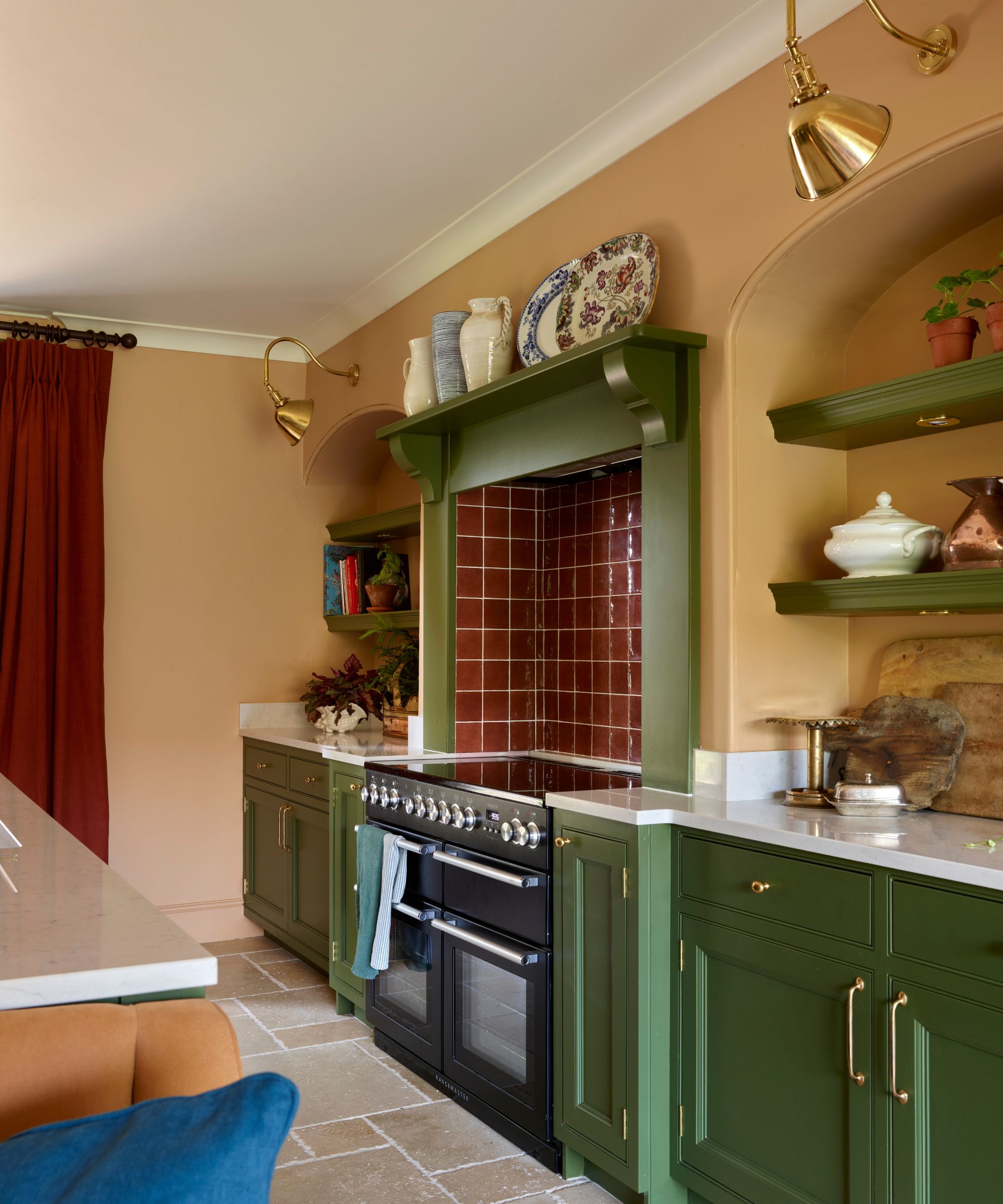
If you are considering a dark green kitchen, Bancha should be on your list. It's the perfect kitchen cabinet color that falls somewhere between olive green and moss. Pair it with kitchen cabinet hardware in gold or aged brass, and you've got a timeless combination that exudes heritage charm and warmth.
Interior designer Katie Cardew used Bancha in a recent project, pairing it with a Dutch Pink, a pastel pink with terracotta undertones. The beauty of Bancha is its luxurious quality; it entirely uplifts cabinetry, transforming a mundane built-in cupboard into the kitchen's centerpiece. It's the perfect choice if you're looking to enrich your space and go bold, but also ticks the all-important endurance box.
4. Drop Cloth
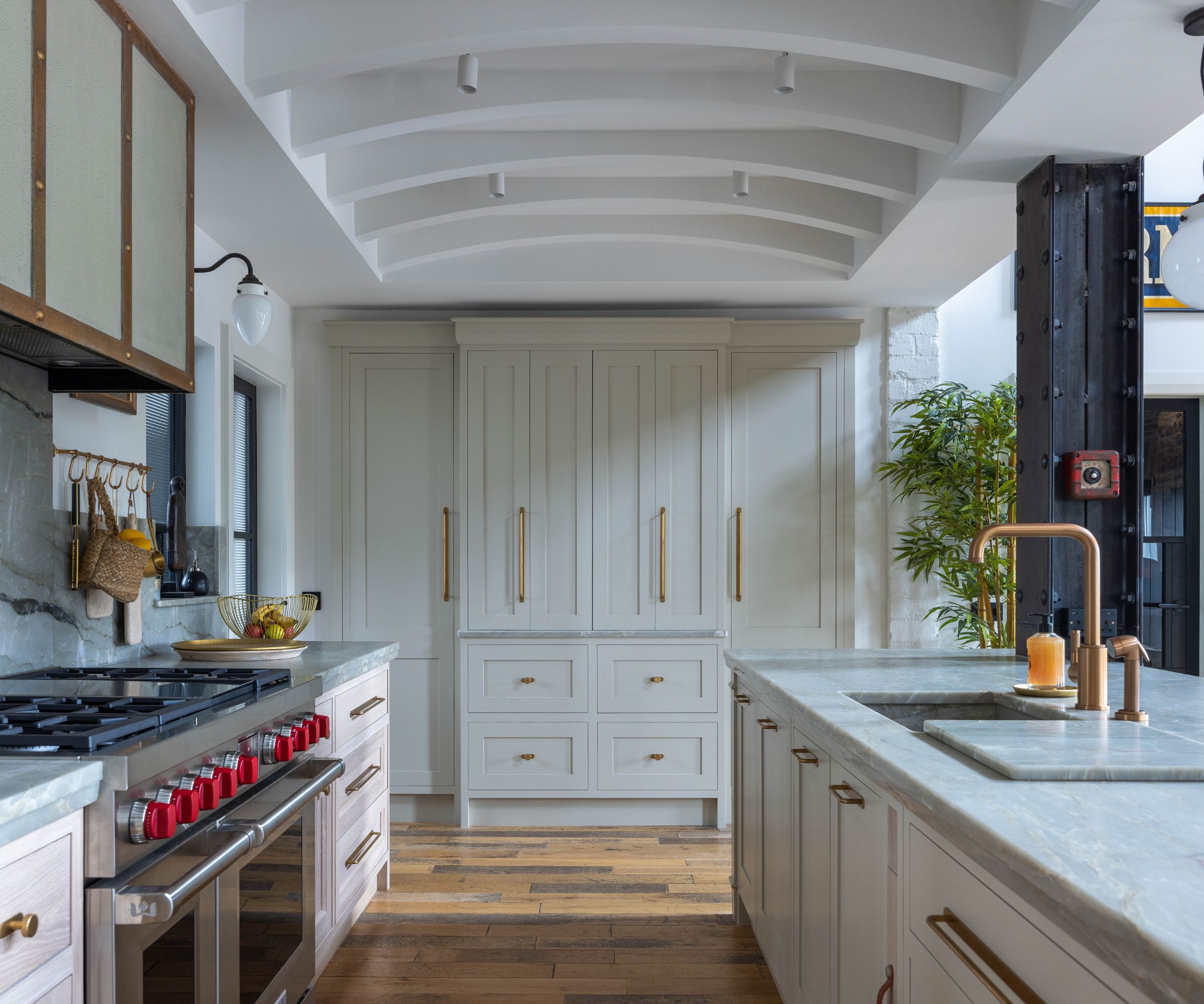
Recommended as one of the best warm neutral paints, Drop Cloth by Farrow & Ball is a bright and airy paint color that beautifully frames kitchen cabinetry of all styles.
Take this spacious kitchen, the designer has enhanced the airy qualities of the renovated building by opting for a refreshing yet far from clinical white to adorn the cabinetry. Max Collins, director of Braco Designs, explains, 'This kitchen is found within a 200-year-old renovated mill building, painted on-site in Farrow & Ball's Drop Cloth alongside Edwardian oak handmade cabinetry completed in a white limed finish.'
With gray and beige notes, it's the perfect off-white shade that uplifts without straying into stark. Whether you've got a modern farmhouse kitchen or a minimalist kitchen that needs some warmth while still feeling fresh, Drop Cloth is an enduring choice that'll frame cabinetry harmoniously.
5. Setting Plaster
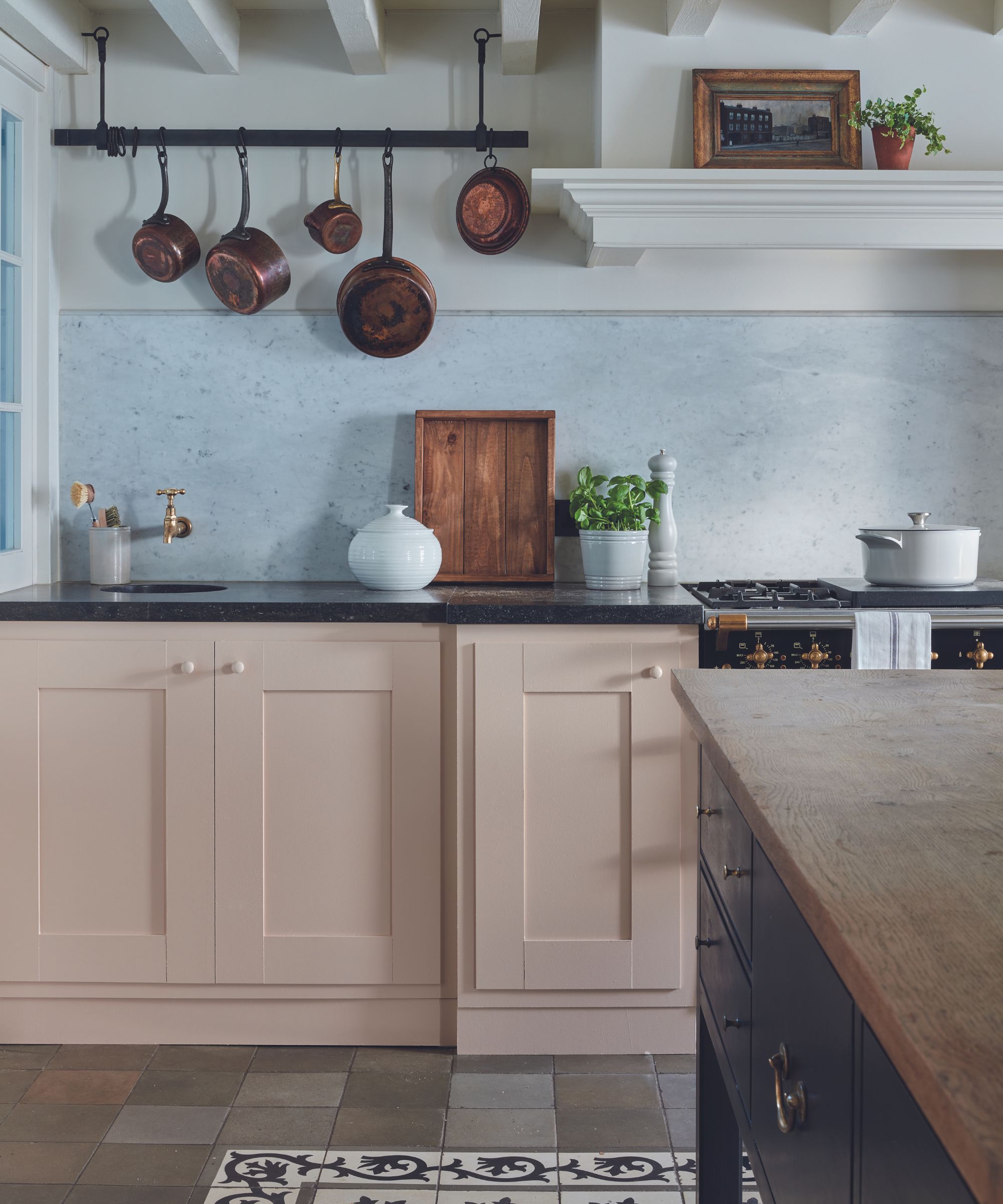
There are many ways to use Setting Plaster, but applying it to your kitchen cabinets just might be our favorite. A pink kitchen may sound a little risky, but using a shade like Setting Plaster, which falls between pastel pink and peach, is a clever way of drawing upon kitchen color trends while still creating a sense of elegance.
Patrick O’Donnell, Brand Ambassador at Farrow & Ball, says, 'Try an earthy pink as a lovely alternative to a ‘safe’ neutral. Think Setting Plaster in our tough and resilient Modern Eggshell, especially when teamed with the tranquil qualities of School House White in Modern Emulsion, which is fully washable for peace of mind!'
Pair it with dark wood accents like a butcher's block kitchen island or countertops for a classic, country-style aesthetic. Alternatively, for a more contemporary feel, use a paler palette of materials such as marble or white-painted wood.
6. India Yellow
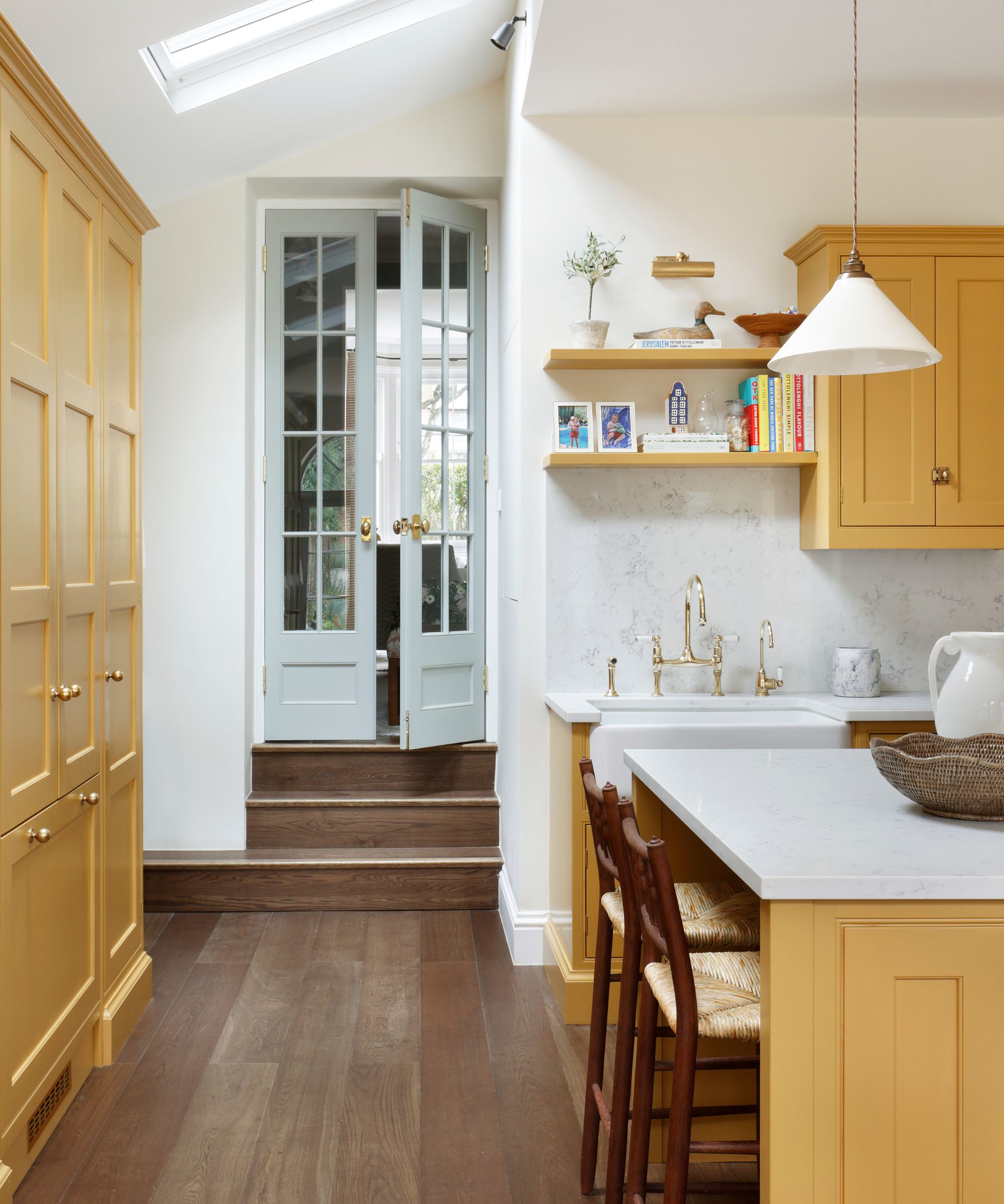
This kitchen was designed by Lisette Nikolic, founder of Lisette Voute Designs. The designer created a vibrant yet deeply classic kitchen that feels cozy but still spacious and light. Using Farrow & Ball's India Yellow on the built-in cupboards, cabinets, and wood-paneled island, Lisette has perfected the level of vibrancy in the space.
Arguably one of the best yellow paints out there, India Yellow is a deep mustard that exudes richness and warmth. It's best paired with lighter shades, like a classic white or a pale blue (Lisette has used Light Blue on the glazed French doors). It's the perfect choice for homeowners looking to bring character and depth into their kitchen, particularly if it falls into the stark or clinical.
Fitted with vintage kitchen hardware such as gold knobs, the cabinetry feels whimsical yet classic, filled with heritage charm and sophistication.
7. Studio Green
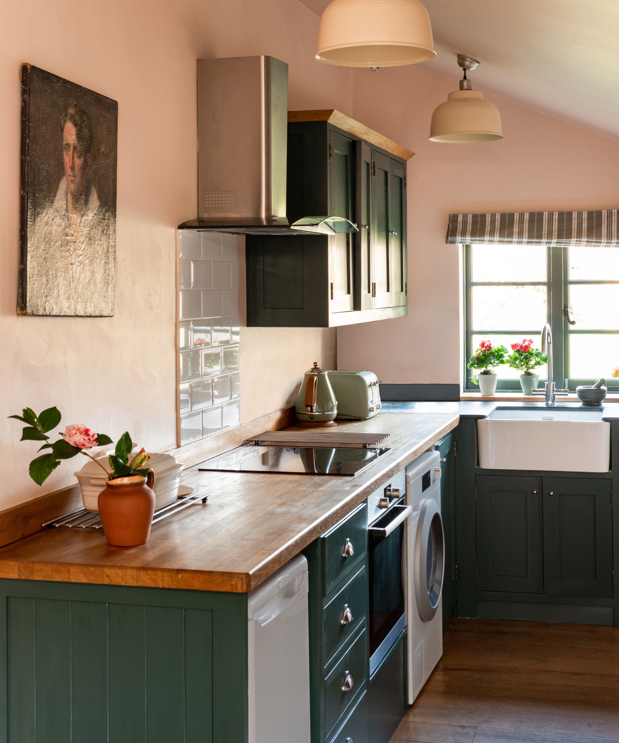
If you're looking to bring a touch of luxury into your kitchen, Farrow & Ball's selection of dark green paints might be for you. Among its selection, you'll find one ever-popular color – Studio Green.
'We know how successful green cabinetry is, but we often think of mid-green as our preferred choice, says Patrick. 'Up the ante and look towards the deepest, darkest green of Studio Green. Almost black in appearance, it will look wonderful both in rural and urban settings, especially in a classic Shaker kitchen. For a more modern aesthetic, pair with a clean, just off-white such as James White or Strong White on your walls. For a softer look, consider Drop Cloth or Stony Ground for a more ‘country’ affair.'
Alternatively, take inspiration from the pink and green kitchen color trend and create a charming, rustic kitchen with pale pink walls and deep forest cabinetry like the space pictured above.
8. Railings
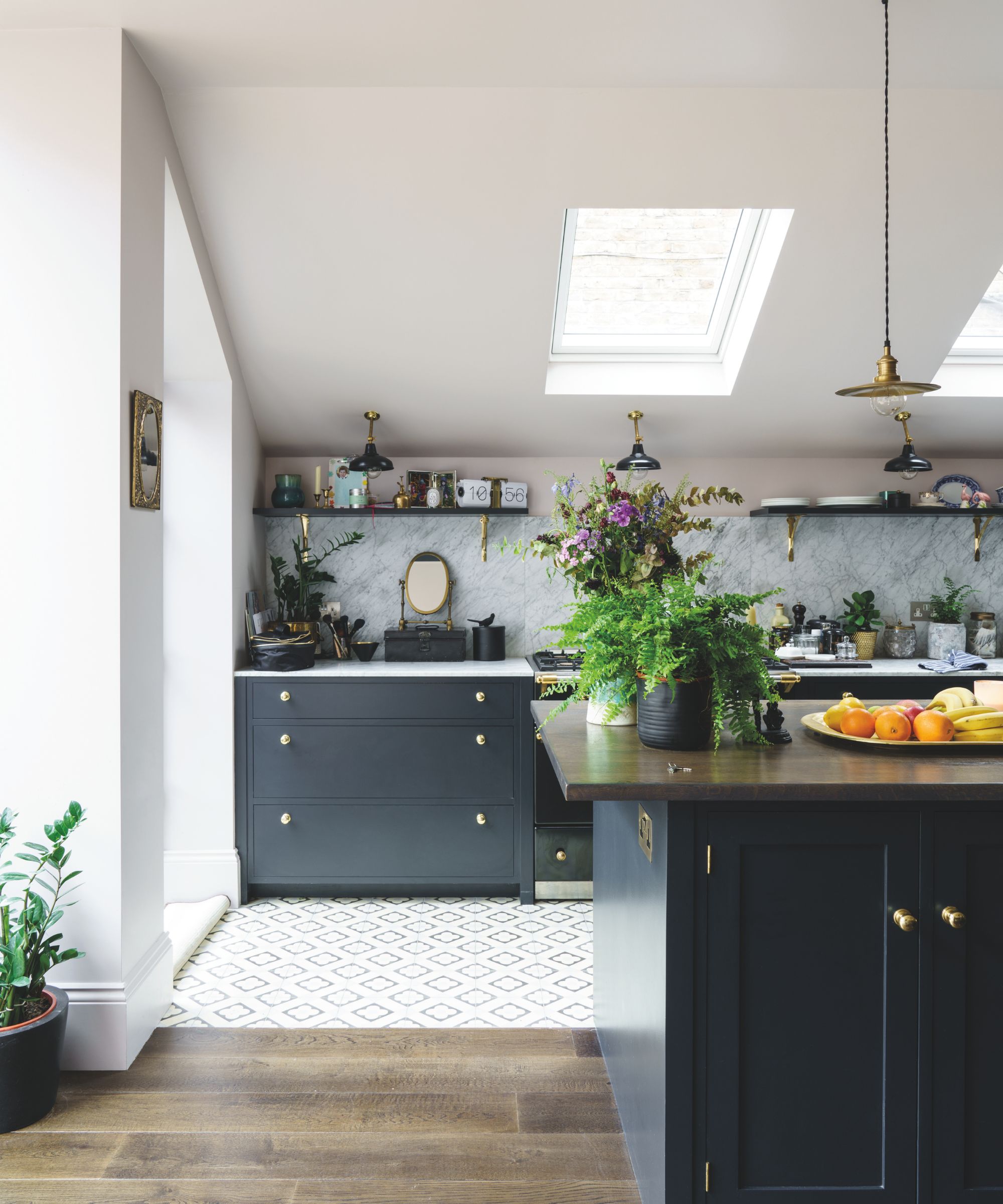
Decorating with Farrow & Ball's Railings might sound dramatic, but it's the most liveable blue-black and can provide real depth and drama in the kitchen, particularly when used on cabinetry.
'Blue kitchens are deeply popular and for good reason. They don’t seem to age in look and are a tried and tested formula that just keeps on giving,' explains Patrick. 'Rather than choosing blue cabinetry against a white wall backdrop, go for a bit of blue saturation. One beautiful combination would be Railings on your cabinetry set against walls painted in De Nimes, a deep mid-blue with slight gray tones. This is a classic combination for a truly striking look.'
9. Sudbury Yellow
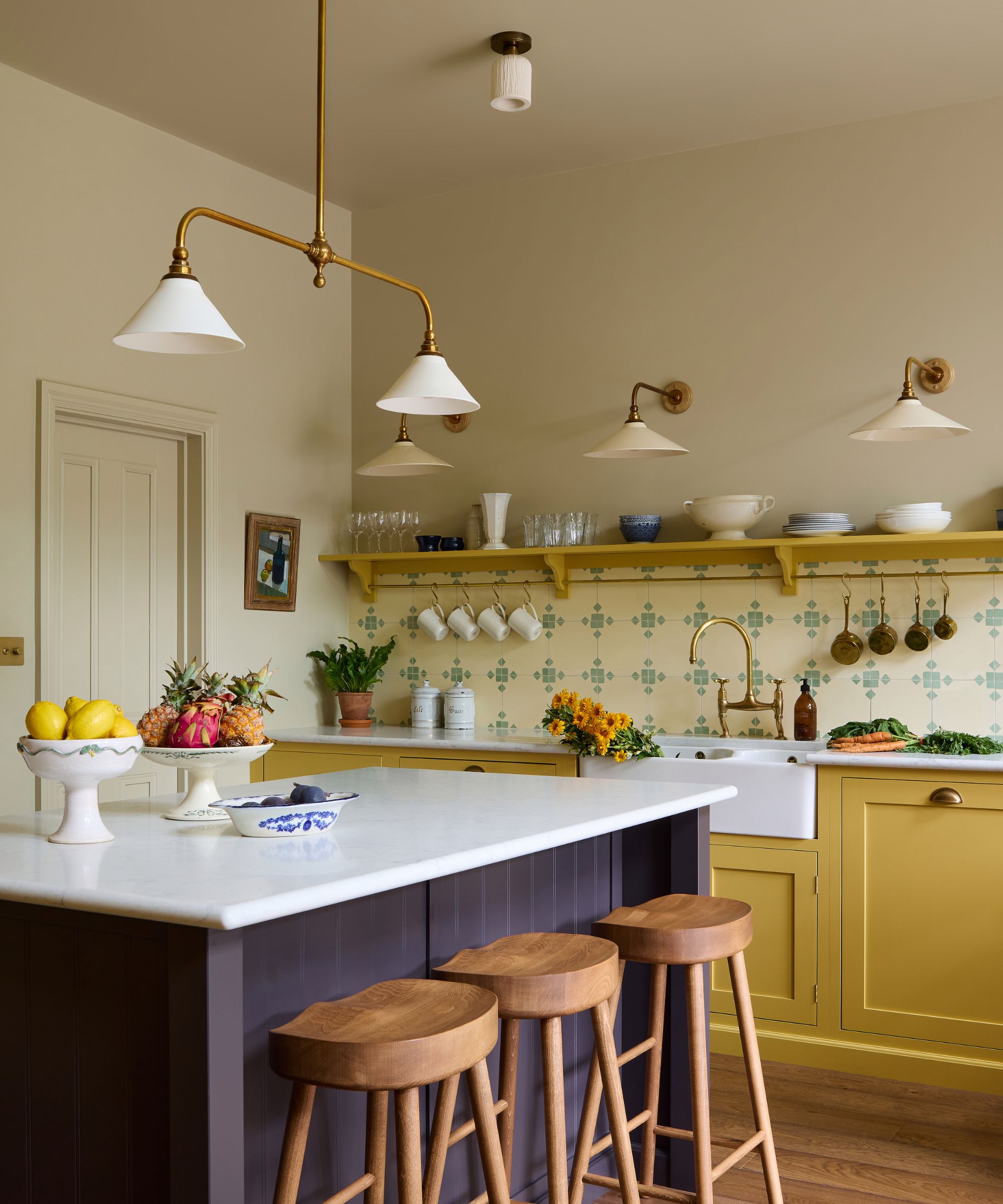
A soft mid-yellow that holds parallels with a classic mustard, Sudbury Yellow will bring life to your kitchen cabinets, giving your kitchen an inviting and refreshing feel that you can sense as soon as you enter.
Interior designer Uns Hobbs created the sophisticated country kitchen pictured above. She says, 'When choosing a paint color for our new-build kitchen, our clients wanted something cheerful and uplifting, but not overly sweet. Farrow & Ball’s Sudbury Yellow strikes that perfect balance. It’s a joyful, sunny hue that lifts the mood without feeling too acidic or saccharine, ideal for kitchen cabinets. It brings warmth and character to the space, making the kitchen feel instantly welcoming.'
Best paired with bright whites for a balance of vibrancy and warmth, Sudbury Yellow is a surprisingly timeless kitchen cabinet color that works in a variety of kitchen styles and sizes.
10. Bamboozle
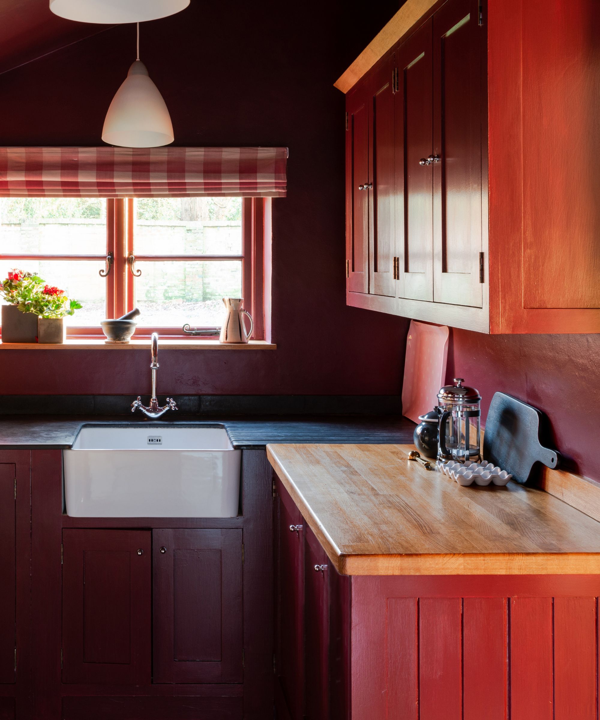
While some might be surprised to see a fiery red on the list, Farrow & Ball's Bamboozle is a heritage color with deeply classic roots. When done well, red kitchens can feel timeless and sophisticated, so it's only right to include the striking shade in the best paints for kitchen cabinets round-up.
'If you wanted to add a splash of color to your kitchen island or free-standing larder cupboard, try a delicious paprika-spiced red, such as Bamboozle,' suggest Patrick. Designer Heidi Caillier, in fact, did just this in a recent kitchen project to add an element of surprise to a neutral kitchen. To balance out the boldness of red cabinetry, a timeless white or cream on the walls and plenty of aged wood accents on your kitchen island, countertops, or flooring will ensure your scheme feels striking but not overwhelming.
While it's always useful to take inspiration from color trends, it's important to ensure your kitchen is timeless by opting for paint shades that are never going to date – something Farrow & Ball prides itself on creating. And remember, timeless doesn't mean boring, it doesn't always need to mean neutral, in fact, more of these designer recommendations are bolder shades than safe ones and yet all these spaces are totally classic.
