10 front door colors to avoid to ensure a welcoming home exterior
Your front door is the perfect place to inject some color and personality, but steer clear of these hues if you want your entryway to be welcoming and sophisticated

Emily Moorman
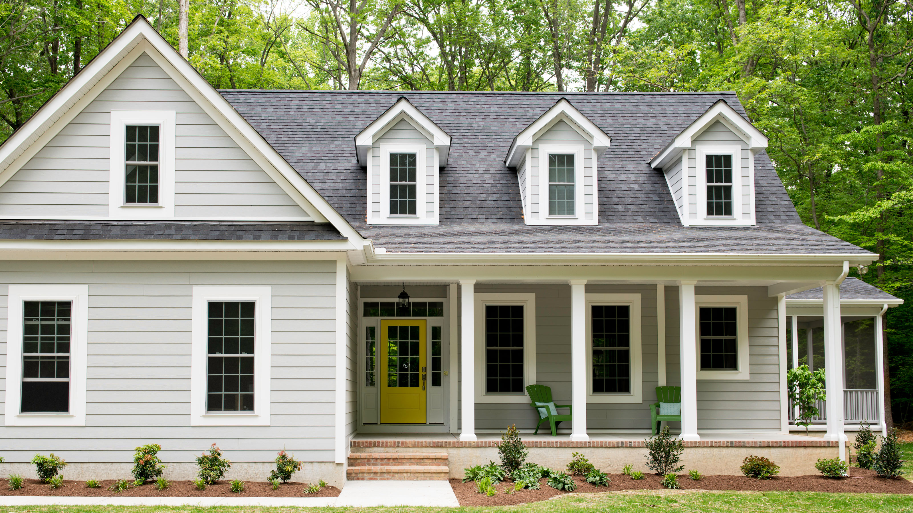
Design expertise in your inbox – from inspiring decorating ideas and beautiful celebrity homes to practical gardening advice and shopping round-ups.
You are now subscribed
Your newsletter sign-up was successful
Want to add more newsletters?
Choosing the color of your front door can be immense fun. There are seemingly endless colors to choose from, and you can be more playful and experimental than in your interiors.
However, it's worth bearing in mind that the color you choose is not just a frivilous choice. It will set the tone for the overall look of the front of your property, directly impacting your home's curb appeal and, just as importantly, the feeling guests have as they are welcomed into your home. In that sense, it's key to know the front door colors to avoid, before you start making decisions.
When deciding which of the many front door colors you are going to choose, there aren't any hard set rules as such, but there are undoubtedly a select few shades that really ought never be used on a front door.
Article continues belowHere we shine a light on the particular colors to bypass, so you can avoid making any front door color mistakes.
10 front door colors to avoid, according to designers and color experts
'Exterior paint colors are always tricky as we are led by the existing finishes of the rest of the home,' says designer Eugenia Triandos, Principal Designer at Hibou Design & Co. 'It's important to make this selection while considering all other elements of the architecture.'
As Eugenia says, your front door design will affect which paint ideas work – or don't work – for your own home. Above all else, keep in mind your home's surroundings and existing features before deciding on the right front door color.
1. Graphite gray
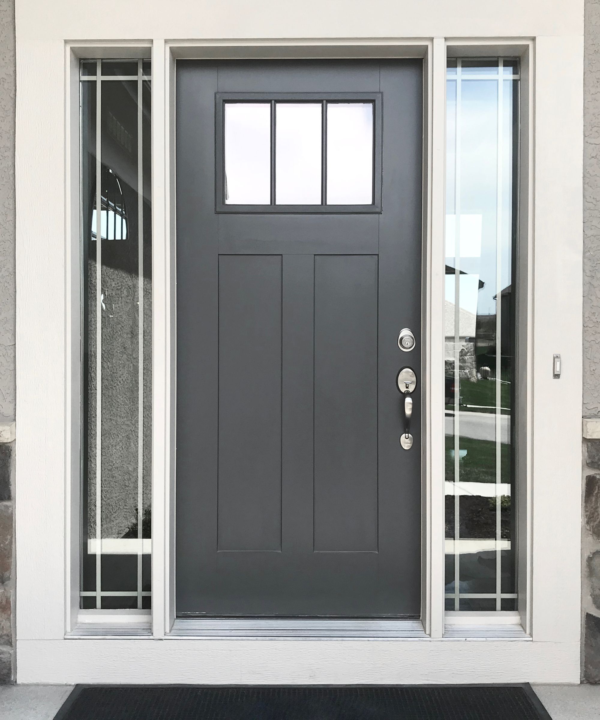
Gray – you either love it or you hate it. Admittedly, there are some places where decorating with gray can work, and there are times you should never paint a room gray. But what about the front door? Often homeowners think to use gray on their front door, out of a desire to neaten and smarten their front porch or entryway. It's true that this fairly sensible, some may say joyless, color can help the front doorway appear orderly and shipshape, but it can also look cold and uninviting.
Design expertise in your inbox – from inspiring decorating ideas and beautiful celebrity homes to practical gardening advice and shopping round-ups.
UK-based interior designer Fiona Duke notes that gray is something of a mood killer, not an ideal first impression, and should be a front door color to avoid.
'When gray is used on a front door, it can oftentimes feel flat and uninspiring, which isn't the best foundation for happy, lively gatherings,' she explains. 'Statement, vibrant colors can help promote engagement and discussion as they feel more creative and give more energy – a much more appropriate welcome.' It's worth bearing in mind that gray can have a profound effect on many of us; often, its sullen presence can feel inhospitable and glum, which is not the desired effect when someone comes into your home.
But what if you love the pared-back, super sleek, sharpness of gray? Rest assured, not all gray paints are created equal, and some hues can look dashingly smart and handsome. If you have your heart set on painting your door gray, steer clear of the charcoal or graphite grays, those that mimic thunderous skies or metal, and instead find a gray with warmer, softer undertones.
Interior designer Lolita Colenzo is convinced, though, that gray should never be on a front door, ‘Gray is a cold, gloomy color, and like in interiors are in the past when it comes to exterior colors,’ she explains. ‘It feels inauthentic. Earthier, neutral tones like stone, light taupe, or even a soft mid-tone off white paint would be the wiser choice.'
2. Bright yellow
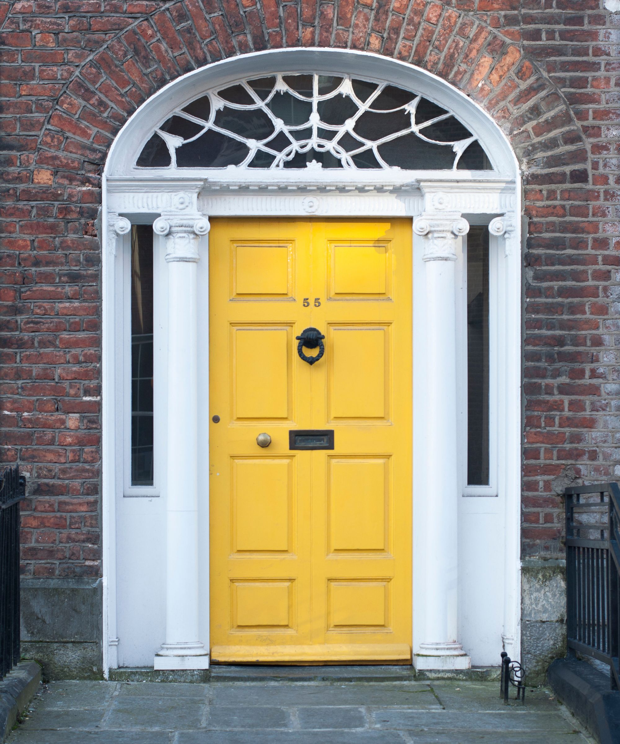
When at a talk recently with the renowned interior designer, Nina Campbell, she made some comments about decorating with yellow, which have stuck with me. She described how some yellow paints ‘go blind’, by this, she meant that their brightness and sharpness can make them overly dazzling and stark, making you want to look away. As such, you may as well have not bothered with the yellow at all. This is owing to the lack of dark pigment or muddiness in the yellow’s undertone.
If you love the smile-inducing qualities of yellow, tread carefully when decorating with this color on your home’s frontage, as it can very easily become an exterior painting mistake you could regret. Super luminous, blazing yellow can be quite an eyeful and can negatively affect the overall appearance of your home and its curb appeal.
A happy, sunny yellow front door is a joy-sparking thing, and can make you feel happier at home, but be sure to select a yellow with warmer, earthier undertones. A great example of a yellow that is perfectly judged for a front door is Bassoon by Little Green, which has a deep-ochre tone that grounds it, so it is distinctly un-zesty. Another great choice is the popular India Yellow by Farrow & Ball, a front door painted in this deep yellow paint would be a sight to behold. Fiona Duke heartily recommends Farrow & Ball Duster for a front door, for a more aged tone, perfect for period properties.
3. Matte black
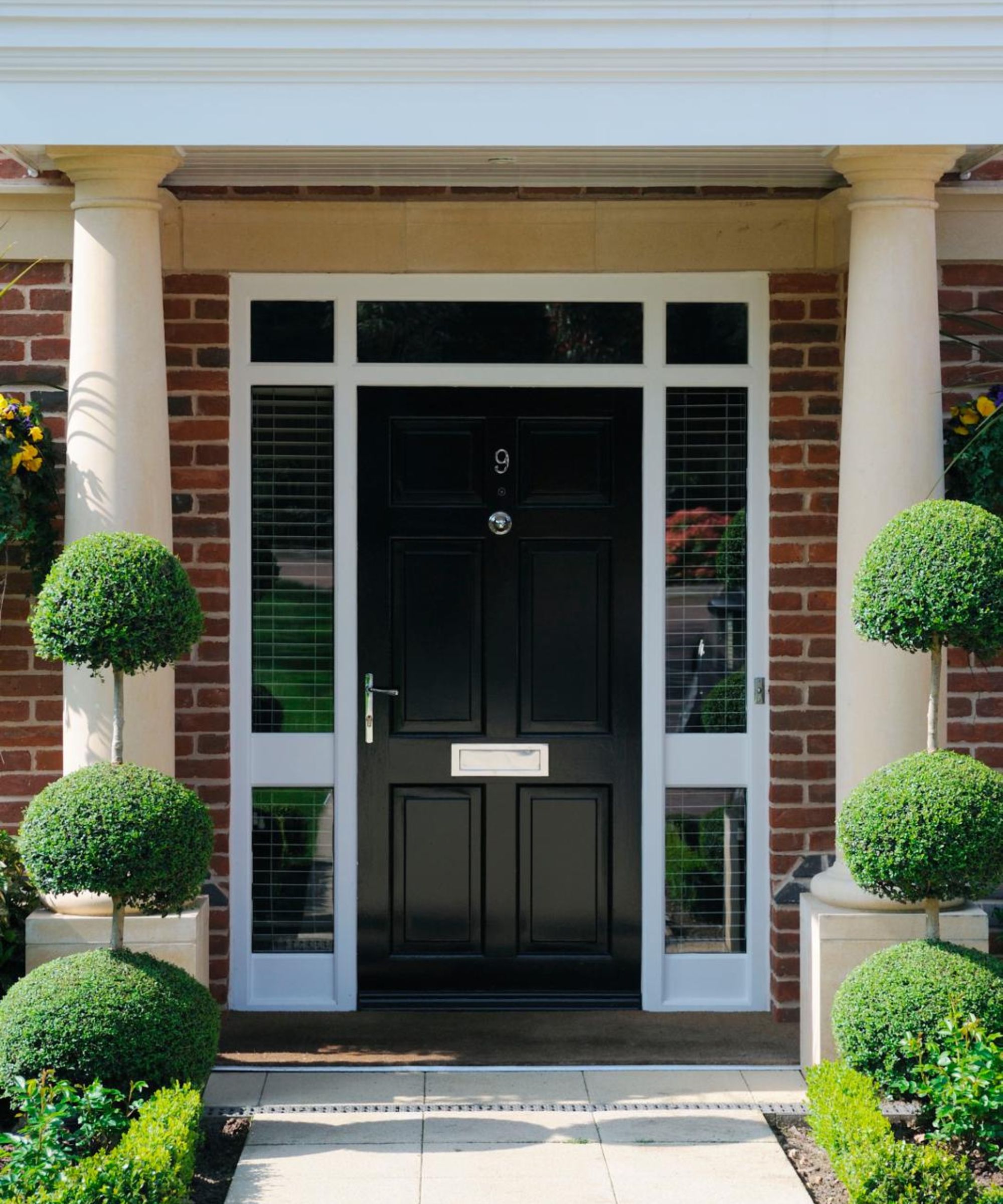
Although dark paints can result in a smart and sophisticated look, they can have negative implications when used for front door ideas.
'Very dark colors might come off as too harsh or uninviting,' says designer Cinzia Moretti, Creative Director at Moretti Interior Design. 'Dark purples, browns, or charcoals can sometimes create a gloomy appearance, especially if not well-lit.'
Zaeem Chaudhary, an architectural draftsman at AC Design Solution, warns that these colors can present practical problems too.
'A black front door absorbs the heat daily and will expand (and repeatedly contract) until the timber gives out. This can cause some doors to split, crack, or warp to the point that they don't fit the frame correctly. Painting your door black may, unfortunately, terminate your door's warranty due to these unfavorable impacts.'
4. Trending colors
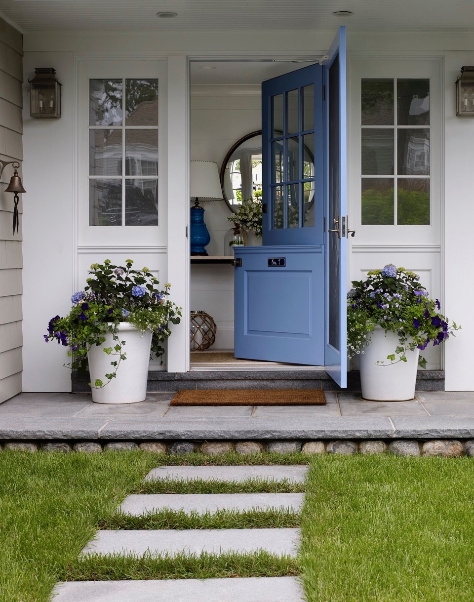
While your front door color should align with your interior design style, embracing an overly trend-led approach can result in one that constantly needs updating.
'When choosing a color to paint your front door, it's wise to consider several factors to ensure the color is welcoming, timeless, and complements the overall aesthetic of your home,' says Cinzia. 'Colors that are currently in vogue might become too dated over time such as certain shades of bright pink, or very specific trendy hues like millennial pink or gen-Z -yellow.'
5. Mahogany Brown
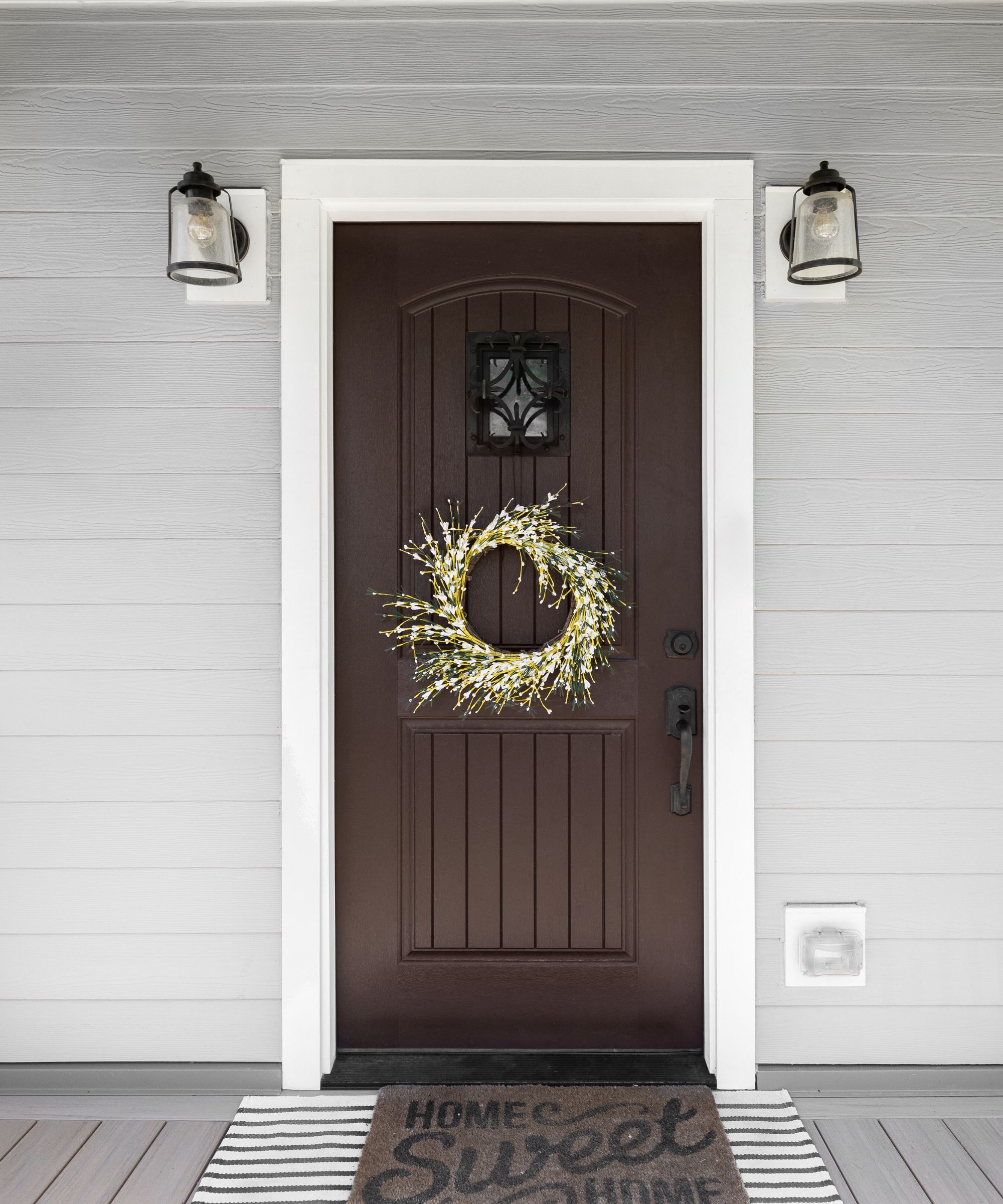
Brown, in color psychology, often inspires feelings of grounding, stability, and a connection to nature, so selecting a brown paint for your front door might seem like a sensible choice. However, a deep, rich brown on a front door can appear very dated and uncurated. A dark brown front door can feel like a '70s throwback, and not in the stylish, retro way, but in an uninspired, unchanged way.
On the whole, steer clear of brown to avoid an entrance to your home that feels passé and behind the times. Instead, look to much paler, less saturated neutral paints or beige paints, like moleskine or a milky taupe, Café au lait, hue. These fall somewhere on the end of the brown spectrum, but are distinctly modern, fresh, and still warm and inviting. Try Oxford Stone by Farrow & Ball if you want to keep things neutral with a brown tinge, or Slaked Lime Deep by Little Greene for something cooler.
‘Swap dark brown for light beige’ suggests Jaime Zhener, founder and principal designer at JZ Interiors, a celebrated California-based interior design studio that specialises in older beach cottages and a relaxed West Coast aesthetic.
‘Beige has a grounding quality, bringing a quiet warmth that feels both modern and timeless. One of my all-time favorite shades is Farrow & Ball’s Jitney as it has a soft, sun-kissed depth that works beautifully on both contemporary and traditional properties.’
6. Violet
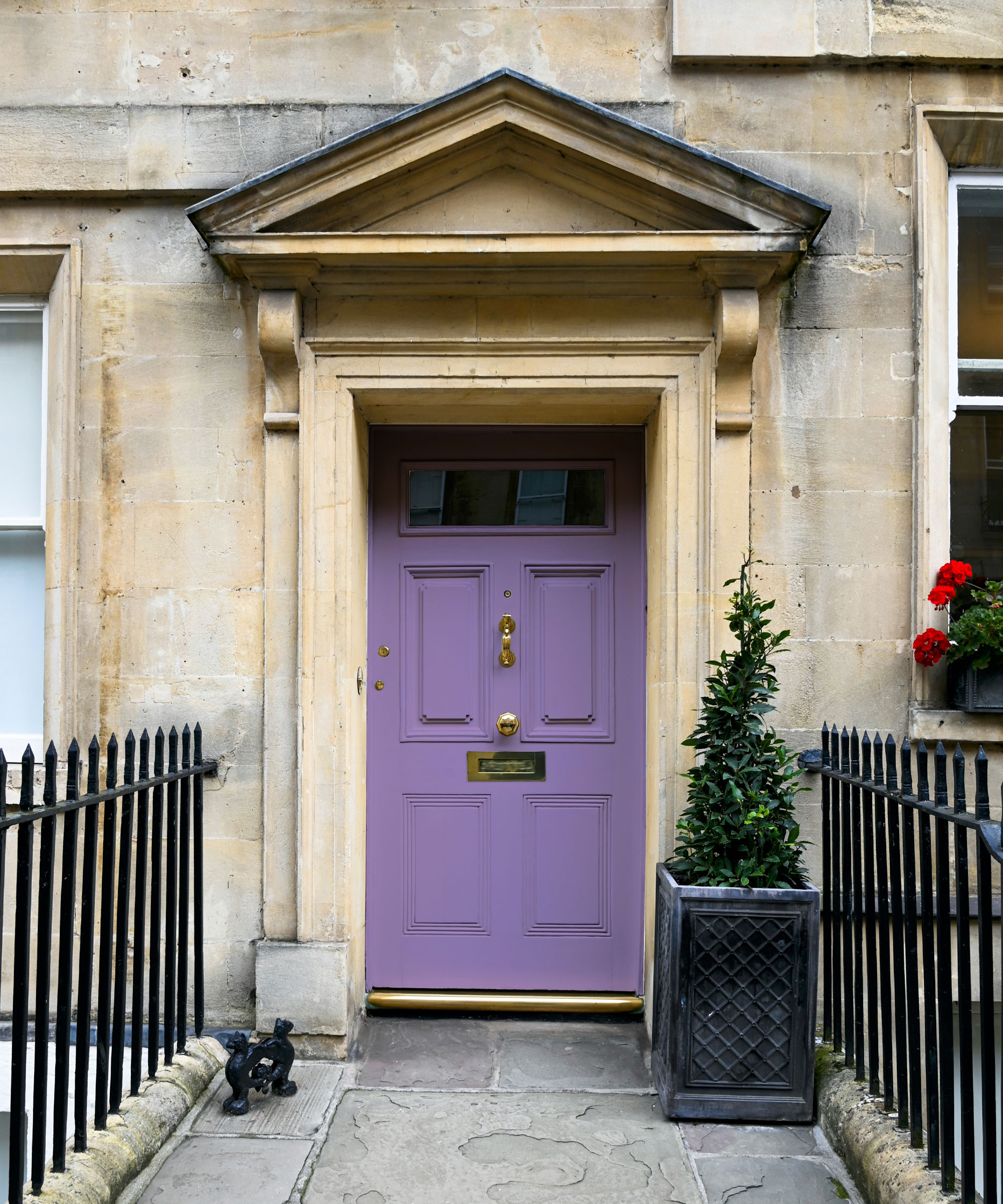
'Violet can be a difficult color to work with. Considering the options of exposed brickwork or natural stone cladding, the violet on the front door may not be the best option,' says Nishtha Sadana, the creative director and founder of NISH.
Moreover, the designer explains that it can sometimes stand out too much as an external paint color – making it difficult to sit simultaneously in your neighborhood or community.
If decorating with purple is on your agenda, note that the key lies in choosing a purple paint that is not overly sugary or pastel. Try a purple hue with taupe or mauve undertones, like Brassica by Farrow & Ball, with deep, earthy undertones and a hint of black pigment, all of which helps to make the purple more grown up and chic.
7. Bright orange
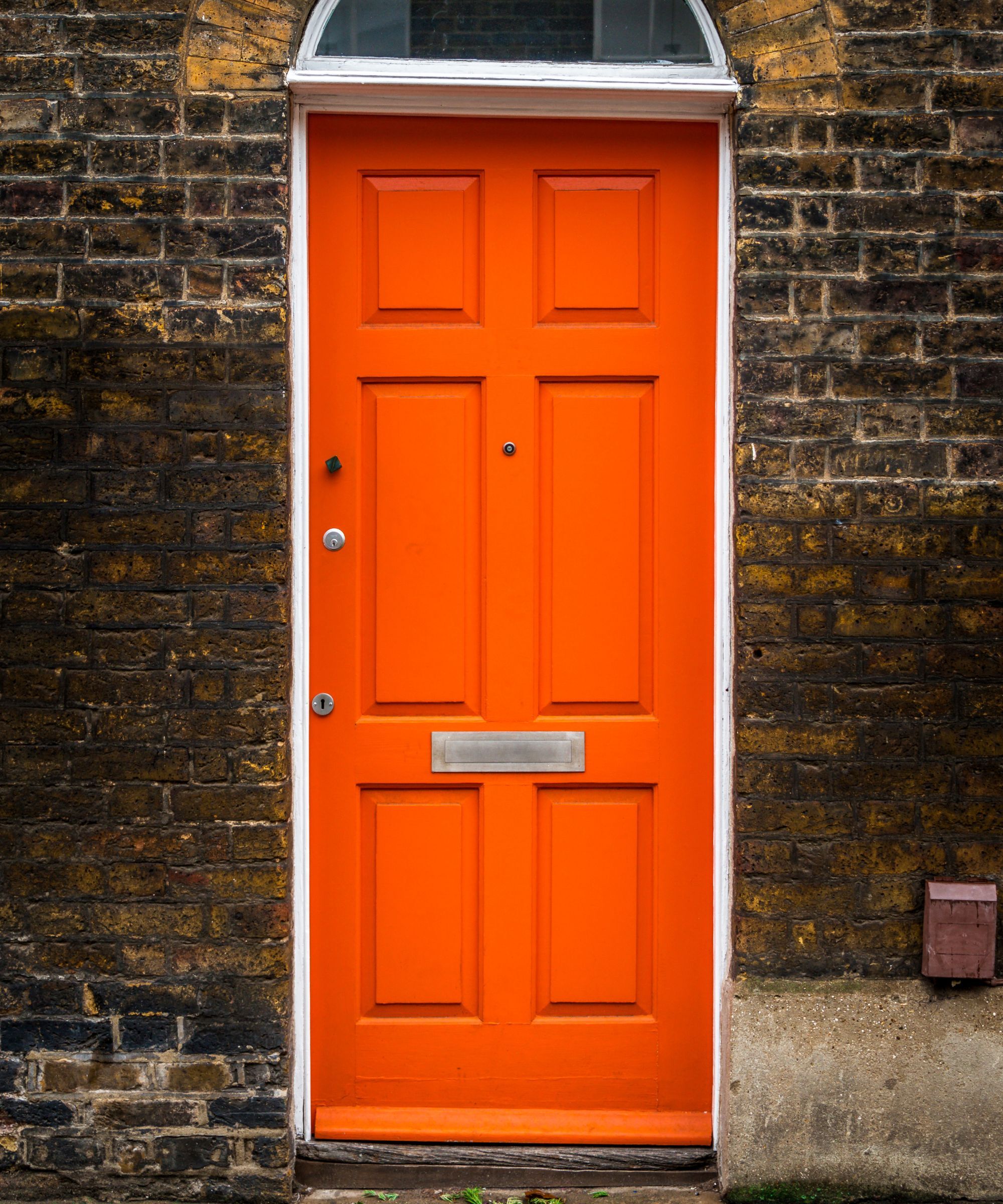
Using bright citrus notes of zesty orange is not advisable for a front door. There are many benefits of decorating with orange around the home, but as far as selecting it for a front door, this punchy hue is definitely off the list.
It's not so much the rusty, smoky paprika shades that homeowners should bypass; the orange paints to avoid are those bright, vibrant shades with cadmium yellow pigment in their undertone. It is this undertone that gives an orange shade its power and punch, which can work in small doses in some spaces, but on a front door looks more akin to the orange hue seen on traffic cones, safety vests, or a Halloween display.
Milder, smokier burnt orange tones would be a good swap; the best hue by far for a more relaxed orange front door is Crayfish Party by Mylands, which is so flattering, there’s hope’s among many of us that they will transform the color into a lipstick.
8. Brilliant White
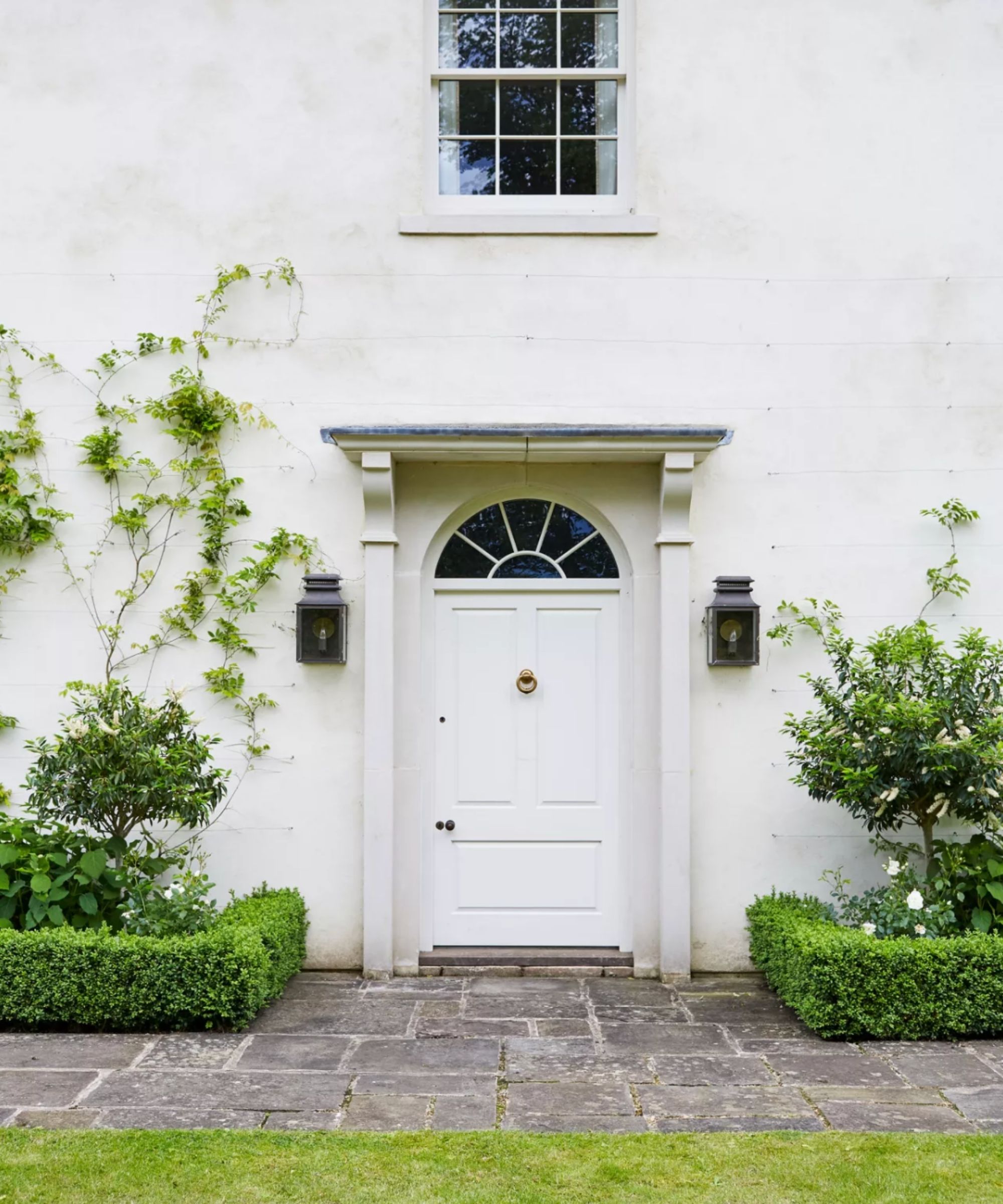
There's no denying that white is one of the most classic colors for a front door, and if it was just down to visual appeal, white would be a highly-ranking choice. However, using brilliant white paint on front doors can be incredibly impractical, quickly losing its clean look due to wear and tear.
'I would advise avoiding lighter colors for a front door,' suggests interior designer Kathy Kuo. 'Your front door is going to get lots of use and high traffic day in and day out, and a lighter color is going to show scuffs, fingerprints, weathering, and just general wear and tear much more than a darker tone.'
A warmer off white paint, like Swiss Coffee by Benjamin Moore would be a more practical choice, as well as being less jarring and stark as a pure white.
9. Neon colors
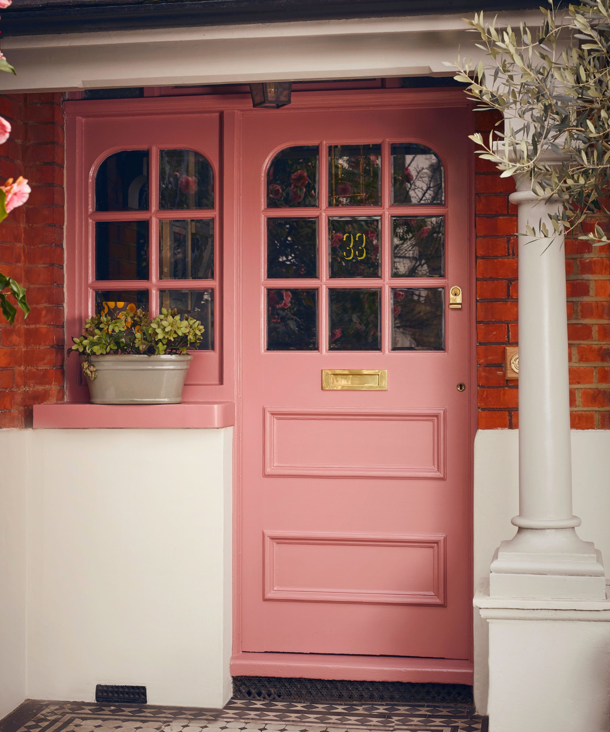
'We always avoid bright and neon colors for front doors, as they can be too trend-led and lack longevity, often clashing with the overall exterior space,' says Eugenia Triandos.
While we like to think that our neighbours opinions don't and shouldn't affect our decisions about our own home, its worth considering that neon colors may be considered somewhat antisocial colors, and affect the overall look of your street or neighbourhood.
Cinzia also advises steering clear of neon hues for the front door too, adding that they can quickly overwhelm the outdoor setting. She explains, 'Extremely bright or neon colors like bright lime green, electric blue, or neon yellow can be too bold and may clash with the overall design of your home and neighborhood, making your home stand out in an undesirable way.'
10. Multiple colors
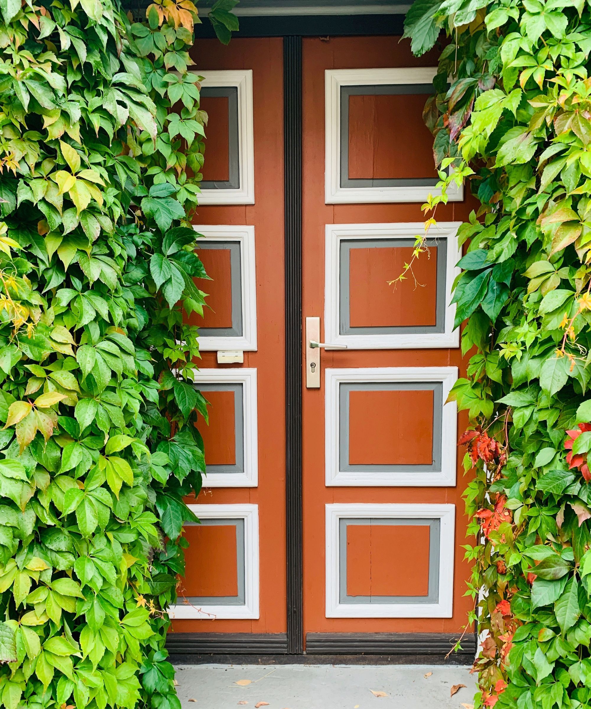
If you are keen to get adventurous, and paint your front door more than one color, be wary that getting creative with certain color combinations can be a risky move.
I recently walked past a London townhouse that had incorporated this idea, but from the street, it appeared they had not remembered to remove the masking tape from the edges of their door. On third or fourth glance, I realized it was strips of beige paint they had purposefully used on the panelling. That’s to say, what might look artful and creative up close may look haphazard from further away.
It is still worth experimenting with your front door color, though on the whole it is far safer, and timeless to stick to one consistent color allover for a streamlined, sophisticated look.
‘If you're going for contrast, one all-over rich color, like navy, will look striking, especially on shutters or the front door, adding a touch of sophistication without clashing,’ explains Interior designer Jennifer Davis. One of my favorites to use on a front door is Sherwin-Williams Sea Serpent.’
Of course, the beauty of a front door is that it is all to play for, and there are no set-in-stone rules, unless you are obeying certain building regulations.
That said, there are some colors that just don't work in this context, and while they can shine in other areas of the home, they are best avoided when you're working with your front door. It's worth noting the rules for choosing the best exterior paint for your home so you aren't browsing endless tins of paint without having a firm grasp of the basics, but on the whole, your front door is a place to experiment, try out new colors and hues and let your family's personality shine through.

Sophia Pouget de St Victor is the UK Content Editor at Homes & Gardens, bringing readers the latest trends, expert insights, and timeless design inspiration tailored to a UK audience. With a background in luxury interiors and a qualification in Garden Design from London, she has a passion for creating spaces with character and emotional depth. Sophia gravitates toward interiors that defy definition, valuing individuality and effortless elegance. She lives in West London with her partner, two mischievous terriers, and a plump cat named Lettuce.
- Emily MoormanContributing Writer