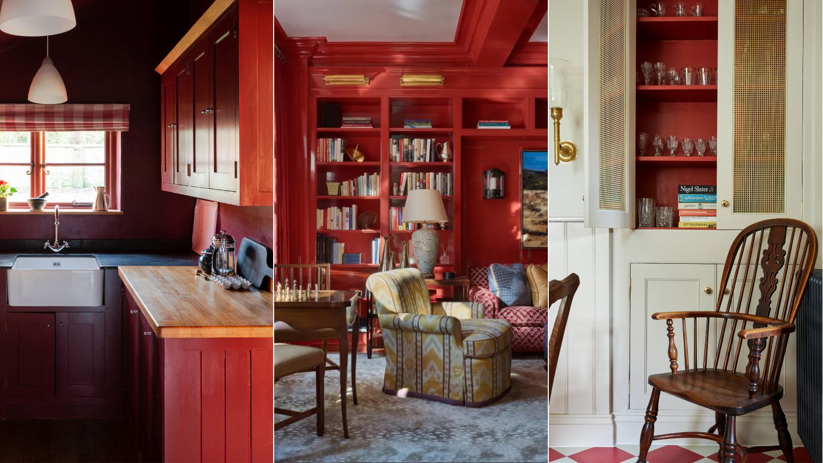
These are the 5 best red paints chosen by color experts for a vibrant but liveable scheme
Experts say these red paints are surprisingly liveable

Design expertise in your inbox – from inspiring decorating ideas and beautiful celebrity homes to practical gardening advice and shopping round-ups.
You are now subscribed
Your newsletter sign-up was successful
Want to add more newsletters?
Decorating with red is a bold move. Yet it can also be an effective color choice to create a deeply warming and sophisticated look in the home, that's guaranteed to make a statement.
In recent years, softer paint ideas of neutral hues have somewhat dominated the world of interior design, but now, we're beginning to see designers and homeowners welcome a shift toward bolder hues. With trends such as maximalist decor and dopamine decor on the rise, we're seeing vibrant color trends embraced to add drama to the home, such as red.
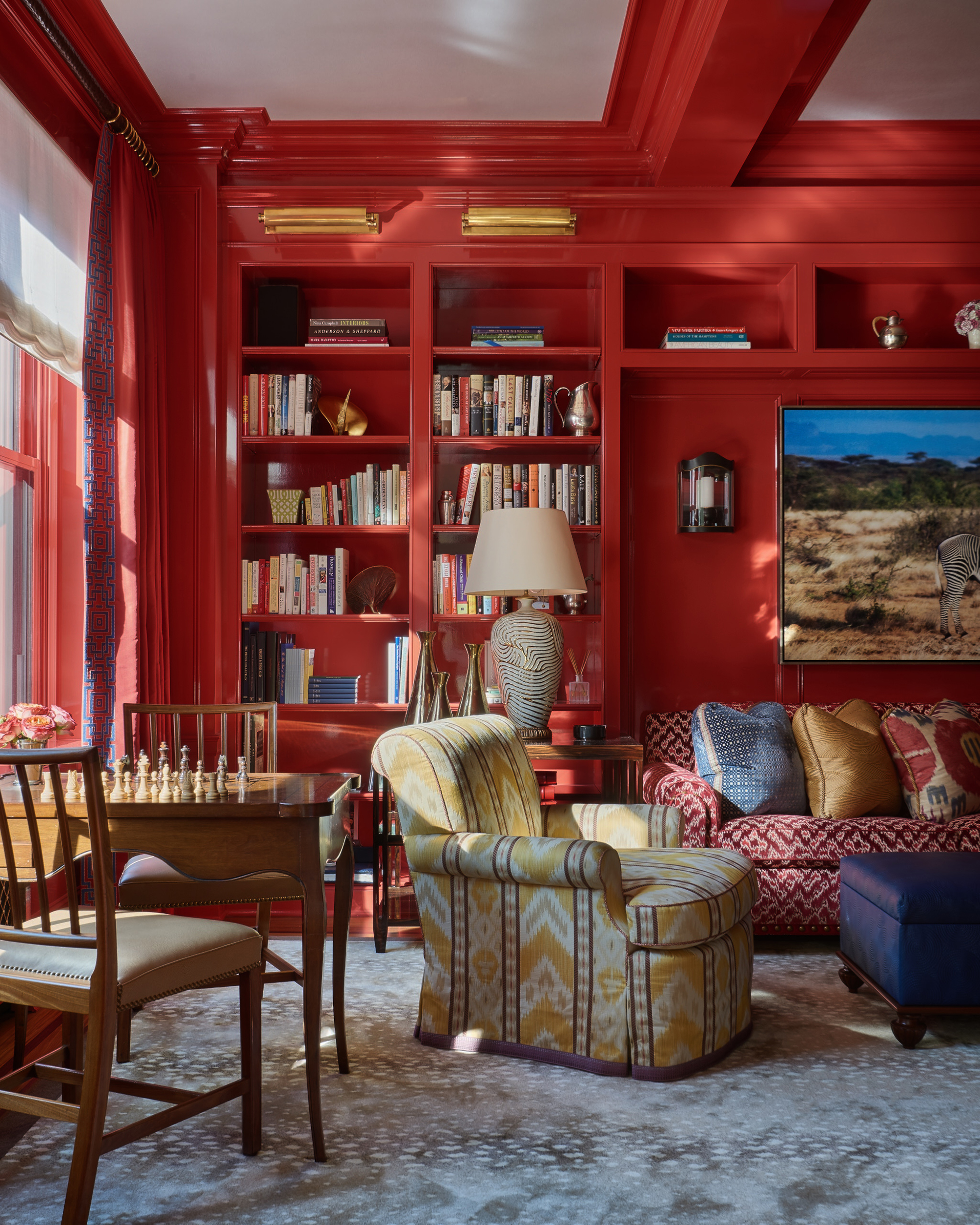
While decorating with red can no doubt add energy to your decor, experts say it must be used carefully to avoid an overpowering look. 'Red is a bold color that is often polarizing so when including it in a space, it must be used strategically,' says interior designer Luis Carmona, founder of VERDE Interior Design. 'Red can often evoke intense emotions such as love, passion, anger, and urgency. It is best used in spaces where heightened stimulation and energy are desired, such as dining areas, playrooms, or creative workspaces.'
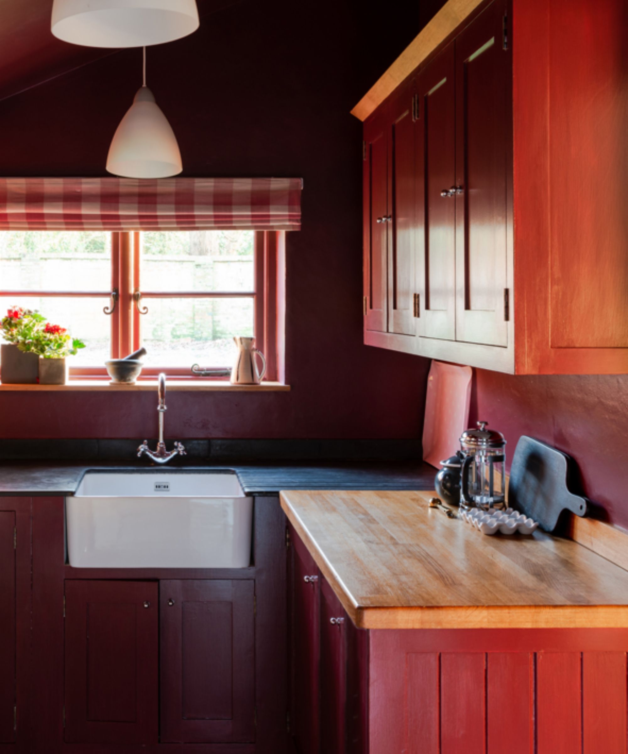
'Even for someone who loves the color red, having red walls or a red ceiling can be a lot to process,' continues Luis. 'A few ways to minimize the impact of the color is to decorate with complementary colors that are opposite each other on the color wheel. When coupled, these colors provide an energetic contrast. Using shades of red that are either more muted or darker than your standard shade of red is also a way to utilize the color in a space without it seeming overbearing.
'Shades of burgundy or wine will still give the richness of red with a bit more sophistication that darker colors often bring. Muted or less saturated shades of red, such as mauve or terracotta, will still offer the red hues, but with a more calming effect that its brighter counterpart cannot offer.'
5 red paints that are brave but liveable
But what are the best red paints to choose from? Below we've rounded up five of the most popular, according to interior color experts. Whether you're looking to add drama with a highly saturated hue or create a sophisticated space with a deep red, these expert ideas will have your red room ideas covered.
'The range of red is wide, from the brilliant yellow-tinged scarlet to blush-red crimson, meaning you can find a hue that suits your personal style and home aesthetic,' says Helen Shaw, Director of Color Marketing at Benjamin Moore. 'Use it as a statement color to liven up an entryway or add playfulness to a kids’ space. A statement wall is a great way to introduce red to your home before committing to a full room, which may seem overwhelming.'
Design expertise in your inbox – from inspiring decorating ideas and beautiful celebrity homes to practical gardening advice and shopping round-ups.

Helen Shaw is part of Benjamin Moore's UK division. Color expert and international marketing director, Helen and her husband Craig are founders of Shaw Paints, acquired by Benjamin Moore in 2020.
1. Caliente, Benjamin Moore
Caliente by Benjamin Moore is a deep yet classic shade of red that feels endlessly warming. Although bold, this shade can be styled across several decor styles, from rustic to maximalist as Helen explains: 'Pair a classic shade of red such as Caliente with beige to create a rustic charm feel or with purples and turquoise for a maximalist vibe.'

Benjamin Moore's Caliente is guaranteed to bring drama to any room in the home. Make a statement with this daring hue in the dining room, or use it to create a cozy living room.
2. Topaz, Benjamin Moore
Also by Benjamin Moore, Topaz is a much more orange-toned red that works well as a modern take on decorating with red. 'Certain shades of red will create a more understated look,' says Helen. 'Opt for warmer sun-baked brick such as Topaz to provide a muted quality that brings depth and elegance. These more earthy colors blend beautifully with brown, taupe and wood.'

Use Benjamin Moore's Topaz in rooms such as a child's bedroom or powder room to create an uplifting and warming feel.
3. Incarnadine, Farrow & Ball
If you're looking for an uplifting tomato red, Farrow & Ball's Incarnadine is a great choice. 'Bright, energizing reds such as Incarnadine, a ripe tomato of a red, bring richness to any room but would look super smart in a dining room dressed in well-curated mid-century furniture,' says Patrick O'Donnell, color expert at Farrow & Ball.
Alternatively, Patrick also suggests using this hue in a child's bedroom for a vibrant scheme: 'For a more playful twist, use to create a tented or striped ceiling in a nursery or child’s bedroom and team with a fresh green such as Breakfast Room Green on your walls.'
4. Preference Red, Farrow & Ball
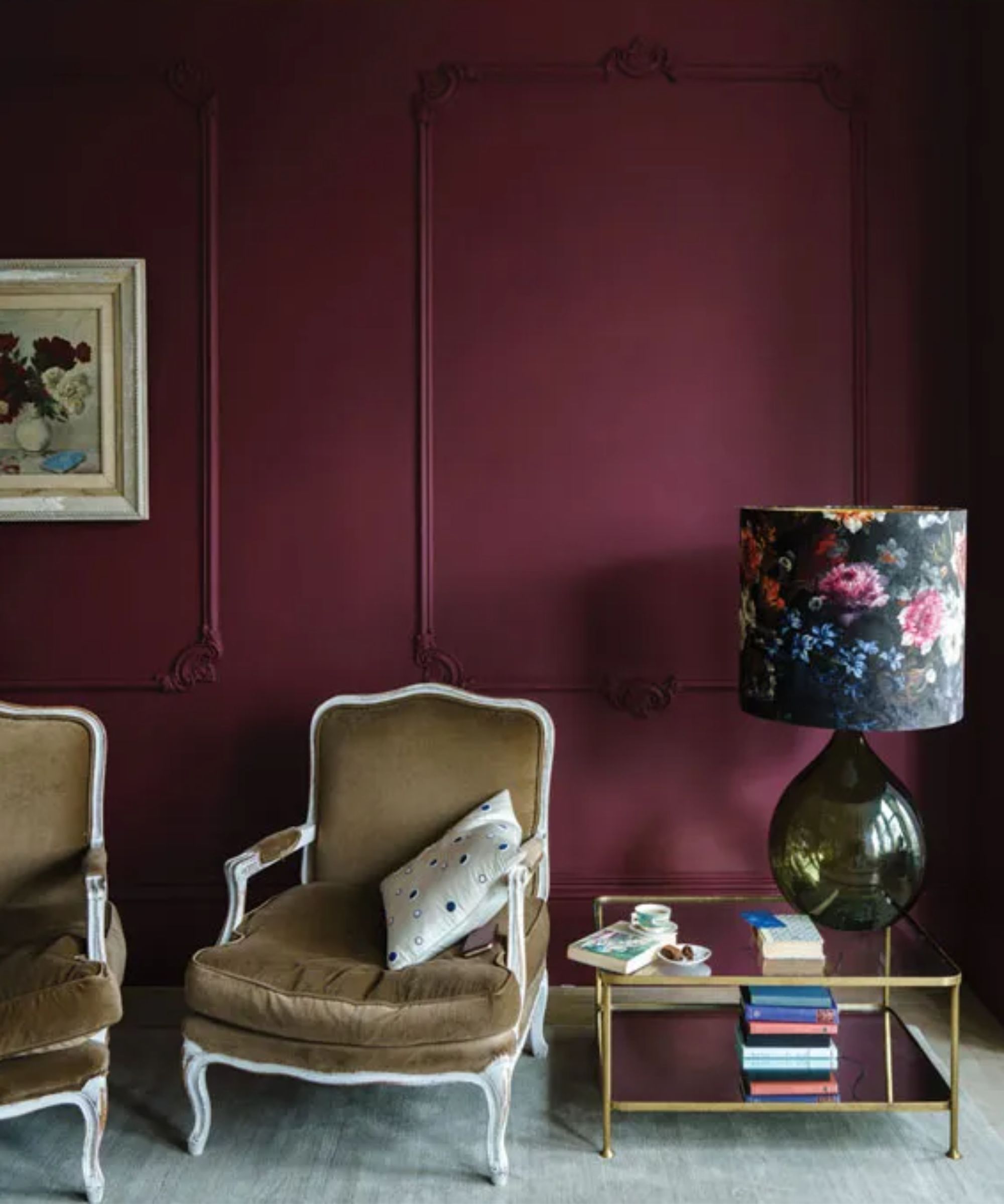
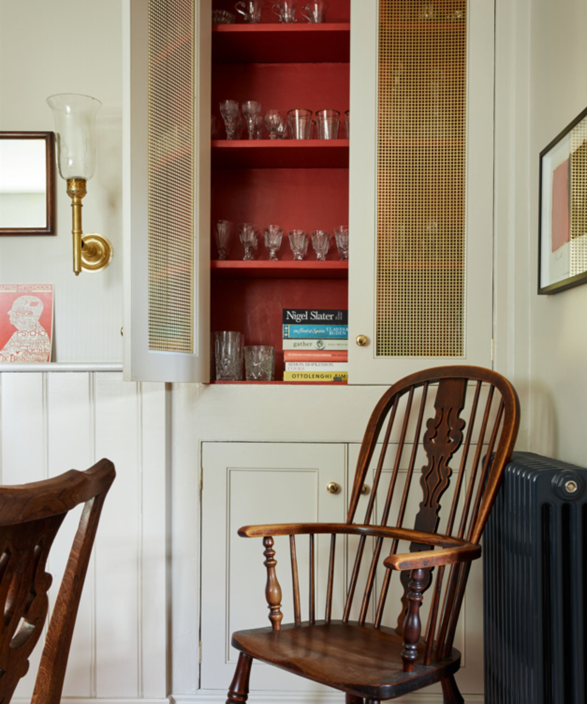
For a much deeper and purple-toned red, choose Farrow & Ball's Preference Red. 'Rich reds make a great choice for kitchen cabinetry such as Preference Red especially when teamed with a flattering pink on your walls such as Setting Plaster – both are warm and exude conviviality.'
5. Brick Dust, Glidden
Lastly, Brick Dust by Glidden is a muted shade of red, that works well to bring warmth to a scheme without overpowering. Ashley McCollum, color expert at Glidden suggests using this hue on the front door to make a statement, or on kitchen cabinets for a splash of color: 'Highlight the exterior by using a beautiful warm shade like Brick Dust on your front door. For interiors, use this color on cabinetry and surround it with deep, warm neutrals for a pop of personality.'
Embracing red in your home decor doesn't have to mean classic bright reds. With so many variations, you can welcome this warming hue into your decor to best suit your interior style. If you're looking to add a sense of drama and create a cozy, opulent space, decorating with red is a great choice.

Emily is a freelance interior design writer based in Scotland. Prior to going freelance in the spring of 2025, Emily was Homes & Gardens’ Paint & Color Editor, covering all things color across interiors and home decor for the Homes & Gardens website. Having gained specific expertise in this area, Emily is well-versed in writing about the latest color trends and is passionate about helping homeowners understand the importance of color psychology in home design. Her own interior design style reflects the simplicity of mid-century design and she loves sourcing vintage furniture finds for her tenement flat.


