We're calling it – Brooke Shields' living room color combo is the next spin on the Unexpected Red Theory
Brooke Shields' white living room features bright red accent chairs and a light blue area rug for a space that feels traditional yet modern


Design expertise in your inbox – from inspiring decorating ideas and beautiful celebrity homes to practical gardening advice and shopping round-ups.
You are now subscribed
Your newsletter sign-up was successful
Want to add more newsletters?
Sometimes, unexpected color combinations yield delightful results. While going for a classic black and white or warm neutral color scheme is timeless, experimenting with vibrant color pairings can be a great way to make a space feel more unique.
Case in point: Brooke Shields' living room, which features the increasingly popular combination of red and blue. These two primary colors dance delightfully together in her white living space, adding just the right pop to the otherwise light room. It's a fantastic twist on the ever-popular unexpected red theory.
The key to the compatibility here is that the colors don't overpower the white base: bright red accent chairs sit among a white sofa, while the light blue area rug's cool undertones complement the glass coffee table.
Article continues belowA post shared by Brooke Shields (@brookeshields)
A photo posted by on
Shop the blue and red living room edit

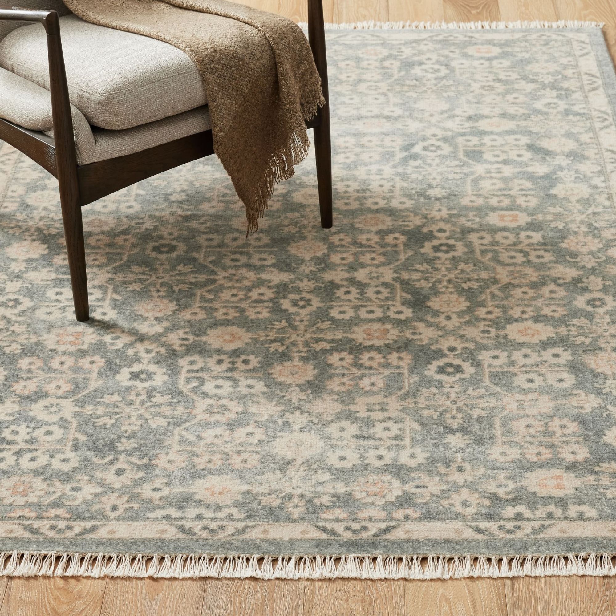
The perfect whisper of color that Rachel mentions, this pale blue rug would be easy to incorporate into any scheme. There are hints of orange in there, too, which ups the warmth.

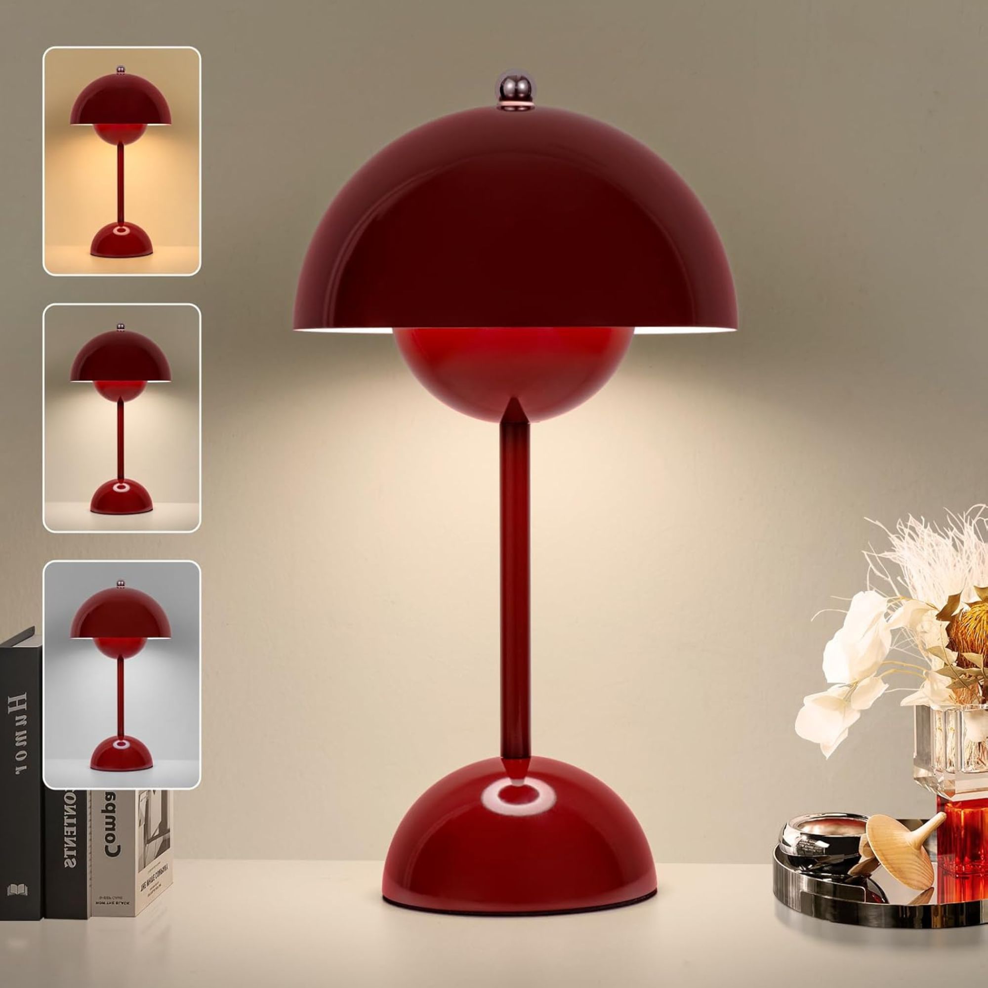
The rise in popularity of portable, cordless lamps has made bringing softer light into any room easy than ever. This one from Amazon is super affordable and would be perfect for adding a pop of red to a living room.

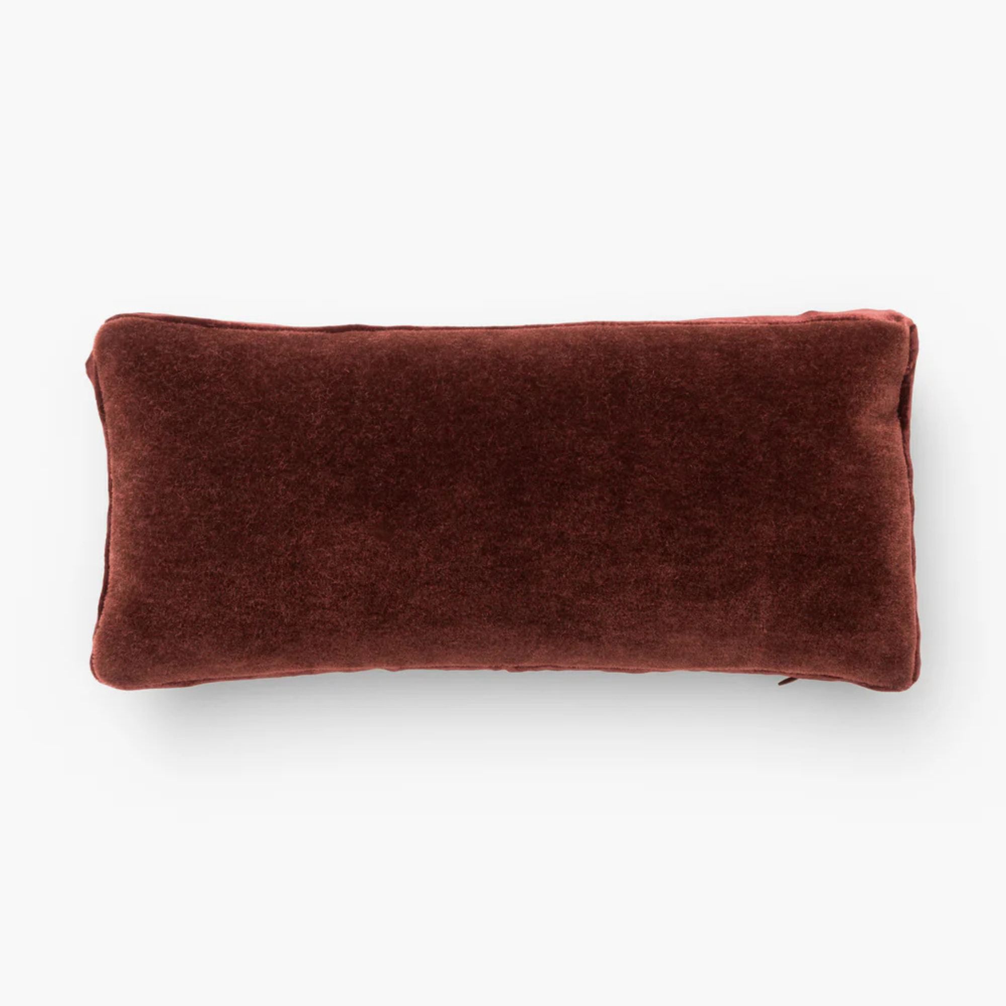
This kind of almost brown, almost red shade is the perfect hue for the Unexpected Red Theory, it adds a hint of warmth and color and will create just enough contrast with a neutral scheme. Throw this pillow on a beige sofa or combine with cream bedding for a luxurious look.
According to experts, blue and red is trending in part because both colors are highly versatile and timeless in the home.
'In interiors, we’re seeing red and blue come together in a more grown-up way: less stars-and-stripes, more Paris apartment meets Hudson Valley retreat,' explains designer Nina Lichtenstein. 'The rise of warm minimalism and moody maximalism has opened the door for deeper, richer colors to take center stage. Red is no longer just bold; it’s warm, grounding, and even romantic. Blue, depending on the shade, can be cool and cerebral or soft and serene.'
Nina recommends using a set ratio when mixing blue and red to keep things balanced.
'For a harmonious look, pick a dominant color and let the other play a supporting role,' she suggests. 'A midnight blue velvet sofa against a rust-red plaster wall reads layered and intentional. Or go the other way: a cherry lacquered cabinet in an otherwise navy room makes for a chic, modern focal point.'
Design expertise in your inbox – from inspiring decorating ideas and beautiful celebrity homes to practical gardening advice and shopping round-ups.
Additionally, she says that the inclusion of natural materials can help a blue and red space look more cohesive.
'To soften the contrast, incorporate wood, stone, or leather,' she says. 'A red rug and blue curtains feel more grounded when paired with oak floors or travertine accents. These materials buffer the boldness and add warmth.'
You can also try layering blue and red textures for even further visual interest; it's a bold choice, but one with high payoff, as we can see in Brooke's space.

Hannah is Homes & Gardens’ News Editor, with a focus on celebrity style and entertainment content. She got her start in media as a digital editorial assistant at ELLE Canada, and has since written about lifestyle and culture for publications such as Nylon and i-D.
Her love of film is rivaled only by one with a great soundtrack, and she hopes to someday decorate a Nancy Meyers-worthy kitchen.