7 unusual colors you might not think to use, but designers love
Unusual colors are having a moment. Our interior design experts reveal their favorite striking shades to make your home truly stand out

Design expertise in your inbox – from inspiring decorating ideas and beautiful celebrity homes to practical gardening advice and shopping round-ups.
You are now subscribed
Your newsletter sign-up was successful
Want to add more newsletters?
Unusual colors are having a moment again. For a long time, playing it safe has been a common choice when it comes to interior design, and especially when it comes to choosing paint colors.
A bold new shade can transform a room, sometimes for better, sometimes for worse, and if the color doesn’t work, it can mean a lot of wasted time and effort to change it back. This is why neutral, timeless and ‘easy-to-live-with’ colors consistently remain a popular color trend, and form the foundational palette for most interiors.
However, if you're looking to be a little adventurous with your room color ideas, with a bit of guidance and courage, opting for an unexpected, less conventional color can breathe new life into a space in ways standard hues simply cannot. The impact can be worth the risk, revealing how a transformative color can make you see your interiors in a whole new light.
Article continues belowMany of these unconventional colors have been unfairly associated with outdated styles, like kitschy, retro interiors, or have been dismissed as too dark, too bright, or too emotionally intense. As a result, they’ve been overlooked for far too long.
7 unusual colors to consider
A skilled interior designer can make almost any color work. By thinking outside the box and confidently introducing some of these unique shades, you can revitalize your space. To help, we’ve gathered insights from trusted experts on unexpectedly great colors to consider.
1. Aubergine
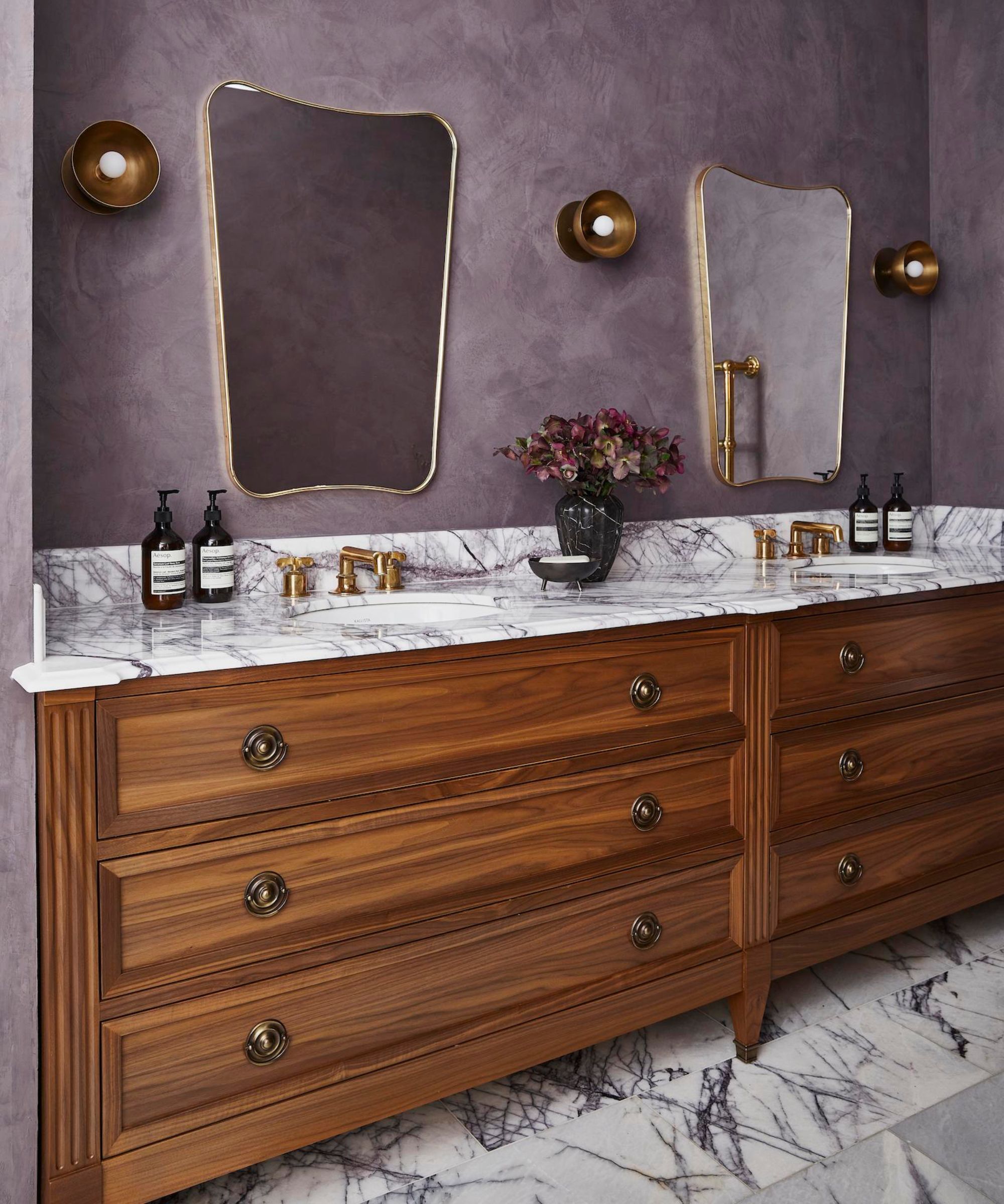
Dark purples such as plums and eggplant shades are for the truly committed. Rich, luxurious, and often overlooked in favor of safer, lighter hues, this particular shade has drifted in and out of style over the years.
Currently, the darker hues in the purple spectrum are enjoying a resurgence, with interior designers, brands, and homeowners rediscovering its potential beyond just the winter months.
Design expertise in your inbox – from inspiring decorating ideas and beautiful celebrity homes to practical gardening advice and shopping round-ups.
For a time, decorating with purple was seen as a risky choice. Either too bold, too dark, too rich, and overpowering for many spaces, especially those on the smaller side, such as a bathroom.
But as Wendy Labrum, founder of Wendy Labrum Interiors reminds us, it can work when you consider the undertones. 'We chose this deep smoky eggplant Venetian plaster for our client's primary bath because it was sophisticated but unique at the same time. At a time when many primary baths are white, we wanted something rich and unusual for this bathroom. Most people don't inherently think of purple as a bathroom color but pairing it with natural materials and rich wood tones made it sophisticated.'
Interior designers are loving these darker purples for their versatility but it’s key to strike the balance right; pair darker purples with neutral tones like soft grays, taupe, or warm whites to soften up and avoid it becoming too overbearing.
A top trick for keeping it looking natural rather than synthetic is to look to nature for inspiration: think of the rich, layered colors found in fruits like eggplants, plums, and berries.
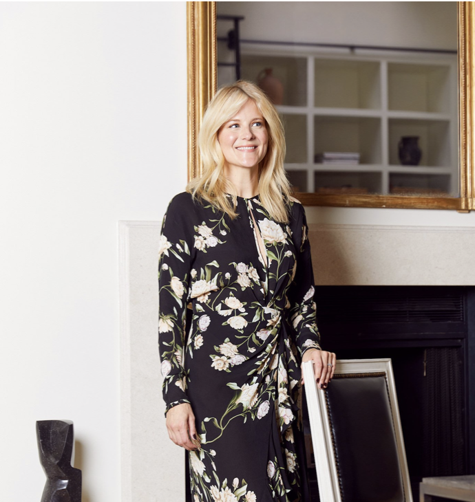
Wendy Labrum is a Chicago-based interior designer whose passion for interiors began while living in London and traveling through Europe. In 2007, she founded her namesake firm, focusing on timeless design that blends elements from various periods and creates beautiful, practical spaces for families to enjoy and thrive in.
2. Tomato Red
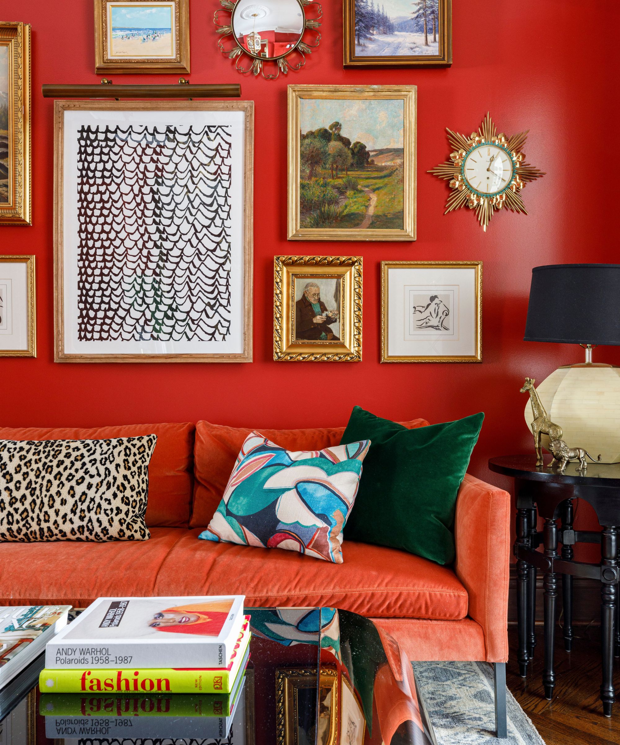
Red is often overlooked in interior design due to its associations with danger and intense emotions, but it can fill a room with passion, vibrancy, and even a touch of regality.
Helen Shaw, Director of Marketing at Benjamin Moore, notes, 'Red is one of the most divisive shades, yet it can add energy and sophistication when paired harmoniously. The trend of ‘unexpected red’ shows how impactful this bold hue can be – whether framing views, highlighting architectural details, or adding dynamic pops of color.'
Red works beautifully in social spaces like living rooms or kitchens, where it promotes lively conversation and creates a warm, intimate atmosphere. Even in small doses, like an accent wall or statement furniture, red can pack some punch in a neutral scheme and add just a hint of daring.
When decorating with red, consider the design scheme as a whole and ensure tonal consistency. Different shades can evoke varied moods – a bright tomato red brings energy and playfulness, perfect for a child’s bedroom or a lively living space, while a deep burgundy can highlight historical features and lend a classic, moody feel.
When paired thoughtfully with complementary shades, red adds depth, character, and a sense of tradition to a room, making it a bold choice for those willing to embrace its power.
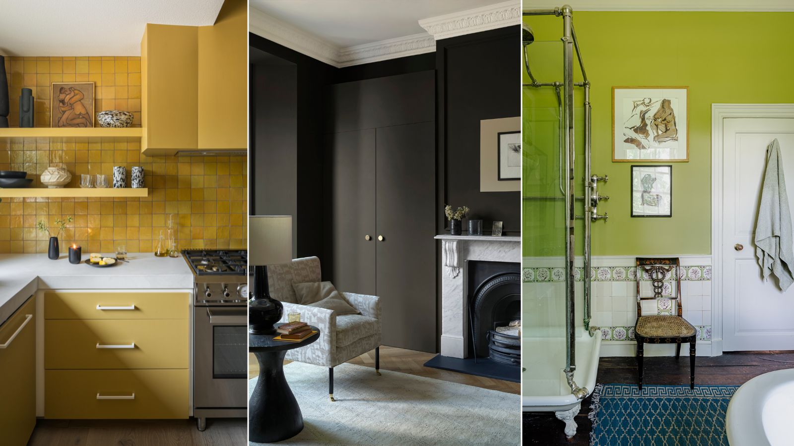
3. Jet Black
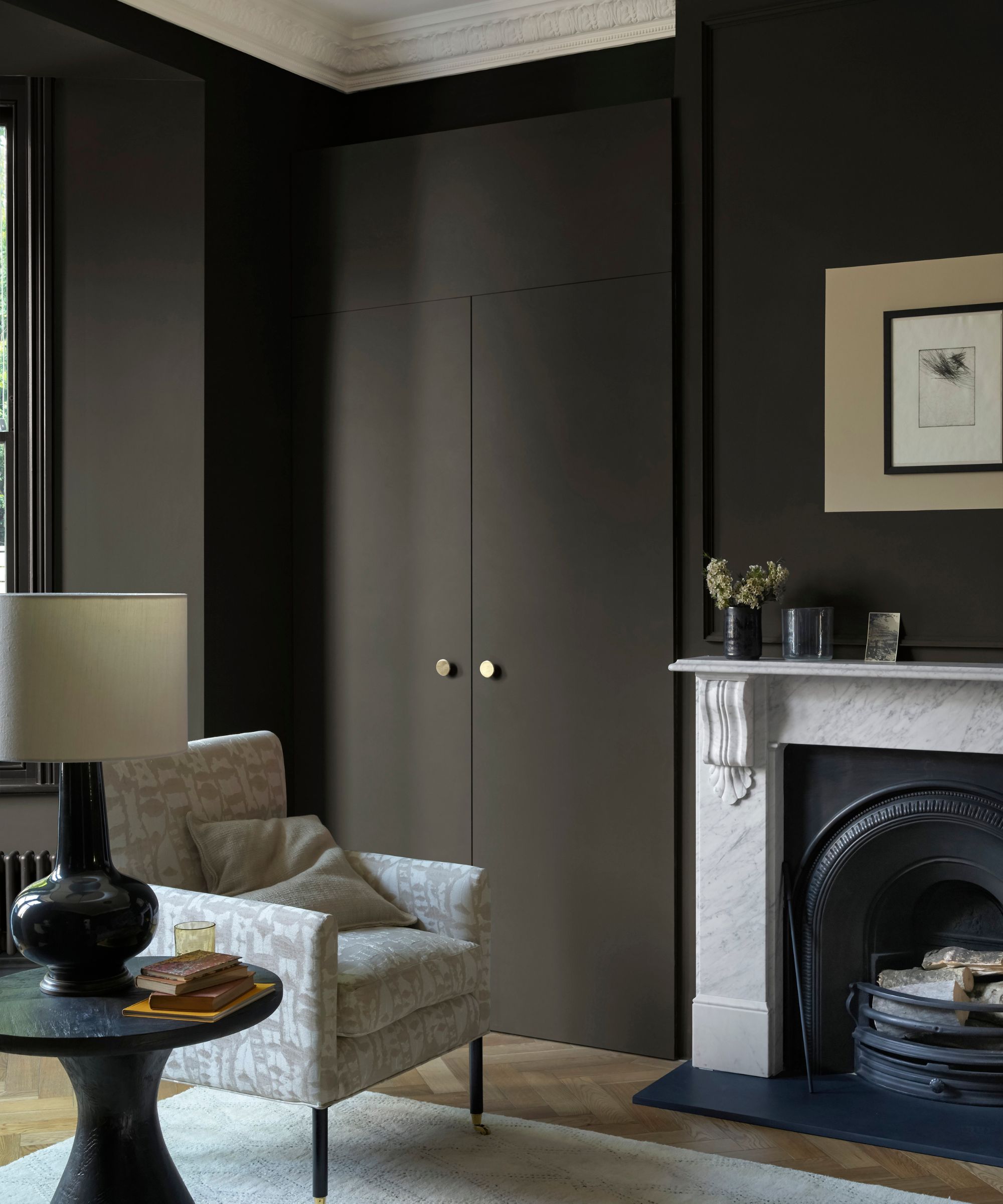
Are you tempted by the dark side but hesitant to take the plunge? Black might not be an obvious choice for walls, we’re conditioned to use lighter shades to maximize space and reflect light.
But decorating with black is finally making a comeback and far from being reserved for a teenage goth's bedroom, this strong and robust color choice can bring unexpected elegance and depth to a room.
Interior Designer Cortney Bishop, loves to use Tar by Farrow & Ball when introducing black into a client's scheme 'One of the things I love about Tar is its versatility and how well it pairs with almost any other color or material, especially when used as a trim – whether it’s with natural wood, a bold wallpaper, or neutral tones. It’s a bit darker and more daring than most might go for, but it really does pay off in terms of adding drama, depth, and interest to interiors compared to the more popular lighter neutral shades'
When considering black, it's worth noting that matte finishes are much better at giving the room a relaxed, inviting feel, avoiding the glossy sheen that can make black feel harsh or cold. And for those looking for a twist on neutral, black sits brilliantly in this palette as an alternative base color.
Black also comes in a spectrum of shades, from cool charcoal tones such as Black Horizon, to rich, inky hues like Black Panther, both by Benjamin Moore. It’s surprisingly versatile in creating different moods, something we often forget.

Cortney is an interior designer known for blending creativity, comfort, and functionality with a modern flair. After founding her firm in 2007, she’s built a diverse portfolio of residential, commercial, and multi-family projects. Inspired by travel, art, and fashion, Cortney also designs custom furniture and plans to launch a textile line.
4. Creamy Brown
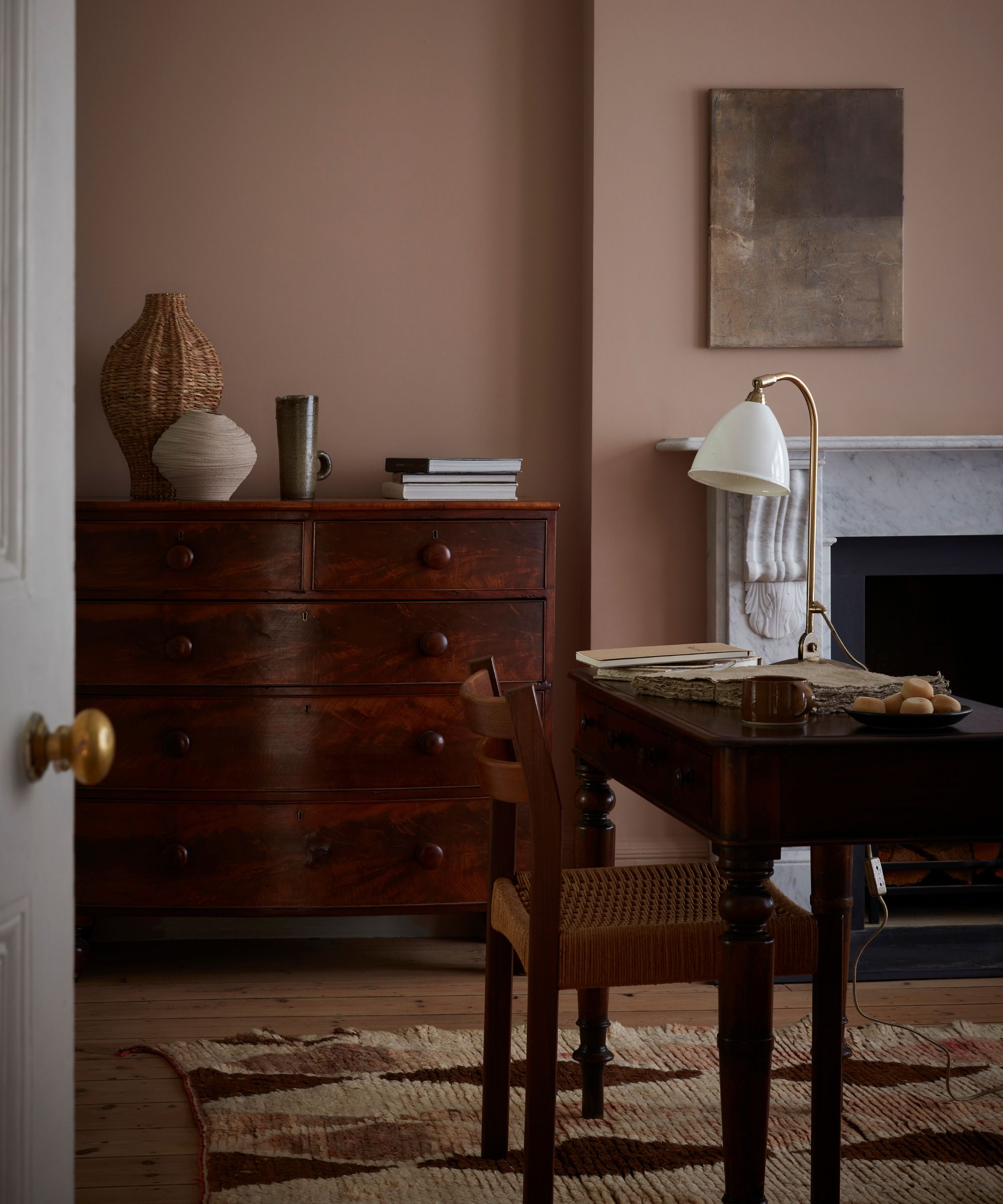
Brown rooms are having a moment in 2024, and it’s not hard to see why. Often overlooked and lumped in with overtly kitsch 70s interiors, brown is a color that can bring comfort, warmth, and a sense of grounding to any space when used correctly.
It’s a favorite among interior designers because it offers a neutral base with much more depth and richness than your typical whites or grays. Plus, it comes in so many shades from soft taupe, to warm caramel to deep, rich chocolate.
Laetitia Laurent, Principal & Founder of Laure Nell Interiors tells why she loves introducing this shade to her clients ' Light brown works beautifully in living rooms and bedrooms, creating a warm, cozy atmosphere. It’s also ideal for cabinetry and furniture as well as pairing effortlessly with neutrals, muted greens, and soft blues for a soothing palette, or with gold accents for a touch of luxury.'
Brown is that rare color that feels both luxurious and earthy all at the same time. It reminds us of creamy chocolate and a steaming cup of coffee while still feeling natural and inviting.
It's particularly versatile when incorporated into the ‘outside in’ trend where it pairs beautifully with deep greens, like olive, or other earthy tones and textures. And for those who like to think outside the box, brown also looks amazing with unexpected colors like light blue, creating a combination that's surprisingly livable.
When natural light hits, brown comes alive, revealing hidden undertones of rich reds and warm yellows, something to keep in mind when choosing accent colors.
5. Lime Green
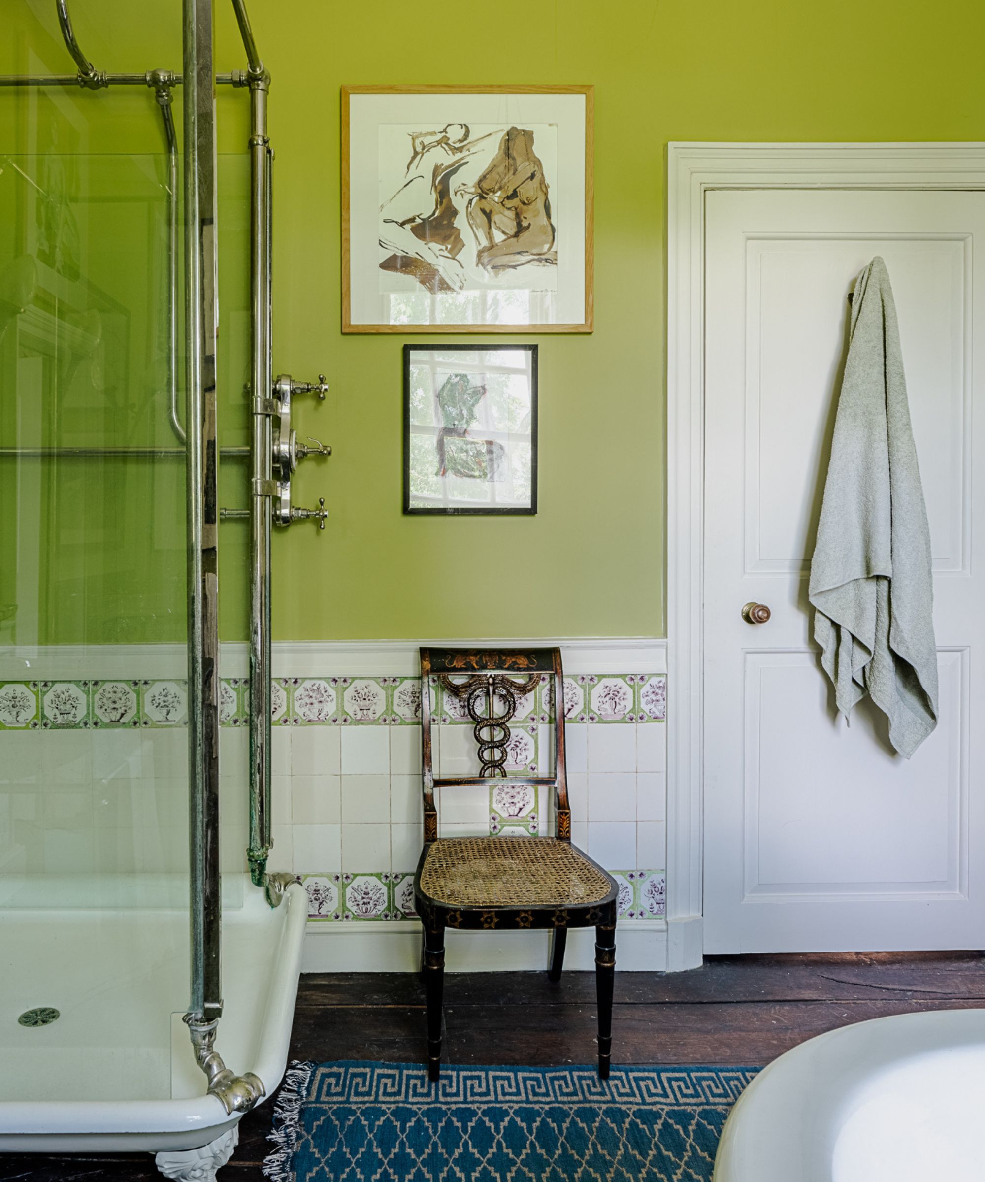
Lime is undeniably a bold and intense choice. Unlike its more subdued cousin, sage green, which is known for its calming effect, lime is all about vibrancy, freshness, and a touch of the exotic. While it may seem intimidating at first, lime green has a surprising ability to energize small spaces or make a statement as an accent color.
Laetitia Laurent, Principal & Founder of Laure Nell Interiors tells us 'Lime green is ideal for bold, adventurous personalities who want to create an upbeat, stimulating environment! It pairs well with crisp white or charcoal gray for a fresh, modern look, or with wood tones to balance its vibrancy. Its brightness can lift a room and inspire creativity.'
While it might be too bold for spaces you frequent often, like a bedroom or living room, lime is invigorating and punchy in smaller areas such as a bathroom or pantry. It also looks stunning paired with brass and gold accents which is just another reason why it lends itself so well to a bathroom space.
We love the way this Edward Bulmer paint has been used in a very traditional bathroom, giving those antique features a fresh, contemporary and unexpected twist.

Laetitia Laurent, creative director of Laure Nell, creates thoughtfully curated, modern spaces guided by European design principles. With a focus on clean lines, organic materials, and tailored palettes, her work balances beauty and functionality. A Sorbonne graduate, she frequently draws inspiration from her Parisian roots for her standout projects.
6. Sunflower Yellow
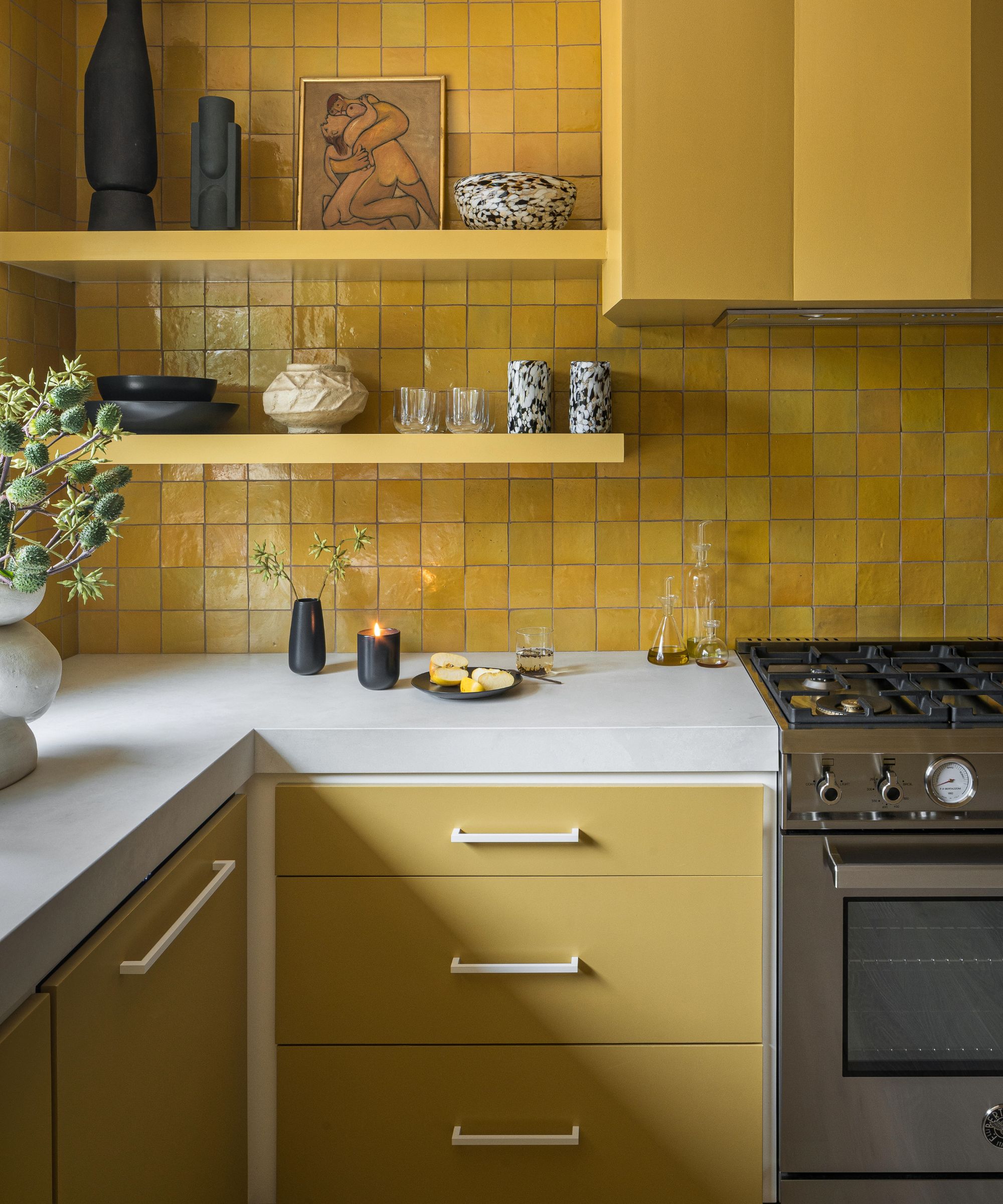
Bright yellow is often overlooked in interior design because of its bold intensity and its association with a year-round sense of summertime – a nice idea in theory, but perhaps too much for some when painting a room.
However, when used thoughtfully and in the right shade, decorating with yellow can introduce a sophisticated vibrancy that transcends seasons. From soft buttery pastels to striking acid tones, yellow is a versatile color that can be both cheerful and refined. Paired with the right accessories and textures, yellow becomes contemporary and sophisticated, shedding its ‘retro’ reputation.
To balance yellow walls, pair them with more subdued hues. Vibrant yellows work well alongside warm browns, off-whites, or deep blacks to temper their intensity. For a moodier effect, richer shades like ochre can be used sparingly on accent walls, furniture, or small architectural details like skirting or door frames.
Yellow also complements neutral or natural palettes, blending seamlessly while still making a statement. Austin Carrier and Alex Mutter-Rottmayer, founders of Hommeboys explain that, 'For this kitchen, we really embraced the color and dipped the room in it. But if you want to bring it into an existing space, it sits really nicely with warm neutrals, raw natural materials like wood and stone, as well as alongside printed fabrics that have it as an accent'.
Mixing textures and selecting complementary tones allows yellow’s sunny disposition to be embraced in a modern, sophisticated way, adding warmth and personality without feeling overly retro or juvenile.
7. Candy Pink
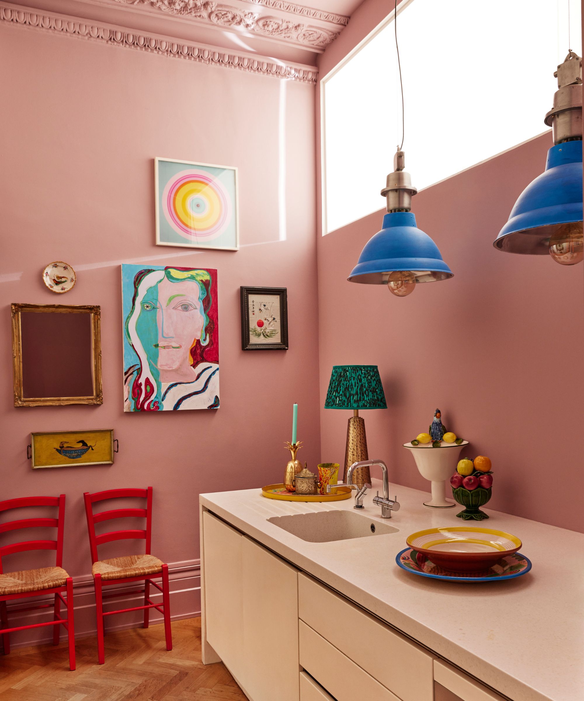
After a season of Barbiecore interiors, sugary pink is back on the radar in a big way. While it’s often thought of as a color reserved for a girl’s bedroom, pink is breaking out as a standalone color throughout the home. When used in unexpected ways, decorating with pink can range from fun and playful to sultry and elegant, proving it’s not limited to a purely feminine aesthetic.
Laetitia Laurent, Principal & Founder of Laure Nell Interiors agrees 'As Baby pink has evolved beyond a purely 'feminine' color. When used thoughtfully, it can be surprisingly sophisticated, adding warmth without overwhelming a space. It’s perfect for someone who appreciates a touch of softness in their interiors, but still wants a space that feels fresh and modern.'
While softer pinks with earthy or neutral undertones have long been embraced as versatile shades in interior design, I’m talking about the bolder candy pinks – the bubblegum hues that have typically been dismissed as too juvenile or overly girly.
These brighter pinks can transform a space. In designer Matthew Williamson's kitchen, for example, candy pink walls are paired with bright pops of abstract art, creating a gallery-like backdrop that’s both light enough to let the art shine and lively enough to keep the room's energy upbeat.
Candy pink is an excellent choice for a vibrant, contemporary scheme, offering a bold color that's still more approachable and livable than red but still packs some punch when you walk into a room.
Surprisingly, candy pink also works beautifully in more traditional settings. When paired with veined marble, enamel sinks, and brass taps, it becomes a striking wall color that adds warmth and charm to classic kitchen and bathroom designs.
As all these shades prove, unusual doesn't mean unusable. While these shades may seem dramatic at first, and aren't ones we are used to seeing all that much, it can clearly pay off to go with something unexpected to create unique and characterful interiors.

Isabella is a freelance interiors journalist based in London. Her journey into the world of interiors began as a stylist assistant and researcher, working with some of the leading UK interiors stylists.
Over the past few years she has contributed to various prestigious titles, working on features, news, buying guides, trend pieces and more, bringing forth expertise and a unique perspective on the ever-evolving world of home decor and design.