How to decorate with plaster pink tones – 5 ways to bring this timeless yet trendy hue into your home
Ranging from taupe and cream tones to earthy pink hues, we hear from 5 experts on how to introduce this charming neutral into your home

Pippa Blenkinsop
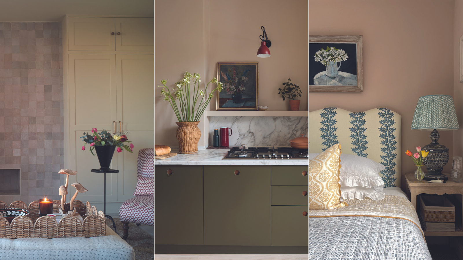
Ever had your walls replastered and found yourself wanting to live with them in their semi-finished state? It's no wonder – the gentle and evocative color of plaster pink is in many ways, the perfect room color.
Decorating with plaster tones and warm pinks is suitably warm to create a comforting and nest-like space. Soft and dusty in appearance, they add visual interest, appearing dappled, even in the dullest of lights. These shades are pale enough to keep a space feeling bright and airy, looking especially beautiful when drenched in sunlight, yet their orangey undertones add a richness and depth that greys and whites fail to add.
Find the right shade of plaster pink – not overly feminine or cloying, but modern, light, and uplifting, and you can build a space that feels interesting and alluring, without being in your face. We spoke to 5 interior design experts to talk about the color, and the myriad of ways in which it can be used throughout the home.
5 examples of how plaster pink can enhance every room
We hear top tips from 5 interior design experts about how plaster pink tones can be the ideal choice for decorating all over. Room by room, we explore the value of the color, and why we shouldn't be afraid of embracing blush tones.
1. Soften a kitchen with plaster walls
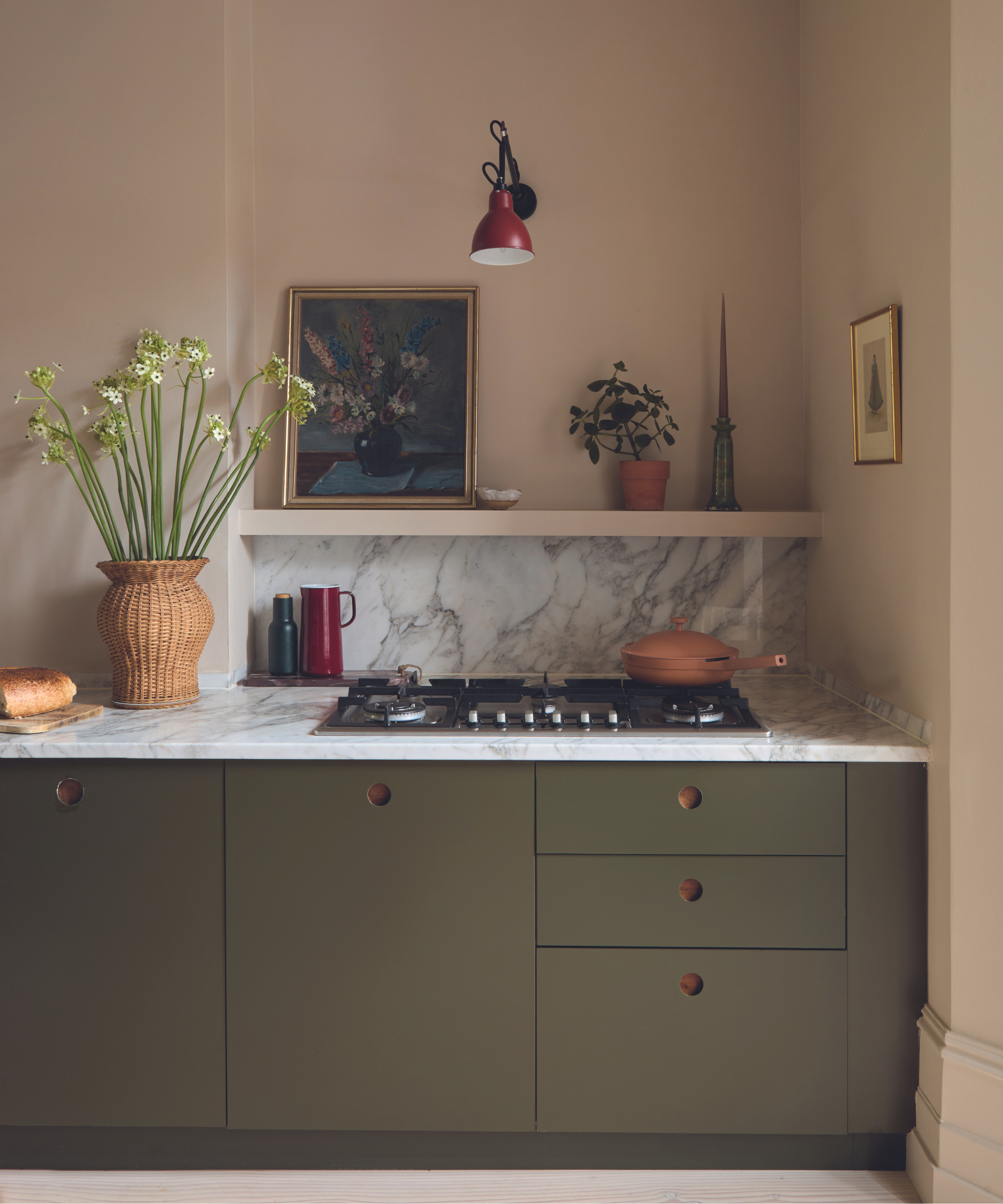
Walls in Hammock by Little Greene and ceiling in Mink by Paint & Paper Library.
In the kitchen, choosing a plaster pink will create an inviting and calming atmosphere. The softening feel of a light pink will counter the colder qualities of marble and metal.
For this kitchen color, Laura Stephens, founder of Laura Stephens Interiors, explains ‘We wanted a warm mood to counteract the hard surfaces in the kitchen. This was achieved using Little Greene’s Hammock on the kitchen walls and a darker color, Paint & Paper Library’s Mink, on the ceiling, which helps draw the room in.’

Laura Stephens is the founder of the respected London-based interior design company, Laura Stephen Interiors. The practice works mostly on residential projects and offers an award-winning bespoke service.
2. Create a cozy and welcoming entryway
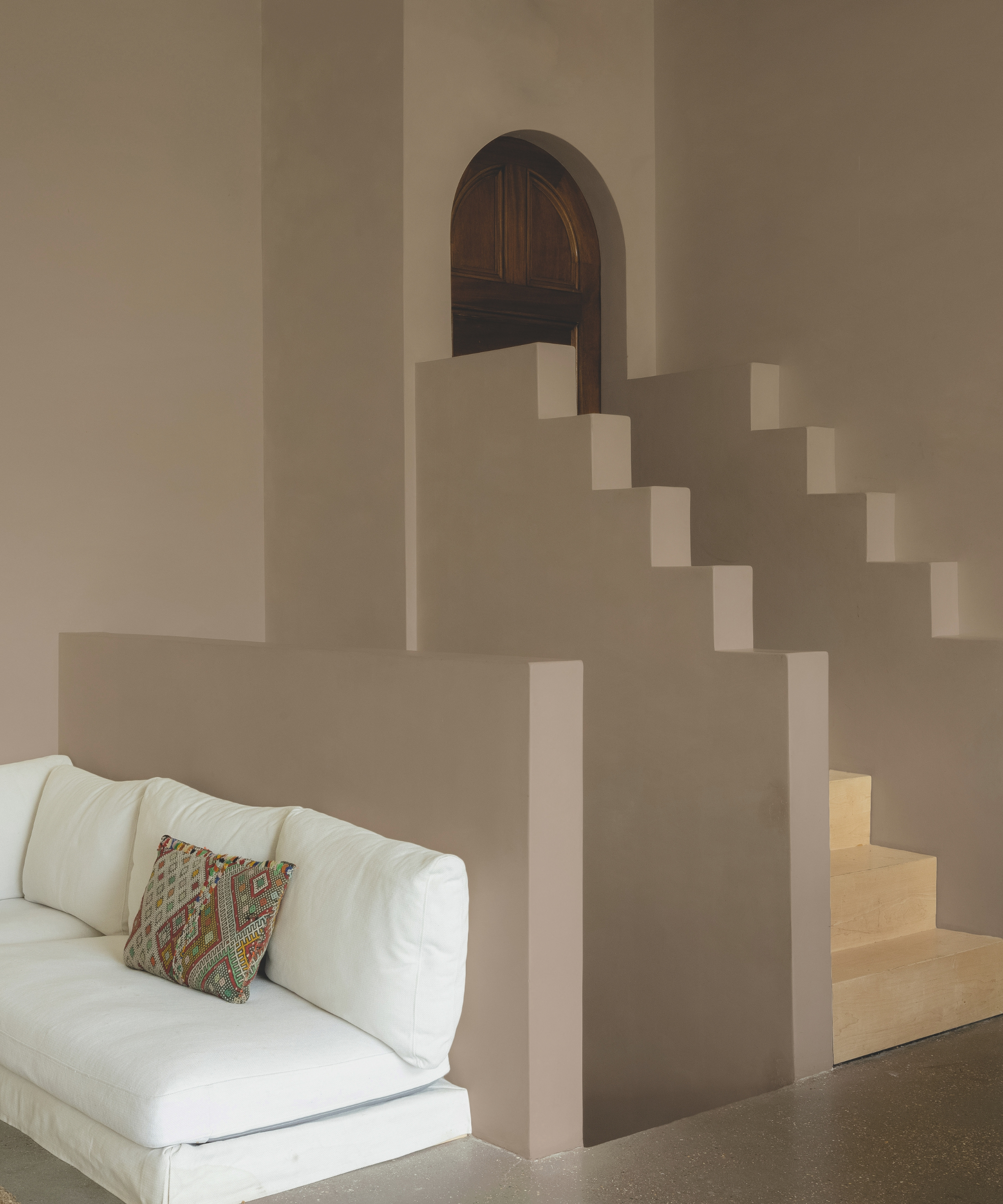
Walls in Buon Fresco by COAT.
For entryways and stairwells, plaster pink is an elegant neutral that isn't diminished by a lack of natural light. Its warm but slightly shadowy quality looks lovely even when lit by the low glow of a row of wall lights, for example. It will evoke warmer climes, as explained by Rob Abrahams, co-founder, of COAT:
Design expertise in your inbox – from inspiring decorating ideas and beautiful celebrity homes to practical gardening advice and shopping round-ups.
‘A modern take on the traditional style of Italian painting, Buon Fresco creates a wet-plaster look, capturing the charm of sun-soaked Italy. This slightly deeper neutral is perfect for south-facing rooms. It’s also ideal for exterior spaces where you need something stony and grounded without too much vibrancy. To bring this color to life, opt for natural materials and rustic textures to create an inviting space.’
3. Create a timeless living room with earthy pinks
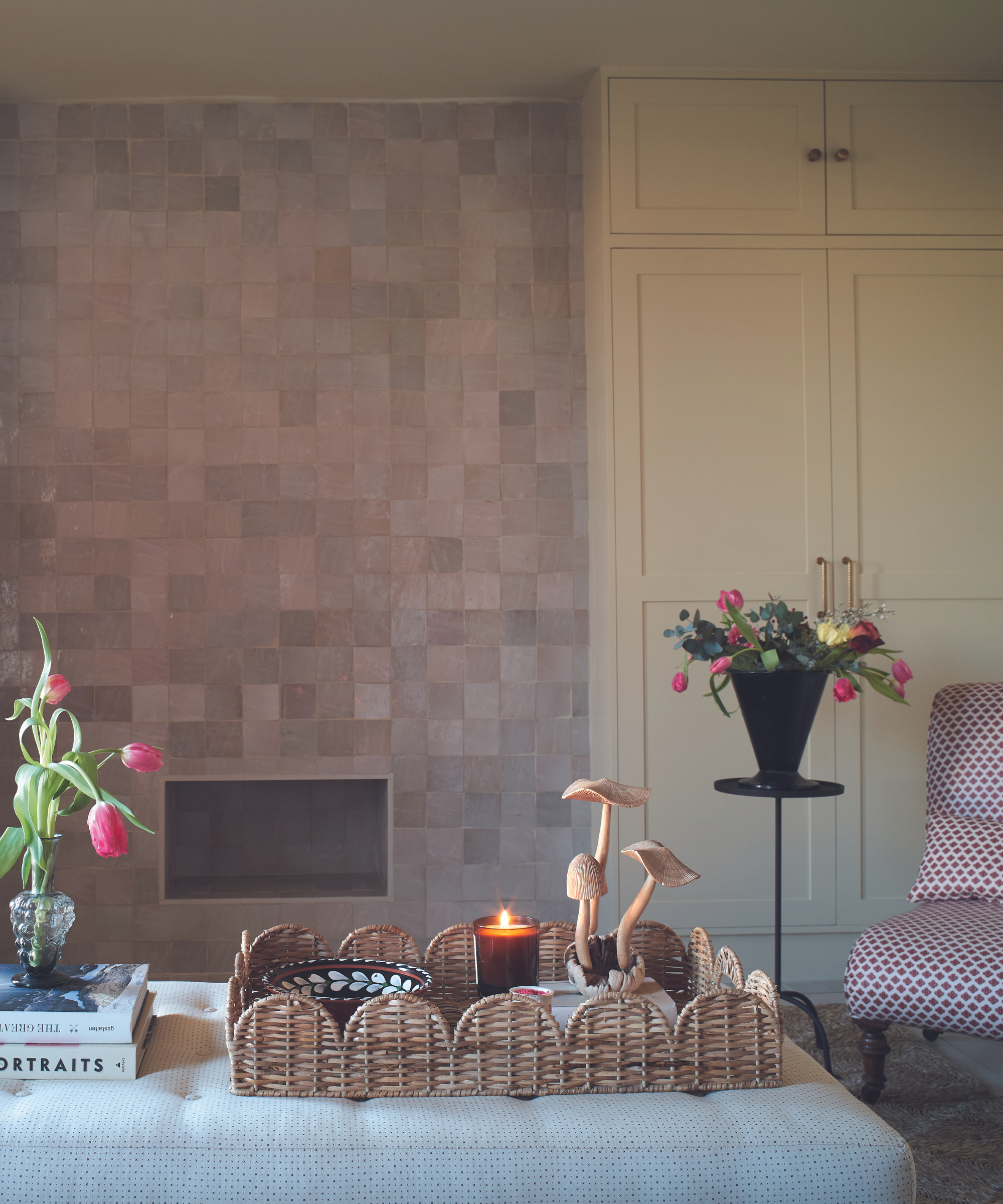
Walls and ceiling in Clay Pale and storage cupboards in Clay Mid by Little Greene.
Living rooms can benefit from the cozy mood introduced by a touch of plaster pink. The warming color brings a rich quality, and in the dim light of the evening, the brown undertones of the pink will be emphasized, creating a cocooning effect. With the right pink, the space will feel adequately light in the natural brightness of the day. Here, the surface effect of tiling ensures plenty of light bounces throughout the space.
‘It was important to make the space inviting and calming. We used Little Greene’s Clay Pale on the walls and ceiling and Clay Mid for the built-in storage. The zellige tiles have an irregular gloss finish, adding depth and light play,’ says Sophie Rowell, director and founder of Côte de Folk.
4. Pick plaster tones for the perfect bedroom shade
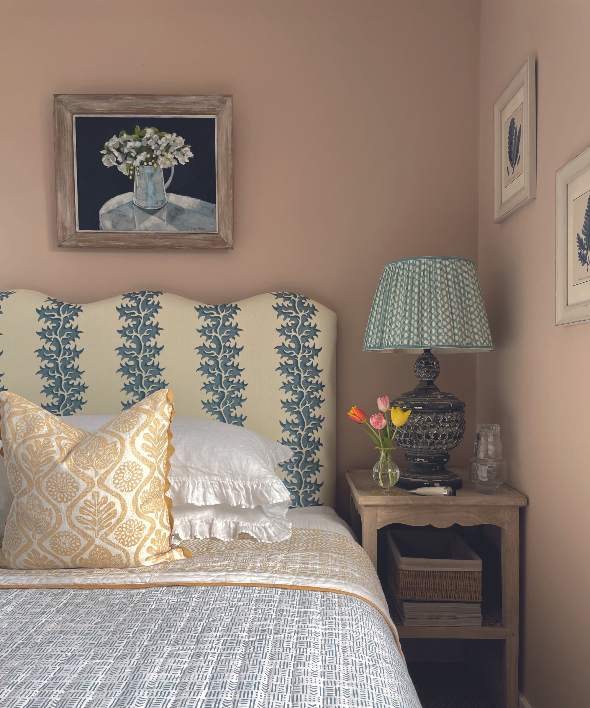
Walls in Setting Plaster by Farrow & Ball.
In a bedroom, plaster pink is a natural choice, inviting a touch of romance and elegance. Opting for a shade with clay undertones, and pairing it with characterful artwork and interesting patterns and texture helps to create a space that feels contemporary.
Megan Robson, founder, Kit & Co, explains ‘For our guest bedroom, I chose Farrow & Ball’s Setting Plaster to create a dusty pink backdrop for layering color and pattern. There’s a softness and timelessness to this pretty shade that pairs wonderfully with every color I introduce.’
5. Create a bathroom that doesn't feel like a bathroom
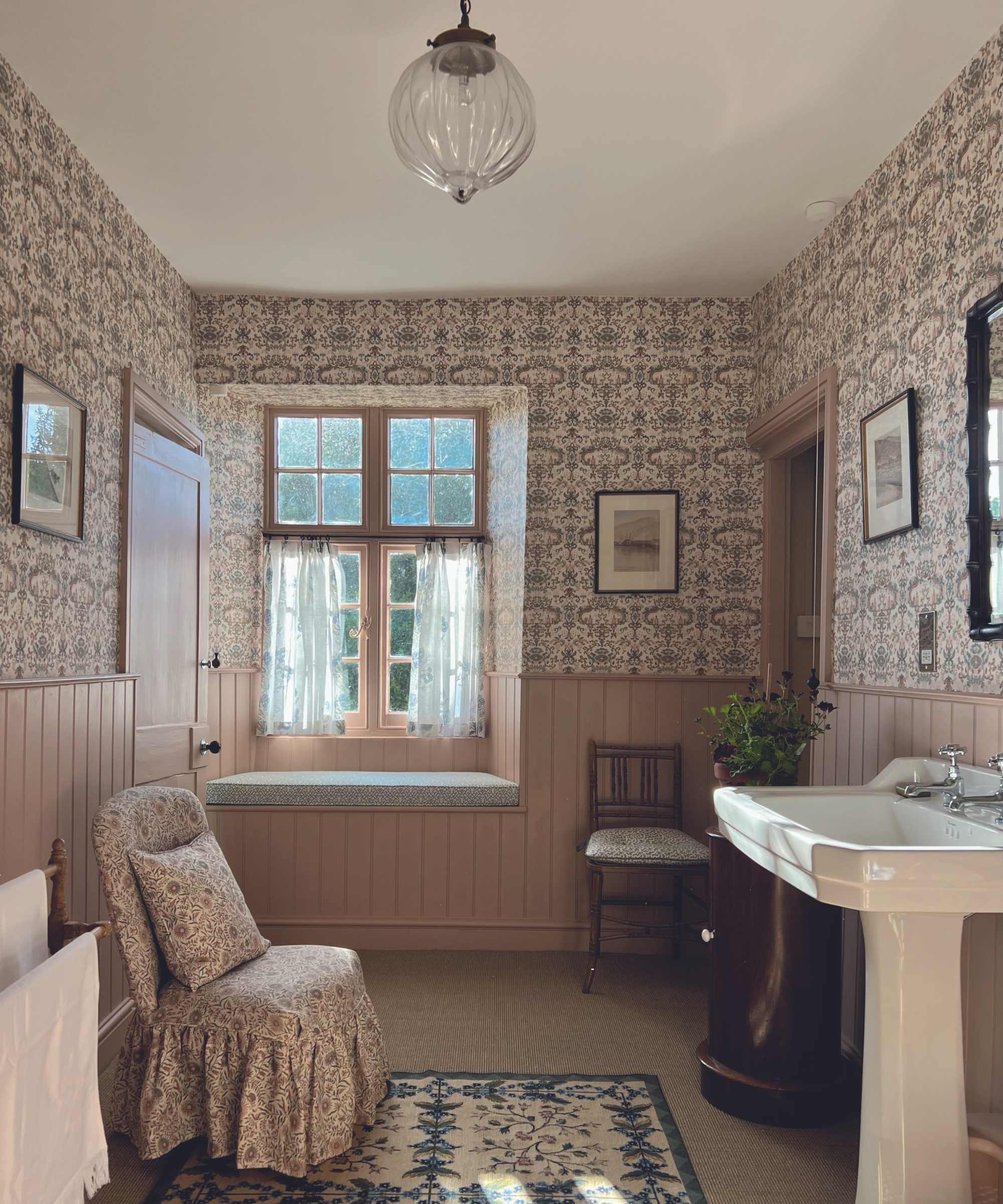
Walls in Jonquil by Edward Bulmer Natural Paint.
For a bathroom inspired by vintage style, plaster pink is a great choice as it creates a charming and inviting space with allusions to a traditional powder room. Combining the color with bathroom wallpapers and fabrics in similar tones will create a layered look adding interest and depth.
In the words of Carlos Sanchez-Garcia, founder of Carlos Garcia Interiors, 'The color chosen for this pink bathroom is a good yellow-pink that gives cohesion to the room’s architectural elements and is the perfect canvas for the furniture and wallcoverings.’

Carlos Sanchez-Garcia is the founder of what's considered one of the UK's top 100 interior design companies - Carlos Garcia Interiors, established in 2009. He has more than 15 years of industry experience and has also launched a collection of fabrics.
Time-honored, plaster pink is a color that was popular in stately homes in Georgian times, and it's easy to see why it has stood the test of time. Versatile, cheerful, and quietly elegant, welcoming blush hues into your home is a great way to create a space full of interest and charm.

- Pippa BlenkinsopContributor