This Interior Designer’s Simple Color Balancing Formula Finally Helped Me Plan the Scheme for My Entire Home – It’s the Answer to Using Both Calming Neutrals and Bold Shades
It turns out, not every room needs to shout to make a statement

Design expertise in your inbox – from inspiring decorating ideas and beautiful celebrity homes to practical gardening advice and shopping round-ups.
You are now subscribed
Your newsletter sign-up was successful
Want to add more newsletters?
During my (seemingly never-ending) home renovation, I’ve been caught between two decorating instincts: a love of soft neutral spaces that feel calm and grounding, and a pull toward bolder color-drenched rooms that bring personality and depth.
I knew I didn’t want every space to shout, but I also didn’t want to play it too safe with the color scheme for my entire home. What I couldn’t quite work out was how to do both. That was until I stumbled across this room color formula that Melissa Oholendt of Oho Interiors uses in her work.
If you're also wondering where to begin with choosing a color scheme, Melissa's approach goes like this: for every white-painted room, there should be a color-drenched one. Not a hard-and-fast rule, but more of a way to work against the dreaded decision fatigue and color overwhelm. Here, Melissa talks me through her simple color-balancing formula.
Article continues belowHow to Balance Bold Color with Neutrals for a Cohesive Home
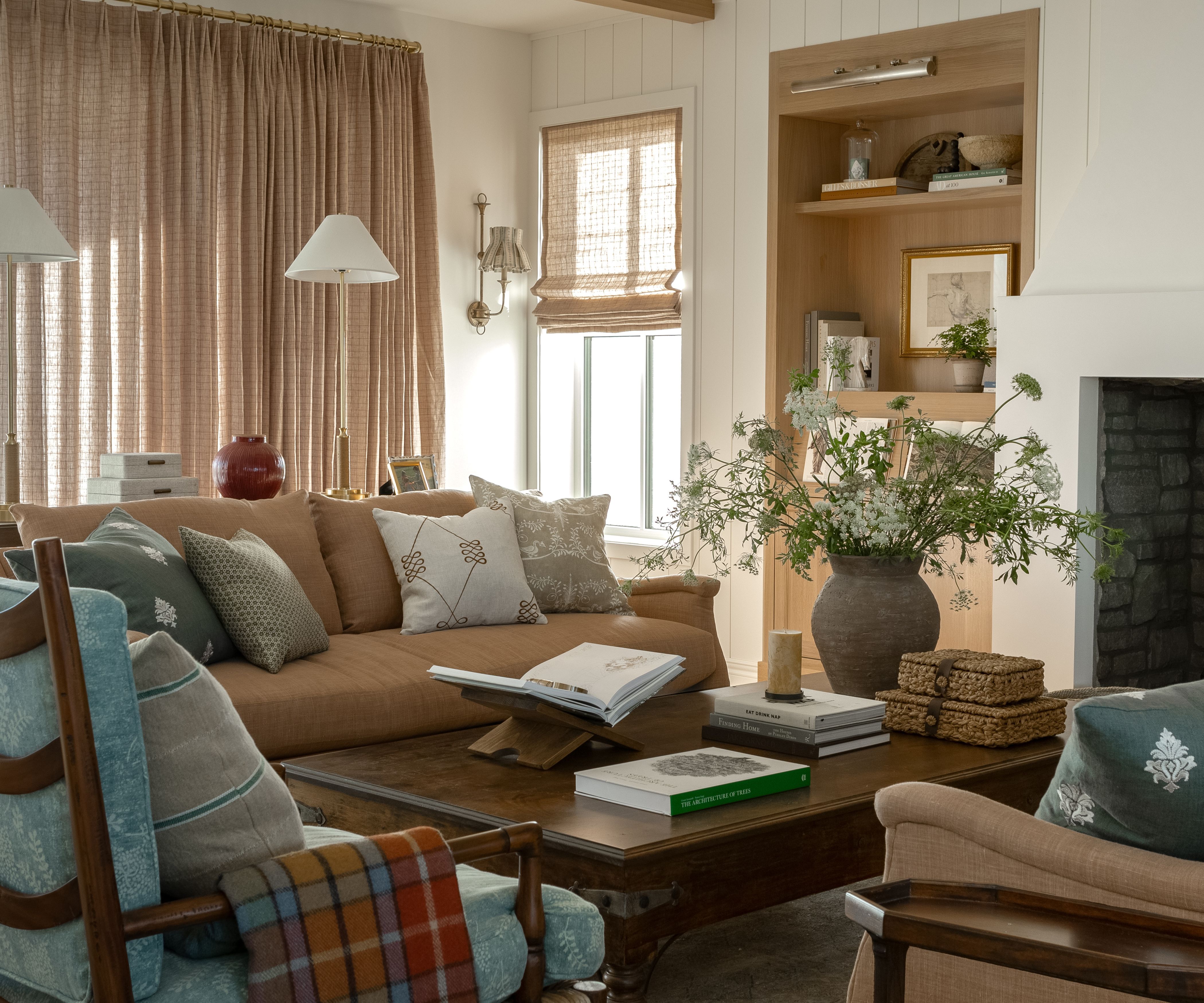
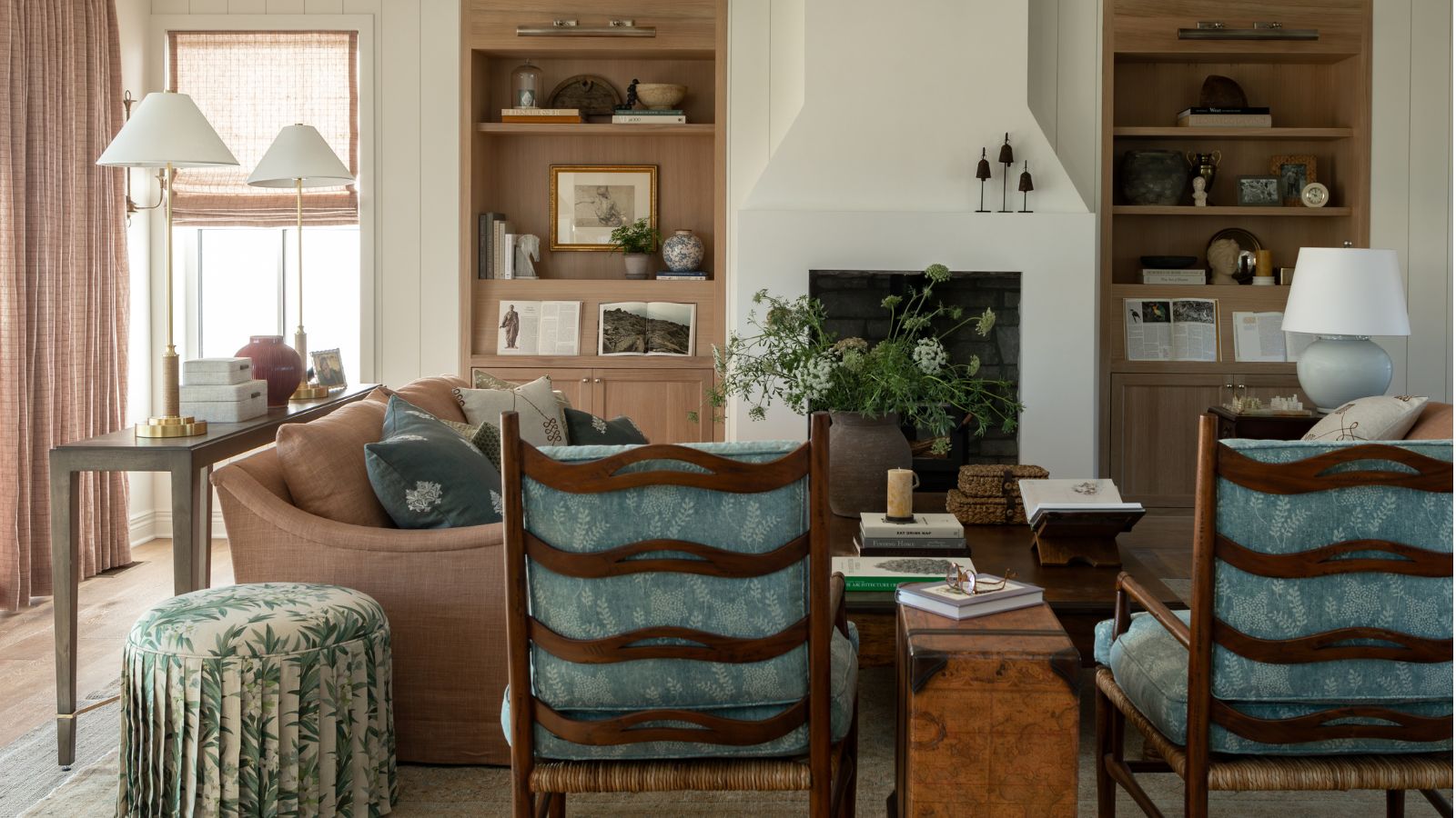
Melissa's project that first introduced me to this color trick was designed by Oho Interiors to feel like an English country home – while being situated in Iowa.
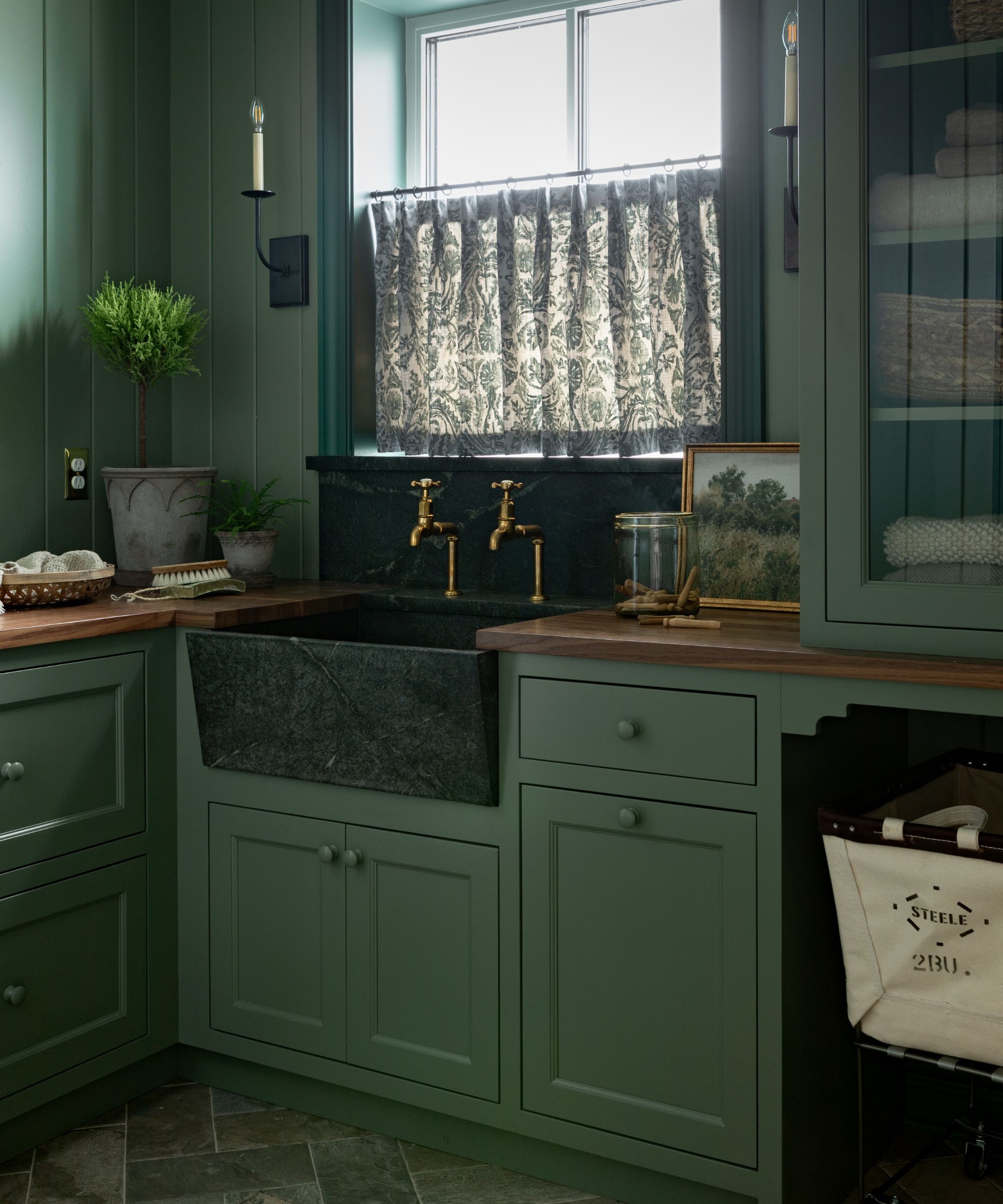
Despite being a new build, it avoids stark white and clean lines, and instead has a balance of color-confident rooms and more pared-back spaces. Some rooms are wrapped in soft, pale hues that let the farmhouse-style architecture and materials speak; others lean fully into bold color, creating moments of contrast.
What stood out the most from this cozy home was not only the collected use of antiques and playful patterns, but how naturally those color contrasts sat alongside one another.
According to Melissa, this sense of balance is never about paint ideas alone.
Design expertise in your inbox – from inspiring decorating ideas and beautiful celebrity homes to practical gardening advice and shopping round-ups.
'In design, we are always seeking a sense of balance,' Melissa explains. 'Sometimes this comes in the form of materiality with natural materials in selections playing the balancing act with the demand of man-made elements in construction materials.'
'Sometimes this comes in the form of balancing masculine and feminine design elements – blending yin and yang to create a sense of calm,' she continues. 'And sometimes, especially in many of our projects – this comes in the form of balancing color with neutrality throughout a home.'
While Oho Interiors is known for its use of rich, saturated hues (this cocooning purple living room is a firm favorite), Melissa is sure to consider the importance of balance.
Careful to point out that harmony across a home rarely comes from doubling down on boldness in every room, Melissa suggests that instead, it’s about knowing when to pull back.
'You could never accuse us of being shy in our use of color; however, we do love to find some level of harmony throughout the home as a whole, and we have found that over the years, that definition of harmony for color and neutrality is different for every client,' Melissa explains.
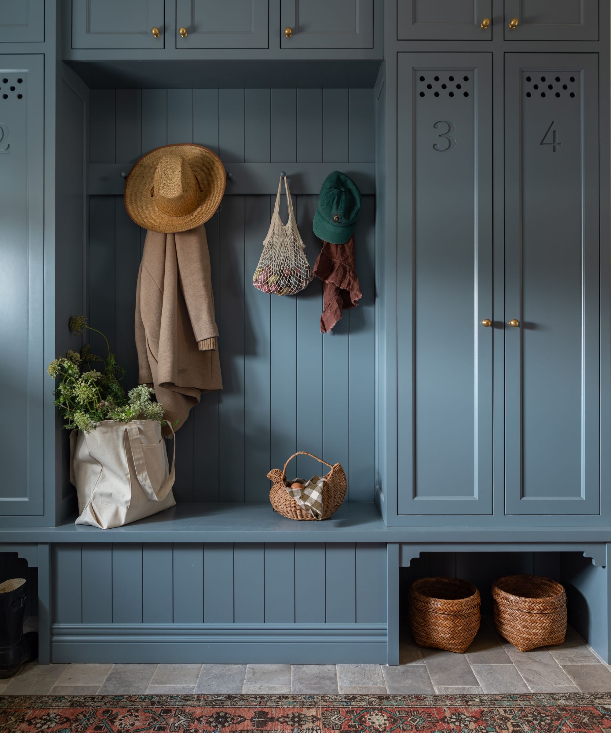
With neither a strong preference for color nor decorating with neutrals, Melissa often begins with a simple ratio: one neutral room for every room that’s saturated in color.
'One sort of fail-proof method that we have found that does seem to really have a place for the vast majority of our clients is the balance of one room of neutrality for every room that we saturate in color,' she explains.
'For every moment of wow-bam-hello color, we have a space that gives a moment of rest – almost like the argument for negative space in both art & writing – allowing a moment to regain your breath and surroundings.'
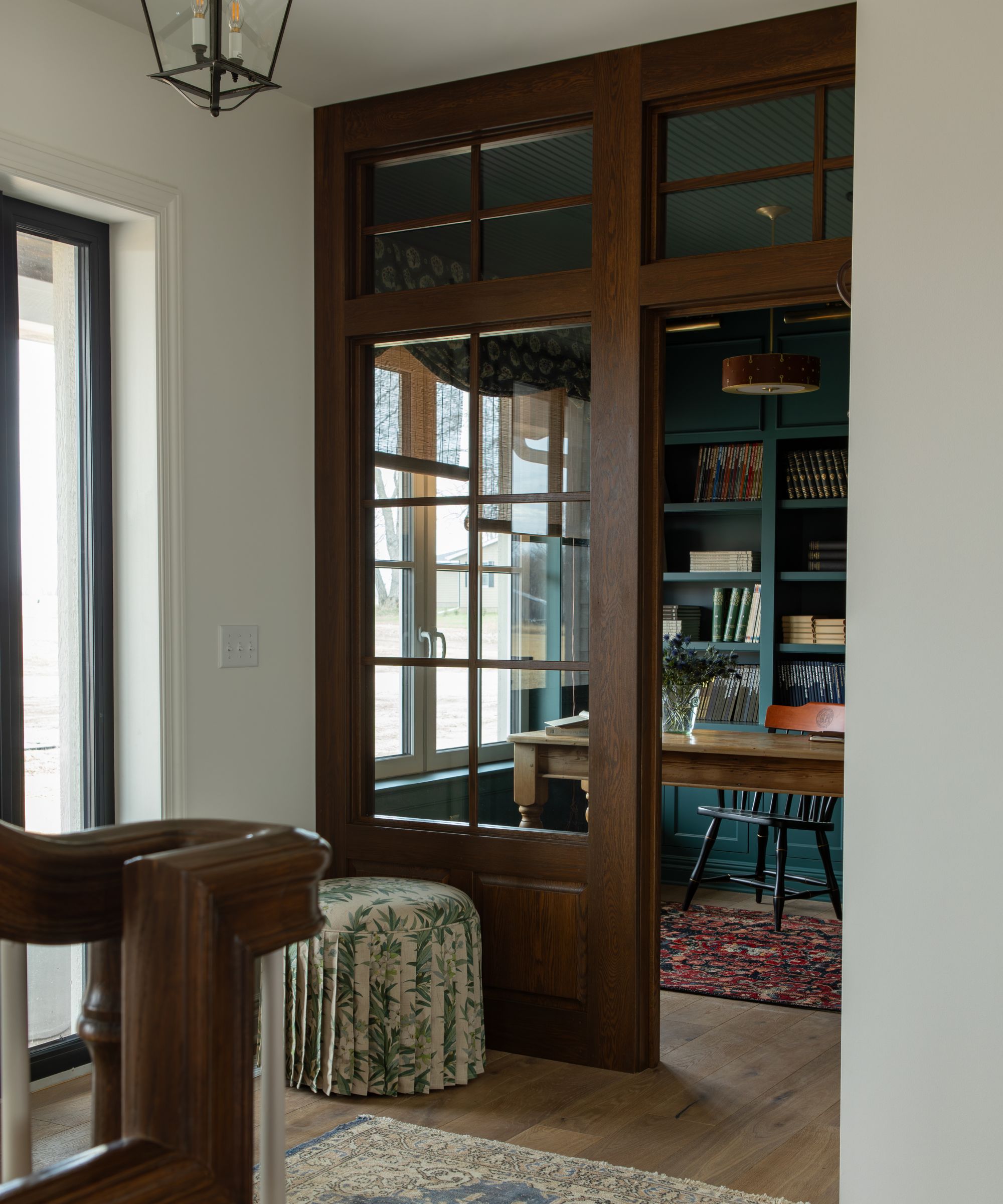
The best part is that this formula isn’t prescriptive or restrictive – it’s more a permission to play into the room's strengths and mood. By alternating moments of visual impact with spaces that feel calmer and more pared-back, the home has a better sense of flow throughout.
It allows you to work with natural light and existing architecture to choose a hue for that space that best fits its nature and your intended use for the room.
For example, a small home office that leans into moodiness with a wash of inky blue (Farrow & Ball's Inchyra Blue was the hue of choice for Melissa in the room above), while a light and airy kitchen gets a warm beige makeover to create a calm heart of the home.
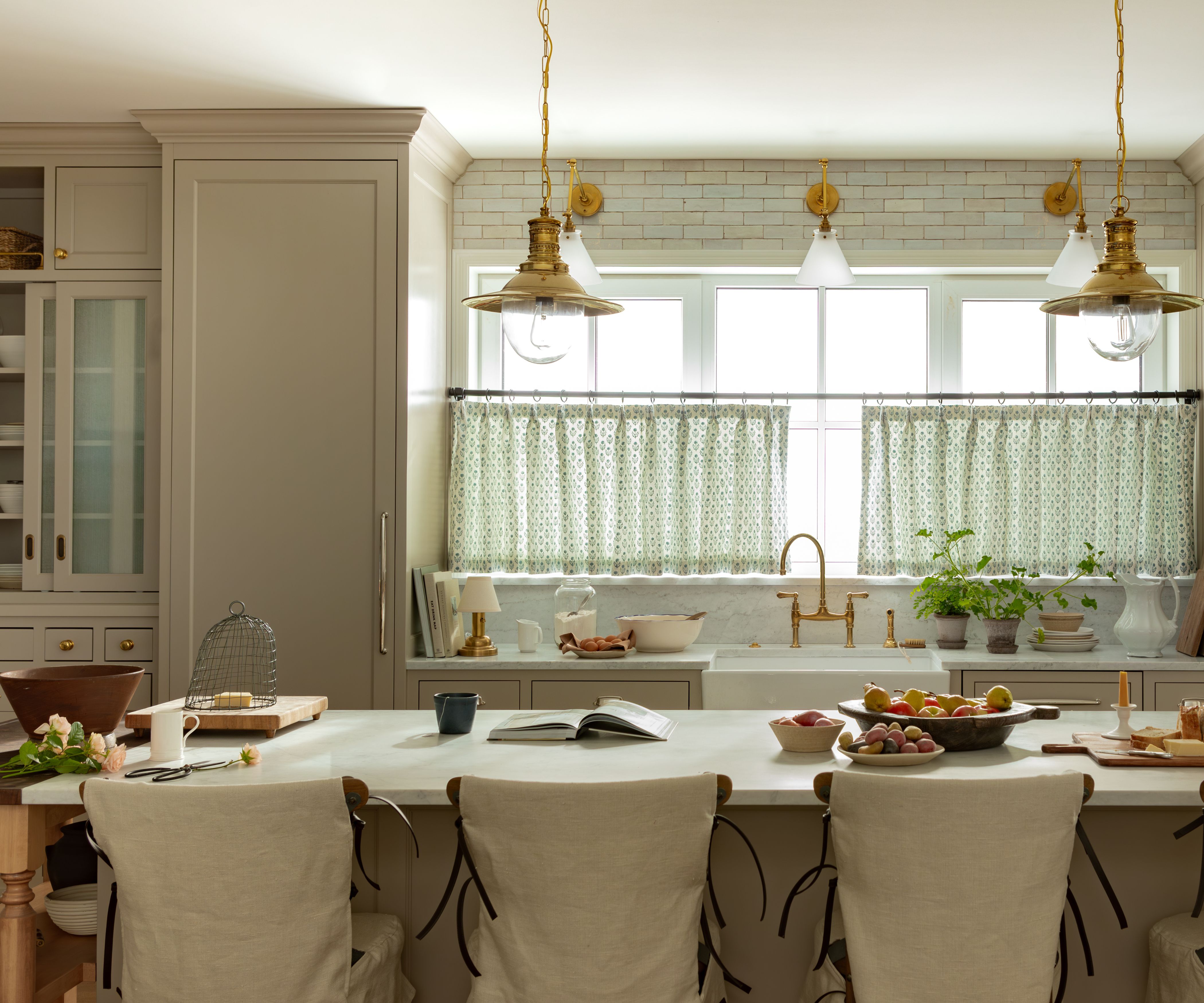
'I've said it before, and I'll say it again: rooms should feel like individual pages of the same story, but they don't have to be the same,' Melissa said in her Instagram post.
'Now, of course, there will always be clients on both ends of the spectrum, as well as in this middle space of equal parts, but our theory of a 1:1 ratio does feel like a good place to start from, in the absence of a strong opinion one way or another,' she tells me.
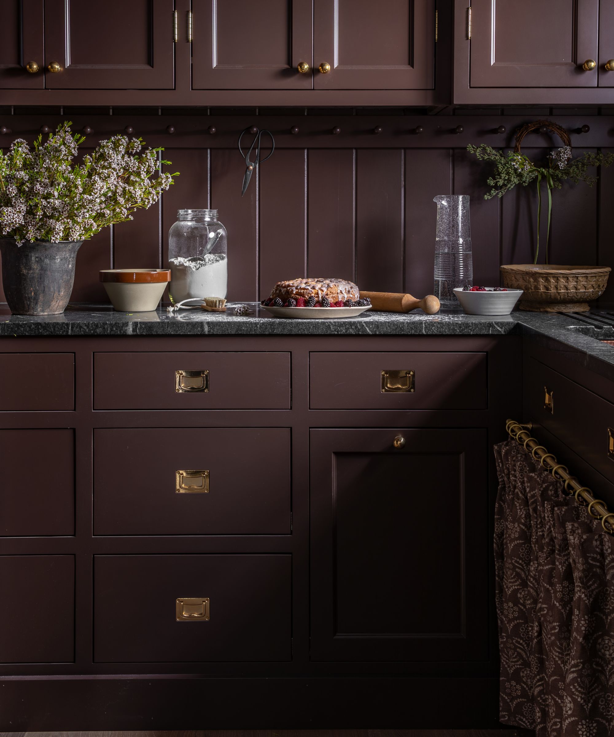
As Melissa puts it, these quieter rooms act as a kind of visual palate cleanser. They offer a pause between the bolder moments, allowing the eye to reset before moving on.
Once you start looking at your entire home this way, it becomes much easier to see where color will have the greatest impact – and where restraint will feel just as powerful.

One of the best Farrow & Ball blue paints, Inchyra Blue is a designer fave for a reason. Used in the home office in this project, it is a moody blue-grey inspired by the dramatic Scottish landscape that brings instant atmosphere to a space.

Used in the living room, this is a warm white that never feels stark. Alabaster by Sherwin-Williams offers softness without slipping into creaminess with a gentle warmth that makes it ideal for balancing deeper hues elsewhere in the home.

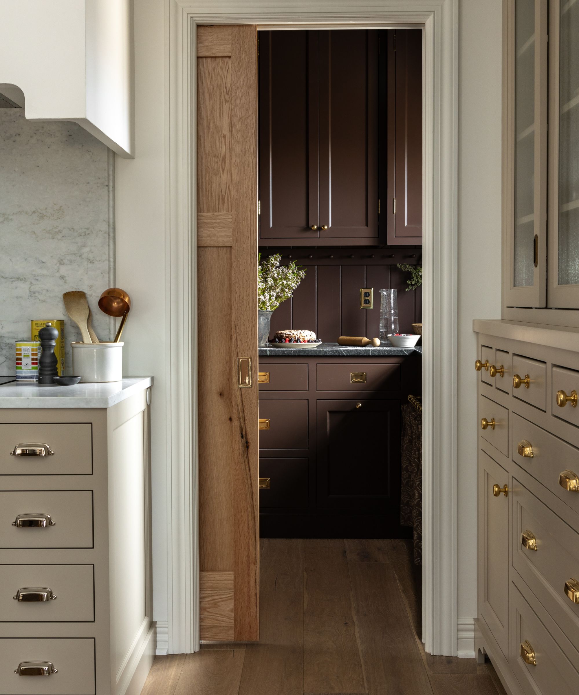
Benjamin Moore's Stone Hearth is a beautifully nuanced neutral with a subtle warmth without heaviness. Sitting comfortably in that sweet spot between beige and greige, it brings an understated richness to the kitchen in this home while remaining incredibly versatile.

Farrow & Ball's Cola is a deep, warm brown with red undertones that lend it a softness often missing from darker shades. Rich without feeling austere, it creates an intimate, enveloping feel – particularly effective in smaller rooms like the pantry Melissa used it in.

A calming blue-grey with slate undertones, Foggy Day brings a depth to the mudroom in this project. Neither too cool nor too warm, it’s ideal for small rooms or transitional spaces where you want color without intensity.

Used in the primary bath, Shadow White is a soft, shaded neutral that reveals a delicate hint of gray, particularly in lower light. Designed to mimic the look of white used in shadowed spaces, it is an ideal companion to richer colors, providing contrast without starkness.
What I’ve personally taken away from Melissa’s color balancing formula is a whole home approach that helps to work with boldness and calmness in harmony.
Instead of agonizing over every color choice in isolation, I’ve started thinking about how each room relates to the next – where it makes sense to lean into color, and where neutrals might be needed. The result is a space that feels considered, cohesive, and far easier to live with.

Charlotte is the style and trends editor at Homes and Gardens and has been with the team since Christmas 2023. Following a 5 year career in Fashion, she has worked at many women's glossy magazines including Grazia, Stylist, and Hello!, and as Interiors Editor for British heritage department store Liberty. Her role at H&G fuses her love of style with her passion for interior design, and she is currently undergoing her second home renovation - you can follow her journey over on @olbyhome