I used this unexpected Farrow & Ball paint in my living room – but this simple tweak transformed the space
I love the depth of color in Cola by Farrow and Ball. It's perfect for a cocooning living room, but it got so much better when I learned about the Dead Flat finish
Design expertise in your inbox – from inspiring decorating ideas and beautiful celebrity homes to practical gardening advice and shopping round-ups.
You are now subscribed
Your newsletter sign-up was successful
Want to add more newsletters?
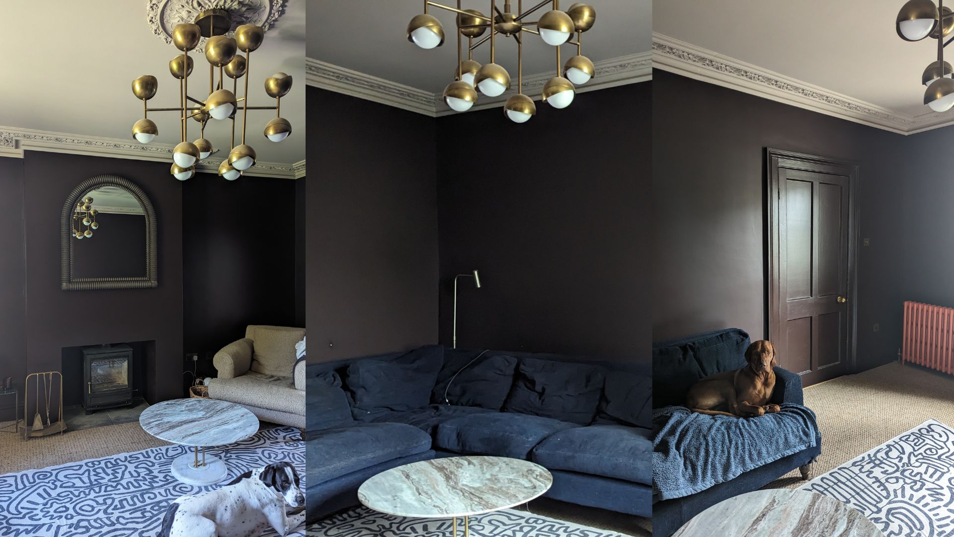
Cola, by Farrow & Ball, isn't going to be everyone's first choice for a living room. As the name implies, it's a rich, dark brown, but its base of red pigments gives it a depth and the ability to pick up light – a little fizz, just like the soda it's named after.
And I love it. It was the only choice for our living room color, a west-facing room without loads of natural light, where we hunker down, watch movies and TV, cuddle the puppies on a big squashy sofa. We wanted a color that made us cocoon.
When older neighbors or relatives visit, their eyebrows shoot square off the top of their forehead. They can't understand why we've chosen such a deep and formidable shade. But then, it's not for them, it's for us, and it truly helped our house feel like a home. 'The rich color of Cola – being the reddest of our browns – is irresistible, feeling deliciously intimate and somehow grand at the same time,' says Farrow & Ball's Color Curator and in-house guru Joa Studholme. And it's the perfect way to describe the shade.
Article continues belowBut then we made a tiny tweak to the paint choice and suddenly it went from fantastic to utterly, wonderfully incredible. A decision I would advise anyone and everyone to make every time they're using a Farrow and Ball color going forward, one that has the blessing of the brand's color experts, whose opinions I hold so dear. And that was simply to change the finish, to choose a newer and more perfect option. Let me explain about Dead Flat...
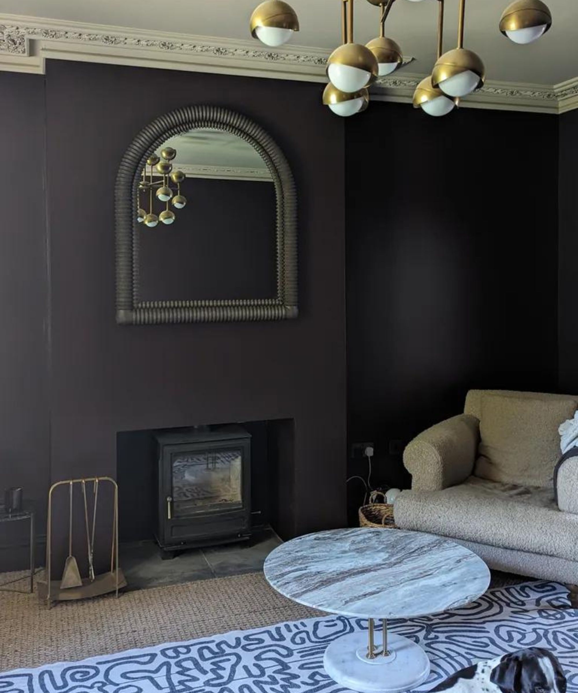
Spot the camouflaged English pointer puppy
'Life is too short for white ceilings,' the London-based interior designer Stephanie Barba Mendoza told me recently. And on the whole, I agree with her. It would have been too stark to go for a classic white ceiling color, too big a contrast with the Cola walls. I've been delighted with our choice of Farrow & Ball's Jitney instead, a sandy beige paint that has similar brown and red undertones, and provides a softer pairing than, say, All White would have done (I wasn't brave enough to color drench with Cola. There's being embraced by a color, and there's being oppressed!).
I also love how intimate the living room feels in this color. 'That feeling of being cocooned is so important,' Stephanie said when talking about 'brave' color choices she made in her own home, and the Cola does seem to draw us all together, especially in the evenings. And in the day, it feels cool, like an antechamber you might shelter from the sun in. I stand by the color choice wholeheartedly.

There have been slight setbacks with my paint choice, however. You know those dogs I mentioned? They ruined the paintwork. This is meant to be the chilled room, where they're not allowed to play, but you try telling that to two boisterous puppies who often have more energy than decorum.
Design expertise in your inbox – from inspiring decorating ideas and beautiful celebrity homes to practical gardening advice and shopping round-ups.
By roughhousing across the sofa, body slamming each other into the walls and catching the paint on their collars (and probably teeth) they've scuffed it, chipped it and just generally made it lose its sheen. You can see the smears in the image above.
For the record, I find Farrow & Ball to be a pretty hardwearing paint brand, on the whole. I have it in other spaces that are high-traffic but just aren't where the dogs playfight, and when it gets the occasional mark I've been able to dab it off with a damp cloth. But these two mutts proved to be too much.
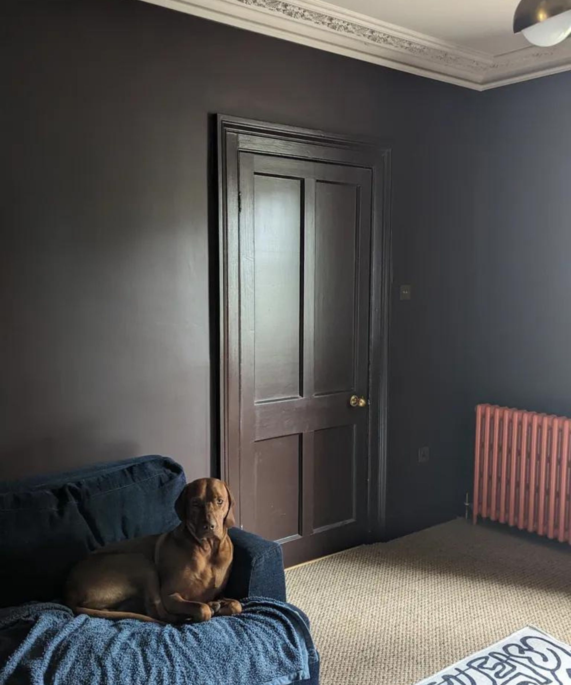
And so, two years after it was painted, I've had it repainted, in exactly the same color, but this time in Farrow & Ball's new Dead Flat finish, which was only released last year (I previously used the brand's classic Modern Estate Emulsion). The result is game-changing.
It was so easy to apply that even I, the least handy person I know, was able to do it without getting a single drip on my clothes. Not one! It goes on every surface – walls, trim, woodwork, the lot. It's easily wipeable! It's been six weeks now and it's still pristine, each minor scuff coming away instantly with a damp cloth.
And it has the perfect matte sheen to it that catches the light in the most amazing way – check out the picture above (and excuse the dog blanket in a vague attempt to save the sofa from being ruined any further). Suddenly, Cola has gone from being a rich color to a rich color that has the ability to make the light dance across it.
'In our Dead Flat finish, [Cola] is particularly spectacular, with its fantastically soft flat finish looking like velvet, creating walls that you feel you could dive into!' says Joa Studholme, and she's not in the least bit wrong.
Had this paint finish been available when I first painted the room, I'd have used it then. Now I'm using it in every space in the house – Jitney in Dead Flat has just been used to color drench my bedroom.
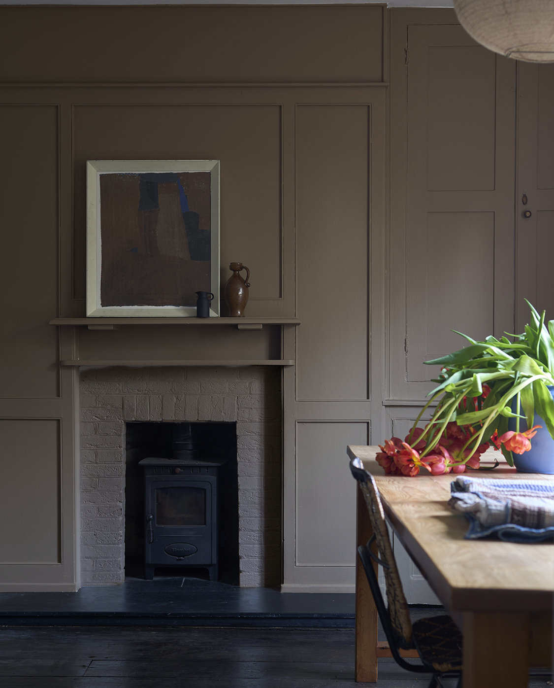
Walls painted in Mouse Back No.40 | Dead Flat®
'Many of us are drawn to a flat finish for their innate subtlety and discretion – but as a rule they haven’t been the most durable finish for high traffic/busy households,' says Patrick O'Donnell, Farrow & Ball's International Brand Ambassador and a color guru in his own right.
'The rule of thumb is the higher the sheen, the tougher the finish. However, Farrow & Ball has developed the flattest, most durable finish on the market in our reformulated, multi-surface Dead Flat, which has a scrub class rating of 1 and is both washable and wipeable, meaning you can introduce a flat finish into some of the most demanding areas of your home.'
Traditionally, designers and homeowners have used Emulsion for walls and ceiling and eggshell or gloss on trim. 'However, you can use Dead Flat across wood, metal, and woodwork to create a seamless flow of color in the same 2% sheen level through a whole room,' Patrick adds. 'For a fully immersive color-drenching experience.'
And I can attest, it's worth it.
Pip Rich is an interiors journalist and editor with 20 years' experience, having written for all of the UK's biggest titles. Most recently, he was the Global Editor in Chief of our sister brand, Livingetc, where he now continues in a consulting role as Executive Editor. Before that, he was acting editor of Homes & Gardens, and has held staff positions at Sunday Times Style, ELLE Decoration, Red and Grazia. He has written three books – his most recent, A New Leaf, looked at the homes of architects who had decorated with house plants. Over his career, he has interviewed pretty much every interior designer working today, soaking up their knowledge and wisdom so as to become an expert himself.

