From plum to butter yellow – Lone Fox's DIY 1920s kitchen makeover proves a paint color mistake can make (or break) a room
Why the buttery paint shade Farrow’s Cream was the subtle but powerful choice that brought this vintage kitchen to life


Design expertise in your inbox – from inspiring decorating ideas and beautiful celebrity homes to practical gardening advice and shopping round-ups.
You are now subscribed
Your newsletter sign-up was successful
Want to add more newsletters?
As a seasoned renovator and creative DIY-er, Lone Fox’s Instagram is a constant source of inspiration – packed with enviable thrifted finds and clever, design-savvy hacks. His DIY kitchen projects rarely miss the mark, so when Drew (the creator behind Lone Fox) shared a rare color mistake as part of his 1920s kitchen refresh, I was instantly intrigued.
The first glimpse of his no-demo retro kitchen makeover hit Instagram this week, and it’s already shaping up to be one of his most compelling reveals. From its vintage-inspired concept to the perfectly curated mood board, the space is full of character – and a few bold design decisions, including a butter yellow kitchen.
If you're in the midst of your own kitchen remodel and wondering just how impactful a kitchen cabinet color change can be, Drew's latest video offers all the proof you need that the right cabinet shade can completely transform a space.
Article continues belowA post shared by Lone Fox by Drew Michael Scott (@lonefoxhome)
A photo posted by on
‘Hopefully this is not too dark,’ says Drew, who is known to fans as Lone Fox, as he begins painting the kitchen cabinets of his 1920s-era downstairs kitchen in a rich plum shade. The space itself is a characterful vintage gem, complete with a black and white checkerboard floor, pistachio green wall tiles, and a butter-yellow tiled backsplash and countertops.
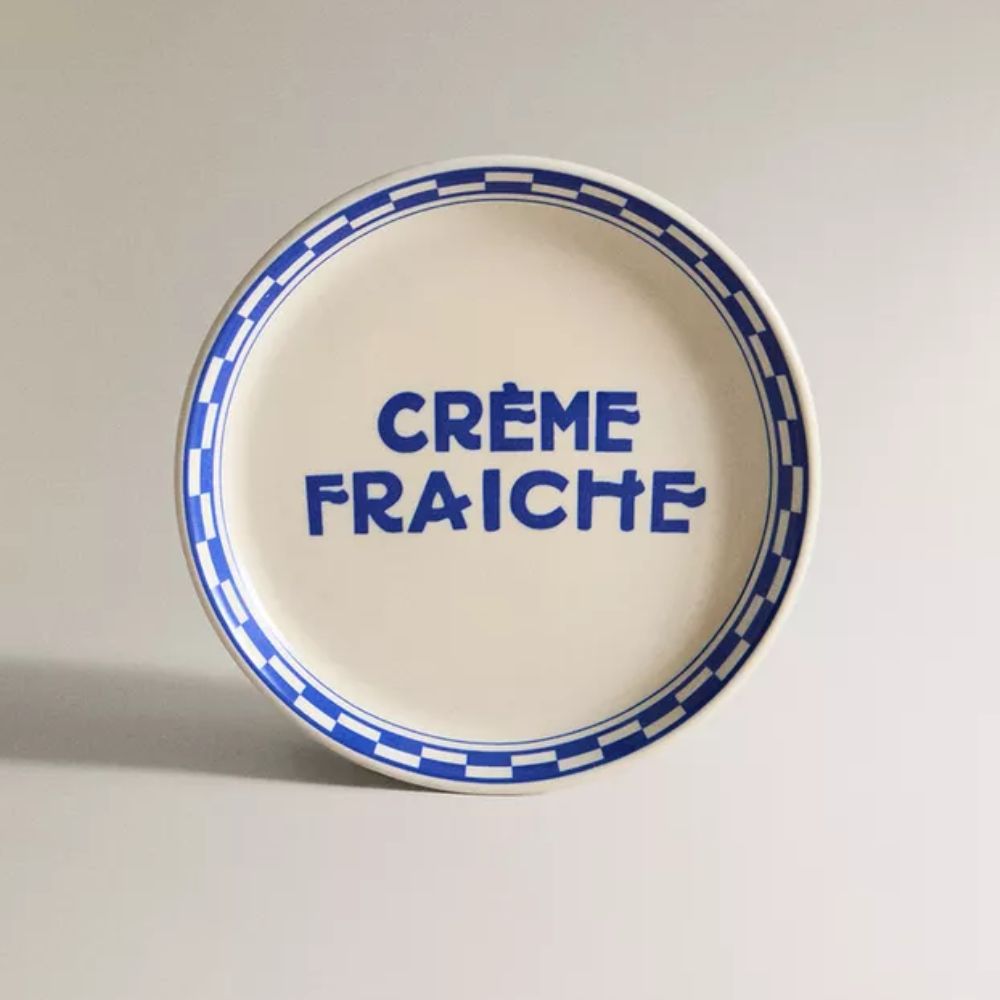
‘I’m trying to stick with the original tile and not get rid of it – at least for now – because paint can work wonders,’ he shares. In a previous video introducing the space, Drew outlined his vision: ‘I’m kind of thinking Ladurée, French café vibes. The green tile just reminds me of that, especially with the checkerboard floor.’
The plum paint color, selected with the help of his Instagram followers, was intended to add depth and contrast to the room’s pastel palette. But once it was on the cabinets, it became clear that the hue didn’t quite align with the dreamy Parisian look he had in mind.
A post shared by Lone Fox by Drew Michael Scott (@lonefoxhome)
A photo posted by on
‘I picked the wrong color,’ Drew admits candidly. ‘The plum was reading too red, and I just wasn’t loving the darkness. So I went back to my Ladurée inspiration.’
Design expertise in your inbox – from inspiring decorating ideas and beautiful celebrity homes to practical gardening advice and shopping round-ups.
After testing a few softer options, he settled on Farrow's Cream – a warm, buttery hue that feels fresh without veering too yellow. ‘It’s a really beautiful creamy color that leans buttery, but not too yellow, which I like, so I painted that all over the cabinets,’ he explains.
This food-themed color trend is a hue I can fully get behind. Farrow’s Cream offers a versatile alternative to cooler neutrals, with just enough depth to infuse a space with warmth and softness – something decorating with white or beige alone can’t always achieve.
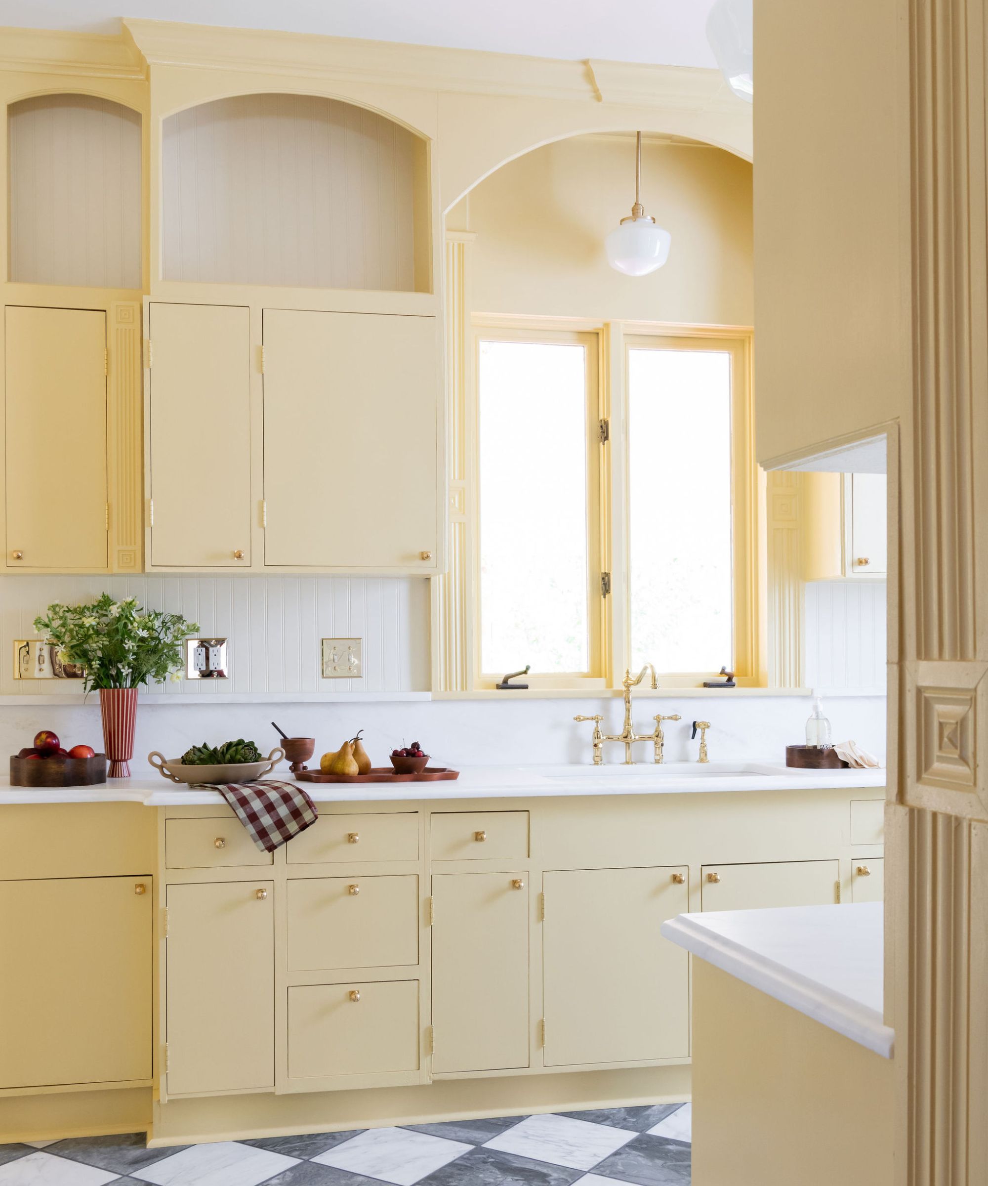
In Drew’s kitchen, it’s the perfect match for the pastel green wall tiles and checkerboard floor, tying together the inherited vintage details with a fresh, elegant finish. And in my own home, I’ve seen the magic of this shade firsthand: I used it in a small bathroom, where it adds a cozy, uplifting feel and complements the warm tones of Victorian mosaic floor tiles beautifully.
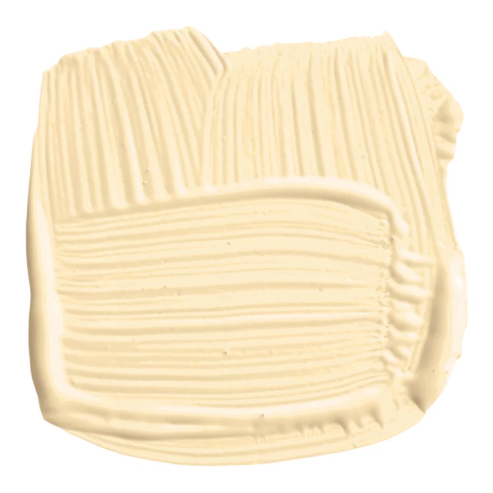
Named after the paint pioneer who founded Farrow & Ball, this traditional cream shade creates 'delightfully inviting rooms with gentle warmth'. It has no black pigment and works lovely alongside the slightly paler White Tie.
Naturally, paint wasn’t the only update Drew made. Since this is his second kitchen, he removed the refrigerator to make space for a vintage-style popcorn machine – a playful nod to the adjoining home movie theater. In the process, he also uncovered a 1920s ‘West Wind’ ventilating fan, which he plans to restore to its original green finish, staying true to the kitchen’s roots.
With these touches and a full embrace of a charming bistro aesthetic, the space now feels warm, whimsical, and full of character. The project is a reminder that even seasoned renovators don’t always get it right the first time – and that’s part of the process. The beauty of a slow renovation lies in the freedom to reassess, recalibrate, and let your space evolve, one thoughtful decision at a time.
Shop Drew's bistro kitchen inspired decor
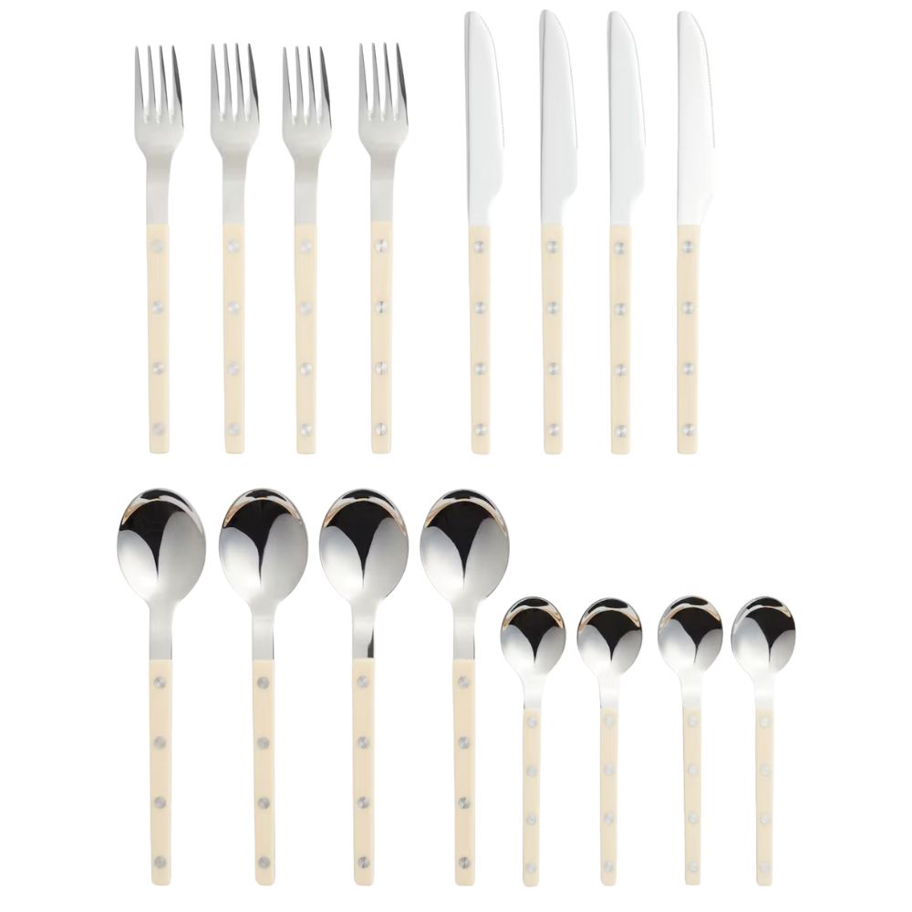
I’ve been searching for the perfect French bistro-inspired cutlery, but that iconic Parisian brand is just a bit beyond my budget. Luckily, H&M’s latest collection includes this stylish (and surprisingly affordable) 16-piece set – and I almost didn’t want to share it.
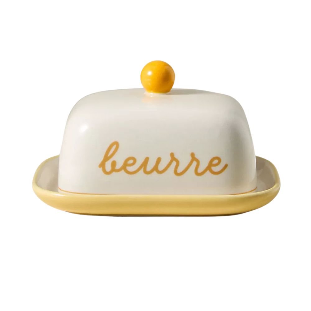
Anthropologie always nails the retro aesthetic, and this hand-painted butter dish is no exception. From the soft yellow glaze to the rounded knob and charming ‘beurre’ script, it’s the perfect piece for bringing a touch of café-inspired charm to your kitchen.
Watching Drew’s kitchen makeover take shape is a timely reminder that some of the most effective transformations begin with the simplest changes. Swapping out a deep plum for the gentle warmth of Farrow’s Cream instantly lifted the space, proving that a well-chosen neutral can still bring plenty of personality.
We're eagerly awaiting the next chapter of this charming, retro-inspired renovation.

Charlotte is the style and trends editor at Homes and Gardens and has been with the team since Christmas 2023. Following a 5 year career in Fashion, she has worked at many women's glossy magazines including Grazia, Stylist, and Hello!, and as Interiors Editor for British heritage department store Liberty. Her role at H&G fuses her love of style with her passion for interior design, and she is currently undergoing her second home renovation - you can follow her journey over on @olbyhome
