I Have ‘Statement Fatigue’ – Here’s How I’m Simplifying My Rooms in 2026 and Why Designers Agree Fewer Focal Pieces Is Key to a Chicer Home
Designers say great design isn’t about gathering more statement pieces, but 'better hierarchy'

Design expertise in your inbox – from inspiring decorating ideas and beautiful celebrity homes to practical gardening advice and shopping round-ups.
You are now subscribed
Your newsletter sign-up was successful
Want to add more newsletters?
I’ve recently realized that filling my home with too many ‘main character' pieces might be having the opposite effect to what I intended. I’ve always been a bit of a magpie for special items and believed that the more beautiful, statement-making pieces a room has, the better.
But somewhere between the sculptural lighting, bold upholstery, patterned rugs, and oversized art, I crossed the line from curated to chaotic. Individually, each piece felt exciting. Together, though, it looks too much.
And designers agree that this is a rather common and expensive decorating mistake. You see, once you fill your spaces with too many focal points, the eye has nowhere to rest, and the room lacks a clear sense of direction.
Article continues belowTo understand how to strike that balance between personality and negative space, I asked designers how they avoid the too many main characters trap.
Why Having Too Many 'Main Characters' in Your Home is a Mistake
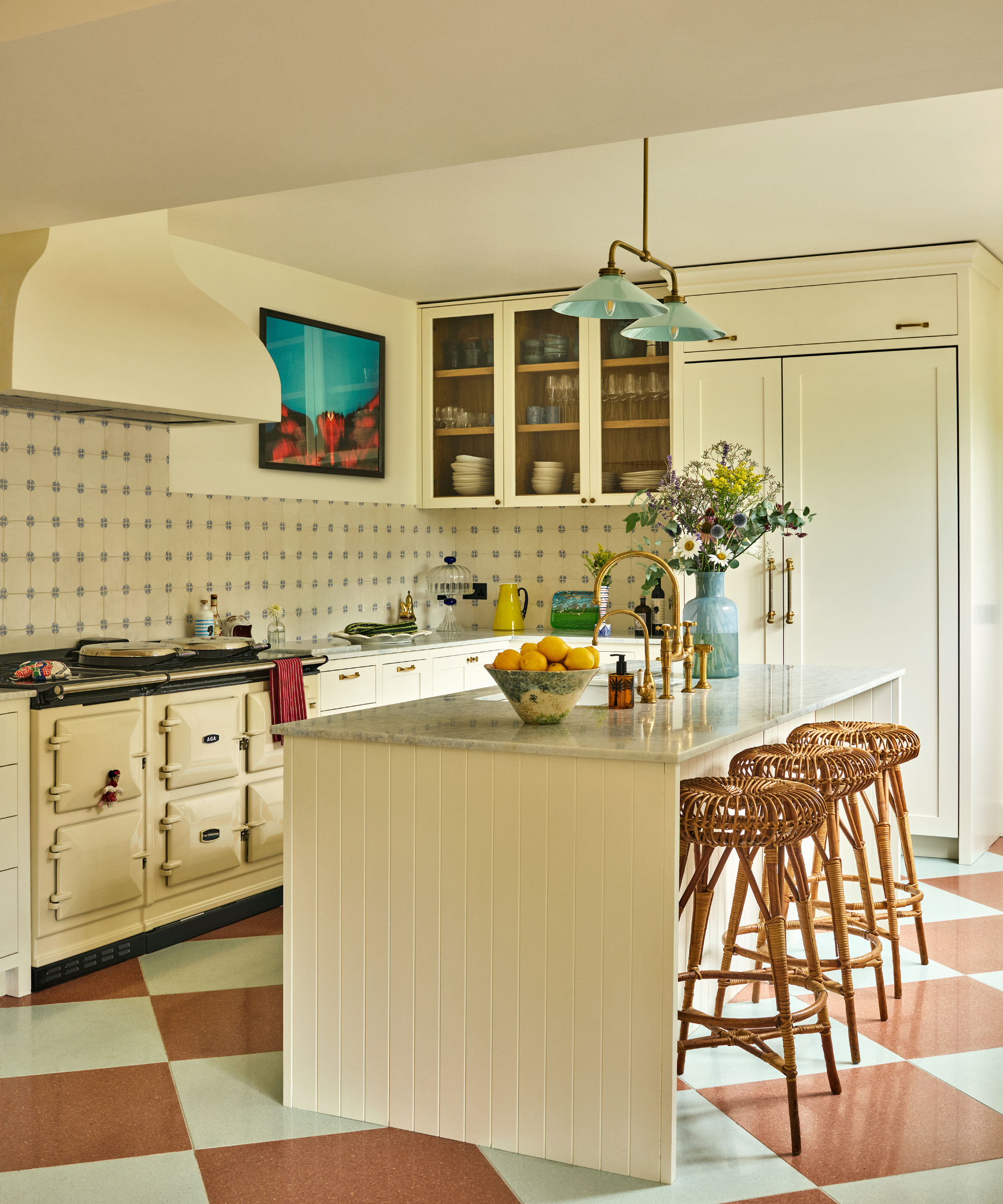
In this stylish kitchen, the terracotta and white checkered floor is balanced out with warm white traditional cabinetry and rattan accents that don't compete but compliment.
I’ve started to think of it like getting dressed. If your closet is full of printed jackets, embellished tops, and statement heels, but you don’t own a single great white tee, shirt, or tailored pair of trousers, getting dressed becomes surprisingly difficult.
Every piece is shouting; there's no layer of great basics to anchor the look and pull everything together, and instead, everything is competing for attention. And it turns out I've been practising this 'ooh shiny' way of shopping for both my home and closet for a while now.
'This is actually something I work through on all my projects,' says designer Bethany Adams. 'I get excited about all the beautiful furniture pieces I could specify, but in order to keep my spaces from feeling chaotic, it's important to choose the 'stars' and let the other pieces play supporting roles.'
Design expertise in your inbox – from inspiring decorating ideas and beautiful celebrity homes to practical gardening advice and shopping round-ups.
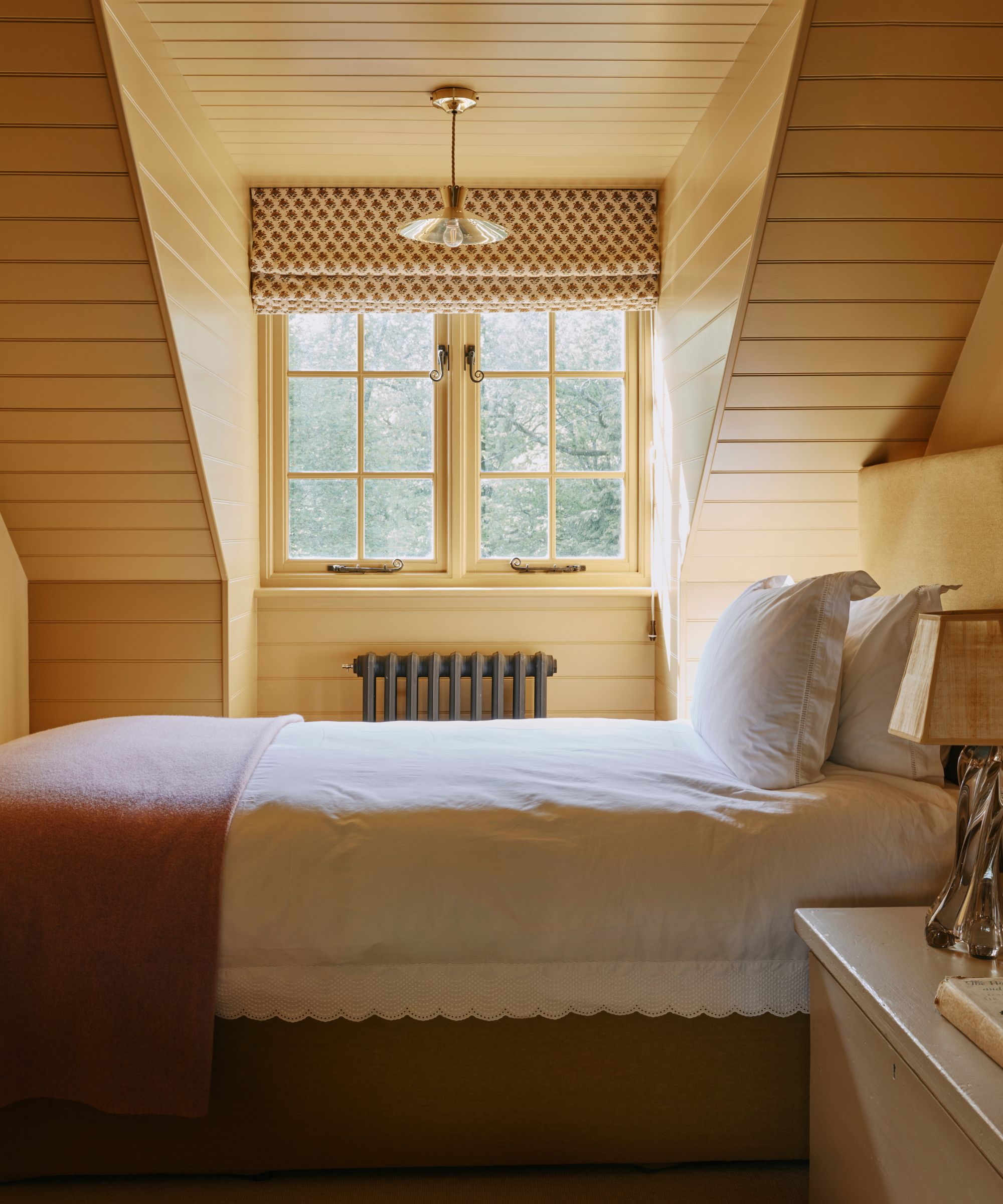
You can still go bold with color, making that your main character, like in this butter yellow bedroom that mixes simple white linens with scalloped edges and a printed window blind.
'This doesn't mean the supporting cast must be bland, it just means that rather than steal the spotlight, most of the furniture in the room should play the role of highlighting the star's key features,' Bethany adds.
'Statement pieces are meant to be the star of the show, not one element that competes or blends in with the rest,' Kathy Kuo agrees. 'When you pare back and create breathing room, your true stars get to shine – and the whole space feels intentional and elevated as a result.'
So in 2026, I’m not giving up statement pieces, but I’m learning to be more selective about which ones get the leading role in each room. Here, designers talk me through why this is such an easy mistake to make – and thankfully, fix.
How to Achieve a Balance Between Main Character Energy and Quiet Moments
1. Decide What Your Anchor Pieces Will Be
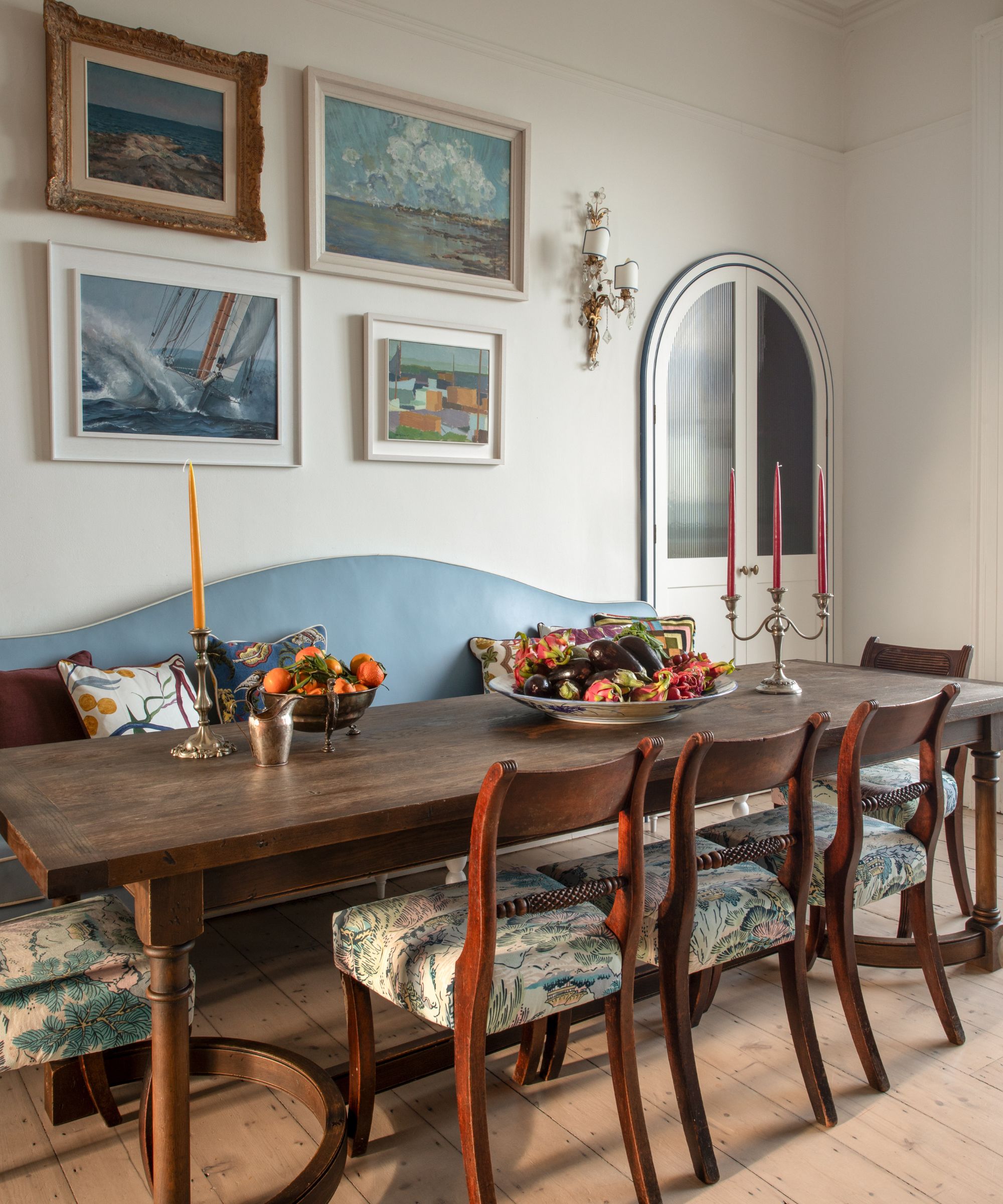
The designer behind this sweet dining nook knew to keep the walls plain white to allow the antique table and chairs, blue banquette seat, and arched cabinetry to shine.
When every piece is chosen because it’s exciting and special, the overall scheme can begin to feel too much. The solution, designers say, is to identify the room's anchor piece (or pieces) before layering anything else in.
'I always tell clients to decide what the room is actually about,' says Jen Dean of Jede Interiors. 'From there, we can decide what the anchor is. Once that’s clear, everything else should support it, not compete with it.'
That anchor piece might be an oversized couch, a hero wallpaper, an antique table, or a single standout piece of art. Interior designer Justine Wolman of Justine Wolman Interiors explains that she always starts by identifying 'the primary focal point or main vignette, then I build everything else to support it.'
'One (occasionally two) statement pieces is usually enough. When too many elements are competing for attention, the space can feel visually noisy and lack clarity, even if every individual piece is beautiful,' Justine continues.
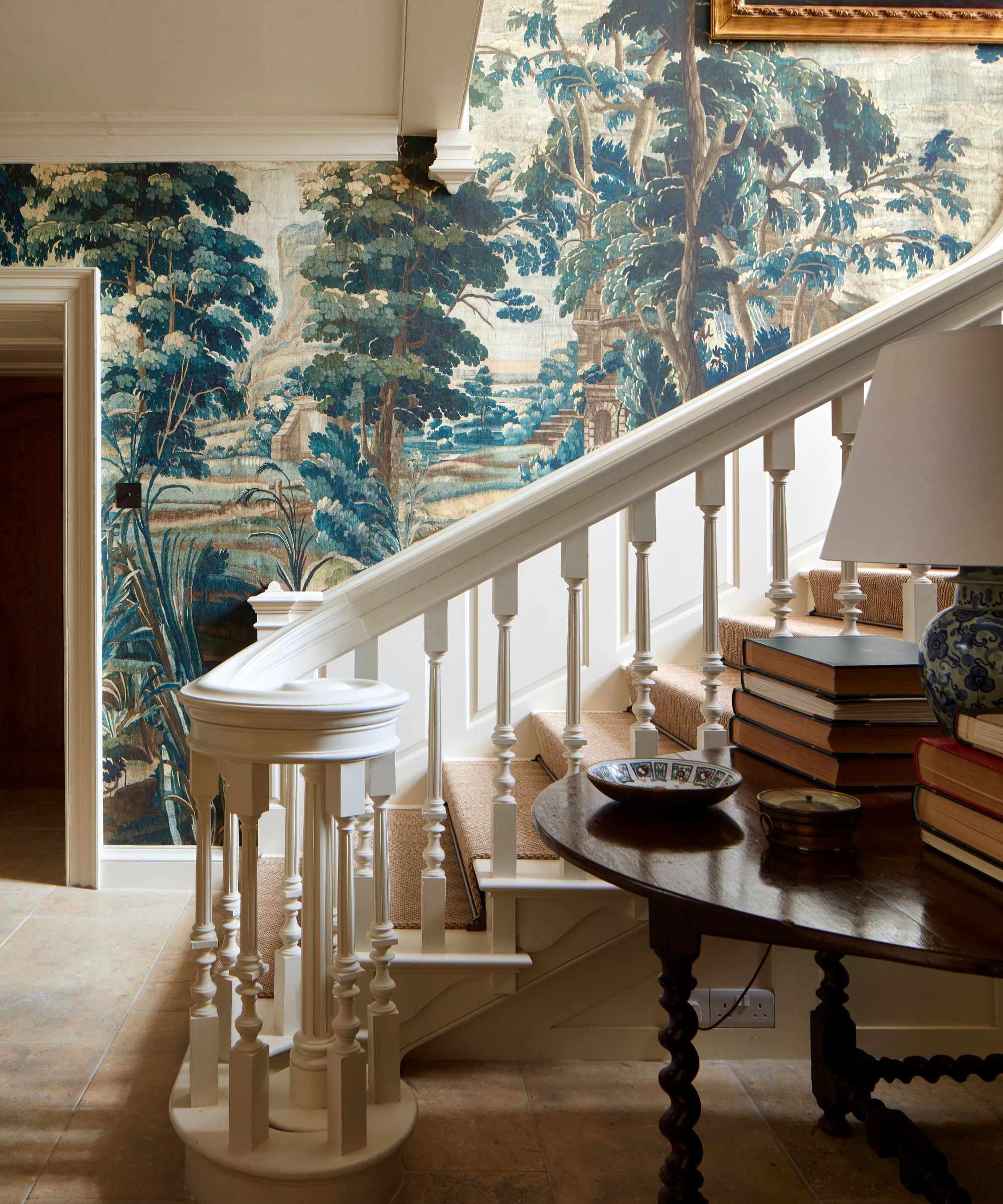
A mural wallpaper dominates this traditional entry, so the flooring and woodwork choices remain simple and understated in comparison.
'When too many statement elements compete for attention, a scheme can start to feel busy and unsettled rather than considered,' adds designer Sean Symington. 'Strong design works best when there’s a clear hierarchy with one or two pieces that lead the conversation like a hero print that’s then supported by quieter elements that allow them to breathe.'
Renowned designer Marie Flanigan echoes this principle, noting that 'when every element in a room tries to be the focal point, the space loses its sense of ease and intention.' Thoughtful interiors rely on hierarchy, she says, and there should be a 'clear lead, supported by quieter, more restrained moments.'
'Too many statement pieces create visual noise, leaving the eye with nowhere to rest and the room feeling unsettled rather than layered.'
2. Let Your Supporting Pieces Support
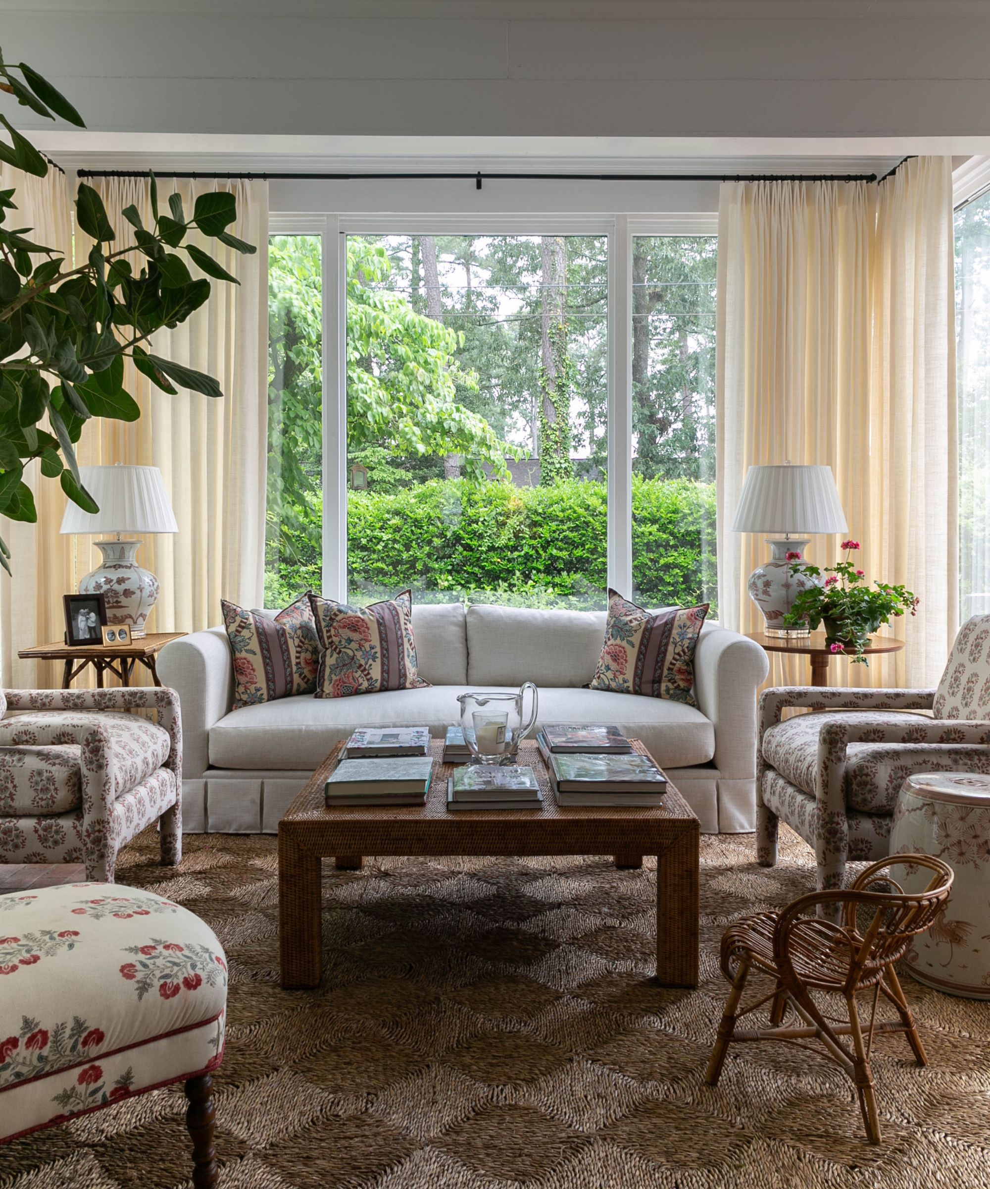
In this delicate sunroom, the view is the main character. The neutral seagrass rug anchors the scheme and allows the furniture to be bolder with botanical prints.
Once a clear focal point has been established, the next step is ensuring everything else plays its role well. That doesn’t mean stripping a home of its character – it means understanding the importance of balance.
'The secret to designing a cohesive space is letting one or two pieces in each category (e.g., lighting, furniture, decor) take center stage while everything else plays a supporting role,' Kathy Kuo explains. 'For example, if you have a gorgeous sculptural chandelier, pair it with timeless, streamlined sconces and lamps, or let an alluring velvet tufted sofa be the leading lady and keep your accent chairs simple and classic.'
Kailee Blalock of House of Hive Design Co. describes this as visual pacing. 'A common misstep in contemporary interiors is the overuse of statement pieces without establishing hierarchy,' she says.
'There should be a dominant focal point, secondary elements that reinforce it, and quieter components that allow the eye to rest. Without this structure, a room feels visually noisy rather than layered.'
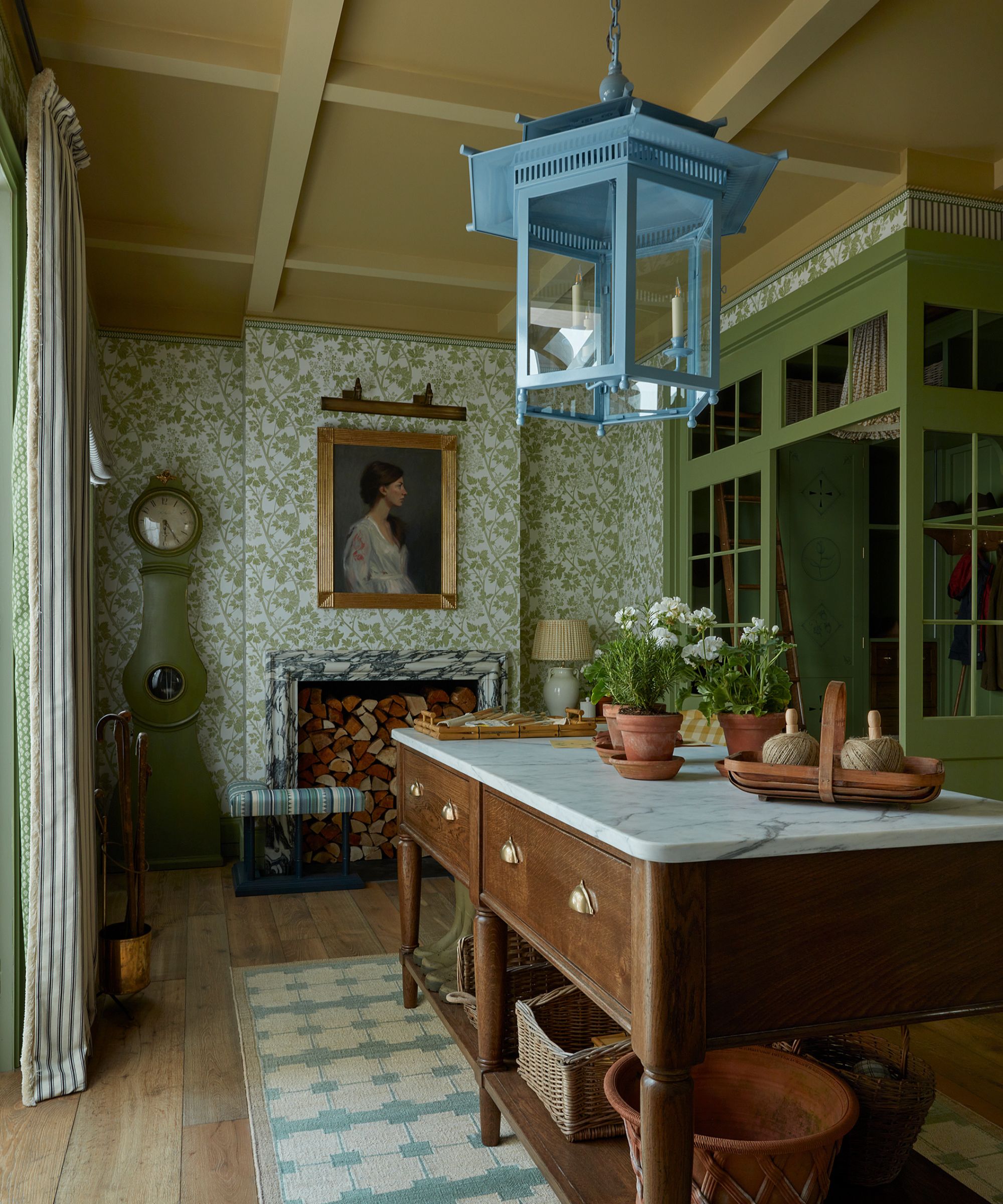
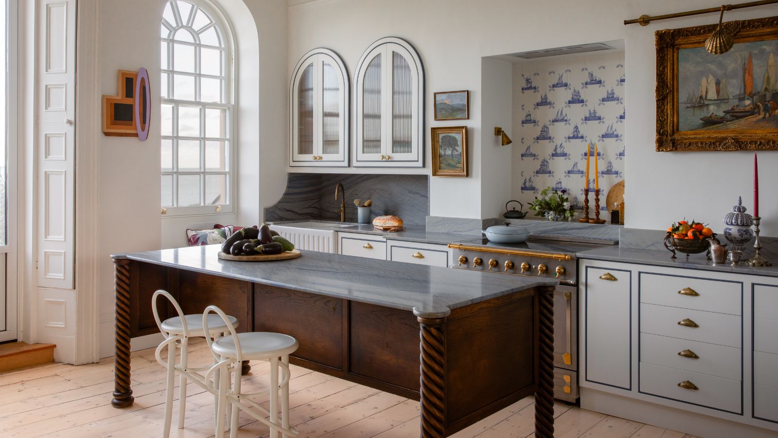
As seen as last year's WOWhouse, this more is more kitchen balances color and pattern well thanks to the restricted palette and a vibrant pop of blue.
And as Marie Flanigan adds, restraint doesn’t dilute a scheme – it strengthens it.
'Dialing things back isn’t about stripping a room of character, but refining what matters most,' Marie explains. 'By choosing one or two elements to lead, the remaining pieces can soften and support through tone, texture, and craftsmanship. The result is a space that feels calm, balanced, and timeless rather than busy or overworked.'
'Dialing back does not diminish personality; it strengthens clarity and ensures the statement pieces that remain feel deliberate rather than accidental,' Kailee adds. 'Repetition of subtle colors or forms creates cohesion, while negative space provides balance.'
3. Perfect the Art of Negative Space
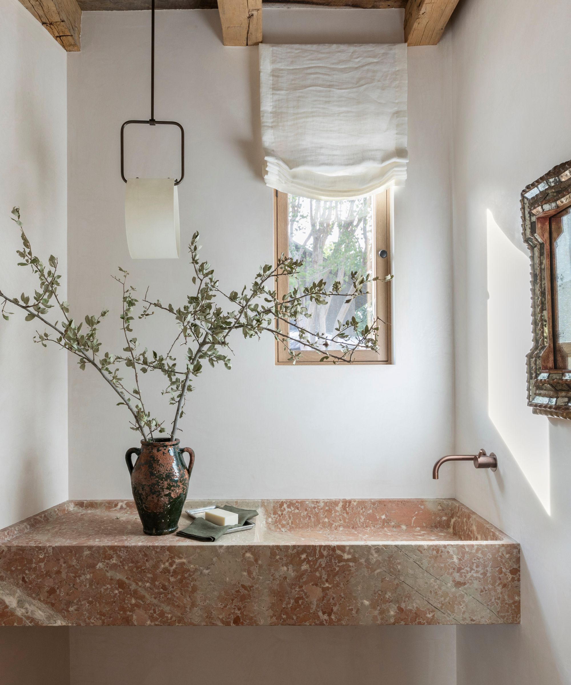
To let the pink marble do the talking, Marie Flanigan washed the walls in white paint and left plenty of negative space while still accenting with special touches like the relaxed linen blind and vintage mirror.
Even with a clear main character and a well-selected supporting cast, there’s one final principle that makes all the difference: protecting negative space.
Filling every corner doesn’t necessarily make a space feel richer. Erin Hackett Nordholt of Hackett House Studio explains that instead, it actually becomes diluted.
'I’m always paying close attention to negative space, because the eye needs somewhere to rest,' she explains. 'That pause is what allows a true 'main character' to stand out in proportion with its intended use. Restraint is one of the hardest disciplines in any creative field, but it’s also the most powerful. Without it, nothing gets the chance to really speak!'
Giving a space some breathing room also improves how a space functions. Justine Wolman notes that allowing 'quieter supporting pieces, negative space, and thoughtful layout lets the main elements shine while improving flow and livability.'
Often, this means editing back. Allowing some blank wall space, resisting the urge to fill every empty surface, and allowing furniture to sit comfortably within a space rather than trying to fill every corner.
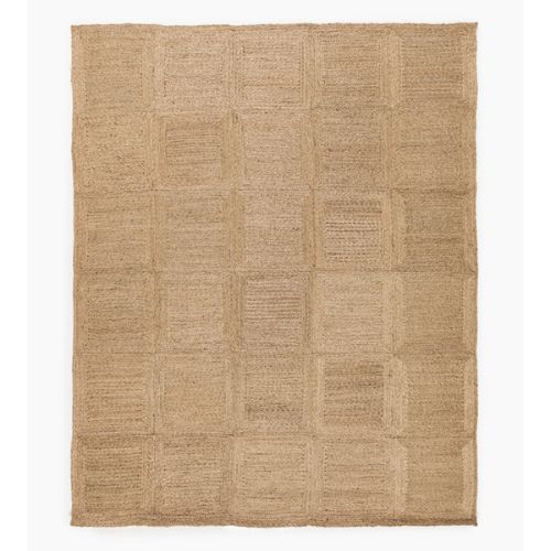
If you’re looking for a warm layer that lets bolder pieces shine, this handwoven jute rug is exactly the kind designers rely on. It’s the sort of foundational piece that anchors a room yet is versatile enough to sit beneath a statement sofa or patterned wallpaper without competing for attention.

This vintage-style painting proves that personality doesn’t need bold color to make an impact. Designed by Heidi Caillier, the muted palette gives it a collected, storied feel, making it a charming focal point either hung solo or as part of a pared-back gallery wall.
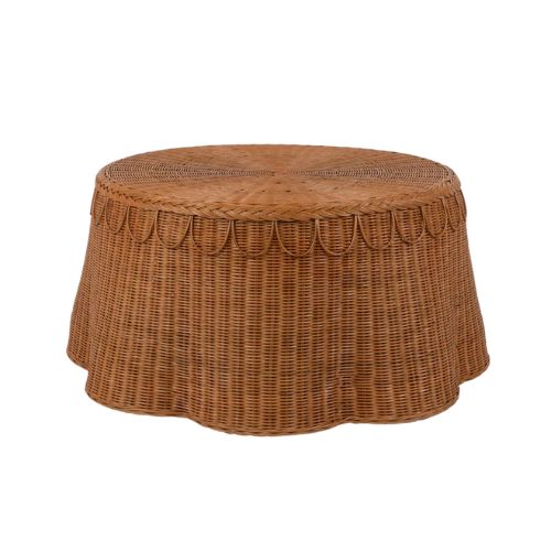
With its handwoven detailing and sculptural, scalloped edge, this coffee table brings shape and craftsmanship to a space. The warm rattan texture keeps it grounded, while the silhouette adds intrigue. It’s a perfect example of a supporting piece that still feels special.
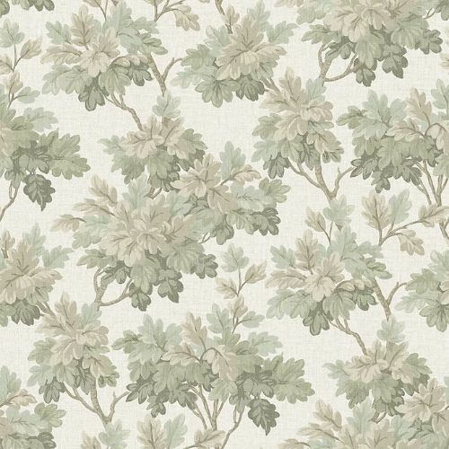
The trailing botanical motif of this wallpaper has movement and romance, but the restrained color palette still gives your space room to breathe. Paired with simple upholstery and natural materials, it becomes a confident hero print rather than a competing voice.
'Good design has hierarchy,' says Jen. 'If a room feels chaotic, editing one major element often does more than tweaking ten small ones,' she advises. As Jen explains, pairing back and refining your space isn't about a total overhaul or letting go of all your statement pieces. It’s about being clear on what deserves the spotlight and having the discipline to let that piece hold its own.

Charlotte is the style and trends editor at Homes and Gardens and has been with the team since Christmas 2023. Following a 5 year career in Fashion, she has worked at many women's glossy magazines including Grazia, Stylist, and Hello!, and as Interiors Editor for British heritage department store Liberty. Her role at H&G fuses her love of style with her passion for interior design, and she is currently undergoing her second home renovation - you can follow her journey over on @olbyhome
