What is the most stressful color? The one shade to use with caution
Red is considered the most stressful color, influencing everything from our behavior to our decorating choices

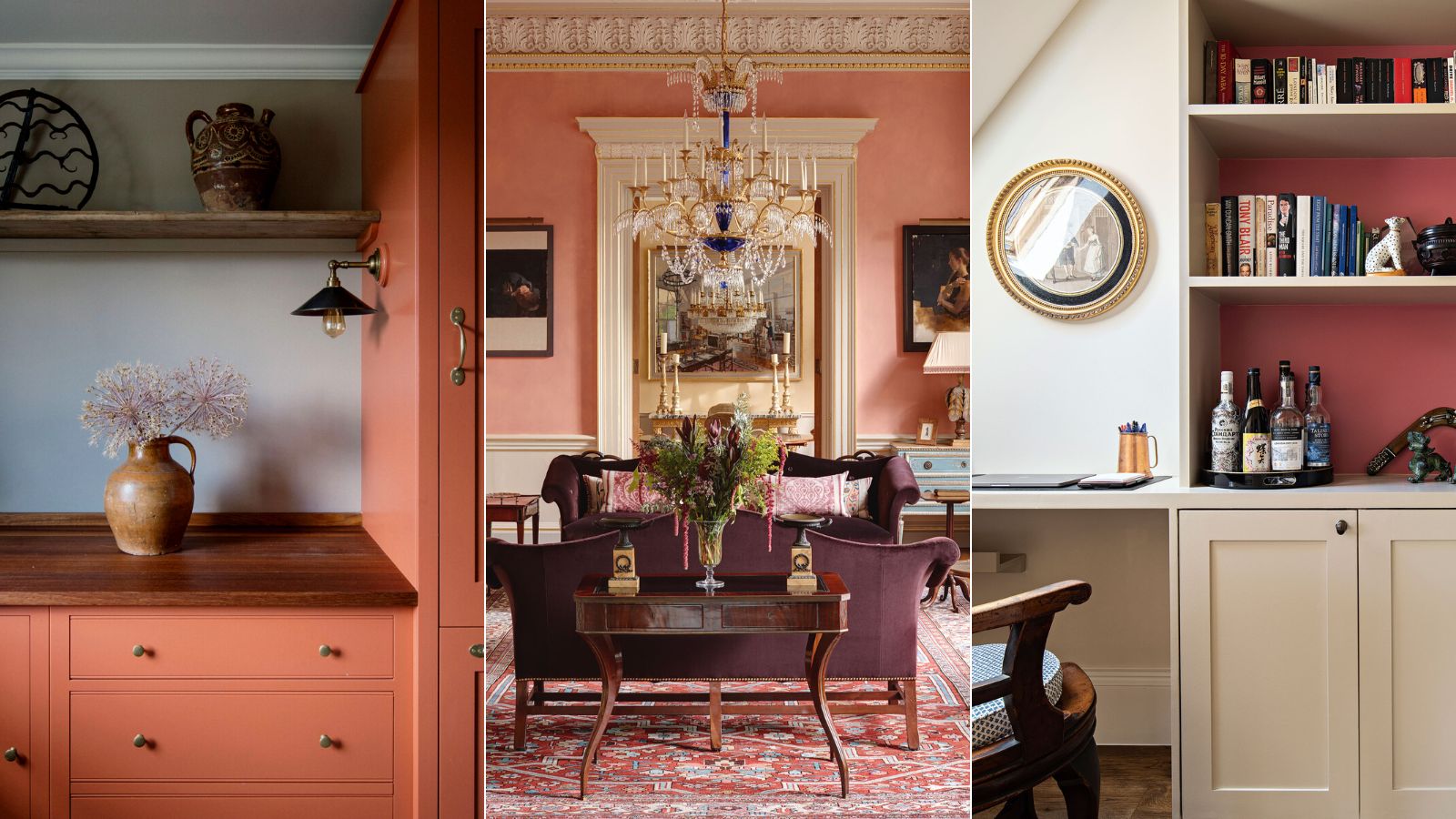
Design expertise in your inbox – from inspiring decorating ideas and beautiful celebrity homes to practical gardening advice and shopping round-ups.
You are now subscribed
Your newsletter sign-up was successful
Want to add more newsletters?
As anyone who has been through the process of searching for room colors will attest, choosing the right color for a room can be a minefield with endless choices and subtle nuances to understand and overcome.
But two common questions we often ask when deciding on the best room color ideas are; what is the most stressful color? and what colors cause anxiety? According to color psychologists, the most stressful and anxiety-inducing color is 'red'.
Red room ideas can be too intense for some people – could your red decor be one of the reasons why your friends hate your house? It reminds us of danger and is a color that makes you angry. It is strong, aggressive, and stimulating, which is why it is often used in warning signs and traffic signals. Physically, red can induce reactions in the body that are similar to stress responses, such as increased heart rate, heightened senses, and higher body temperature.
Article continues belowHowever, red isn't all bad, especially when used as an accent color in the home. It has many positive connotations, too. Red is the color that represents love, power, and motivation. This hue has the ability to grab attention, and evoke passion and sensuality – and has also been known to stimulate the production of melatonin and help with memory.
Here, color psychologists, decorators and experts reveal why red is the most stressful color – and how to decorate with red in a more pleasing and less stimulating way by using the color wheel to create strong color combinations, using red as an accent shade, and what variations to use to create a scheme that won't overwhelm.
What is the most stressful color?
For all its negative associations, it is undeniable that red is a color that we should pay heed to when it comes to our mindset as well as our decorating ideas. A noteworthy and historical color, scientists have more recently found evidence that over 40,000 years ago, Stone Age dwellers ground up red clay to make wall and body paint. Another use was protection in the afterlife.
Today, we've established that shades of red play a pivotal part in early development. Did you know that red is the first color that humans perceive, after black and white?
Design expertise in your inbox – from inspiring decorating ideas and beautiful celebrity homes to practical gardening advice and shopping round-ups.
Red is also a prominent color found at weddings, from Roman times when brides wore red shawls to show their love and loyalty, to present-day China, where red is a symbol of good fortune.
Over time, color psychologists have found that red can have a profound influence on our mood, perceptions, and even our actions. Decorating with red can even change your physiology and balance of hormones. So what is it about the shades of crimson, scarlet, and ruby that make them so highly potent when it comes to interior design?
Red, for all its design potential, is considered the most stressful color. 'It's the one color that we are unable to live within large quantities,' says Karen Haller, color psychology specialist, teacher, and best-selling author of The Little Book of Color.
'The most stressful color for you is entirely personal,' she says. 'It could be a color that conjures up a personal memory that has negative or unpleasant feelings. This might not necessarily be carmine. However, we respond to red in a more physical way – it can raise our pulse rate and put us into fight or flight mode.'
'It helps to be mindful of the visceral impact color can have on our mindset, and think about what color is good for health. For this reason, I would avoid red for a child’s bedroom,' Karen continues. 'You want them to go to sleep straight away, and the color red is saying "stay awake" – it’s bursting with energy, physically stimulating, and can cause an overactive imagination.'
But that is not to say that you shouldn't use red for your home decor ideas. In fact, the color red is enigmatic, and strong, and can be used to great effect. We asked some of our favorite interior designers about the best ways to use this controversial color with aplomb.
How to use red in the home
Earthy pinks – these natural hues, somewhere between red, pink and brown, conjure up warmth in any room and are reminiscent of late summer evening sunsets.
1. Decorate with an earthy rhubarb
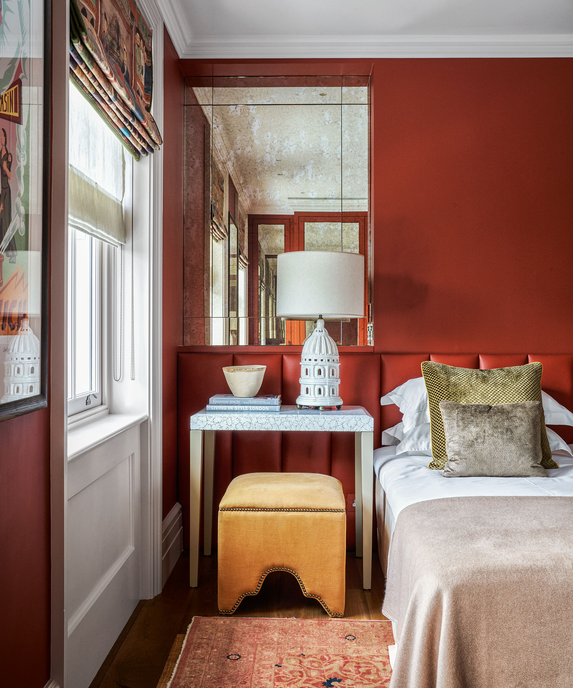
Temper down the color by only using it on the walls and painting the joinery in a fresh white, as shown here in this room by Georgie Wykeham. Toned down, earthy shades are considered some of the most relaxing colors to add to your home.
‘Rhubarb is my go-to color; added to a neutral scheme, it creates warmth, depth and a touch of the unexpected,' says Georgie Wykeham, founder, Georgie Wykeham Designs. 'Used on its own, it is a very easy color to live with and yet it also works beautifully with blues, greens, pinks and reds.’
2. Add depth and light
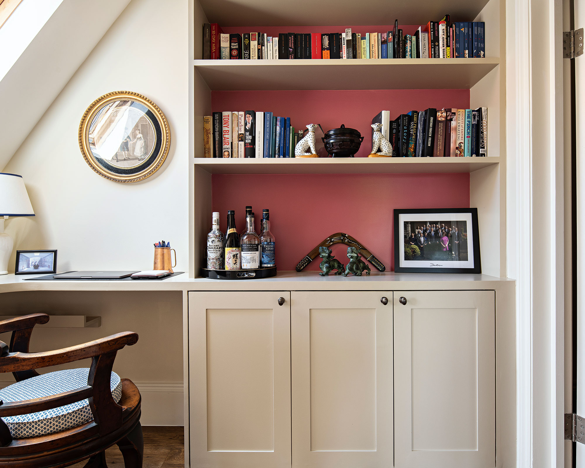
‘When colors hover between one shade and another they can take on interest and intrigue,' says Edward Bulmer, founder, Edward Bulmer Natural Paint. 'Our Etruscan Brown is so named to recognize that it owes as much to the cinnabar red of Etruscan fresco decoration as the earth tones of a classic brown. It gives you all the redness you need for a “red” room but in the evening light it pounds with the soft deep neutral appeal of brown, warm and chic.’
Conveying an unrivalled depth and light, we love this sophisticated tone. If this is too daring, then consider using this shade in smaller doses or in lesser used rooms to add an element of surprise.
3. Inform a distinctive note
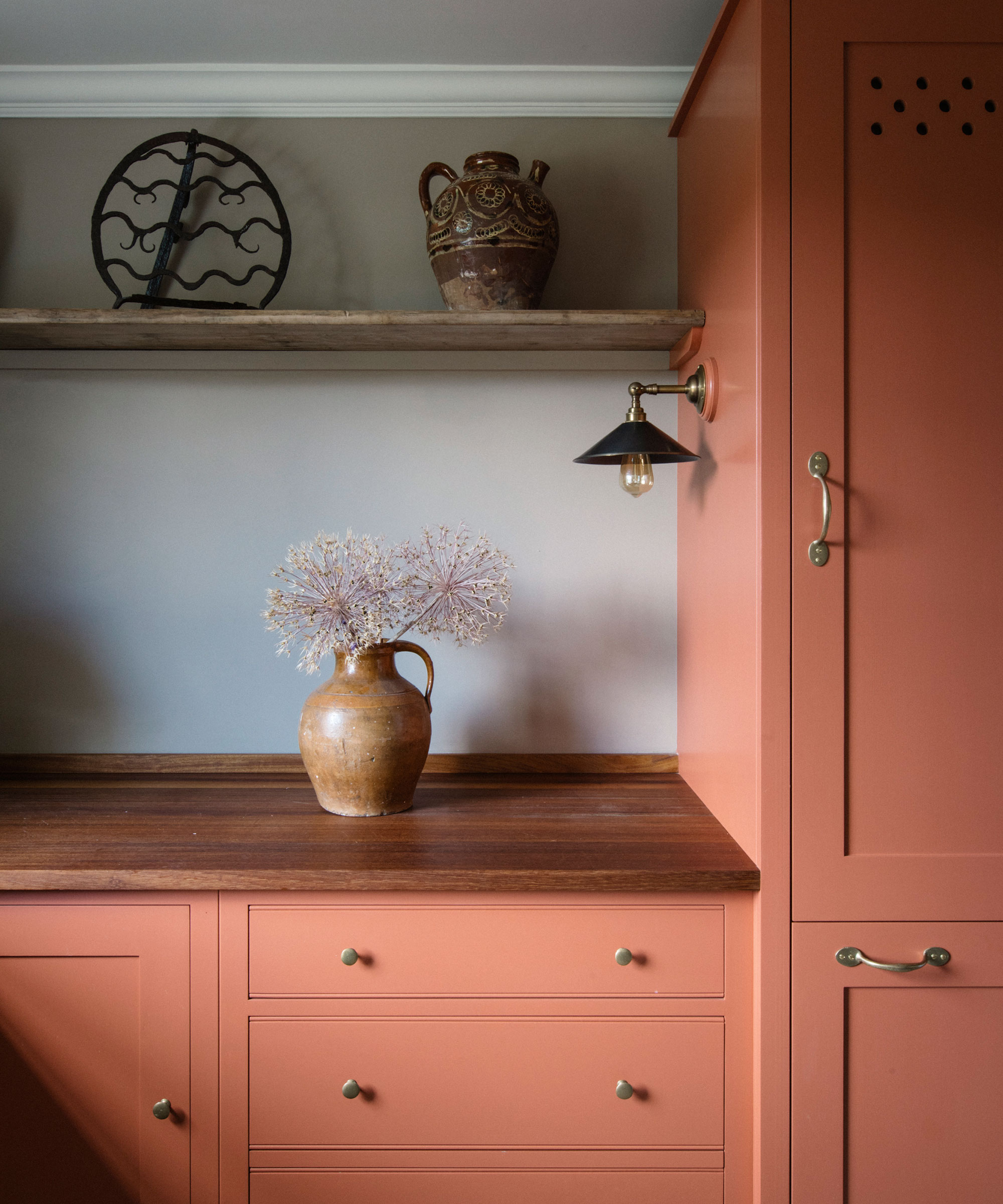
Max Rollitt brings his distinctive style of decoration to this Georgian rectory where the pantry is given a sense of grounding with a selection of antiques set against warm-colored kitchen cabinets.
‘These pinks work brilliantly to bring year-round warmth to dark or north-facing rooms,' says Max Rollitt, founder, Max Rollitt.
Be daring and decadent with your color combinations for rooms when red is involved. 'I recently used an earthy pink hue in a bathroom and paired it with a complementary cornflower blue.’
4. Use red-pink as a canvas for art
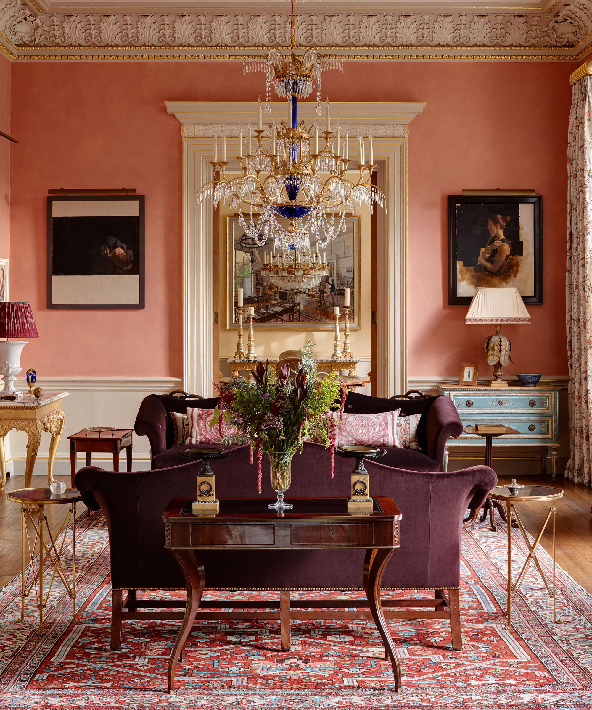
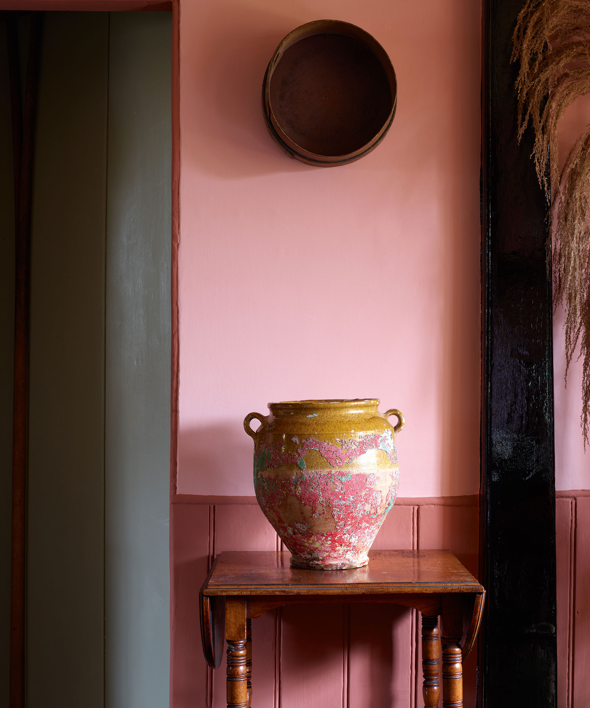
Providing a perfect backdrop for portraits by the artist Diarmuid Kelly, this elegant hue pairs with the cornice and panel details in this drawing room by Studio Indigo. Walls in Battlesden Pink, mixed by Studio Indigo and specialist painter Tony Malins.
‘Pink is my favourite color and a perfect backdrop to art,' says Mike Fisher, creative director and founder, Studio Indigo. 'When this color is layered and built up using many coats it gives the walls a sense of depth and movement which is particularly important in rooms that are flooded with light – the effect is the air seems to shimmer and sparkle.’

Jennifer is the Digital Editor at Homes & Gardens, bringing years of interiors experience across the US and UK. She has worked with leading publications, blending expertise in PR, marketing, social media, commercial strategy, and e-commerce. Jennifer has covered every corner of the home – curating projects from top interior designers, sourcing celebrity properties, reviewing appliances, and delivering timely news. Now, she channels her digital skills into shaping the world’s leading interiors website.