Design DNA: Take a tour of a joyful technicolor kitchen-diner and discover the design details behind Studio Hollond's personality-packed space
Designer Phoebe Hollond breaks down the key design choices behind this colorful, characterful open-plan kitchen

Design expertise in your inbox – from inspiring decorating ideas and beautiful celebrity homes to practical gardening advice and shopping round-ups.
You are now subscribed
Your newsletter sign-up was successful
Want to add more newsletters?
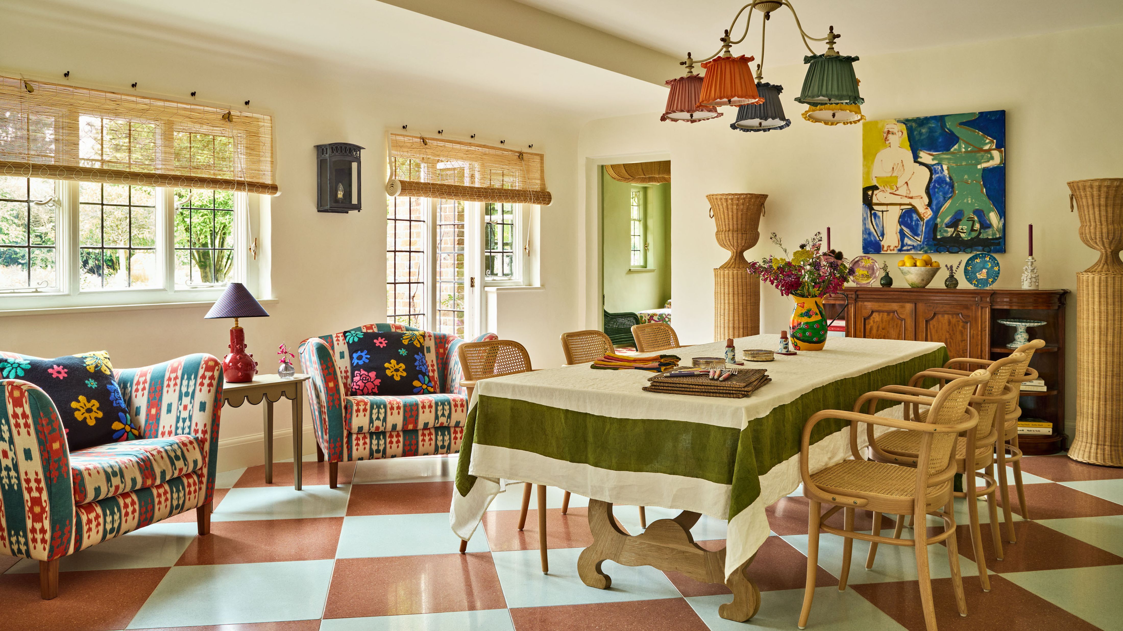
There’s a fine line between chaotic and charming. Most personality-packed interiors veer into the former. But done right, a colorful, dynamic room can feel just as layered, intentional, and sophisticated as one that plays it safe. That balance comes to life in a sun-drenched kitchen-breakfast room in Sussex, designed by Phoebe Hollond of Studio Hollond.
Like the people that live in it, homes have DNA – and this one’s reads warm, inviting, and lived-in. So what’s the secret? Ahead, Phoebe decodes the five essential design elements that infuse this joyful open-plan kitchen with conversation and comfort – plus how to channel them in your own.
Historical references
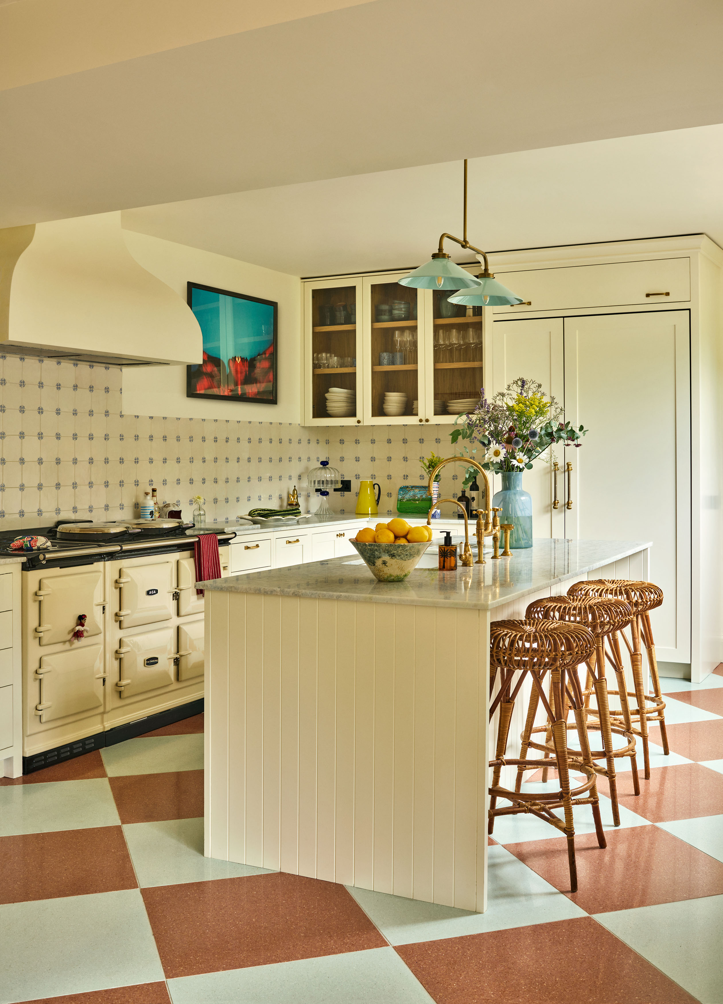
In with the old and out with the new – Phoebe leaned into decorating with antiques and bringing in vintage elements to make the space feel more youthful, not less. What might typically read as overly-traditional instead became a grounding force against the light, fresh energy found elsewhere.
She points to the backsplash as a prime example: ‘The Douglas Watson tiles are historic, they really bring the kitchen back down to earth and create such a craftsmanship feeling,’ the designer tells Homes & Gardens.
And while recreating those exact tiles might be a heavier lift, there are other ways to channel that same effect. ‘I think that there are a lot of small details that can breathe life and soul into spaces,’ says Phoebe. 'Finding unique items from auction houses or online antique shops really helps add some personality and a sense that something is completely different that nobody else has.’ Even a few storied ceramics on a kitchen counter can do the trick.
Pattern play
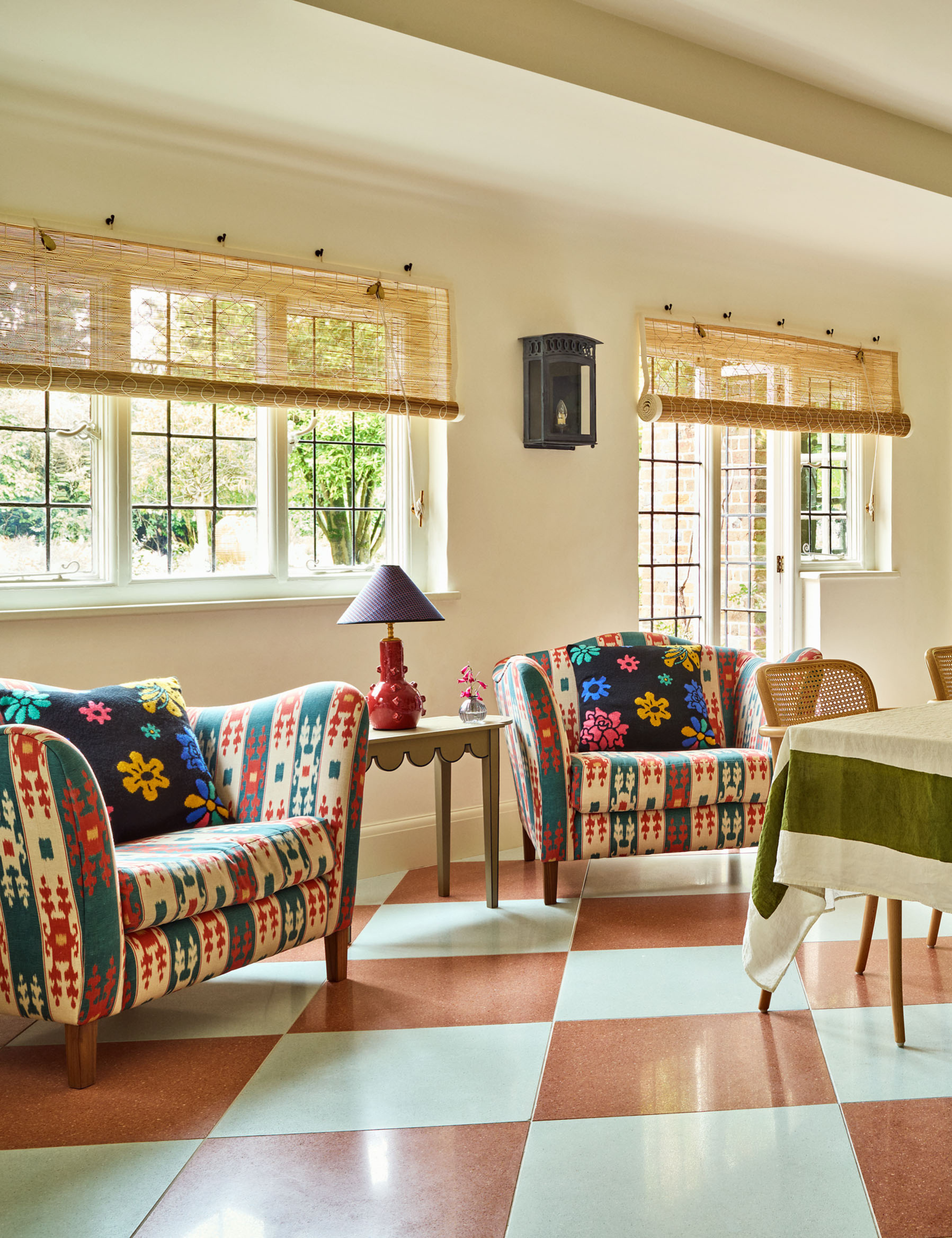
The ‘oversized, insanely comfortable chairs’ – as Phoebe describes them – are essential not only for their lounge-worthy feel but also for the visual contrast they bring. Their bold, multi-colored pattern pops against the woven, airy dining chairs at the center of the room, creating a layered tension that feels considered, not chaotic. That’s key, especially in a space already grounded by a strong built-in pattern like the checkerboard terrazzo floor Phoebe installed here.
Even if you’re mixing patterns and prints – curtains, cushions, occasional seating, no matter – Phoebe says not to hold back. ‘Be brave, mixing patterns is such fun,’ she encourages.
‘I don’t think there are rules, but I do think when you mix patterns it’s important to think about the scale of each one – the more diverse in scale, the better. It’s important to create a narrative between them and everything else that is going on in the room.’
‘I think that there are a lot of small details that can breathe life and soul into spaces’
Phoebe Hollond founder of Studio Hollond
Elements of surprise
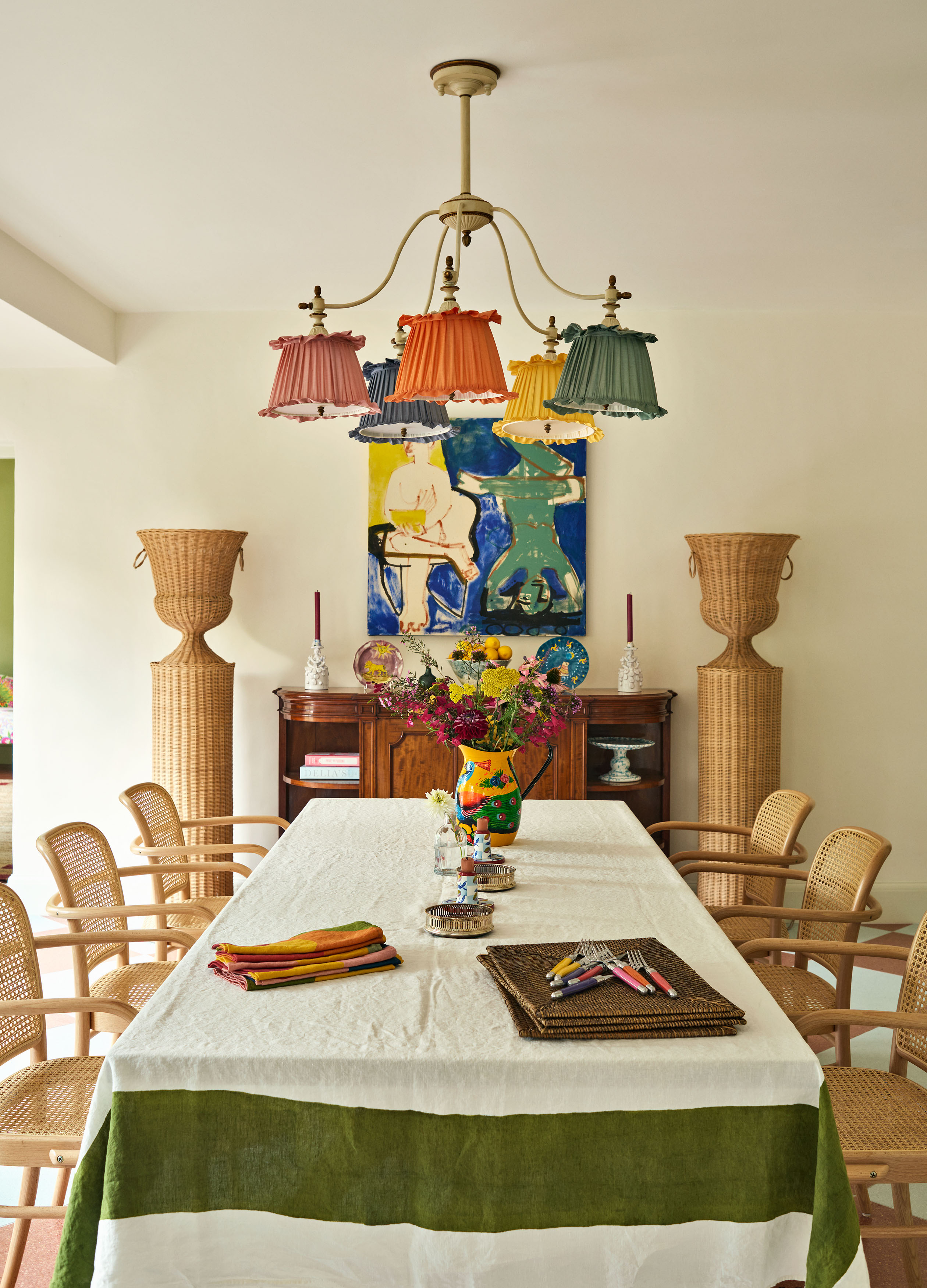
Would you think of having an Atelier Vime rattan urn–pedestal combo in your breakfast area? Probably not. But in this open-concept kitchen and dining space, surprise abounds – look left, right, up, or down, and you’ll find something unexpected.
Adding strategic twists, Phoebe suggests, is what makes a room memorable. Think: a scalloped wooden side table styled with a purple-and-red table lamp, or an unlikely hero piece like a multicolored, multi-shaded pendant light.
One such piece is the Mercury Pendant, designed by Studio Hollond itself – and one of Phoebe’s favorites in the entire project. ‘The various silk shades are reminiscent of a candy bar and bring such joy and humor to the space,’ she says.
‘I want people to smile, to feel comfortable, to feel joy and happiness,’ Phoebe explains. A little irreverence, it turns out, goes a long way in making a space feel alive.
Synergy with the outdoors
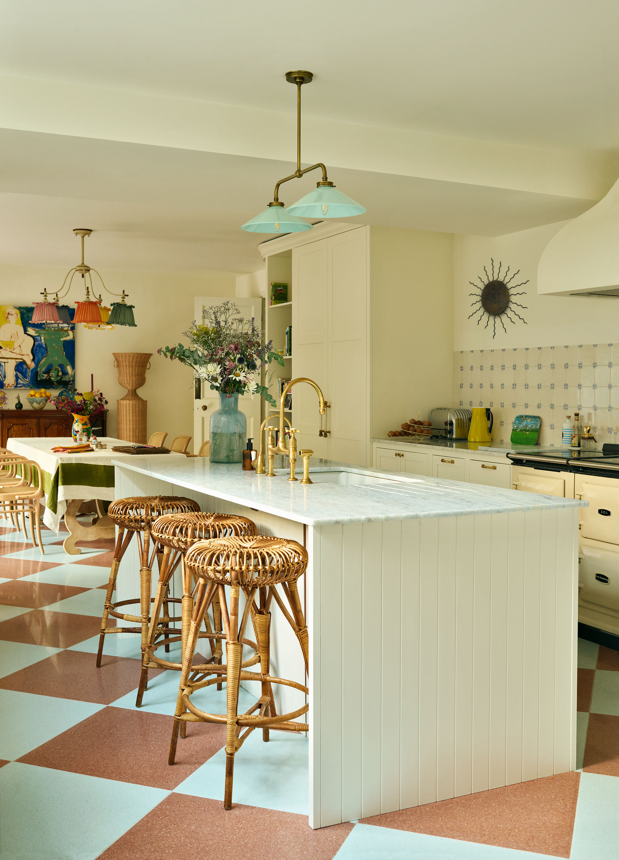
When you’ve got large, light-filled windows, you naturally find yourself gazing out of them. In this sun-drenched part of the home, Phoebe wanted to echo the idyllic scenes just beyond – blue skies, lush greenery – in ways so subtle they feel subconscious.
‘We wanted the kitchen to feel very fresh and light and welcoming, so we painted the walls a beautiful bright white with a green tint in it to bring the outside in.’ Even the worktops carry that softness, crafted from a cloudlike blue marble.
To avoid interrupting the view, Phoebe chose breezy, natural weave chik blinds for an organic feel and to coordinate with the garden outside. ‘It’s such a nice detail to use these blinds when overlooking a wonderful green space as it creates a wonderful synergy with the outdoors,' she explains.
‘I want people to smile, to feel comfortable, to feel joy and happiness'
Phoebe Hollond founder of Studio Hollond
Petite punches
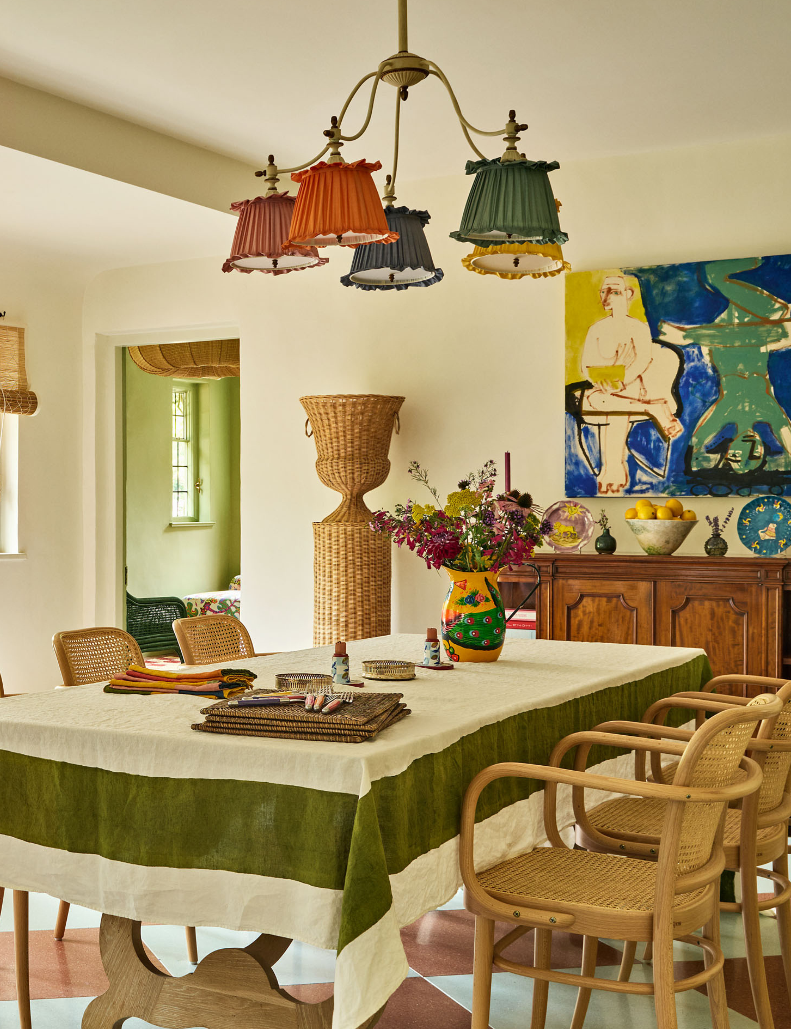
Don’t underestimate the small stuff – petite interior accents often do more heavy lifting than statement pieces. While commissioning oversized abstract art can be a fast track to injecting color or drama, it’s the little moments that make a space feel layered and lived in.
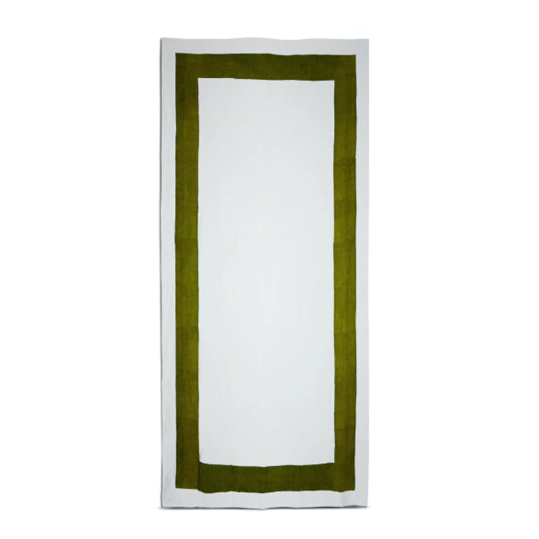
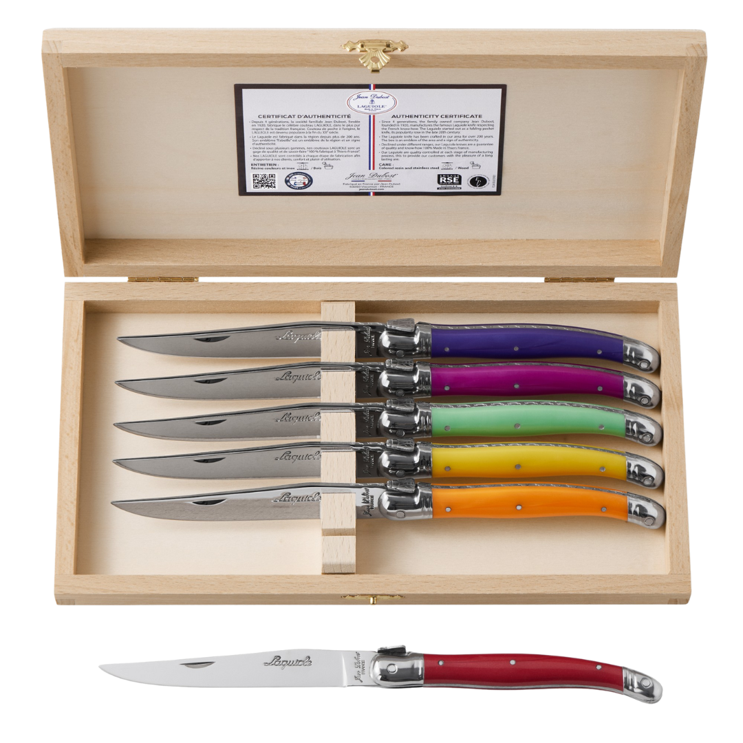
‘Investing in lovely, unique and colorful cutlery, table linen’ – like the one blanketing the breakfast table from Summerill & Bishop – ‘and jugs always help add character to dining spaces, they bring so much personality without having walls adorned with artwork,’ says Phoebe.
The same goes for color more broadly. ‘If one is nervous about it, then it is better to start with just pops of color, whether this is on lampshades or cushions’ – calling these smaller touches ‘a great way to ease yourself into a lively home!’ It’s a thoughtful way to sidestep kitsch and add vibrancy, without going fully off the deep end.
The edit
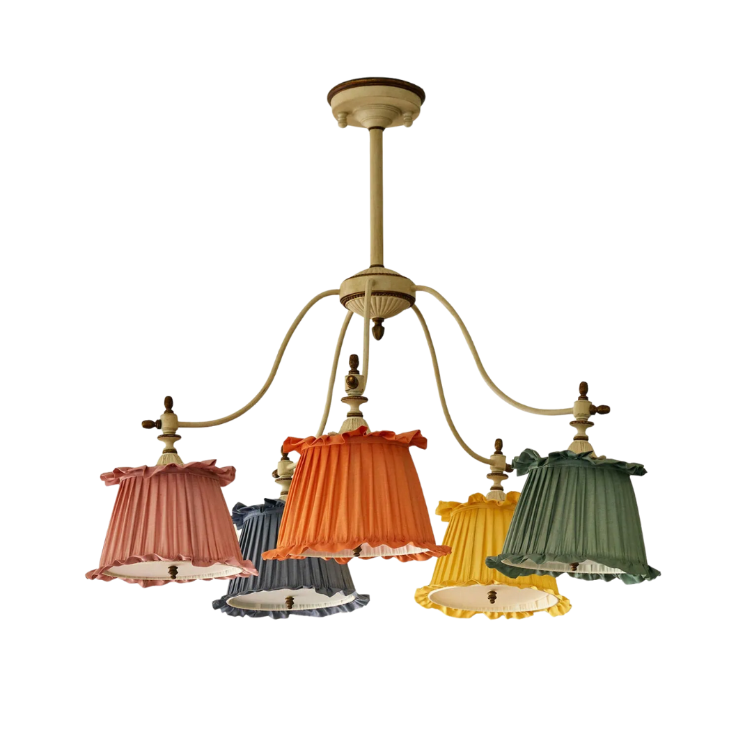
Five shades, five saturated hues – it's hard to dispute the hero status of this candy-wrapper effect. The fixture's off-white metal frame grounds the palette, just so. Hang the Mercury Pendant over a breakfast table or anywhere craving levity. 'It is so surprising and uplifting,' says Phoebe.
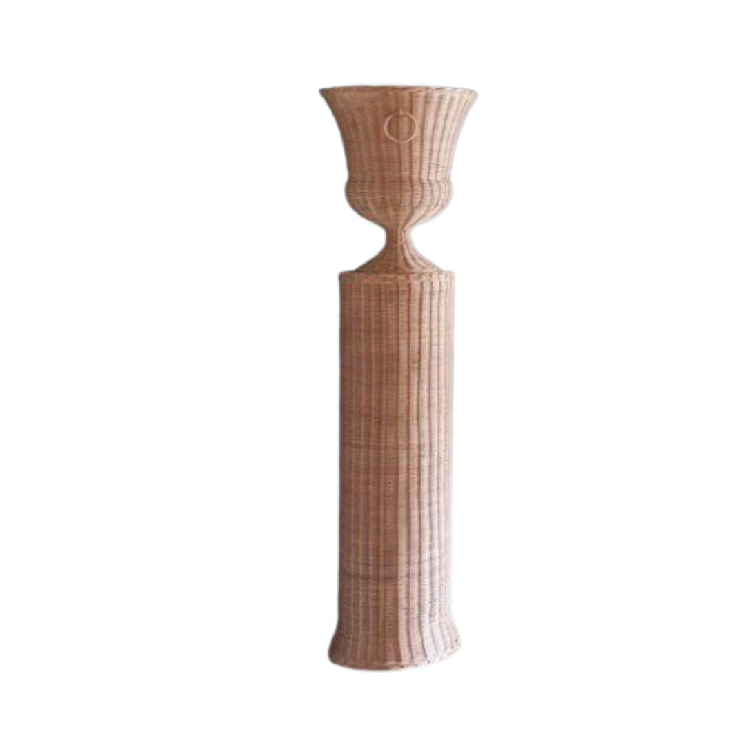
A silhouette worthy of sculpture, rendered in rattan. This pedestal-and-vase pairing has been an Atelier Vime design signature since 1940. Handmade in France, this classic accent looks just as well gracing a Provençal garden as it does in a layered breakfast room. Consider buying a pair to flank a statement art piece like Phoebe. ‘We love introducing these woven items to create warmth, depth, and texture to a space,' she says.

Notice the wall-mounted sunburst shining over the kitchen – a small but striking touch done in the classic Spanish style that gained popularity during the Brutalist wave of the 1940s. This one’s a replica, which gives you a bit of creative license: mount it to the ceiling as a light or use it on the wall as a sculptural accent. For a look closest to the one in this Sussex property, go for a matte or antique black finish.
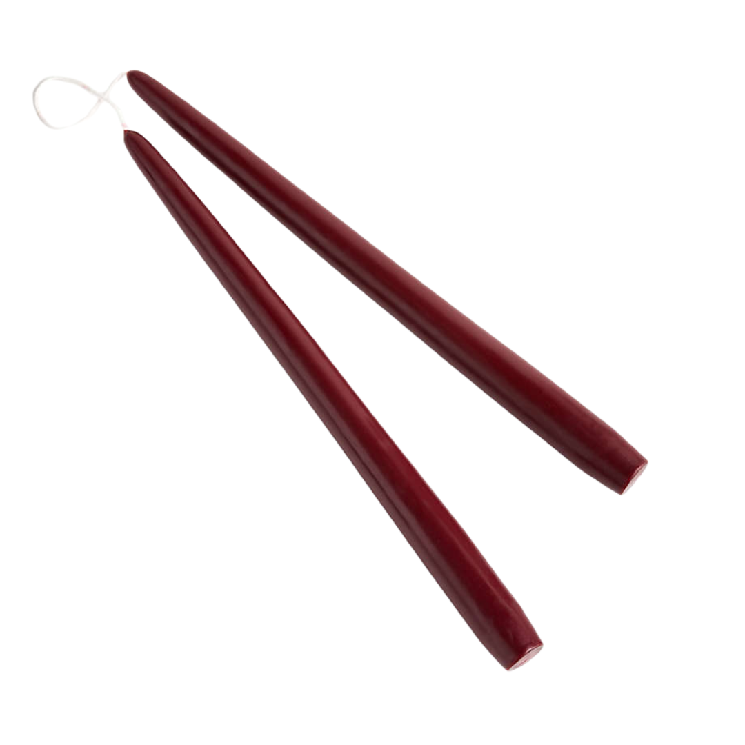
You might not immediately clock the burgundy taper candles tucked into the far corner of the breakfast nook – but they’re there, and they’re adding to those pops of color Phoebe talks of. Pair with whatever candle holders you already own to give old staples a brand new vibe.
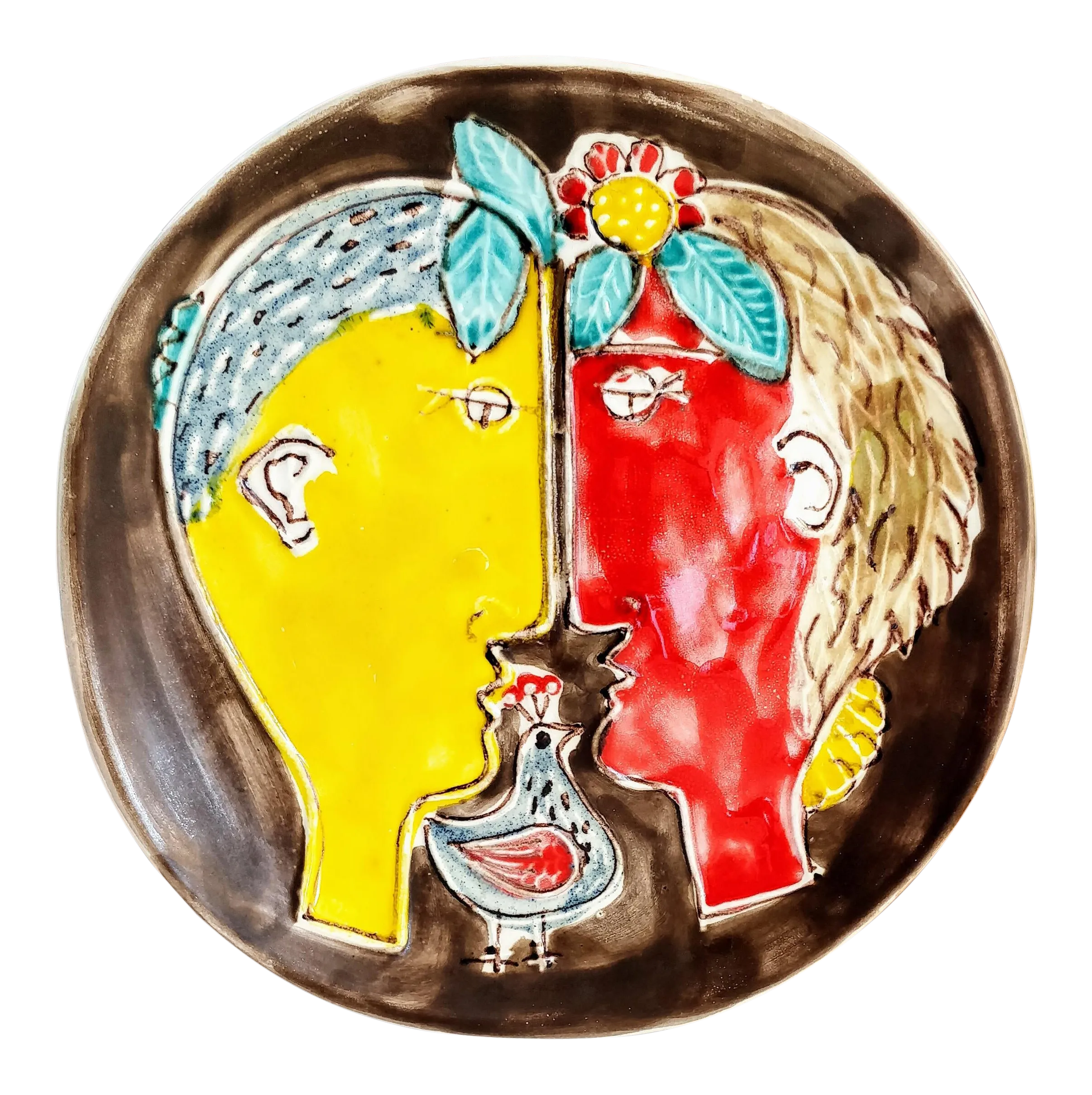
This vintage painted porcelain plate depicting a Greek god and goddess is the story every room needs. It’s got the presence of a full-scale painting, minus the framing fuss or gallery price. Style it casually on a countertop, or mount it to the wall like the art it clearly is.
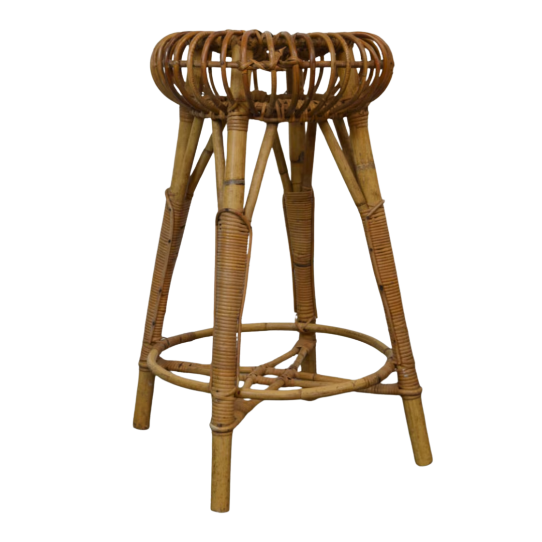
The iconic ‘lobster pot’ pendant by Mario Albini is hard to come by, but we tracked one down on Etsy. All sun-drenched swank and 1960s nostalgia, it brings just the right touch of breezy irreverence. Done in bamboo, it’s a perfectly imperfect foil to a polished countertop – and a smart echo if you’re already working with natural textures elsewhere.
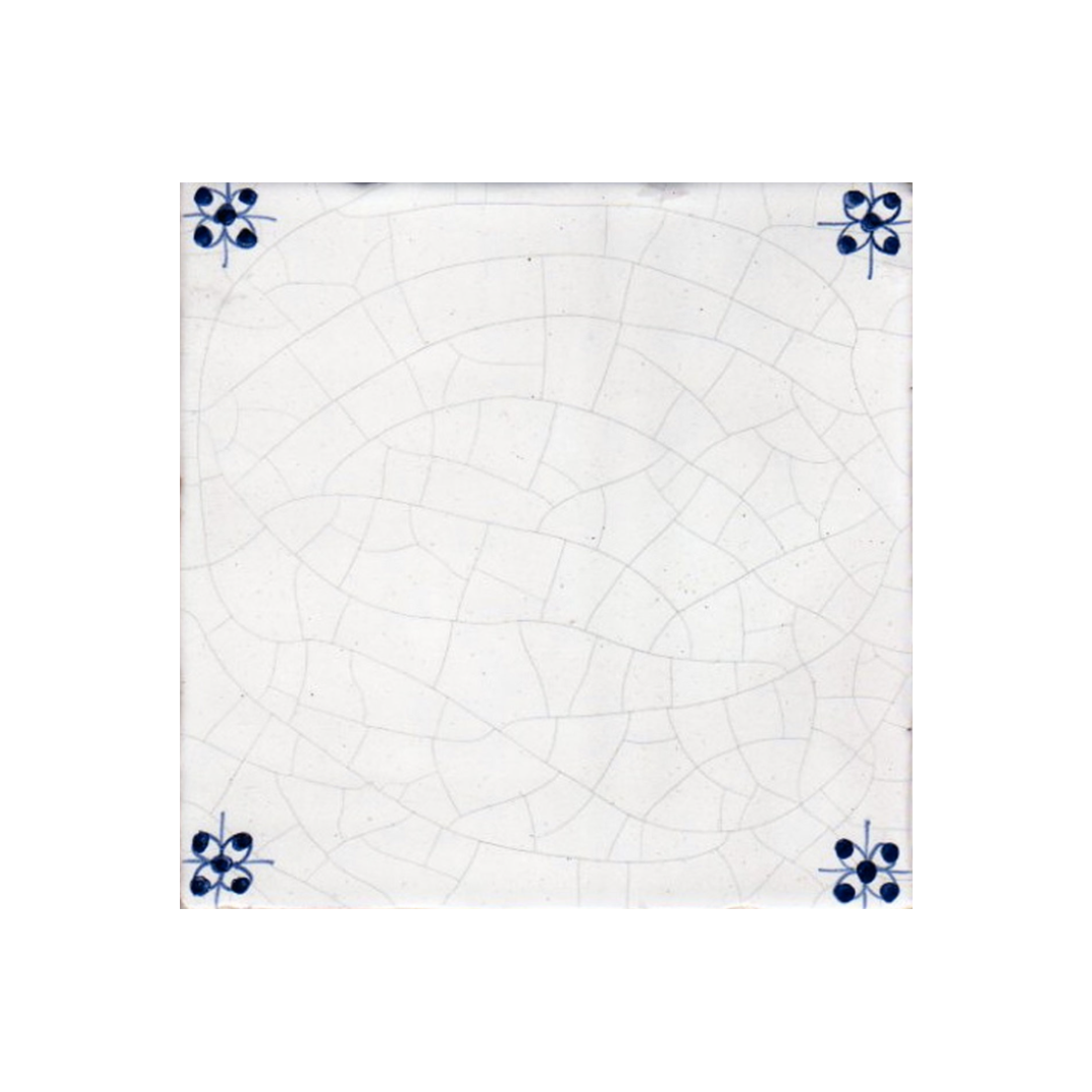
Delft-style corners are forever charming – especially when they're hand-glazed by Douglas Watson Studio. These subtly decorated squares bring a hint of history while keeping the room feeling upbeat and fresh. Echo their bright base in your kitchen cabinetry and wall color for a soft, tonal palette.
What are the key elements of a well-designed open-plan kitchen?
When a room pulls double duty, mastering flow is everything. It should function as two distinct spaces that also converge seamlessly. The easiest way to create that cohesion, Phoebe says, is through the flooring. In this project, a checkerboard terrazzo runs throughout, grounding the open-plan layout for everyday living.
Beyond layout, nothing should feel too precious. Love vintage furniture, but have small children? Great – just opt for a silhouette substantial enough to take a tumble. ‘It needs to provide the space to cook, to eat, to entertain, to relax – and this space does exactly that,’ says Phoebe.
How do you create a balanced culinary space?
Cooking and eating are both activities where you want state-of-the-art function and a sense of nostalgia – precision (food should ideally taste good) and emotion (reminding you of something sweet), all at once. It’s often rooted in tradition, so your design should reflect that balance.
Consider pairing high-performance appliances with pieces that feel storied. In this Sussex space, a sleek, blue-shaded double pendant hovers above a barely-blue kitchen island, subtly offsetting the antique-style backsplash. It’s this kind of juxtaposition that keeps a kitchen feeling both grounded and forward-looking.
What design choices make this room timeless?
Even the most tasteful trends will eventually date themselves – which is why a room should never be just one thing. A space filled entirely with period pieces starts to read like an antique shop; a space built only on trends won’t age well.
The key is layering: something contemporary, something inherited, something uniquely yours. Timelessness is less about avoiding trends and more about refusing to commit to any one era too strongly. That’s why this Studio Hollond project works – it resists being pinned to a single moment in time.
What should every sociable kitchen include?
Beyond the obvious checklist – a table, enough cutlery – if Phoebe’s Sussex project is any indication, the real answer is seating. And not just enough of it, but supremely comfortable seating. Yes, you need dining chairs to gather around the table, but don’t be afraid to layer in a pair of armchairs too. It invites guests, friends, and family to shift around, settle in, and stay a while. The result is a more comfortable home and a far more natural flow of conversation.
If you remember nothing else about Studio Hollond’s farmhouse project, let it be this: design is dialogue – between patterns, palettes, and pieces with a past. That conversation is what gives the room its spirit, its rhythm, its sense of self. It’s what shapes the design DNA.
Design DNA is the Homes & Gardens series that breaks down beautiful rooms into their essential elements. Each installment dissects one interior and shows readers exactly what makes it work, from the anchor furniture and layout choices to color, lighting, and styling details.

Julia Demer is a New York–based Style Editor at Homes & Gardens with a sharp eye for where fashion meets interiors. Having cut her teeth at L’Officiel USA and The Row before pivoting into homes, she believes great style is universal – whether it’s a perfect outfit, a stunning room, or the ultimate set of sheets. Passionate about art, travel, and pop culture, Julia brings a global, insider perspective to every story.
