What are the most relaxing colors? Color psychologists urge us to use these shades to cut the chaos
Escape the stress of daily life by using these relaxing colors around your home

Design expertise in your inbox – from inspiring decorating ideas and beautiful celebrity homes to practical gardening advice and shopping round-ups.
You are now subscribed
Your newsletter sign-up was successful
Want to add more newsletters?
Turning our homes into relaxing sanctuaries is a common goal, so you might be wondering what are the most relaxing colors to include.
When it comes to room color ideas, it can be tempting to choose our favorite colors and call it a day, but taking the time to consider what psychological impacts colors could have is important for our mental wellbeing.
‘When we are feeling stressed or overwhelmed, colors that provide calming confidence and reduce our stimulation are great for taking the edge off and giving us the space to find serenity,’ explains Lee Chambers, psychologist and wellbeing consultant.
Article continues belowHere, color psychologists and paint experts have talked us through what color reduces stress in the home, and the one to avoid.
What are relaxing colors?
‘There are no “best’ colors for any room as it largely depends on the person’s comfort level and the colors they like to surround them with,’ explains Leatrice Eiseman, director of the Eiseman Center for Color Information & Training and executive director of the Pantone Color Institute. ‘What is best for one person, might not fit for everyone, especially if the color recommended is not a favorite of the person living in that bedroom.’
Saying that, however, there are some sure-fire schemes that are proven to be relaxing.
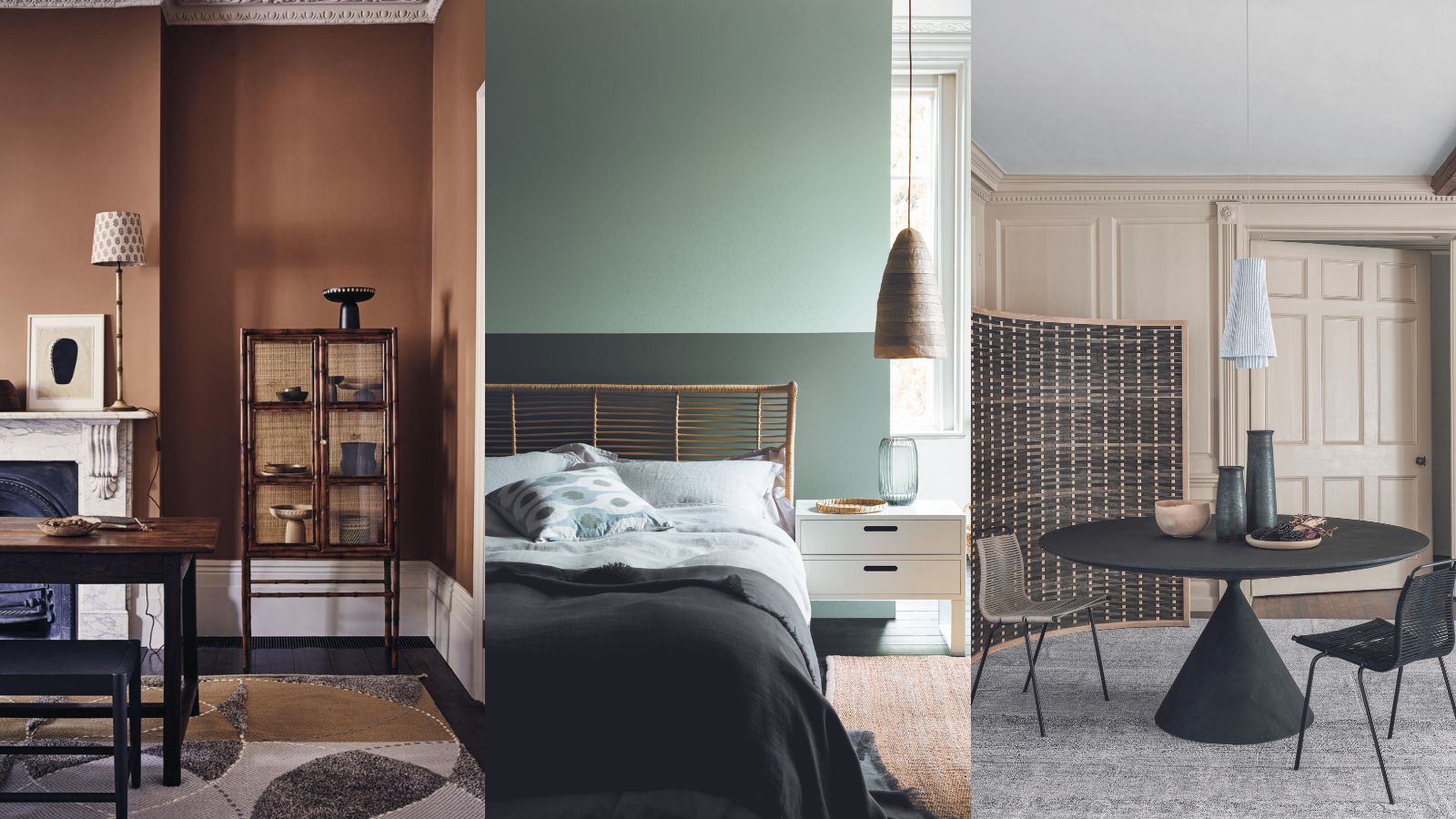
1. Use colors from nature – blues and greens
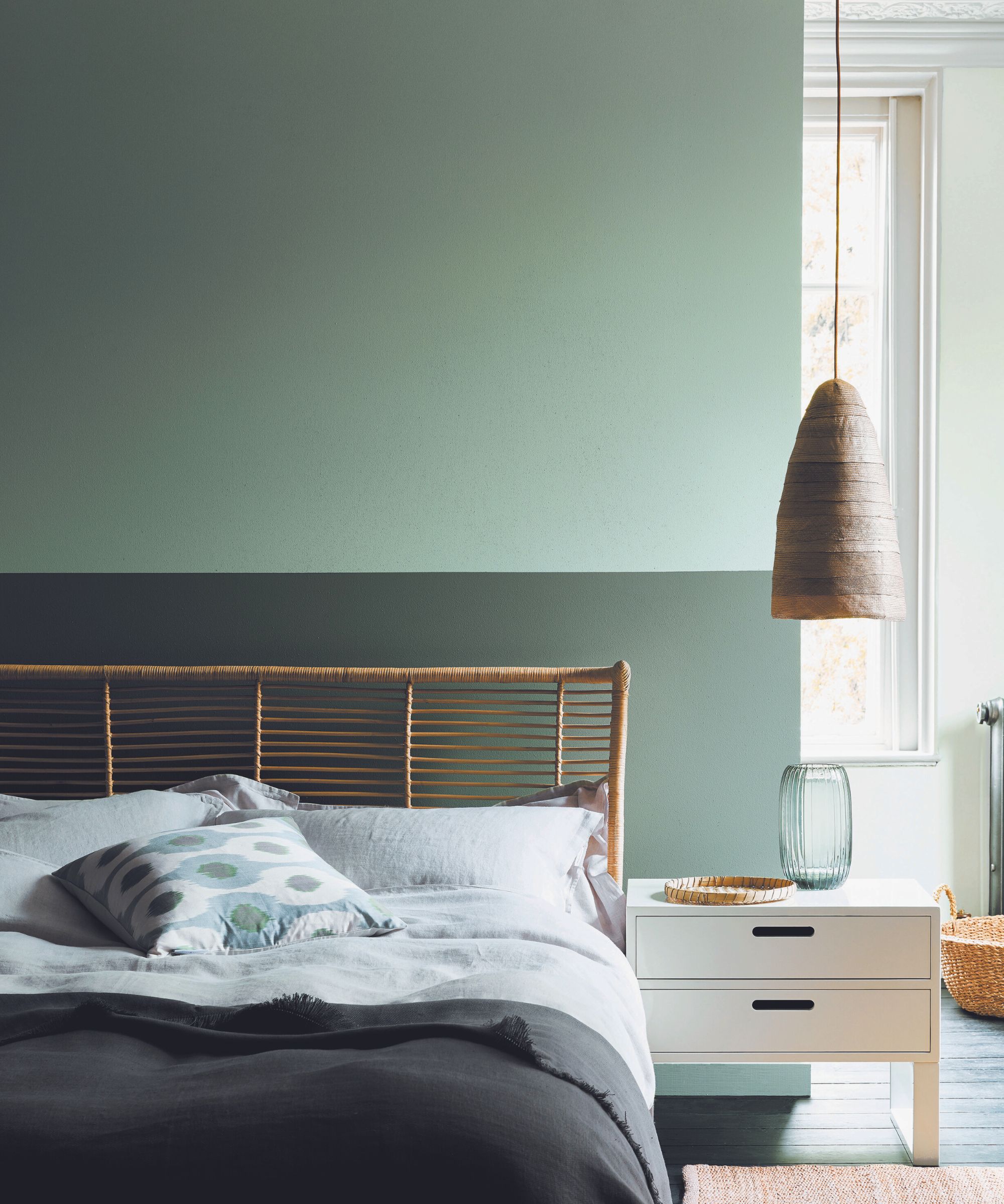
‘Blues and greens are prominent in nature and are great colors to support relaxation and restoration,’ explains Lee, ‘paired with warmer greys and white can also give us a feeling of peace and a chance to recharge our batteries.
Design expertise in your inbox – from inspiring decorating ideas and beautiful celebrity homes to practical gardening advice and shopping round-ups.
‘Naturally, we look towards colors and shades that will create a feeling of restfulness, destimulate us and make us feel at ease. While we all have elements of preference towards certain colors, those give us feelings of stability and restoration.’
Decorating with green and decorating with blue work to soothe and relax us as they sit beside one another on the color wheel, making them analogous – these are colors that work well in conjunction with each other because they share a base color. It is a good idea when decorating in analogous schemes to choose one dominant color and use the second as an accent throughout the room. These earthy shades work great as bedroom color ideas.
Patrick O’Donnell, Farrow & Ball brand ambassador, concurs: ‘consider colors that soothe and aid sleep, such as mid-tones, especially earthy neutrals, and gentle, soft greens. Jitney, falling into the former, is a perfect sand-hued off-white that is brilliantly easy to layer and will act as a foil for most decoration regardless of your aesthetic.’
2. Use a natural scheme – neutrals
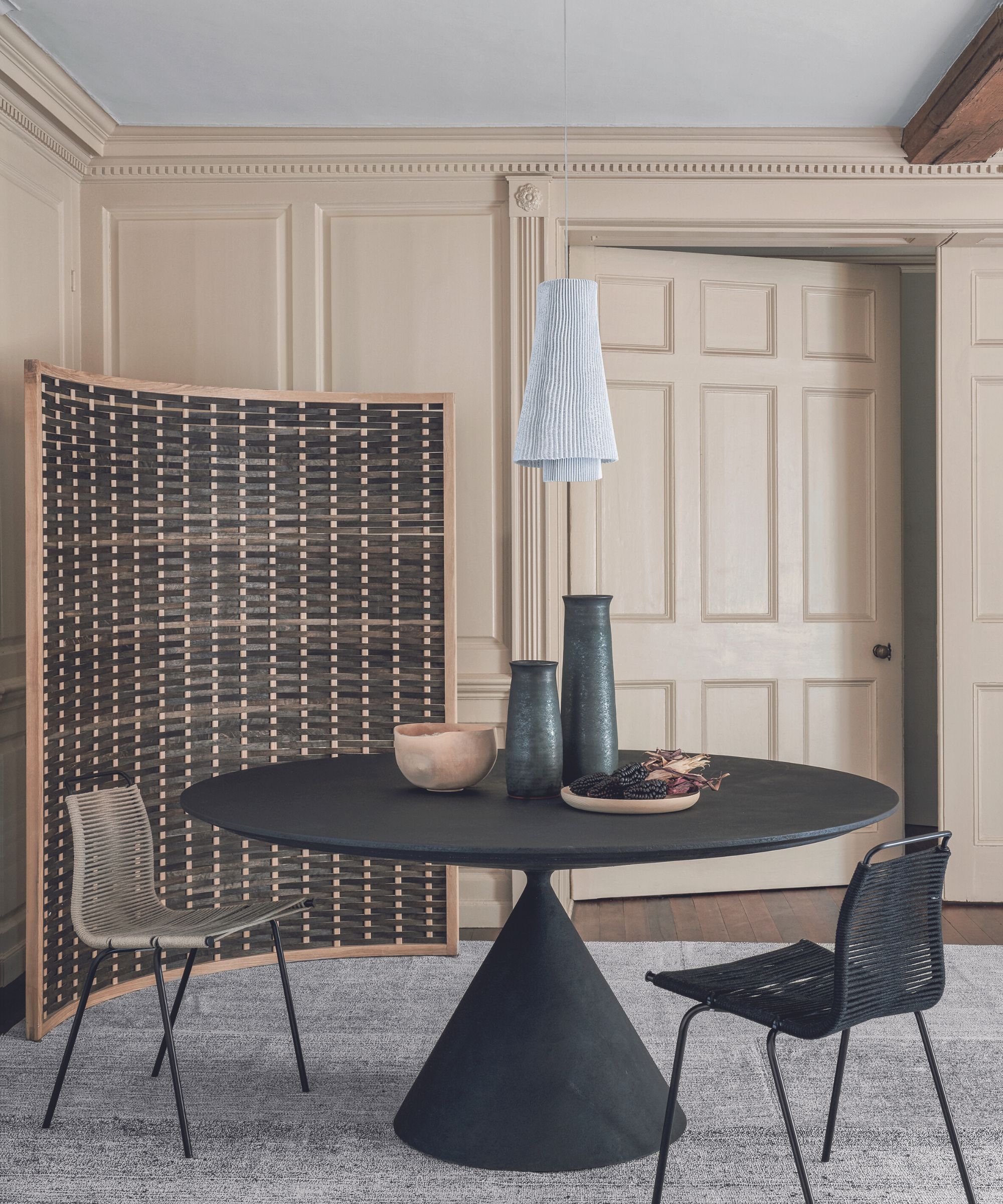
Neutrals are an obvious choice for a calming color scheme, and there are countless neutral room ideas to play with.
‘Relaxing colors are generally thought of as lighter natural or sandy tones, such as neutrals, that are related to nature or deeper tones like twilight blue that make us think of the day winding down.’ says Leatrice.
Decorating with neutrals is a great idea for living room color schemes, for example, rich, sandy neutrals such as tans or caramels add a rich touch of luxury as well as calmness to a space. ‘This shade instantly makes a room feel grounded,’ explains Natasha Bradley, director of interior design at Lick. ‘If you’re looking to decorate a whole room in this color, I’d suggest the addition of a black accent somewhere within to tie it all together,
‘To add softness I’d recommend matching woodwork, while also introducing green into the space as an accent. These color combinations will give a wonderful European twist while creating a calming aesthetic.’
3. Tone up the space – soft warm shades
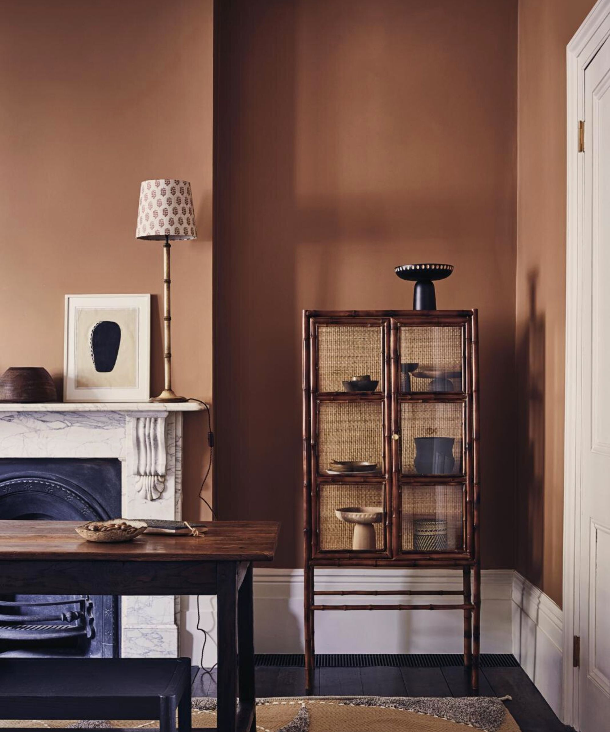
While warmer tones are typically avoided in calm spaces, toning down the hues could create a welcoming, relaxing space nonetheless.
‘Some might seek more excitement and energy in a bedroom and then the warmer yellows, orange tones, reds, red-violets, warm pinks would work,’ suggests Leatrice. ‘They would not need to be bright colors, but the softer variations of each color would work as well, such as peach instead of orange or pink instead of red.’
You may also wish to incorporate these warmer tones into smaller elements of your home decor, such as with terracotta decor, or using dustier rose pinks in pink room ideas.
4. Play with some color – gentle pastels
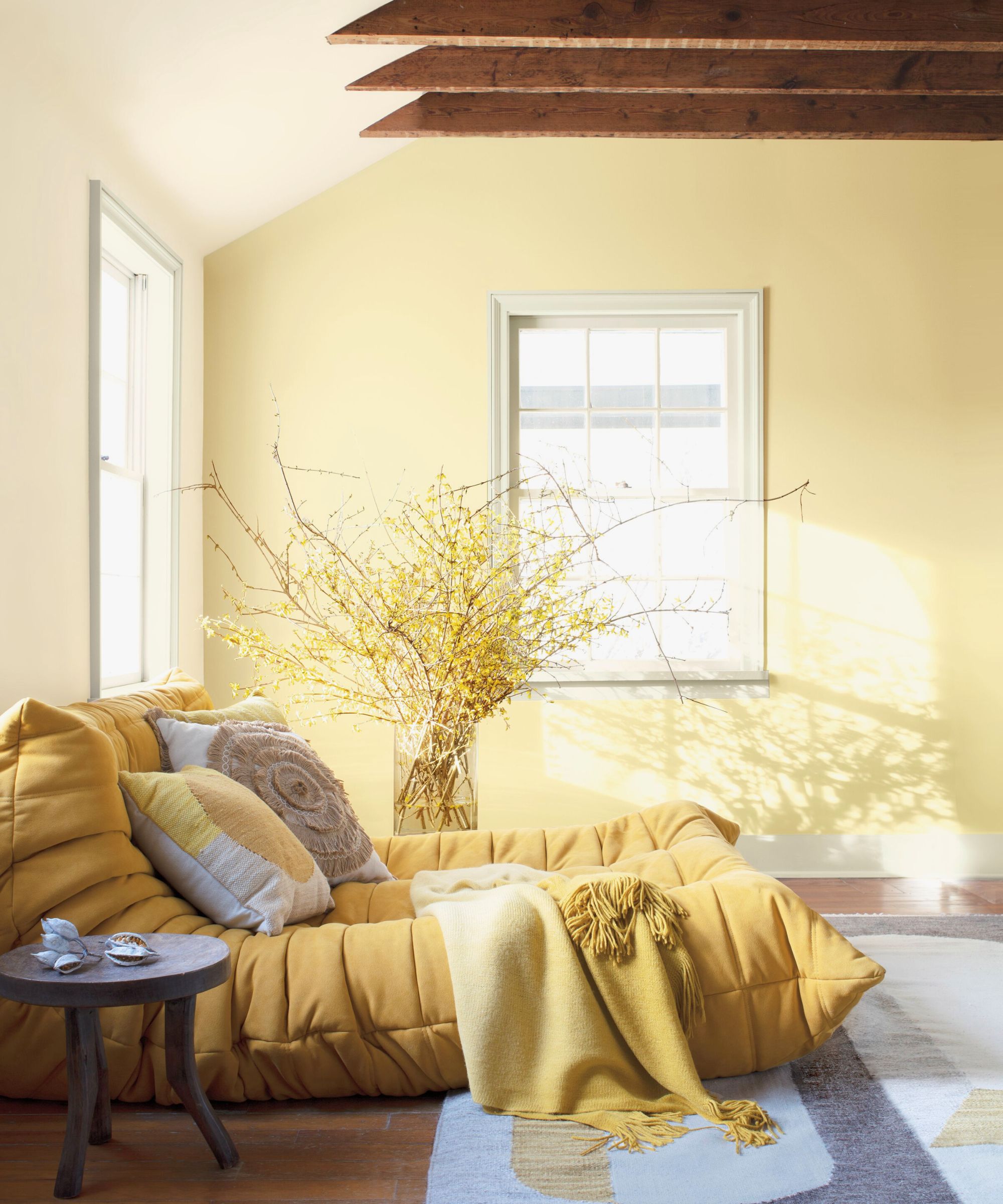
If you want to play with color in your interiors, but also want to maintain a light, calm aesthetic, using pastel schemes is a good way to go.
‘Softer warmer colors such as subtle yellows and pastel purples can give us a cheerful boost first thing in the morning,’ says Lee.
‘From a general standpoint, if one is seeking peace and quiet in a bedroom, then the recommended tones are in the cooler tones of blue, blue-green, and cool lavenders or in the lighter cool pastels or neutrals,’ Leatrice adds.
‘With this in mind, French Gray offers a restful space, with underlying drab sage notes, it is one of the best colors to calm and quiet,’ continues Patrick. ‘As with every color choice, however, remember your room aspect will also influence how colors respond to the natural light, so bear this in mind.’ he warns.
Avoid using bright tones in relaxing schemes
Colorful room ideas have a place in our homes, however, relaxing schemes are not one of them because certain colors cause anxiety.
‘Bright tones in any color family are more energizing, so they are not perceived of as relaxing,’ says Leatrice.
Because of this, it is recommended that you stay away from decorating with red and decorating with yellow when they are in their boldest shades. Consider reserving more striking colors in high-energy parts of the home such as kitchen color ideas.
What color calms anxiety?
There are a few colors that could help calm anxiety such as blues, greens, and light purples. The lilac color trend offers a shade that will both energize the space while also maintaining an air of relaxation.
What color is most stressful?
Red is the most stressful color. Intense shades of red can remind people of danger, and its stimulating hues can prevent total relaxation. If using red in a relaxing scheme, tone the shade down and use an earthy hue such as terracotta or rust.
Chiana is Homes & Gardens’ kitchen appliances editor. With a lifelong passion for cooking and baking, she grew up experimenting in the kitchen every weekend with her baking-extraordinaire Mom, has spent time cooking with Le Creuset's expert chefs, and has developed a great understanding of how tools and appliances can make or break your ideal relaxing kitchen routine.