The best colors to pair with taupe, according to designers – 5 shades to complement this grounding neutral
From soft shades of purple to earthy greens, these are the most stylish color pairings for taupe

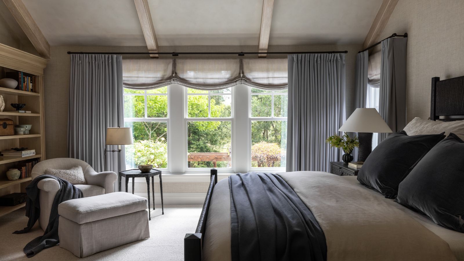
Taupe is a nuanced neutral, ranging from light to dark and combining the warmth of brown with the coolness of gray, and it makes for a sophisticated and timeless hue when used on the walls in interior schemes.
Once you understand what color taupe is – namely, that it combines both warm and cool tones – the next step is to choose the most flattering color combinations. Since some shades of taupe lean cooler with more gray, and others come across as warmer, there is much variety within this popular neutral, meaning that there are many color pairings to inspire.
Here, we explore five of the best color pairings for taupe, as explained by designers who have tried and tested these room color ideas. From colorful pairings that add warmth to this grounding shade to neutral pairings that offer timelessness, these ideas cater to many decorating styles.
Article continues below1. Brown tones
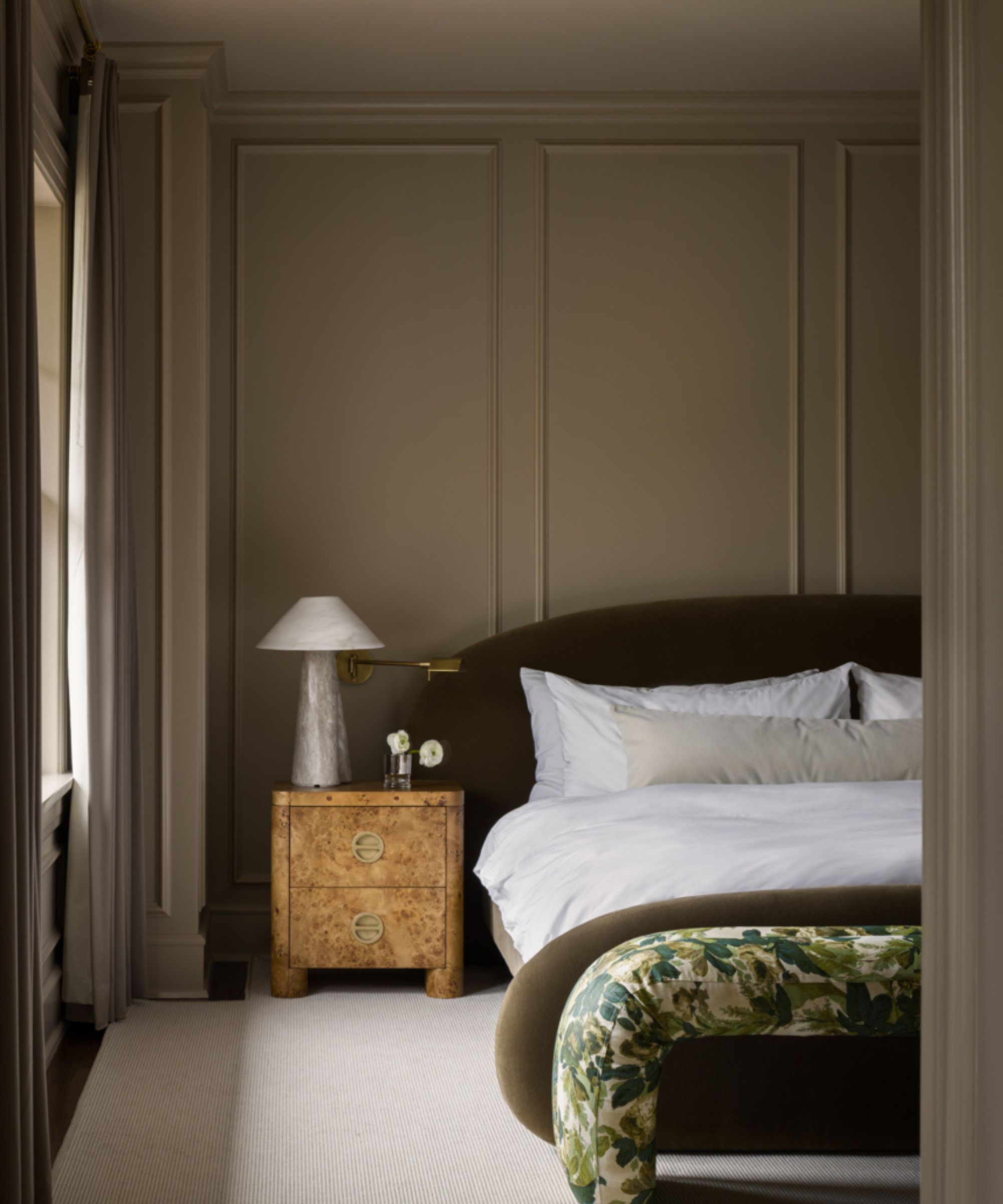
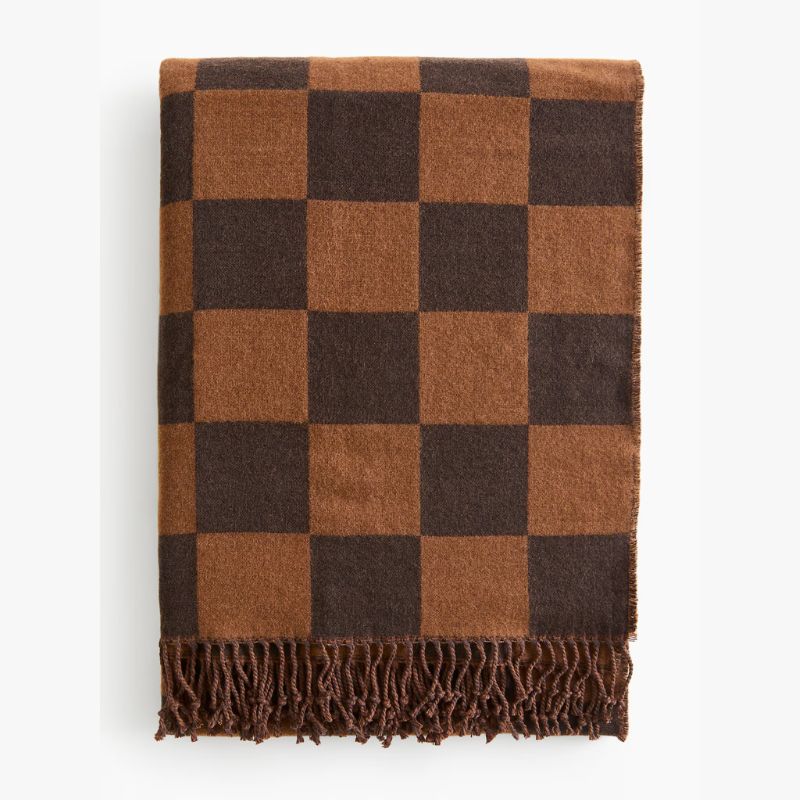
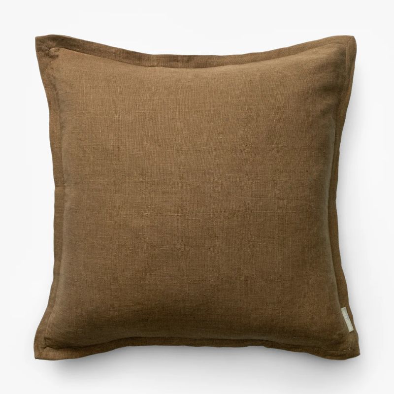
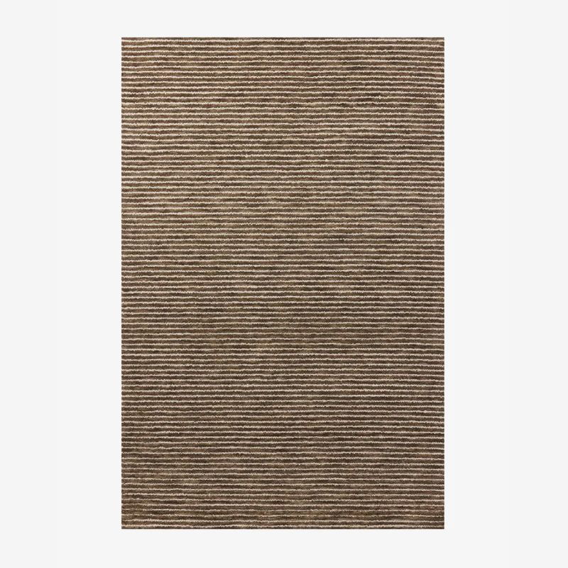
While taupe makes a calming backdrop color for bolder hues, it works equally well alongside neutrals. To add depth to taupe walls, consider decorating with brown, which adds warmth and creates a monochromatic color scheme.
'We love leaning into a tonal look when it comes to taupe spaces and creating a truly enveloping surrounding,' say the interior designers Mallory Robins and Elizabeth Bennett of Kobel + Co, who designed this neutral bedroom.
While chocolate brown will add more contrast to a taupe room, lighter brown tones, much like the nightstand in this bedroom, also work well if you prefer a lighter color scheme.
2. Green
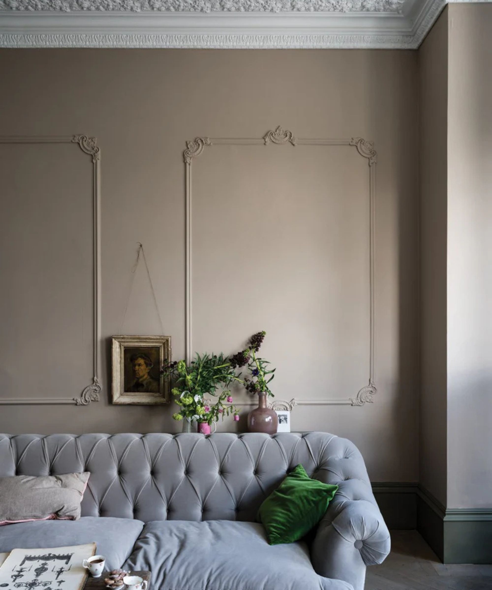
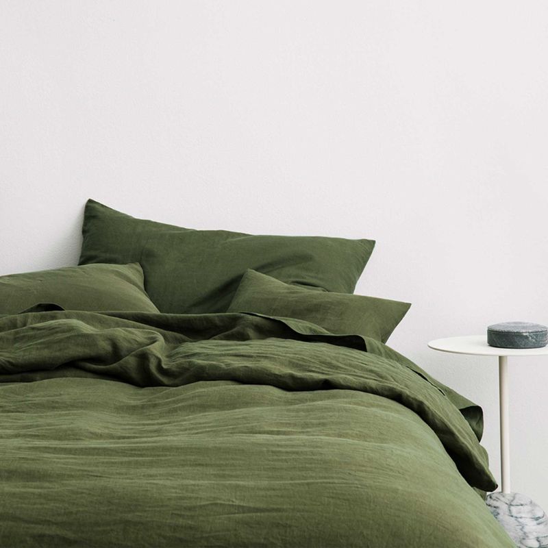
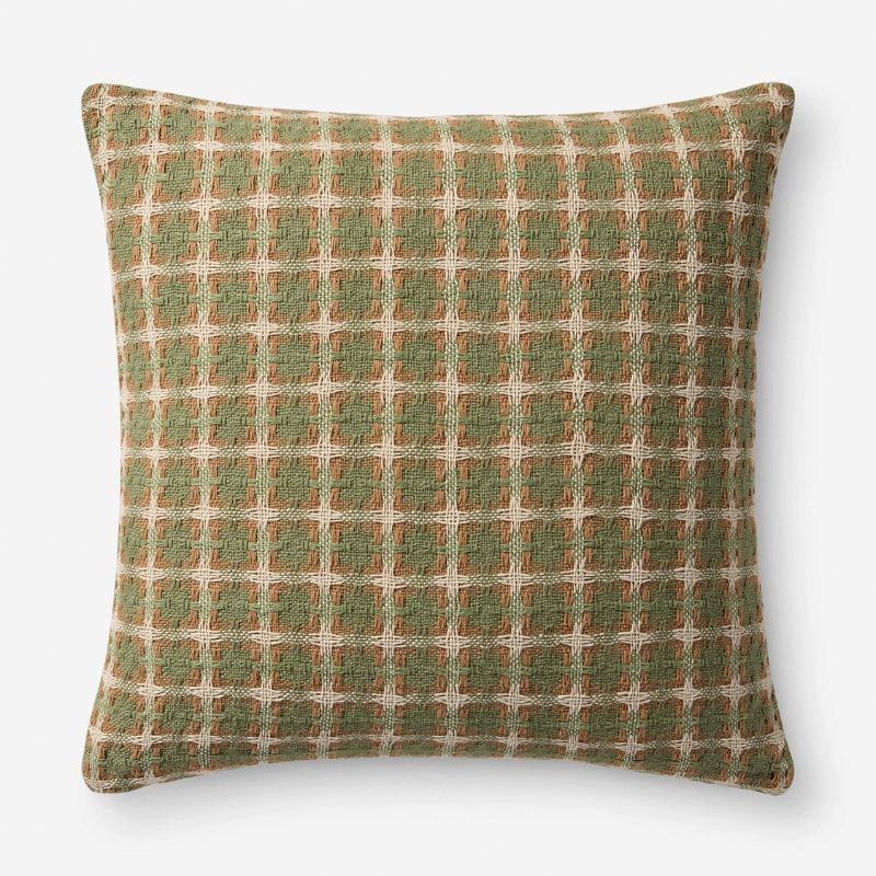
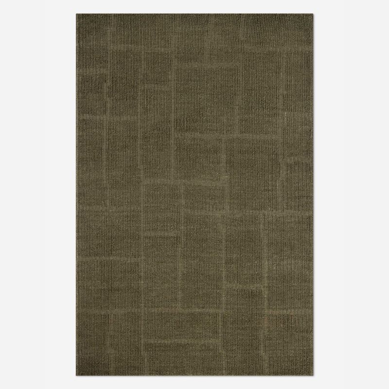
If you'd like to add a pop of color to your taupe scheme, consider decorating with green. Earthy greens in particular are a great way to make a taupe room feel more inviting and stop the space from feeling overly cool. 'A contrasted piece in a mucky green is the perfect way to bring an unexpected element to the space,' add Mallory Robins and Elizabeth Bennett of Kobel + Co.
Design expertise in your inbox – from inspiring decorating ideas and beautiful celebrity homes to practical gardening advice and shopping round-ups.
'I really love to pair taupe with shades of green, from forest to sage,' agrees interior designer Kathy Kuo. 'The gray notes in taupe pair with green hues in a really sophisticated way that keeps things in the cool color family without feeling heavy or gloomy.'
3. Cream
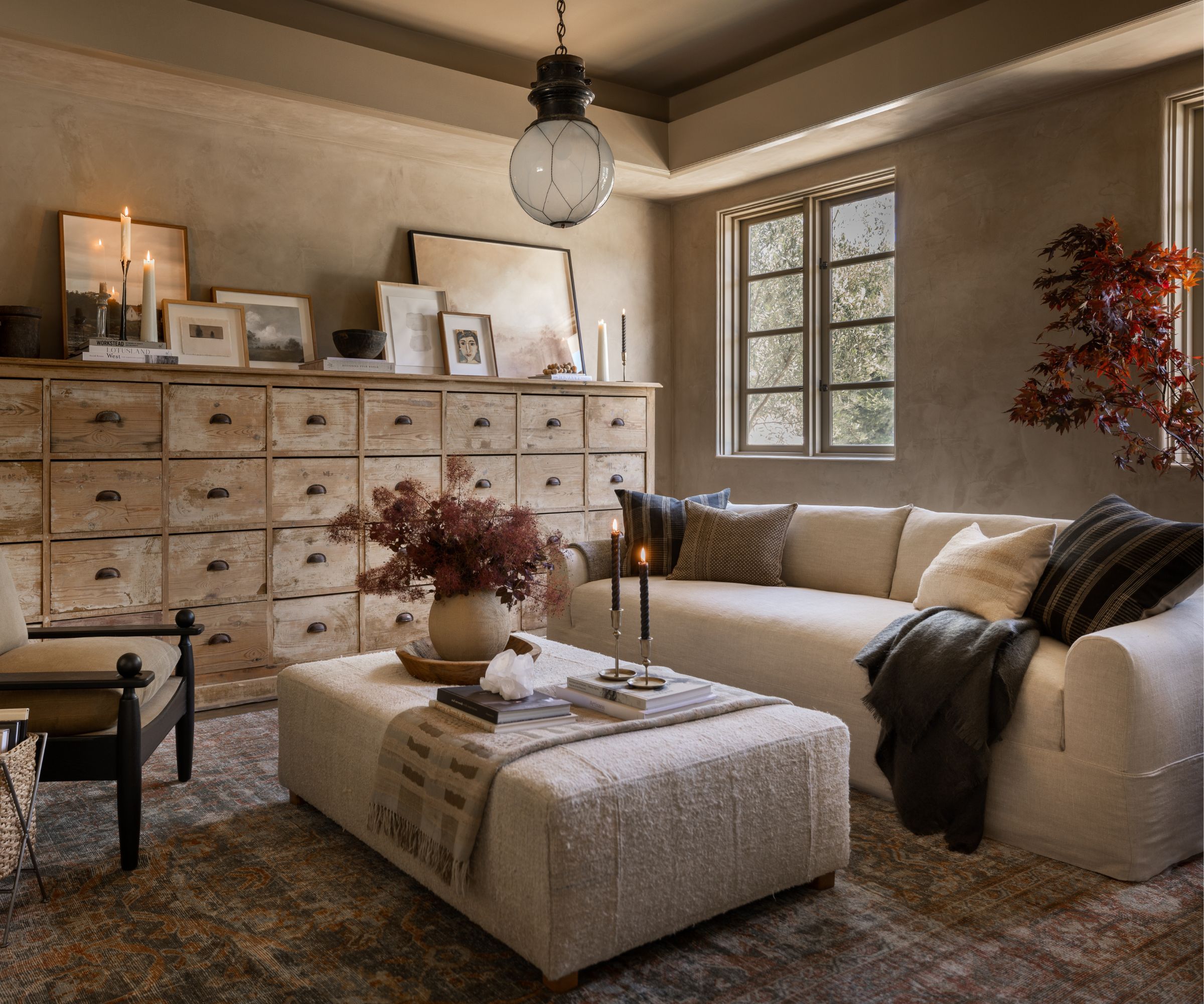
To add lightness to a taupe room, consider decorating with cream or white. In this living room, the taupe walls, Rustica by Portola Paints, are balanced by the lighter cream sofa and ottoman.
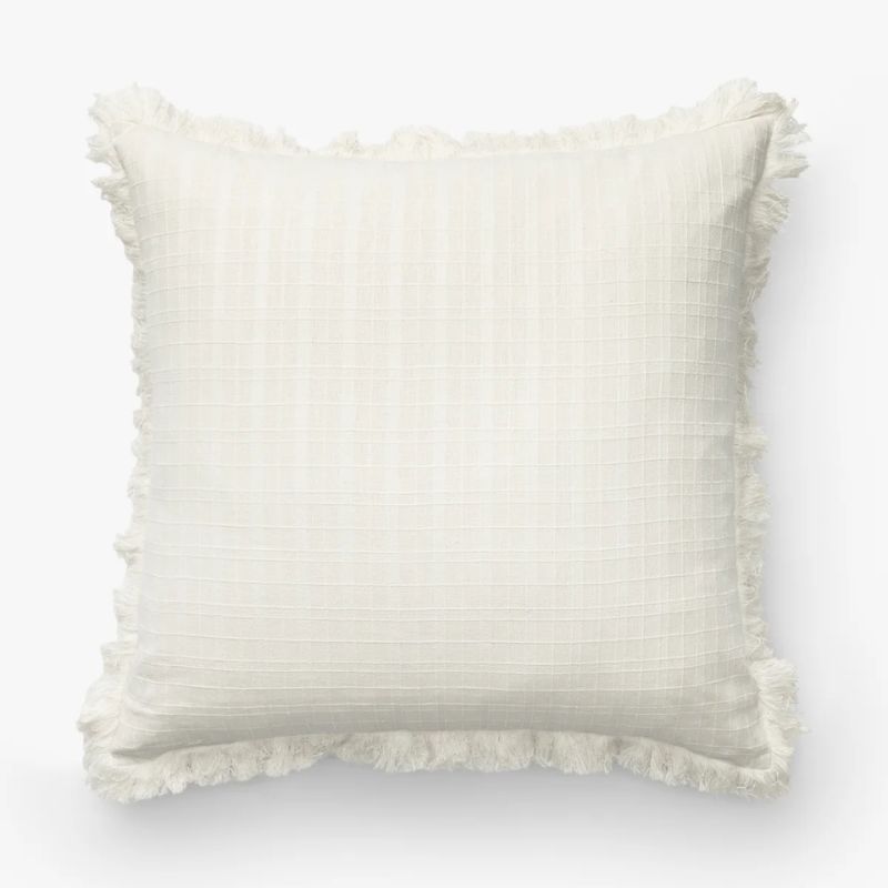
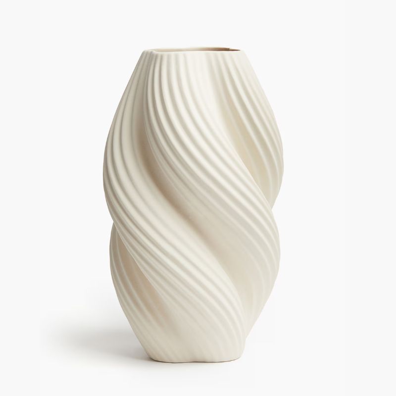
'I love pairing taupe with a creamy, nuanced white because it elevates the whole palette and makes the room feel layered and intentional,' explains interior designer Caron Woolsey, founder and principal at CW Interiors. 'Creamy white balances taupe’s cozy warmth and brings in just the right touch of sophistication. Together, they feel collected, inviting, and quietly luxurious.'
4. Dark blue
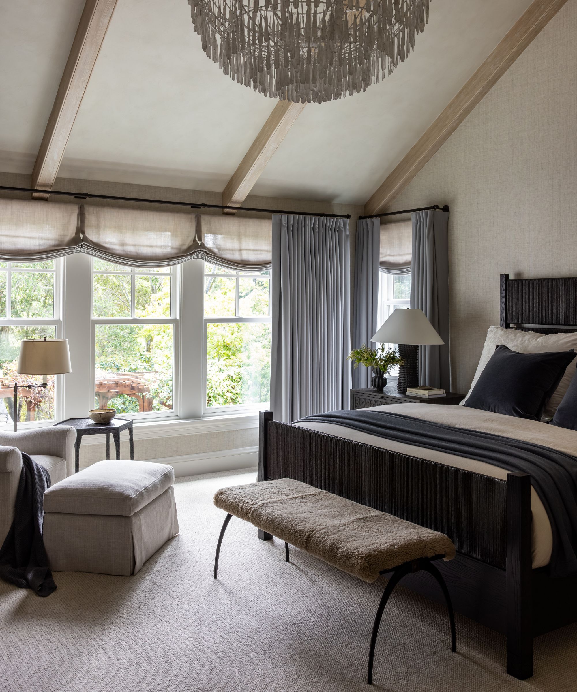
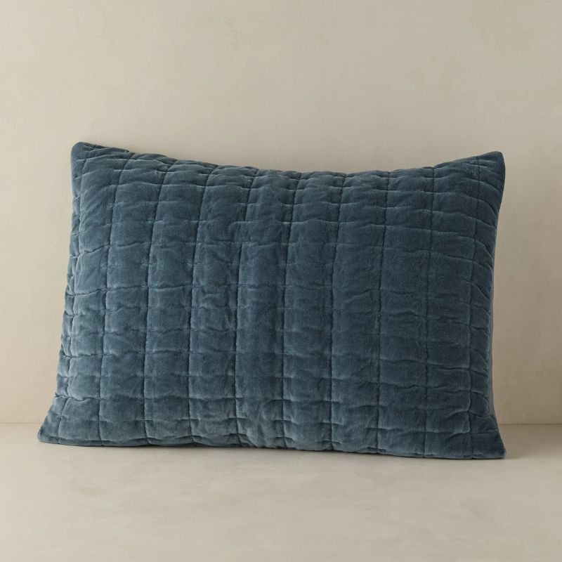
To add more depth to a taupe scheme, decorating with blue is recommended by designers. While plenty of shades of blue work well alongside taupe, dark blues add richness and contrast, as seen in this bedroom through the soft furnishings.
'In this primary bedroom, I have paired taupes and creams with a deeply saturated blue on both the striated velvet shams and repeated on the alpaca throw to add that rich, deep color, grounding the soft neutrals and drawing your eye in,' explains the interior designer Marianne Jones of Marianne Jones Interior Design.
5. Lavender
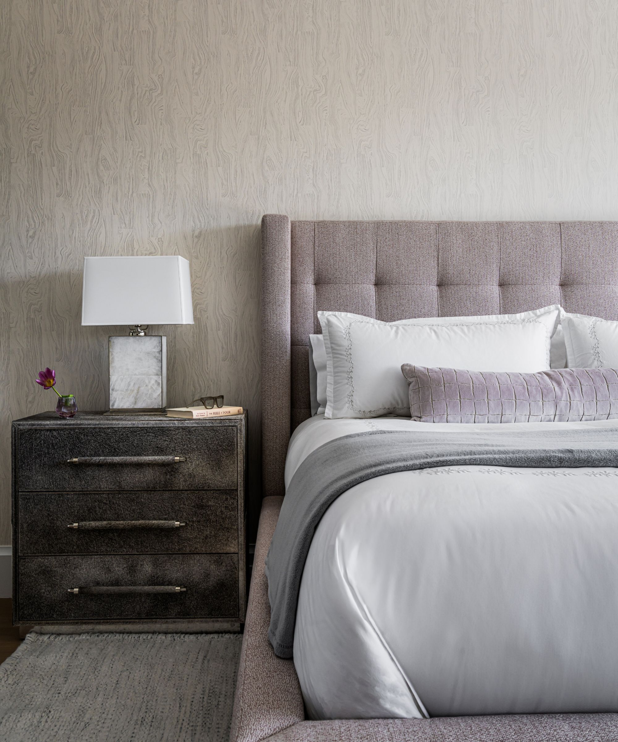
'One of my favorite pairings with taupe is a soft, dusty lavender,' shares interior designer Glenna Stone of Glenna Stone Interiors. 'Taupe is a beautiful neutral with warm undertones, and when combined with a muted lavender, the effect is serene, elevated, and unexpected. The taupe grounds the space while the lavender brings a touch of softness and sophistication.'
The pairing of taupe and lavender is also enjoyed by designer Lauren Czarniecki of Czar Interiors, who designed this relaxing bedroom. The lavender headboard adds a subtle hint of color to the taupe walls, while the overall feel remains understated and soft.
'I just love how taupe and mauve work together – they feel so effortlessly refined and luxe,' says Lauren. 'There’s this great balance of softness and contrast that keeps things from feeling flat. It’s warm, it’s layered, and it really lets texture shine, which adds so much depth and interest to a space. It’s one of those combos that always feels fresh but timeless.'
You can pair plenty of colors with taupe, from soft purples to richer neutrals. Since taupe can vary a lot, from light to dark and cool to warm, you may want to create balance with your pairings. For cooler shades of taupe, do so with warmer accent colors, but for warm taupes, consider going for cooler color pairings.

Emily is a freelance interior design writer based in Scotland. Prior to going freelance in the spring of 2025, Emily was Homes & Gardens’ Paint & Color Editor, covering all things color across interiors and home decor for the Homes & Gardens website. Having gained specific expertise in this area, Emily is well-versed in writing about the latest color trends and is passionate about helping homeowners understand the importance of color psychology in home design. Her own interior design style reflects the simplicity of mid-century design and she loves sourcing vintage furniture finds for her tenement flat.
