Decorating with cream: 11 expert ways to style this calming and classic neutral – from bedrooms to dining spaces
Interior designers share their favorite ways to decorate with the color cream

- 1. Use cream in light-flooded rooms
- 2. Decorate with cream in minimalist rooms
- 3. Create a calming living space
- 4. Decorate with warm-toned cream paints
- 5. Incorporate textures when decorating with cream
- 6. Use cream tones in the kitchen
- 7. Create a timeless dining room
- 8. Decorate with cream for a calming bedroom
- 9. Opt for a cream-colored sofa
- 10. Consider a cream carpet or rug
- 11. Use cream as a backdrop to highlight art
Within the realm of neutral colors, cream is one of the most classic, versatile, and timeless, used widely by interior designers across many rooms and decorating styles.
Used commonly as an alternative to white, designers say that decorating with cream provides a more flattering backdrop to room color ideas, with its subtle warm tones providing a cozy feel while still achieving that much-desired light and airy look.
If you're a fan of decorating with neutrals, there are endless reasons to incorporate cream into your home decor, as explained here by designers.
11 ways to decorate with cream
From cream living room ideas to cream kitchen ideas, this understated hue withstands the latest trends, and designers love using it in all types of rooms. Read on to gain some decorating ideas for this much-loved neutral.
1. Use cream in light-flooded rooms
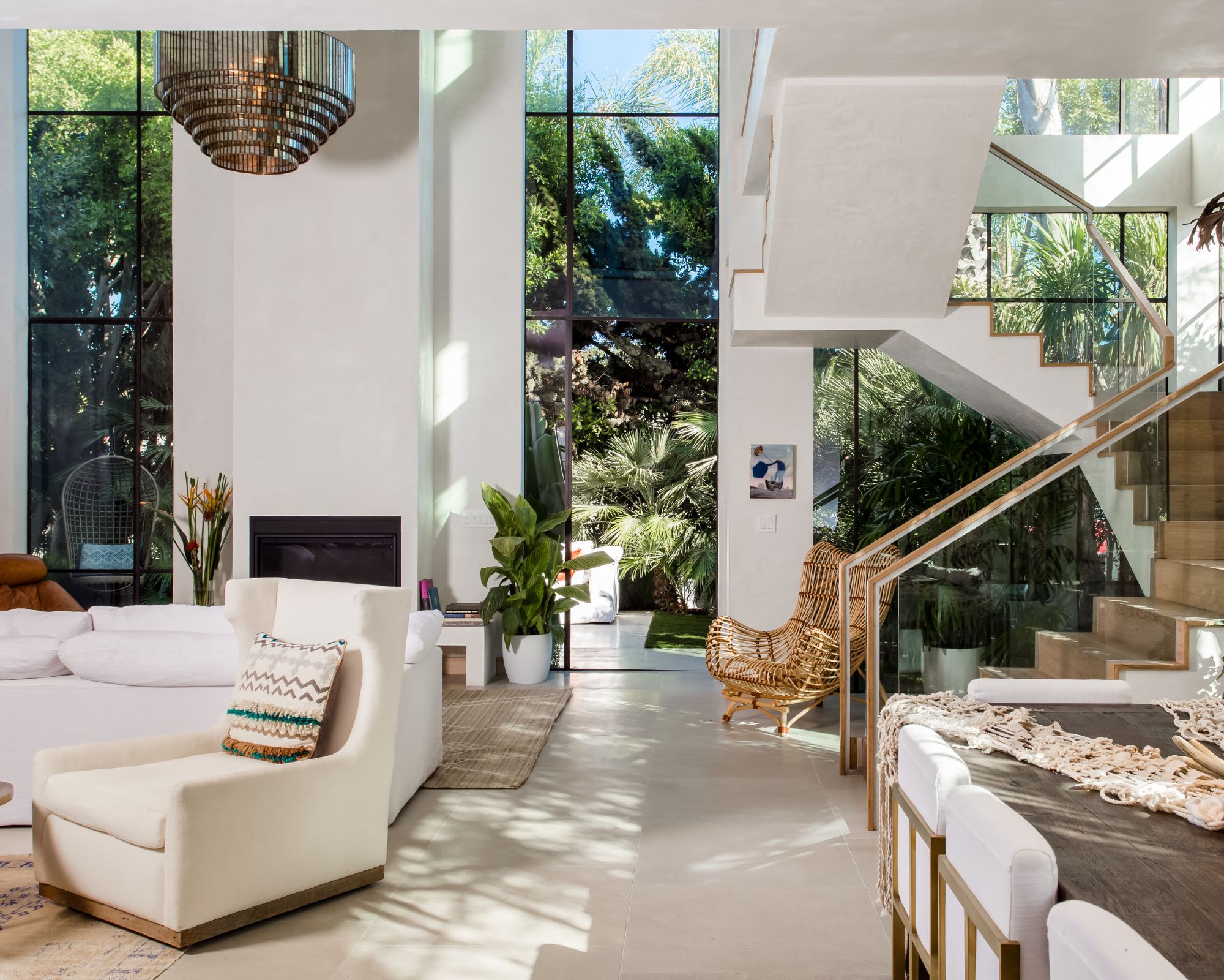
If you're lucky enough to have a south-facing room in your home that receives lots of natural light, cream is an excellent color choice. While white paints can appear stark and even uninspiring, cream, on the other hand, will enhance the existing light with its slightly warm tones.
'Cream is the color of calm and opportunity: it opens a room allowing light to refract and bounce purely,' says Kim Gordon of Kim Gordon Designs, who opted for this classic hue in this light and airy open plan living room.
'I like to use a cream color that has the slightest tinge of warmth so that the room doesn’t feel cold as it could should there be a more gray tone. A little sheen in the paint helps pick up the happy notes as well.'
Design expertise in your inbox – from inspiring decorating ideas and beautiful celebrity homes to practical gardening advice and shopping round-ups.
2. Decorate with cream in minimalist rooms
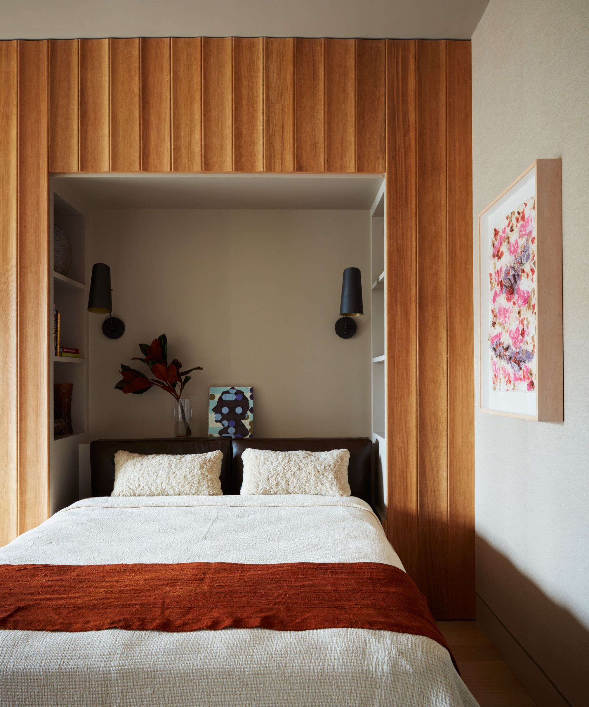
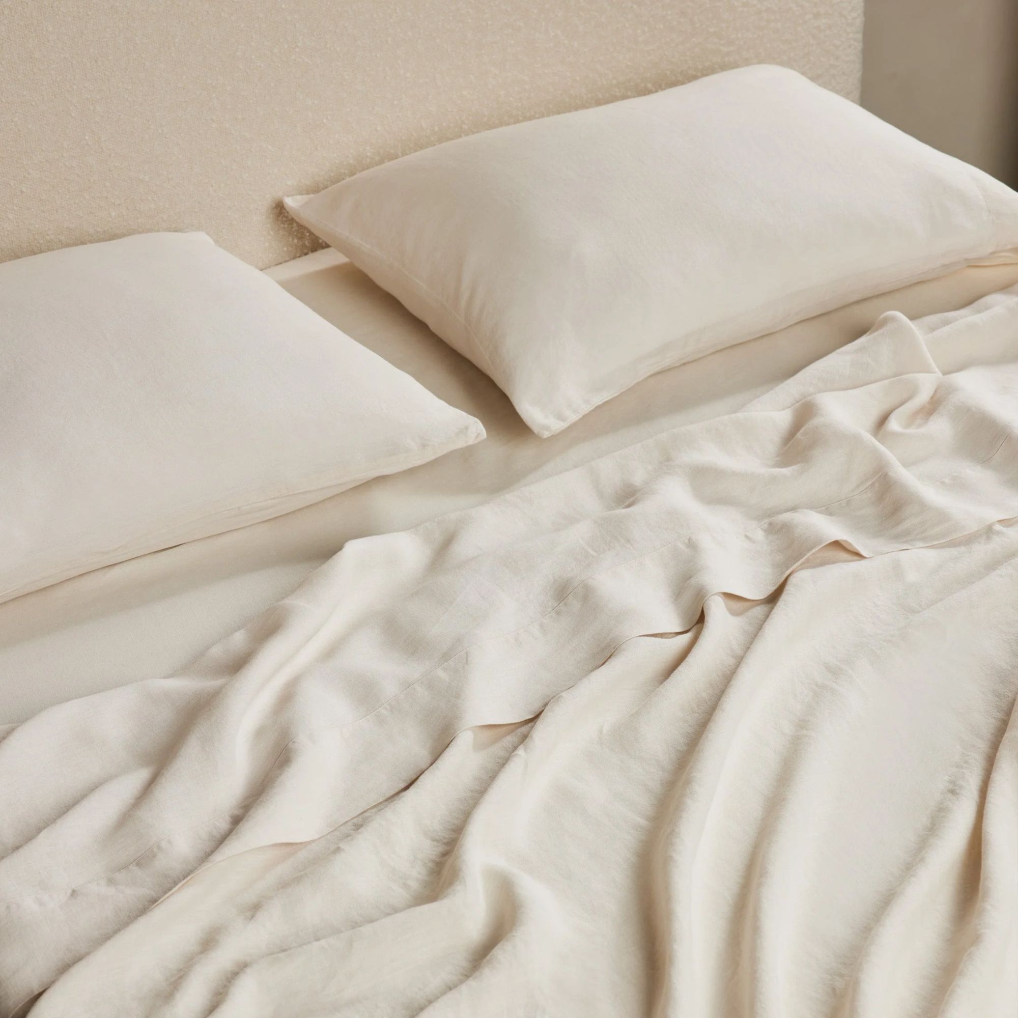
If your style leans towards minimalist decor ideas, favoring a pared-back approach with quality materials and clean lines, the color cream can make an effective color choice. Demonstrated in this modern and minimalist bedroom designed by MK Workshop, the cream walls and bedding appear timeless, enhanced by warmer, rust-colored accents.
'We love decorating with cream, using minimalist touches that give off a vibe of elegance and calm,' say Jonah Kilday and Petra McKenzie, co-founders of the design studio. 'Cream tones add warmth and sophistication to any room, whether through cozy cushions and throws or picking out wall colors and linens.'
'Cream goes well with many different styles and colors, making it a go-to for creating a comfy, stylish space that always feels just right.'
3. Create a calming living space
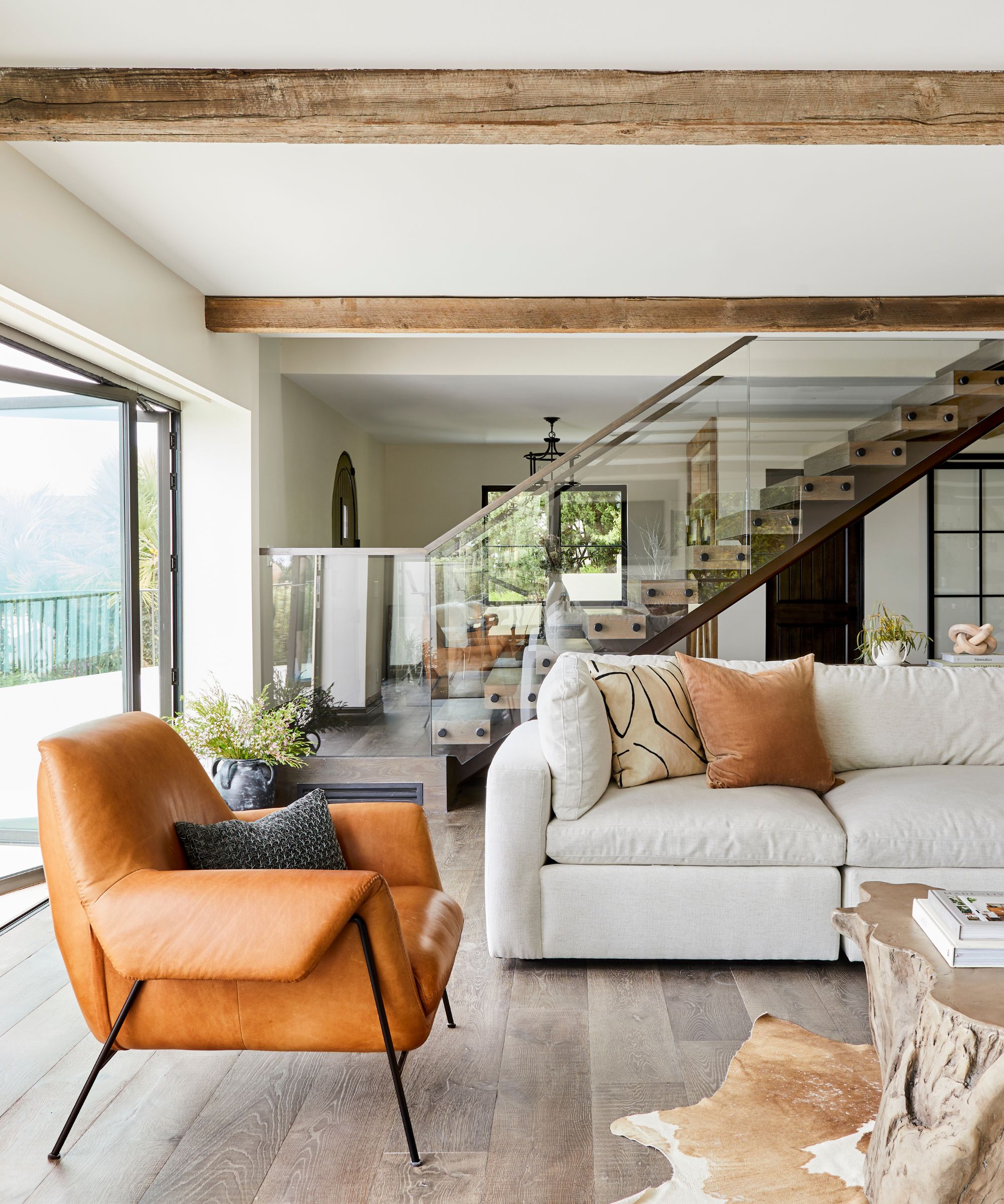
In this open-plan living room designed by Christine Vroom Interiors, various shades of cream are used, from the wall color to the sofa, resulting in a pared-back and relaxing space.
'Cream is the new white and we have so many gorgeous ideas on how to use it to enhance spaces,' says Christine Vroom, founder of the design studio. 'I suggest using a few different tones of cream to add depth – champagne, off-white, alabaster, and biscuit, in different textures like boucle, velvet, and linen.'
'If you want to add some color rather than a monochromatic color scheme, I love pairing cream with earth tones like rich brown, warm terracotta, and deep greens. Cream provides a really beautiful, warm base that you can build off of and layer into your already designed space.'
4. Decorate with warm-toned cream paints
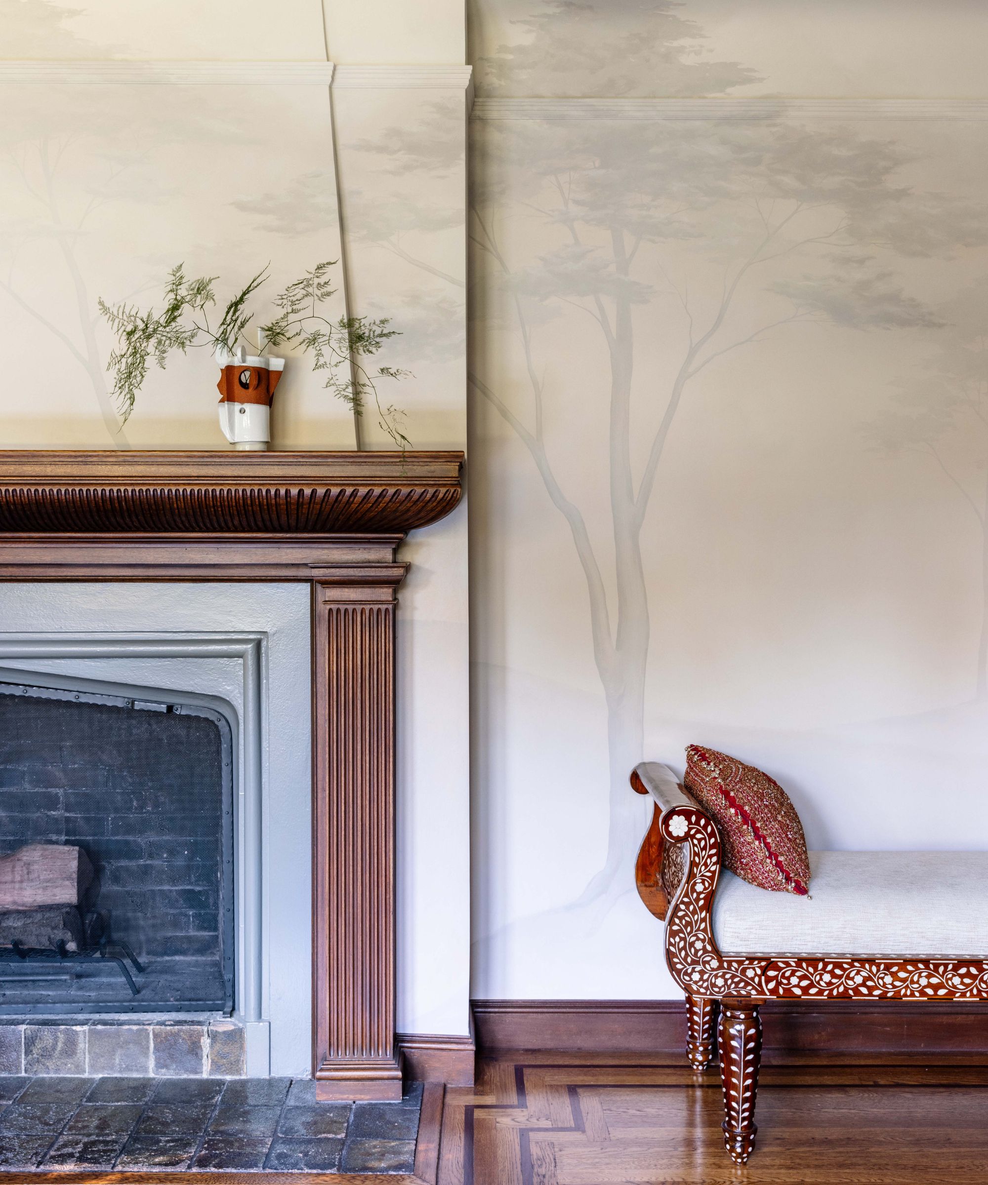
'When using the color cream, I like to choose a slightly warm tone as my base and then layer in the drama from there,' says designer Alexis Banks Humiston of ABH Interiors, who opted for a cream-colored wall in this traditional living room.
'Even after adding various textures, patterns, and in this case, darker hand-painted trees to the walls, the overall effect is still very calming.'
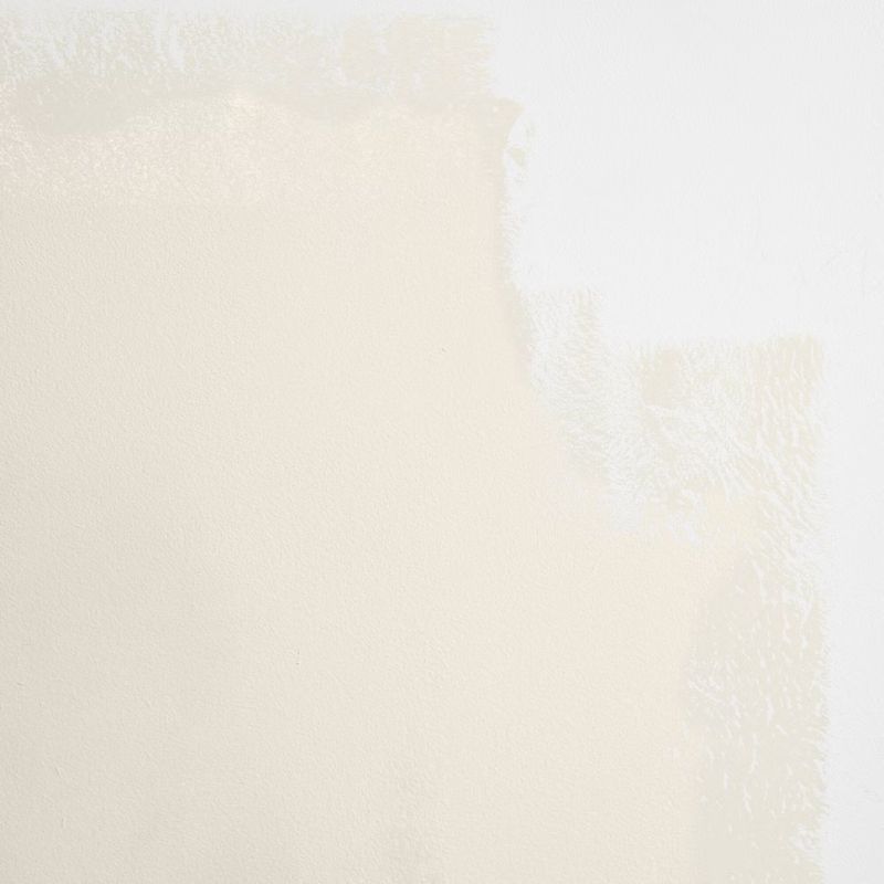
There are plenty of best cream paints to choose from, but ones like Backdrop's Harvest Moon and Benjamin Moore's Devon Cream will add just enough warmth to create a cozy yet clean backdrop in any room in the home.
5. Incorporate textures when decorating with cream
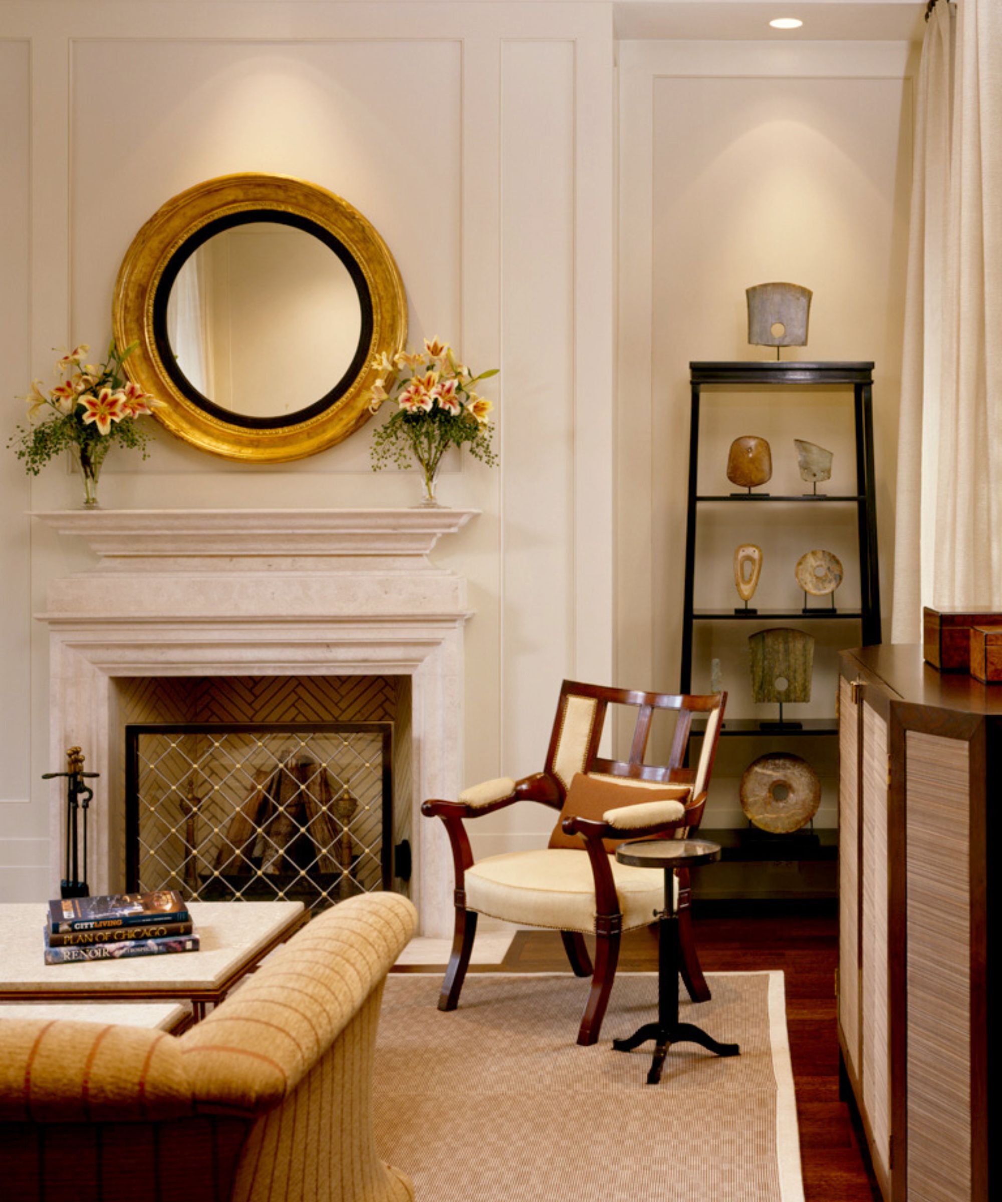
'There is nothing as calming and restful as cream,' says designer Martin Horner, co-founder of Soucie Horner, who used cream as the dominant color in this formal living room.
'It’s as versatile as white but warmer – and therefore more soothing,' continues Martin. 'The trick is to pair it with plenty of texture to keep it from being boring. We start with an amazing rug to ground a scheme and keep the space from feeling like it’s floating away. Then we layer in stones, woods, textiles, pottery, and anything else that begs to be touched.'
6. Use cream tones in the kitchen
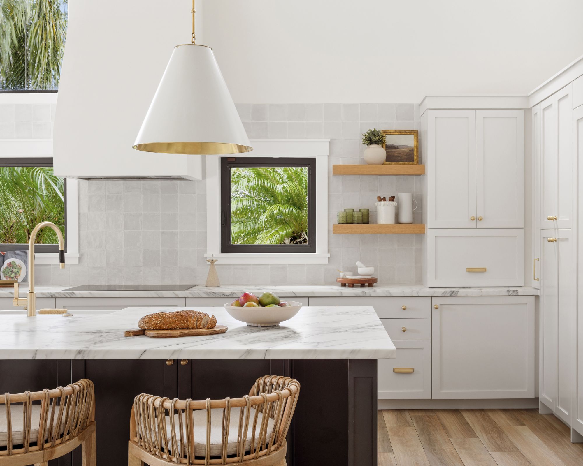
In this modern kitchen, Smith Home Studios chose cream tones for the space, creating a calming look that lets the home's surroundings shine.
'Cream is forever my go-to color to build a beautiful room,' says designer Jamie Lyn Smith, owner of the design studio. 'In our Miami Falls project, our client wanted to play with the gorgeous natural light and lush landscape. With each room, we selected various shades of cream as a base color and layered natural elements like white oak, stone, and terrazzo, resulting in a home that is light and bright while being warm and welcoming.'
'In the kitchen, a backsplash of Moroccan tiles by Wow Fez in warm gloss plays to the kitchen cabinets painted with Benjamin Moore's Swiss Coffee, and warm brass hardware looks lovely on the Calcutta gold kitchen countertops.'

Use this best-selling paint as a versatile and timeless kitchen cabinet color, pairing seamlessly with plenty of wall colors.
7. Create a timeless dining room
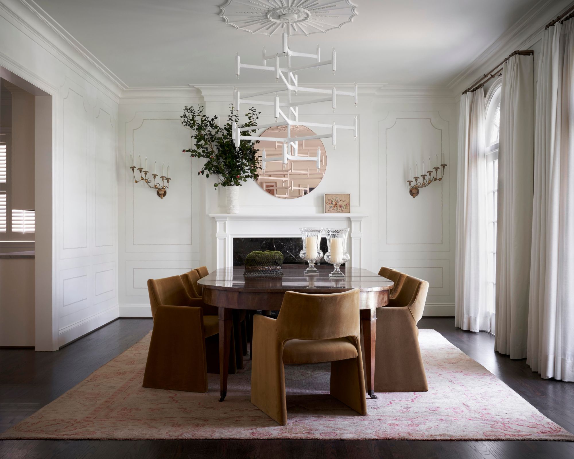
In this dining room designed by Houston-based Meg Lonergan, cream informed the room's color scheme, achieving a light and airy look that allows the modern, clean lines of the furniture to stand out.
'We like to 'fully dip' rooms in the color cream,' says Becky Duca, designer at the design studio. 'For this dining room, cream was the focus on the walls and ceiling in different sheens and textures. Cream was also featured in this room with the trompe-l’oeil painted paneling base; the moire fabric drapes; and the plaster ceiling light fixture.'
8. Decorate with cream for a calming bedroom
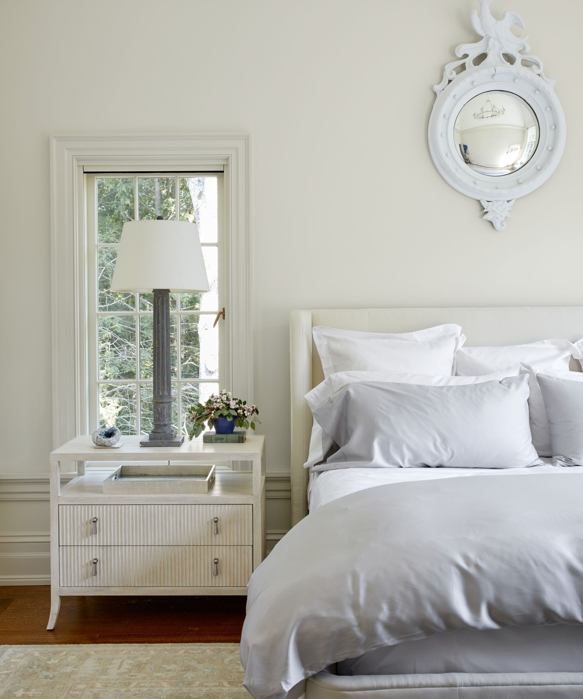
You can never go wrong with a neutral bedroom if you want to create a relaxing space to retreat to at the end of each day. Within the realm of neutral hues, cream makes a failsafe choice: it's light enough to feel restful with enough warmth to feel cozy.
'I love the color cream for a bedroom,' says interior designer Caroline Kopp. 'It is the perfect soothing, calming, cocooning color. In this bedroom, the bed, the walls, and the curtains are all different shades of cream and it creates a wonderfully quiet and peaceful atmosphere.'
9. Opt for a cream-colored sofa
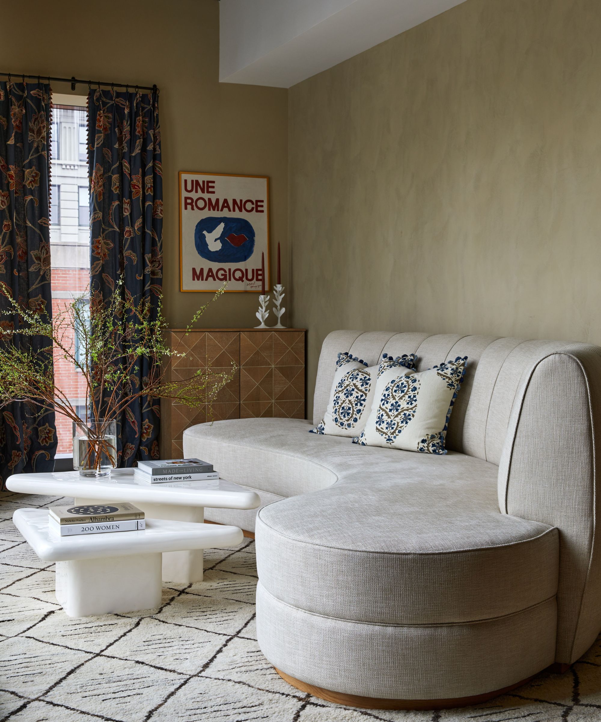
A cream-colored sofa is a popular choice for good reason: it pairs well with lots of other colors, so while other decor elements in a room may change over time, your sofa will be versatile enough to endure evolving room styles.
In this living room, Isy's Interiors opted for a curved cream sofa, pairing effortlessly with the rest of the room's neutral, earthy palette.
'Cream will always be in style because it's cozy, it's elegant, it's classic,' says Isy Runeswe, founder of the design studio. 'It can be used as a fantastic neutral around the room or a standout against darker colors. Our favorite way to use cream is through texture and layering textures. Think Roman clay on the walls, linen window treatments, a boucle accent chair, or a wool area rug. Layering cream by varying textures creates such a dynamic space!'
10. Consider a cream carpet or rug
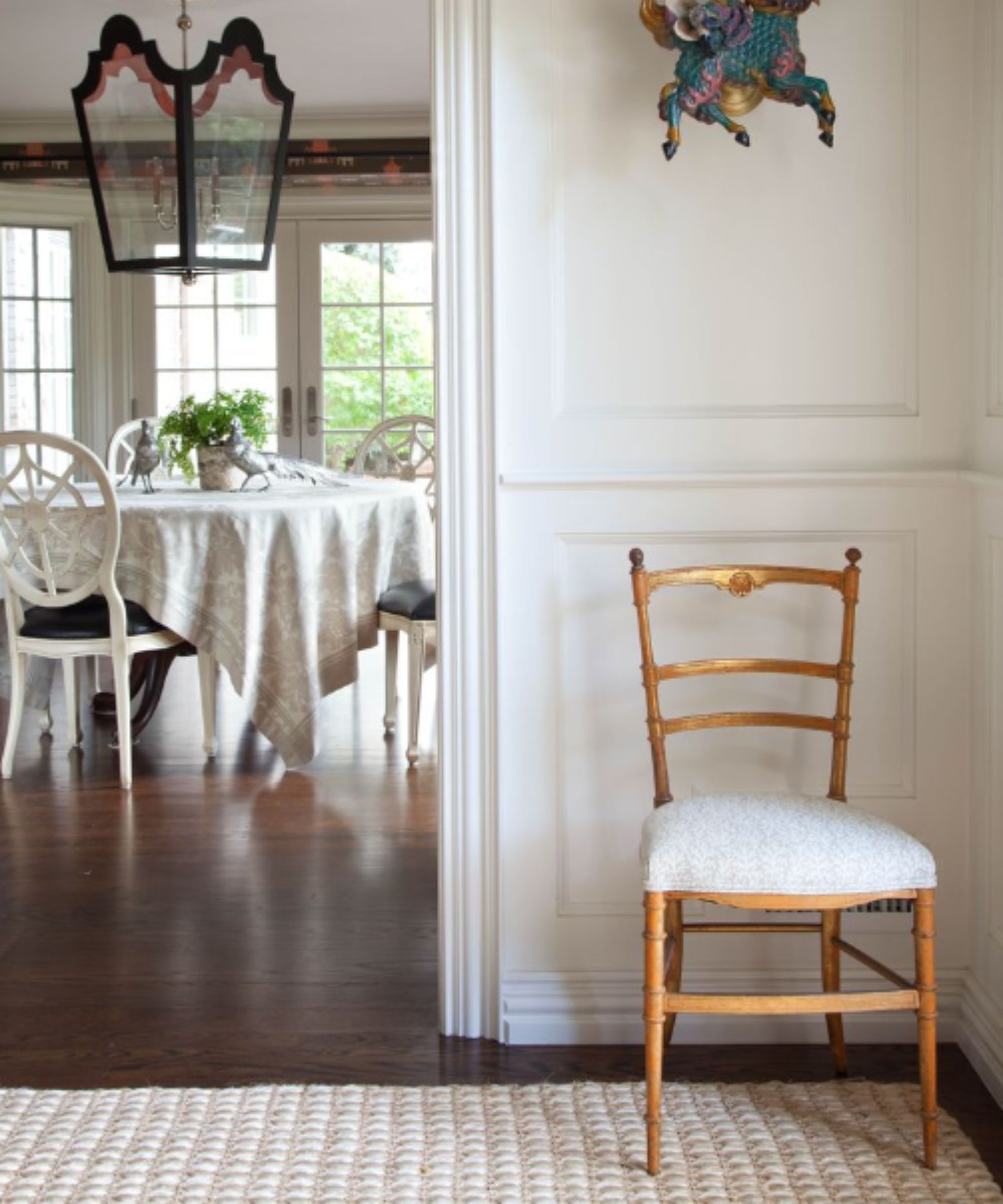
While cream-colored carpet ideas can sound like a brave choice, it's recommended by interior designer Nadia Watts. 'Crisp and clean yet less likely to show dirt than white, cream is a great option for floor coverings,' she explains.
A cream carpet or rug is an incredibly timeless flooring idea too, working well with lots of design styles. Nadia adds that it is less intense than white and provides an excellent backdrop to darker warm tones: 'Cream provides the same simple modern aesthetic as a white interior but with a homier vibe. It's the perfect backdrop for a natural color scheme such as wood tones, greens, and blues. It brings the same crisp contrast to these darker colors without feeling too white or bright.'
11. Use cream as a backdrop to highlight art
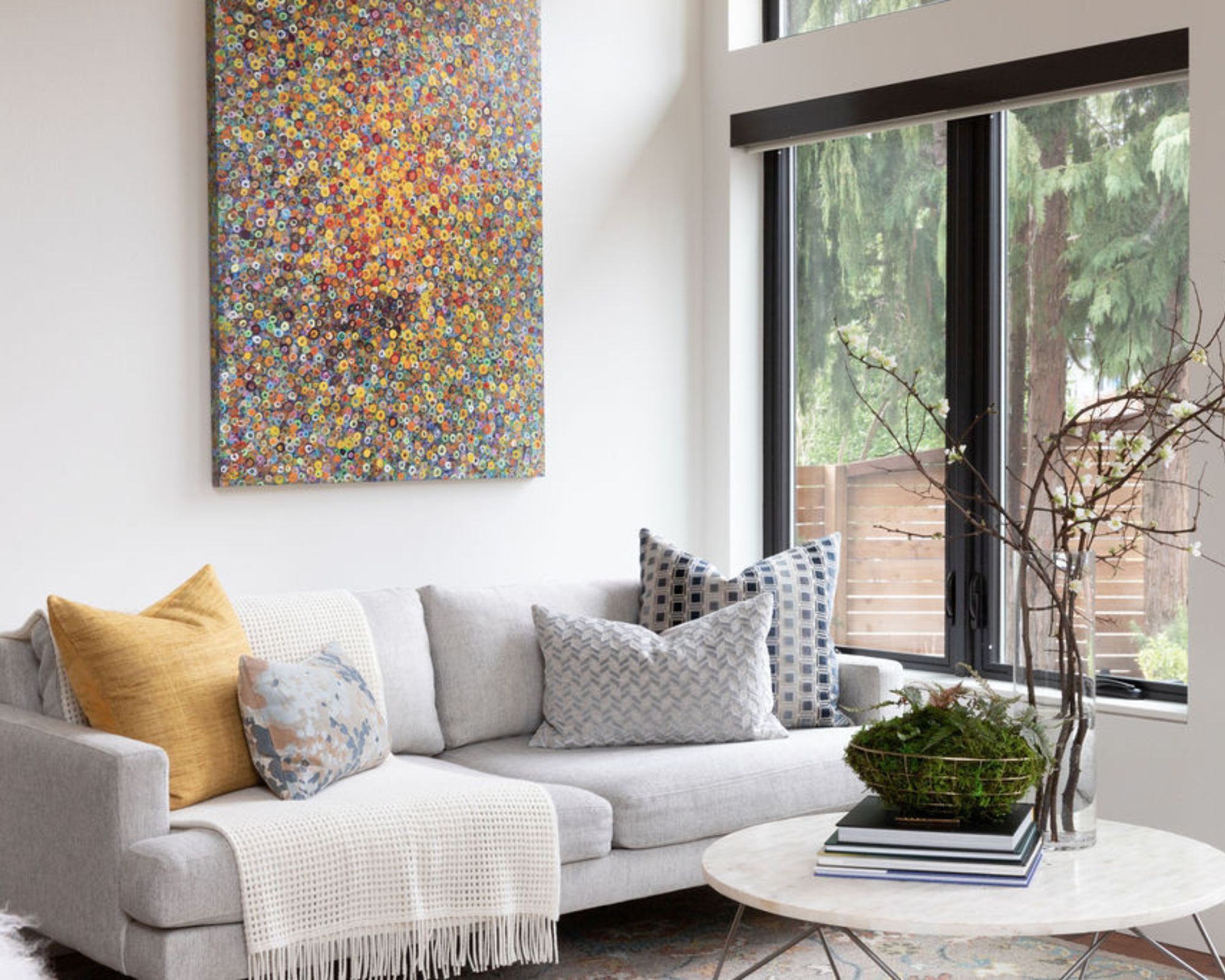
Knowing what color to paint the walls when decorating with art can be tricky. Opting for cream often makes a failsafe choice, however, since it likely won't clash, and instead will provide an understated backdrop to allow the artwork to take center stage.
'Using a nicely balanced cream wall color is a great way to show off art,' explains interior designer Jessica Dorling of Dorling Design Studio. 'A natural background with a creamy color allows the art to be the main focus while allowing the artwork to complement the furniture in the space.'
A gentle and warm neutral, it's clear why decorating with cream is so widely embraced by designers in both modern and traditional homes. To ensure you make the most of your cream color schemes, in whatever room they may be, take a look at what colors go with cream to gain some expert color combination ideas.

Emily is a freelance interior design writer based in Scotland. Prior to going freelance in the spring of 2025, Emily was Homes & Gardens’ Paint & Color Editor, covering all things color across interiors and home decor for the Homes & Gardens website. Having gained specific expertise in this area, Emily is well-versed in writing about the latest color trends and is passionate about helping homeowners understand the importance of color psychology in home design. Her own interior design style reflects the simplicity of mid-century design and she loves sourcing vintage furniture finds for her tenement flat.

