5 bedroom colors going out of style in 2025 – and what designers are using instead for a stylish sleep space
Designers are ditching these bedroom colors in favor of these on-trend and more restful alternatives

Design expertise in your inbox – from inspiring decorating ideas and beautiful celebrity homes to practical gardening advice and shopping round-ups.
You are now subscribed
Your newsletter sign-up was successful
Want to add more newsletters?
Choosing the right colors for a bedroom plays a key role in ensuring a calming sleep space to unwind in at the end of each day. And in 2025, experts say that certain colors are going out of style since they can feel at odds with ensuring a soothing space.
Here, we've rounded up five bedroom color trends that designers and color specialists say have fallen out of favor, and share alternative color ideas for a more on-trend and restful room.
From cool-toned neutrals that risk appearing drab, to vibrant and saturated tones that can disturb a bedroom environment, steer clear of these bedroom color ideas to ensure a well-designed sleep space.
Article continues below1. White
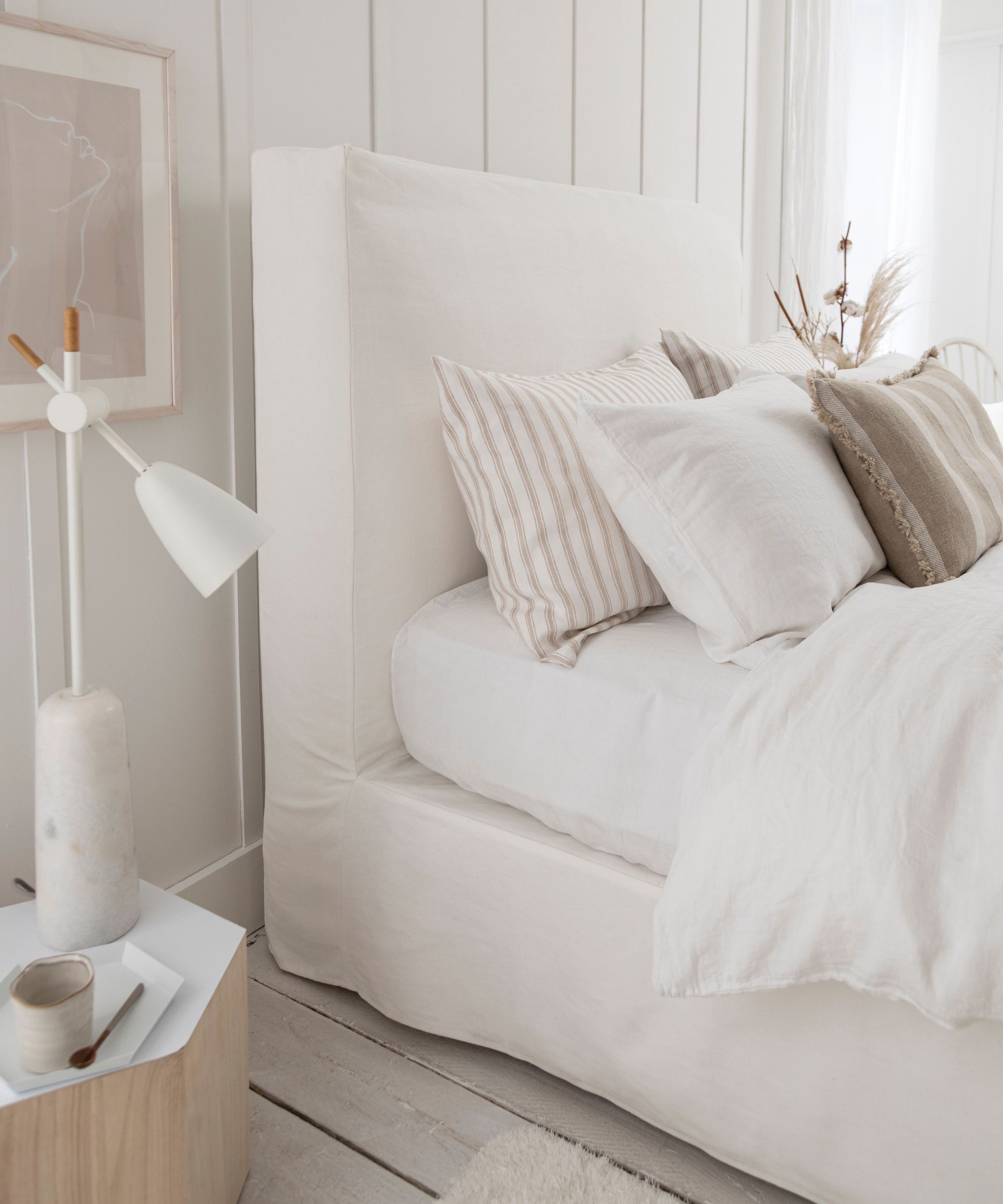
'White is a trend in certain areas, but we do not believe that area should be in the bedroom,' explains Blair Britt, Lead Designer & Owner at Bella B Home Designs. 'Life is hectic, your sleeping space needs to feel calm, relaxed, and serene. That can easily be done on a budget or in a luxurious way, just by adding the right paint color.'
'If you like the calming look of white bedrooms, go in the direction of Collingwood by Benjamin Moore, Revere Pewter by Benjamin Moore, or Stone Hearth by Benjamin Moore. These colors add just that right touch of warmth,' says Blair.
'I advise steering away from flat whites like Benjamin Moore's Misty Gray,' agrees designer Jacqueline Goncalves of Moksa Studio, who recommends going more colorful with paint ideas for an on-trend look. 'Blank neutral walls are being replaced with rich hues that can hold their own. In 2025, high style is in, and safe neutrals are out. 2025 embraces deep, rich earth tones that envelop a space, like a cozy blanket. Try Farrow & Ball's Ball Green or Portola Paints' Nitty Gritty.'
2. Cool neutrals
Similar to white, gray paint is another color designers are ditching in 2025. 'Once homeowners heard it could help sell a home faster, it quickly became a trend,' notes interior designer Amanda Jacobs of Amanda Jacobs Design.
Design expertise in your inbox – from inspiring decorating ideas and beautiful celebrity homes to practical gardening advice and shopping round-ups.
'But like white, if not layered with texture and depth, a gray bedroom can feel cold and uninspiring. There’s certainly a right way to use gray, but its overuse has made it feel tired. Moving forward, we should be designing spaces that feel like a retreat – somewhere to escape and unwind,' says Amanda.
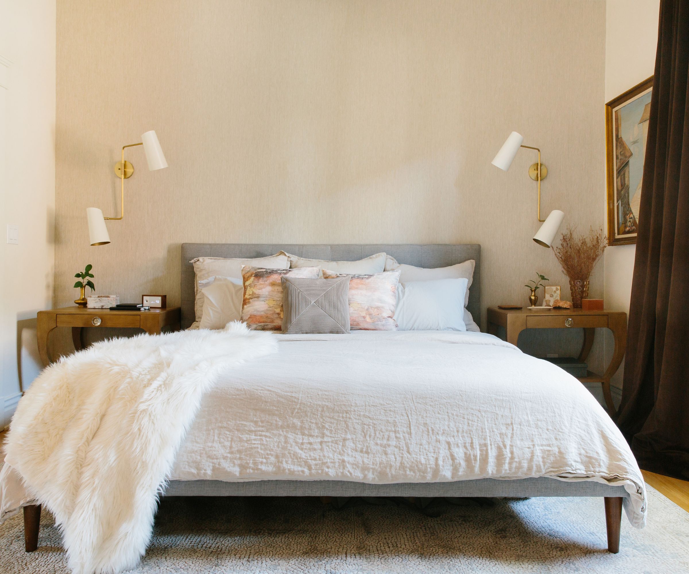
Choose warm neutrals instead of cool grays for a soothing sleep space.
'Cool grays have fallen out of favor for bedrooms – their stark, sterile feel at odds with the intimacy and comfort we all crave,' agrees interior designer Christina Kelley.
Instead of cool grays, Christina recommends warm-toned neutrals, which can be far more effective at creating a cozy and calming space: 'In their place, rich, earth-toned neutrals – like warm taupes, soft beiges, and muted clays – create a grounded, inviting retreat. These hues offer a perfect balance of sophistication and natural ease, infusing the room with a quiet, refined elegance. For a truly elevated look, opt for a matte or textured finish to enhance the organic appeal. Ditch the grays for taupe – it's down-to-earth and understated luxury guarantees a timeless, effortlessly chic vibe.'
3. Bright colors
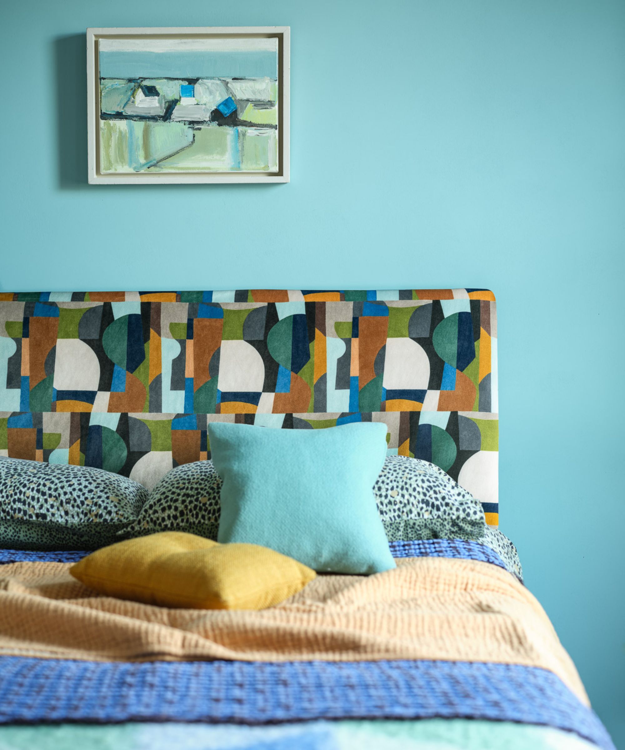
While certain neutral paints are said to be out of style for bedrooms in 2025, you should pay equal caution when decorating with bold and bright hues.
'I always like to go with really soothing and calming colors for a bedroom design, so I feel like super-bright and maximalist colors are falling out of favor a bit when it comes to bedrooms,' observes interior designer Kathy Kuo. 'Whether your preference is towards warm tones or cool tones, a more muted and subtle palette – think mauve, terracotta, and sienna for warms, and sage, slate, and lavender for cools – is going to feel more appropriate for a bedroom.'
This is echoed by Arianna Barone, Color Marketing Manager at Benjamin Moore, who adds that cool color schemes can be a better choice when the aim is to create a restful sleep space: 'Colors that are very bright or saturated, particularly warmer hues like vibrant reds, tangy oranges, and sunny yellows, can help to energize a space. Cooler colors – like blues, greens, and violets – are synonymous with tranquility and relaxation, and are popular options for bedrooms and bathrooms.'
'A few favorites include October Mist 1495, Silver Lining 2119-60, and Quiet Moments 1563. Don’t discount darker hues as they can also create a cocooning oasis when color-drenched. Colors like Velvet Cloak CSP-480 can create the ultimate sanctuary to start and end your day,' says Arianna.
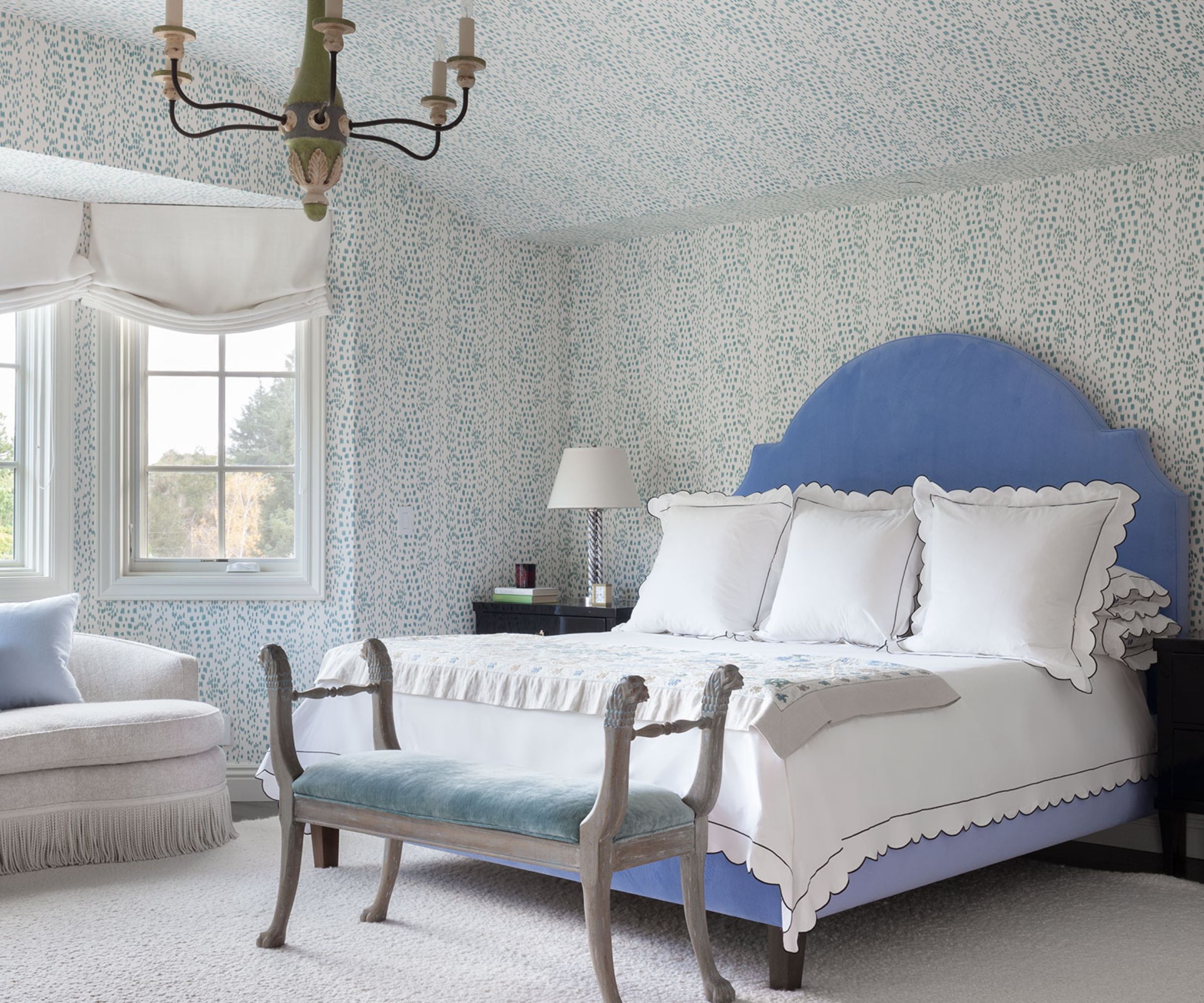
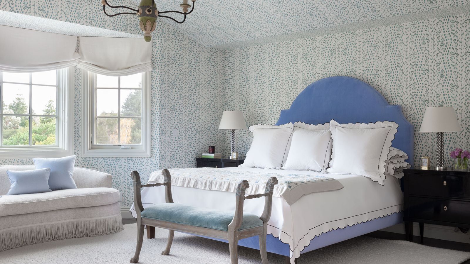
Opt for soothing cool colors instead of anything too warm or saturated to create a relaxing bedroom.
Here, the powder blue bedroom allows a colorful look while maintaining a calming feel throughout. 'I think blue is an eternally 'in' color for bedroom spaces, giving signals rest and relaxation, but I think anything too bright might look beautiful but regretful in function,' explains San Francisco-based designer Heather Hilliard of Heather Hilliard Design. 'Warm, muted tones are very much in, and I also love using fresh, airy blue tones. Both are easy on the eyes and promote a sense of calm and serenity.'
4. Navy blue
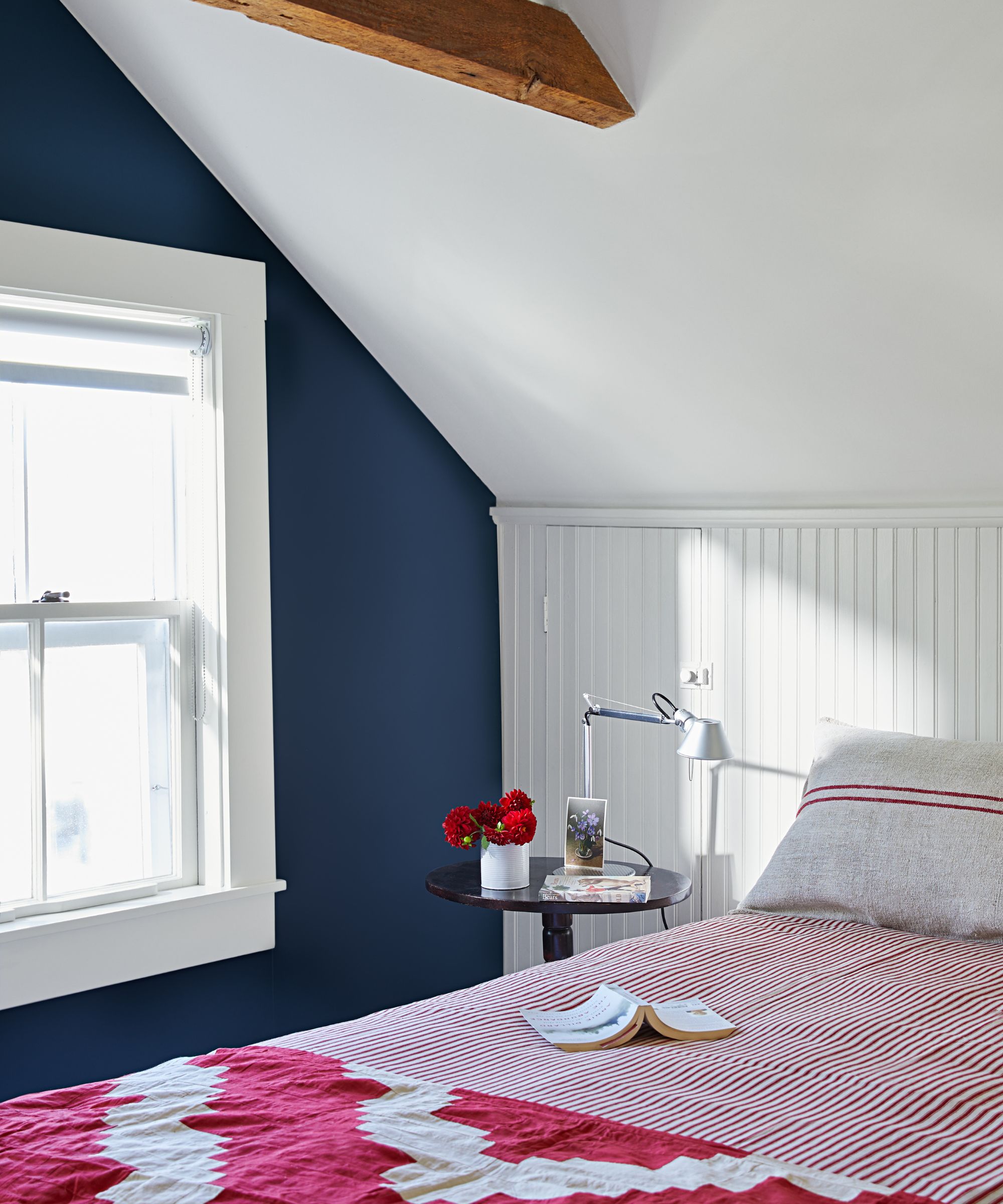
Navy blue is another color which, while once popular, can appear outdated in a bedroom color scheme, says Tash Bradley, Director of Interior Design at Lick and color psychologist. She warns to steer clear of a blue bedroom color scheme.
'Navy blue had its moment, and in 2025, we're seeing a definitive shift away from those deep, cooler hues in bedrooms. While navy can be classic, it’s starting to feel a bit heavy and emotionally distant for a space that should encourage rest and connection.
'Homeowners are now gravitating toward warmer, more nurturing tones – think soft terracottas, blush-toned beiges, and warming pinks. These shades feel like a warm hug at the end of the day. They foster a cozy, intimate atmosphere and reflect that growing desire to bring comfort and emotional well-being into our homes. Bedrooms are deeply personal spaces, and these warmer palettes allow people to express that in a more emotionally connected way.'
5. Pale pastels
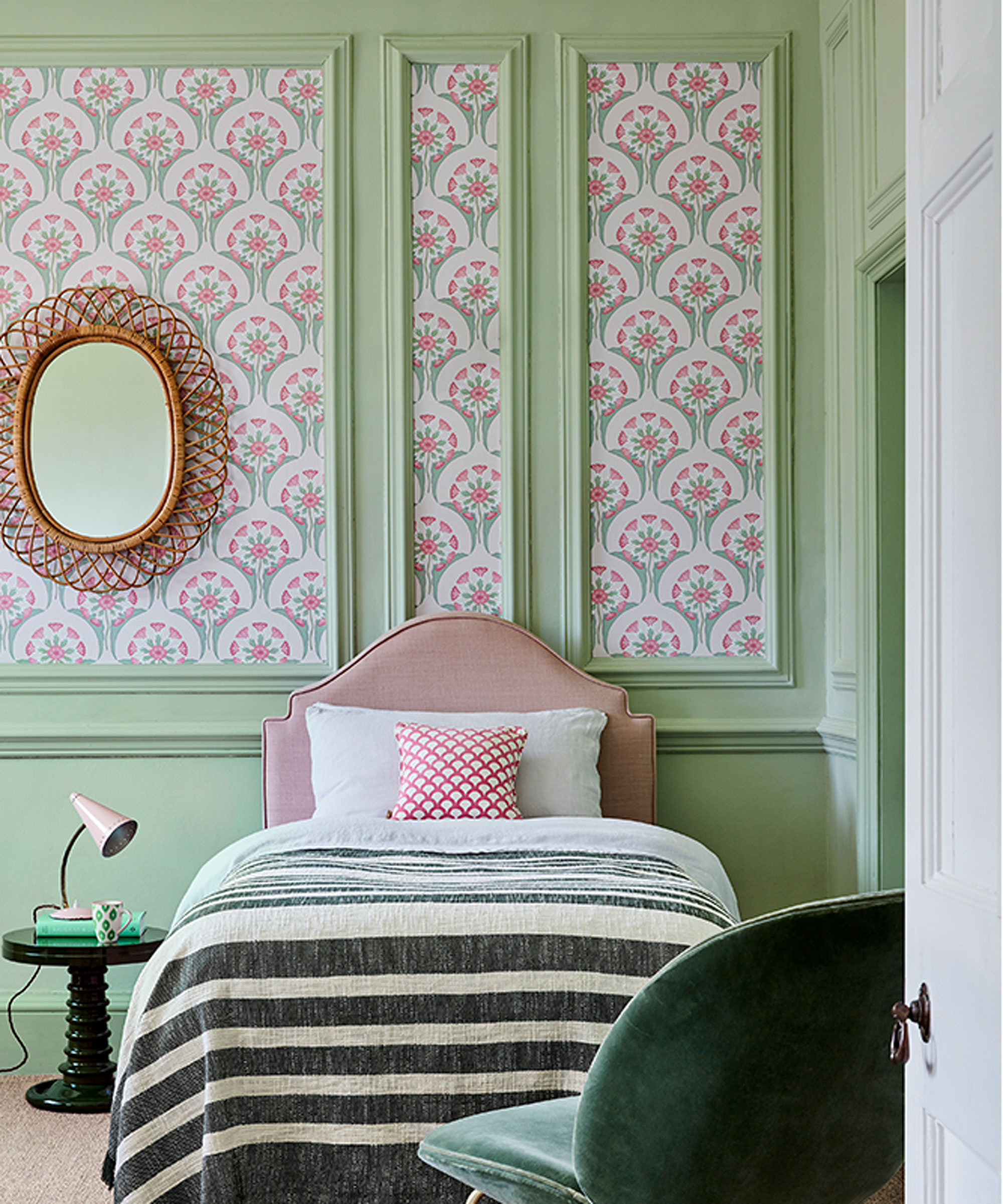
Lastly, pastel room ideas may not be the most stylish choice for bedrooms anymore. Although calming, richer, earthier tones can create a more stylish look while offering more coziness.
'We are seeing a move away from soft pastel colors, and off-whites that have historically typified a bedroom color palette, with warmer, richer neutrals and deeper, darker colors being used to create inviting and restful bedroom design schemes that layer texture, color and pattern,' explains Ruth Mottershead, Creative Director at Little Greene.
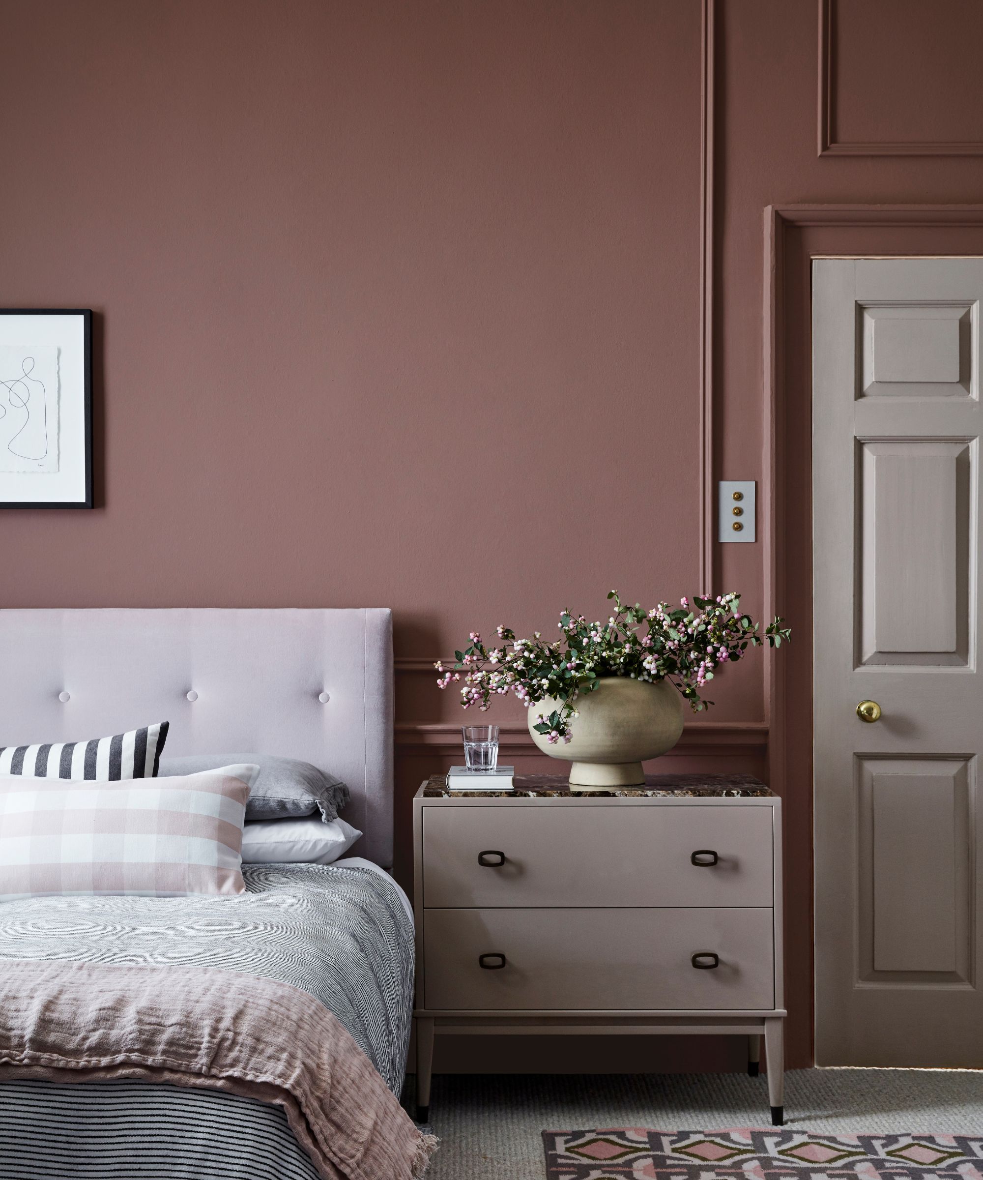
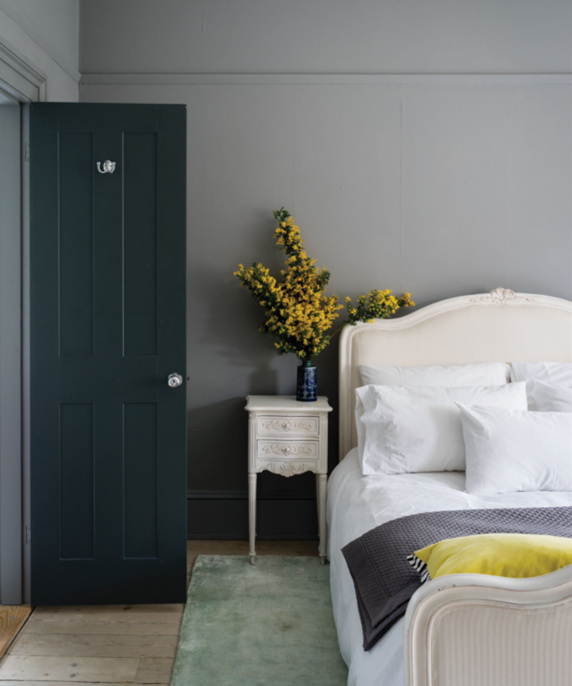
Add more depth to your bedroom color scheme with earthy tones rather than pale pastels, such as Little Greene's Nether Red which was used here.
'Intimate and cocooning colors are a fantastic choice for bedrooms – consider warm, deep neutrals such as Split Pink and Nether Red or bolder, yet natural pairings with striking tones such as the sumptuous Baked Cherry, deep Invisible Green, and rich Cordoba,' suggests Ruth.
Color is subjective, and so ultimately, you should be led by the colors that you align with most. That said, if you enjoy decorating with neutrals, consider swapping harsh whites and cool grays with warm neutral paints, which can feel much softer. If you prefer a colorful bedroom, swap pale pastels and overly saturated hues for slightly muted, earthy mid-tones or deep and dark warm-toned colors, which feel endlessly cozy and cocooning.

Emily is a freelance interior design writer based in Scotland. Prior to going freelance in the spring of 2025, Emily was Homes & Gardens’ Paint & Color Editor, covering all things color across interiors and home decor for the Homes & Gardens website. Having gained specific expertise in this area, Emily is well-versed in writing about the latest color trends and is passionate about helping homeowners understand the importance of color psychology in home design. Her own interior design style reflects the simplicity of mid-century design and she loves sourcing vintage furniture finds for her tenement flat.

