Bathroom colors going out of style in 2025 – and the designer-approved shades to decorate with instead
These are the colors to swerve in your bathroom decor if you want to create a stylish and design-led space, according to experts

Design expertise in your inbox – from inspiring decorating ideas and beautiful celebrity homes to practical gardening advice and shopping round-ups.
You are now subscribed
Your newsletter sign-up was successful
Want to add more newsletters?
In 2025, interior designers are avoiding certain bathroom colors that can feel out of style, and instead reaching for warmer or bolder hues to make the most of these small spaces.
While bathrooms are most commonly decorated with light neutrals to achieve a light and airy look, designers are proving that's not the only option for these functional rooms, and a revised approach to bathroom color ideas can do wonders.
Below, we've rounded up the outdated color trends for bathrooms in 2025, as explained by interior designers and color experts. For a stylish, design-led bathroom that doesn't compromise on functionality, designers' alternative color choices are worth exploring.
Article continues below1. Icy blues
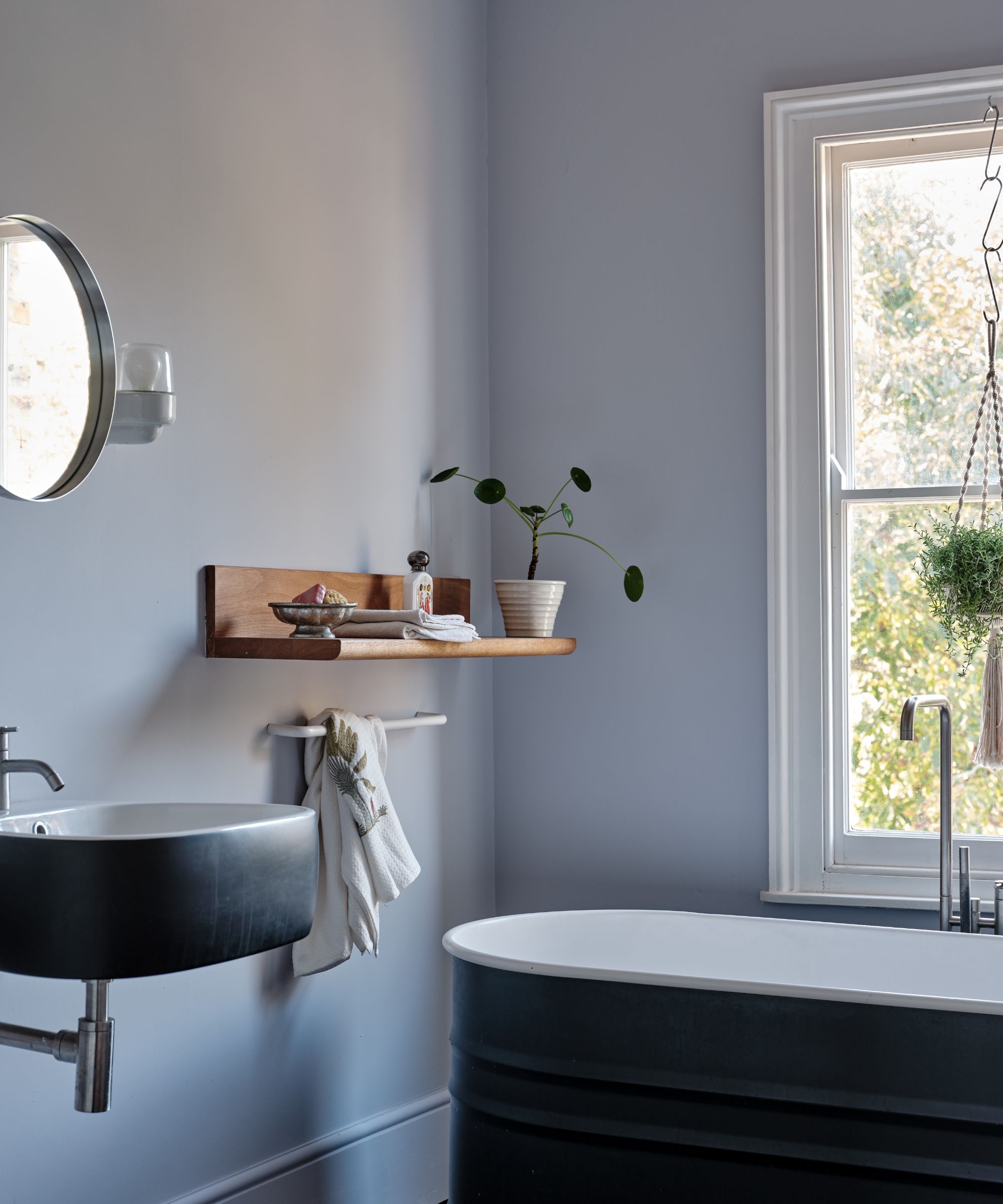
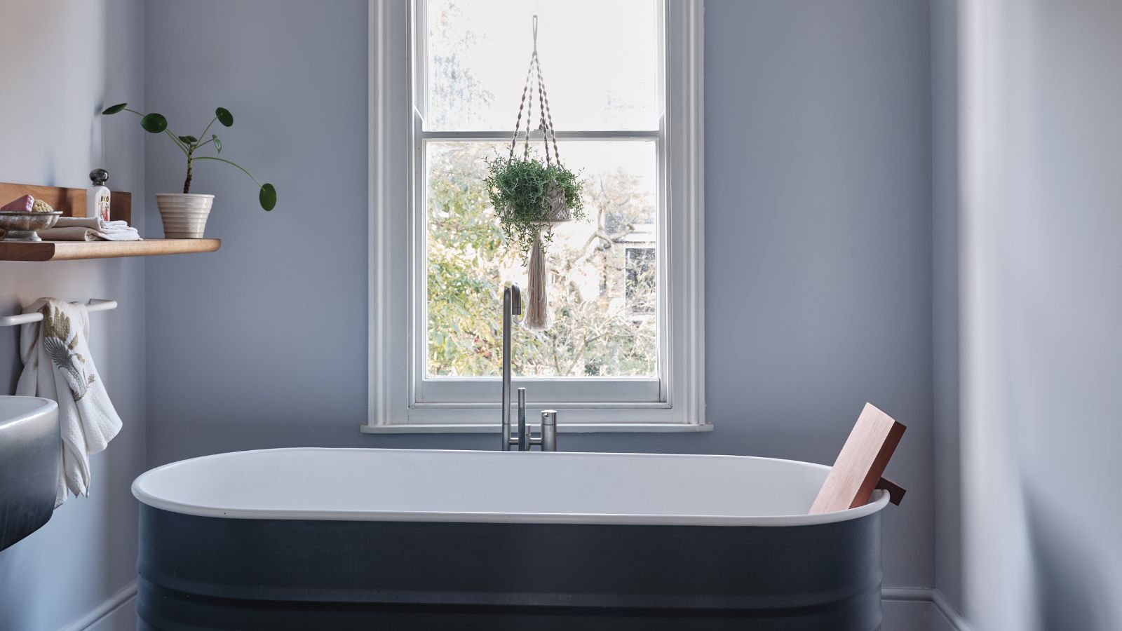
'In 2025, cool-toned blues, especially icy or saturated shades, are starting to fade in bathroom spaces,' observes Denver-based interior designer Nadia Watts. 'They can now feel too cold. Instead, try adding texture with grasscloth wallpaper, which brings warmth and organic charm, or go for bold, playful patterns like florals or geometric prints to make your bathroom feel more dynamic. Whether you opt for a calming or fun vibe, both options add personality and keep your bathroom on trend.'
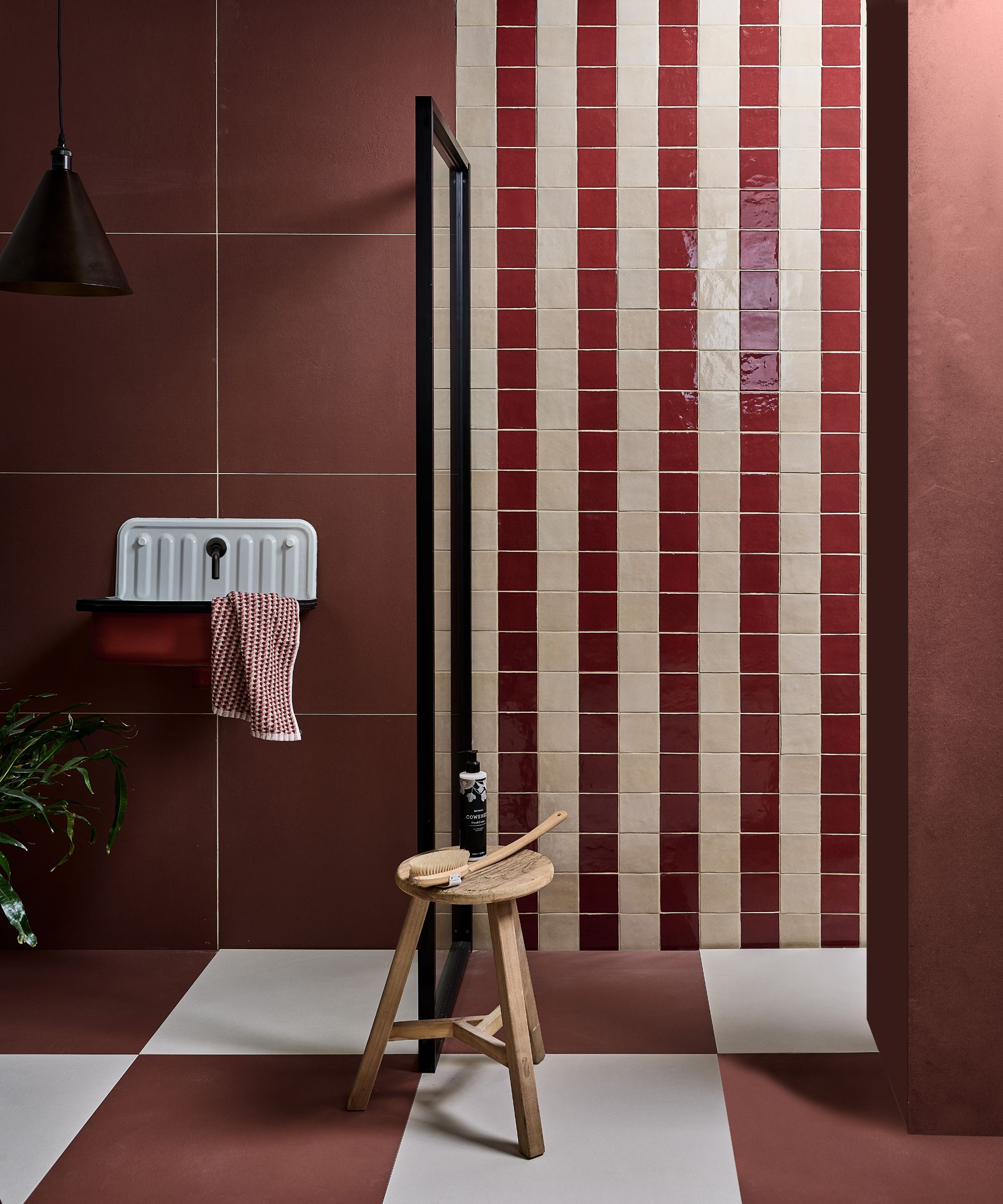
Swap icy cool tones for warmer colors, which create a more welcoming feel.
Tash Bradley, Director of Interior Design at Lick and color psychologist, also points to gray-toned blues as a bathroom color going out of style in 2025. 'I'm advising homeowners to steer away from those cold, clinical tones – particularly cool gray-based blues – in their bathroom spaces,' she explains. 'These shades can often feel sterile and uninspiring, especially in a room that should feel like a sanctuary. They can also be quite unforgiving in terms of lighting, sometimes making the space feel flat or even a little harsh.'
Instead, Tash recommends using richer shades that add design appeal and warmth to create an on-trend bathroom in 2025, while adding that matching the wall color to your tile ideas feels especially effective:
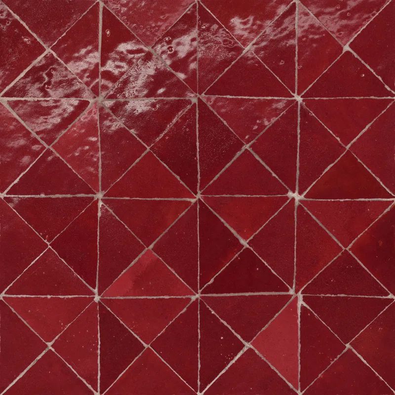
'We're seeing people becoming bolder and more expressive with their color choices – think rich, enveloping shades that turn the bathroom into a place of indulgence. I'm loving the rise of material drenching – where the same tone is used across tiles and walls. Deep reds like oxblood or claret and luxurious dark greens are becoming the go-to. These shades bring depth, mood, and personality, while still feeling incredibly stylish and timeless,' says Tash.
Design expertise in your inbox – from inspiring decorating ideas and beautiful celebrity homes to practical gardening advice and shopping round-ups.
2. 'Safe' neutrals
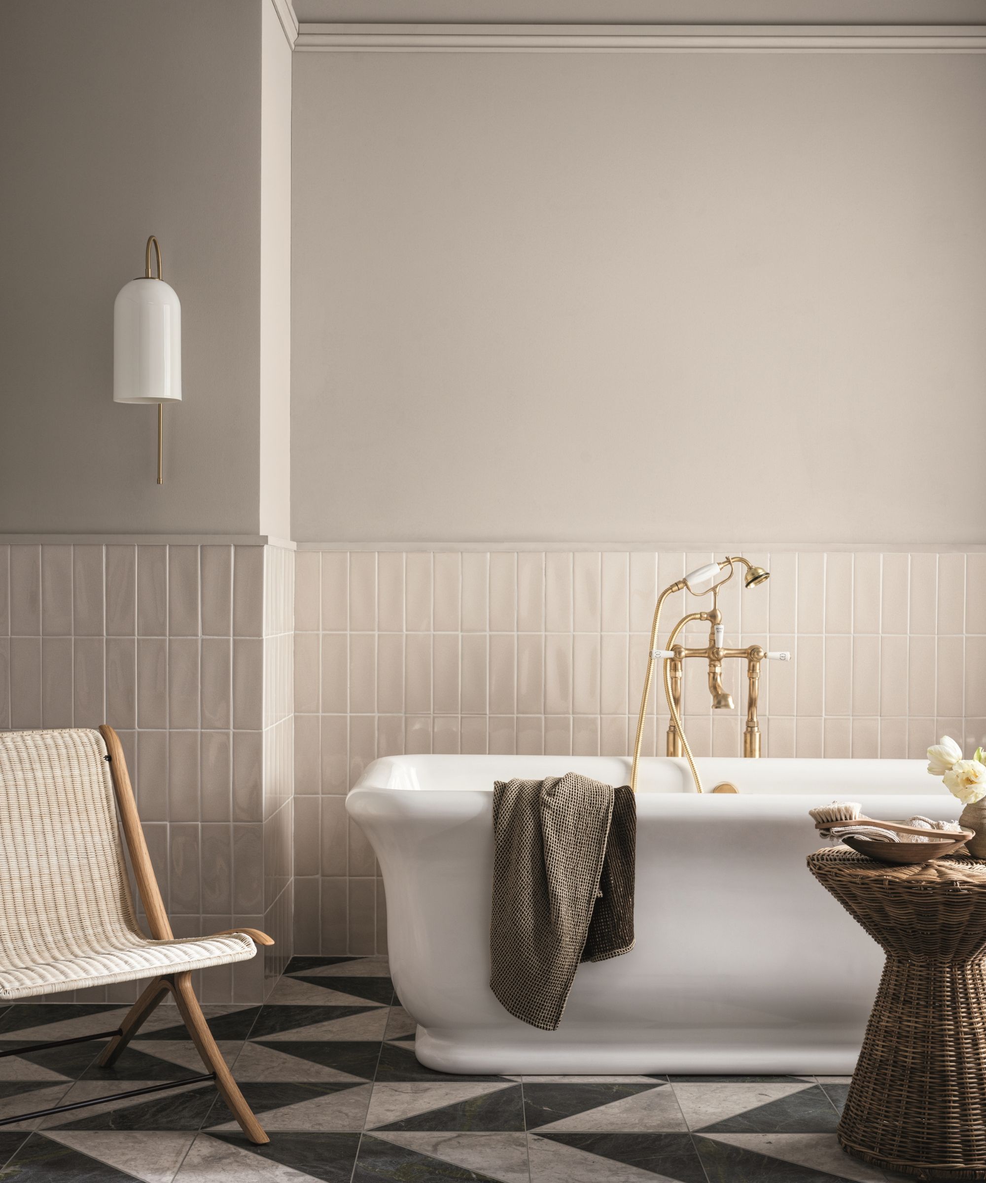
While decorating with neutrals has long been the go-to for bathrooms, neutral tones can lack design appeal, and many bathrooms can feel much more cozy and design-led with the use of bolder, moody hues.
'Moody paint colors bring depth and character to a space,' explains Arianna Barone, Color Marketing Manager at Benjamin Moore. 'They can either be dramatic and bold or sophisticated and soothing, and they are often infused with notes of gray or brown. If you are looking to create a moody bathroom vibe, lean into smoky mid-tones and darker hues over pastels and lighter colors. Colors like Black Satin 2131-10, Smoked Oyster 2109-40, and Antique Pewter 1560 are great options to start with. These darker, nuanced colors bring just the right amount of drama.'
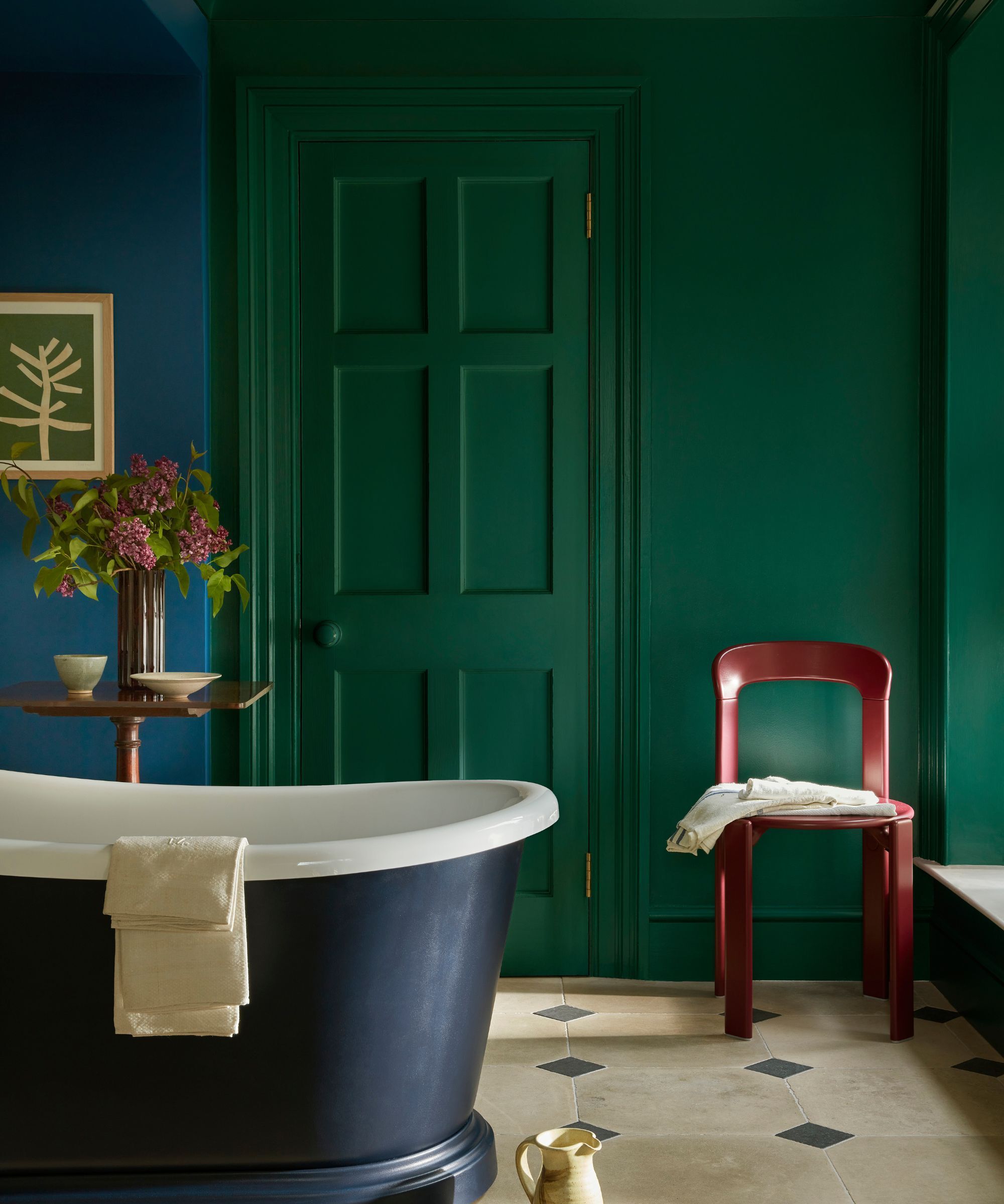
Go bolder in your bathroom with richer colors for a design-led look.
Ruth Mottershead, Creative Director at Little Greene, also sees a shift toward richer hues in bathrooms. She adds: 'Often painted in bright white out of habit, bathrooms can feel cold, generic and stark, so it’s wonderful to see the smallest room in the house benefitting from more decorative and creative design schemes, with artwork, fabrics and blinds and a renewed use of color rising to the fore.'
'Deep enveloping tones such as Mid Azure Green, a splendid, sophisticated green-blue teal color, can work fantastically in a bathroom. Consider combining it with the vibrant Deep Space Blue and indulgent indigo-hued Dock Blue in a double drenching scheme to create both contrast and harmony. This balanced color palette, which feels both lively and calming, is perfect for an engaging and tranquil bathroom reminiscent of forests, deep water, and blue sky,' adds Ruth.
3. Gray
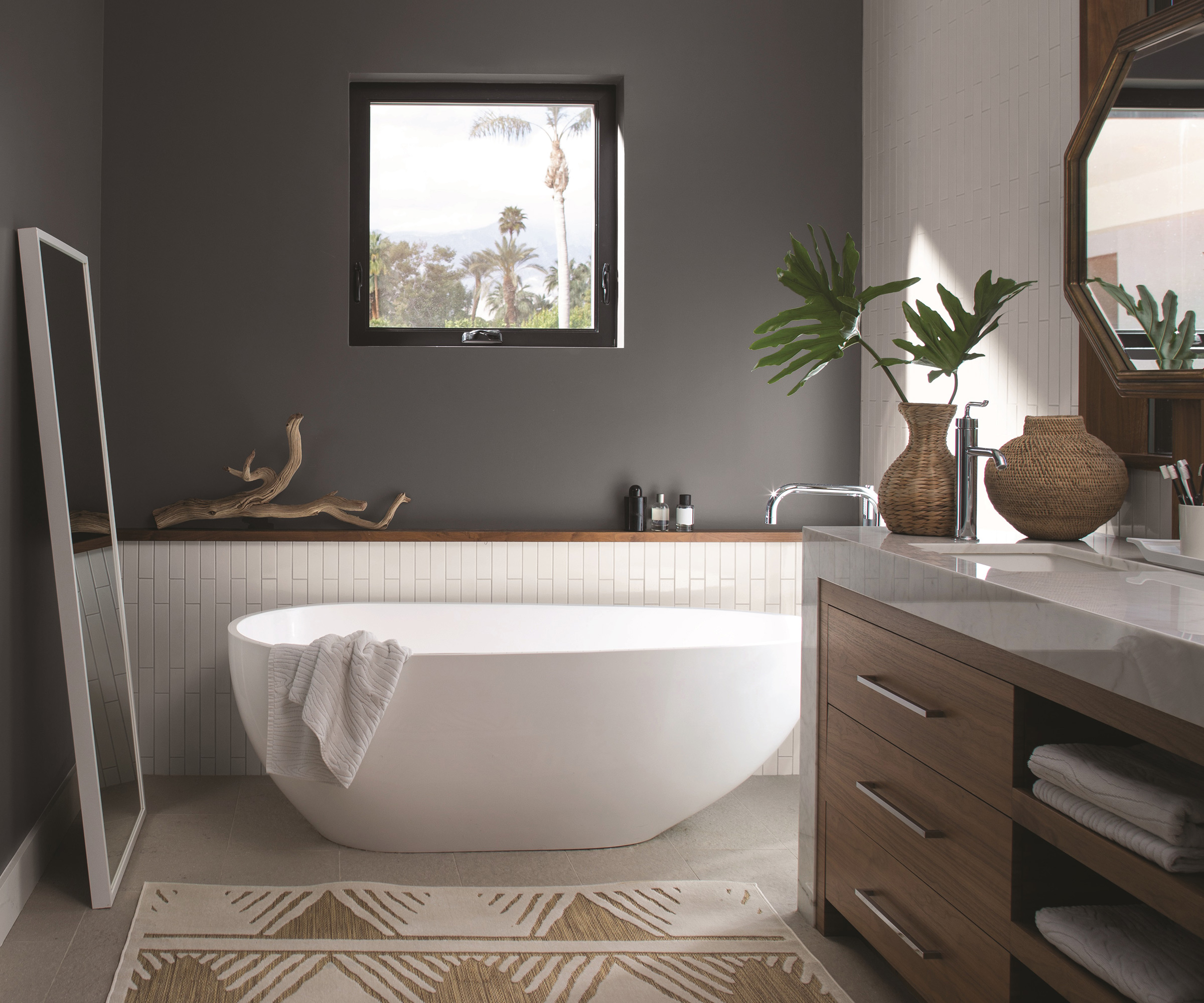
Aligning with the general shift in interiors away from cool color schemes and toward warm color schemes, decorating with gray continues to feel outdated in bathrooms.
'Cool grays are something we tend to steer away from,' says Blair Britt, lead designer and owner at Bella B Home Designs. 'It is very difficult to match tiles – they tend to pull blues and purples, even greens. They make a space feel very industrial, stark, and cold. We would favor warmer neutrals: Balboa Mist or Collingwood by Benjamin Moore are always a client favorite.'
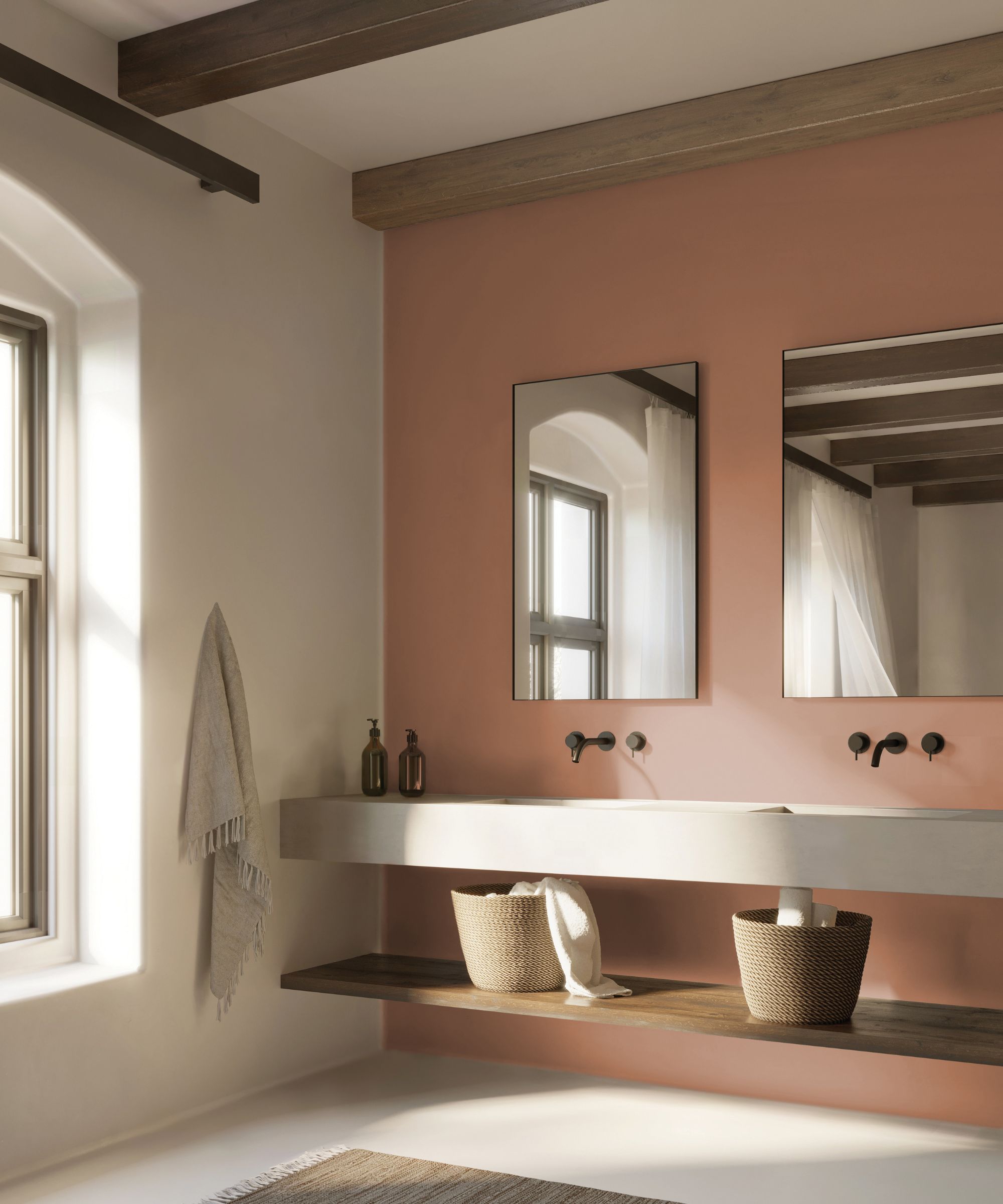
Go for earthy and warming neutrals instead of cool grays for an on-trend bathroom.
While richer, moodier shades feel more on trend, as explained earlier, neutrals will always work well in a bathroom. If you do want to embrace a neutral bathroom color scheme, experts point toward warmer, earthy tones for a more welcoming feel.
'We recommend steering away from gray in a bathroom as gray neutral bathrooms can feel cold. Instead, we’ve seen warm beiges and earth tones stepping in for gray, and also love a warm, muted terra cotta for a little more color,' says Sarah Kuchar, Creative Director at Kuchar Studio.
4. Cool whites
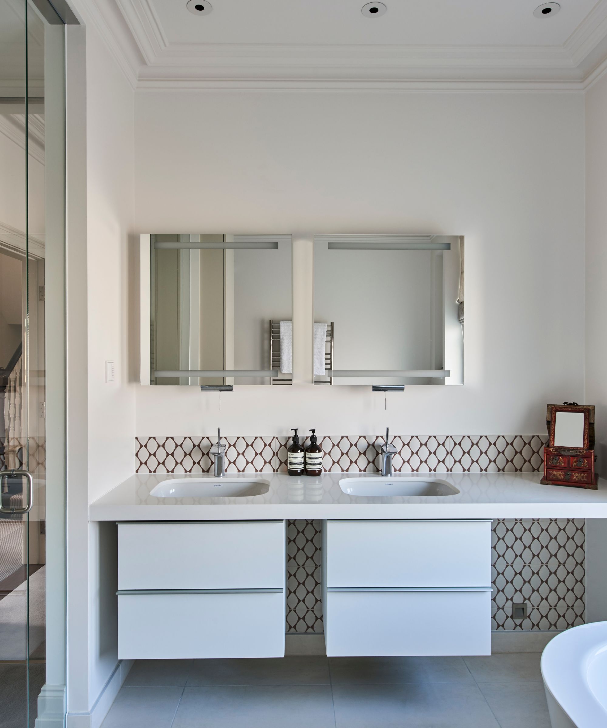
While white is another classic bathroom color, designers advise steering clear of cool-toned whites, which can appear stark and clinical. 'Stark, cold whites – especially when paired with glossy finishes – are starting to feel a bit sterile and outdated in bathroom design,' explains designer Jessica Whitley. 'For years, the all-white spa aesthetic was a default choice, but in 2025, we’re seeing a shift toward moodier, more soulful spaces.'
'Icy neutrals like Farrow & Ball's Wevet, popular in years past, are now dated,' agrees designer Jacqueline Goncalves of Los Angeles-based Moksa Studio. 'By nature, bathrooms are typically flooded with light, which bounces off bright icy neutrals – together with porcelain fittings, the bathroom becomes very stark.'
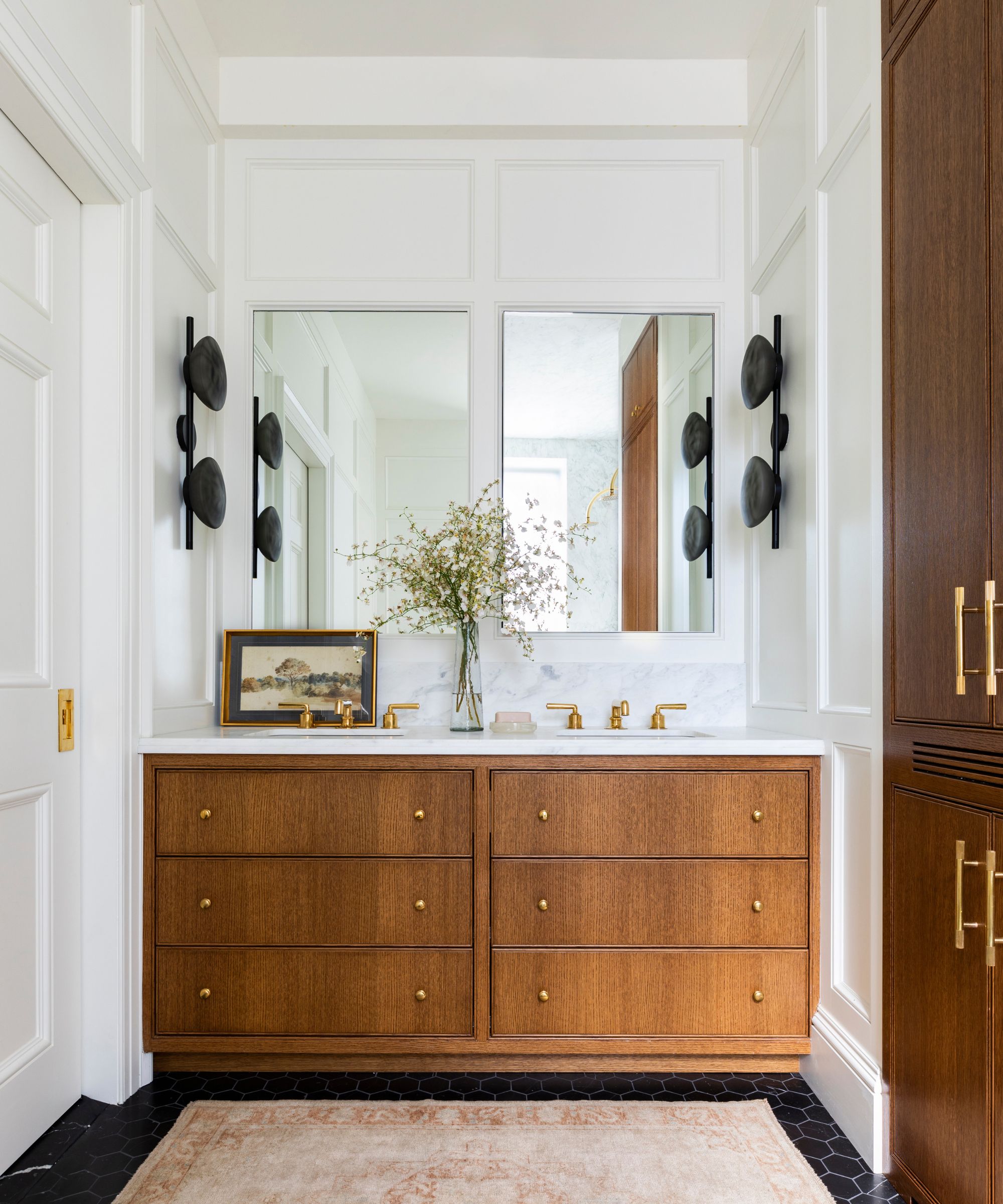
Choose flattering warm white paints for a welcoming bathroom.
If you love the pared-back, classic appeal of decorating with white, swap out cool tones for warm white paints. Giving you the same light and airy look, yet with a much softer finish, paint colors like Benjamin Moore's Cloud White, which was used here, can elevate your white bathroom.
'If our clients still like the idea of white, we look towards softer whites like calcutta and blend them with creamy accents and warm stained woods to soften the space,' explains Gina Valenti, Director of Interior Design at Michael Abrams Interiors.
While there are many warm white paints to explore for bathrooms, Portola Paints' Full Circle features undertones of blush and lavender for a soft look. 'For a master bath, I would go for a soft, warm white. Full Circle has a wonderfully balanced palette. Very subtle gray and blush undertones,' explains Jamie Davis, founder of Portola Paints.
While bathrooms can be small rooms, there's no reason to shy away from using exciting, rich colors. A fresh coat of paint in a moody, sophisticated hue can do wonders to transform these functional spaces, while warm neutrals can be used instead of cool, stark tones to create a welcoming and understated feel.
Emily is a freelance interior design writer based in Scotland. Prior to going freelance in the spring of 2025, Emily was Homes & Gardens’ Paint & Color Editor, covering all things color across interiors and home decor for the Homes & Gardens website. Having gained specific expertise in this area, Emily is well-versed in writing about the latest color trends and is passionate about helping homeowners understand the importance of color psychology in home design. Her own interior design style reflects the simplicity of mid-century design and she loves sourcing vintage furniture finds for her tenement flat.
