What color makes you angry? This powerful color should be used with caution
Red is considered the most anger-inducing color, influencing everything from our decorating choices to our behavior and emotive responses

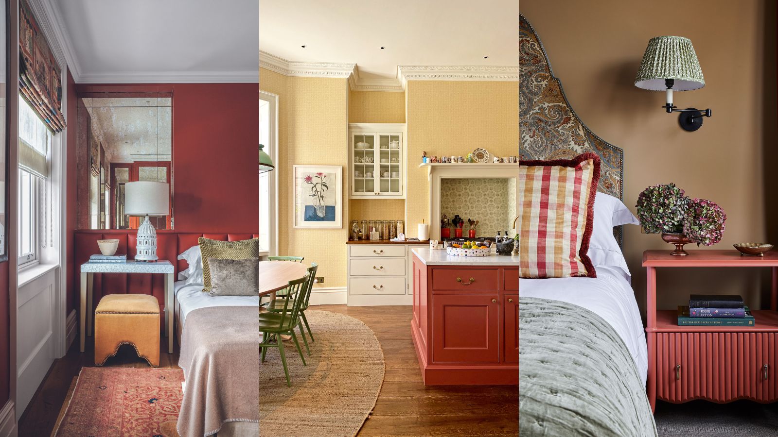
As anyone who has been through the process of searching for a happy room color scheme will attest, choosing the perfect color can be a minefield of decorating possibilities.
But one common question we often ask when deciding on the best room color ideas is; what colors make you angry? According to color psychologists, the one color that could make you angry is 'red'.
If you've felt angry, frustrated, and overly stimulated while just sitting in a red-painted room, you are certainly not alone. Red room ideas can be too intense for some people. This assertive and aggressive color often reminds us of danger, which is why it is often used in warning signs and traffic signals.
Article continues belowHere, color psychologists, decorators, and experts reveal why red is the most anger-inducing color – and how to decorate with red in a more pleasing and less stimulating way.
What colors make you angry?
Experts and decorators agree that red can make you angry, which may not come as a surprise to many. Physically, red is reported to induce reactions in the body that are similar to stress responses, such as increased heart rate, heightened senses, and higher body temperature.
For all its negative associations, it is undeniable that red is a color that we should pay heed to when it comes to our mindset as well as our decorating ideas. A historical color, scientists have more recently found evidence that over 40,000 years ago, Stone Age dwellers ground up red clay to make wall and body paint. Another use was protection in the afterlife. These days, red is a prominent color at weddings and religious ceremonies in certain countries, too.
Over time, color psychologists have found that red can have a profound influence on our mood, perceptions, and even our actions. Decorating with red can even change your physiology and balance of hormones. So what is it about the color red that makes it so highly potent when it comes to interior design?
Design expertise in your inbox – from inspiring decorating ideas and beautiful celebrity homes to practical gardening advice and shopping round-ups.
What is an aggressive color?
Red, for all its design potential, is considered the most aggressive color. 'It's the one color that we are unable to live within large quantities,' says Karen Haller, color psychology specialist, teacher, and best-selling author of The Little Book of Color.
'The most aggressive color for you is entirely personal,' she says. 'It could be a color that conjures up a personal memory that has negative or unpleasant feelings. This might not necessarily be carmine. However, we respond to red in a more physical way – it can raise our pulse rate and put us into fight or flight mode.'
'It helps to be mindful of the visceral impact color can have on our mindset. For this reason, I would avoid red for a child’s bedroom or playroom,' Karen continues. 'You want them to go to sleep straight away, and the color red is saying "stay awake and alert" – it’s bursting with energy, and can cause an overactive imagination.'
But that is not to say that you shouldn't use red for your home decor ideas. In fact, the color red is enigmatic, and strong, and can be used to great decorative effect. We asked some of our favorite interior designers about the best ways to use this controversial color in our homes.
Why is red such a powerful color?
Red is a powerful and evocative color like no other; this physically stimulating hue should always be used with caution. Red is known to stimulate our senses and adrenal glands, making us more sensitive to our environments.
How to use red at home
Look no further than the warming tones of a rusty red, deep crimson or earthy pink for a hue that packs a punch.
1. Use red in small doses
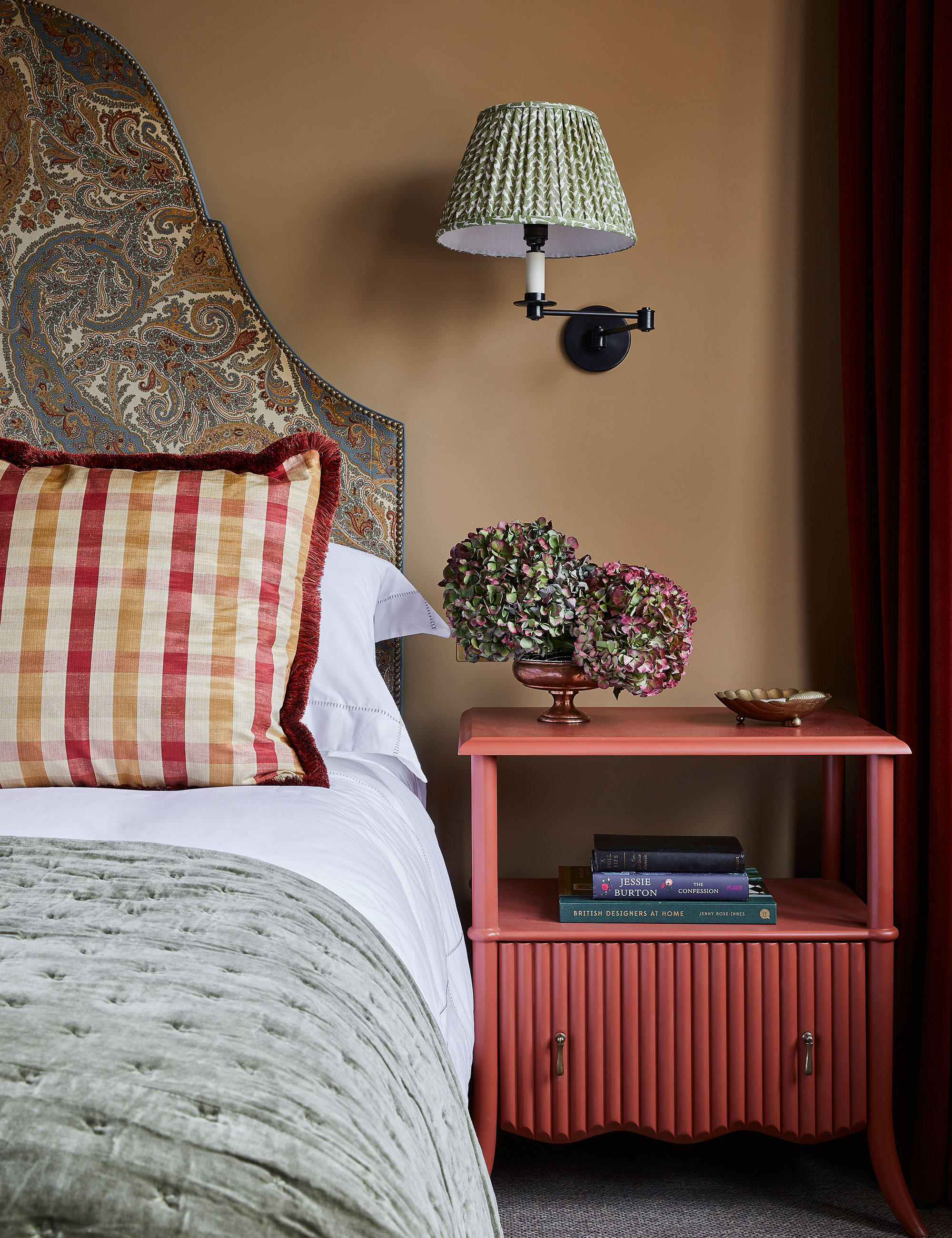
If you love the color red, then use it in smaller doses to create a unique and characterful statement. Despite its negative associations, red isn't all bad, especially when used as an accent color in the home. It has many positive connotations, too. This hue has the ability to grab attention, and evoke passion and sensuality, making it the perfect choice for the main bedroom.
2. Take a monochromatic approach
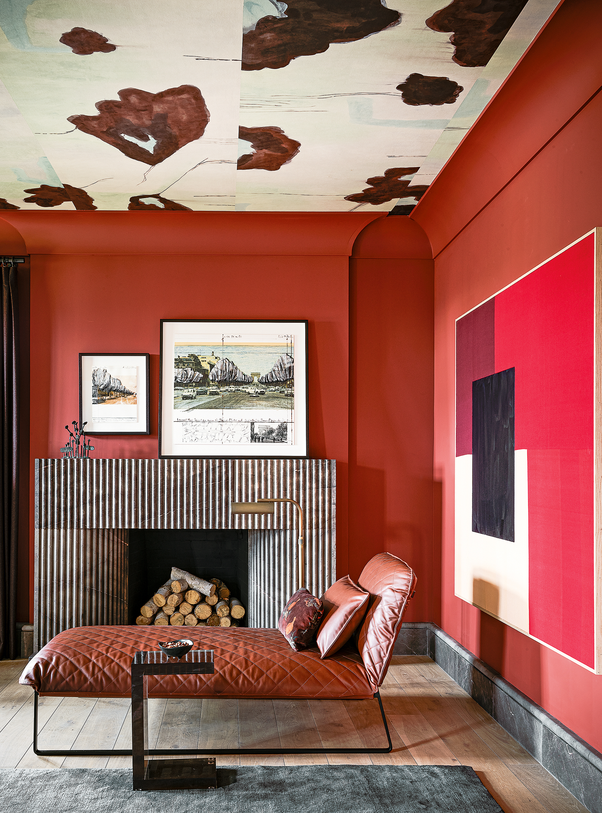
‘Many people think red is harsh, but used in a monochromatic way I find it to be very soothing,' says Chad Dorsey, interior designer and founder, Chad Dorsey Design. 'We also used it for the ceiling in this room, designed in collaboration with Porter Teleo wallcoverings.’
3. Soften red with a complementary color
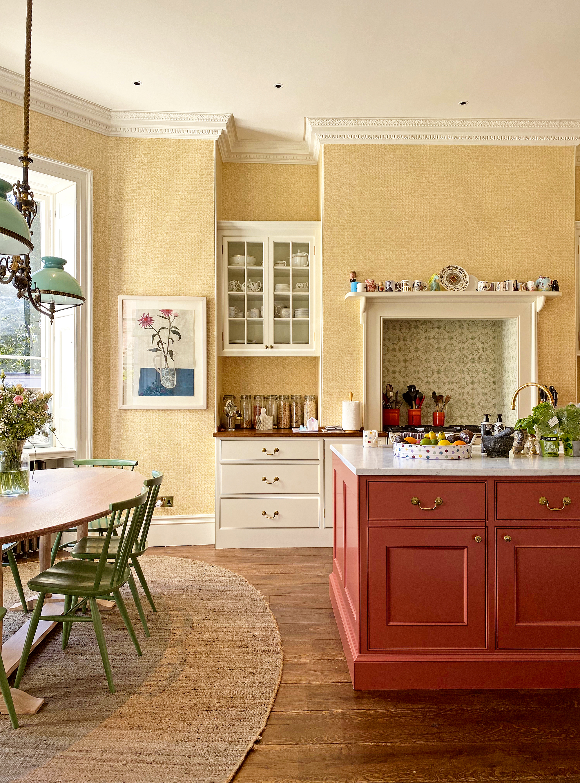
‘I love deep red hues and use them often in my projects,' says Brandon Schubert, director, Brandon Schubert Studio. 'It’s a color that can take on loads of different attitudes depending on what you pair it with. It’s that versatility that makes deep rusty reds a perfect choice for joinery.’
4. Don't fight the light
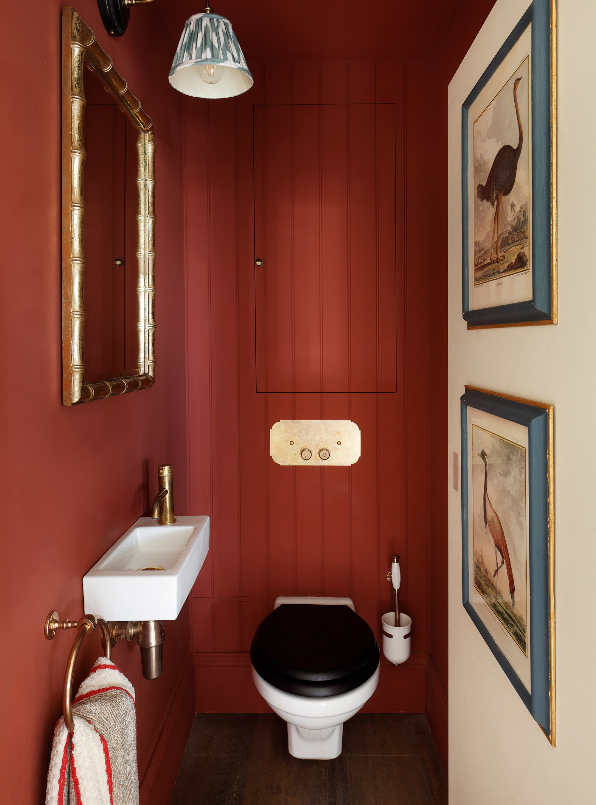
Windowless powder room or cloakroom? Don’t fight the lack of light. ‘Dark shades are a great way to deal with cloakrooms that have little or no natural light. The key is to keep the palette simple but strong,’ says Kate Cox, interior designer, HÁM Interiors. ‘Here, we opted for a rich red. Its dark undertones take a room from drab to dramatic and enlivened.’

Jennifer is the Digital Editor at Homes & Gardens, bringing years of interiors experience across the US and UK. She has worked with leading publications, blending expertise in PR, marketing, social media, commercial strategy, and e-commerce. Jennifer has covered every corner of the home – curating projects from top interior designers, sourcing celebrity properties, reviewing appliances, and delivering timely news. Now, she channels her digital skills into shaping the world’s leading interiors website.