5 living room paint colors going out of style in 2025
What colors are going to date your living room this year? We look at the shades that are falling out of favour in 2025

Design expertise in your inbox – from inspiring decorating ideas and beautiful celebrity homes to practical gardening advice and shopping round-ups.
You are now subscribed
Your newsletter sign-up was successful
Want to add more newsletters?
Living room colors that are going out of style in 2025 all point to one thing: we are very much over bland, neither here nor there shades. Move over, slate gray. ‘Laid back luxury’, your time's up. Time to shift a gear from inoffensive but ineffective greige.
Choosing the right paint color for your living room is one of the quickest and most impactful ways to inject personality into a space. However, opting for colors that are on their way out can easily detract from the room’s potential.
So if you're searching for living room color ideas, it can be just as useful to know the colors that are falling out of fashion as it is to know the latest color trends. Especially as many once-popular colors are starting to feel a little stale, so some of these dated shades may surprise you.
Article continues belowHere, with the help of interior designers, we unveil what living room paint colors are out of style, plus their advice on what colors have stepped into the spotlight.
1. Beige and greige are overdone
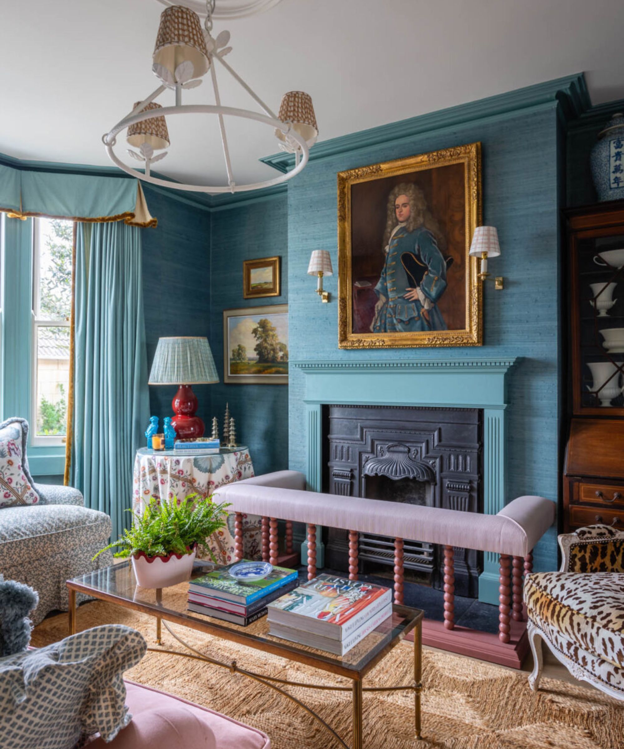
Interior design by Sean Symington
When I consulted color and design experts to help me read the tea leaves on the paint trend forecast for 2025 and beyond, there was one resounding takeaway from the experts. Beige, greige, and taupes, which for a long time were hailed as the ultra-chic and dependable neutral, have taken a backseat as brighter, bolder, and more saturated colors take the limelight.
This paint trend for ditching muted hues for bolder colors is being seen more and more in living rooms, which were for a long time considered too risky, and too important a space to be painted in a color other than a neutral.
‘We have noticed people reaching for color more,’ explains Arianna Barone, Color Marketing Manager at Benjamin Moore. ‘Off-whites and neutrals will always be color palette staples, but people are no longer defaulting to them, even for common connector spaces in the home, like living rooms. People are looking for more nuanced colors that have a presence in the space but are not distracting.’
Design expertise in your inbox – from inspiring decorating ideas and beautiful celebrity homes to practical gardening advice and shopping round-ups.
2. Sage green is off the hot list
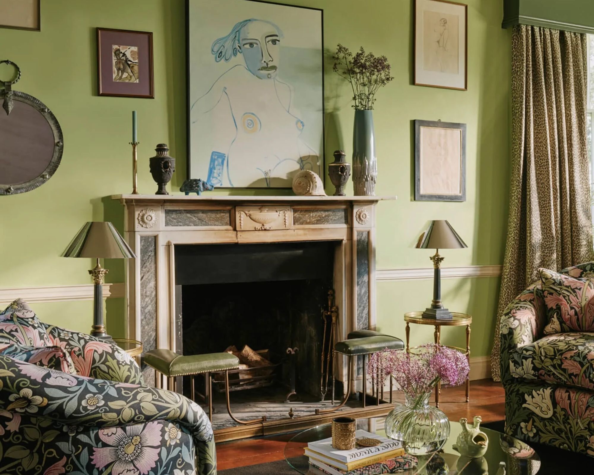
Walls: PETUNIA, House of Hackney
Sage green fatigue seems to have well and truly set in. Once the darling of calm, cottagecore interiors, traditional sage green has reached its saturation point. Its muted (and sometimes very muddy) gray-green tone became the go-to for kitchen cabinets, bedroom walls, and living rooms, but with such widespread use, it started to feel predictable, even tired. As a result, sage green is retreating from center stage, making way for more vibrant, saturated green paint colors with more spirit.
Even though sage green is no longer trending in living rooms, if this is a color you have used throughout your interior, rest assured that sage green won’t necessarily age poorly. It is a color found so often in nature, it can serve as a neutral backdrop that won’t fall out of fashion as dramatically as the avocado bath suite.
However, for something with more personality, that feels more current, consider more vivid greens that brings a fresher twist. If it's the muted softness of sage you’re drawn to, opt for a lighter, livelier take – something like Farrow & Ball’s Cooking Apple Green, which offers a gentle freshness without losing its calming appeal.
3. Switch out garish yellows
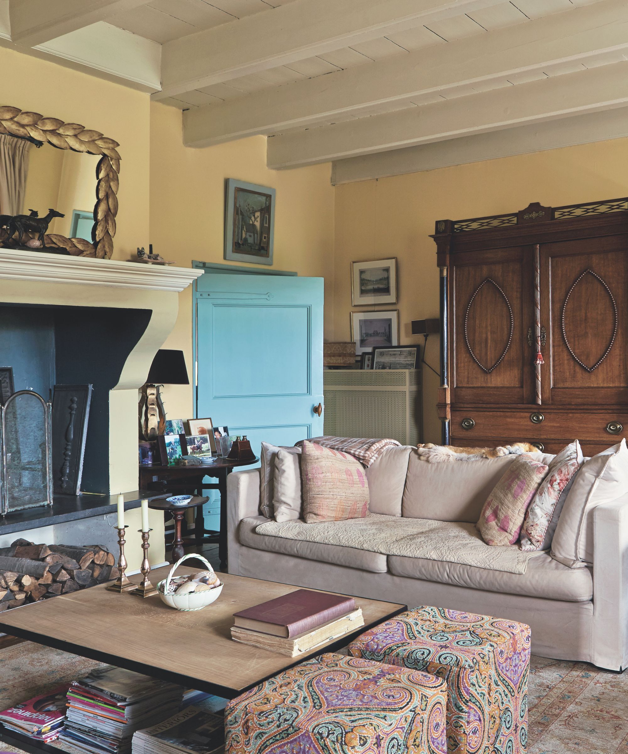
Walls: Hay, Farrow & Ball
Certain yellows are definitely seeing a revival as a living room color, but bolder or more muddy tones are shades are on the out. The key is choosing a yellow paint that strikes the right balance
Unless you want your living room to look like the sun-drenched walls of a Tuscan villa, a yellow with muddy or brown undertones may feel a little too warm. Likewise, a yellow with blue, cool undertones may appear very zesty and sharp, and perhaps suited better to less lived-in areas of the home. And, darker mustard tones, which once dominated the design world, are now starting to feel a bit outdated.
In their place, butter yellow has emerged as the new favorite. Butter yellows are their own breed entirely; they’re softer and more refined than their sunnier cousins, like bright pollen yellow or electric yellow, and much more livable than their heavy and often oversaturated counterparts, like turmeric or mustard yellows.
A true ‘butter yellow’ like Farrow & Ball Hay, Butter by Mylands, and Madeliene by Little Greene will be just as welcoming in 10 years as it is today. 'Butter yellow brings reassurance and character. It's a color that exists in nature, and it ages beautifully over time,' explains Shauna Dennison-Taylor, Creative Director at Penny Morrison.
3. Graphite grays have fallen out of fashion
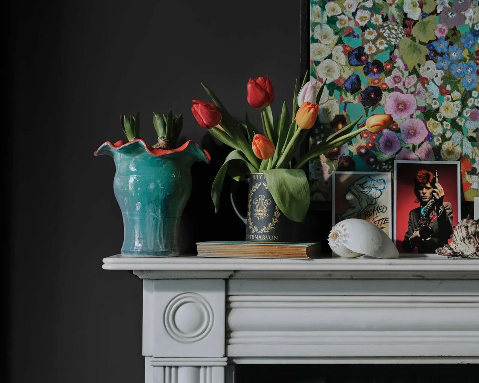
Walls: JET, House of Hackney
Decorating with gray was once very much the 'done thing'. Now, it is safe to say, the design world has grown tired of this non-color.
I, for one, can’t see the back of gray quickly enough. But if you love the cool, Scandi-sleek effect, rest assured that the pared-back aesthetic can still be achieved without incorporating the energy-zapping iron grays and ice-cold blue grays that are much more skilled at depressing a room rather than uplifting it.
‘We have seen a real shift away from the cool, blue-toned grays that were popular in recent years,’ explains Ruth Mottershead, Creative Director at Little Greene. The shift, it would seem, has come from a rejection of cold, sterile interiors. Even within cool, minimalist living rooms, the design world has moved on to sharper, smarter colors that are, it would appear, much better at achieving this refined look.
‘A living room should not be gray,’ states UK-based interior designer Loita Colenso. ‘Gray is a cold, gloomy color, and like interiors of the past.’ Instead, look to more sophisticated but equally chic bold hues like charcoal (crucially those with a red undertone), midnight blues and petrol hues, with a shock of gray in their undertone, mahogany browns or moss greens like Farrow & Ball Dibbler or London Brown by Mylands.
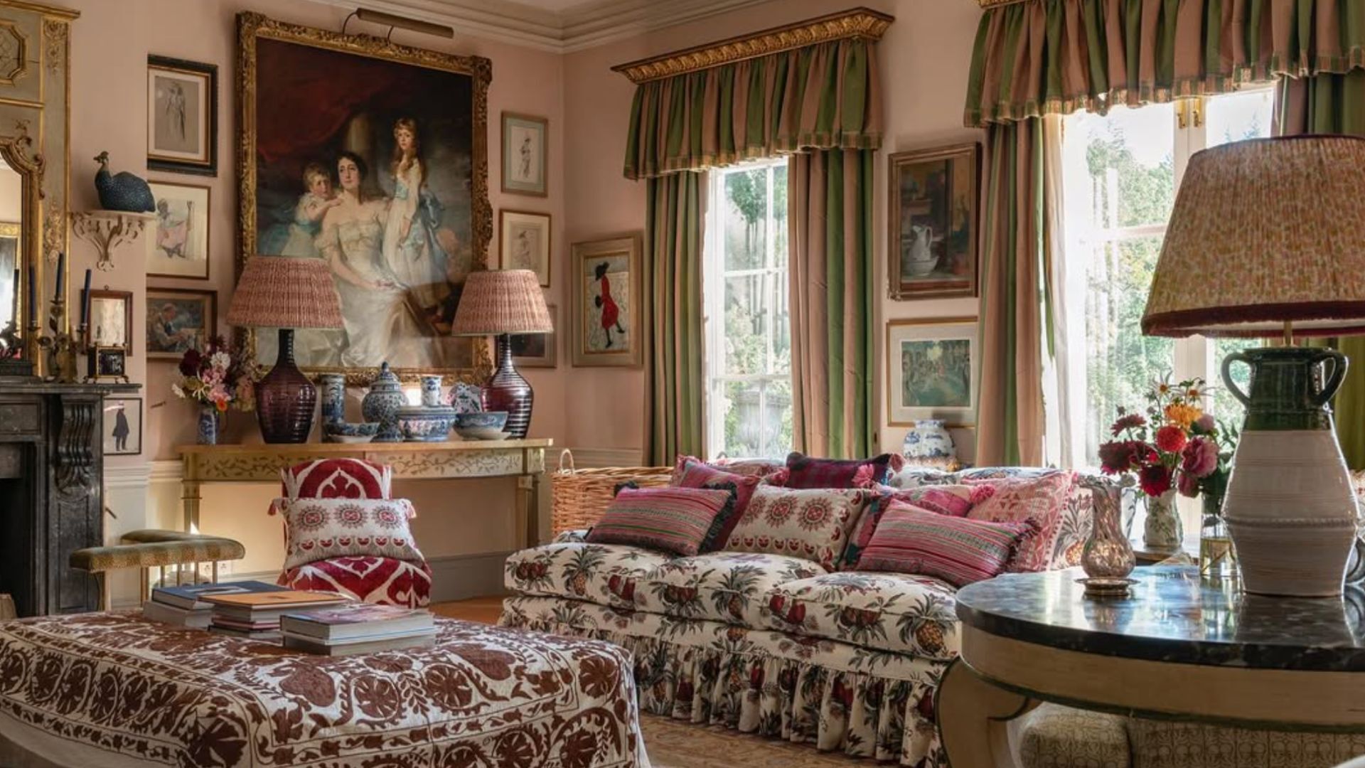
4. Pastels be gone
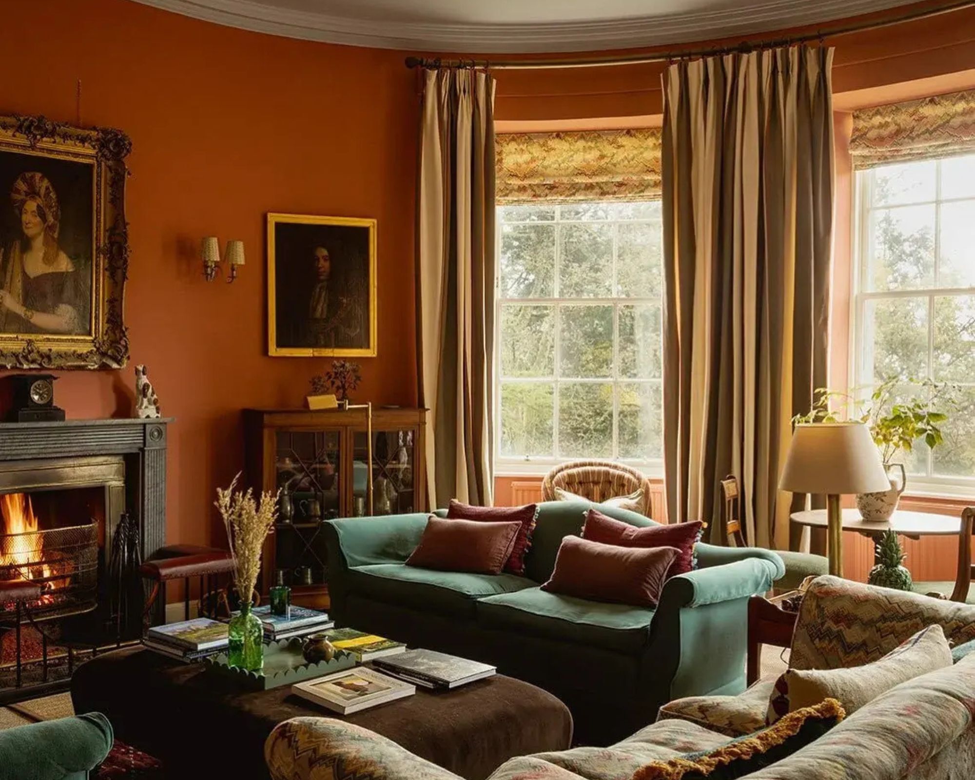
Walls: Red Earth, Farrow & Ball
The sugary, iced-cake aesthetic of pastel rooms – think Bridgerton ballrooms and frosted cupcake hues – has officially melted out of favor. Now, these pretty pastel shades feel more costume than current.
‘Color is deeply personal, but when it comes to interiors, some shades are simply losing their charm,’ explains Shauna Dennison-Taylor. ‘We’re seeing a strong shift away from living room colors that feel overly manufactured, overly clean, or simply out of touch with the way we want to live now. Cool-toned grays, once the go-to for a sleek, modern ‘international’ aesthetic, are falling out of favor, and can often come across as cold and impersonal, especially when overused. Similarly, classic pastels like mint green, baby pink, and powdery blues are starting to feel artificial or dated.’
The era of feminine, saccharine shades has given way to much warmer, richer, and grounded colors.
‘In their place, we’re embracing earthier, dustier, more grounded hues that bring warmth and a sense of familiarity, and ultimately seem more authentic,’ continues Shauna. ‘This evolution isn’t just aesthetic, it reflects a growing desire for homes that feel real. We’re tired of dispassionate spaces and overly styled rooms. Today’s most flattering colors are the ones that feel lived-in and unpolished, that match the messiness and warmth of daily life. They’re more honest, more natural, and far more comforting.’
If you’re completely renovating a house or just giving your living room a lick of paint, one of the best ways to get the room spot on from the beginning is to create a moodboard. This will help you get a feel for the colors and textures and how they work together in one space, and ensure nothing feels too tired and dated.
And if you are thinking of repainting your living room, don’t forget to swatch plenty of iterations of the same color, and watch the behavior of the paint as the light changes from morning to night.

Sophia Pouget de St Victor is the UK Content Editor at Homes & Gardens, bringing readers the latest trends, expert insights, and timeless design inspiration tailored to a UK audience. With a background in luxury interiors and a qualification in Garden Design from London, she has a passion for creating spaces with character and emotional depth. Sophia gravitates toward interiors that defy definition, valuing individuality and effortless elegance. She lives in West London with her partner, two mischievous terriers, and a plump cat named Lettuce.