If You Are Sick of Red and Green at Christmas, Here Are the 5 Unexpected Holiday Colors Designers Are Using to Break Away from Tradition This Year
From icy blues to a pop of pink, these are the non-traditional hues designers are decorating with this festive season

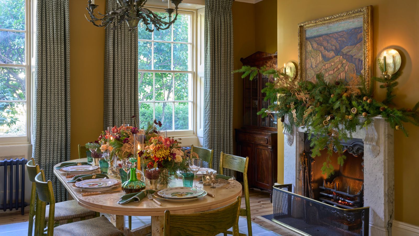
Design expertise in your inbox – from inspiring decorating ideas and beautiful celebrity homes to practical gardening advice and shopping round-ups.
You are now subscribed
Your newsletter sign-up was successful
Want to add more newsletters?
Not all of us align with the most classic of Christmas color schemes. While red, green, and gold feel undeniably festive, they don't always feel at home with certain design styles, and so turning to some of the more unexpected hues for holiday decorating can offer fresh inspiration.
But what are the unexpected Christmas colors that feel design-led and playful, while still managing to bring festive cheer into a home? We turned to the expertise of interior designers who share all below.
From icy shades of blue to soft pinks, you'll find that these five non-traditional shades for the holidays feel in keeping with the latest color trends, ensuring a design-forward home that isn't afraid to break the rules.
Article continues belowFive Non-Traditional Colors to Inspire Your Christmas Decor
1. Mauve

Use mauve instead of red this year for an on-trend look.
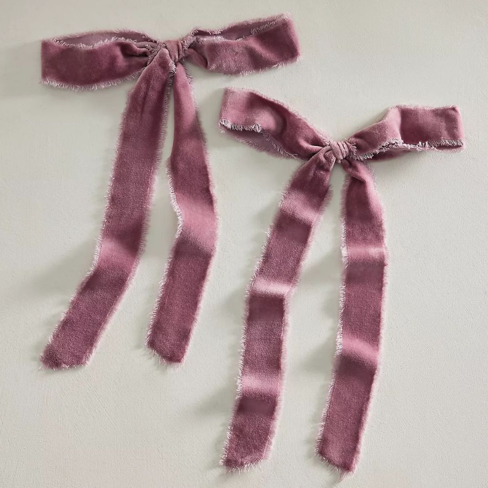
Mauve, the once-outdated color, has been making a comeback in interiors lately, so it's only fitting to bring this soft shade to Christmas color schemes. 'Soft mauve makes a beautiful choice for Christmas,' says the interior designer Lauren Saab. 'It has an intrinsically romantic glow that never gets close to red.'
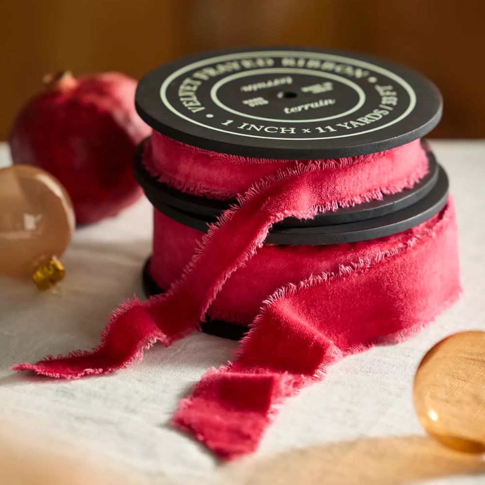
To style this shade, Lauren recommends using it in place of red, alongside classic Christmas colors such as green. 'Pair it with brass and natural greenery, and you have a holiday look that feels both nostalgic and modern,' she says. 'The trick is to keep the palette tight. If mauve appears in accents such as velvet ribbon, florals, and ornaments, you’ve got a look that feels intentional instead of overly used.'
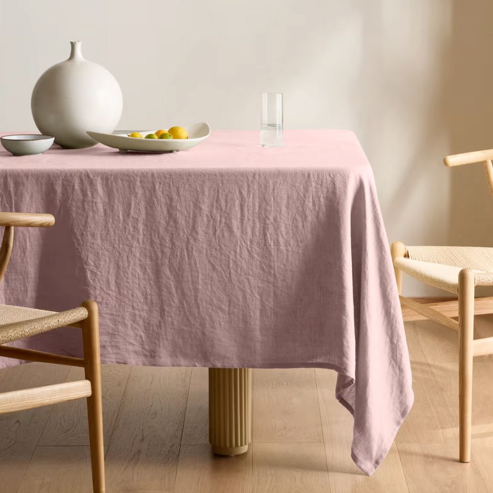
Create an unexpected Christmas table with this mauve tablecloth. Paired with rich greens and metallics, it will set a stylish tone for festive feasting.
2. Pink
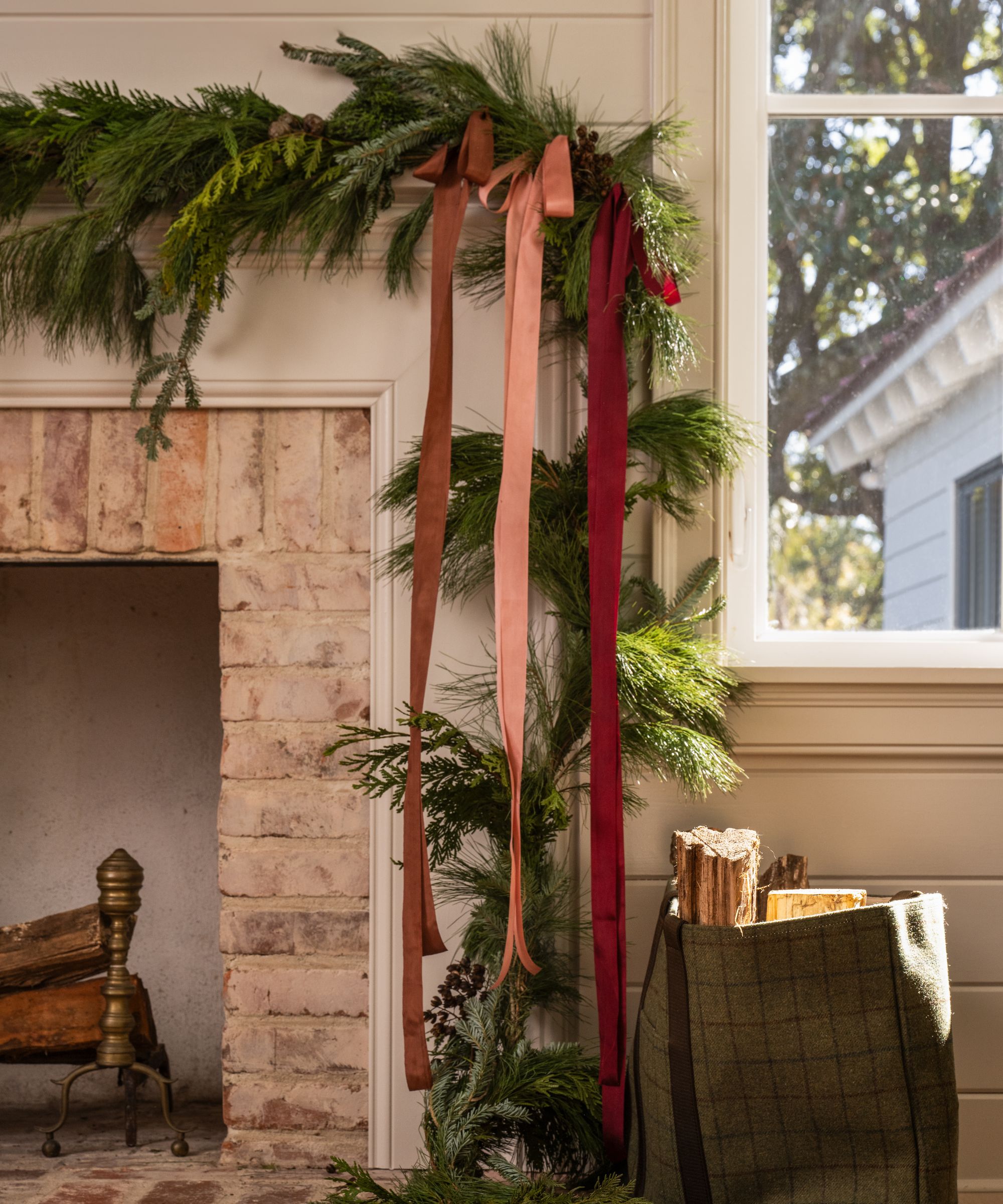
Paired with classic green, pink adds a fresh and unexpected touch to Christmas schemes.
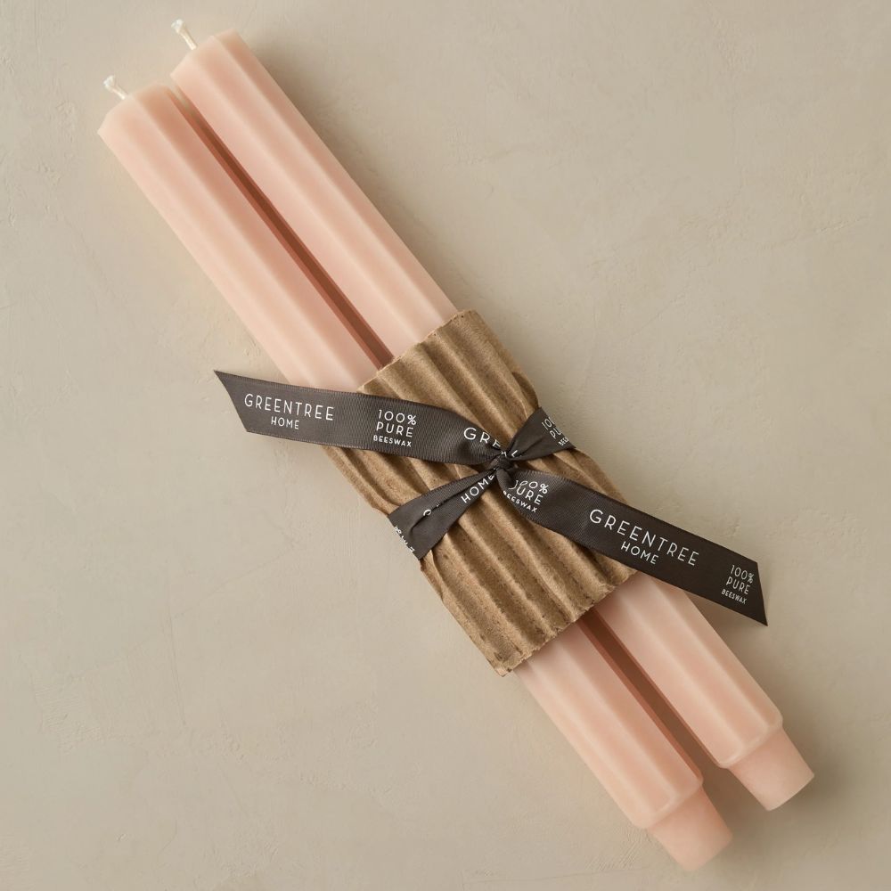
Another modern twist on red Christmas schemes is pink, which adds softness and warmth. 'I love the use of pink instead of red, paired with green,' says interior designer Alexandra Kaehler. 'It’s a riff on a classic holiday color scheme that feels a bit fresh.'
'Burgundy and blush are a beautiful way to refresh your holiday decor if you want something beyond the traditional red and green,' agrees Suzanne Barrow of Barrow Interiors. 'The deep burgundy adds richness, while the soft pink keeps everything feeling warm and romantic – especially on a fireplace garland.'
Design expertise in your inbox – from inspiring decorating ideas and beautiful celebrity homes to practical gardening advice and shopping round-ups.
'When trying this at home, keep your greenery simple and let the ribbons introduce the color,' says Suzanne. 'Varying the widths and textures, like velvet and silk, adds dimension and makes the whole look feel thoughtful, yet unexpected.'
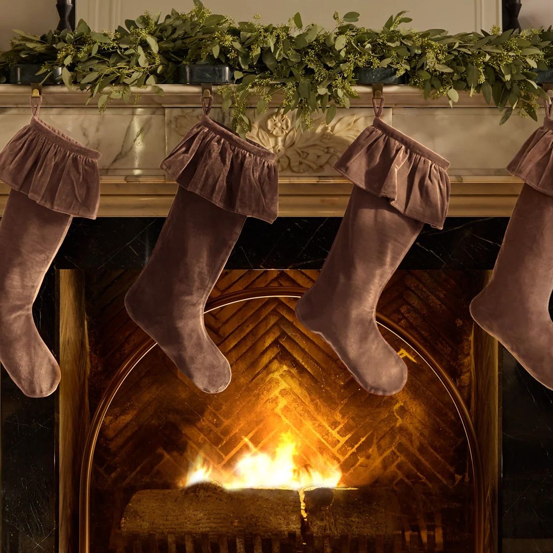
This dusty pink stocking would look every bit cozy when used for Christmas mantel decor.
3. Light Blue
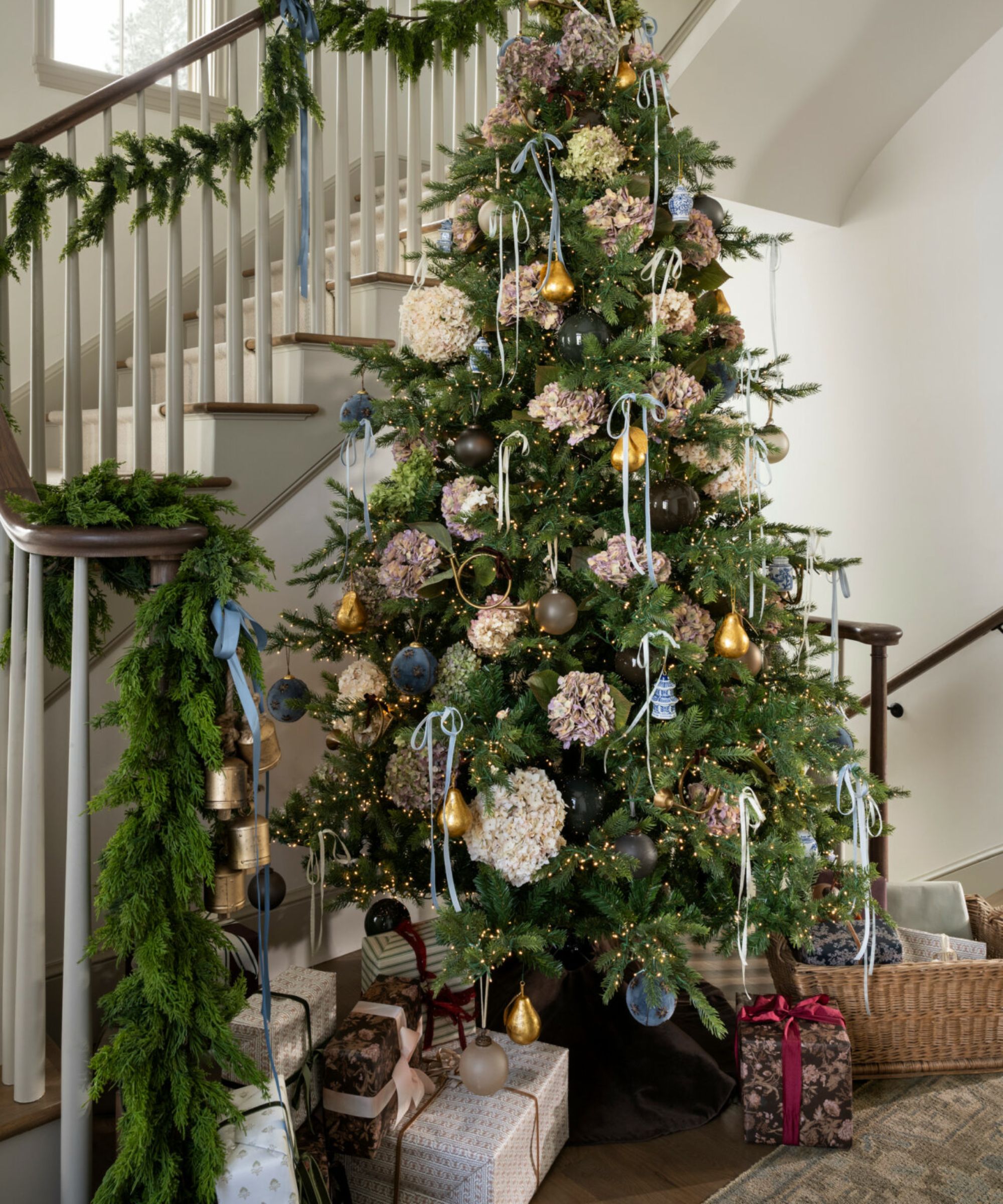
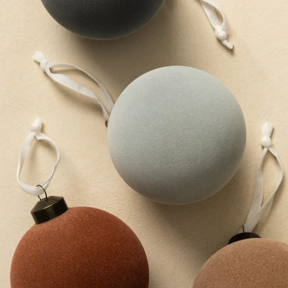
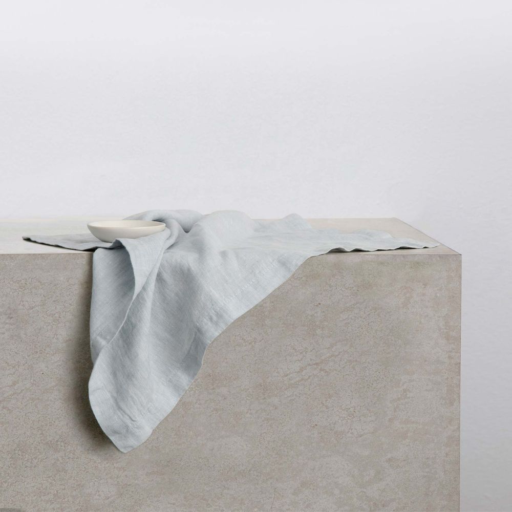
Icy shades of blue are endlessly stylish, bringing a contrast between warm and cool tones.
Warm color schemes are so often the go-tos during the holidays, but cool-toned colors can be just as stylish – adding an unexpected and fresh touch that also leans more contemporary. Interior designer Kelly Neely enjoys using light blue and teams it with metallic hues as well as the more traditional green.
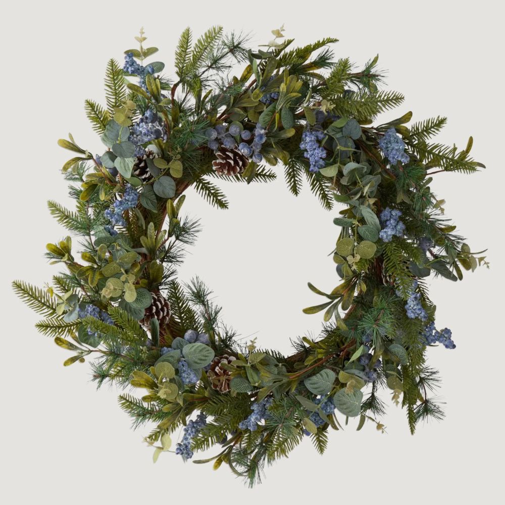
'The trick to using non-traditional colors for Christmas is to pair them with a more traditional tone or metallics,' says Kelly. 'This helps to bring the festive holiday look full circle. Think blue and sage green. It’s non-traditional but can be very festive.'
4. Brown
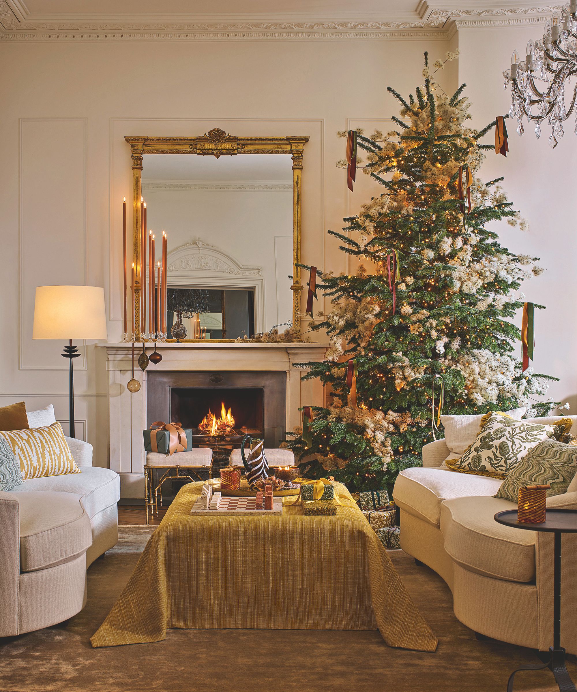
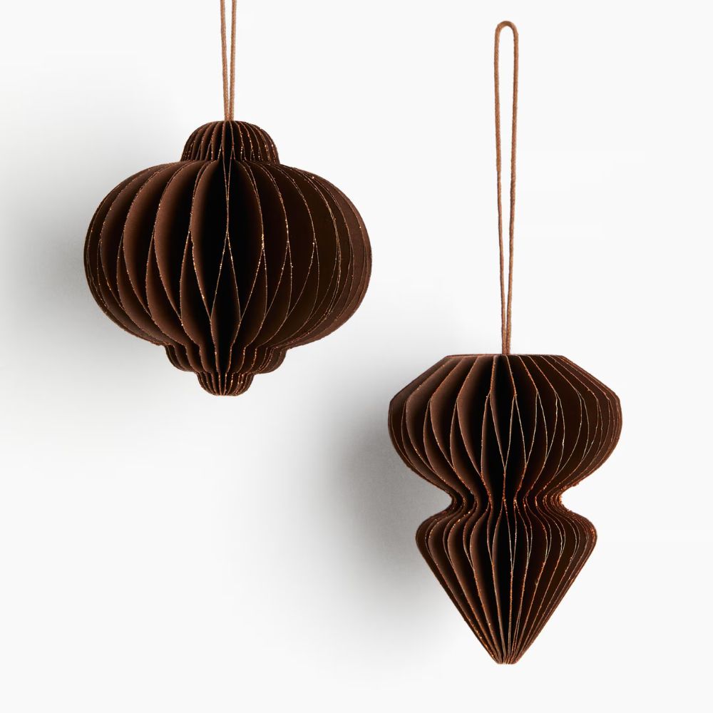
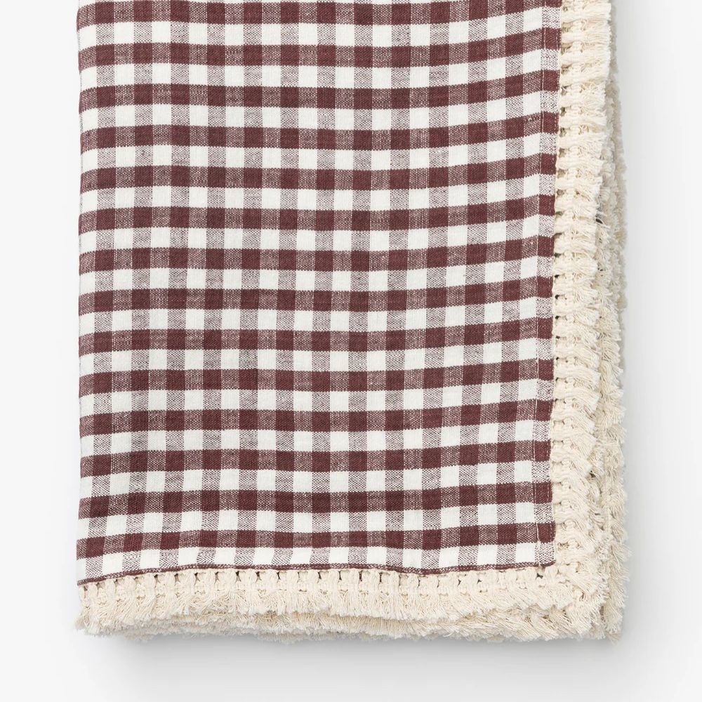
Rich shades of brown are a wonderful alternative to red if you prefer a neutral festive scheme.
If you prefer decorating with neutrals for the holidays, brown is an on-trend way to go. 'Browns feel cozy, grounding, and full of warmth, which is exactly what I want at Christmas,' says color consultant Charlotte Cropper.
'If you’re using an unexpected color like brown, the key is to use it through accents and materials with plenty of texture,' Charlotte adds. 'Think warm woods, amber glass, maroon accents, brass details, and natural fibers. These variations in texture and finish add depth and help the color feel intentional rather than dominant.'
'An unconventional color can be just as festive (if not more) than the traditional red and green, because when it’s a shade you genuinely love, it feels personal, and you’ll smile every time you see it,' says Charlotte.
5. Chartreuse
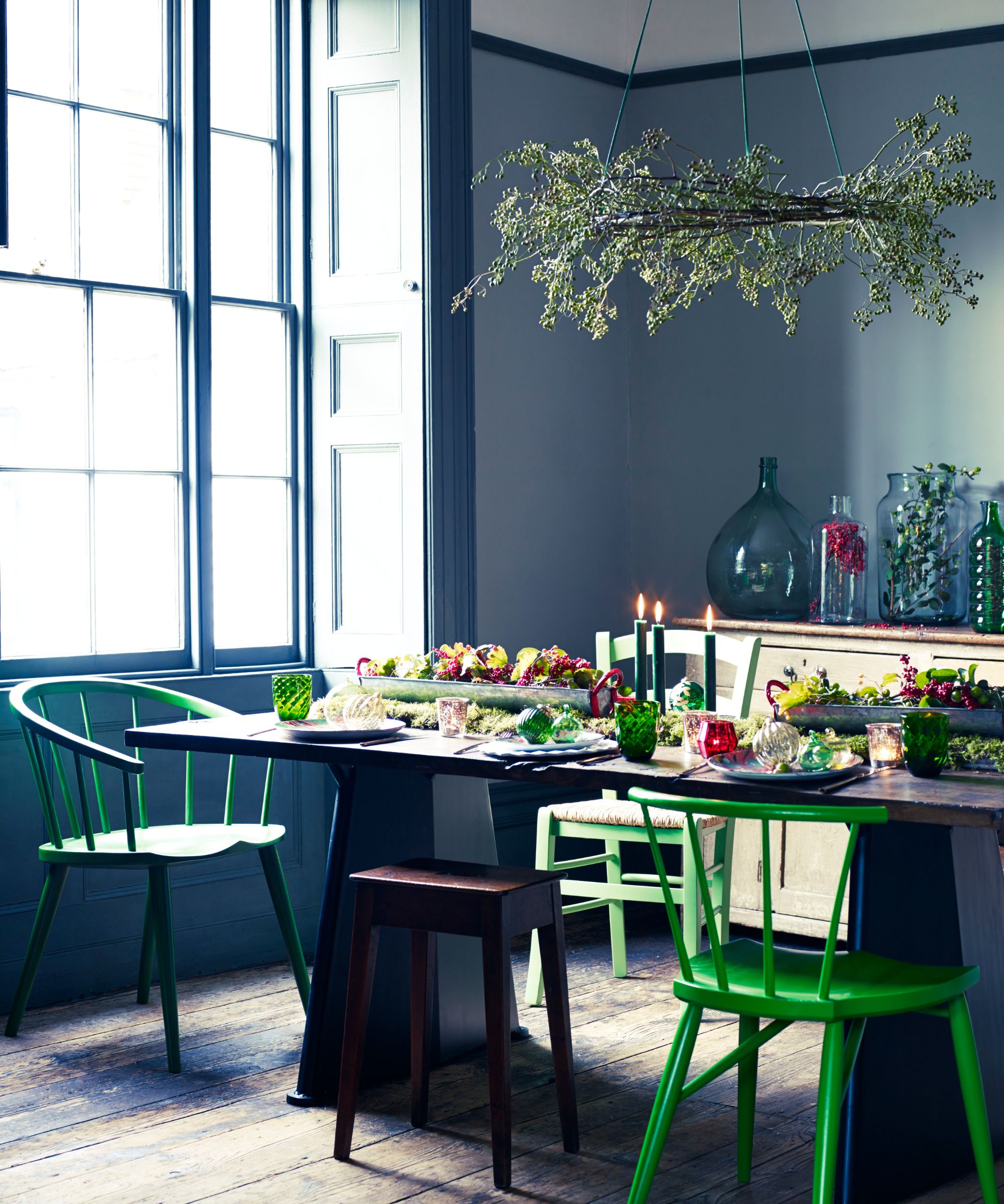
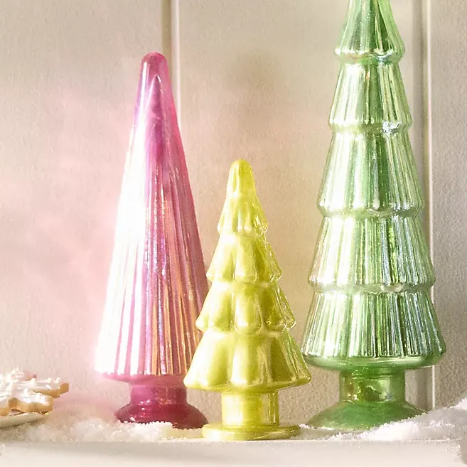
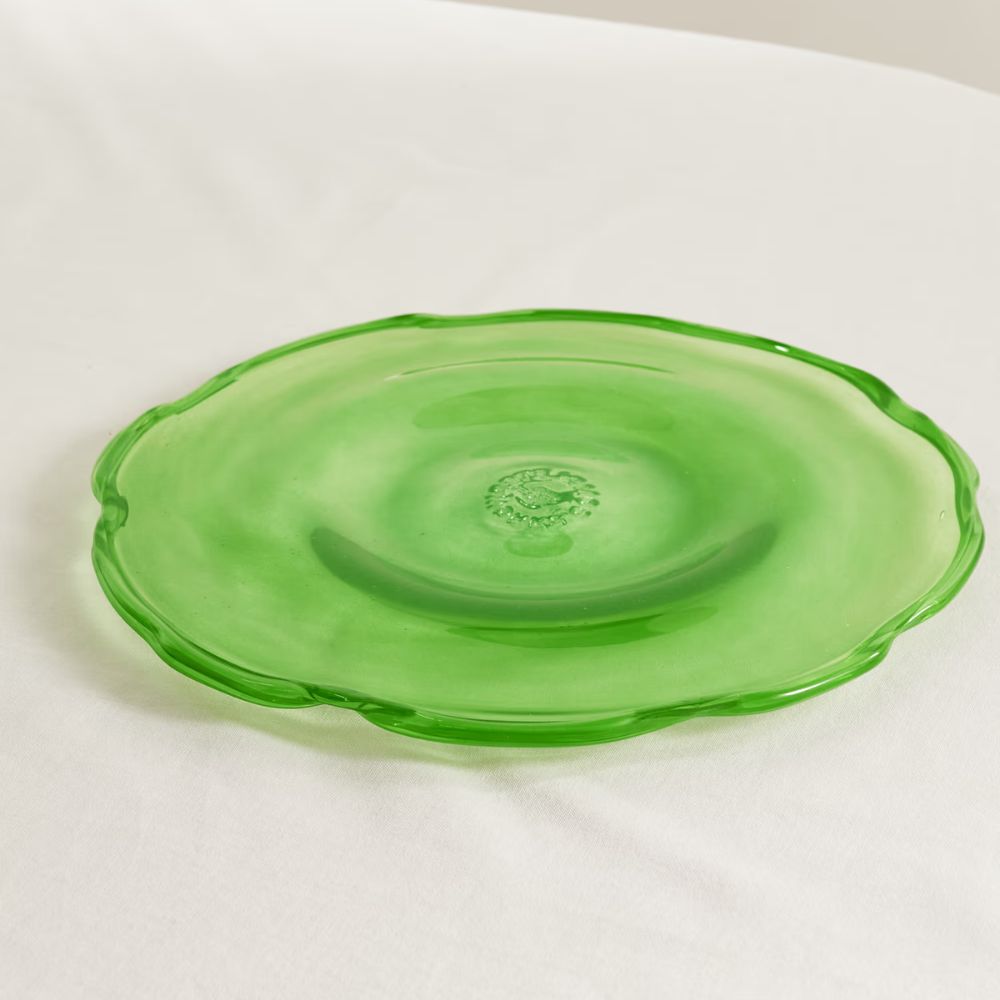
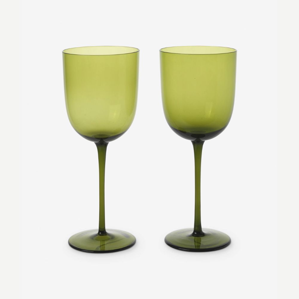
Make a statement with bright Chartreuse this Christmas.
Decorating with green is one of the most festive hues, but rather than the dark tones that reflect evergreen leaves, why not go for a more playful look with bright tones? This is a favorite style for designer Katie Kiser of Katie Kiser & Co., who highlights chartreuse and olive as a festive pairing. 'It is unbelievably chic and fresh,' she says.
'Think Fraser fir, cedar, and olive leaf garlands and wreaths with luxurious chartreuse satin ribbon,' says Katie. 'For an additional pop, tie in smaller olive velvet accent bows with long flowing tails, and crisp Granny Smith apples peppered throughout. I think you can tie this scheme back into your Christmas tree with beautiful chartreuse glass ornaments, and even a table-scape with your Bordallo Pinheiro cabbage plates mixed with your traditional Christmas china paired with a chartreuse linen.'
Each of these unexpected colors brings a fresh touch to Christmas schemes and takes things from traditional to playful. Whether you choose warm shades of pink as a twist on red or go for the more unexpected chartreuse, don't be afraid to experiment and layer colors that bring you joy.

Emily is a freelance interior design writer based in Scotland. Prior to going freelance in the spring of 2025, Emily was Homes & Gardens’ Paint & Color Editor, covering all things color across interiors and home decor for the Homes & Gardens website. Having gained specific expertise in this area, Emily is well-versed in writing about the latest color trends and is passionate about helping homeowners understand the importance of color psychology in home design. Her own interior design style reflects the simplicity of mid-century design and she loves sourcing vintage furniture finds for her tenement flat.
