This electric 1960s shade is making an unexpected return – and designers say it’s the key to lifting darker, moodier interiors this fall
Learn how to leverage the ‘rockstar accent’ for energy, contrast, and a little irreverence in your autumn palette

Design expertise in your inbox – from inspiring decorating ideas and beautiful celebrity homes to practical gardening advice and shopping round-ups.
You are now subscribed
Your newsletter sign-up was successful
Want to add more newsletters?
Pantone may have dubbed Peach Fuzz the official Color of the Year, but 2024 belonged – culturally, if not chromatically – to Brat Green. The acid-sick, highlighter-adjacent yellow-green was popularized by Charli XCX’s Brat era and, much like the album, delivered maximalist club-kid chaos to the power of 12. But if you loved it for its confidence – or even if you didn’t – chartreuse, its calmer, arguably more design-literate cousin, is back. And this time, the electric color trend isn't peaking for summer. It’s cozying up for fall.
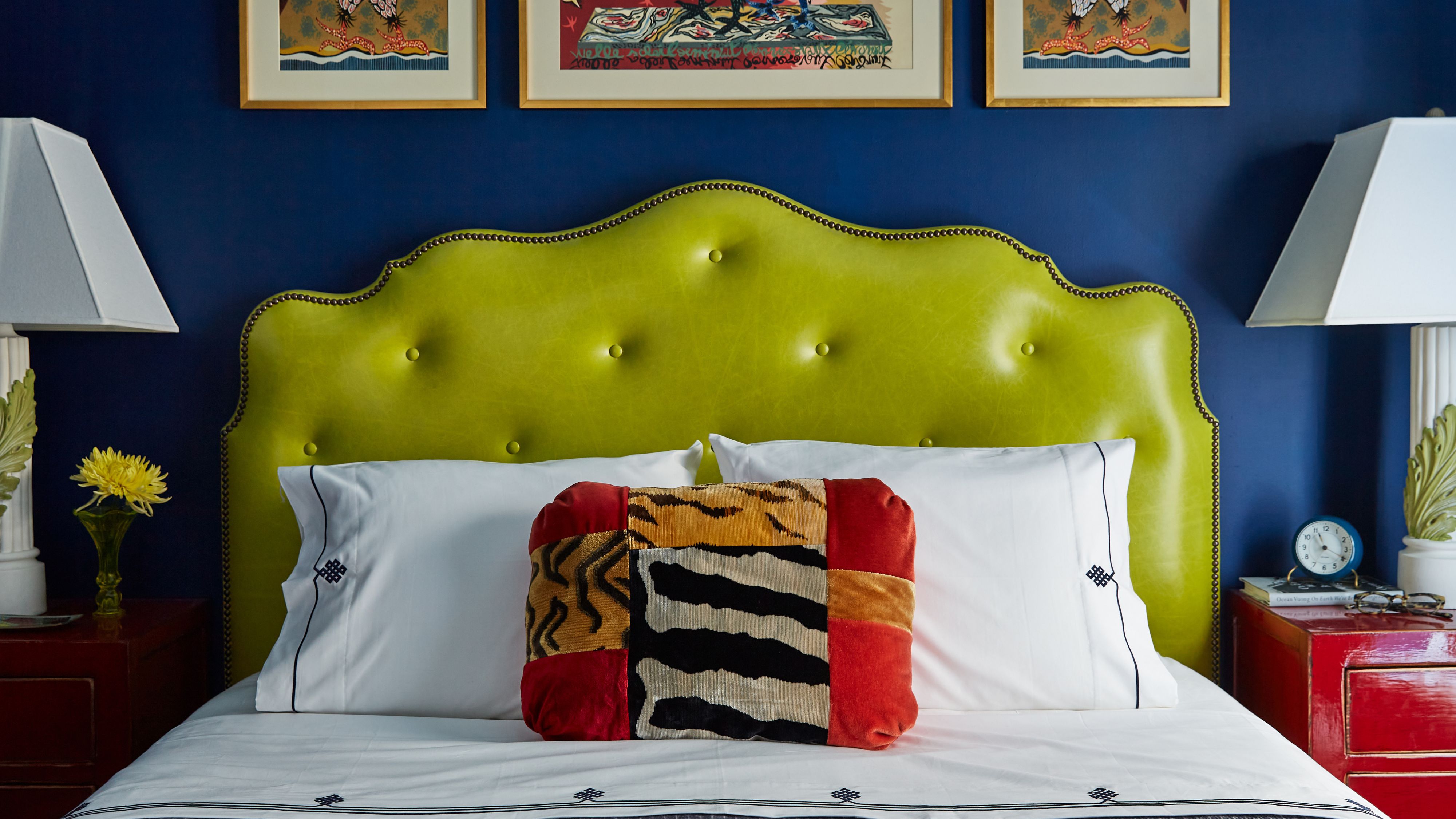
‘As the weather turns colder and we lose the green outdoors, chartreuse can keep things feeling fresh and alive, even when it’s dismal out the window,’ says New York–based interior designer Tara McCauley (and self-proclaimed Charli XCX fan). ‘I loved seeing bold Brat Green everywhere last year, but that was really more of a lime, less chartreuse – chartreuse skews more yellow.’
Chelcie Eastman and Gray Benko of Magnolia Network’s Happy to Be Home – and the lifestyle brand Gray Benko Home – are equally bullish on the interior design trend's return. ‘Chartreuse has this instant energy to it,’ says Gray. ‘After the last few years of softer palettes, people are craving something that feels alive and optimistic. For fall, when homes tend to lean darker and cozier, chartreuse brings that unexpected spark. It wakes up a room and keeps it from feeling heavy.’
Article continues below 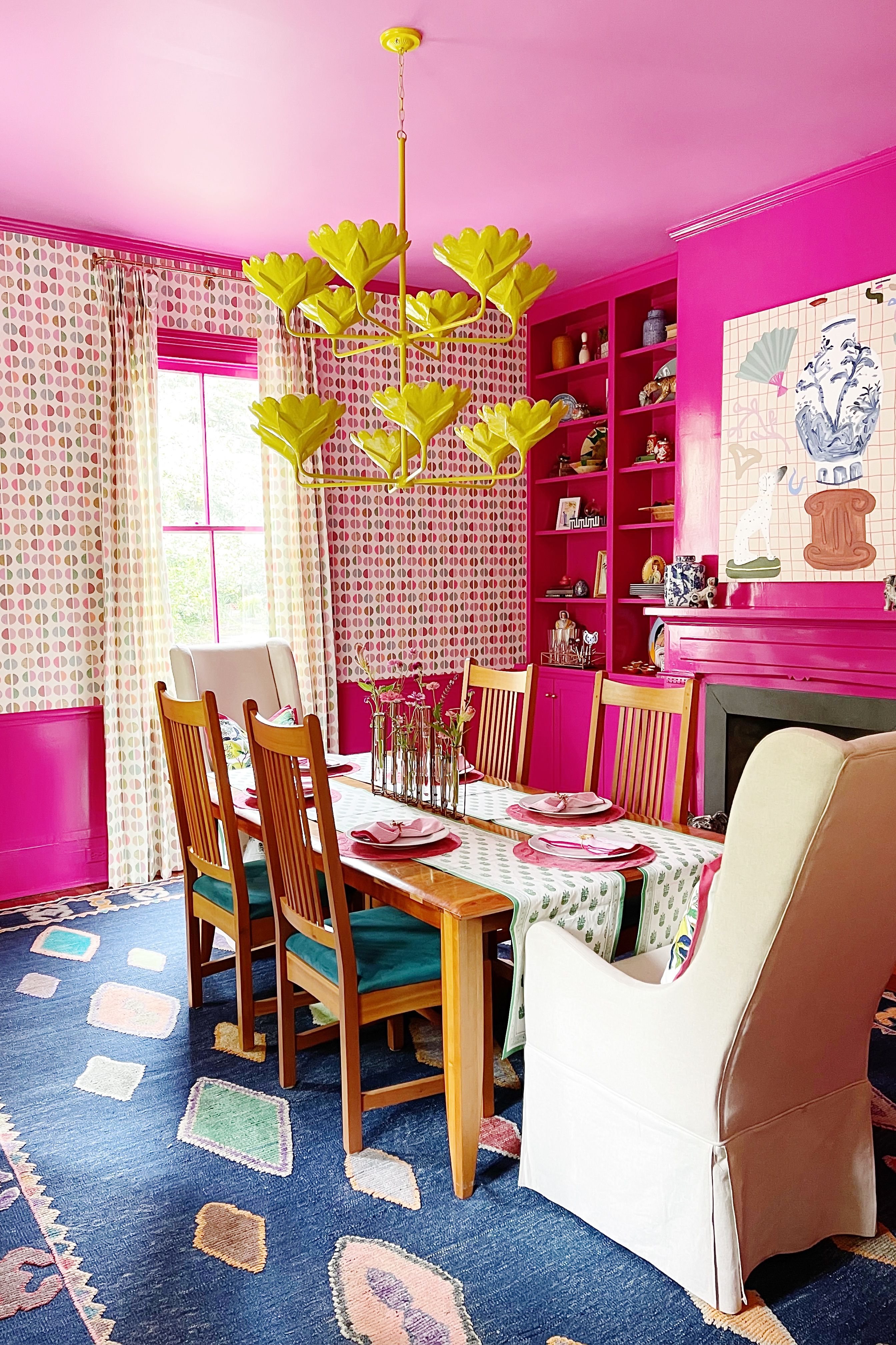
‘Chartreuse is not shy. It needs to be used intentionally,' adds Chelcie. 'We think of it as a rockstar accent color. A patterned wallpaper, a single chair in velvet, or even a stripe can completely transform a space.’
And while it’s having a moment for fall color trends 2025, like Brat Green did last summer, chartreuse is nothing new. ‘When I think of chartreuse, I think of Andy Warhol’s Marilyn Diptych, Emilio Pucci’s bold fashion of the 60s, or its presence in pop culture during the 90s and 2000s, from The Fresh Prince to Britney Spears’ iconic VMA performance with an albino python,’ says Houston-based designer Sherrell Neal. ‘For me, it is very much nostalgic.’
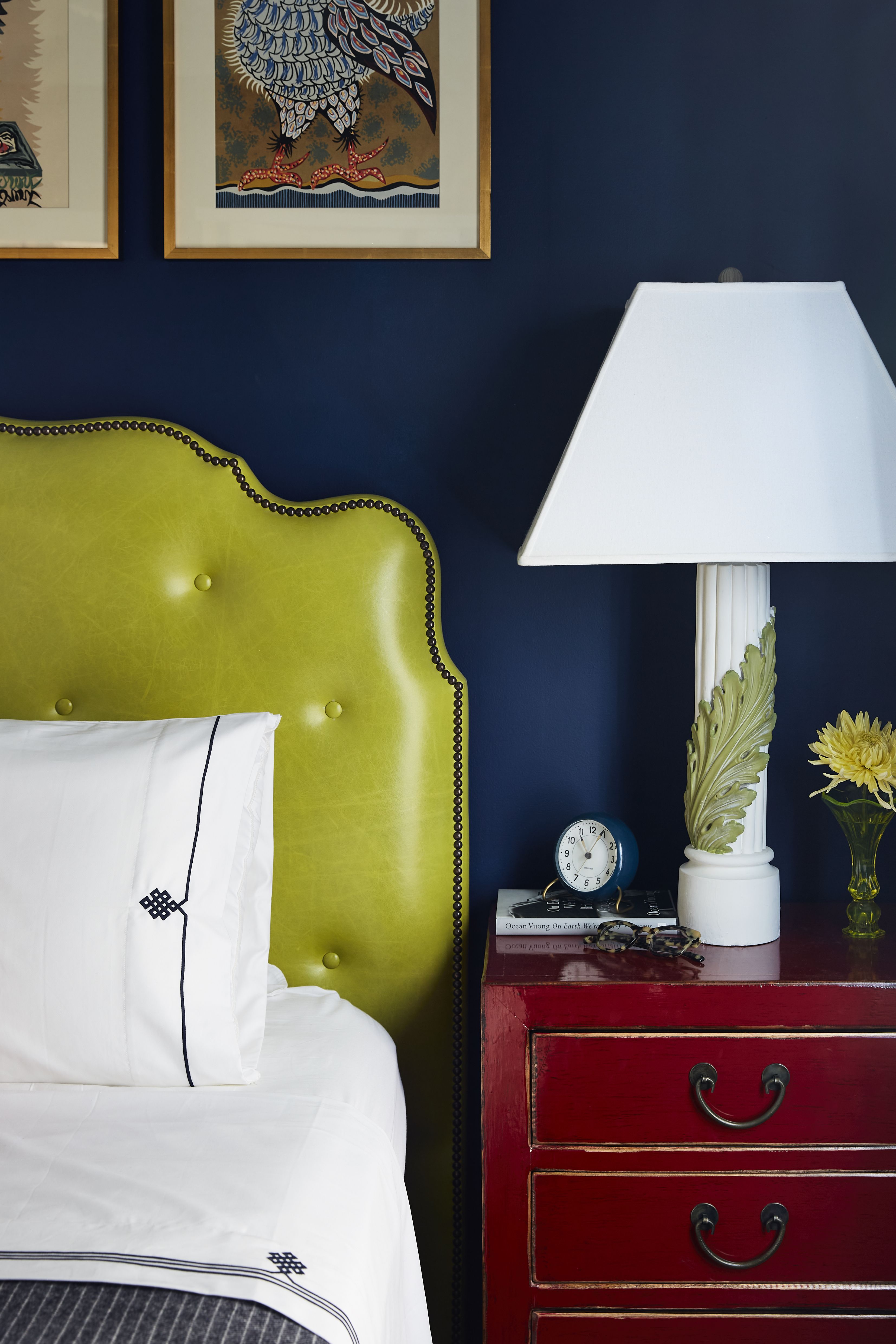
Still, she’s particularly interested in how the room color is being used today. ‘When used as draperies, it reads as confident and collected, never accidental,’ Sherrell explains. She’s already eyeing green paints like Benjamin Moore’s Citrus Burst in high-gloss lacquer behind built-ins, or Farrow & Ball’s Green Ground paired with floral chintz. ‘To cozy it up during winter, I’d balance it with inky navy, deep espresso, or even chalky mauve.’
Linda Eyles of Linda Eyles Design points out we’ve been seeing chartreuse every fall – we just weren’t naming it. ‘Chartreuse is easy to use since it is found in nature – think Concord pears or Aspens turning from green to gold in the fall, and green goes well with most any color.’
Design expertise in your inbox – from inspiring decorating ideas and beautiful celebrity homes to practical gardening advice and shopping round-ups.
Unlike Brat, this isn’t a gimmick. Chartreuse, with its decades-deep resume of cultural comebacks, isn't even really a trend at all – more of a sharp, versatile tool that we can leverage during the dark days (a.k.a. fall). ‘We love using it in stripes, florals, and big bold prints,’ say Chelcie Eastman and Gray Benko. ‘It works just as well alongside antiques as it does with modern lines or even coastal details. That range makes it feel fresh every time.’
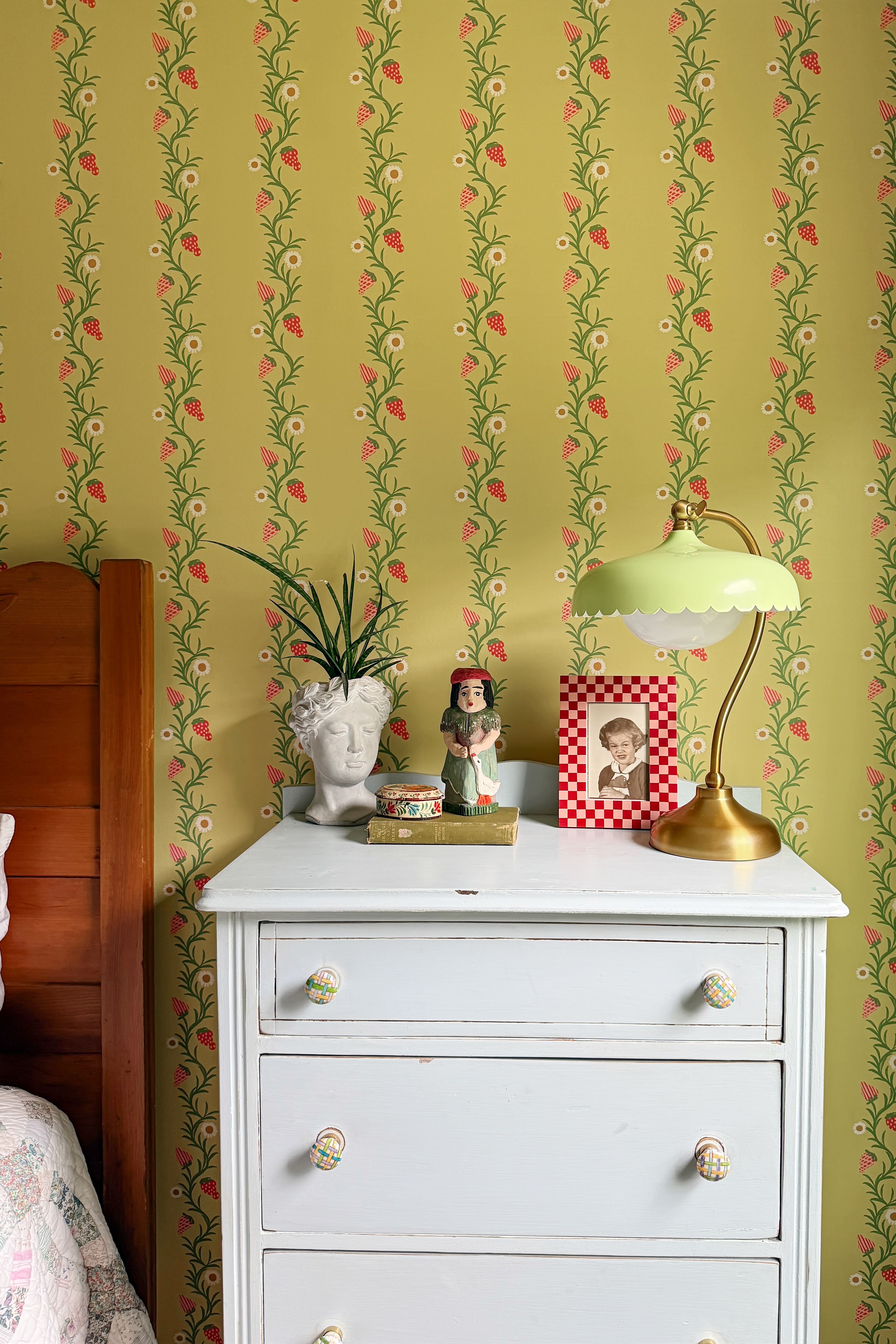
Gray and Chelcie are doubling down on decorating with green this season – they’ve actually introduced chartreuse in both their new wallpaper and fabric lines with Milton & King, launching this October. 'You will also see it showing up in a number of the homes we have been designing this year,' says Gray.
Call it Brat Green’s grown-up sister. Or don’t. But do call it back.
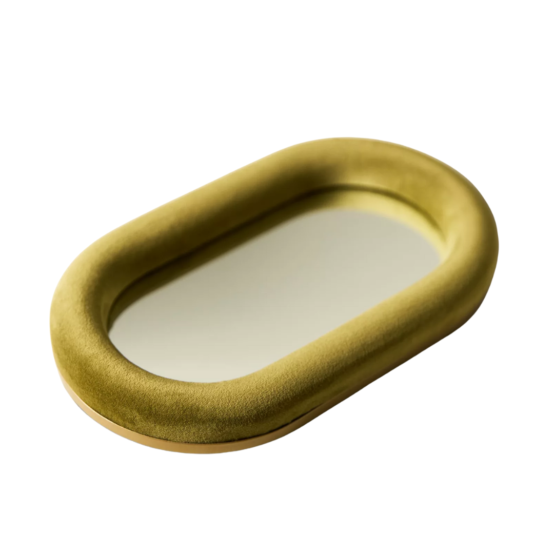
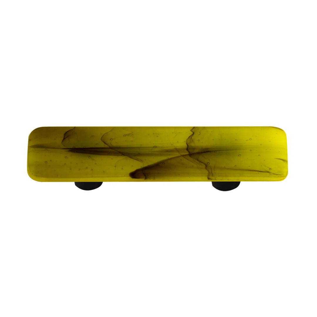
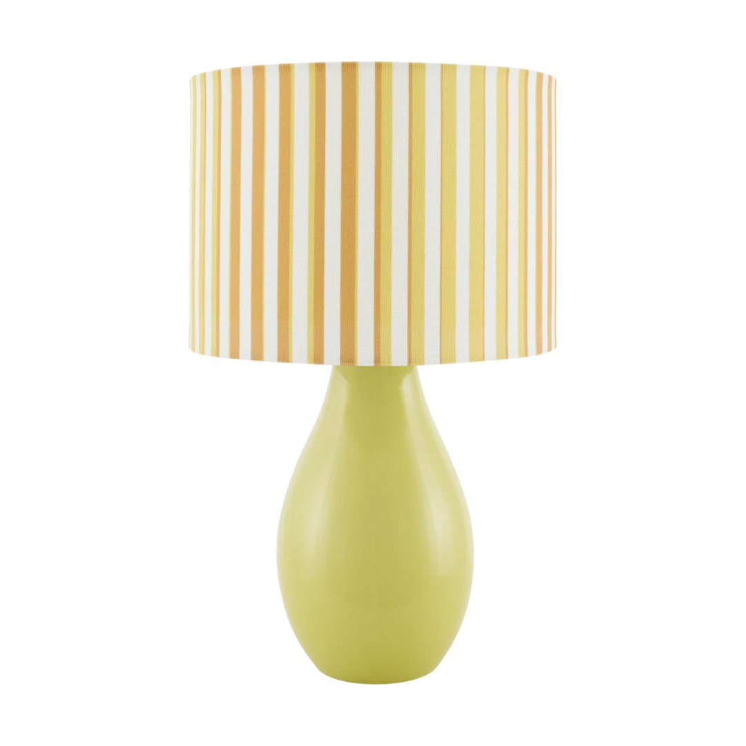
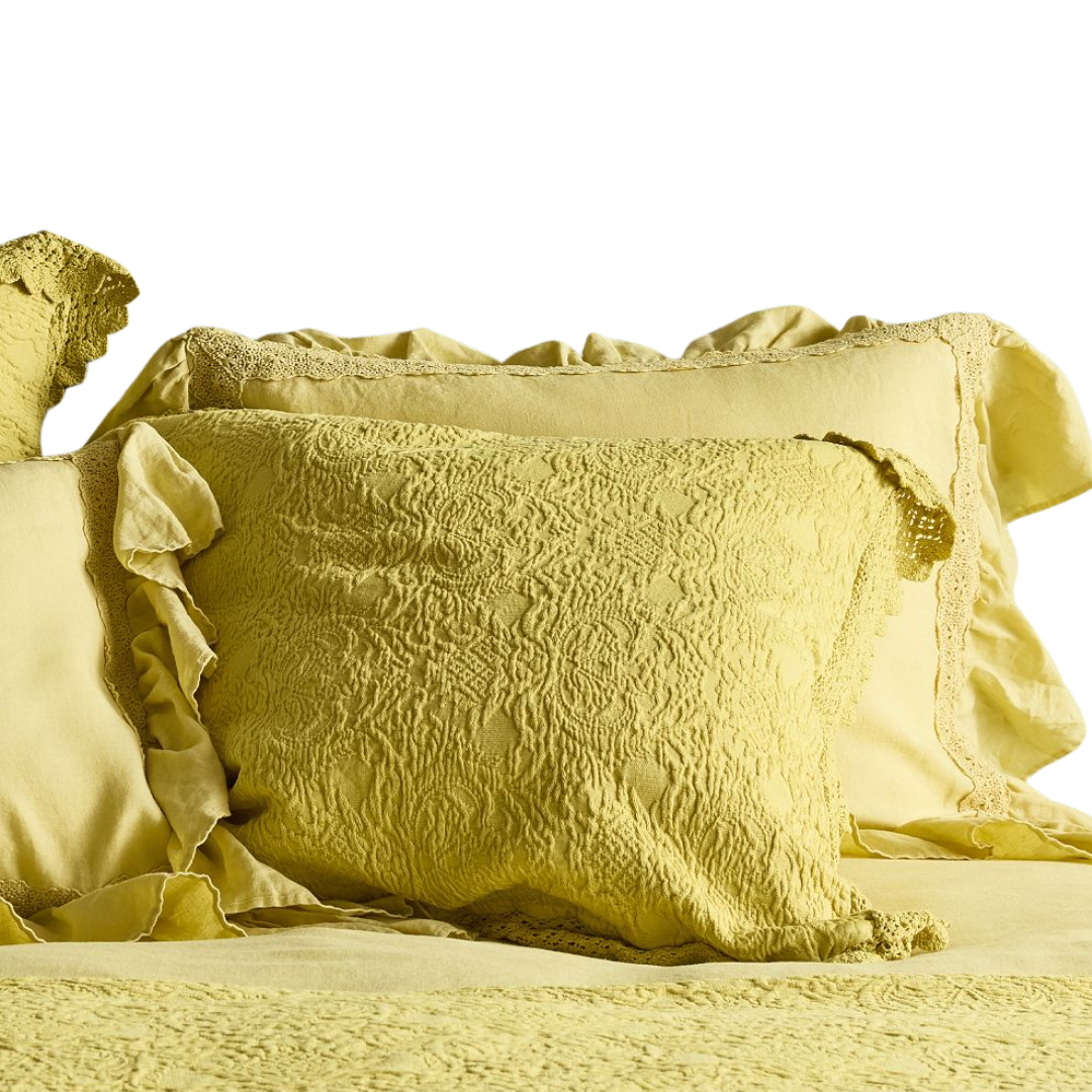
Shop the most unexpected shade of the season, below.
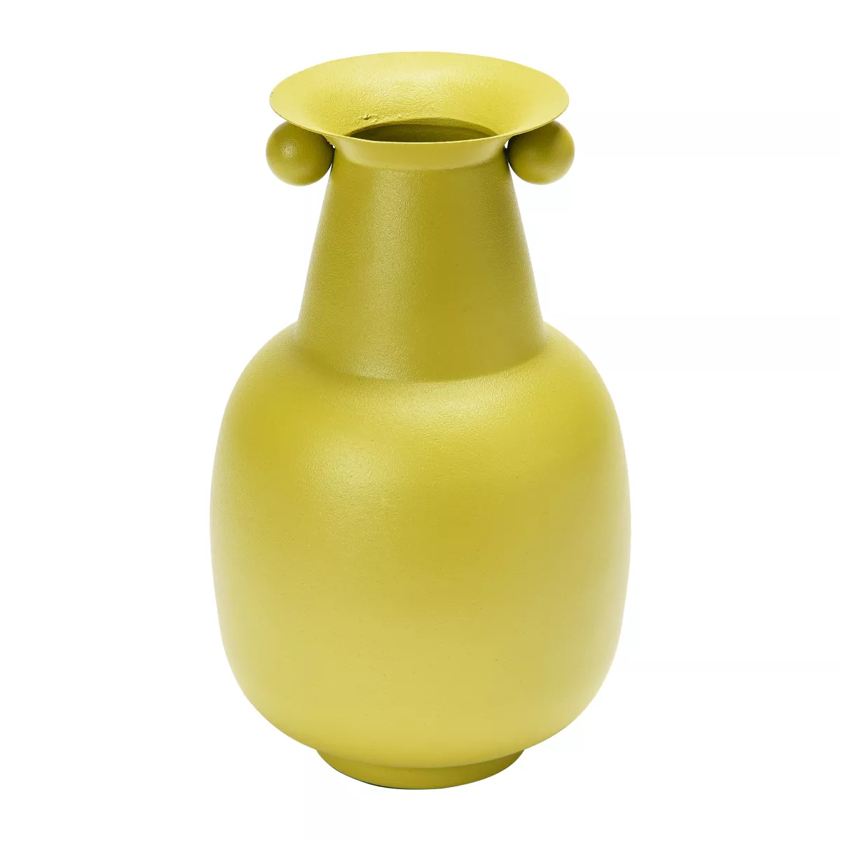
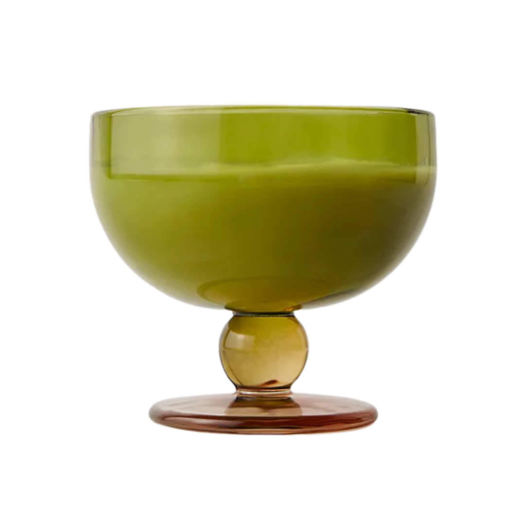
You know a vase is good when flowers are optional. That’s the case with this upbeat yellow-green room idea, which earns real estate even when empty. Style it against darker, rustic furniture – say, a moody wood shelf or coffee table – for a tonal lift.
Another green worth watching? Dill. Moodier, more grounded, and a sharp tonal foil to chartreuse’s yellow-tinged energy. Here's everything you need to know about the dill green color trend.

Julia Demer is a New York–based Style Editor at Homes & Gardens with a sharp eye for where fashion meets interiors. Having cut her teeth at L’Officiel USA and The Row before pivoting into homes, she believes great style is universal – whether it’s a perfect outfit, a stunning room, or the ultimate set of sheets. Passionate about art, travel, and pop culture, Julia brings a global, insider perspective to every story.
