Yes, It's Unexpected for Pantone to Have Picked White – but Designers Say ‘Cloud Dancer’ Could be the Design Reset We All Need
A blank canvas only works if you know what to do with it. Designers break down the smartest ways to style Pantone’s most simplistically subversive pick yet


Design expertise in your inbox – from inspiring decorating ideas and beautiful celebrity homes to practical gardening advice and shopping round-ups.
You are now subscribed
Your newsletter sign-up was successful
Want to add more newsletters?
White ruled the 90s – the stark Helmut Lang and Calvin Klein runways, the bright–dark tension of a Peter Lindbergh photograph, the monastic perfection of a Carolyn Bessette T-shirt. Minimalism wasn’t just an aesthetic; it was a collective detox from the decade before.
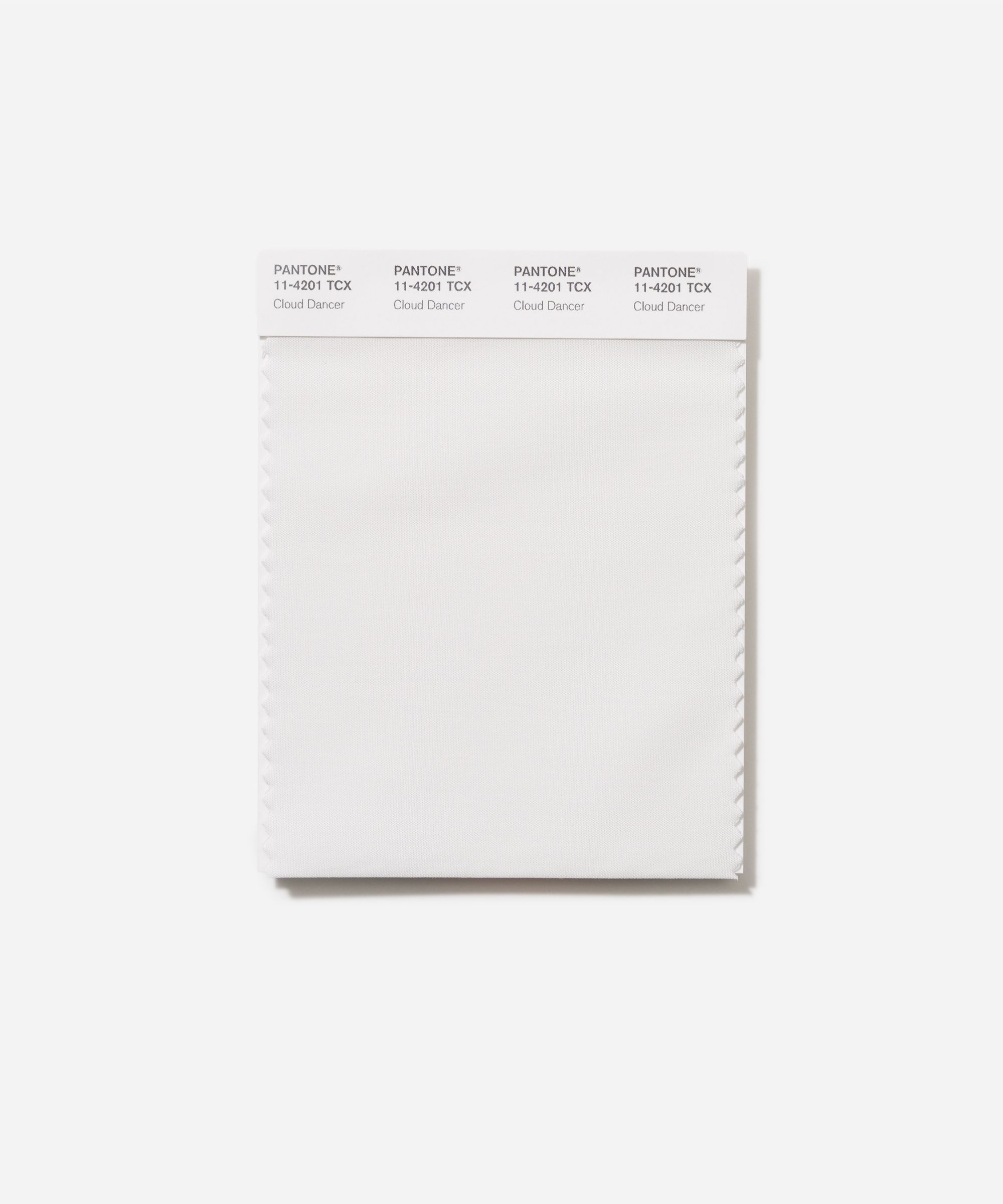
And now, still blinking through our glittery Y2K hangover, the cycle seems to be repeating itself. Pantone’s 2026 Color of the Year, 11-4201 TCX Cloud Dancer – ‘a billowy, balanced white’ – signals a pendulum swing past the novelty shades of Very Peri and Viva Magenta. What remains is a reset. Or, to honor the era that did restraint better than anyone: soft minimalism.
‘I see that soft minimalism coming through as a really big trend in interior design, so for me it’s continuing that journey,’ Pantone Creative Director Jane Boddy tells Homes & Gardens. She frames this Color of the Year as a tool for crafting relaxation in whatever form that takes.
Article continues below‘To me, Cloud Dancer is all about having a reset and about serenity, so I can see people using it to create spaces in their homes where they can relax, wind down,’ she says. It’s not, in her view, about disconnecting entirely. ‘It could be a tech-free space, or you could include tech within it. We actually see Cloud Dancer as a color that softens tech and enables it to be a little bit more integral into an environment.’ It’s not an anti-tech white; it’s a white that negotiates with the realities of modern life.
Jane sees Cloud Dancer pairing naturally with last year’s Mocha Mousse for a mid-century mood, but says the most striking application is also the simplest: go all in. ‘We haven’t really seen that in a long time with white. In the 90s, it was huge. I remember friends whitewashing floors, walls, furniture – everything.’

‘The cacophony that surrounds us has become overwhelming, making it harder to hear the voices of our inner selves,’ notes Leatrice Eiseman, Executive Director Pantone Color Institute. ‘A conscious statement of simplification, Cloud Dancer enhances our focus, providing release from the distraction of external influences.’
Designers outside the institute are seeing the vision, too.
‘Cloud Dancer feels like an intentional reset,’ says Mark Tremblay of the international luxury firm Marc-Michaels Interior Design. ‘My instincts immediately go to spaces where people want clarity and comfort, such as serene bedrooms, muted great rooms, and kitchens where light plays a major role. It is incredibly versatile because it does not fight for attention; instead, it elevates textures, natural materials, and architectural lines. In 2026 and beyond, I see Cloud Dancer becoming a new neutral foundation that homeowners use to create timeless, light-filled environments.’
Design expertise in your inbox – from inspiring decorating ideas and beautiful celebrity homes to practical gardening advice and shopping round-ups.

Pantone tends to spotlight what’s already simmering in the zeitgeist. Consider Harlequin’s Kasuri upholstery, an early whisper of Cloud Dancer before the name ever dropped.
Meredith Page and Liz Livingston of Page House Studio approach decorating with white through contrast. They describe Cloud Dancer as a ‘chic eyeshadow or an icy manicure,’ warning that it could read flat if you’re not careful. They make a case for the shade as strategic punctuation – the ‘10% accent’ that keeps warm, layered rooms from feeling heavy or dated.
‘Although surprising because of the surge in saturated, colorful design, I actually love this pick,' says Denver-based designer Peggy Haddad. ‘With all the richness and warmth we are seeing in furnishings, and golden oaks making a comeback, a white with gray undertones will cool the palette down and provide a flexible backdrop for all the pattern and color to shine.’

As always, the Color of the Year arrives with its own constellation of brand collaborations, the most prominent being Joybird. Cloud Dancer is the brand’s sequel collaboration with Pantone, following the runaway success of Mocha Mousse.
But not everyone is thrilled about what will presumably become the next major color trend. Pantone often sets a clear chromatic direction; Cloud Dancer feels more like an open question.
'As a designer, my immediate reaction to Pantone's 2026 color of the year, Cloud Dancer, was disappointment,' says Jennifer Cataldo, interior designer and founder of Maison Cataldo. 'It feels safe and unimaginative in a moment when design is craving depth and soul. Last year's palette moved us forward with warmth and nuance. To me, Cloud Dancer signals a retreat into something one-dimensional and sterile.'

Cloud Dancer leaves room for nuance. Morris & Co.’s Pure Marigold wallpaper in Cloud Grey plays into the shade's potential for tone-one-tone softness.
'There are a lot of mixed feelings over announcing Cloud Dancer, essentially a white, as the leading color for 2026,' admits Katy Momeni Repetto, Creative Director at Momeni. Lacking the clearer sense of direction Pantone has projected in past years, the pick felt, in her words, like 'offering water as the feature drink at a black-tie event. I'll always enjoy a fresh glass of water all day, every day, but I just wasn't expecting such a staple choice to have so much hype in my wine glass.'
While white will never go out of style, she sees Pantone's logic behind branding the shade as a du jour kind of deal. 'Minimalism and serenity are persevering. Perhaps this echoes the sentiment for a desire for peace and calm in a world dominated by noise and friction. On the other hand, it’s somewhat controversial as the masses are demanding more color in a neutral-dominated design world.'
To Katy, Cloud Dancer is both an opening and a provocation. 'It can serve as the perfect backdrop to complement the entire color spectrum, allowing designers the freedom of the “blank space” for creativity without a dominating compass. The color is a challenge and an invitation for design innovation geared towards optimism and light.'

What Cloud Dancer lacks in novelty, it compensates for in clarity: a clean slate, a softened edge, a mood shift toward hope and a fresher design era on the horizon.
Which may be the real point: this isn’t a color that tells us what’s next. It clears the deck. It creates conditions for the next aesthetic swing rather than defining it – a hinge year rather than a headline hue.
The more interesting question isn’t how to use Cloud Dancer, because it works almost anywhere. It’s what design does once the slate is wiped clean. If 2026 is the reset, 2027 could be the rupture – and perhaps the most creatively open palette we’ve seen in years.
In the meantime, here are a few Cloud Dancer–clad pieces to start experimenting.
‘Some are calling Cloud Dancer “more boring than beige.” I smile at that,’ says designer Nina Lichtenstein. Because the real trick of Cloud Dancer is that it plays well with everything – stones, beiges, emerald, bordeaux, even florals and Deco prints. It’s the shade that makes everything around it look better.
And as Katy Momeni Repetto puts it, it’s ‘not “anti-color,” but the greatest complement to any color.’

Julia Demer is a New York–based Style Editor at Homes & Gardens with a sharp eye for where fashion meets interiors. Having cut her teeth at L’Officiel USA and The Row before pivoting into homes, she believes great style is universal – whether it’s a perfect outfit, a stunning room, or the ultimate set of sheets. Passionate about art, travel, and pop culture, Julia brings a global, insider perspective to every story.


