Every Color of the Year We Know So Far – The Compiled List of 2026's Trendiest Shades, Revealed by Leading Paint Brands
Our roundup of all the Colors of the Year for 2026 that have been announced so far will guide you on all the latest color trends

- Benjamin Moore Color of the Year: Silhouette
- Sherwin Williams Color of the Year: Universal Khaki
- Dutch Boy Color of the Year: Melodious Ivory
- Valspar Color of the Year: Warm Eucalyptus
- Behr Color of the Year: Hidden Gem
- Graham & Brown Color of the Year: Divine Damson
- C2 Paint Color of the Year: Epernay
- Minwax Color of the Year: Special Walnut
- Glidden Color of the Year: Warm Mahogany
- Dulux Color of the Year: The Rhythm of Blues
- Lick Color of the Year: The Return to Play Palette
Design expertise in your inbox – from inspiring decorating ideas and beautiful celebrity homes to practical gardening advice and shopping round-ups.
You are now subscribed
Your newsletter sign-up was successful
Want to add more newsletters?
As a Style Editor with a particular love of all things paint and color, I love this time of year, not just for the seasonal delights that come with fall, but because it's Color of the Year season. We see the biggest paint brands announce the key color (or colors) that they think are going to define the year of decorating and color trends ahead.
October has been a big month for the Color of the Year reveals, with our favorite brands, from beloved Sherwin-Williams to the renowned Benjamin Moore, unveiling their chosen hues. And there has been a real mix too, moody shades have definitely dominated so far, but there has been an unexpected amount of neutrals and playful bright shades.
2025's Colors of the Year were quite quiet in comparison, lots of warm neutrals and soft blues, 2026's cohort feels a lot darker and more dramatic. Here are all the shades that have been announced so far.
Article continues belowBenjamin Moore Color of the Year: Silhouette
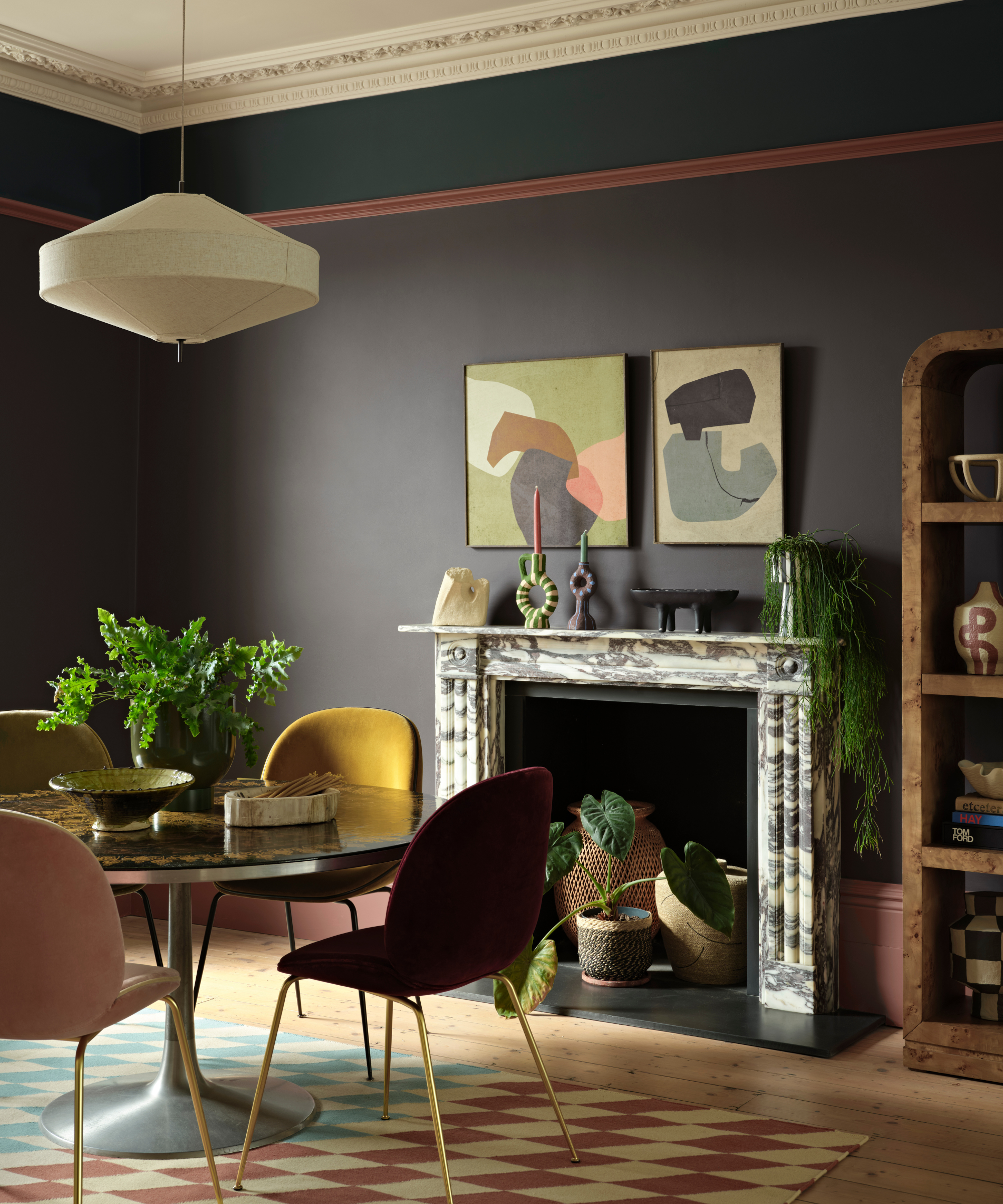
Benjamin Moore's color of the year 2026 is a luxurious charcoal named Silhouette. Despite edging on the darker side, the gray paint feels just as livable as other neutrals and will give any room an enriched warmth.
An all-rounder paint shade, Silhouette proves that dark hues can work no matter the time of year. Silhouette moves away from the dark and gloomy associations of gray; its espresso brown undertones make it feel earthy and inviting.
Pair it with organic textures like wood, marble, and stone for some earthy contrast or for a more playful look, introduce yellow and other colors that go with dark gray for an exciting yet accomplished look.
Sherwin Williams Color of the Year: Universal Khaki
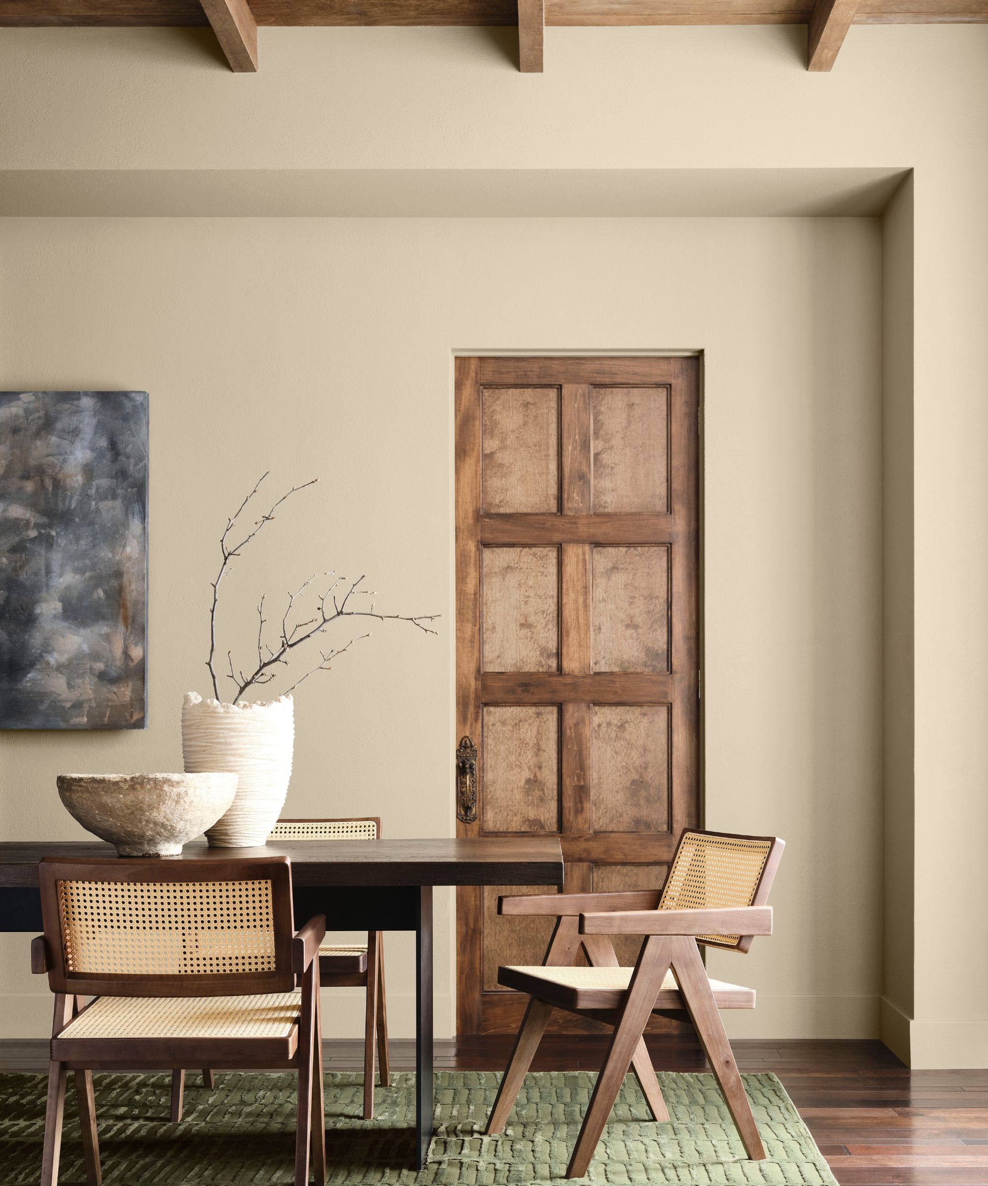
Sherwin-Williams Color of the Year 2026 is a liveable neutral, named Universal Khaki (SW 6150). Falling somewhere between beige and taupe, the 'universal' neutral is the perfect way to introduce subtle color into the home.
Design expertise in your inbox – from inspiring decorating ideas and beautiful celebrity homes to practical gardening advice and shopping round-ups.
This has faced a bit of backlash due to it being a fairly safe choice for a Color of the Year, but you can't deny Universal Khaki's depth. It's a rich yet subdued sand color that feels quiet and still present. Color-drench your walls or use it to frame ceiling trim; it's hard to think of a space where the chic neutral wouldn't work.
The beauty of the khaki shade is its versatility, but it's still worth considering the colors that go with beige to ensure your scheme feels balanced and harmonious.
Dutch Boy Color of the Year: Melodious Ivory
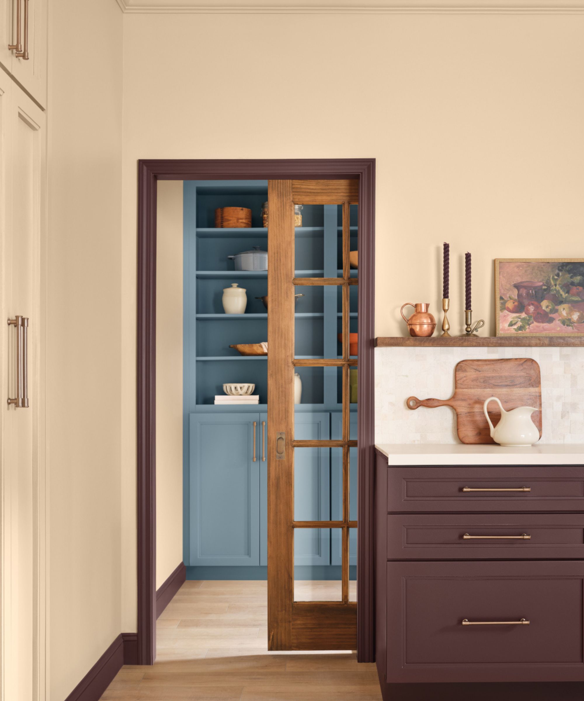
Although cream has fallen out of favor in recent years, Dutch Boy's Color of the Year suggests that off-whites are making a much-needed comeback. Melodious Ivory (313- 2DB) is the ultimate cream paint with deeply warm undertones – it puts an end to the myth that neutrals are stark or clinical.
Proving that decorating with neutrals needn't be boring, the subtle yellow-infused ivory is the perfect choice for interiors in need of warmth and character. Use it on kitchen cabinets or as the wall color in a living room; it's not hard to introduce this classic hue into the home.
Valspar Color of the Year: Warm Eucalyptus
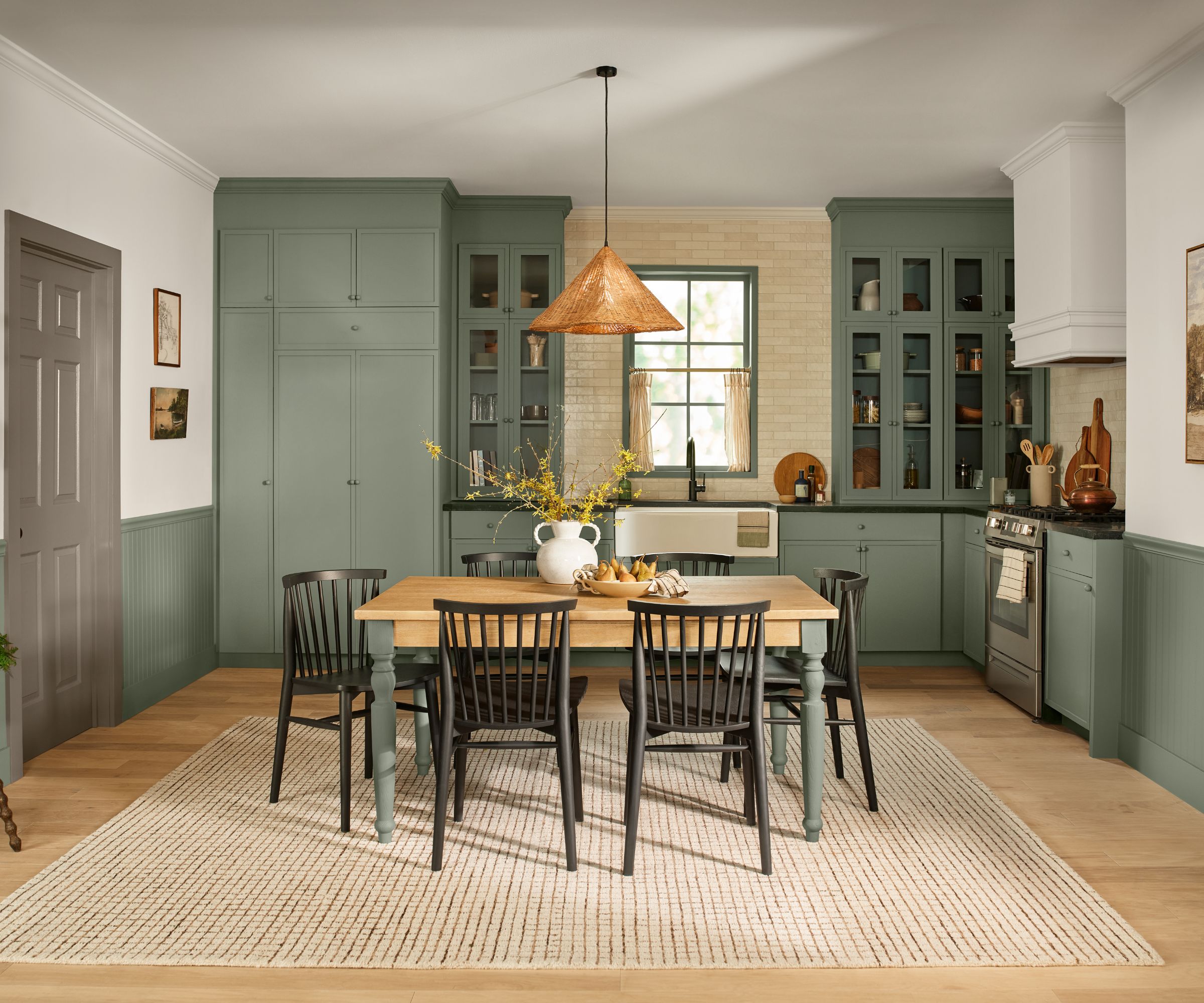
Green seems to be a popular choice for Colors of the Year 2026. While a fair few green hues have been announced, what makes Valspar's Warm Eucalyptus (8804-28F) stand out is its moody gray undertones.
Arguably one of the best green paints in this year's lineup, the midtone green is a refreshingly unique take on the much-loved classic, sage. It's infused with gray and blue to give it a truly heritage feel.
'Warm Eucalyptus is more than just a beautiful shade of green, it's a reflection of the comfort we crave in our homes," said Sue Kim, director of color marketing at Valspar. “Its warm undertones create a grounded, welcoming mood while drawing inspiration from nature and the familiarity of retro design. This is a color that encourages restoration and resilience.'
Behr Color of the Year: Hidden Gem
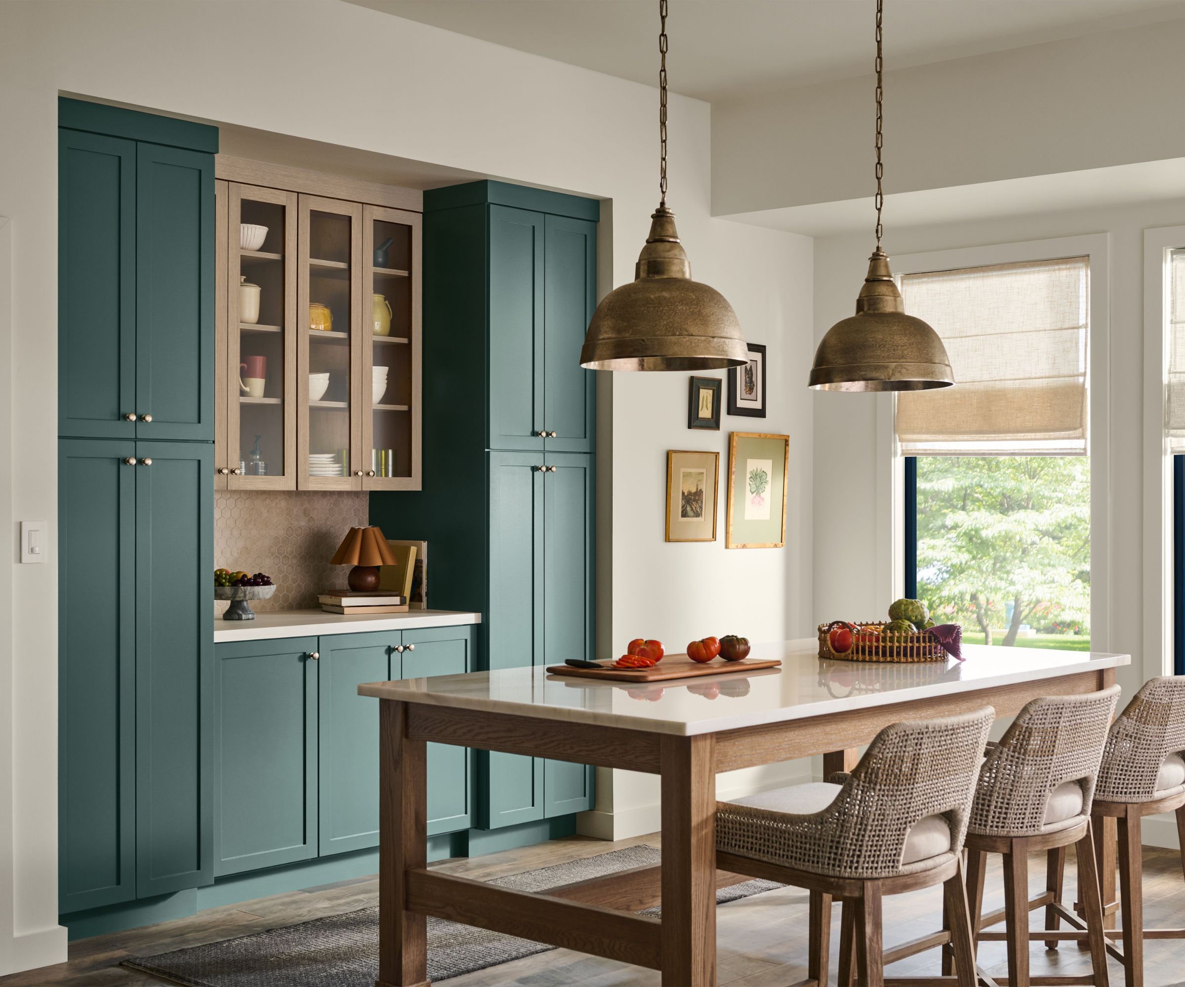
A deeply luxurious jewel tone, Behr has announced their Color of the year 2026, to be Hidden Gem. A heritage green with dark blue undertones, that is one of the most sophisticated in the line-up.
Described as a smoky jade, Hidden Gem is not just a fall color trend for 2025; it's one of those enduringly elegant shades that will give any room depth and moodiness. I can picture it drenched over the walls in a home bar or office, exuding warmth and that unbeatable snugness that you'll never grow tired of.
It's a classic jewel tone with gray undertones, so no matter what style your home is, create a lasting statement with this deeply inspiring jade that will transition into traditional and contemporary spaces.
Graham & Brown Color of the Year: Divine Damson
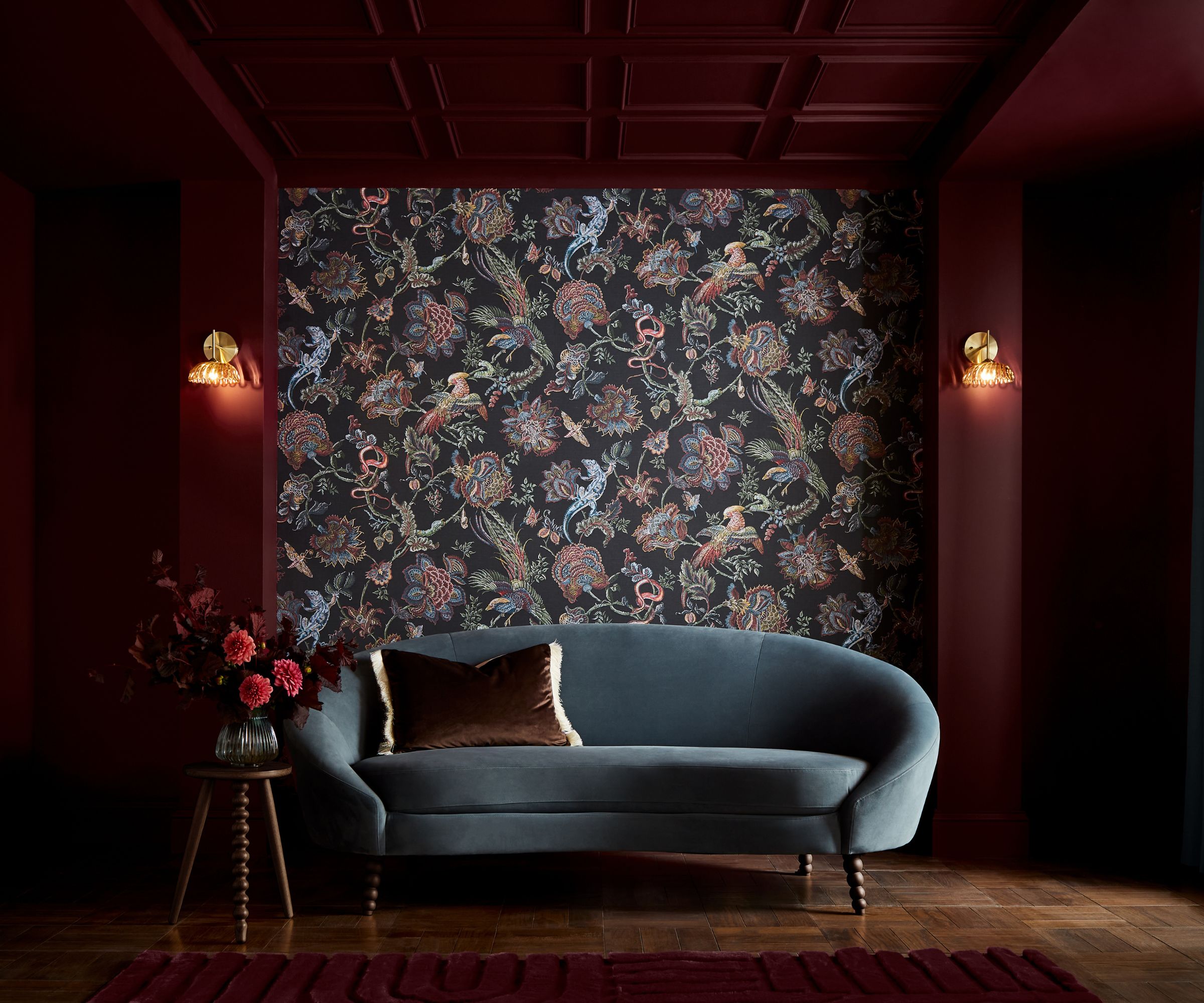
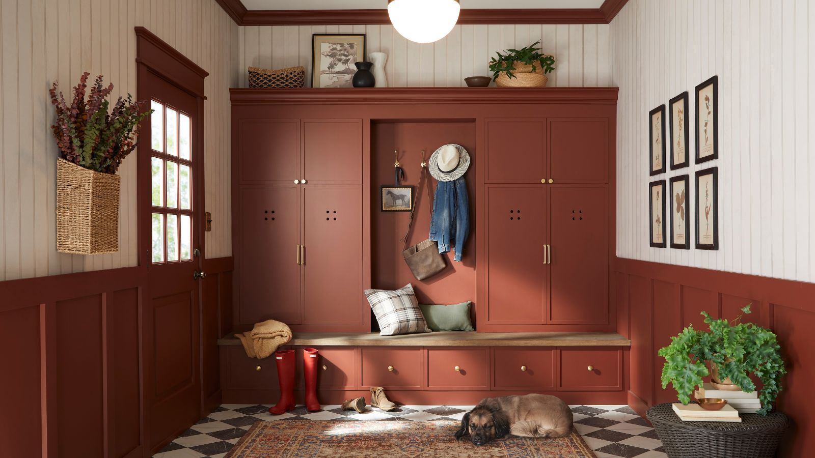
Another moody jewel-tone, Graham and Brown's color of the year 2026 is Divine Damson. The ultimate oxblood red, the richness of Divine Damson makes it an unbeatable choice for the colder months.
Introducing dark colors into the home can feel a little bold, especially if you're new to decorating with a moody color palette, but the timeless elegance of Divine Damson makes it a no-brainer choice if you're looking to create a sense of ambience in your space.
The deep burgundy paint is the perfect way to decorate with red in 2026, whether you're enriching your hallway with color or giving your doorframe some distinction.
C2 Paint Color of the Year: Epernay
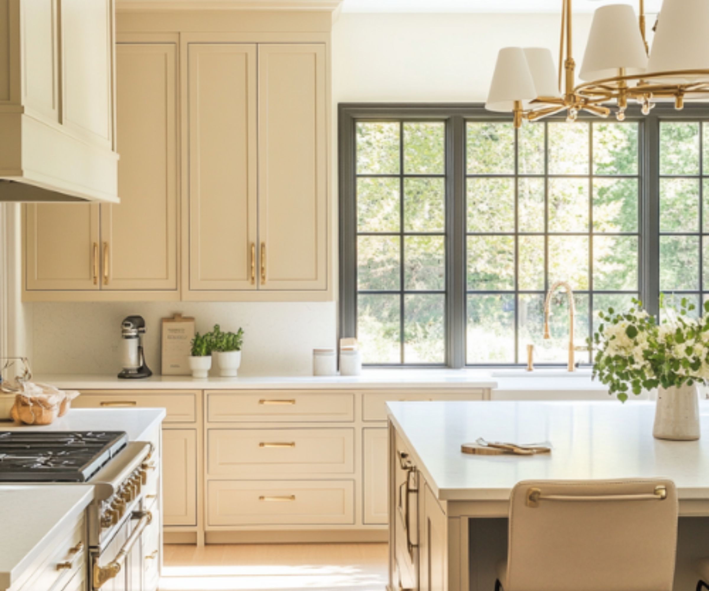
Inspired by the heritage colors of the last century, C2 Paint's Epernay (C2-639) is a timeless neutral with real depth and character.
Named after the French village known for its rustic architecture, Epernay is a champagne-inspired hue with warm yellow undertones. Falling somewhere between a neutral and earthy tone, Epernay is the perfect choice if you're looking for something a little deeper than your classic white paint.
Philippa Radon, Interior Designer and C2 Color Specialist, says, 'C2 Epernay has long been tied to European influences and is now emerging in contemporary design for its classic, versatile ambiance. This historic hue helps us retell the wondrous stories woven through history via the inseparable threads of color, art, furnishings, and nature. It reminds us to appreciate the personal touches that make a home uniquely ours – and to live with reverence for the stories we’re creating every day.'
Minwax Color of the Year: Special Walnut
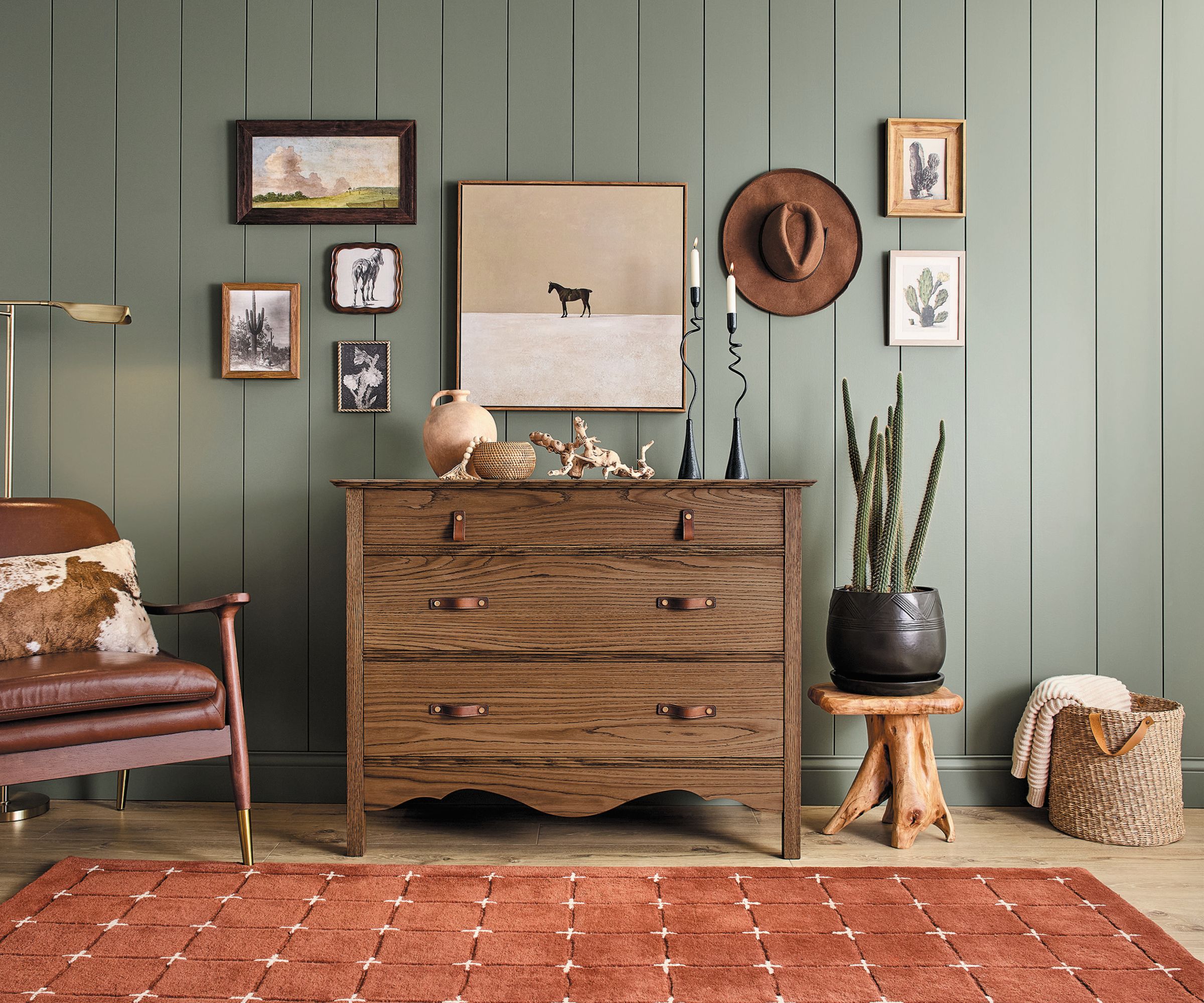
Minwax's Color of the Year is refreshingly unique compared to its counterparts. Special Walnut is a pared-back paint finish that encourages you to decorate with wood and make the most out of natural surfaces.
Lisbeth Parada, Color Marketing Manager at Minwax, says, 'Inspired by the comfort of familiar spaces and the charm of reclaimed materials, Special Walnut helps you slow down, try something new, and create with confidence.'
Designed for wood tones, Special Walnut is available in an array of hues. Whether you're transforming furniture or a countertop, it will give any surface depth and shine.
Glidden Color of the Year: Warm Mahogany
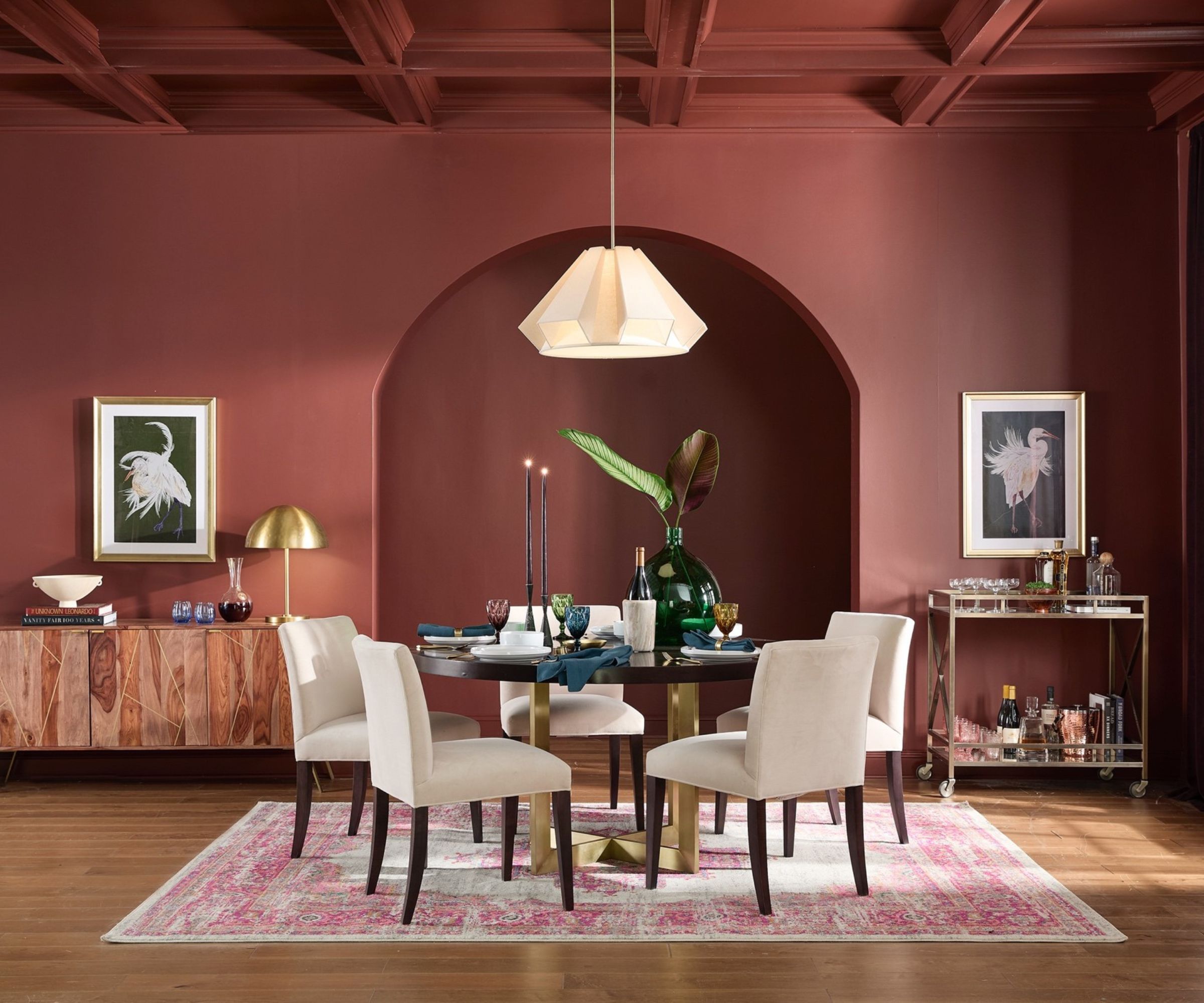
A rich hue somewhere between red and terracotta, Glidden's color of the year 2026 stands out amongst the crowd. Dubbed Warm Mahogany (PPG1060-7), the refreshing red is the ultimate earthy tone with fiery undertones.
A flexible shade that's striking without feeling too bold, it's surprisingly easy to introduce Warm Mahogany into a scheme. Tone it down with white accents or continue with the earthy vibe and pair it with a sage green for a whimsical look.
We all know red is on trend, but Warm Mahogany is a refreshingly new alternative. It's a sophisticated, warm, and inspiring shade that couldn't be more fitting for 2026.
Dulux Color of the Year: The Rhythm of Blues
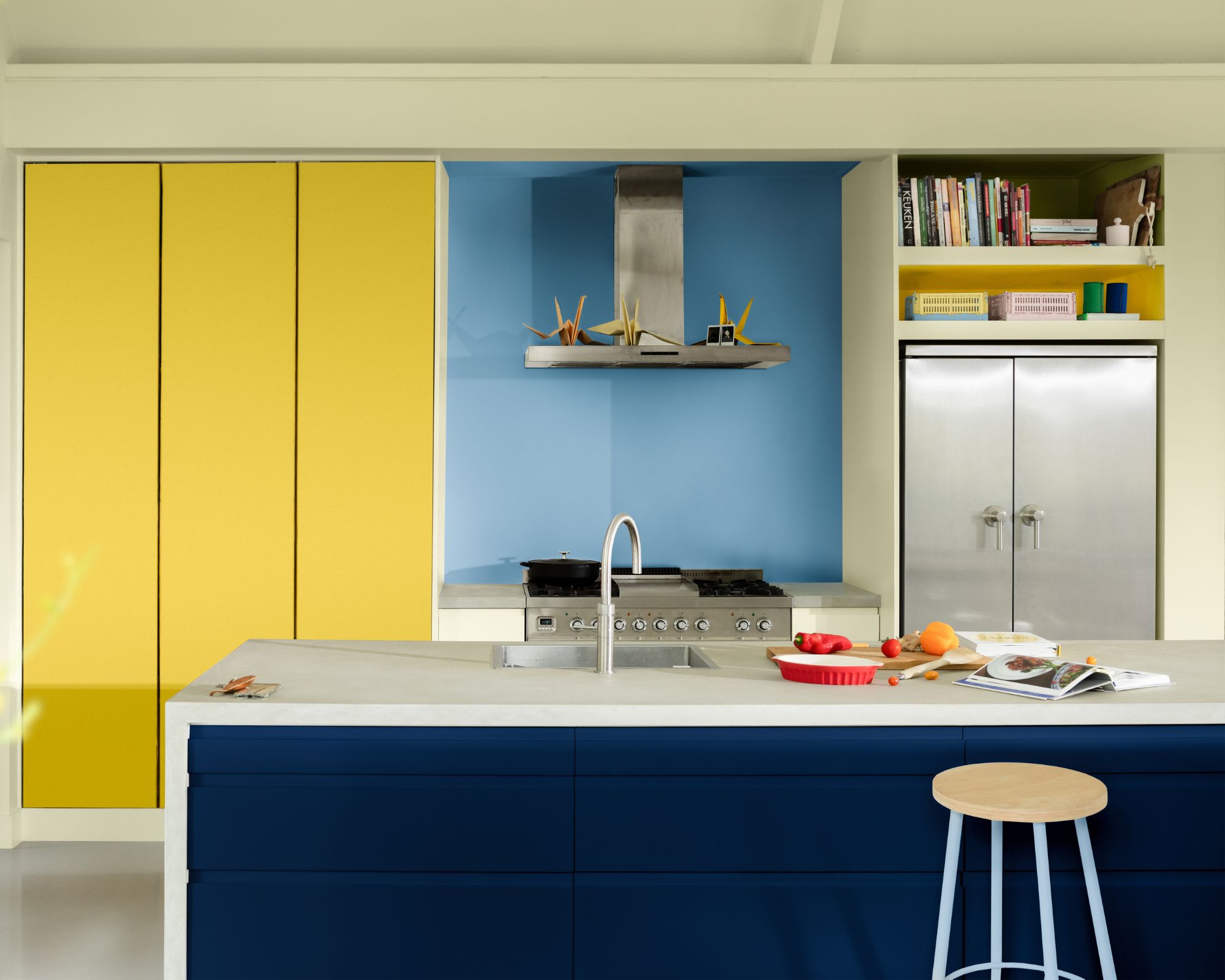
Dulux's Color of the Year is a trio of blues that proves blue paints are still on trend. A vibrant royal blue called Free Groove was amongst the selection, alongside Slow Swing, a classic navy, and a pale blue dubbed Mellow Flow.
Whimsical yet classic, Dulux's blue paint family offers something for every space. Whether you're decorating a traditional living room with the heritage navy paint, or you want to create a statement in a kitchen with the zingy royal blue.
Lick Color of the Year: The Return to Play Palette
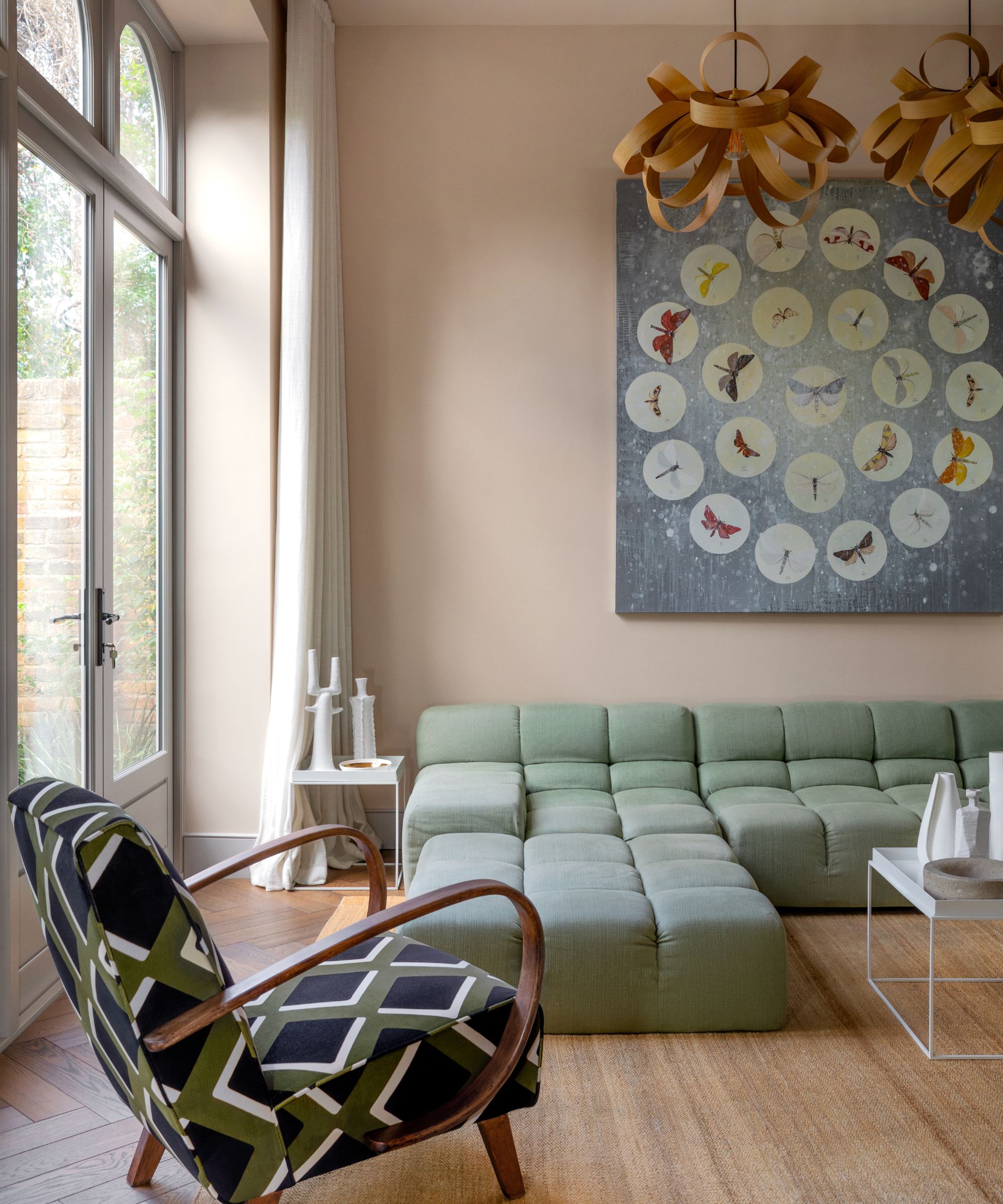
Lick home color edit 2026 is unique. It's a unique take on tradition; it transforms the much-loved primary color palette into something chicer.
The paints included are White 01, Yellow 07, Blue 03, Green 18, Taupe 03, Red 06, Blue 18, and Green 05.
'This year’s edit is about letting go of the rules and rediscovering the joy of play through color,' Tash Bradley, Director of Interior Design at Lick, explains. 'Primary shades were our very first introduction to color as children – the foundations of color theory and the simplest building blocks of creativity. Revisiting them now with a refined twist feels both nostalgic and exciting.'
From refreshing greens to warmer neutrals, there's plenty of inspiration to gather from 2026's Colors of the Year. The line-up is varied, but it's a sure sign of an exciting year ahead.
