6 ways to decorate with jewel tones to bring intrigue and character to your color schemes
Deep greens, dark purples and rich reds are everywhere right now and designers say we should be embracing these jewel-like shades

Design expertise in your inbox – from inspiring decorating ideas and beautiful celebrity homes to practical gardening advice and shopping round-ups.
You are now subscribed
Your newsletter sign-up was successful
Want to add more newsletters?
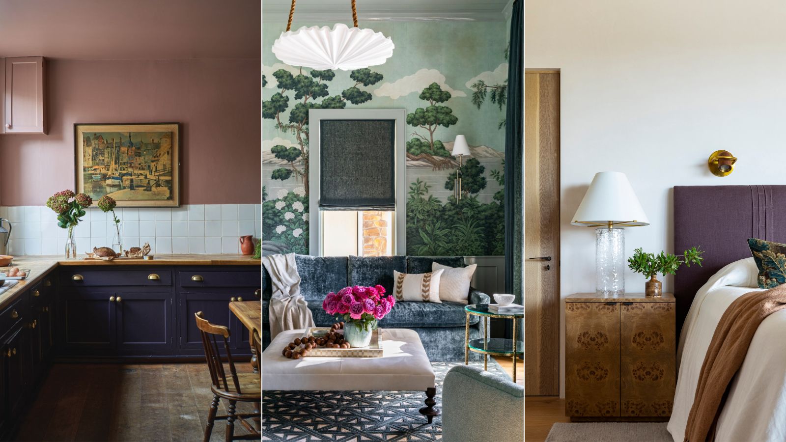
Tis the season for decorating with jewel tones. But while deep reds, greens, and blues are so often associated with winter and the holidays, designers say these moody shades have been on the rise for months and will be hanging around into 2024 for sure.
For so long color trends and design trends in general have favored neutral shades and minimalist style. But there's a slow and steady shift happening, we are moving away from what some might consider 'safe' decor to and into being bolder with color schemes and designs. With the rise in dopamine decor and the encouragement to just embrace personal style, jewel tones have never been more popular.
We have seen so many beautiful spaces that are color-drenched in a fabulous eggplant shade, or covered in a detailed forest green wallpaper, and bold deep reds are popping up more than beige nowadays. So here we have brought all our favorite jewel tone looks together and asked designers how you can bring these rich and exciting shades into your home.
How to decorate with jewel tones
'Rich, darker tones are growing in popularity with consumers, we have seen shades such as royal blue, plum tones, and emerald green surge in demand. Reminiscent of the Renaissance period, this trend is making its way back into our home and adding drama and a luxurious feel to our schemes,' explains Helen Shaw, Director of Marketing at Benjamin Moore.
We are entering an era where these braver, more dramatic shades are over taking neutrals like whites and grays, but how can you bring them into your home in a way that's liveable and timeless?
1. Pick the right shade for your space
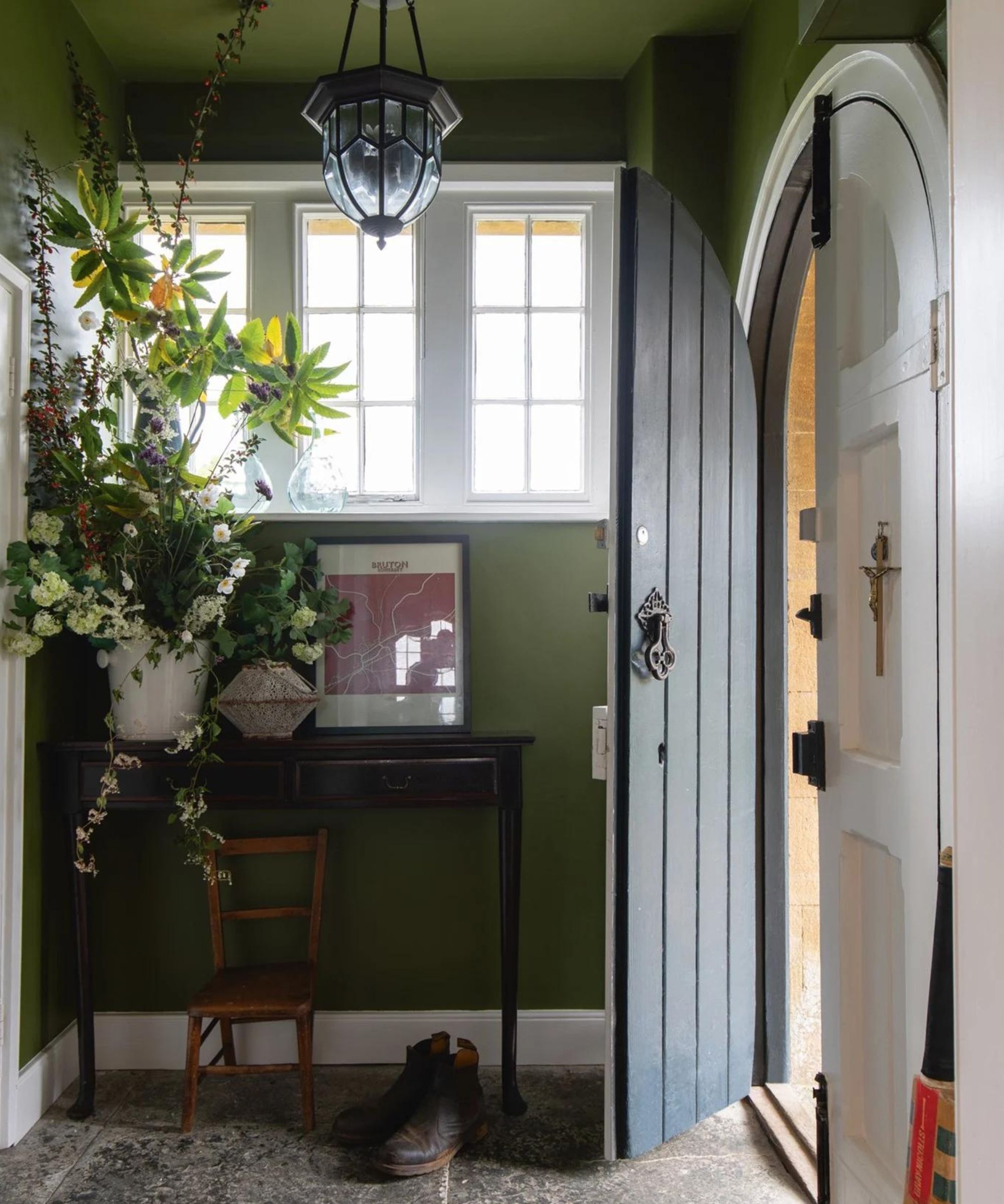
'Often a concern when painting with dark colors is that the space will feel closed in and small, however, this is not the case when carried out correctly. Instead, they can add character and coziness,' explains Helen.
'Firstly, ensure you’re selecting a shade with the right undertone, understanding if your room is north or south-facing will help when choosing a shade - rich plums are warm and inviting, whereas blue can often feel colder depending on which room they are used in.'
Design expertise in your inbox – from inspiring decorating ideas and beautiful celebrity homes to practical gardening advice and shopping round-ups.
'And also consider how the room will be used – is it a sociable space or is it a bedroom that you’d like to be a cozy space to retreat to at the end of a long day? Bedrooms lend themselves to deep, jewel tones as they work to create a cozy space full of character which looks beautiful when dimly lit with lamps and candles.'
'On the other hand, kitchens should feel fresh and airy so more organic dark shades such as forest greens work well when paired with organic woods and metallic accents to help lift the space.'
2. Layer jewel tones together
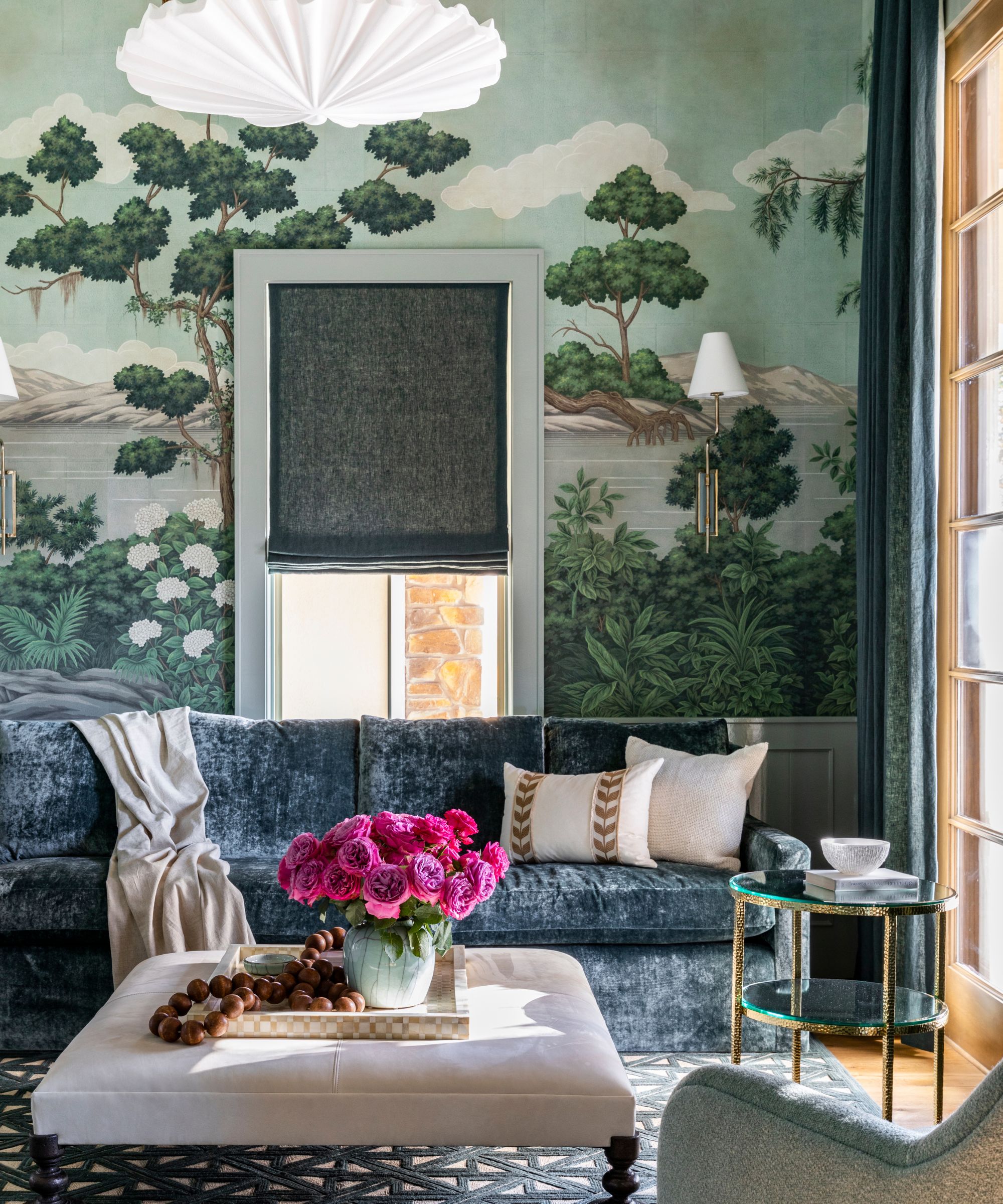
'Muted gem tones are a part of my go-to color palette. Often, when people think of gem tones, they associate the tones with the bold colors of the early 90s and 00s. However, when you take these colors and make them slightly less saturated and more organic feeling, they complement any space,' explains designer Marie Flanigan.
'These tones also layer together beautifully. I love pairing an evergreen color with a beautiful russet or copper. If you’re looking to incorporate more gem tones into your existing design, start with throw pillows and throw blankets for a touch of added color. When designing a space around a gem tone-inspired palette, I love using these gorgeous tones as a paint color and also in soft finishes like furniture, drapery, and rugs.'
3. Colordrench the room
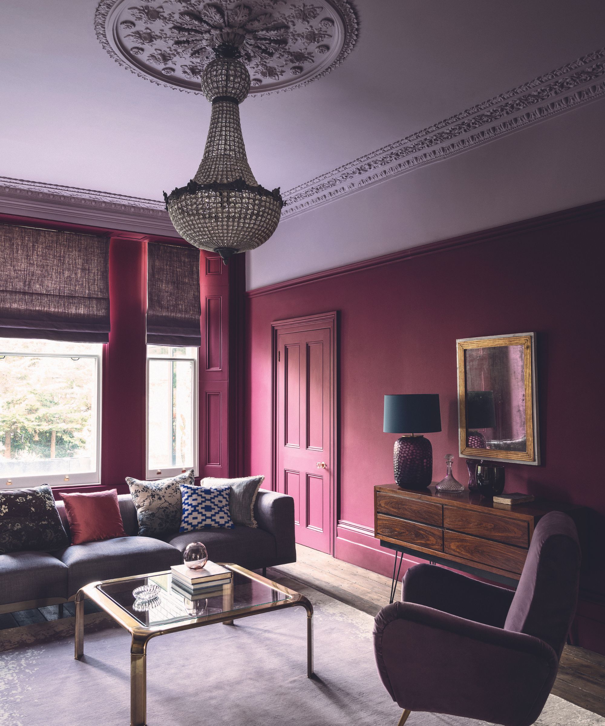
Often when decorating with bolder shades, the key to the look is to really commit. Rather than just adding an accent wall, embrace the color drenching trend and take the scheme around the whole room - walls, woodwork, ceiling, the lot. Plus, this can look so much better than creating that contract between wall and ceiling which can shrink the room and make it look dated.
'Dark colors can help to create an illusion of a larger room or higher ceilings. So, when painting consider ditching pure white for the ceiling and instead opting for a lighter shade of your wall color to reduce the contrast between the walls and ceiling. If you’re brave enough consider taking the dark color onto the ceiling too which will imitate the staple, more is more, ethos,' explains Helen.
4. Ground a lighter scheme with jewel tones
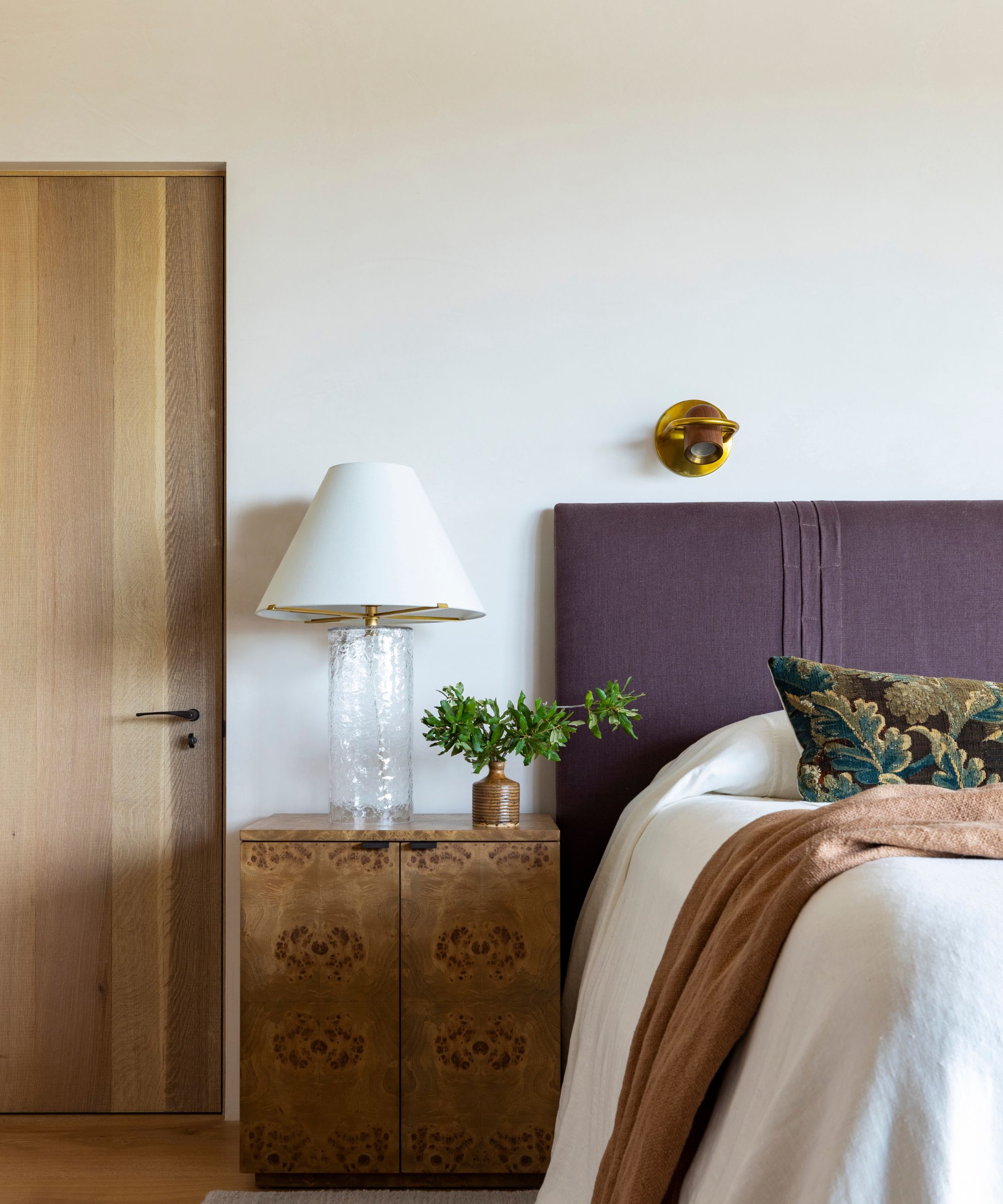
Bringing accents of jewel tones into a neutral scheme can really work to ground those lighter colors. Avoid going for a feature wall as this will create too high of a contrast, and instead bring those deep tones in with your textiles. The headboard used here works perfectly with the lighter shades and the pale wooden tones.
'Oozing maximalism - an aesthetic of excess - jewel tones such as emerald, ruby, and sapphire typically have a strong dosage of hue saturation making them highly dynamic. However, if you balance the jewel tones with paired back off-white ceramic pieces and warm neutral tones it creates an indisputably elegant juxtaposition within a space,' suggests Eleanor Taylor-Roberts.
5. Balance the deep tones with paler shades
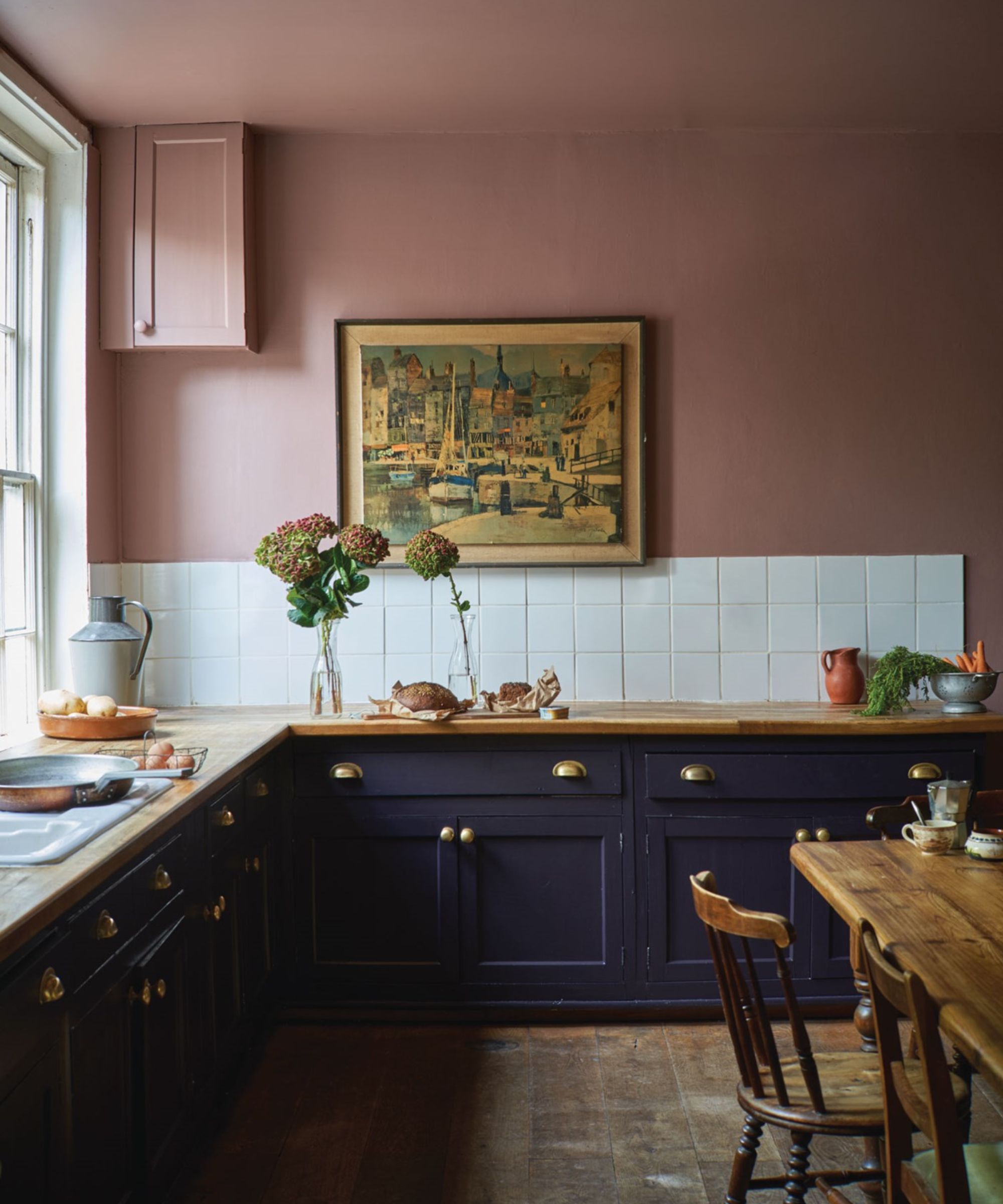
'Jewel tones are fantastic any time of year, but when we get close to the holiday season, I find myself reaching for all things amethyst, turquoise, emerald and ruby,' says Bethany Adams.
'Jewel tones are also surprisingly versatile and easy to incorporate. If you have lighter greens in your decor, for example, reach for a cozy emerald throw or pillows to lend a luxuriousness to your scheme. Similarly, ruby reds pair beautifully with pinks, amethyst with lavender--you get the idea.'
'For rooms that are light and white, pick one jewel tone and scatter it around the space in your accessories. If you have a deep, rich wall color like navy, go ahead and pile on all the jewel tones! Your room will be dazzling, but not overwhelming, thanks to the muted backdrop.'
6. Treat jewel tones as you would decorating with neutrals
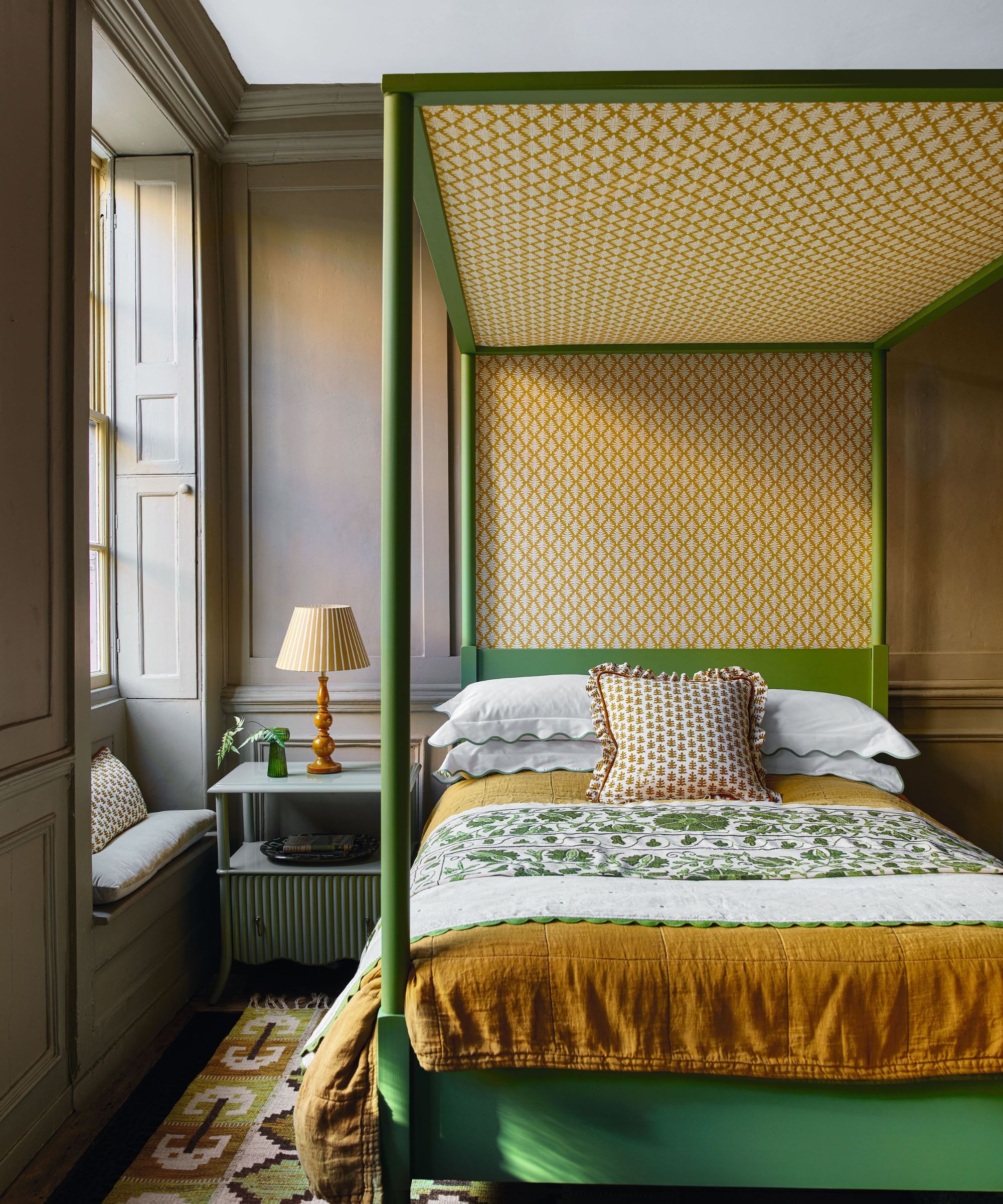
This is a great way to see decorating with jewel tones, treat them as you would a neutral scheme. It makes them far less daunting and easier to be bolder.
'I like to think of jewel tones almost like a neutral palette, but with darker colors instead of lighter ones - essentially meaning that it's so easy to decorate with them because they're so versatile!' explains Kathy Kuo.
'I love to set the mood for a living room space with a velvet sofa in a jewel tone live emerald or sapphire, and anchor the sofa with a patterned rug also featuring rich and luxurious jewel hues. If you already have a lighter color scheme at play and are just looking to add pops of darker jewel tones, try a throw blanket and decorative pillows featuring colors like maroon, amethyst, and teal, or a decorative tray rendered in oxblood or even onyx.'
Decorating with jewel tones really needn't be as dramatic as it sounds, we love Kathy's advice to just approach them as you would neutrals. The key to the most effective and impactful approach is to really commit to the scheme and layer up lots of different deep gem-like colors. Alternatively, if you are just after some winter decor ideas and want to add some depth to your current color scheme, don't go near the paint, just bring in purples, blues, and greens with fabrics, drapes, cushions, throws, and rugs.

I am the Head of Interiors at Homes & Gardens. I started off in the world of journalism in fashion and luxury travel and then landed my first interiors role at Real Homes and have been in the world of interior design ever since. Prior to my role at H&G I was the digital editor at Livingetc, from which I took a sabbatical to travel in my self-converted van (not as glamorous as decorating a home, but very satisfying). A year later, and with lots of technical DIY lessons learned I am back to writing and editing, sometimes even from the comfort of my home on wheels.