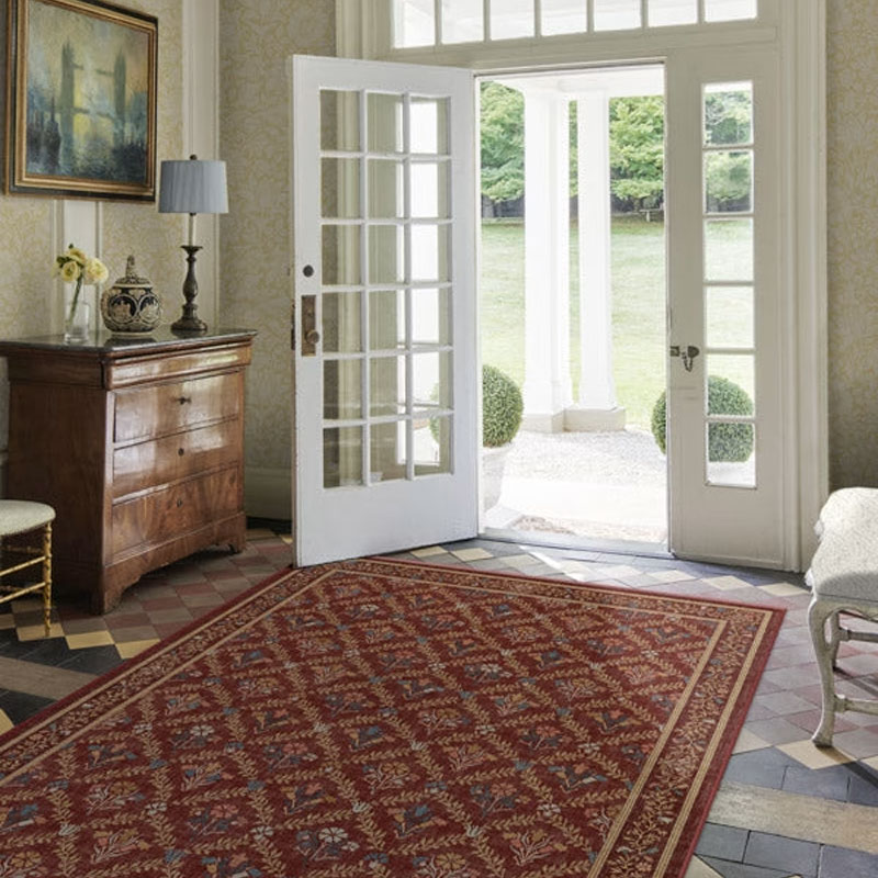
Is red on trend? Designers weigh in on this tricky but powerful color and the one specific shade that's on the rise
Impactful, warming, and fun, red has dominated the runway for fashion trends this year, now, rich red color schemes are making a big impact in the world of interiors

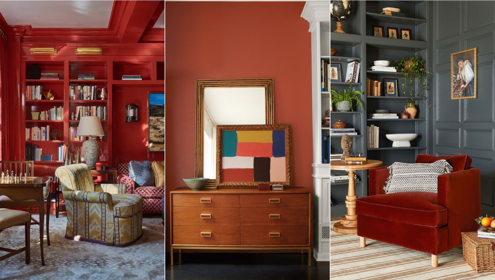
It's fair to say that red has never been one of the most popular colors to decorate within interior design, but is that all about to change?
2023 has been a year of being brave and bold with color in the home, and recent color trends have shown that more and more of us have been decorating with red by embracing rich red color schemes; bringing warmth, character, and beautiful visual interest to our spaces.
From the rise of dopamine decor, to the fun tomato girl summer trend, the renaissance of red is not only taking over the world of fashion, it's enhancing our interiors with a playful use of color, too.
How to embrace a rich red color scheme in your home
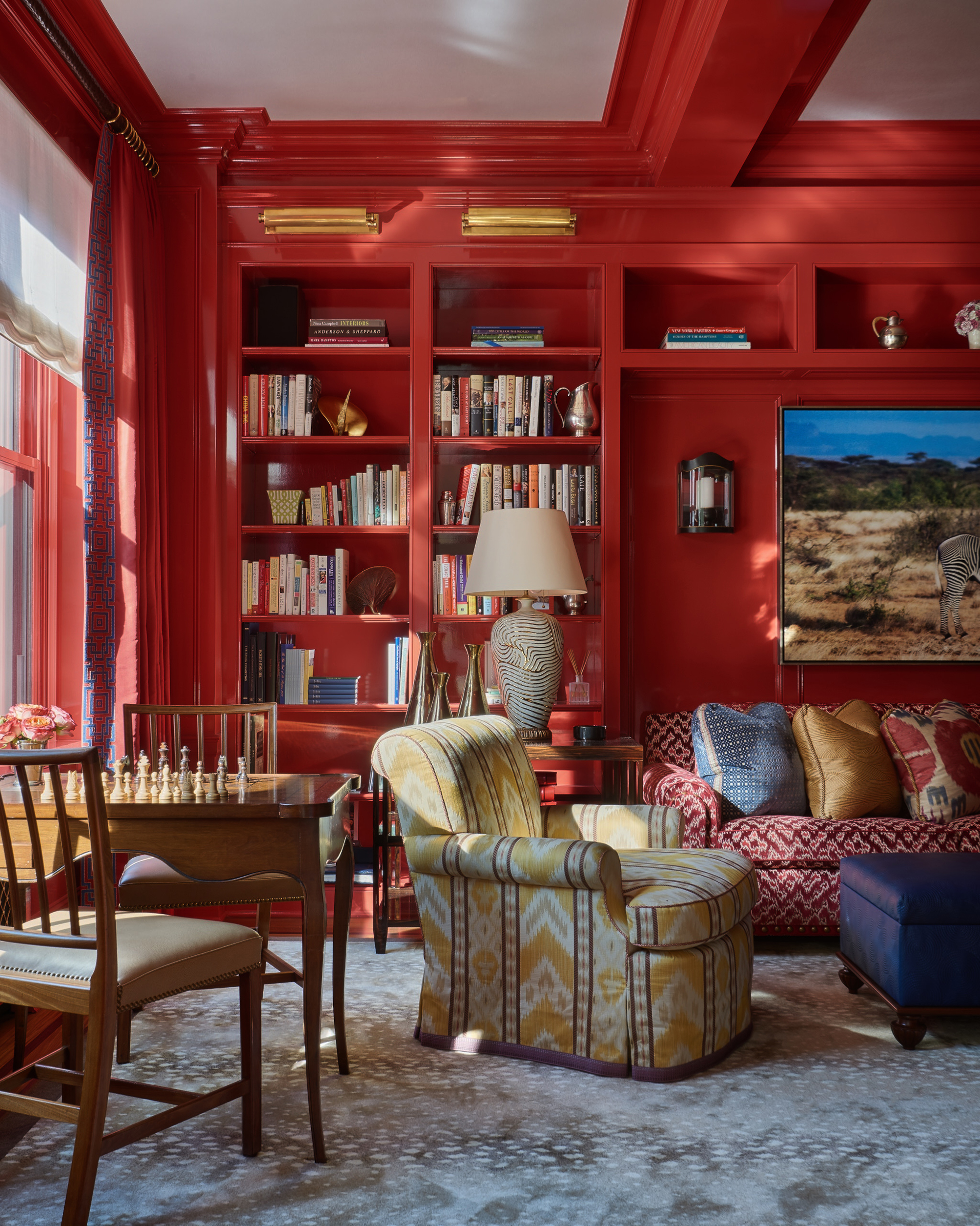
Using shades such as berry, burgundy, and maroon for red room ideas can establish an elegant, opulent feel in homes both classic and modern, as well as enrich a space with an uplifting and unique energy.
'Offering elegance with comfort, rich reds are a prominent and captivating hue for autumn and winter trends this year. With deep undertones, shades like Damson exude a sense of sophistication and allure that perfectly complements the seasons’ changing landscape. Along with its warming tone, these colors hold the potential to add a touch of opulence to any aesthetic,' says Emma Bestley, creative director and co-founder of YesColours.
To help you embrace the bold beauty of a rich red color scheme, we've asked paint and color experts to share their best decorating advice, as well as why so many of us have been recently drawn to the power of this primary shade.

Homegrown paint brand, YesColors, was founded by friends, John Stubbs and Emma Bestley. Alongside being a paint and color expert, Emma has worked in fashion buying and events within the media industry.
Rich red painted walls
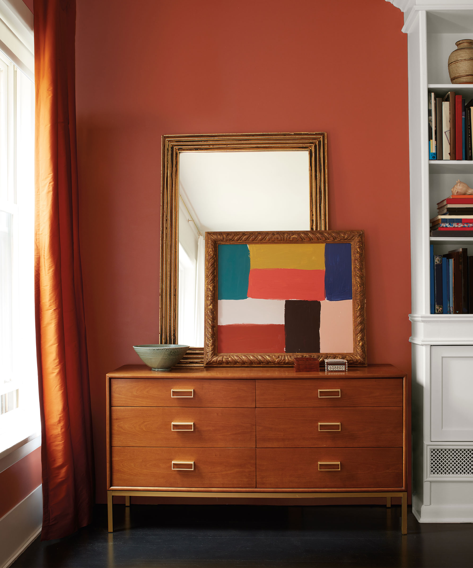
For so long, many of us have been told to avoid bold colors such as red for room colors, but when used correctly, a rich red can establish a wonderfully warm, welcoming and cocooning environment, perfect for both colorful and cozy room ideas.
Design expertise in your inbox – from inspiring decorating ideas and beautiful celebrity homes to practical gardening advice and shopping round-ups.
'Red paint can be confident and charismatic, rich and sensuous. From the deepest garnet to a soft rose, red is very often used as a strong, statement color – but it can also be understated, too. It can swing warmer towards sun-baked brick and cooler towards crimson-kissed violets, providing a muted quality that brings depth and elegance. A statement accent wall is a great way to introduce red to your home before committing to a full room, which may seem overwhelming if it is your first time using red. Red can also liven up a hallway, create a dramatic dining room, or add playfulness to a kids' room,' advises Benjamin Moore color expert, Helen Shaw.

Helen Shaw is part of Benjamin Moore's UK division. Color expert and international marketing director, Helen and her husband Craig are founders of Shaw Paints, acquired by Benjamin Moore in 2020.
Rich red cabinetry and trims
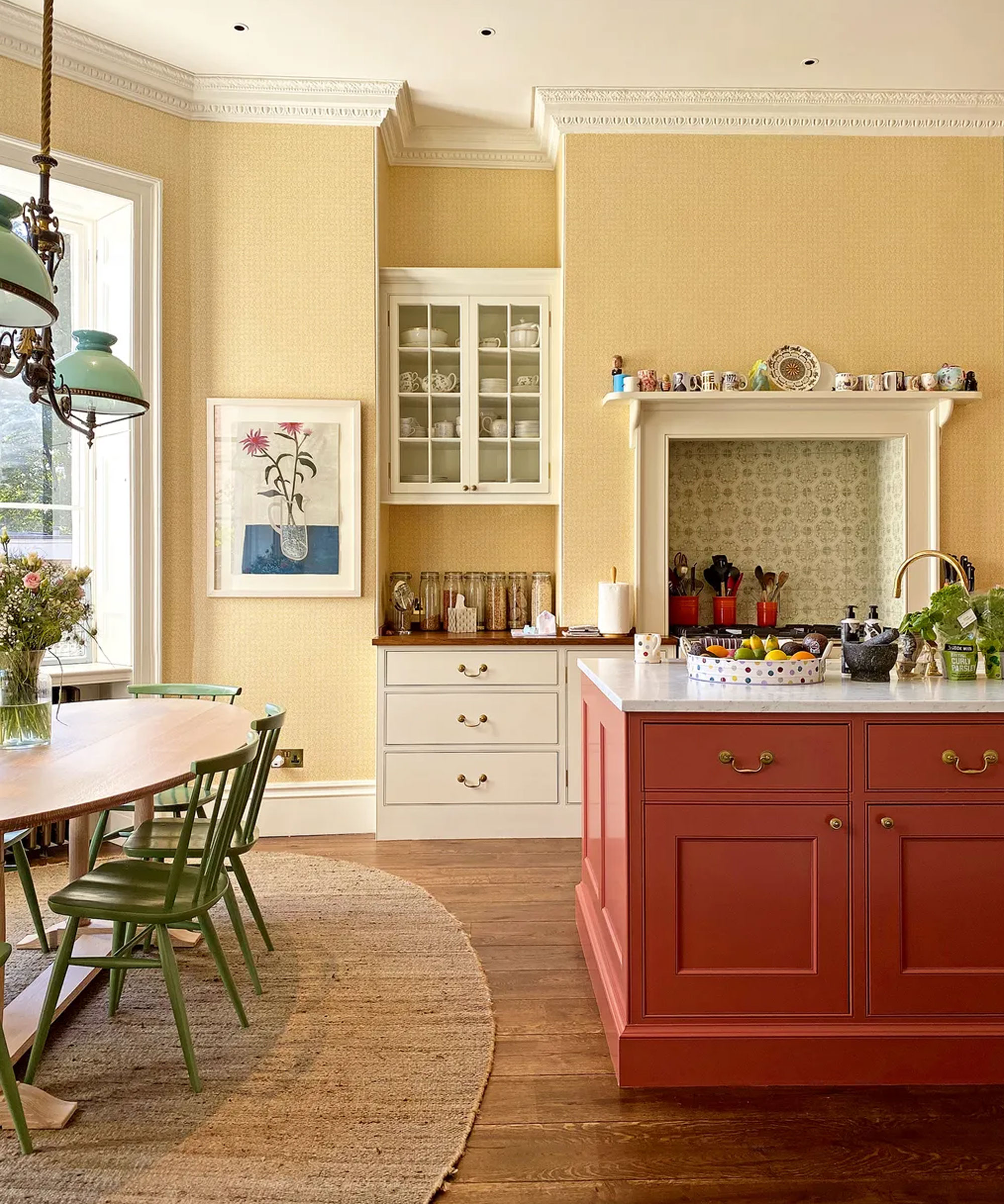
Patrick O’Donnell, color expert and brand ambassador at Farrow & Ball says, 'Bordeaux rich reds make a great choice for kitchen cabinetry such as Preference Red, especially when teamed with a flattering pink on your walls such as Setting Plaster – both are warm and exude conviviality. Other reds, such as spice reds like Bamboozle, can make a wonderful statement on bookcases or the interior of a cupboard, especially when teamed with a gentle neutral.'
Flora Hogg, Craig & Rose color designer also adds, 'Painting woodwork or joinery is often less daunting than tackling all four walls when working with impactful colors such as rich red. Whether it’s a shelving unit, kitchen cabinets, window frames or ceiling trim ideas, applying a subtle sheen enhances the play of light – making red appear brighter and less imposing within the room.

Patrick O’Donnell is Farrow & Ball's color consultant & brand ambassador and has been with the brand since 2012. Patrick works with designers in the UK and North America, helping to bring their projects alive with the iconic, F&B color palette.
Rich red furniture and accessories
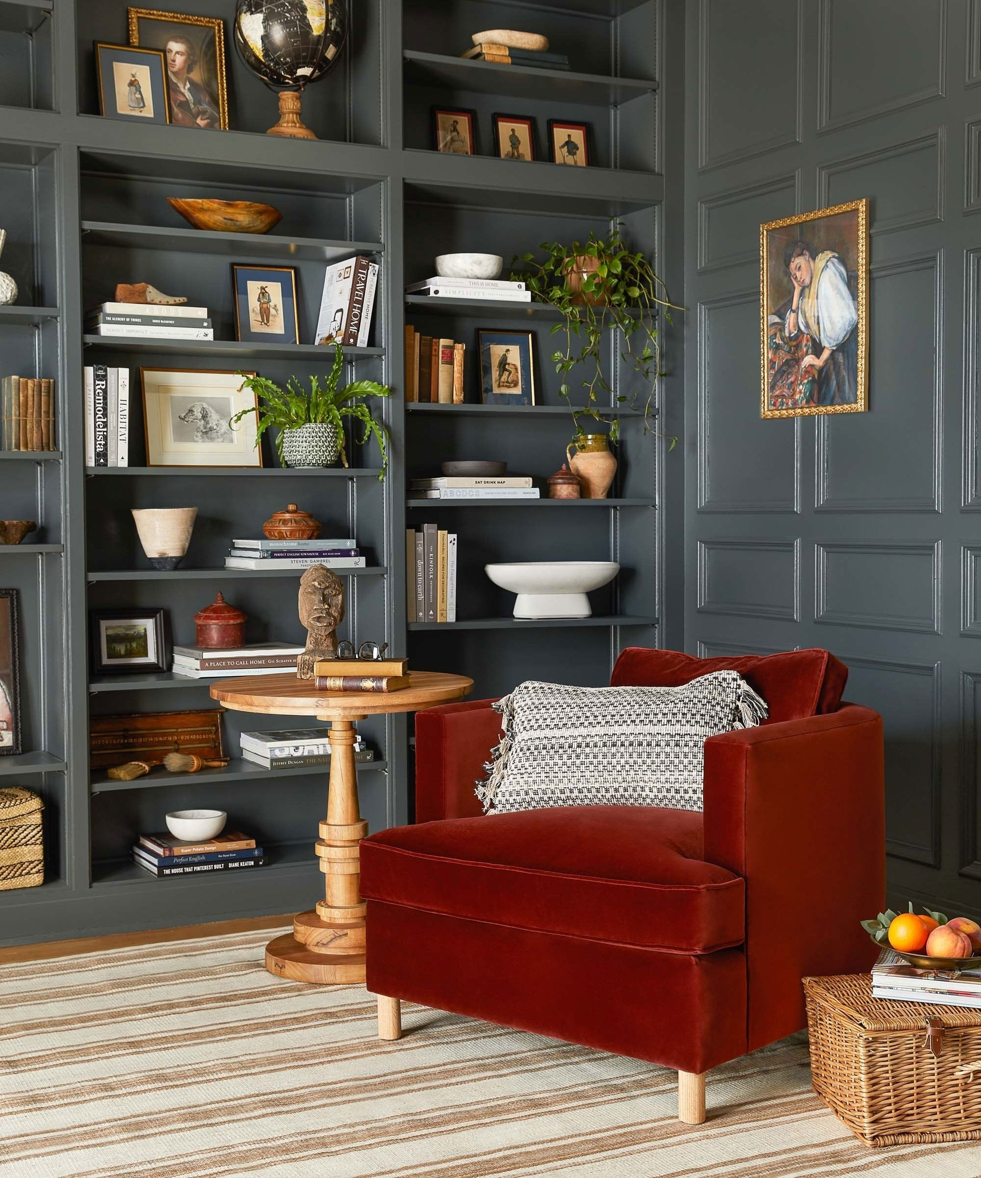
As well as becoming popular for recent paint ideas, rich red palettes can be seen across homeware trends, too.
From luxurious red velvet sofas and armchairs, like this irresistibly cozy Belmont Accent Chair, designed for Lulu and Georgia by Ginny Macdonald, to colorful tableware and artwork, adding rich red to a scheme through furniture, lighting, and accessories is an easier way to embrace this shade, especially if you're looking to use it as an accent color.

This adorable portable Flowerpot lamp from &Tradition, designed by one of the most influential 20th-century interior designers, Verner Panton, can bring beautiful, uplifting color and retro shape to rooms throughout your home.
FAQs
What colors go with rich red?
'When designing a rich red scheme, always consider the layers and colors that complement your chosen red. I love pairing reds and pinks for a harmonious feel, where the warmth of red is tempered by the gentle allure of a soft pink shade. Then I’d opt for either a striking blue or a rich, deep green to give the space a contrast,' says Flora Hogg from Craig & Rose.
In terms of color theory and using the color wheel, colors that sit opposite each other on the wheel are seen as complementary colors, and are often used together in interior design to create a harmonious, balanced and visually appealing scheme. Red sits opposite green on the color wheel, with the calming, earthy qualities of green perfectly balancing out the vibrancy and warmth of red.
Embracing a rich red scheme doesn't have to be overpowering and intense, as our experts have discussed, red can be elegant, sophisticated, cozy, and inviting.
Of course, red is certainly not for everyone, but the recent rise in rich red color schemes shows how this divisive, often negatively perceived color, can invigorate a space with character, energy, and depth; adding a classic and luxurious touch to homes both traditional and contemporary.

Zara joined Homes & Gardens in February 2022 as a Content Editor. After studying English Literature at University, she worked as an Ecommerce Website Editor, Content Writer and Buying Intern at multiple independent businesses within the luxury retail and lifestyle sectors. Her role at Homes & Gardens unites her love, experience and passion for the world of design and desire to create inspiring written content. She enjoys nothing more than discovering new trends, brands and products, whether that be in fashion, interior design or lifestyle.

