What color is mauve? How to use it in your decor
A bright pastel or a contemporary neutral? We explore the question, what color is mauve?

Design expertise in your inbox – from inspiring decorating ideas and beautiful celebrity homes to practical gardening advice and shopping round-ups.
You are now subscribed
Your newsletter sign-up was successful
Want to add more newsletters?
A complex color to define, there are many mauve variations out there to choose from, causing confusion over, what color is mauve?
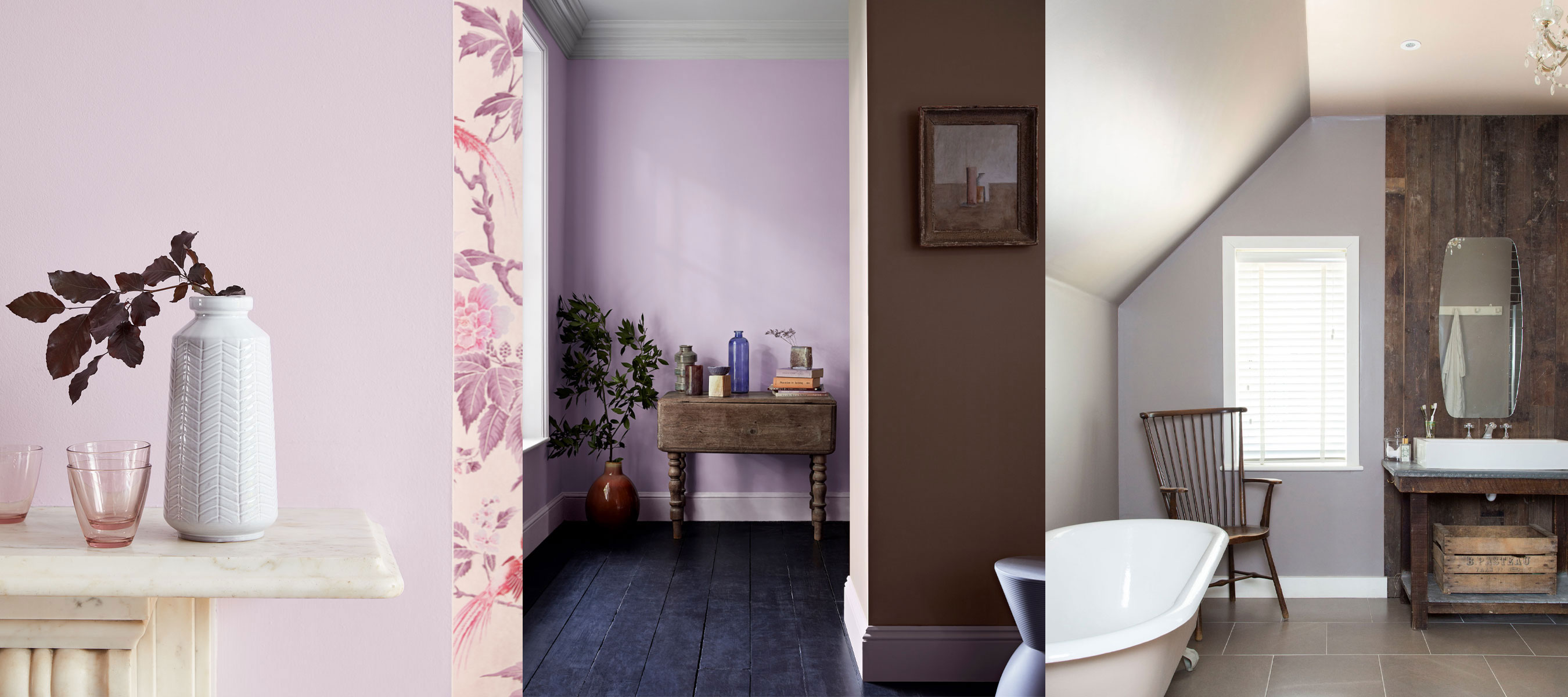
A soft shade that can be both subtle and energetic, mauve sits between violet and pink on the color wheel. Part of the purple family, mauve is created through a mix of blue, white and red, so you can choose from elegant pink-purple shades, or, as Patrick O'Donnell, brand ambassador of Farrow & Ball says, a more 'contemporary, grayish pale purple'.
Charlotte Radford, senior product manager at Valspar Paint says, 'the color mauve is a delicate pale purple named after the mallow flower. It can sometimes be confused with lilac or violet, which sit on the same side of the color wheel, but it results in a more vibrant shade thanks to its hint of blue and pink that make it a versatile color trend for decorating ideas in the home.'
Article continues belowWhat color is mauve?
When exploring room color ideas, mauve can be used across the home, working as both a calming neutral or to bring in a bright pop of color and sense of vibrancy to a space.
Charlotte Radford states, 'thanks to its bright tone, mauve can be used as an alternative to white to lighten up a room or to balance the presence of darker colors in a particular space.' This makes mauve and ideal choice for small rooms if you want to bring in an element of color but still maintain a feeling of brightness and enhanced space.
'It is also a great choice for indoor/outdoor spaces such as the entrance, conservatory or living room, with wide windows opened on the garden because it highlights shades seen in nature.'
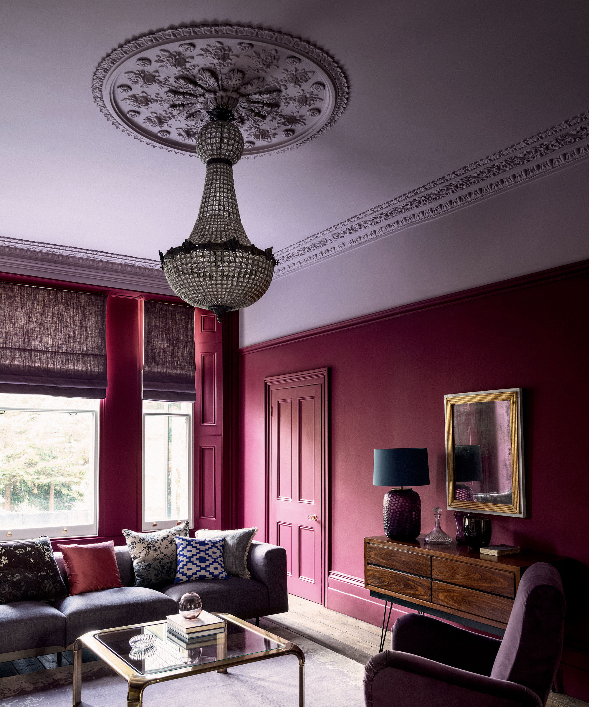
If you are looking into purple room ideas and want to use a darker shade, Radford says, 'darker shades – such as Charcoal Mauve or dusky Mauve Ink with a hint of purple can create a cozy and safe space to rest and relax.’
Design expertise in your inbox – from inspiring decorating ideas and beautiful celebrity homes to practical gardening advice and shopping round-ups.
From muted to impactful, mauve is a truly versatile option for decorating with color in the home, with an extensive palette of shades to choose from to best suit your space.
What color goes with mauve?
Whether you want to create a calming and serene space, or a bold and dynamic and environment, there are a range of complementary colors that can enhance your mauve design.
In terms of color theory, complementary colors sit opposite each other on the color wheel, with mauve sitting opposite yellow-green.
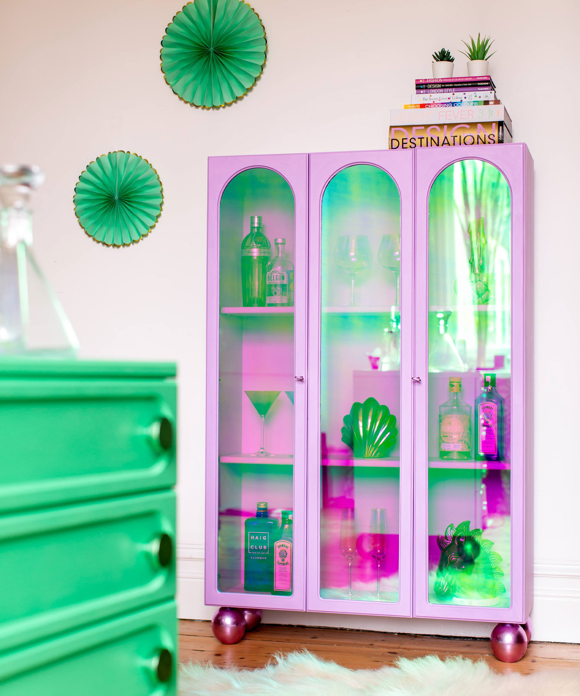
Charlotte Radford states, 'mauve makes the color lime green pop – so painting your furniture with these alternating colors would create a retro effect. Mauve is also a good option to soften dark shades of green or navy blues. Combining a wall in something like Valspar’s Misty Mauve with skirting boards and door frames painted in a forest green, would result in a romantic yet modern effect.'
As shown in this room that features a beautiful cabinet by Webb & Gray, the vivid green and bright mauve work harmoniously together, creating a dynamic color combination that feels fresh, contemporary and striking.
Justyna Korczynska, senior designer at Crown Paints also supports this and says, 'mauve sits well amongst a high intensity green such as lime. An energetic and vibrant green complements a soft powdery color such as a gentle mauve.'
Is mauve a cool or warm color?
There are many mauve options that can create both a cool and warming effect when decorating, along with factors such as the color palette and materials used in the rest of the room having an impact.
Patrick O’Donnell says, 'if used in the right lighting environment, mauve can create a rich, yet soft color for any room, from bedrooms to living spaces. Our color Brassica represents a muted mauve and will add some warmth, even in a north facing room.'
If you want to create a cozy, warming environment, a mauve shade with more pink undertones can work well, pair with wood and other darker purple shades for a truly inviting look.
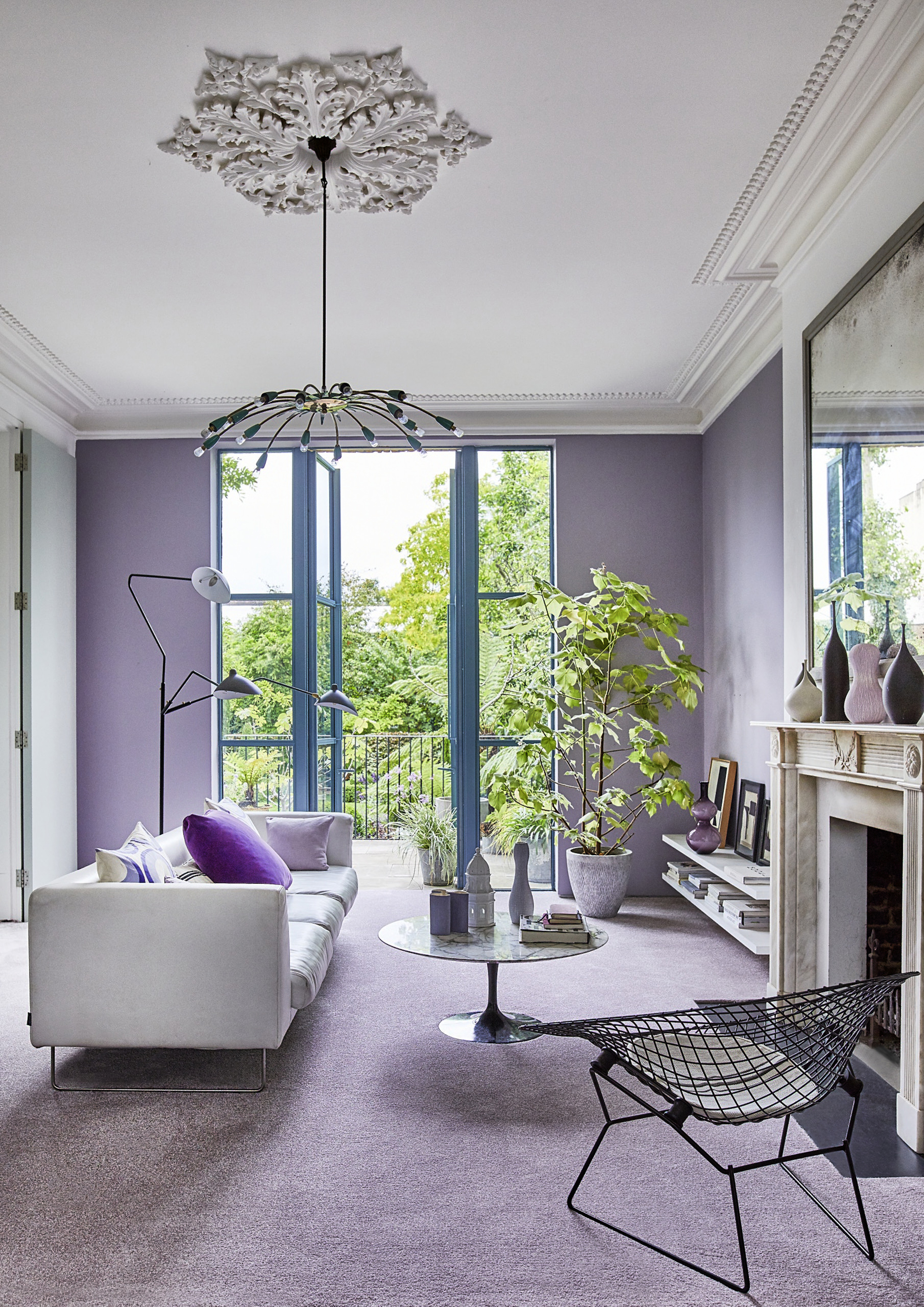
For a cooler space, choose a mauve with gray undertones and pair with white or blue.
Justyna Korczynska says, 'as a guide, warm colors such as red, orange and yellow are considered to be stimulating, while cool colors such as blue, mauve and green tend to be more restful. It’s useful to consider these factors when designing spaces, we live, work and play in.'
What color is mauve closest to?
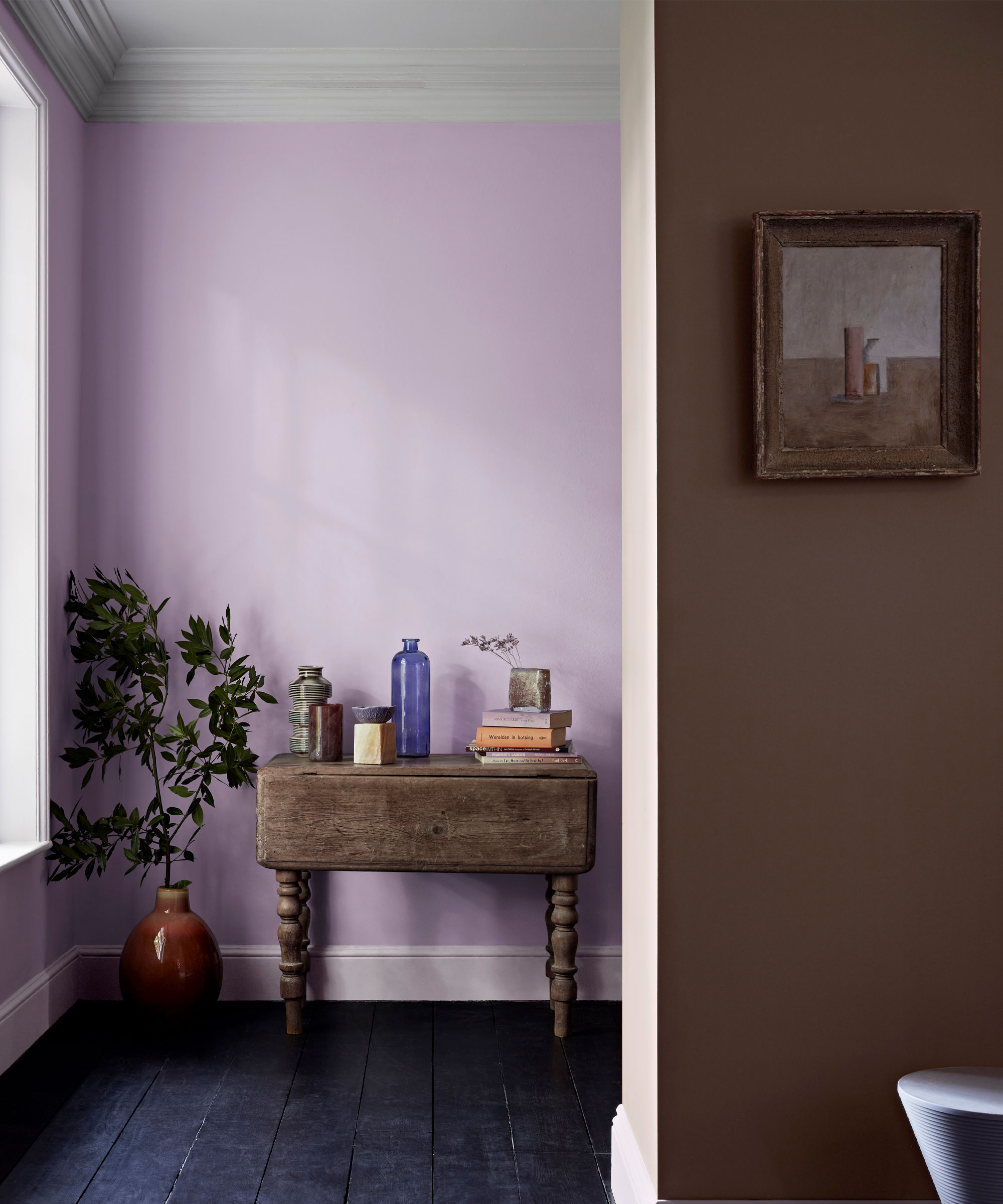
As we have discussed, mauve is traditionally seen as more of a purple color, sitting within the purple family within the color wheel.
However, there are an array of shades out there to choose from, some closer to gray, others closer to pink, so be sure to explore the options available to find the perfect shade for your home.
What undertones does mauve have?
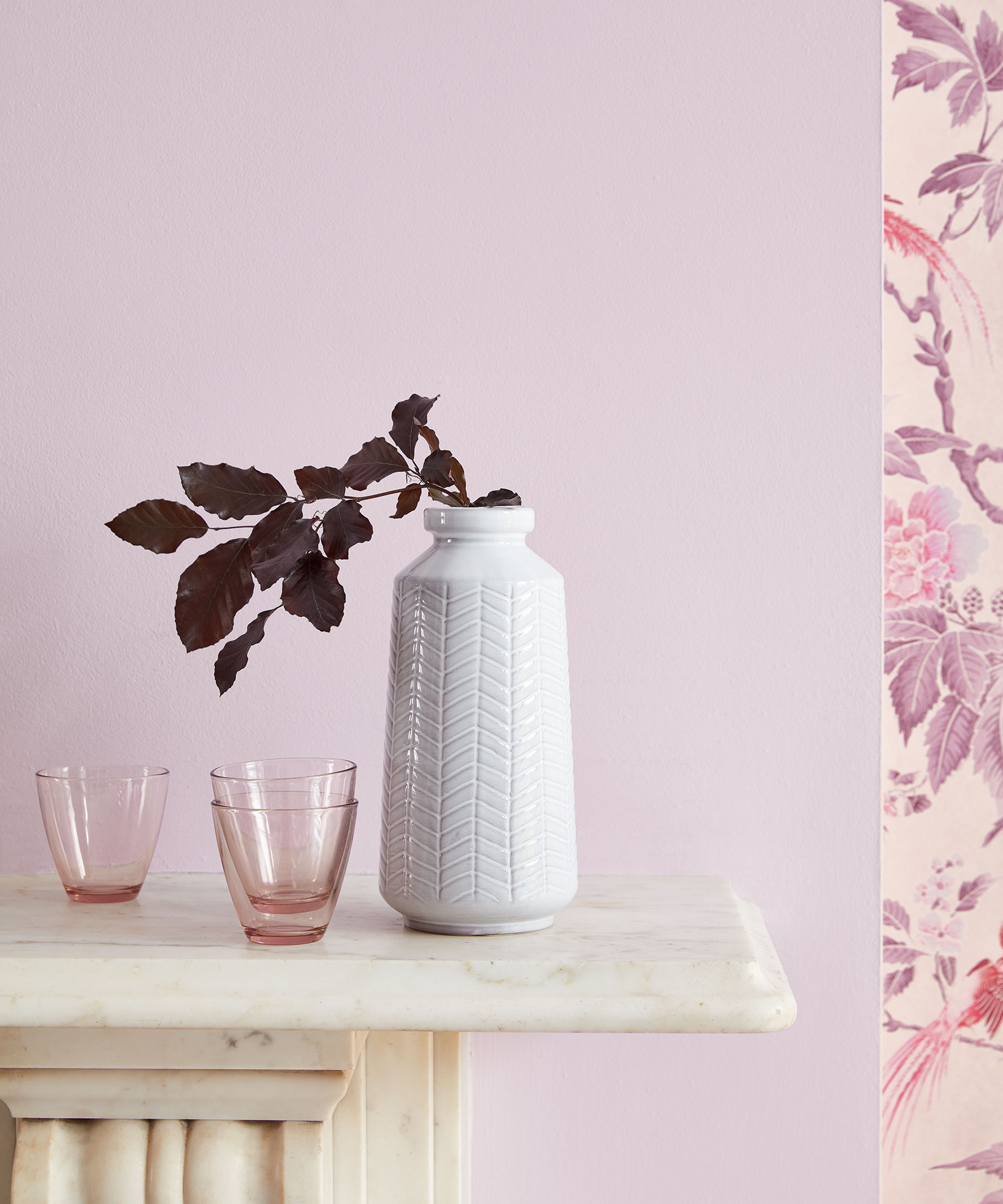
As mauve is between violet and pink on the color wheel, it has both pink and purple undertones.
However, mauve is created through a mix of blue, white and red, so there can be varied undertones depending on the shade.
A very pale mauve shade can be seen as close to a gray, with more blue undertones, whereas a brighter mauve, similar to a lavender, will have pink undertones.

Zara is the Managing Editor at Homes & Gardens. She joined the brand in February 2022 as an Interiors Content Editor, specializing in writing content on interior color trends, decorating ideas and design inspiration. After studying English Literature at University, she worked as an Ecommerce Website Editor, Content Writer and Buying Intern at multiple independent businesses within the luxury retail and lifestyle sectors. She enjoys nothing more than discovering new trends, brands and products, whether that be in fashion, interior design or lifestyle.