6 interior designers on how they would use Sherwin-Williams' most unpopular color – a 'misguided pastel relic' or 'romantic, and calming'?
Radiant Lilac has been christened as Sherwin-Williams Loneliest Color for 2025. But what do top interior designers think of this less-than-popular shade?

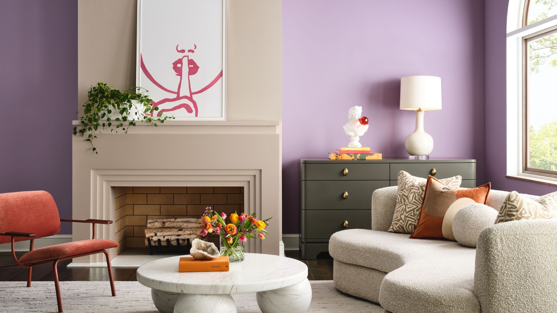
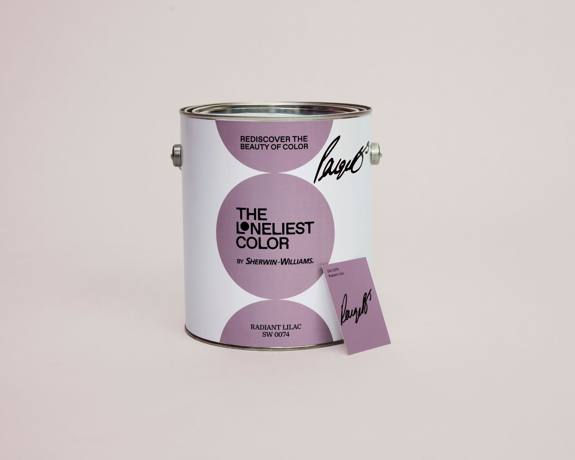
Sherwin-Williams has a famously vast collection of paint shades, some of which have become so iconic to the interior design world that they are bordering on legendary. However, last year it announced its inaugural ‘Loneliest Color’ – a paint color that has something of a sad tale, being its least popular and most overlooked shade. This year is their second year of exposing the name of their undersold shade, and Sherwin-Williams has announced that Radiant Lilac is its loneliest color for 2025, with the fewest gallons sold in 2024.
For context, some of Sherwin-Williams' best-selling paints are tinted in the millions of gallons per year, but there were fewer than 1,000 gallons of Radiant Lilac made last year. Whilst lilac has been incorporated into interior schemes for centuries, Radiant Lilac is a particularly modern interpretation of a light purple paint, and this unconventional and some may say challenging color is evidently not hitting the right note with homeowners.
So, we challenged six interior designers to consider how they would use Sherwin-Williams' Loneliest Color in an interiors project, and gathered their thoughts on what they think of the shade.
Article continues belowWhy has Radiant Lilac been overlooked?
Is Radiant Lilac an interior-designer-approved shade? In truth, the response was something of a mixed bag. Some dubbed Radiant Lilac as ‘terminally outdated’, others view it as ‘a hug in color form.’ Whether you’re skeptical of this hue or take a more complimentary view of this color is, of course, entirely down to personal taste. However, when we asked designers for their top tips for using this color, the memo is clear: approach with caution, and get the color combinations spot on to maximize Radiant Lilac’s potential.
‘It can be an intimidating endeavor to use a non-obvious or untrendy color of the moment,’ says interior designer and antique dealer Jen Bienvenu. Perhaps the reason Radiant Lilac is undersold is because purple and lilac shades in general are decidedly ‘untrendy’ at the moment.
Pastel purple shades, such as a bright, sugary lilac, have somewhat of a playful attitude, so much so that you may be excused for feeling it errs on the side of infantile. Those candy-colored hues with iced-cake appeal seem to be off the aesthetic agenda for the foreseeable future, so their diminishing popularity has not come as a huge surprise to interior designers.
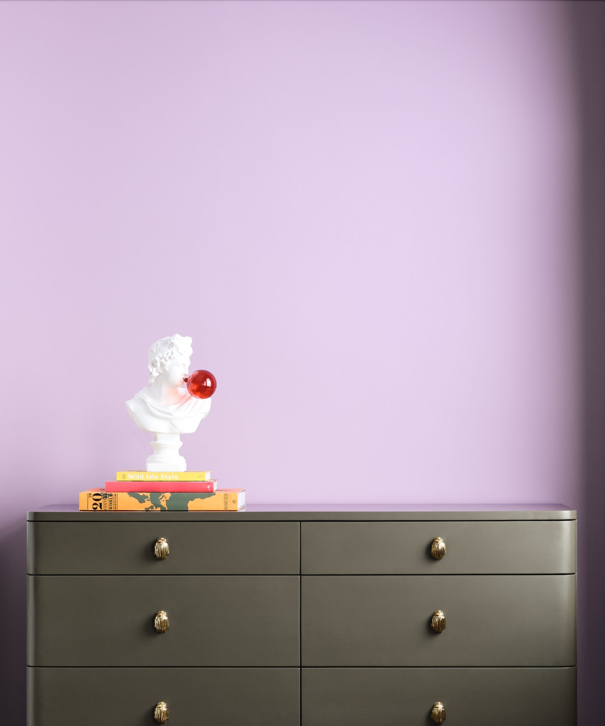
‘It is not a color that I often use as it is very specific to the personal taste of the client, and the color trends over the last handful of years have been leaning towards warm, earthy tones,’ explains UK-based interior designer Mia Karlsson.
Design expertise in your inbox – from inspiring decorating ideas and beautiful celebrity homes to practical gardening advice and shopping round-ups.
Yes, the tide has certainly turned against sweet, saccharine pastel shades, and a distinct preference for natural, organic tones with a certain muddiness to them has been evident over the last few years.
‘In the world of interior design, lilac has a famously bad reputation,’ explains North London Interior Designer, Cegal Caplan. ‘I remember the trend for purple kitchens in the 2010s and recall being very relieved when it proved to be a short-lived one. Some call it soft, romantic, and calming. Others dismiss it as indecisive, twee, or worse, terminally outdated. But in today’s design landscape, I have often asked myself whether lilac will go quietly into the wallpapered night.’
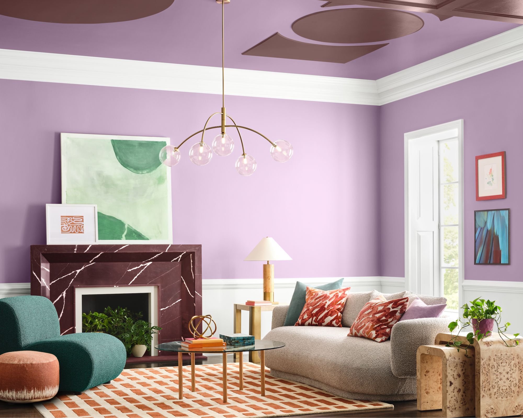
I asked Cegal what the specific characteristics of this shade are that make it so unpopular.
‘Lilacs are infrequently used because they do not have enough variety of undertones that can be used effectively in an interior. Given its gray/blue undertones, lilac simply does not go with the warm colors that are often found in a home, materials such as wood, leather, or concrete. I would avoid using purple or lilac in a kitchen or dining room, as it does not go well with food or the concept of eating and nourishment in general.’
‘So it did not come as a surprise to learn that Sherwin-Williams' Loneliest Color of 2025 was Radiant Lilac SW 0074.’ Cegal continues. ‘This specific shade is chalky, has gray undertones, and absorbs light rather than reflecting it. It feels dated, a misguided pastel relic.’
Where can Radiant Lilac work?
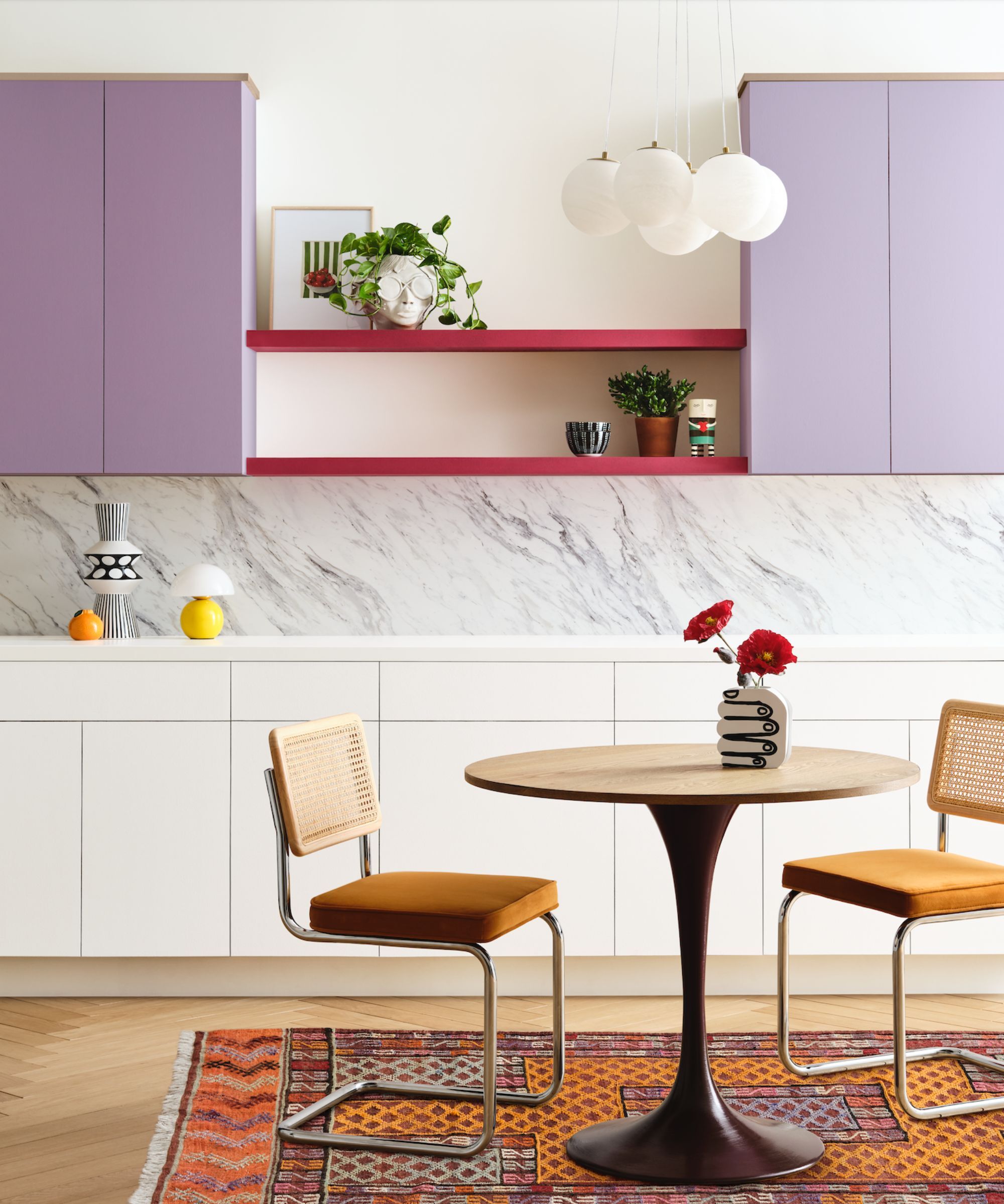
Just because something’s a risk, though, that doesn’t mean it’s not worth experimenting with and taking a chance on, not least as an antidote to ubiquity. There is undoubtedly a time and a place where this lively hue can work, and work well. I asked the interior designers where these areas of the home might be.
‘When choosing to work with lilac, do consider the orientation of the room,’ advises interior designer Nicky Dobree. ‘Lilac needs plenty of natural light. If the room is north facing, it can make the room feel cold.’
The advice is consistent across the board: use it in light-drenched spaces and in small, meaningful amounts. ‘Think: it is best used in rooms with plenty of natural light and the area of the home where you spend most time during the day,’ advises Mia. ‘Steer clear of using it in rooms with poor natural light or rooms that have dim lighting, such as cinema rooms.’
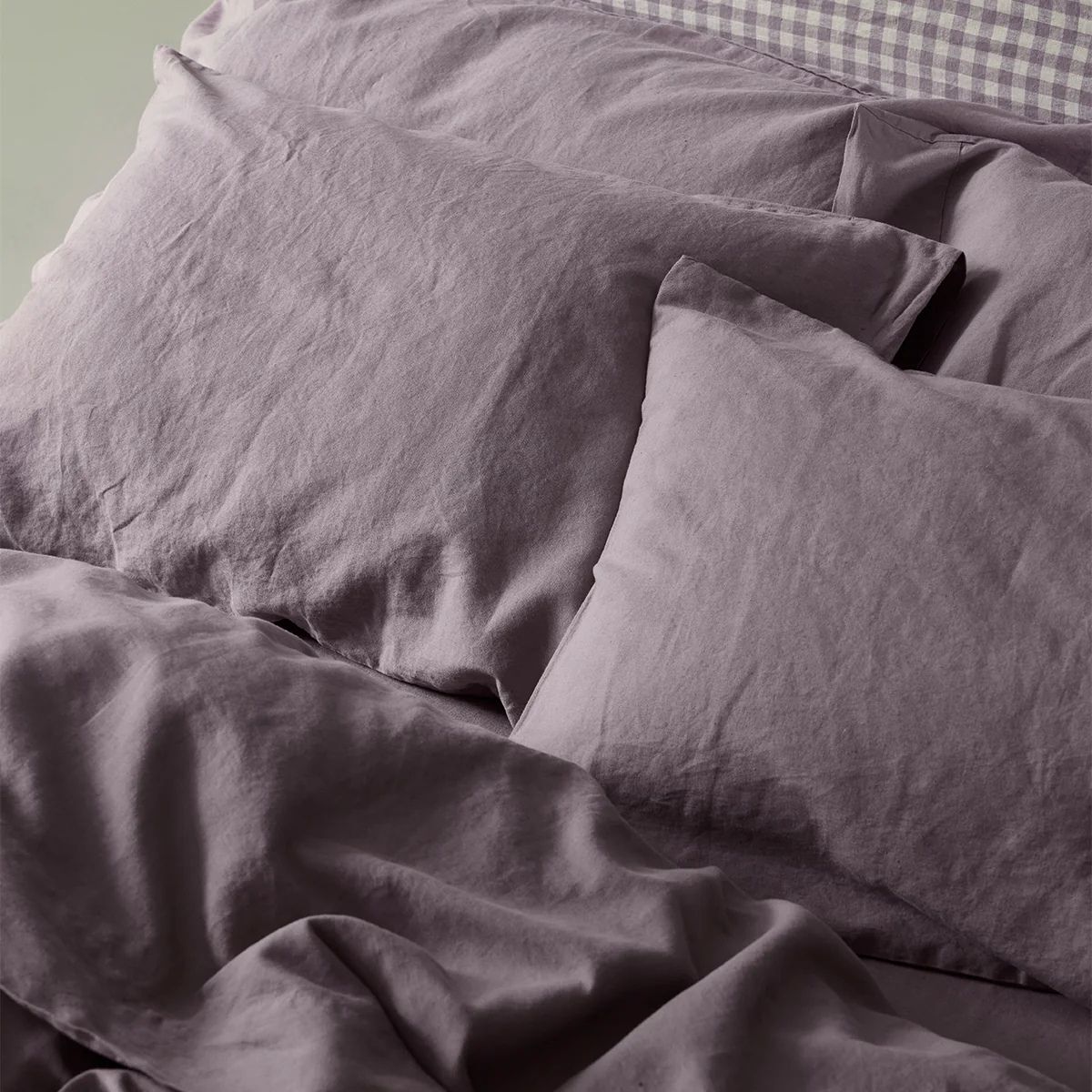
‘Lilac is not always an obvious color to use in interiors, yet when you do, it is calming and evokes a sense of innocence and joy,’ continues Nicky. ‘As well as lilac being a soothing and calming color, it can also bring hope and optimism. In Buddhism, the sacred lilac lotus is a symbol of beauty, rebirth, and enlightenment. Perhaps that is why it is more often used in a bedroom rather than the main living spaces. In one of our children's bedrooms, we used it on the joinery of the bunk beds and paired it with a lighter shade on the walls.’
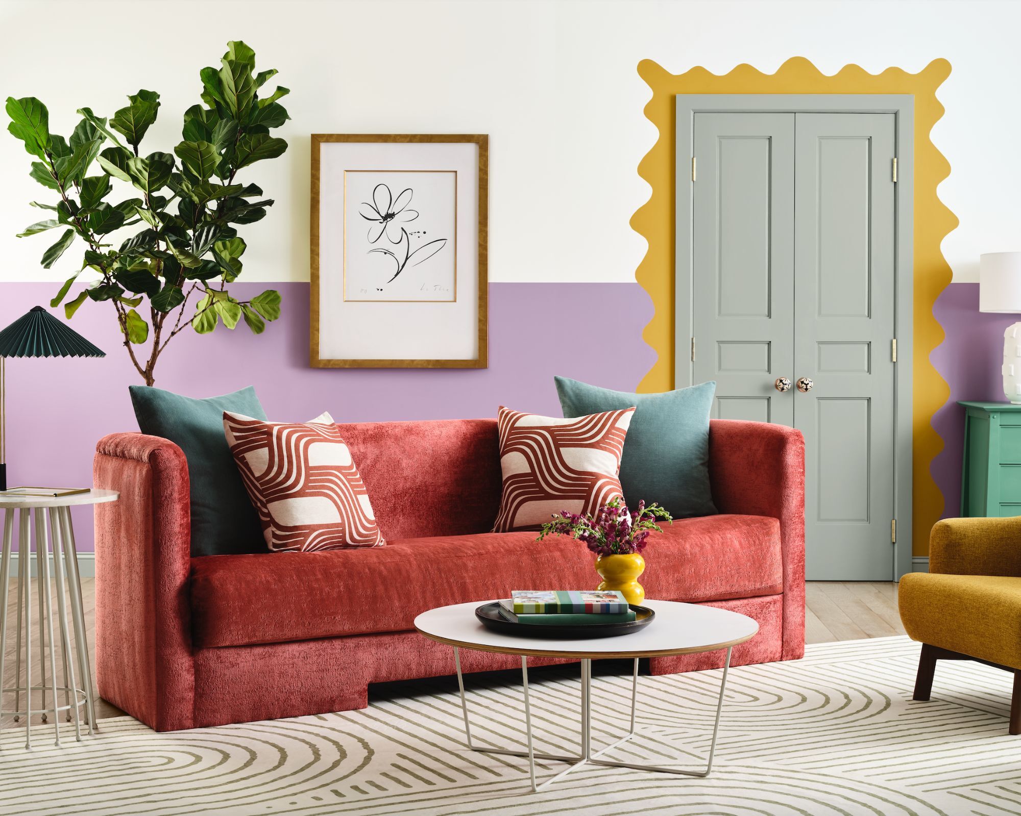
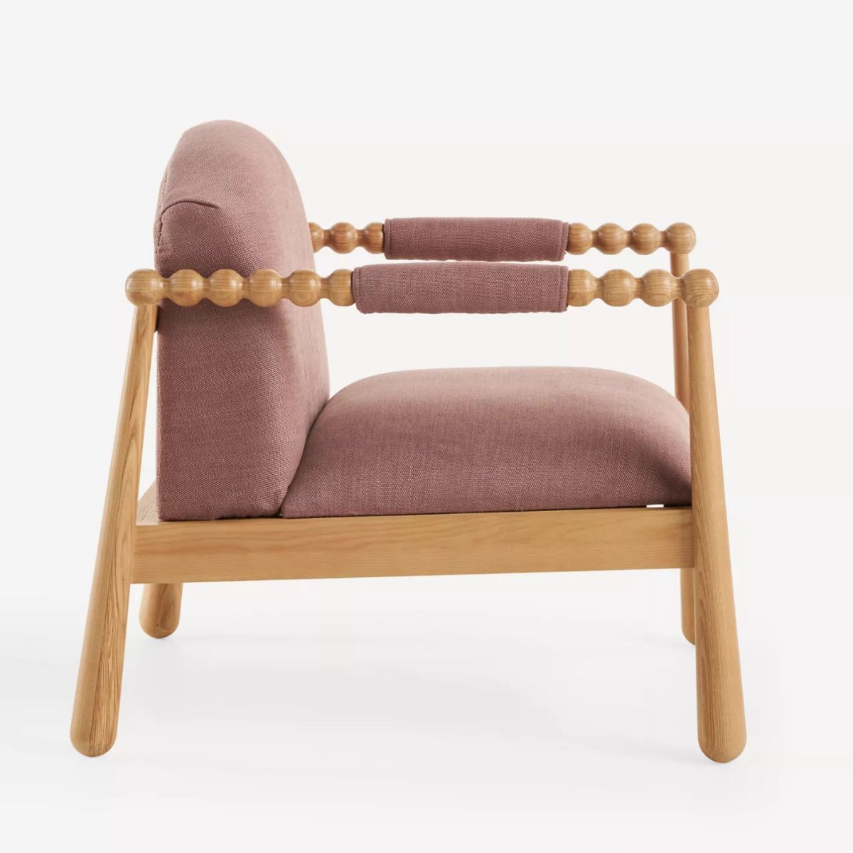
Interior designer Kathy Kuo of Kathy Kuo Home notes that a little of this color goes a long way. ‘It's a very rich, statement-making color, so I would try it first in smaller spaces like the entryway, a home office, a guest room, or the powder room. Pair this color with classic and traditional furnishings and with clean lines so that the eye doesn't become overwhelmed.’
It's worth noting that several interior designers mentioned that lilac can be a fantastic color to serve as a backdrop for decorating with antiques. Perhaps it’s purple’s regal connotations, but something about this color mixed with the richness of antiques is particularly easy on the eye.
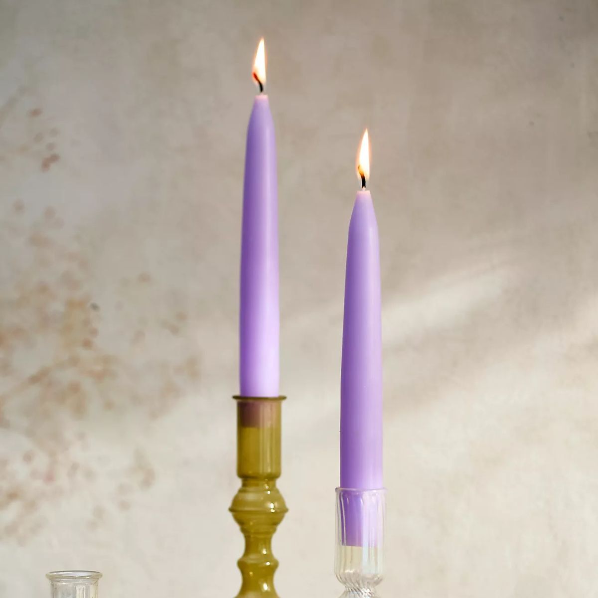
‘I love this color because of the challenge it presents,’ explains Jen Bienvenu. 'Convincing clients of how and when to use this color is a fun puzzle to put together. Purples and lilacs are really just the undertones of some of my favorite shades of brown, making Sherwin-Williams Radiant Lilac a great shade to pair with antiques and brown furniture. For a modern unexpected use of this color pair it with chartreuse tones in drapery, lampshades, or upholstery.’
As Nicky mentioned, using it in her child’s bedroom worked perfectly. It would seem Radiant Lilac, in all its sugared almond shade glory, is a fitting choice for a child’s space, and simply feels joyful.
‘Lilac in a child’s bedroom just works,’ agrees Cegal. ‘Not in a trendy-for-five-minutes way. When you use it on the walls, it encourages a restful atmosphere and a good night's sleep. It’s a little sophisticated, a little dreamy, and honestly feels like a hug in color form. Lilac turns the room into something straight out of a fairy tale or a perfect little doll’s house. Radiant Lilac might just be what any little girl dreams of when she imagines her own special world.’
What colors to pair with Radiant Lilac?
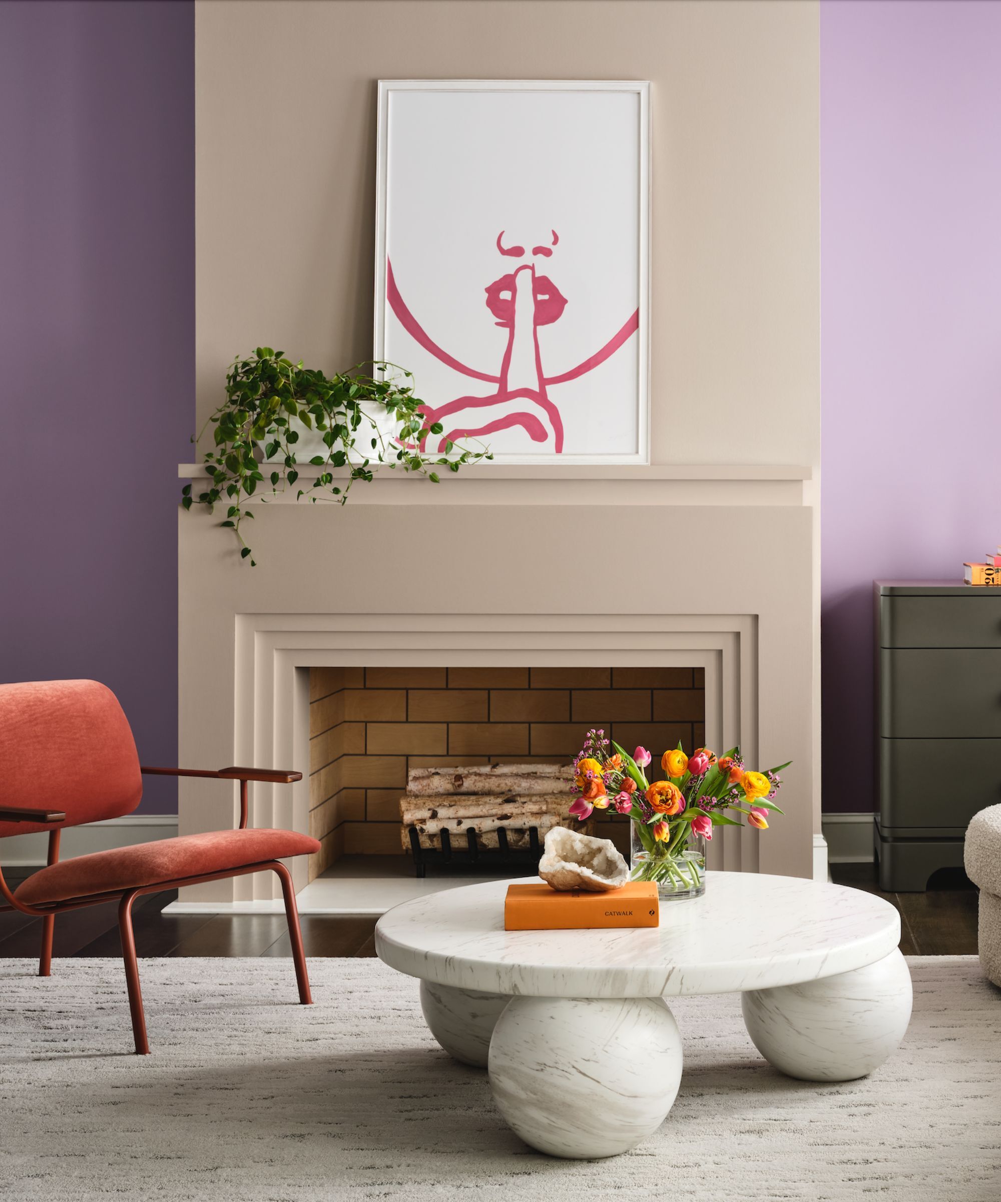
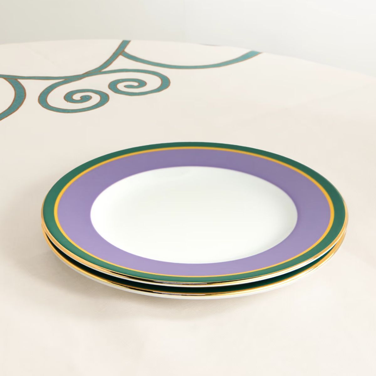
‘I would recommend using greens (olives in particular), deep mustards, and terracotta paints like Farrow & Ball Red Earth with Radiant Lilac as they are striking contrasts,’ advises interior designer Caroline Borgman. ‘Maybe don’t go and paint a whole wall in Radiant Lilac, but if you love the color, then don’t be afraid to, and then break it up with lots of artwork.
Pairing it with green seems sensible, as it's a combination found repeatedly in nature. Though, depending on your desired aesthetic, a deep olive green paint would help calm the scheme, and a citric green, like lime or apple, will feel full of energy, with a retro sci-fi feel. Paired with slick metal elements in a thoroughly modern environment would feel extremely à la mode.
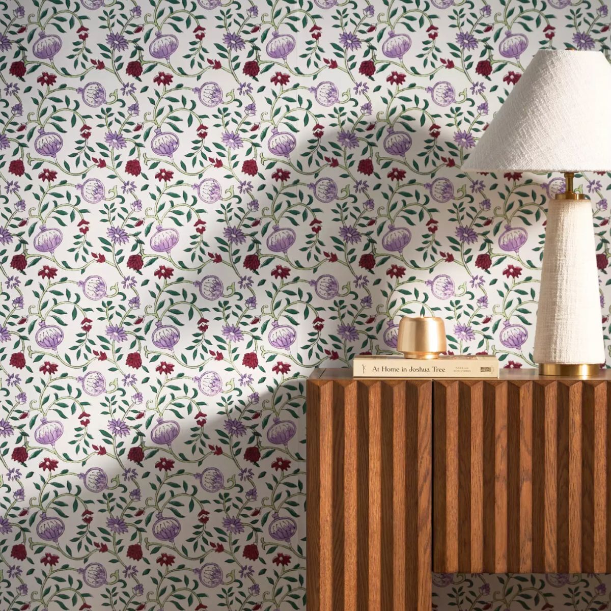
Mia Karlsson would also pick green as a supporting color for Radiant Lilac. ‘I would recommend using a contrasting spring green to emulate the beautiful lilac flower. In Swedish textile and wallpaper patterns, soft lilac is often used. It makes me nostalgic and think of spring and how we used to bring the lilac flower into the house for its color and scent at home in Sweden.’
Love purple? Shop the look
Despite its low sales, Radiant Lilac is described as a bold hue, with the brand encouraging homeowners to consider it for their spaces. Now christened as Sherwin-Williams' loneliest color, it may be that brave color enthusiasts dare to give it a go, even if it isn't set to be topping our color trends list anytime soon.

Sophia Pouget de St Victor is the UK Content Editor at Homes & Gardens, bringing readers the latest trends, expert insights, and timeless design inspiration tailored to a UK audience. With a background in luxury interiors and a qualification in Garden Design from London, she has a passion for creating spaces with character and emotional depth. Sophia gravitates toward interiors that defy definition, valuing individuality and effortless elegance. She lives in West London with her partner, two mischievous terriers, and a plump cat named Lettuce.
