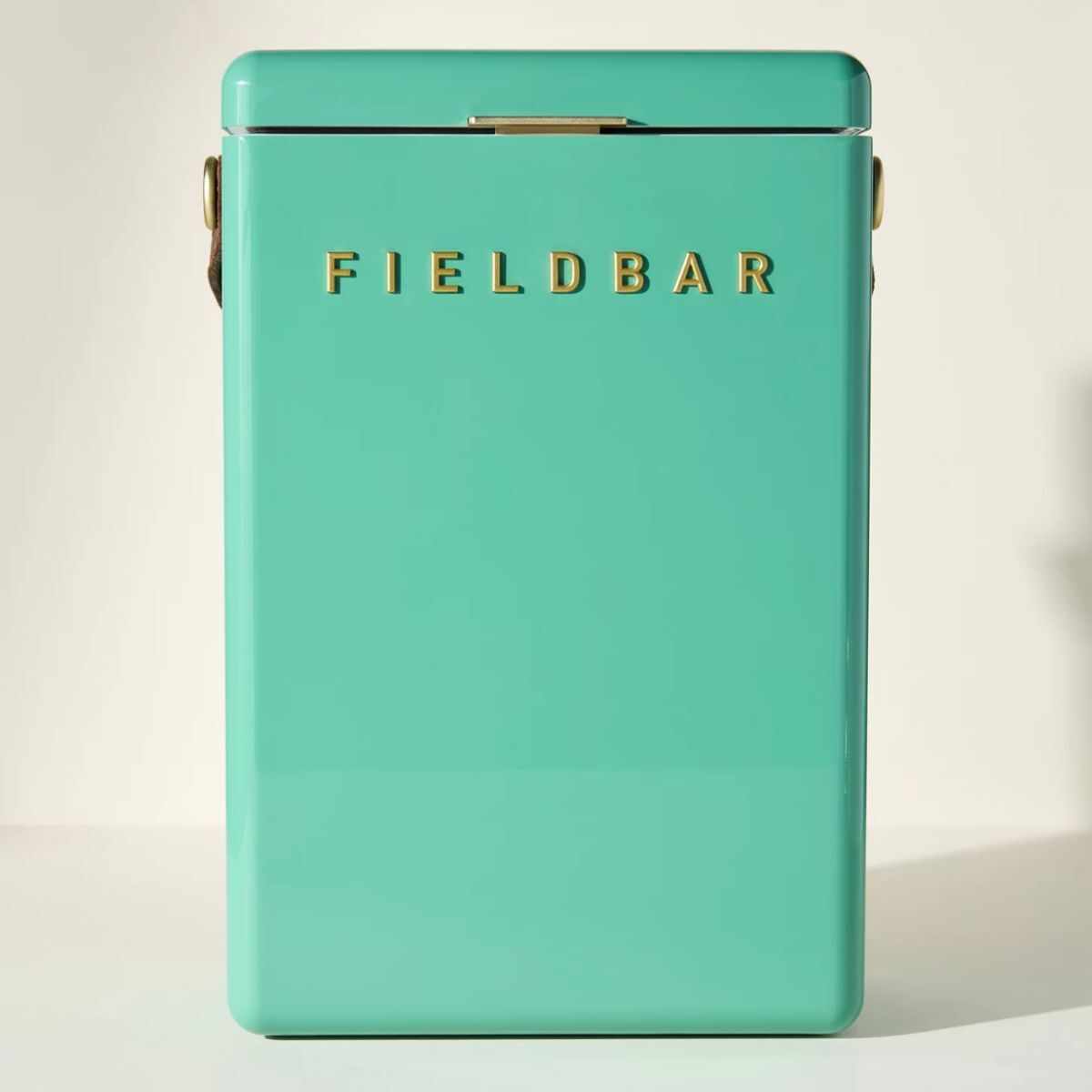
Scientists say they have discovered a 'new' color – but what do interior designers think of this saturated shade?
Scientists claim to have discovered a never-before-seen color called 'olo', which, according to one professor, is 'more saturated than any color that you can see in the real world'

Design expertise in your inbox – from inspiring decorating ideas and beautiful celebrity homes to practical gardening advice and shopping round-ups.
You are now subscribed
Your newsletter sign-up was successful
Want to add more newsletters?
Scientists at the University of California, Berkeley have discovered a brand new color. Extraordinary and seemingly impossible, during an experiment in which researchers had laser pulses fired into their eyes, the participants claimed to have witnessed a unique vivid blue- green color, never before seen by human beings. This brand new color has been named ‘olo’.
According to one professor, olo is 'more saturated than any color that you can see in the real world'. This discovery seems to have divided opinions somewhat, not least because olo is supposedly impossible to see with the naked eye.
Some hail this discovery as a scientific breakthrough, and potentially the gateway to revealing a whole kaleidoscope of color we have, up till now, been unaware of. Others, however, see this new color as something of a gimmick, or at best, not a particularly groundbreaking hue. But the more interesting question, from a homes and interiors perspective, is: will olo be dominating the incumbent color trends, and can we expect to see it shape interior trends in the coming months?
Article continues belowWe shine a light on this new, unusual color, or the closest we can get based on the researchers' descriptions, and ask some interior designers if this newly discovered color has got their pulses racing.
What color is olo and what do designers think of the discovery?

Scientists say olo can be best matched to this blue-green square of color
‘It's always exciting when something challenges the way we think about color and how we see it. Color is so personal and wonderfully subjective’ says interior designer Sean Symington, who often uses bright hues in his interior projects.
‘We all perceive and experience it differently, which is part of what makes working with it so endlessly fascinating. Whether Olo is truly a ‘new’ color or simply a clever manipulation of how the eye processes tone is hard to say. But if nothing else, it’s a brilliant conversation starter on how we perceive colors, and who knows? It might just be the next big thing, or even a breakthrough in science that could lead to something truly helpful and meaningful.’
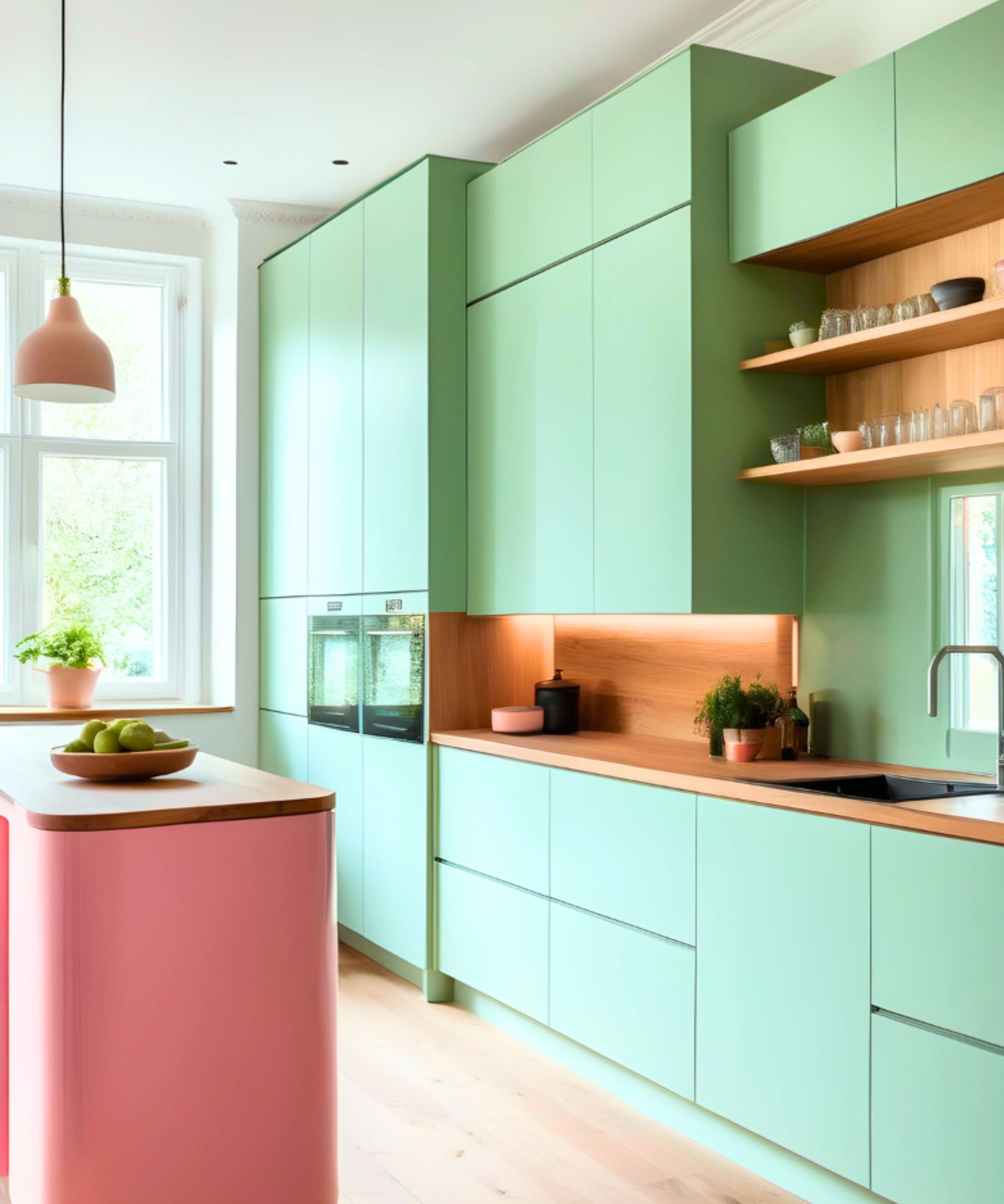
Kitchen cabinets painted in Electric Mint Green by YesColours
Considering we cannot see this newly discovered color without undergoing a retina-stimulating laser procedure, which bypasses the natural limitations of the retina, the long and short answer appears to be, no, olo, in its truest form, will not be the it-girl color this summer. But that's not to say that a close match for olo, this type of Cerulean greenish-blue, won’t be at the forefront of trends in the coming months, as a result of this news.
Design expertise in your inbox – from inspiring decorating ideas and beautiful celebrity homes to practical gardening advice and shopping round-ups.
If we look at the color wheel and try to pinpoint the most similar hue to olo, we land on a vivid, highly saturated, green-heavy turquoise color. Of course, if we are to believe the science, then it is impossible to pinpoint an exact color match, but a bright, almost neon-green imbued azure blue is the closest we can get. And this color, most definitely, exists in interiors across the world.
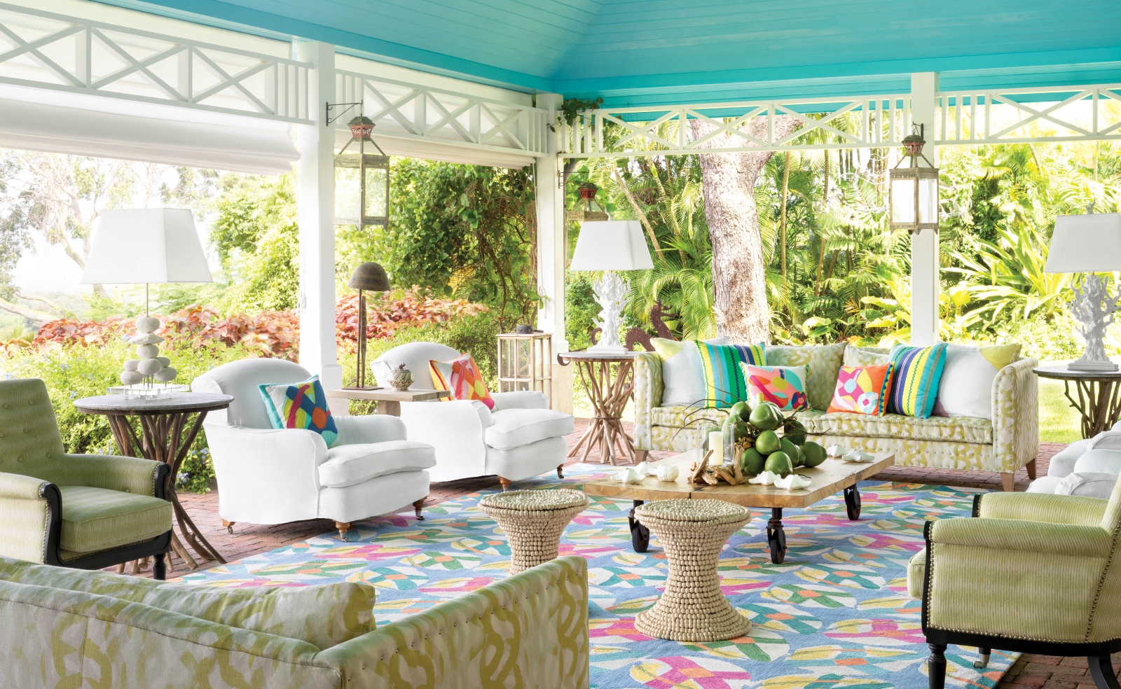
Olo, and its more recognisable cousin, turquoise, evoke images of tropical waters, fresh forests, and equatorial natural landscapes. As such, in modern interiors, turquoise has always been a wonderfully calming color, but thanks to the strong tones of verdant, zingy lime green, it can also feel energizing, almost refreshing, and it's this emotional response that makes many people dub turquoise as an optimistic, buoyant color.
Although olo may be new to the color scene, turquoise most certainly is not. It has had a long history of cultural significance and artistic use. Its use in historical artworks and artifacts, particularly prevalent in Middle Eastern and Eastern cultures. Indian textiles, Persian pottery and tiles, all the way back to the ancient Egyptians who used turquoise in various decorative and symbolic ways within homes and in burial chambers, as they believed it symbolized protection. As such, it's probably more than fair to say turquoise, in all of its variety and across a range of hues, is no new kid on the block.
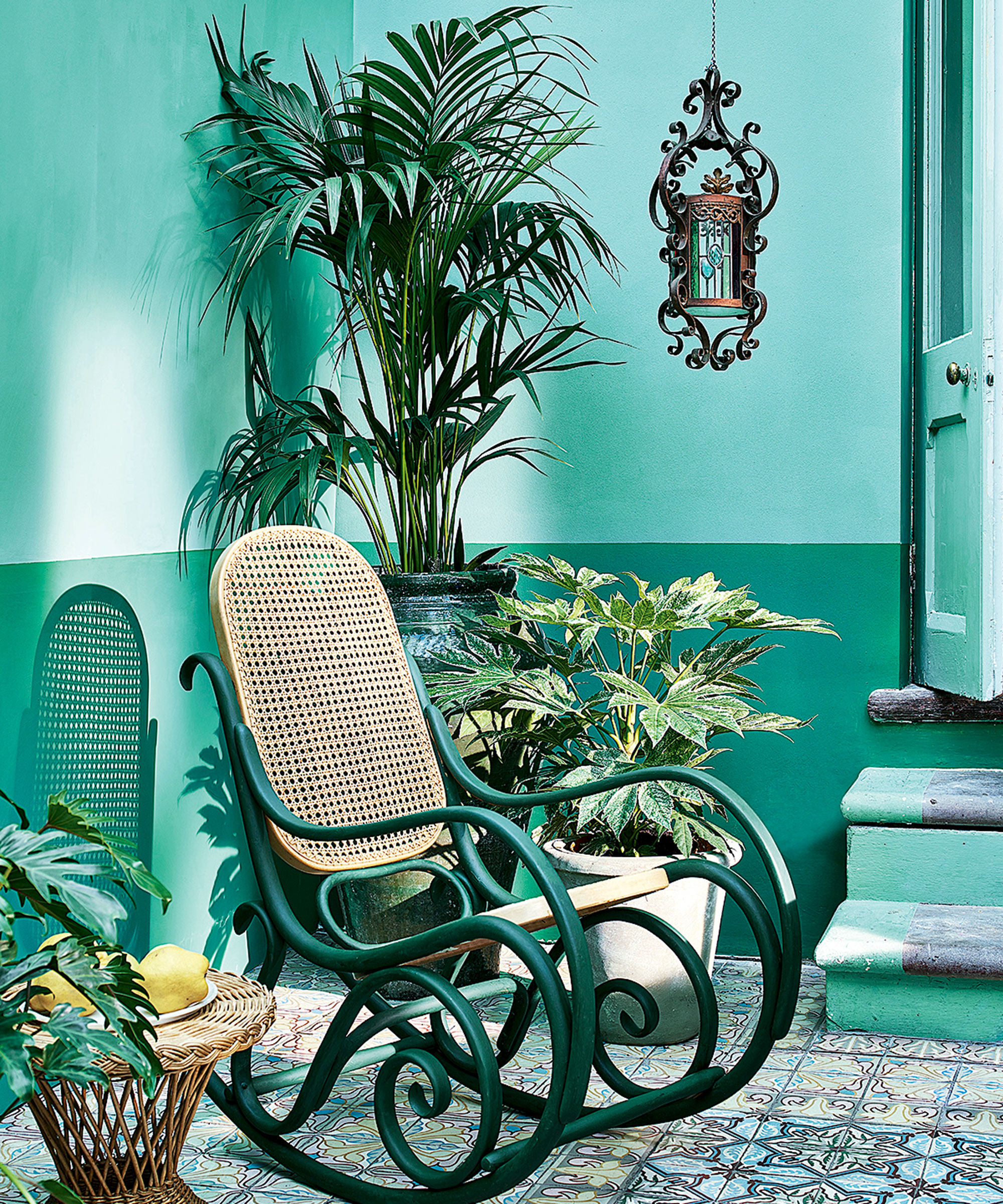
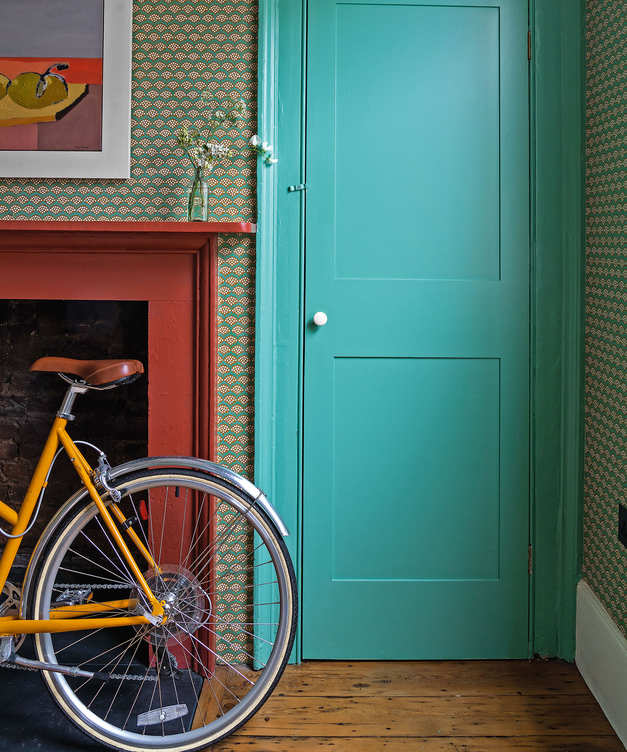
Walls painted in Provence by Annie Sloan
I have always adored turquoise, but have found over the last few years, its popularity and ubiquity have dwindled considerably. In the early 2000s, turquoise was much more commonly used in our homes than today, and due to its tropical connotations, it became seen as a slightly bohemian, free-spirited color.
In recent years, room color ideas have shifted significantly away from saturated or sugary colors like fuschia, turquoise and citrus tones, as these high octane colors been increasingly seen as overly energetic, even juvenile, and the trends have moved towards using a palette of grounding, earthy, organic hues, such as sage greens, earthy browns, clays, terracottas, beige and taupes.
Now, it's far less common to see walls or woodwork covered in colors that resemble olo, but that's not to say none of us still love using bold paint colors in our homes.
‘It reminds me of a more intense and vibrant version of Arsenic by Farrow & Ball,’ notes Interior designer Alex Keith, interior designer and co-owner of Otta Design. ‘Olo would work well as an accent color in a contemporary interior,’ she explains.
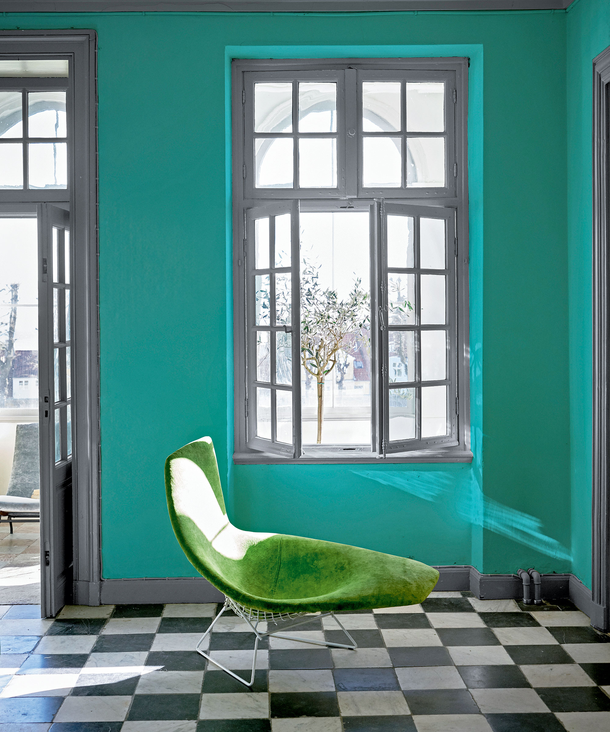
‘Olo is truly mesmerising, like all color and tone, it's open to human perception, one person may see one thing, another something totally different,’ says Jason Lamb, Head of UK Sales for House of Hackney, an interiors and homeware brand renowned for their adventurous color palette and maximalist homewares.
‘We navigate life thinking we all see color the same, when it could differ from one person to the next. We are always intrigued and fascinated by this science and how this has been discovered. What a fabulous striking color, when reviewing our library of color charts, Olo certainly does seem to have additional pizzazz, depth and vibrancy against its blue and green friends.’
I asked Jason where this striking hue could be used within the home ‘We can see this working beautifully as an accent color, maybe used on a bathtub, an antique larder or ceiling rose.’ he explains’ ‘Olo would sit perfectly when balanced with deeper green tones inspired by nature, the color is vibrant and adds a pop of fun and joy to any interior.’
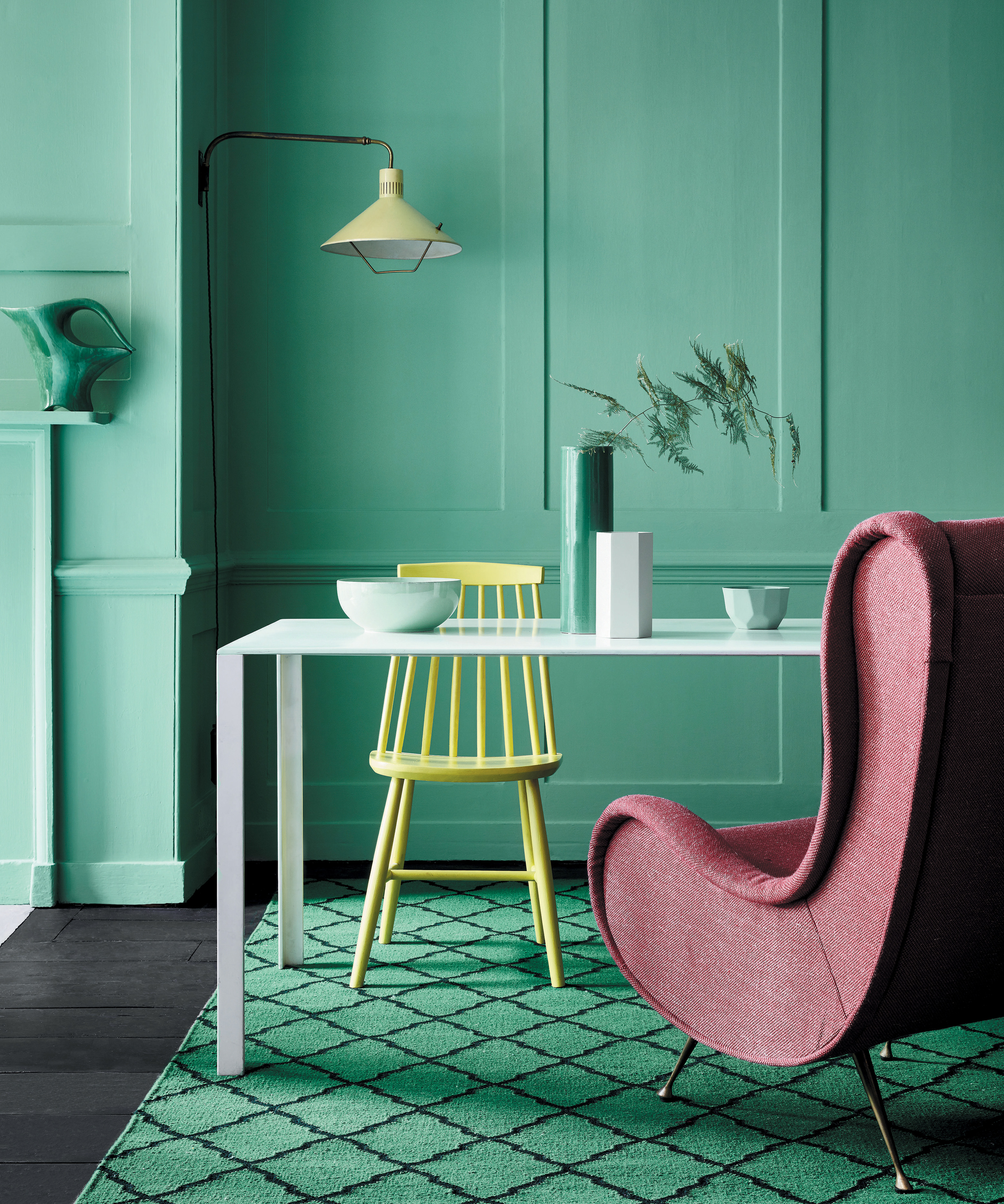
Walls in Greene Verditer, Little Greene.
There are other paints on the market that a resemblance to olo. Anise by House of Hackney is a great example, but it's undoubtedly a more subdued version of olo, which is, according to the researchers in the experiment, very intense when seen in real life.
Jack-in-a-box by Little Greene is perhaps a closer comparison, although olo has a distinctly green undertone, which makes Green Verditer by Little Greene an even closer match, especially when drenched in natural light, making it extremely fresh and zingy.
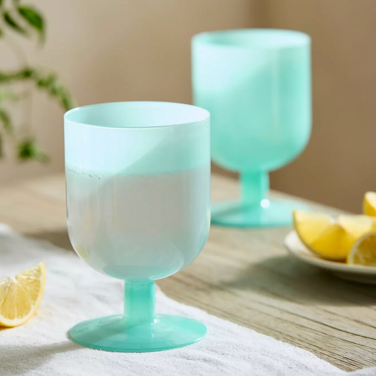
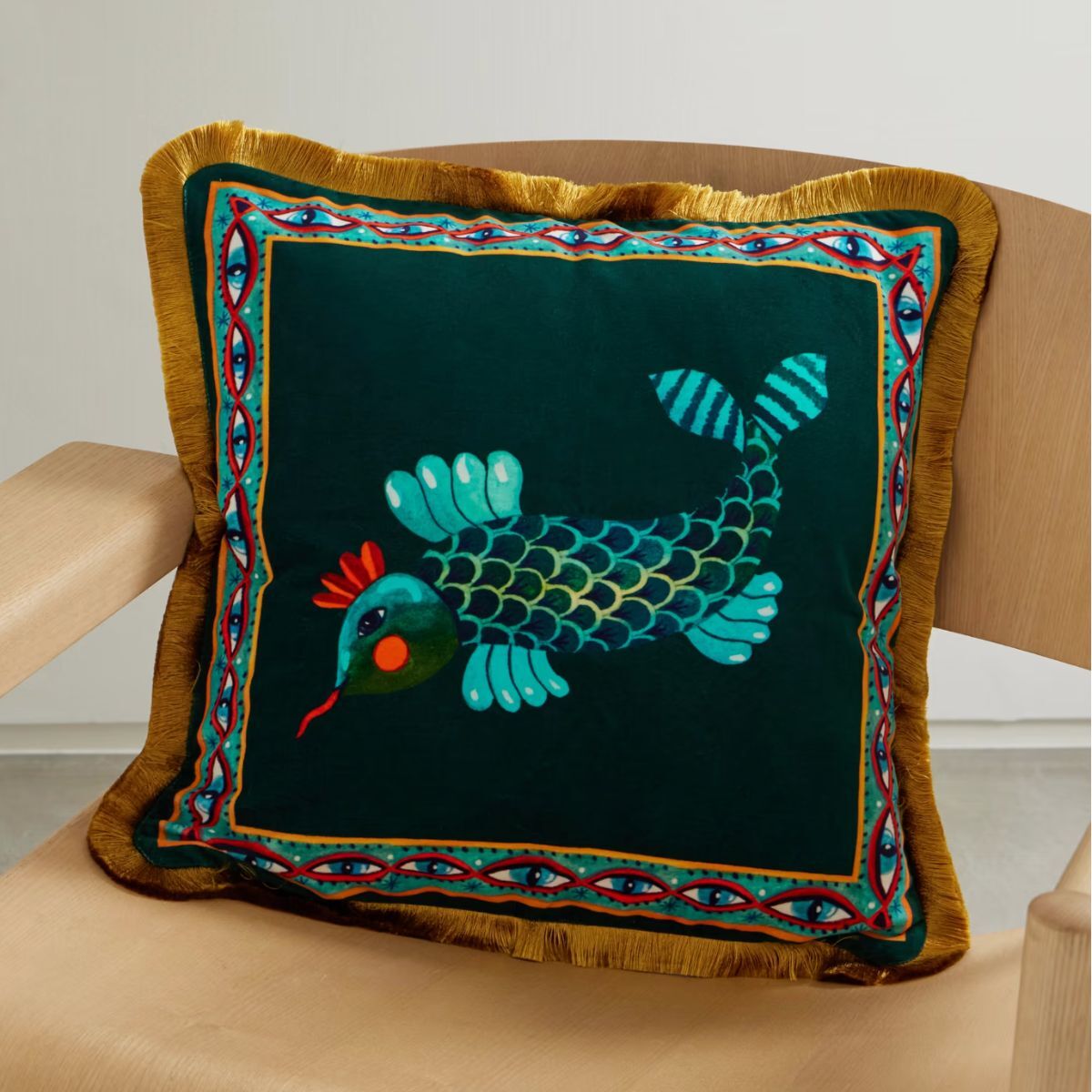
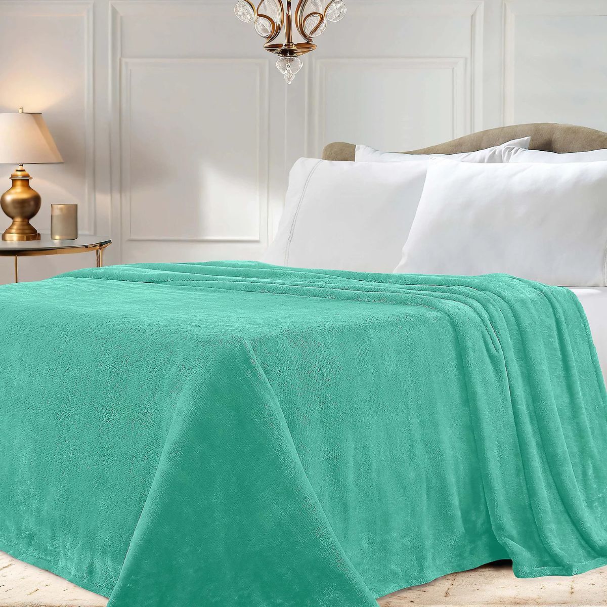
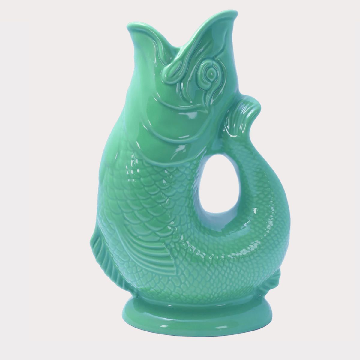
If you love olo, there is still a long way to go before it will be a color we see within our homes. But here are our top picks in a similar color if you love this sprightly hue.
This experiment only had five participants, so it's very difficult to determine the particular nuances of this hot-off-the-press shade. If you are fond of decorating with blue or decorating with green, then this color might just spark something in your imagination. Imagination, though, for now, is where olo will have to remain, as this color is not available to us other than by a series of elaborate descriptions.
For those of us who have our fingers on the pulse with trend forecasting, it's not impossible that olo, or at least shades similar to olo, is about to have a major revival, and step into its zenith.

Sophia Pouget de St Victor is the UK Content Editor at Homes & Gardens, bringing readers the latest trends, expert insights, and timeless design inspiration tailored to a UK audience. With a background in luxury interiors and a qualification in Garden Design from London, she has a passion for creating spaces with character and emotional depth. Sophia gravitates toward interiors that defy definition, valuing individuality and effortless elegance. She lives in West London with her partner, two mischievous terriers, and a plump cat named Lettuce.
