Turquoise color – why this timeless blue-green color is making its way into our homes
This month, we're admiring a gorgeous turquoise that combines blue and green – the most stylish tones of the season

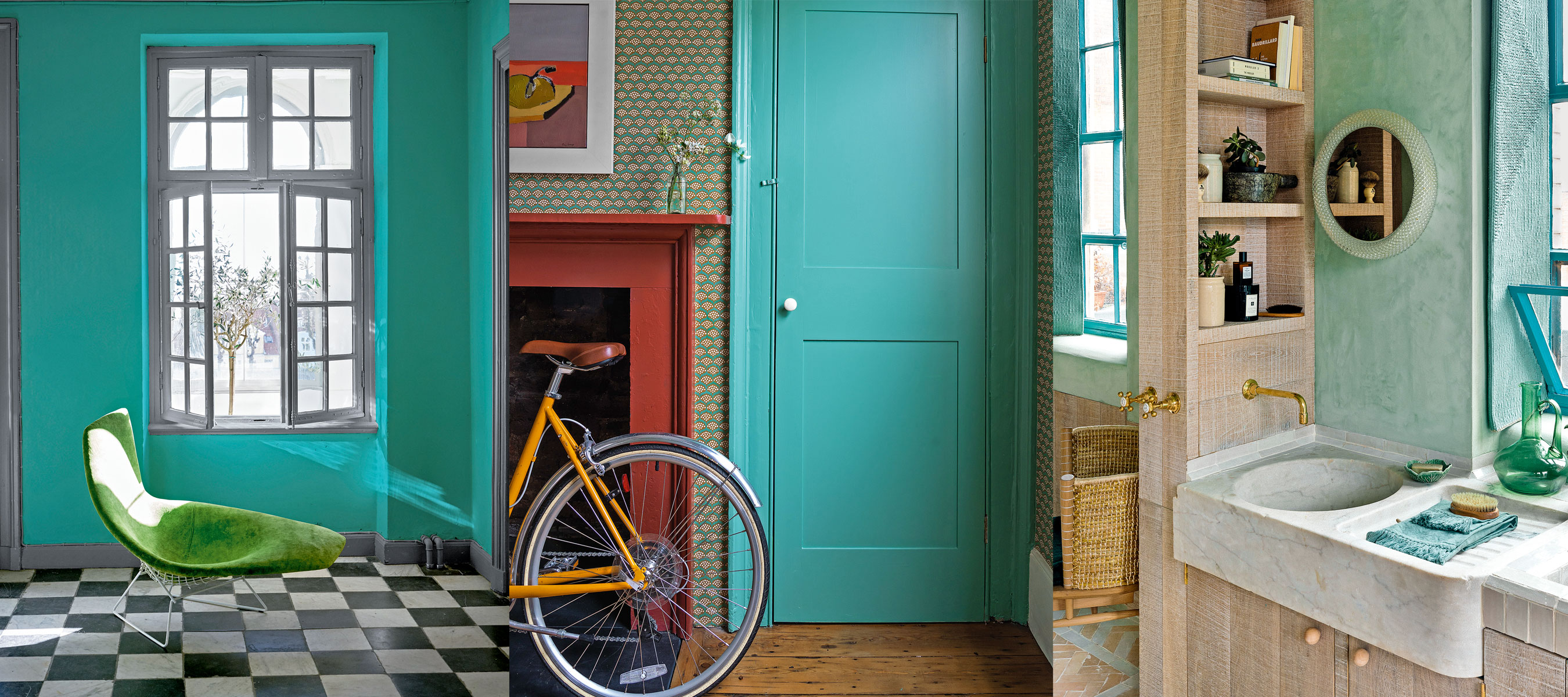
Want to know what color you should be decorating your home with for 2022? This surprising turquoise color choice will have us all re-painting our homes this month.
Understanding color lies at the root of all interior design decisions. If in doubt, consulting the color wheel – and basic color theory – will ensure your decorating scheme flows effectively from room to room.
Turquoise color – how to use this blue-green hue in your home
This popular turquoise color trend is easy on the eye – and a very good choice for those who prefer a louder hue, rather than subtle, quieter shades.
Here decorating experts have taken interior design trends and paint trends into consideration to help you achieve the perfect blue-green color scheme in every room.
What makes turquoise our Color of the Month?
A beguiling hue that reminds us of warmer climes, turquoise has the ability to be invigorating and calming. Insiders reveal how to use the time timeless blue-green to best effect
How should we bring turquoise into our homes?
Some of our favorite insiders reveal how to use it to best effect.
1. Create an eye-catching accent
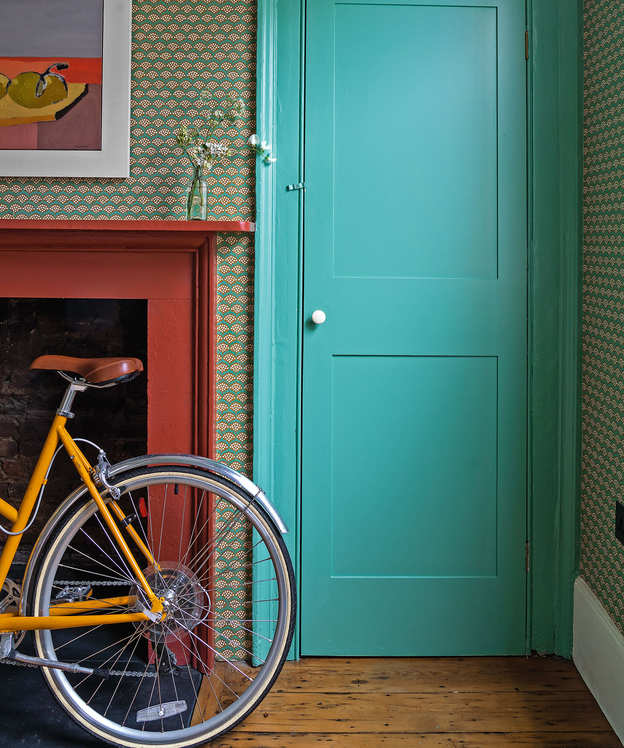
‘If nervous about using a bold hue, painting woodwork adds a color shot without overwhelming,’ advises designer Kate Guinness, who used turquoise accents in this chic boot room.
Design expertise in your inbox – from inspiring decorating ideas and beautiful celebrity homes to practical gardening advice and shopping round-ups.
Sarah Fortescue, founder, Sarah Fortescue Design agrees: ‘I am a big advocate for color, and a rich blue-green on the walls paired with strong red tones creates the perfect harmony in my view. It’s particularly suitable in a north-facing room where strength of color can replace the lack of natural light and sunshine.’
2. Escape with a serene scene
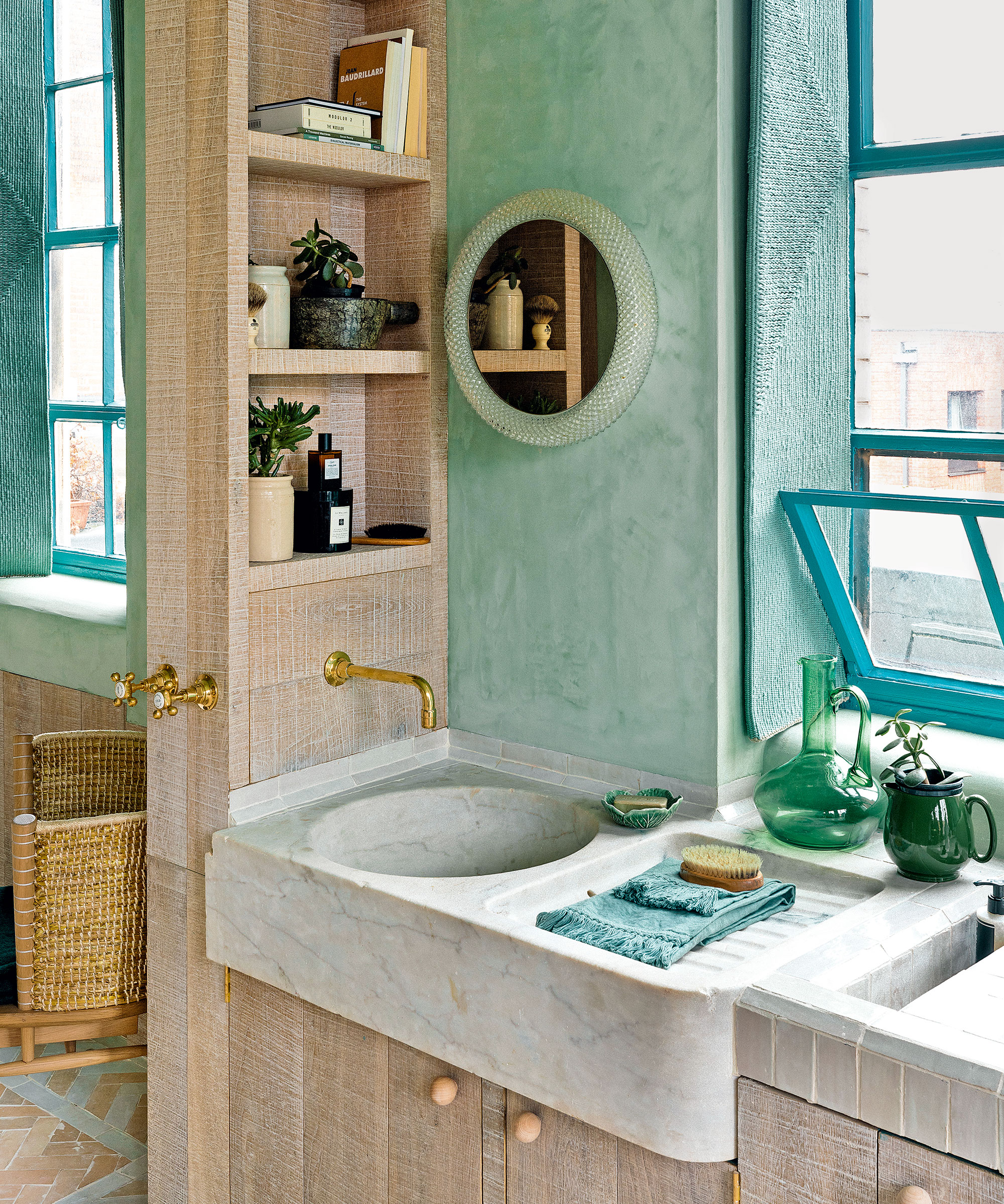
‘Decorating with green and blues working together evoke the feeling of calm because they tend to symbolize the natural world,' says Kate Guinness, founder Kate Guinness Design.
'We don’t always believe they need to be tonal when scheming for interiors, so don’t be afraid to add a dissonant tone to create an unexpected look,' she adds.
In this Shoreditch loft by architects Chan + Eayrs, turquoise woven shutters and sea-blue window frames were teamed with pistachio-green walls for an ethereal look in the city.
3. Take inspiration from warmer climes
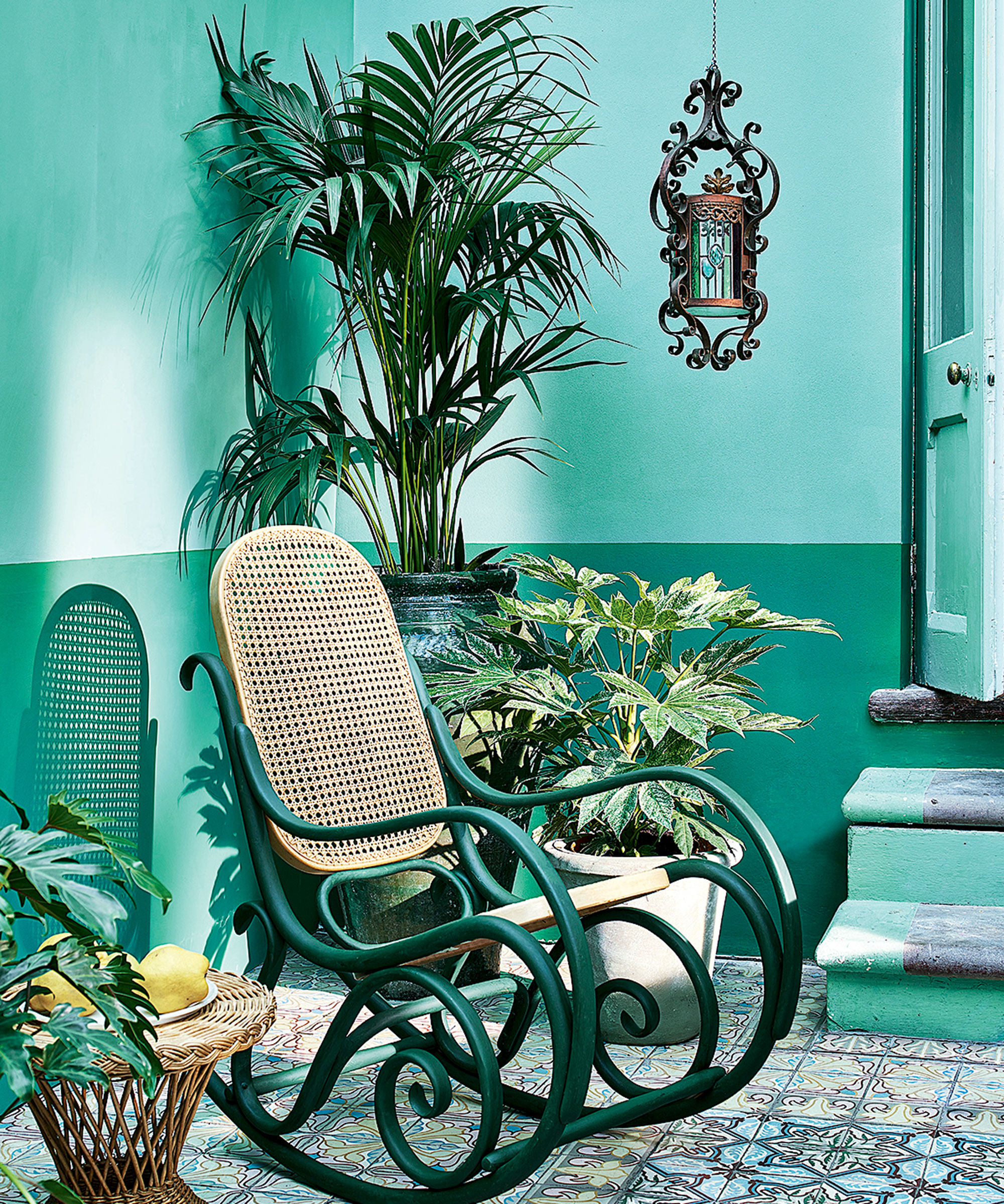
‘Reminiscent of endless tropical skies and oceans, this color is full of vitality even on a grey day,' explains Tricia Guild, founder and creative director, Designers Guild. 'Some consider decorating with blue to be cold (and it can be sometimes), but this powerful, punchy shade is anything but; rather it is enlivening in its strength,' she adds. 'Use it with a white for crisp simplicity, make it dramatic with darker hues or take it to the Caribbean with pastel tones. It responds beautifully to sunlit rooms, but looks equally stunning with low lighting and candlelight.’
The colors in this conservatory were inspired by paint specialist Annie Sloan’s travels around Cuba. She believes a similar scheme would work well to brighten up a small apartment.
4. Use turquoise to transform a bland room
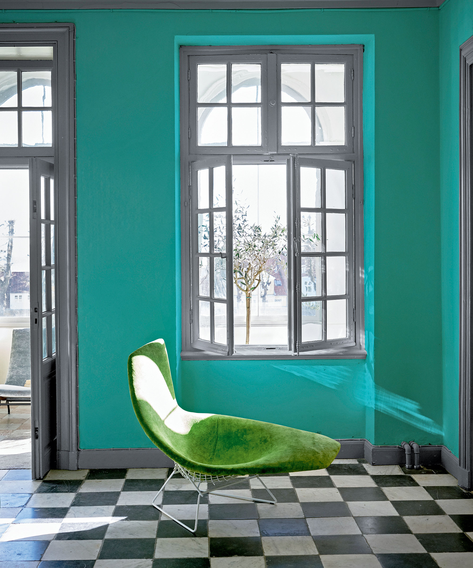
‘Using a truly bright, saturated turquoise can transform a room, making it feel very directional, joyful and modern,' says Dominic Myland, CEO, Mylands.
'Don’t be afraid to use it on the walls, as once you’ve hung artwork its impact will be softened. But if you are not feeling confident enough to paint an entire wall, try introducing it through accents such as painting a door or window frame. Like turquoise stone, it also looks great with natural materials such as wood, rattan, copper and leather.’
5. Mix turquoise and orange for a modern mid-century look
‘This is a guaranteed crowd-pleasing color with lots of positive associations. It embodies both the recessive quality of a blue and the calming quality of a green, making it very easy to work with,' says Annie Sloan, color and paint expert.
'I’d be inclined to dress it with heavily textured accents to give a cozier finish, but a 1960s color combination for rooms of turquoise and orange also works fabulously with mid-century modern silhouettes, glass decor and metallic fittings.’

Arabella is a freelance journalist writing for national newspapers, magazines and websites including Homes & Gardens, Country Life, The Telegraph and The Times. For many years she has specialized in writing about property and interiors, but she began her career in the early 2000s working on the newly launched Country Life website, covering anything from competitions to find the nation’s prettiest vicarage to the plight of rural post offices.
