This country house has a classic modern interior that will stand the test of time
Interior design studio Kitesgrove has created a rural retreat with carefully considered schemes that merge traditional and contemporary

Set within beautiful landscaped gardens, this 1930s country house in the south east of England, the location of many of the world's best homes, was transformed by interior design studio Kitesgrove from a well loved but dated property into a resplendent family home.
Undertaking a complete renovation that took just over two years including Covid delays, Kitesgrove oversaw a two-wing extension as well as a full refurbishment. The result is a rural retreat that cleverly merges traditional features with contemporary design.
'The clients wanted to ensure the house very much remained a family home for extended family and all generations to enjoy,' says Katie Lion, interior designer at Kitesgrove. 'It needed to feel elegant, welcoming, comfortable and keep nostalgic aspects and key heirloom furniture and artwork.'
Kitchen
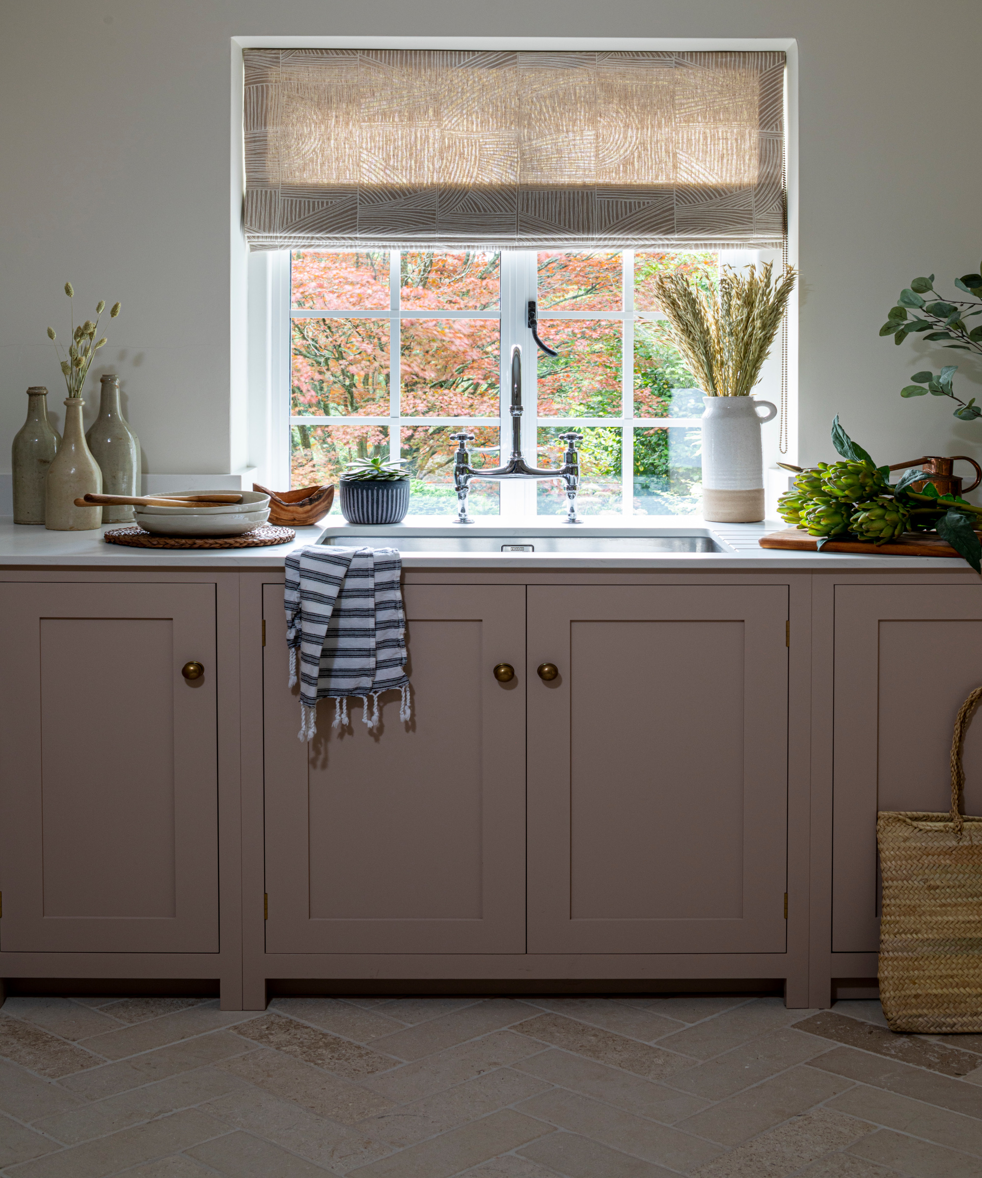
Kitchen ideas included painting the cabinets a pretty chalky pink, Desert Rose by Paint & Paper Library. 'We wanted to create a soft palette that transitioned from other areas of the home,' says Katie. 'The paint was intentionally selected for its gray tone quality, which effectively evolves in the changing light.'
Portland Stone flooring was installed for a more rustic country feel. 'The subtle tumbled and flecked quality of the stone in a herringbone layout provides subtle interest and pattern with the muted palette.'
As the family enjoys cooking and entertaining, a butcher's block island was made with wheels so it could be moved around for extra functionality and versatility within the room.
Breakfast room
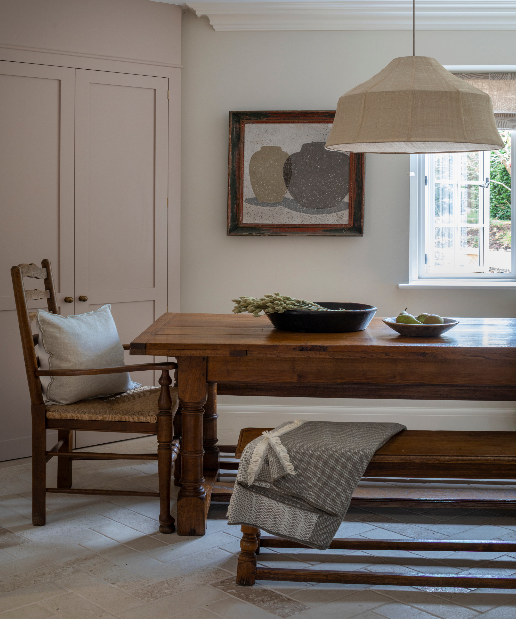
Juxtaposed with the soft pendant lighting and fabric blinds, the original antique dining table and chairs add solidity and a sense of history to the heart of the home.
Design expertise in your inbox – from inspiring decorating ideas and beautiful celebrity homes to practical gardening advice and shopping round-ups.
'We wanted to create a softness in the space for an informal family dining/breakfast room. The linen shade allows for a gentle light glow and sits effortlessly with the almond and pink tones of the room,' says Katie.
Family room
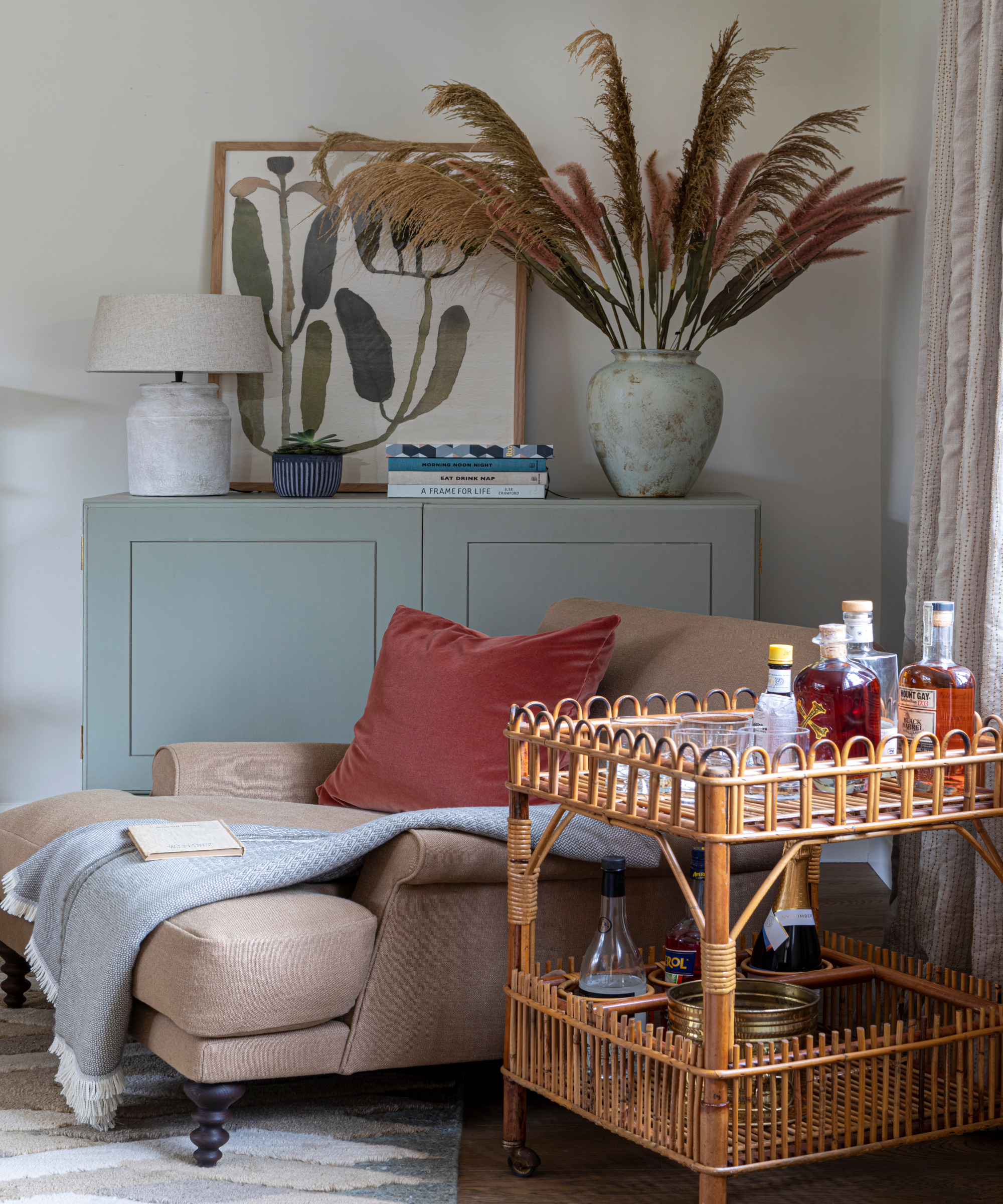
The family room overlooks the garden with wide double doors that make a transition between inside and outside. Living room ideas involved using natural colors and organic forms to enhance the feeling of being immersed in the outdoors.
The rug was chosen as the starting point of the scheme. It has blues and green that connect well with the garden. 'It is the focal pattern and texture in the room and feels very plush underfoot,' says Katie. The eau de nil cabinets draw upon the colors in the rug.
'The aim was to create a calming and more informal family space for all the family generations to enjoy. We therefore allowed for plenty of storage for games and toys, and deep comfortable seating for relaxing.'
The drinks trolley was sourced to add a vintage piece in a more playful room. 'We wanted the home to feel layered with new and older pieces to give a sense of pieces being collected over time.'
Dining room

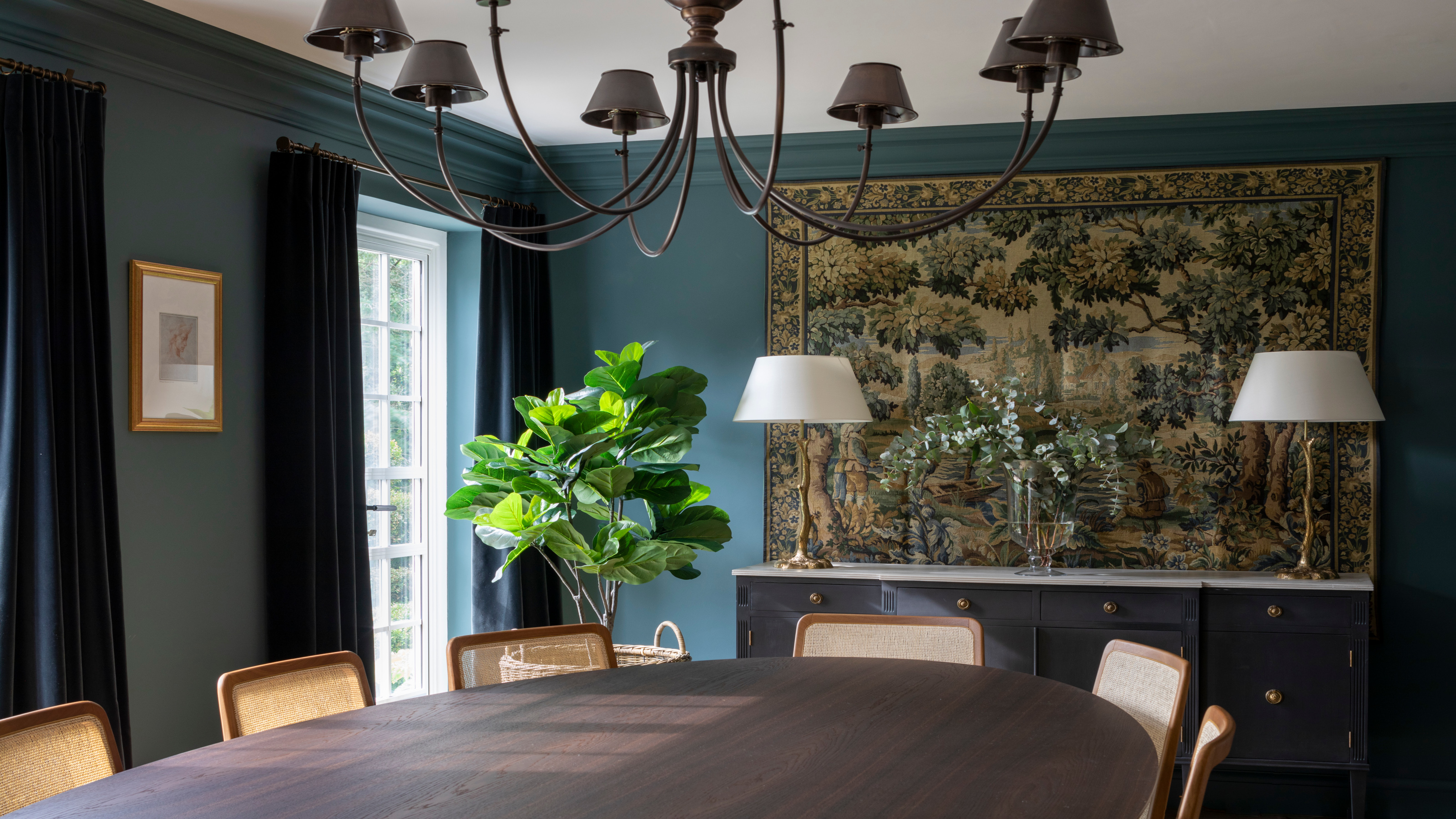
As the central room in the house, the aim was for this space to be rich and deep in tone to suit a formal dining room and make it distinctive against the more muted schemes elsewhere.
The beautiful antique tapestry that became the focal point of the space was sourced in Paris. 'I had always envisaged putting a tapestry in this space so wanted to draw on the inky and green tones within this,' says Katie.
Dining room ideas included enveloping the walls and woodwork in a deep blue, to create an immersive and atmospheric space.
The table and chairs incorporate natural materials, as seen with the mix of wood, cane and leather, while ensuring practicality.
Study
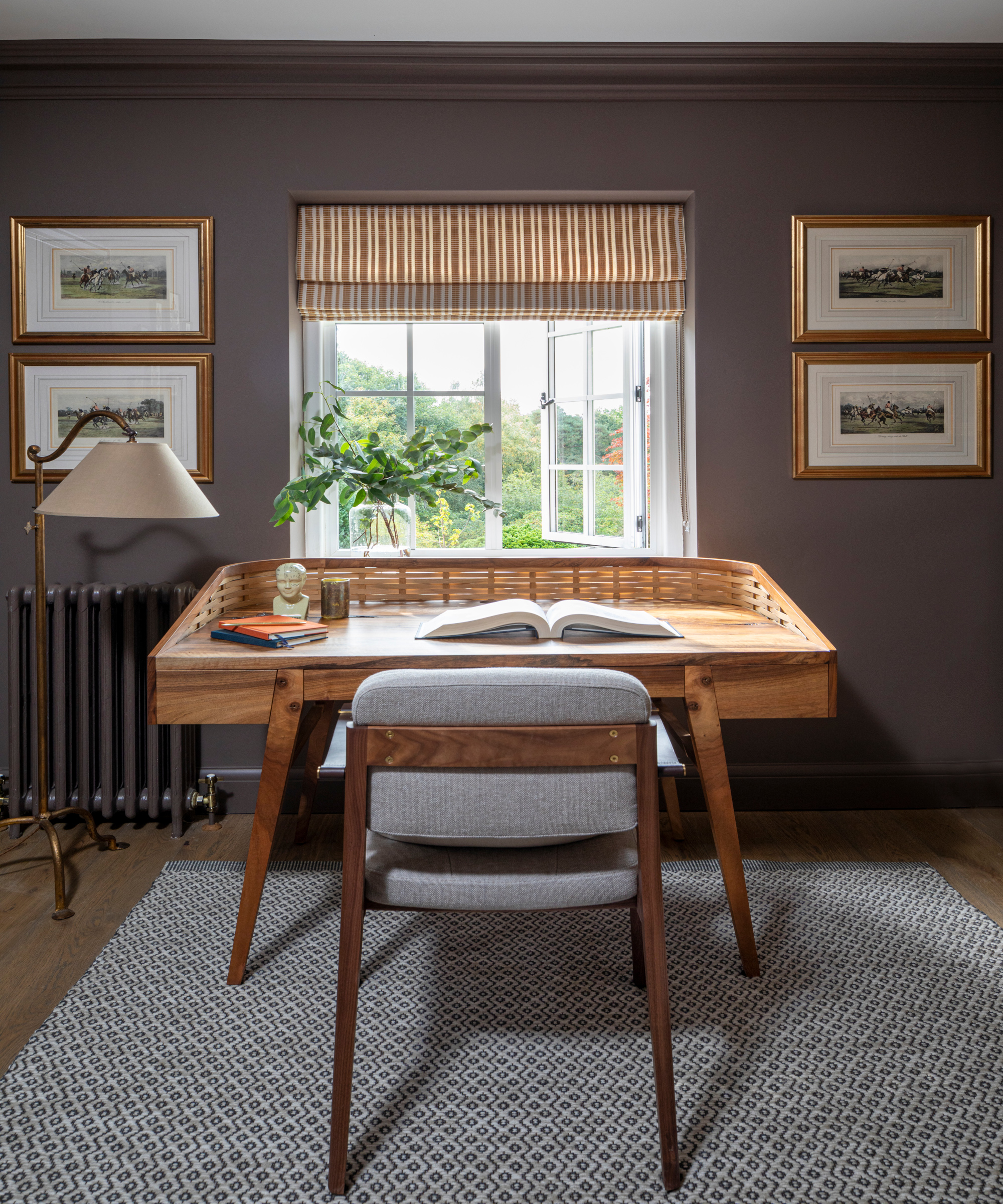
Leading off the formal dining room, the color palette for the study was carefully chosen. 'We wanted an equally rich and earthy tone, which can also be seen in the tapestry,' says Katie. 'It was important to select the right shade of brown so it didn’t dampen the natural light. The brown creates a lovely cocooned feeling to concentrate or relax.'
Mid century influenced hero pieces are among the home office ideas. 'The client’s preference was for a mix of classic and modern pieces so we were always conscious of finding a balance between new and older pieces to sit harmoniously together,' says Katie. 'The woven wood collar on the desk (the Sebastian Cox Bayleaf desk) brings texture and form alongside the sleeker upholstered chair with leather armrests.'
The blind fabric was chosen for its ochre color and stripe to offset the brown. It brings a touch of pattern to the room and acts as a focal point for the window overlooking the garden.
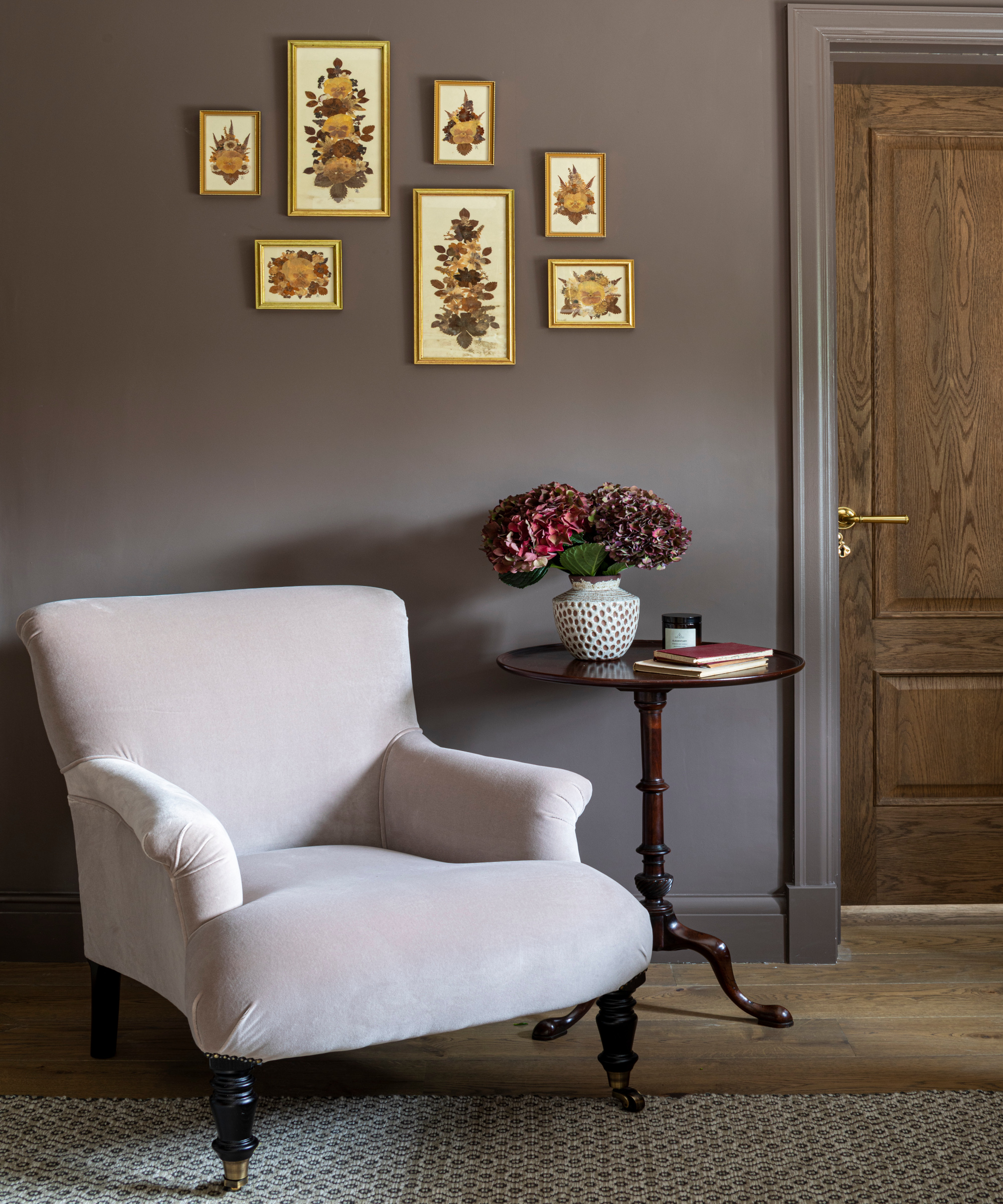
The armchair in the study is upholstered in a muted dusty pink velvet, which was chosen to introduce a traditional touch to the room and hint at the pink and burgundy tones with the interlinked reception room.
Pressed botanicals are part of the client’s existing art collection and pull together the brown, pink and ochre scheme.
Corridor
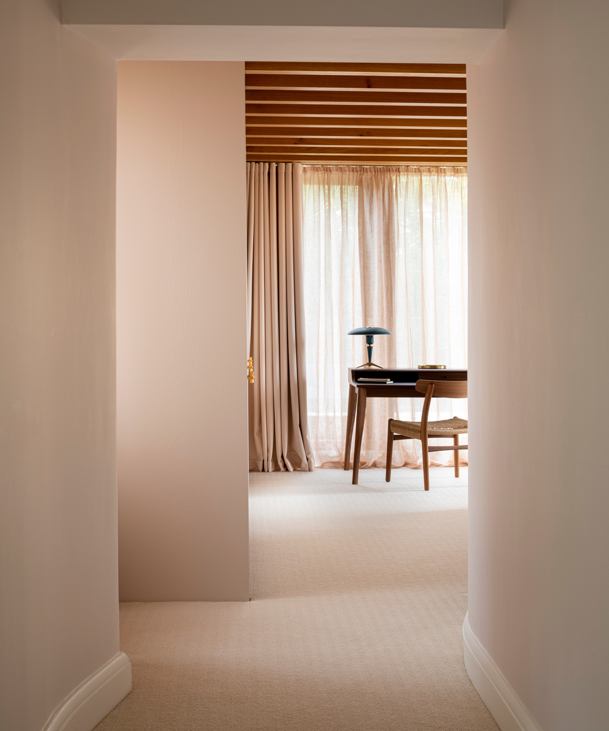
The glass extensions have a main bedroom in each. This corridor upstairs leads to one of the bedrooms. The extensions have glazing on three sides and timber beams, with the idea being to bring in daylight and views over the garden and beyond.
The desk doubles up an occasional work area and dressing table. The client wanted a peaceful place to write letters overlooking the garden.
Bedroom
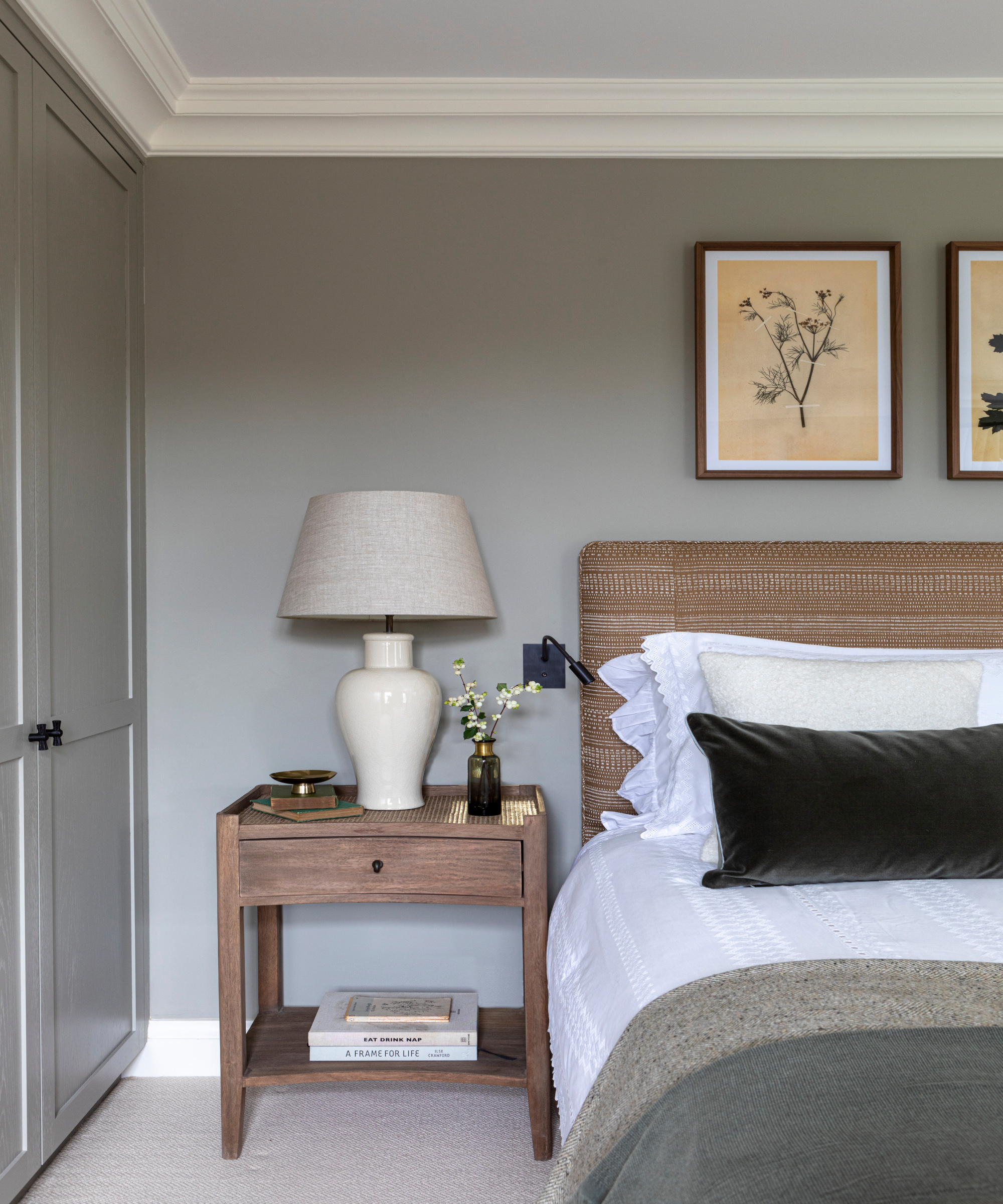
This guest bedroom needed to feel calming and neutral while continuing the theme of natural tones and textures. The brief was also to ensure the room could easily evolve for the changing needs of the family. Wardrobes were built in and bespoke to the client's storage layout requirement.
Children's bedroom
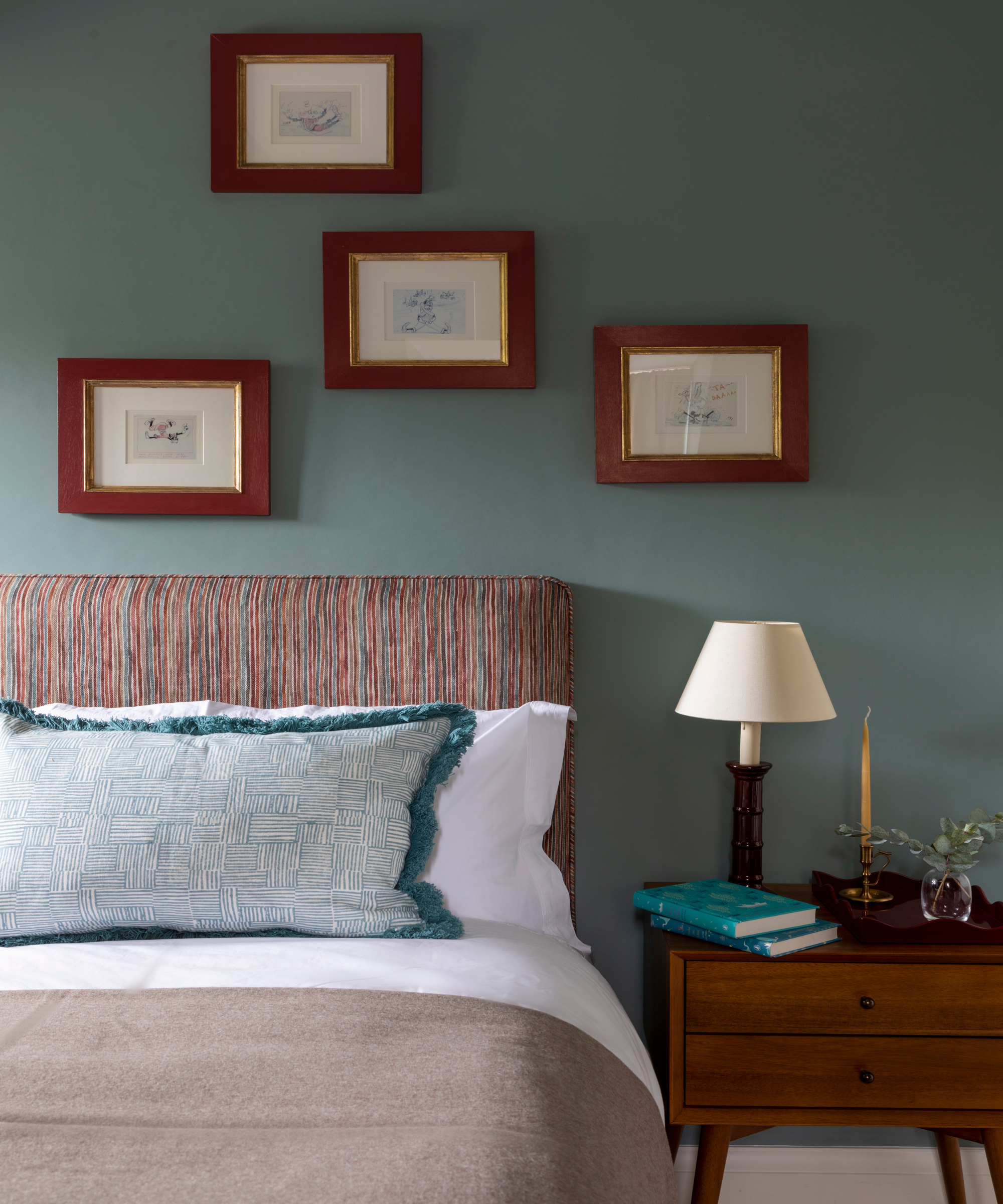
The colors of the children's bedroom were chosen for continuity with other areas of the home so the rooms follow naturally from one to the other. 'We wanted the children’s attic rooms to feel like cozy hideaways with playful details to give each room its own identity. The brief was to ensure the children could grow with these schemes,' says Katie.
The headboard fabric was the starting point for the scheme. 'The playful stripe pattern has a lovely painterly quality to it with a number of colors to draw upon and layers within the scheme.' Mid century bedside chests add a warm oak tone against the deep wall color (Oval Room Blue by Farrow & Ball) and sit well alongside the brown tones in the headboard fabric.
Bedroom ideas include reusing the client's existing artwork, cartoon illustrations on postcards, and bringing it back to life with bold new frames, a cost-effective solution when incorporating artwork within the design. 'They add a lovely whimsical touch,' says Katie.
Children's bedroom
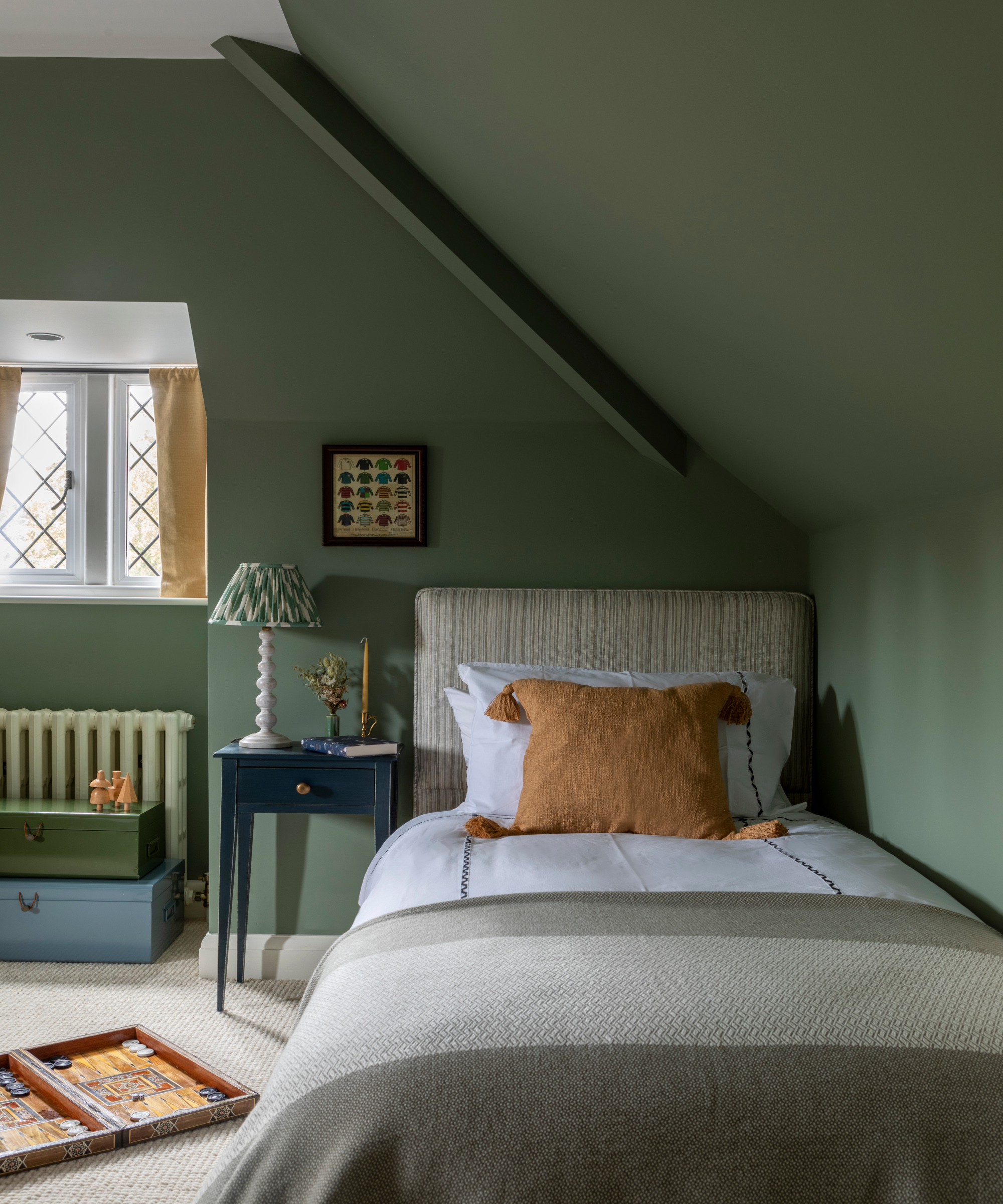
A smoky green blue shade, Green Smoke by Farrow & Ball, envelops the room. 'These attic rooms feel cocooning so we wanted to highlight the subtle mustard tone in the headboard with pops of mustard in the cushions and blinds and punctuate these for added depth against the all green room,' says Katie.
Main bedroom
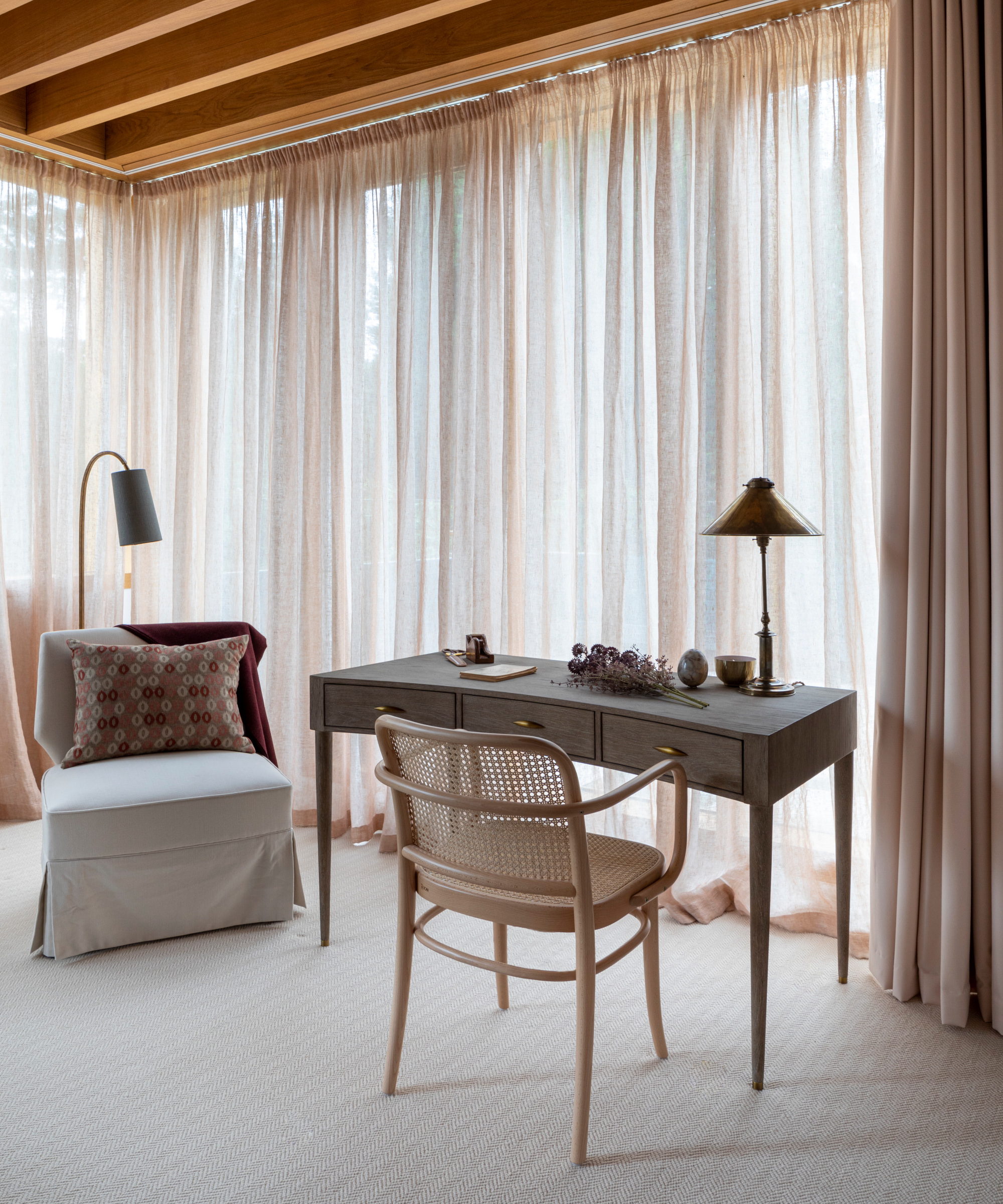
'Soft pinks and neutrals were chosen to create elegant and calming bedrooms that focus on smaller details of texture, form and touches of deep tones such as burgundy and Indigo to punctuate certain pieces,' says Katie. 'This calming scheme also allows the garden to be even more highlighted. Each main bedroom has the same colors but different furniture and furnishing to give them a distinctive character of their own.'
The inspiration for the pink and burgundy tones was the client's beautiful maple tree, which can be seen from both main bedrooms.
The light streams in and creates a wonderful pink hue through the sheer curtains that shifts over the day. 'As part of the timber frame to the extension, we ensured that the curtain track was incorporated within this for a seamless design that allowed the curtain to fully enclose the room for full coverage and an enveloped experience,' says Katie.
'The chair was placed here for a quiet reading corner. We wanted to choose something classic but with a sculptural silhouette. The chair is upholstered in neutral linen. We chose the deeper claret tones on the cushion and throw to sit against the maple tree in the backdrop.'
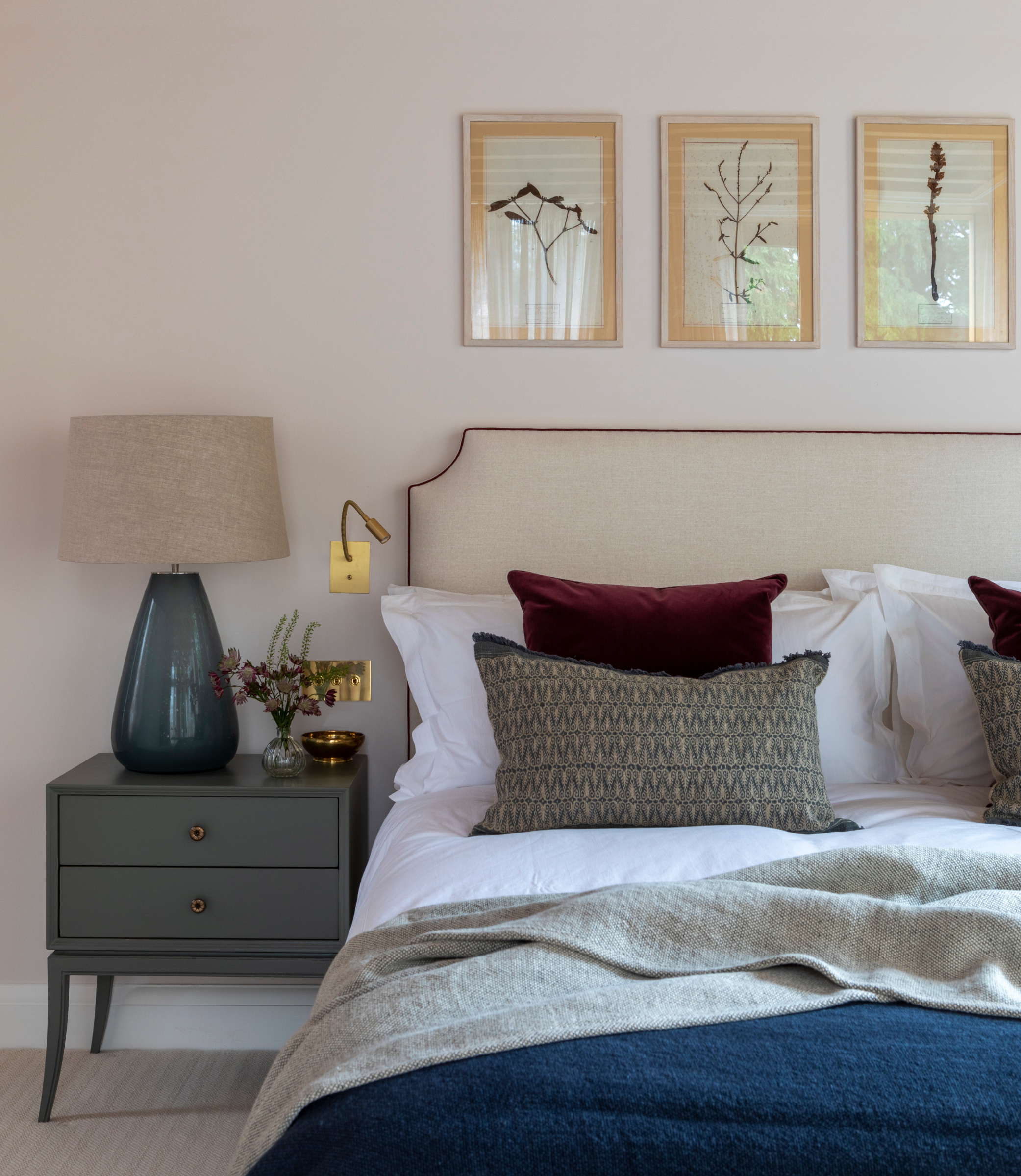
The focal point linen headboard introduces natural texture and tones with the neutral scheme. Burgundy cushions link with the maple tree outside the room while the indigo throw provides an additional punch of deep color for a finishing touch.
Interior design/ Kitesgrove
Photography/ Mark Bolton

Interiors have always been Vivienne's passion – from bold and bright to Scandi white. After studying at Leeds University, she worked at the Financial Times, before moving to Radio Times. She did an interior design course and then worked for Homes & Gardens, Country Living and House Beautiful. Vivienne’s always enjoyed reader homes and loves to spot a house she knows is perfect for a magazine (she has even knocked on the doors of houses with curb appeal!), so she became a houses editor, commissioning reader homes, writing features and styling and art directing photo shoots. She worked on Country Homes & Interiors for 15 years, before returning to Homes & Gardens as houses editor four years ago.
