Design DNA: Inside a Small but Mighty San Francisco Kitchen That Looks Like It’s Been Plucked from the English Countryside
Lived-in, charming, and secretly functional, Lynn Kloythanomsup breaks down the Design DNA of this country kitchen in this city

Design expertise in your inbox – from inspiring decorating ideas and beautiful celebrity homes to practical gardening advice and shopping round-ups.
You are now subscribed
Your newsletter sign-up was successful
Want to add more newsletters?
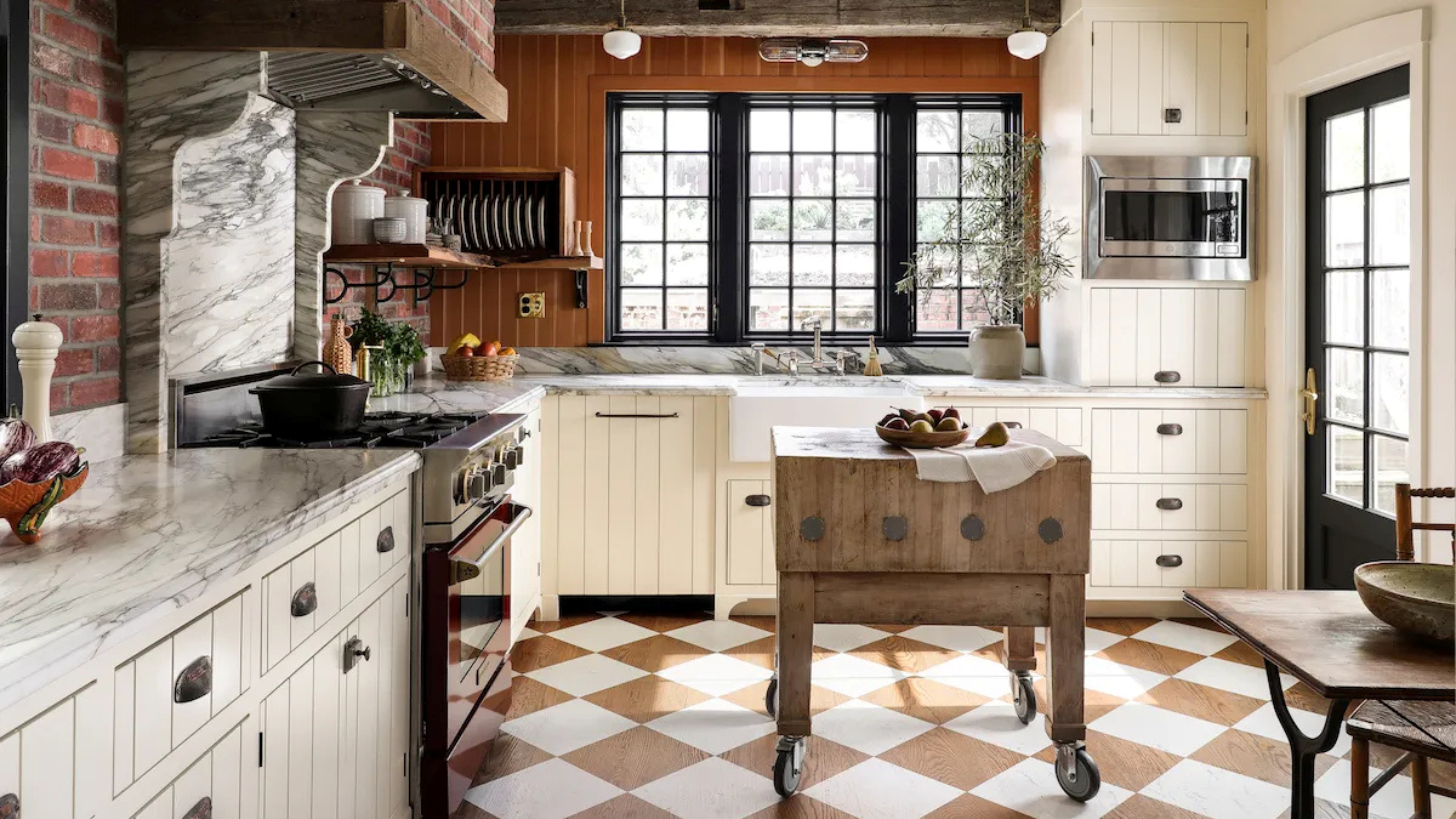
Some interiors have a life of their own – they stay on your mind, and they follow you around the internet. That was the case for fans of this modest San Francisco kitchen, tucked in a remodeled 1914 Arts and Crafts home.
For years, the kitchen has been something of a calling card for Landed Interiors & Homes, in part because it creates something of an illusion. 'The fantasy is that it is supposed to be like an English country kitchen – but it's in the city,' says founder Lynn Kloythanomsup.
The amusement stems from its location, but the attraction is the brand-new kitchen’s vintage-inspired palette, making the most of a relatively small space (at least for San Francisco standards) to create something that looks aged and timeless.
Lived-in, charming, and secretly functional, Lynn Kloythanomsup breaks down the Design DNA of this country kitchen in the city so you can crack the code, too.
A Measured Material Overload
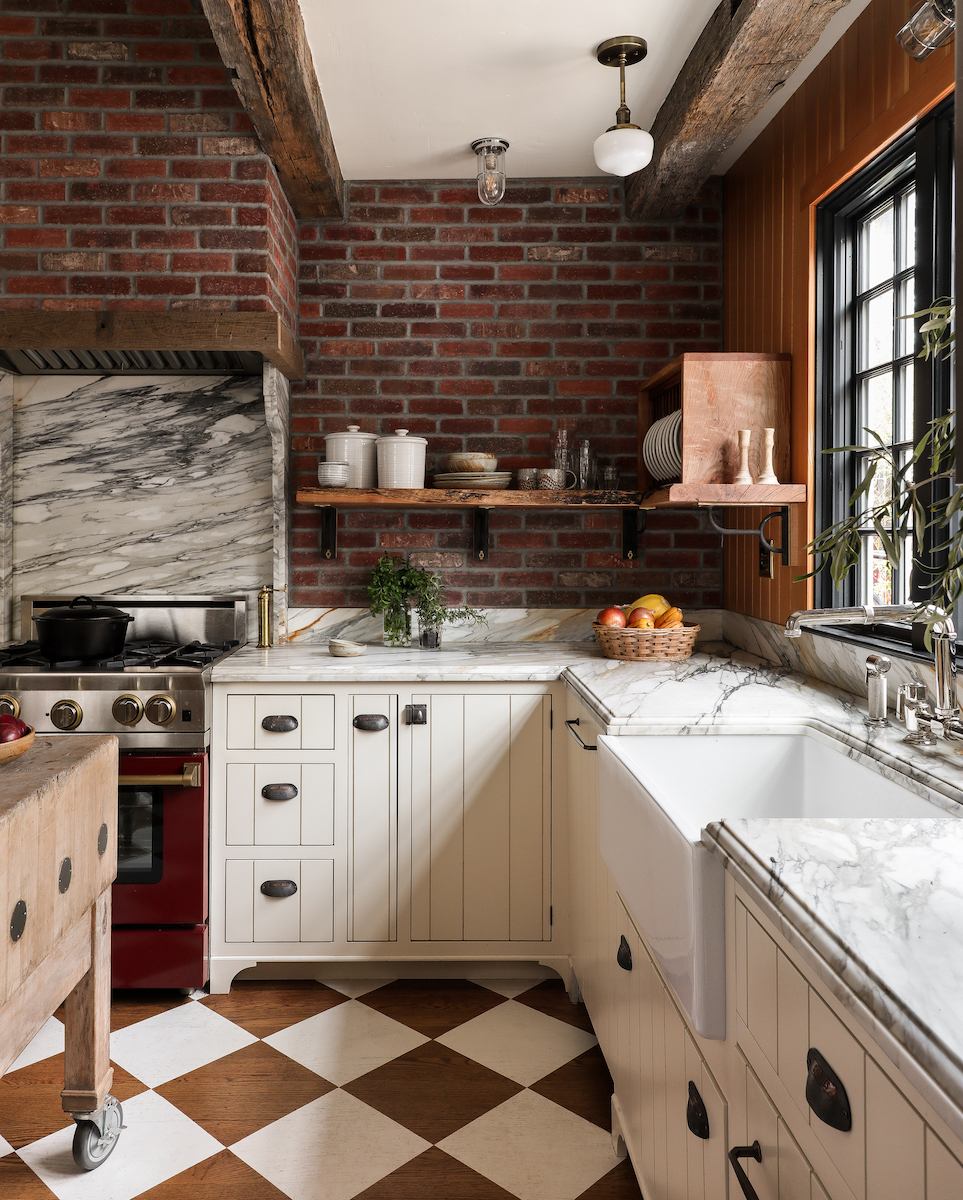
It's a kitchen you can feel with your eyes. Using what Lynn calls a 'farmhouse palette,' an expert layering of rustic materials brings texture and visual interest.
Everything you see is technically new – the design team completely relocated the kitchen from a different area of the house, bringing it to the rear to allow the installation of more windows for better light. But the kitchen color scheme itself creates the vintage illusion through exposed brick, salvaged wooden beams, hand-painted wood floors, cedar paneling, shiplap-esque cabinets, and marble surfaces.
'It's like ten interesting ideas together, which actually quiets the impact of every one of them – they're all a little bit statement,' says Lynn. 'You almost don't start noticing them until you're looking at it for a while.'
Design expertise in your inbox – from inspiring decorating ideas and beautiful celebrity homes to practical gardening advice and shopping round-ups.
The material mix allows rustic and lively materials to blend together and harmonize, creating depth and character. The client didn’t want a home that looked 'too perfect,' which made Lynn’s layered and aged look the perfect solution for creating a space that appears to have been there for a century.
Hand-painted Wood Floors
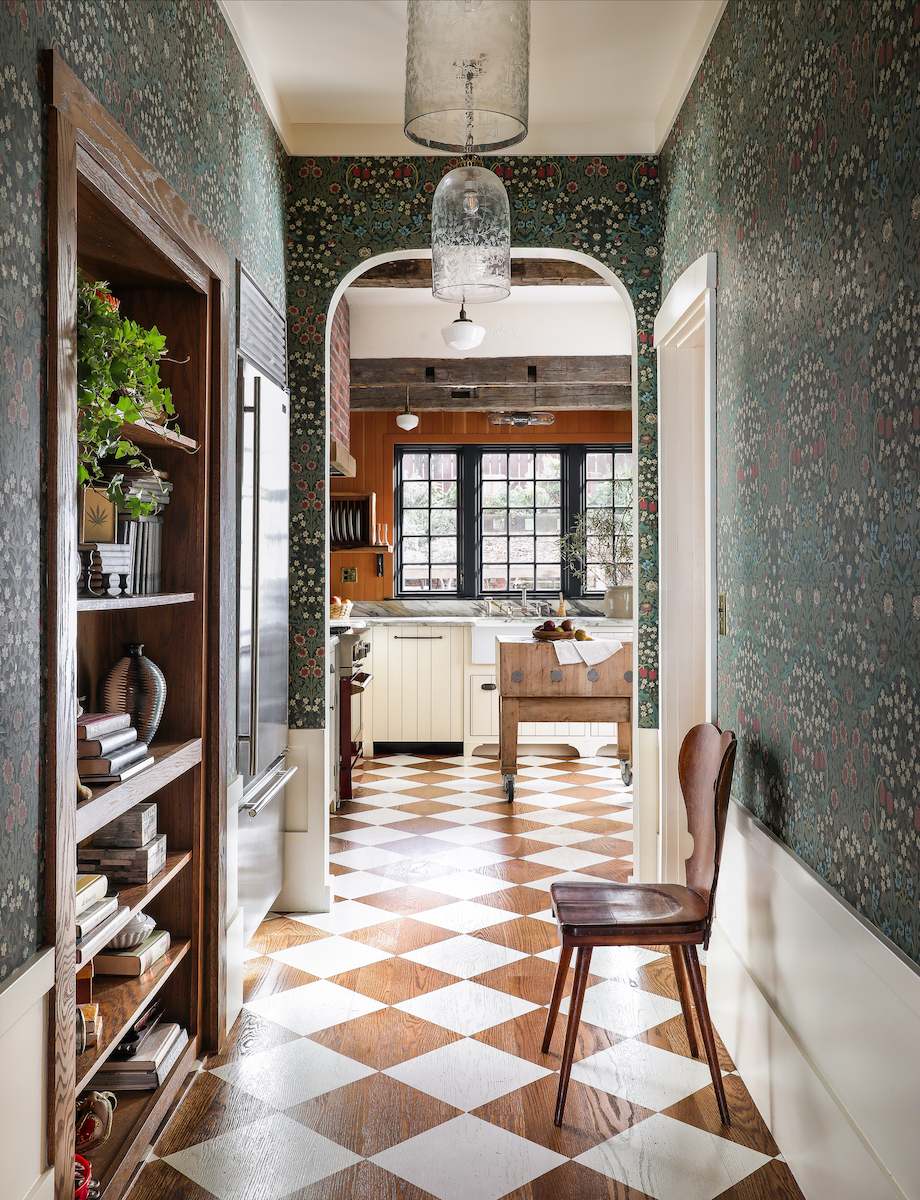
There are many reasons to be attracted to this kitchen. But over the years, Lynn hears about the painted floors most. At the very last stage of the project, a decorative artist used Benjamin Moore floor paint to create a checkerboard pattern across the surface.
There’s a long history of using paint as a cost-effective method to elevate floors with decorative patterns. It grants the scheme an unusual, old-timey effect.
'The idea of painting a floor, for me, is to add interest to a floor that's not that special,' says Lynn. The wood floors were wire-brushed and sanded to emphasize their subtle grain, but are otherwise standard; the paint takes them to another level.
It’s not the ideal kitchen flooring for everyone, especially because this type of look (particularly with white paint) shows wear and tear. 'There needs to be some kind of embracing of that – that it will change,' says Lynn. But to her, that kitchen’s worn look just adds to the transportive charm.
The pattern here is relatively simple, just large squares painted across the surface. But Lynn suggests getting a bit creative. 'You can do very interesting patterns – this one is a bit simple,' she says. 'Since then, we've wanted to do even more elaborate designs on floors.' That’s another way of saying: think outside the box.
A Requisite Seating Area
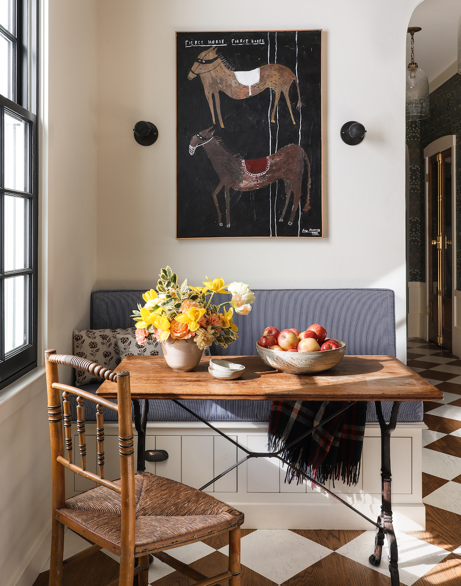
There wasn’t enough space in the kitchen for a proper kitchen island, which also meant there wasn’t a place for guests to naturally ‘settle up’ when gathering in the kitchen, nor was there an obvious place to integrate counter stools. Lynn’s solution was a simple banquette, tucked in the corner along the window.
'I think it's pretty necessary at this point for everyone to have some kind of seating in their kitchen where friends can watch them cook and talk at the same time,' says Lynn.
It’s nothing major, just enough space for one or two people to sit and chat, or a spot to read the paper and have coffee in the morning. But Lynn was sure to include thoughtful touches, like two drawers beneath the bench for storage, and a cushioned seat for comfort. An antique English breakfast table completes the look, and overhead sconces help define the area as its own zone.
Bespoke Storage for a Beautiful Experience
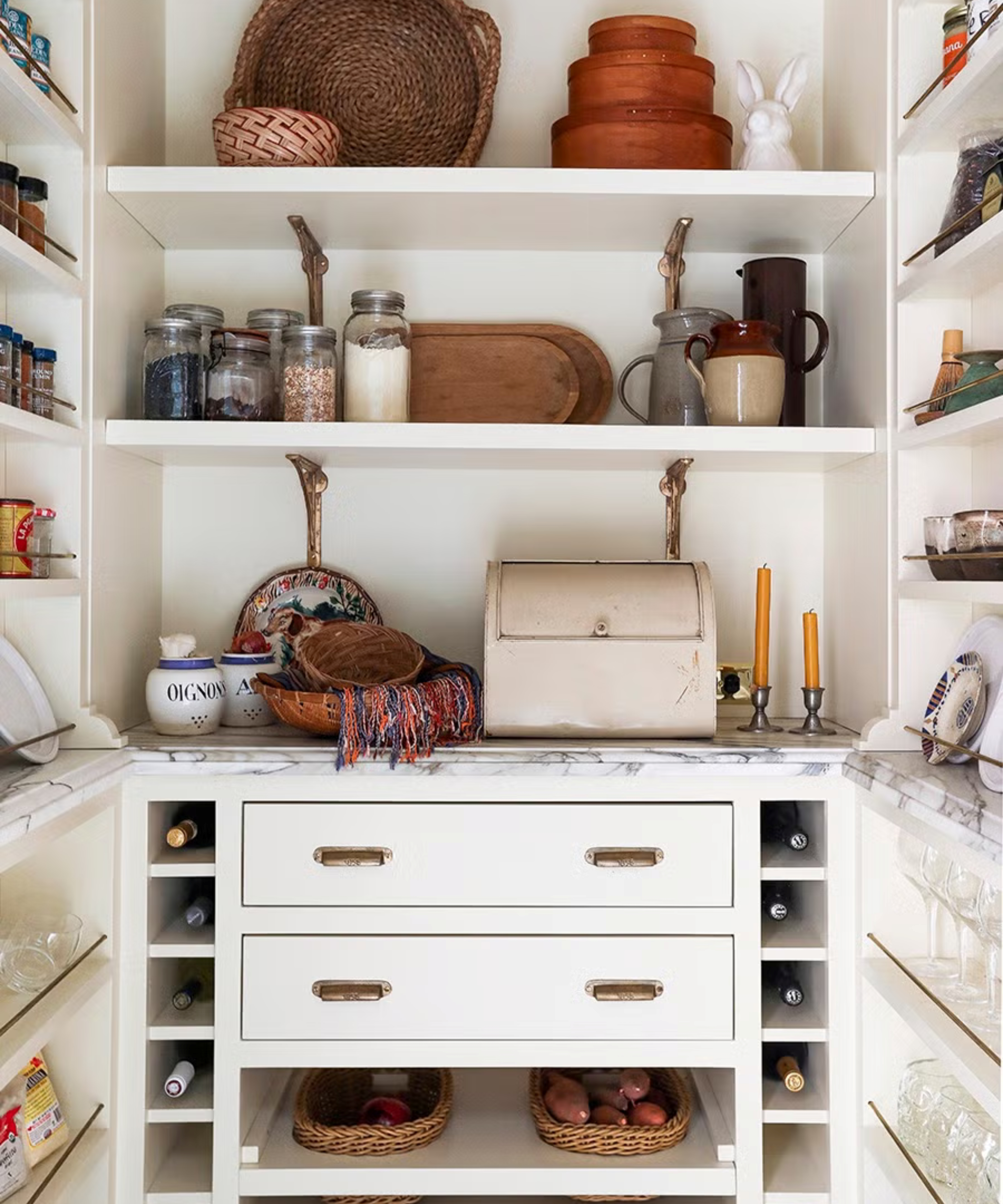
It’s easy to get lost in the big picture, but the beauty of this kitchen also lies in the hidden details. 'We try new ideas that suit whatever the client needs,' says Lynn of custom storage integrated throughout the space, bringing function into the fold.
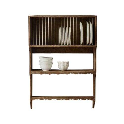
The owner is an artist, which inspired Lynn to create drawers with angled containers for utensils – much like bins for paint brushes. Above the counter, a custom plate rack adds a vintage touch while also making everyday plates easily accessible. 'We had our cabinet maker make a dish rack, but it was actually too perfect, and the client scrapped it,' says Lynn, who had the design recrafted using scrap wood to lean into rustic textures.
A pantry, located in the hallway leading to the kitchen, is something of a workhorse. The client wanted everything to feel open and within reach (including her collection of 60 or so wine glasses), so she wasn’t searching for anything when guests were over.
That was the reason Lynn installed glass doors for the pantry, but also open shelving along the sides, adding rails so the owner could easily store wine glasses. Naturally, there are custom cubbies for wine bottles, and adding a bit of country flair, custom niches for removable baskets.
A Range Hood That Disappears
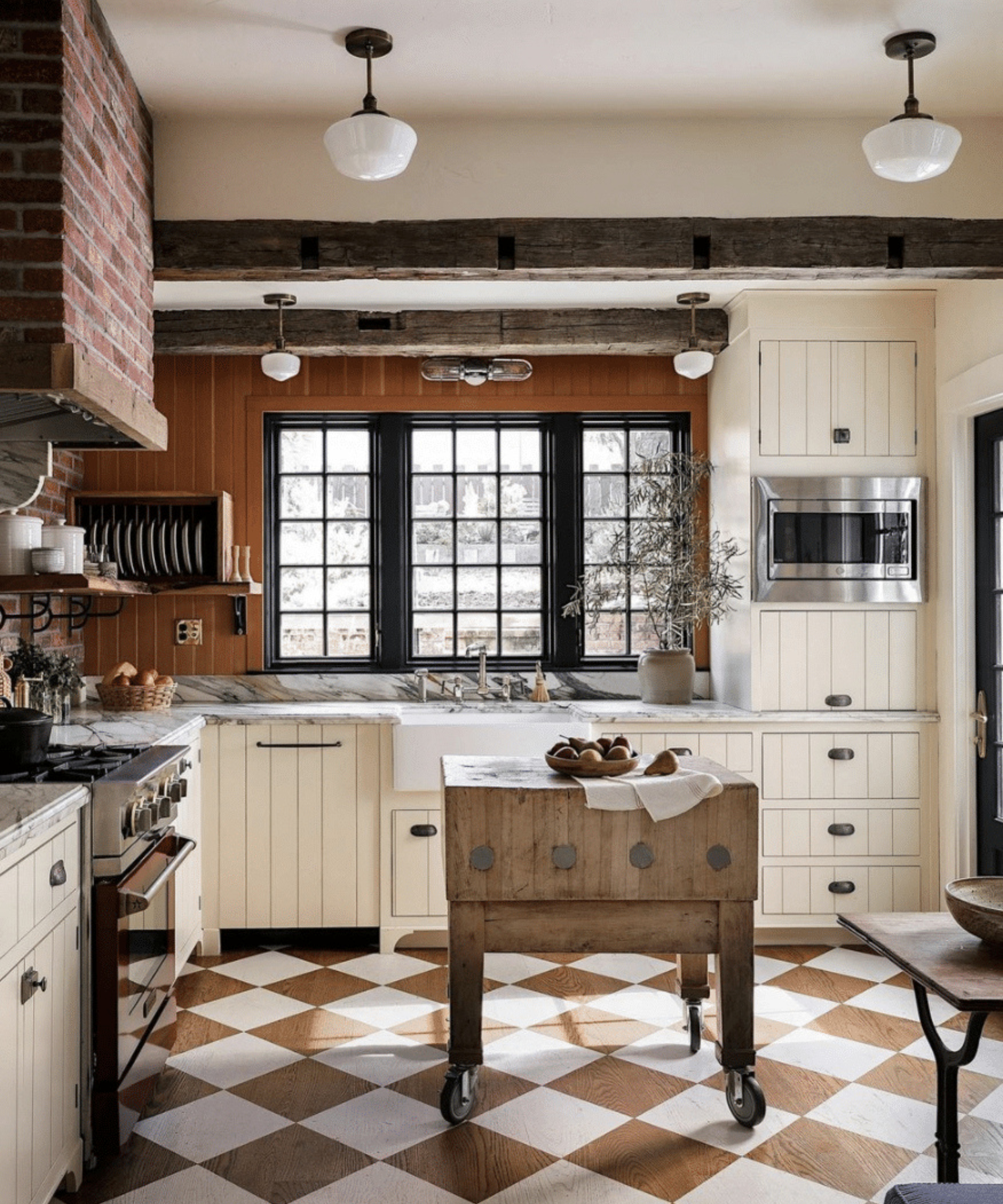
To encourage the ‘fantasy’ of an English country house, Lynn points to one particular trick: she wrapped the range hood in faux brick tile, creating a seamless connection to the walls.
'We're often trying to make the range hood disappear, and not be so called out like a huge statement,' says Lynn. 'So it's very interesting, but at the same time it's subtle.' Matching other elements throughout the space, there’s also a wood trim along the edge, leaning into the rustic look.
Of course, it doesn’t need to be brick. 'I see a lot of examples of it now where the walls tiled, and so is the range head,' says Lynn. 'People are also doing plastered hoods with plaster walls – I think that feels really beautiful and elegant to me, when the range hood doesn't stand out.'
The Edit
Design DNA is the Homes & Gardens series that breaks down beautiful rooms into their essential elements. Each installment dissects one interior and shows readers exactly what makes it work, from the anchor furniture and layout choices to color, lighting, and styling details.

Keith Flanagan is a New York–based journalist covering design, hospitality, and interiors. He was formerly an editor at Livingetc and Time Out New York.

