A 1940s Colonial Revival Where Color and Pattern Mix With Old and New to Create a Truly Transitional Family Home
Designer Lindsay Marcus turns a neutral canvas into a richly layered, transitional family home

Design expertise in your inbox – from inspiring decorating ideas and beautiful celebrity homes to practical gardening advice and shopping round-ups.
You are now subscribed
Your newsletter sign-up was successful
Want to add more newsletters?
The most timeless spaces are the ones where it’s hard to pinpoint what era they were designed in – where old mixes with new, and different shapes, styles, and eras come together to create layered, transitional rooms that feel on trend but also follow no trends.
Designer Lindsay Marcus nails this characterful aesthetic in her latest project. Located in the Little Holmby Hills neighborhood of Los Angeles, this 1940s Colonial Revival–style home needed an update that would preserve its beautiful original features while layering in a more ‘eclectic, layered, and elevated’ style.
‘The client wanted an elevated and refined home that was chic but still kid-friendly (in places),’ Lindsay tells Homes & Gardens. ‘The project needed to embrace a stylistic departure from their previous home, which was a midcentury modern with many neutrals.’
Article continues below‘We also leaned into the traditional aspects of the architecture, allowing them to guide the tone of the space. At the same time, we layered in midcentury lighting and more modern furniture silhouettes with the goal of creating a layered and collected space.’
Here, Lindsay walks us through the home and explains how she created layered, transitional spaces using a mix of old and new, color and pattern – spaces that strike a balance between contrast and cohesion.
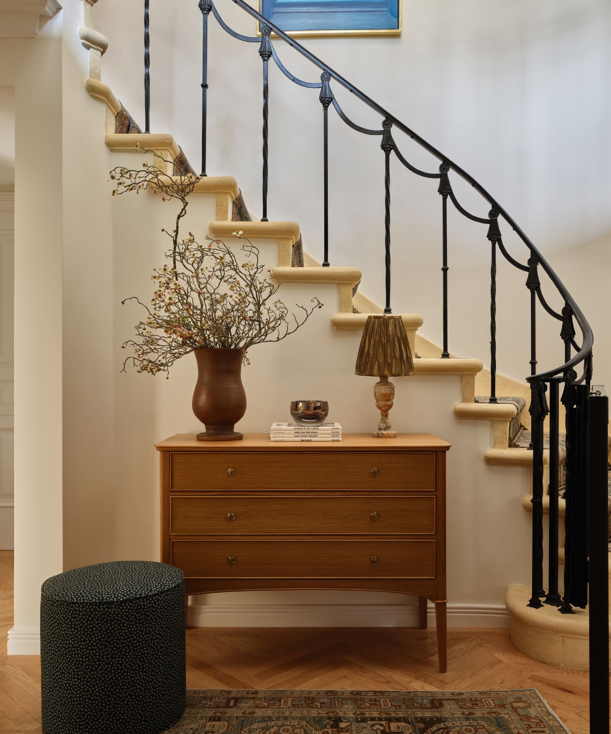
'I wanted the architecture to lead the design process here,' explains Lindsay. 'The house had beautiful existing millwork, much of it painted white, which gave us a clean, classic foundation to build on. We looked for opportunities to introduce color in a way that felt intentional and elegant. We did this through painted finishes, wallpaper, upholstery, and patterned drapery with the hope of bringing warmth and personality without overwhelming the original details.'
The layered design of the entryway perfectly captures Lindsay’s vision for this home. The elegant architecture – from the sweeping stone staircase to the refined iron banister – provides the focal point, forming the ‘classic foundation’ she often references. From there, a thoughtful mix of eras, shapes and textures adds depth: the clean silhouette of the dresser, the collected textures of the vignettes, and the softly worn vintage rug all work together to create a welcoming moment, a space that feels both sophisticated and richly layered with character.
Design expertise in your inbox – from inspiring decorating ideas and beautiful celebrity homes to practical gardening advice and shopping round-ups.
'We created a calm landing zone by painting the walls in Benjamin Moore’s Swiss Coffee, sourced an antique Persian rug from Chairish, a refined Nickey Kehoe white oak dresser discovered at a visit to their LA shop, and a custom pouf in a Robert Kime linen.'
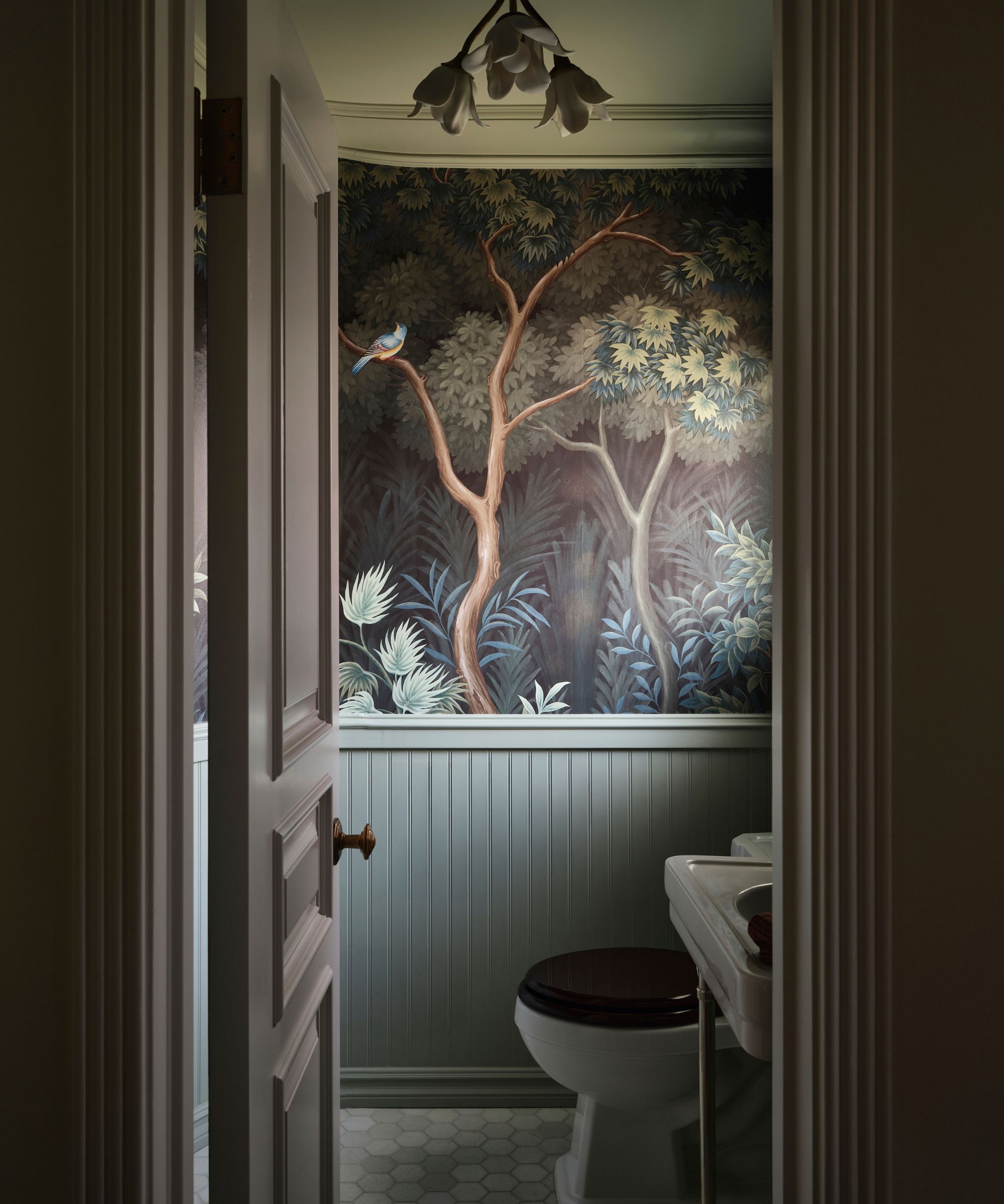
The house had plenty of original millwork, instantly giving the rooms character, but most of it was left plain white, and Lindsay and her clients wanted the home to be layered with soft, welcoming color. In the powder room, the paneling was painted a rich, cool blue and paired with a dramatic mural that transforms this small room into a jewel box of a space. Powder rooms lend themselves to darker, more theatrical treatments – their small footprint and high foot traffic make them ideal places to experiment.
'Our intention in the powder room was to create a beautiful and dramatic moment. We chose a beautiful, scenic wallpaper from Gracie, paired with Farrow & Ball’s Blue Gray, which picked up on the plant life in the wallpaper. We sourced vintage Italian Pietro Chiesa sconces and a floral ceiling flush mount from Urban Electric, both of which accentuate the romance of the space.
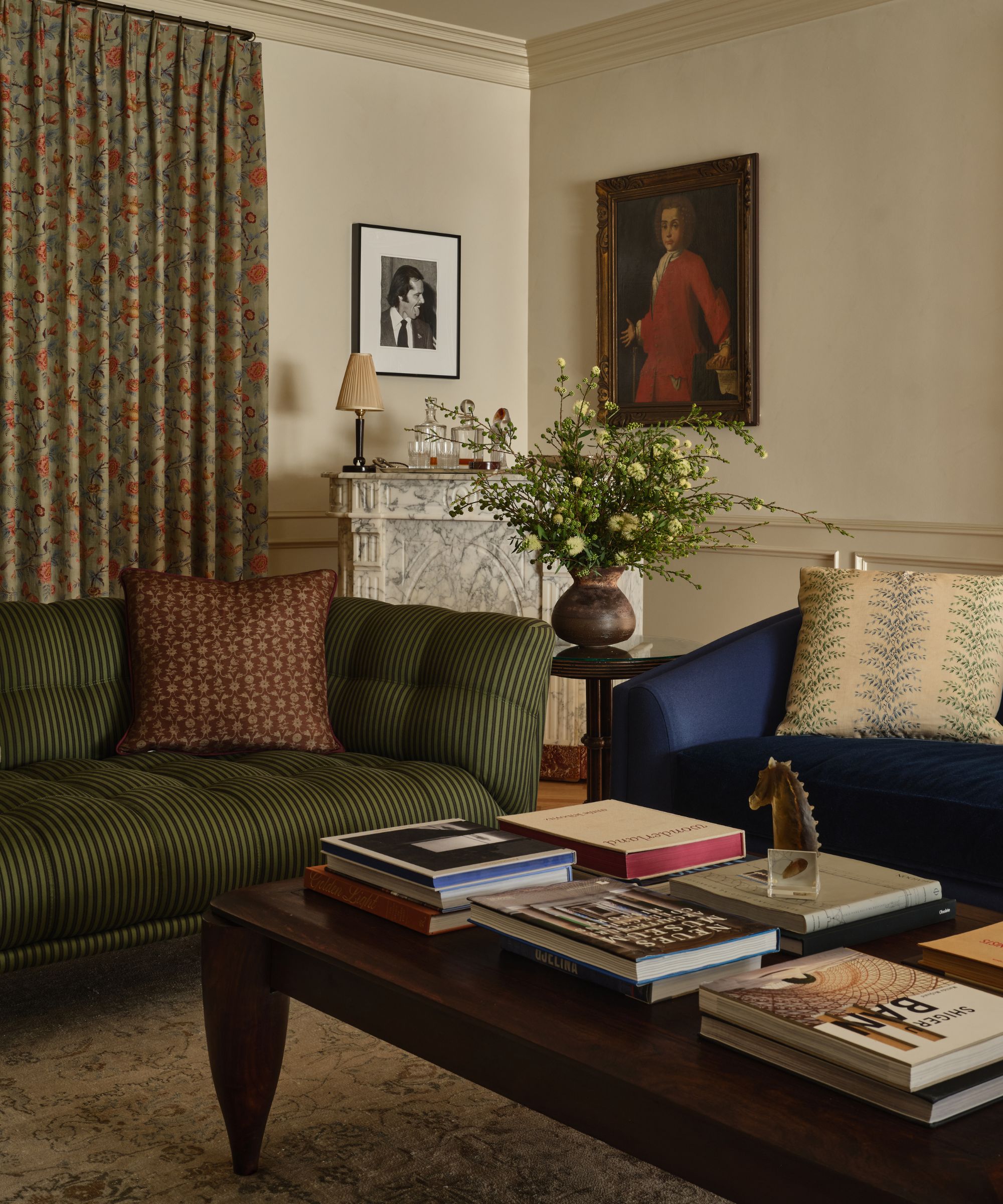
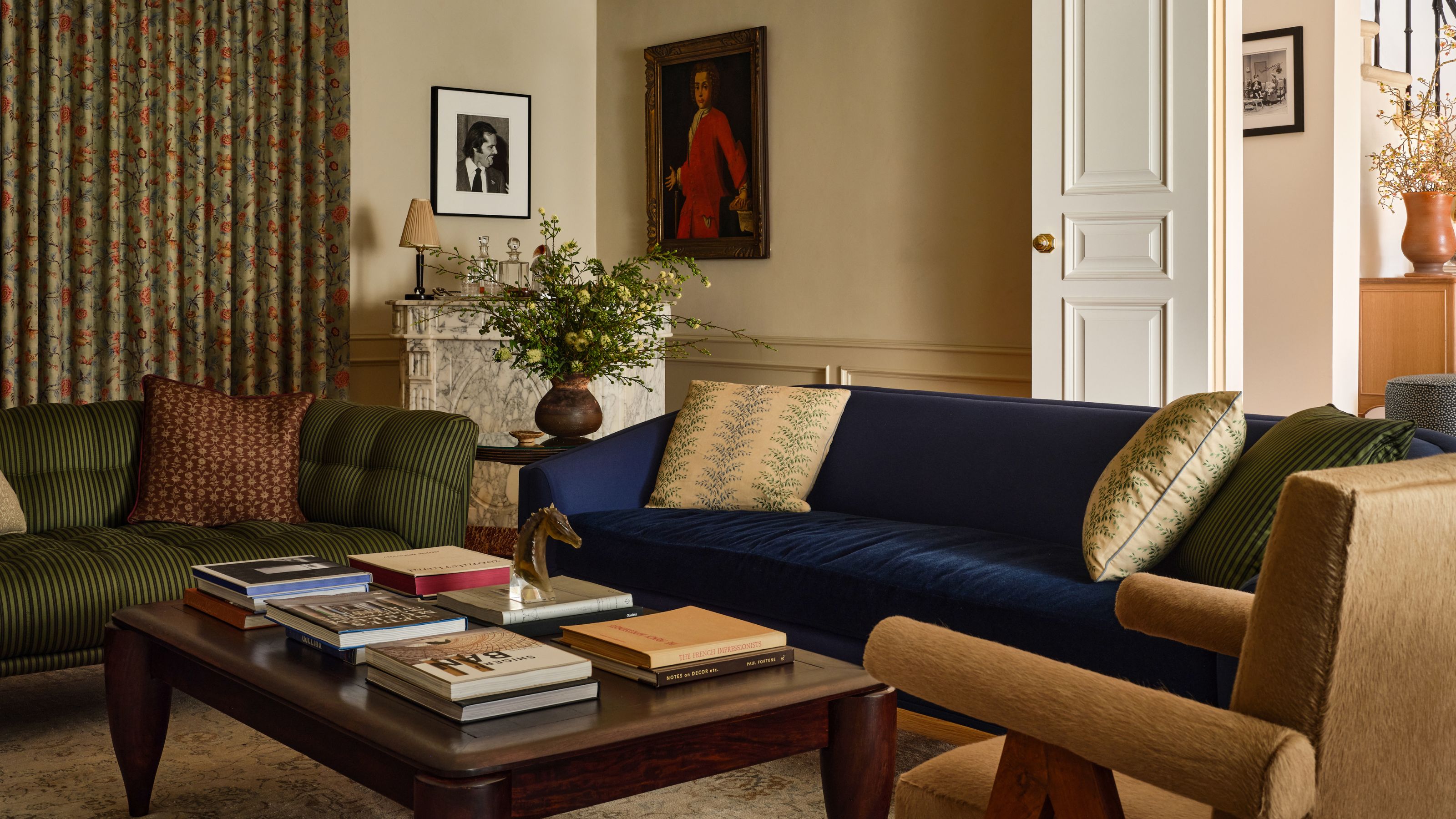
'For the living room, the client had purchased a few standout pieces from the previous homeowner, including a royal blue Nickey Kehoe sofa and a Roche Bobois loveseat. We used the NK sofa as the jumping off point for our palette, and reupholstered the Roche Bobois in a stripe from Howe. A vintage Art Deco coffee table brought in an Old Hollywood note that feels true to the home’s original spirit, while a French giltwood mirror from the 1890s, sourced on 1stDibs, adds a special focal point above the mantel.'
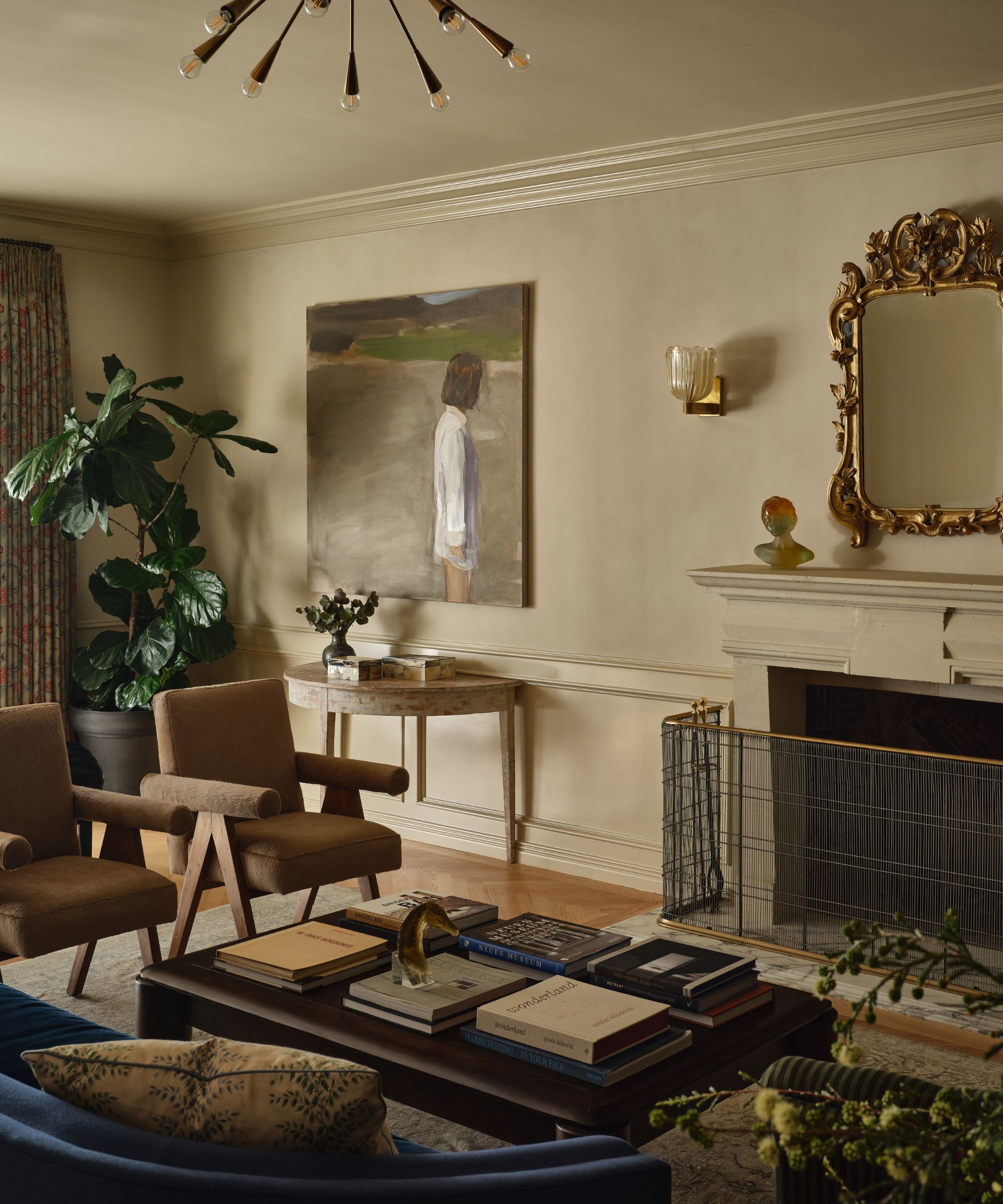
'To heighten the room’s sense of glamour, we added sconce lighting, sourcing Italian Murano glass and brass sconces, which complemented the antique French marble bar and original Pierre Jeanneret chairs. The chairs were re-covered in a hair-on-hide for added texture.'
'We also sourced vintage brass benches, reupholstered in a Fortuny fabric, and framed the space with drapery in a rich Jasper print. The room is fully drenched in Portola Paint’s Tikal – using limewash on the walls and the same color paint on the paneling, to lean into a subtle drama. The two large contemporary oil paintings, by Gideon Rubin and Hannah Brown respectively, were sourced by the clients and are both so phenomenally beautiful – they lend an air of modern sophistication to the space.'
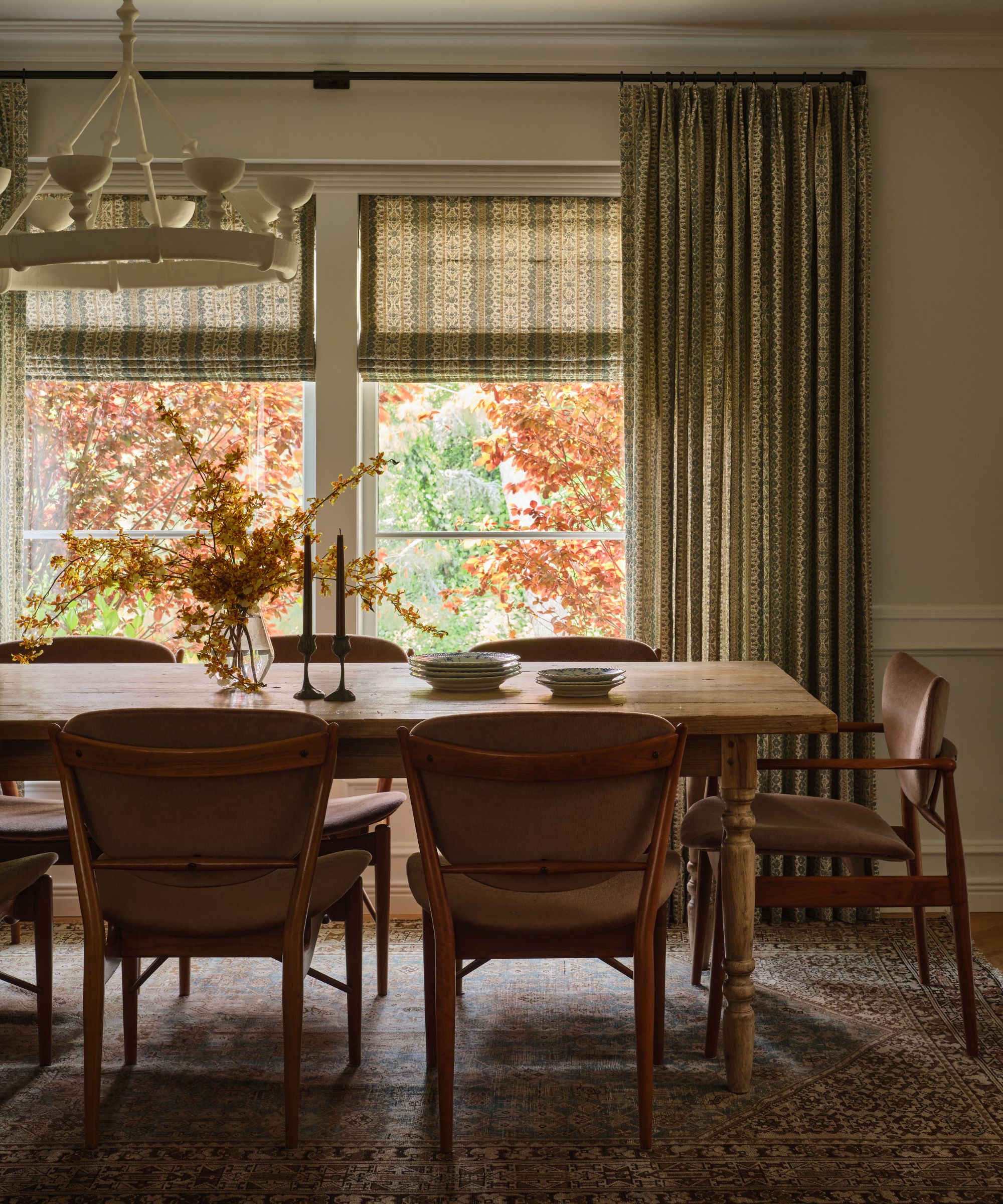
The contrast of old and new continues in the dining room, where 1960s vintage chairs and a rustic farmhouse table sit beneath a modern chandelier. Despite the differing shapes and styles, the room still feels harmonious with its warm neutral color scheme and subtle mix of patterns, softening the contrasts.
'We paired the rustic table with original Finn Juhl chairs, recovered in a light brown mohair. We wanted to create a backdrop for the plaster chandelier to pop against, so we dressed the windows in matching Roman shades and drapery panels in a printed Jasper linen.'
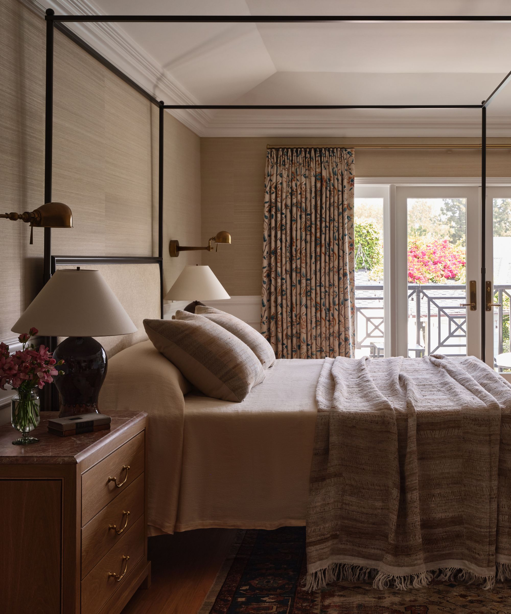
'For the main bedroom, we decided to incorporate the existing white paint on the paneling, as it was fresh feeling, and also a lacquer paint can be somewhat intensive to paint over.'
'The client had also purchased the vintage Persian rug in the room from the previous homeowner. So we started our scheme based on those two factors. To balance the rug’s rich dynamic presence, we opted for a neutral grasscloth wallpaper from Gregorious Pineo that would add depth and texture without competing with the rug.'
'We then fell in love with a Rosa Bernal fabric for the drapery, which plays with the rug, wallpaper, and paneling so nicely. We covered the headboard in a Guy Goodfellow weave and the bench in a Classic Cloth stripe. Custom white oak nightstands with Rojo Alicante marble tops complement the red tones in the rug. The lamps are from Los Angeles-based ceramicist Victoria Morris, in an oxblood glaze. The womb chair, recovered in shearling, created a cozy reading moment, and paired with a vintage Rupert Nikoll lamp.'
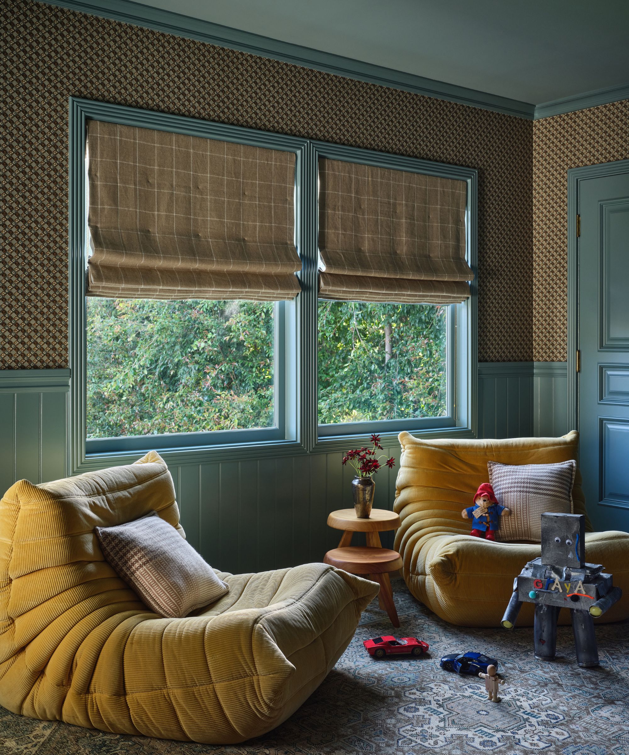
'The playroom was so fun to create. We wanted to go bold. We drenched the paneling and ceiling in Farrow & Ball’s Barrow Blue to play with the blues in our checkered wallpaper. We decided to play with the check further by incorporating a Schumacher windowpane fabric for the Roman shades. The seating in the room are two cozy and fun mustard Togo chairs.'
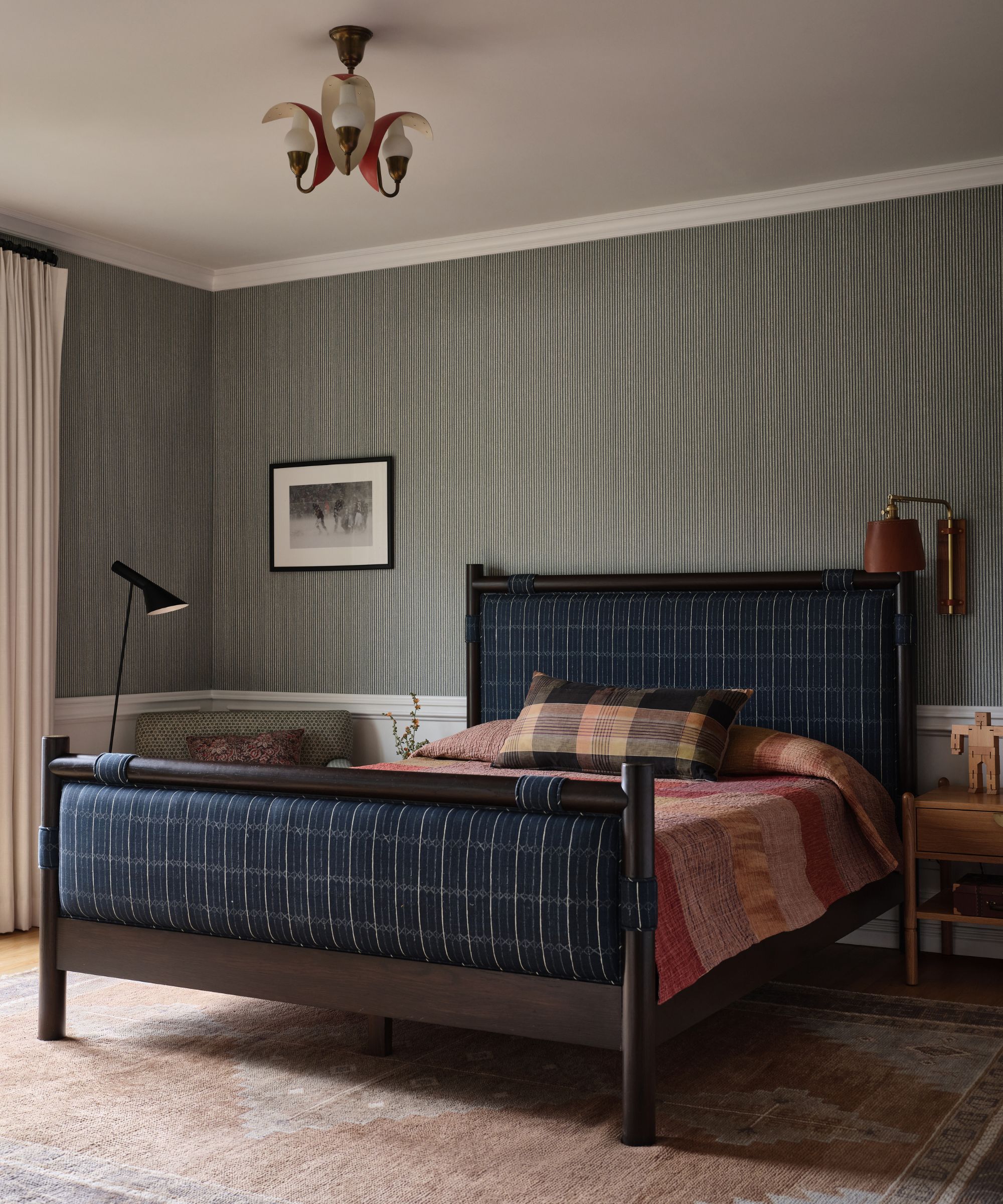
'Our intention in the boy's room was to create a kid's room that could grow with him. We chose a masculine palette, with blues, white, and subtle greens. The Lawson Fenning bed is a lovely anchor for the room, upholstered in a McLaurin and Piercy fabric.'
'The side chair and pouf are from Sabin LA, and the shapes of those pieces are somehow youthful and sophisticated at the same time. The upholstery choices are intended to hit those same notes. We chose a Zak + Fox stripe wallpaper that added subtle color and texture that the young boy could mature with. The lumbar pillow and bedcover, from Nickey Kehoe, add a palette contrast that ties in with rust shades in the rug.'
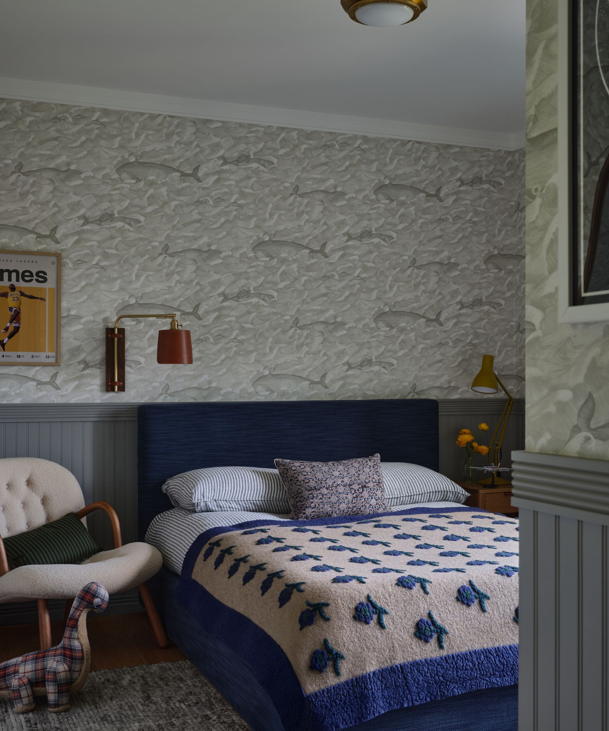
'We allowed whimsy to lead the second child's room more, along with the boy’s love of the water and the ocean. We leaned into the nautical, with a marine ceiling flush mount, and Cole and Son’s classic Melville wallpaper. The leather sconce, from Lostine, adds a masculine touch. The floral bedcover, sourced from Nickey Kehoe, adds an extra element of playfulness to the space.'
'My favorite rooms of the whole home, although hard to pick favorites, are the living room, the primary bedroom, and the powder room. Perhaps my favorite element across the project was our use of patterned drapery fabrics. We incorporated beautiful prints in the living room, dining room, kitchen, primary bedroom, landing, and playroom. It helps make each of these spaces feel so special and held.'
'I am thrilled with the finished result. The client was a dream to work with and was not afraid to take risks, which was empowering and fun, and I believe paid off. This project allowed me to dive deeper into incorporating pattern and texture, and stretch further into creating elevated spaces for a discerning clientele.'

I am the Head of Interiors at Homes & Gardens. I started off in the world of journalism in fashion and luxury travel and then landed my first interiors role at Real Homes and have been in the world of interior design ever since. Prior to my role at H&G I was the digital editor at Livingetc, from which I took a sabbatical to travel in my self-converted van (not as glamorous as decorating a home, but very satisfying). A year later, and with lots of technical DIY lessons learned I am back to writing and editing, sometimes even from the comfort of my home on wheels.