This Sherwin-Williams color palette is inspired by the streets of Paris – and it's perfect for a neutral lover trying to be bolder
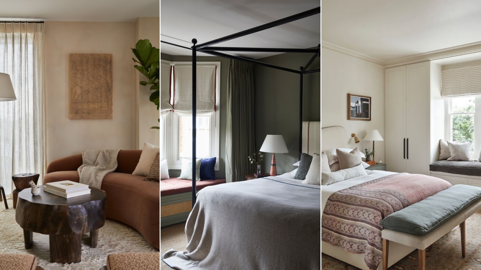
Combining classic neutrals with blues and greens, the 'Parisian Promenade' color palette is ideal for those who love a not-quite-neutral scheme

Design expertise in your inbox – from inspiring decorating ideas and beautiful celebrity homes to practical gardening advice and shopping round-ups.
You are now subscribed
Your newsletter sign-up was successful
Want to add more newsletters?
Host of the Olympic Games 2024, Paris is getting a lot of worldwide attention. And while the games are on my TV screen morning, noon, and night right now, I am a total Francophile all year round.
French fashion, French food, and French interiors. I love it all and unashamedly try to replicate the effortless style in my wardrobe, my cooking, and my home. I am fully aware I will never be able to recreate the je ne sais quoi that the French are famously known for but that doesn't stop me trying.
So of course, when I spied that one of my favorite paint brands, Sherwin-Williams, had paid homage to the streets of Paris in their most recent color palette, I was all ears.
Article continues belowThe palette, named 'Parisian Promenade' is almost neutral, made up of creams, beiges, and mauves. But there's the slightest hint of color in there with blues and greens and even a grounding soft charcoal gray. If you are love decorating with neutrals, but looking to add in a touch more interest with color, this is the perfect scheme.
A post shared by Sherwin-Williams (@sherwinwilliams)
A photo posted by on
'With the Olympics going on right now, it's no surprise that all things Parisian are trending – and this chic color palette is no exception!' says designer Kathy Kuo when I asked for her thoughts on the combinations. 'I love how the neutral Mauve, Creme, and Ivorie tones set a warm and bright foundation for the pops of blue and green, and the moody contrast of the Noir. Like all of the 2024 Olympians, these luxe colors show the beautiful results you can get when you work as a team!'
The new palette is made up of six shades – French Moire, Perle Noir, Crème, Parisian Patina, Chaise Mauve, and Ivoire. What I love so much about this palette is it's a mix of everything – color and neutral, warm and cool, light and dark – it's full of interest, and yet so subtle and timeless.
As designer Benji Lewis explains, 'The combination of colors used here is really clever. Referencing the color wheel for inspiration, what’s been done here is beautifully subtle. Pink and green work well together, we know that, but by knocking all sharpness out of both colors in this instant, the effect is gentle but terribly sophisticated.'
Design expertise in your inbox – from inspiring decorating ideas and beautiful celebrity homes to practical gardening advice and shopping round-ups.
'There's a suggestion that every interior should include some black and white and for the scheme here Sherwin-Williams has fulfilled this brief,' he adds. 'But in keeping with the toned down effect the color combo suggests, the black chosen has a slightly chalky look and instead of bright white they've used a cream.'
As a neutral lover, that's what really draws me to this palette, it's so soft and muted despite having such a mix of tones. Benji goes on to say, 'I know it's not found favor amongst les français but there's something Emily in Paris'ish in the color combo. Sylvie's offices are often painted in similar pinks or blues, possibly because they work so perfectly as a backdrop to showcase the wardrobe choices.'
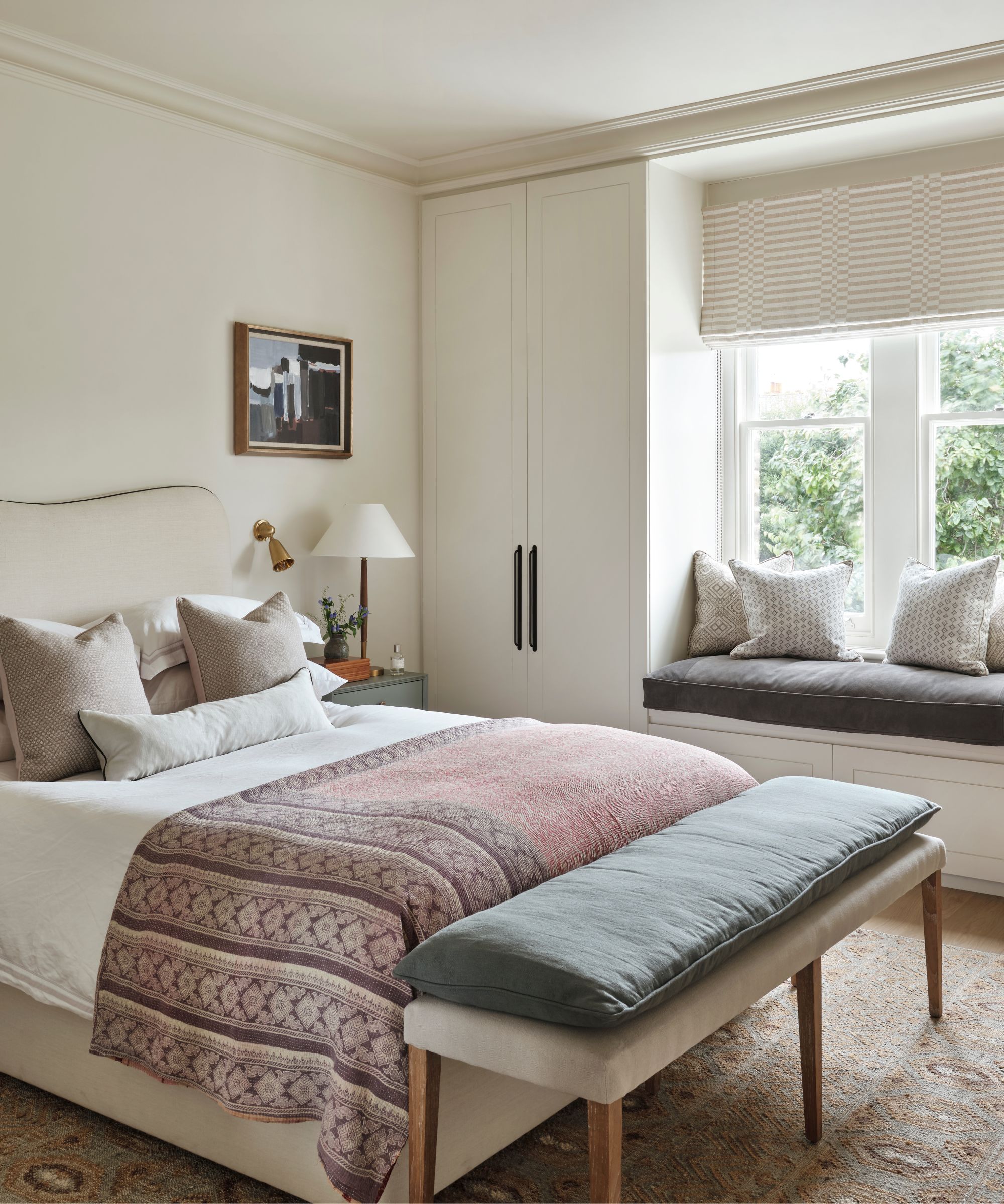
'The Parisian 'Promenade' palette is calming yet balanced as the Creme and Ivory provide a neutral base to be balanced out with the cooler tones of the French Moire and Chaise Mauve while the Parisian Patina and Perle Noire ground the palette,' explains interior designer at De Rosee Sa, Eliza Davey.
'The balance of tone and color creates a sense of harmony within a room. These colors provide the base tone, middle tones, and deeper accent colors that bring it all together as can be seen in this bedroom [above]. The palette results in a calming space, but not cold as the mauve tones in the throw balance out the soft green of the bed bench and bedside with the deep grey on the window seat and ironmongery detailing offset with the soft blue in the artwork.'
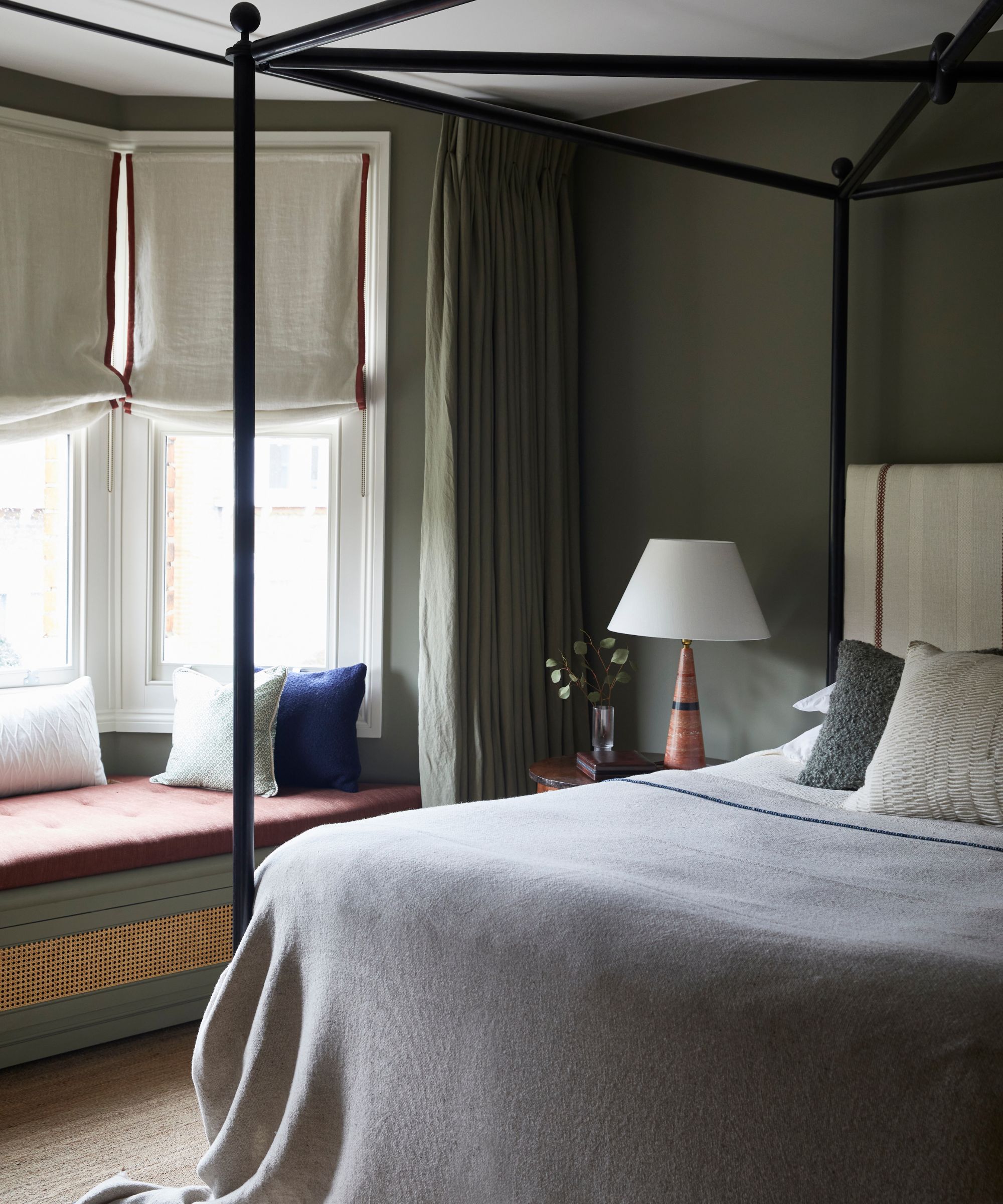
Dark green bedroom with window seat
Murude Katipoglu, Founder of design studio MURUDÉ also praises the palette for the easy-to-use, yet impactful combinations, explaining: 'Our design studio is known for creating spaces that are both calm and inviting. We love working with neutral color palettes, but we also enjoy incorporating muted shades of green and blue tones into our designs to add visual interest and a distinct identity. Both green and blue hues have a calming effect, enhancing the serene atmosphere of our spaces.'
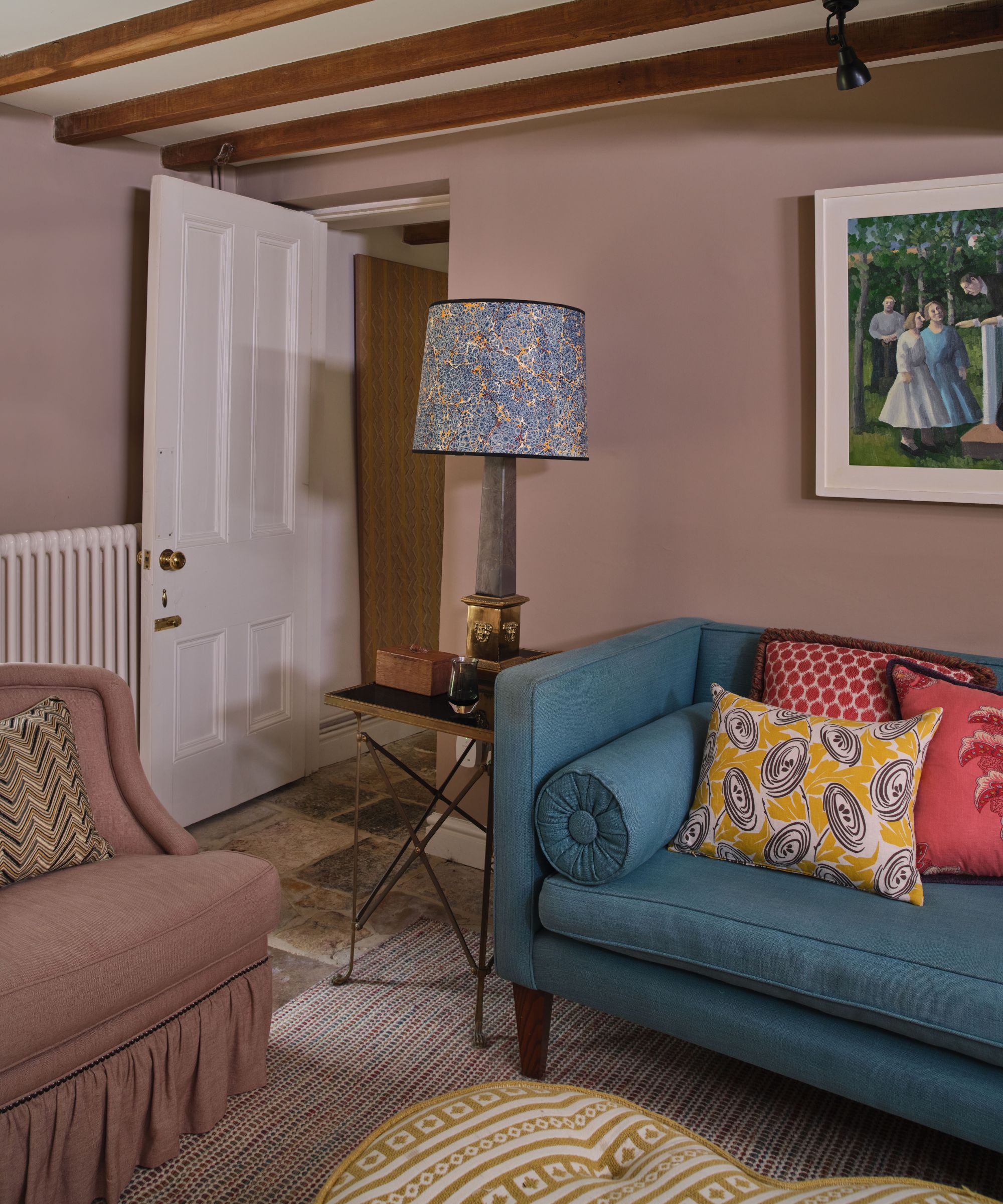
So how would you use the designer-approved Parisian Promenade Palette? I think it's a fail-safe color palette and you can't really go wrong with it. Benji makes a good point however you do have that darker shade in there, Perle Noir, and even the green, Parisian Patina, is on the deeper side. So there is the potential to be quite dramatic with it.
'It'd be interesting to see how the colors were ultimately used as there's a lot of different looks you could go for here. By making the black paint the dominant shade the impact in the room would be most dramatic; if however, the dusky pink was the lead color the effect would be way softer.'
'However, something to be aware of if you are going to let the more neutral, softer colors be the stars. When embarking on a project where subtle colors like these are to be combined, the importance of texture is going to really play its part.'

Benji Lewis is a well-established UK-based interior designer whose clients come to him for his creative thinking and reliability on the delivery of their projects. Benji studied French and Spanish at Oxford Brookes after which he spent considerable time working and gaining a good understanding of period furnishings at Bonhams auctioneers in Knightsbridge.
If you are after an effortless, soft color scheme the Parisian Promenade palette is the perfect place to start. It's a great example of how just slightly departing from a totally neutral scheme and adding in some cooler, earthier, and darker shades can add instant interest and a touch of drama too. It's calming, cool, and effortless, just as you would expect from a Parisian-inspired color scheme.

I am the Head of Interiors at Homes & Gardens. I started off in the world of journalism in fashion and luxury travel and then landed my first interiors role at Real Homes and have been in the world of interior design ever since. Prior to my role at H&G I was the digital editor at Livingetc, from which I took a sabbatical to travel in my self-converted van (not as glamorous as decorating a home, but very satisfying). A year later, and with lots of technical DIY lessons learned I am back to writing and editing, sometimes even from the comfort of my home on wheels.