Introducing Farrow & Ball x Kelly Wearstler: The California Collection – a palette of 8 fresh, sun-soaked hues
The chic designer collaboration celebrates the beautiful colors of California and will add a vibrant, uplifting element to your home...

Design expertise in your inbox – from inspiring decorating ideas and beautiful celebrity homes to practical gardening advice and shopping round-ups.
You are now subscribed
Your newsletter sign-up was successful
Want to add more newsletters?
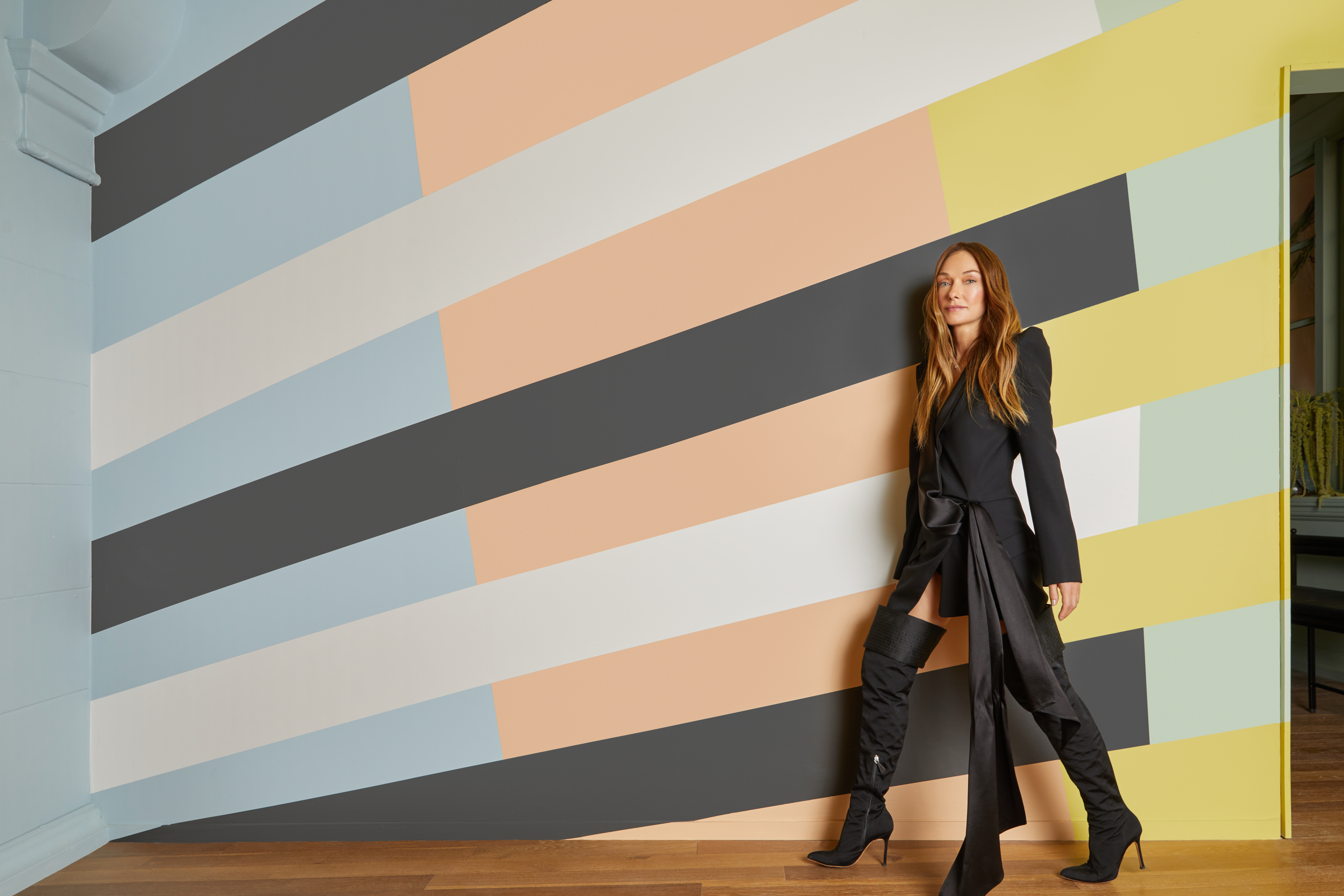
Get excited because the new Farrow & Ball x Kelly Wearstler collaboration is set to land online this week – and it’s eight gorgeous new colors full of the joys of spring. The range is called The California Collection, is the first palette created by an external designer since the paint company’s founding in 1946, and is launching during the brand’s 75th year of business.
The beautiful new hues will have you reaching for the roller, and are all inspired by the landscape of California (from its lemon and palm trees and blue skies to its salty sea air) and the Pacific’s soft-sand beaches.
See: Paint ideas for every room – how to choose the best paint colors every time
Article continues belowKelly Wearstler’s love of color has been a hallmark of her career, and she has used Farrow & Ball in her projects for more than two decades. Her debut collection will live as its own palette and effortlessly complement the carefully curated hues of the existing line of 132 colors. Underpinned by the Farrow & Ball ethos of sustainability, each shade is eco-friendly, low-VOC, water-based, and beautifully packaged in a recyclable tin.
Kelly says: 'I always say living without color is like living without love, so it’s been a dream to partner with Farrow & Ball on a collection of paint that celebrates the emotions color can evoke.
‘Color is the spirit of a room, and provides expressive power to transform a space with your personal voice, whether you’re painting all of your walls, or just one.’
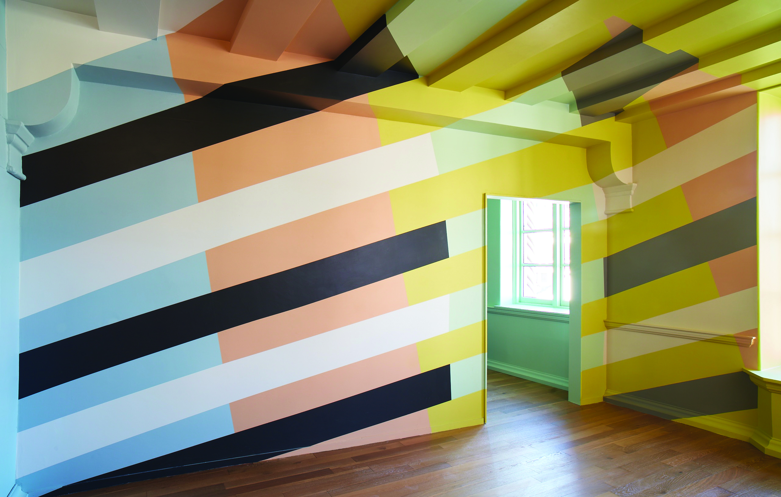
The palette presents a series of harmonious colors that represent a variety of moods, such as the earthy feel of Citrona, the muted dreamlike state of blue-grey Hazy, the fresh green of Palm, or the easygoing warmth of Faded Terracotta.
Design expertise in your inbox – from inspiring decorating ideas and beautiful celebrity homes to practical gardening advice and shopping round-ups.
In keeping with Wearstler’s belief that ‘black and white are colors too,’ the palette also includes tone-setting neutrals in the form of Tar, an off-black; Sand, a warm white with depth and complexity; and Salt, a bright, crisp white reminiscent of the crystalline layer left behind by the winds of the Pacific Ocean.
4 of our favorite Farrow & Ball x Kelly Wearstler colors
The California Collection is rooted in Kelly Wearstler’s belief that colors found in nature resonate on a visceral level, providing a sense of serenity, an innate recognition, and a feeling of belonging in the surrounding environment.
In crafting the palette, she was inspired by the light of the Pacific and the landscape of California, resulting in a modern, American continuation of the Farrow & Ball tradition of celebrating colors in the local landscape.
Here are our four favorites...
1. Citrona
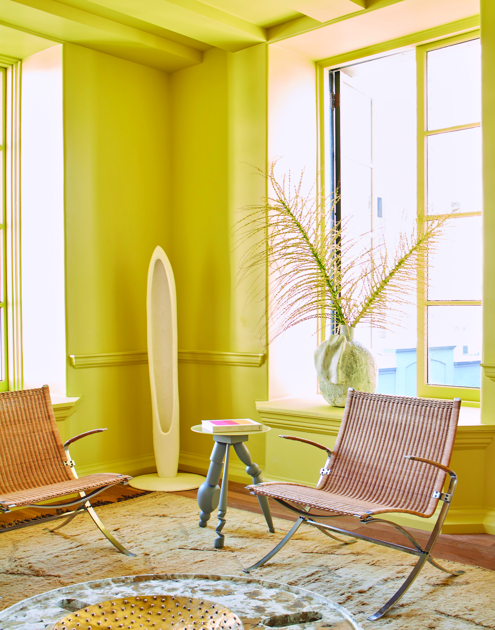
Inspired by the lemon trees that thrive in California’s temperate climate, this softened citrus shade is an earthy, contemporary take on true chartreuse.
2. Palm
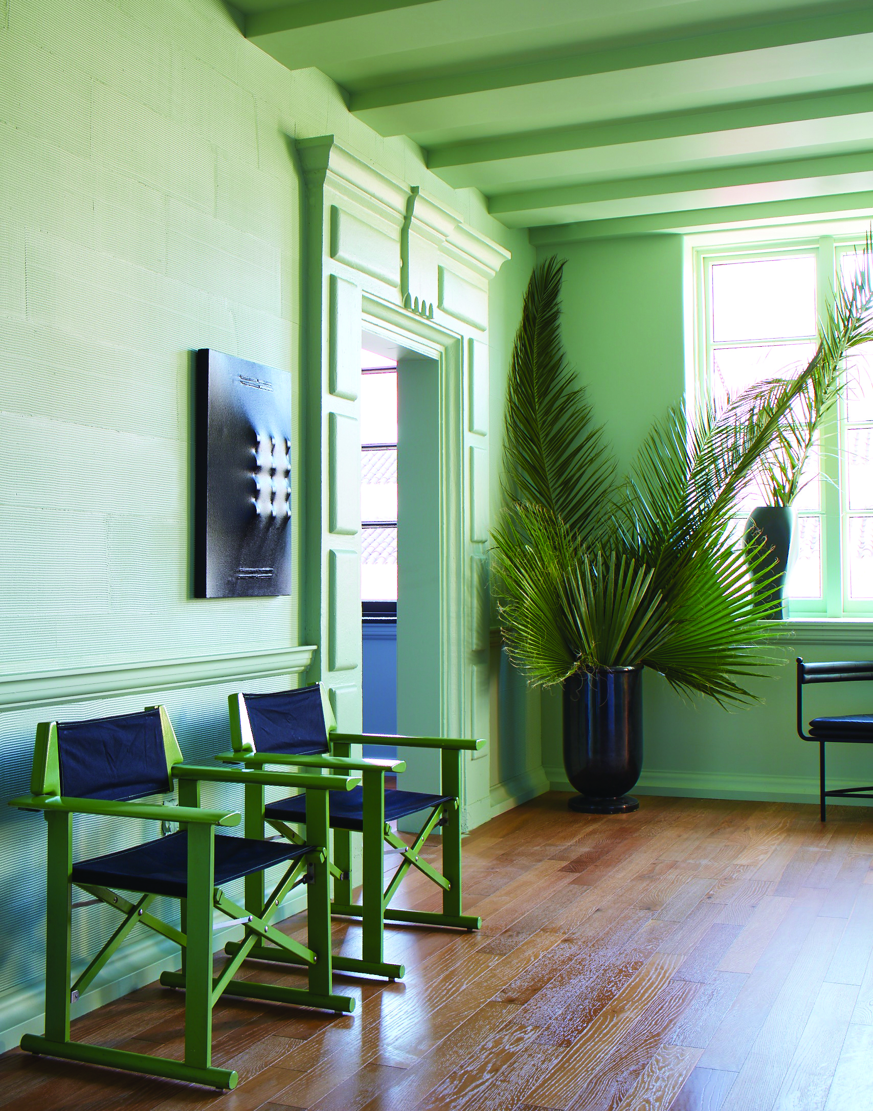
This fresh green is a love letter to the iconic palms that dot the Los Angeles skyline. It has a desaturated quality, as if always being seen in the clear, bright light characteristic of California, that makes it perfect for a green kitchen or hallway.
3. Hazy
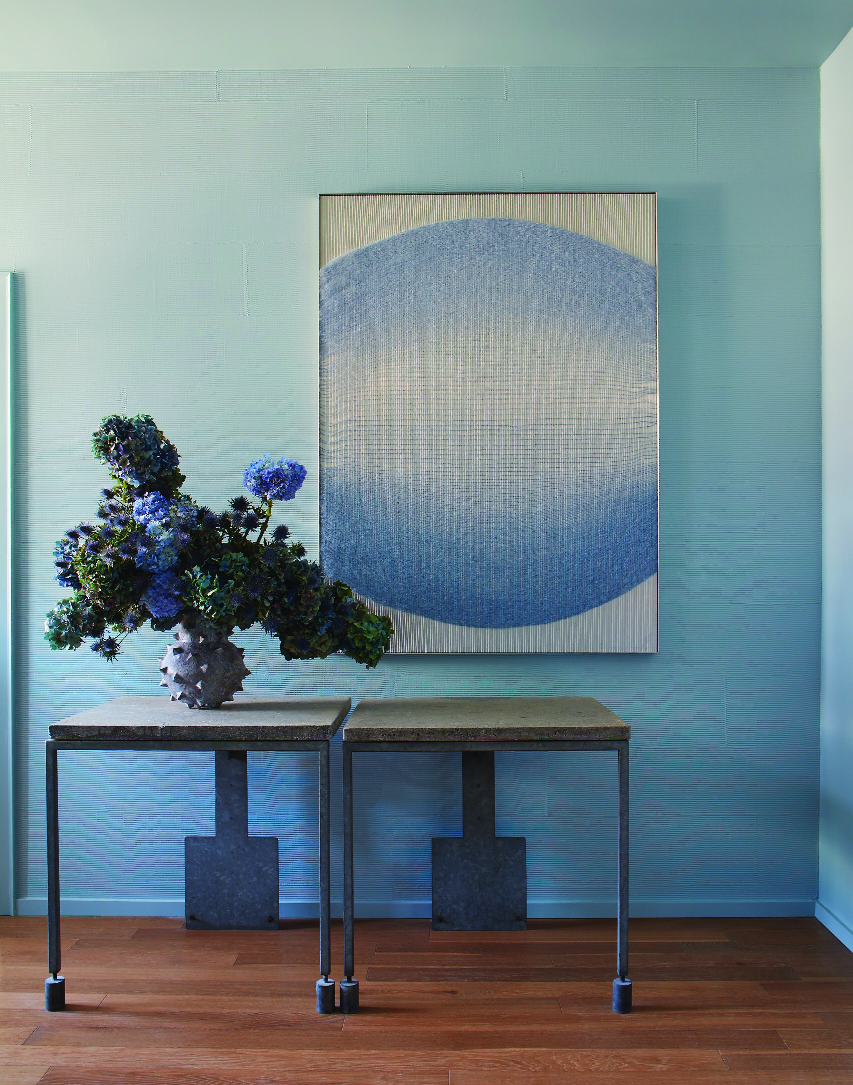
This muted blue-grey is inspired by the marine layer that brings drifts of dreamy fog inland, capturing the fresh feeling of early mornings on the coast.
See more on decorating with blue in our guide.
4. Faded Terracotta
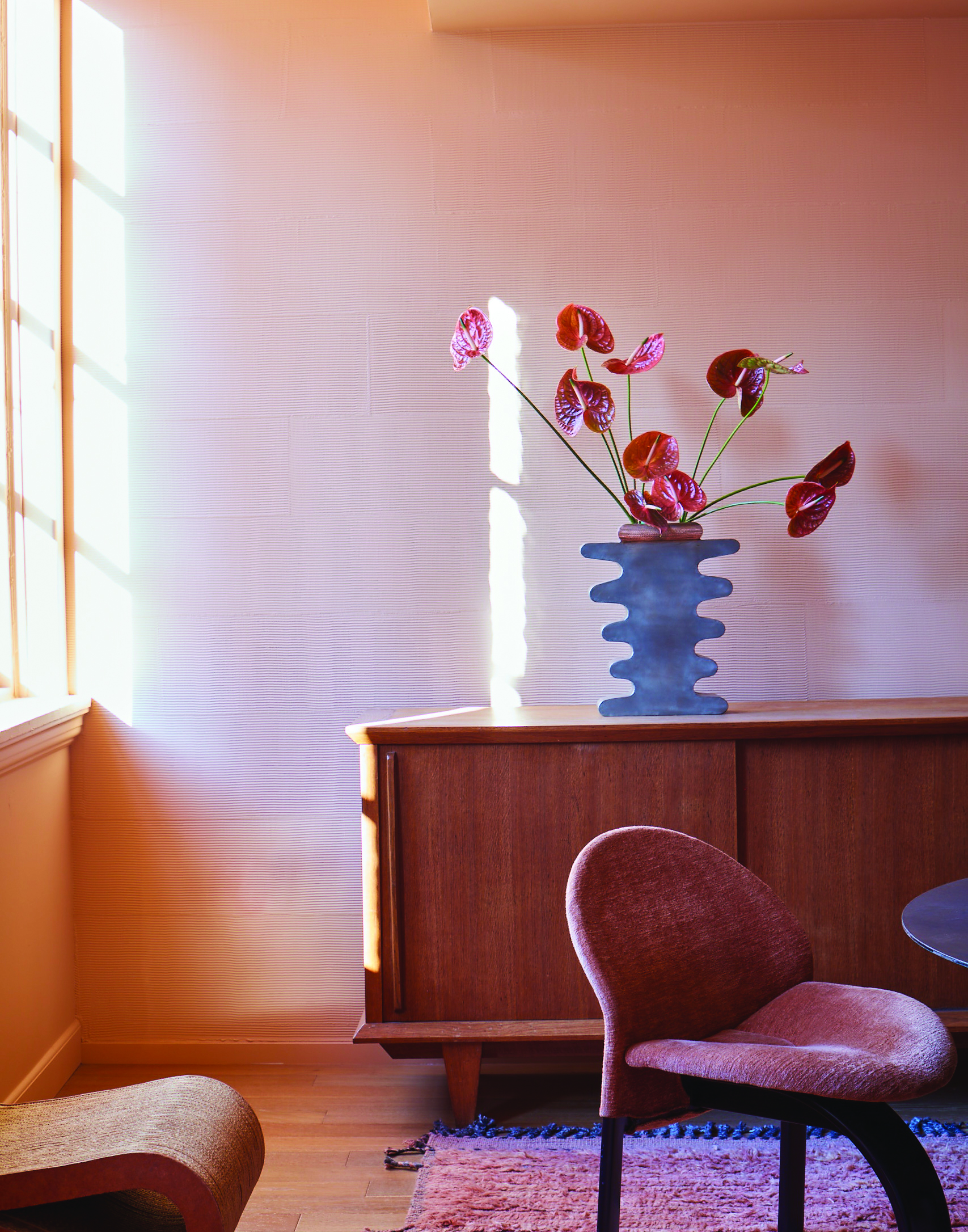
The singular colour of terracotta pots and tiles baked to a pale hue by the California sun. An easygoing shade characterised by softness and warmth.
Available to shop online from 4 March at Farrow & Ball.

Ruth Doherty is an experienced digital writer and editor specializing in interiors, travel and lifestyle. With 20 years of writing for national sites under her belt, she’s worked for the likes of Livingetc.com, Standard, Ideal Home, Stylist and Marie Claire as well as Homes & Gardens.