This inspiring Victorian renovation showcases a clever use of space and light
Clever design tricks were used to create a bright, welcoming interior, from the loft to the basement, in this expertly redesigned family property.

Loft and basement extensions are difficult to perfect. The former risk being all awkward angles and unusable corners, while the latter can result in a dark, cavernous space.
See more inspiring house tours in our Spaces section
THE PROPERTY
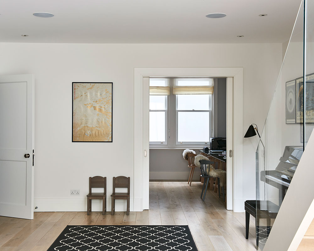
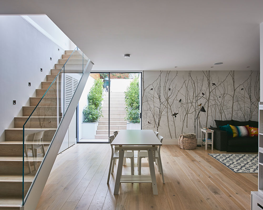
‘My design for this space, which includes a media and dining area, and an office, was dictated by the fact that, from here, the owners wanted to be able to easily access the kitchen-dining room, and the garden, on the floor above,’ says Alex Tart, Architect. ‘We kept the original staircase, with a glazed side panel, between the basement and the ground floor.’
Article continues below‘I worked with the owners when they first renovated their home but, a year or so after they moved back in, the owner asked me to help her make further changes,’ says Marilyn Johnson. ‘After living with the very pale shades of grey that we had originally chosen, they had come to the conclusion that the rooms in the extension needed to have more definition.’
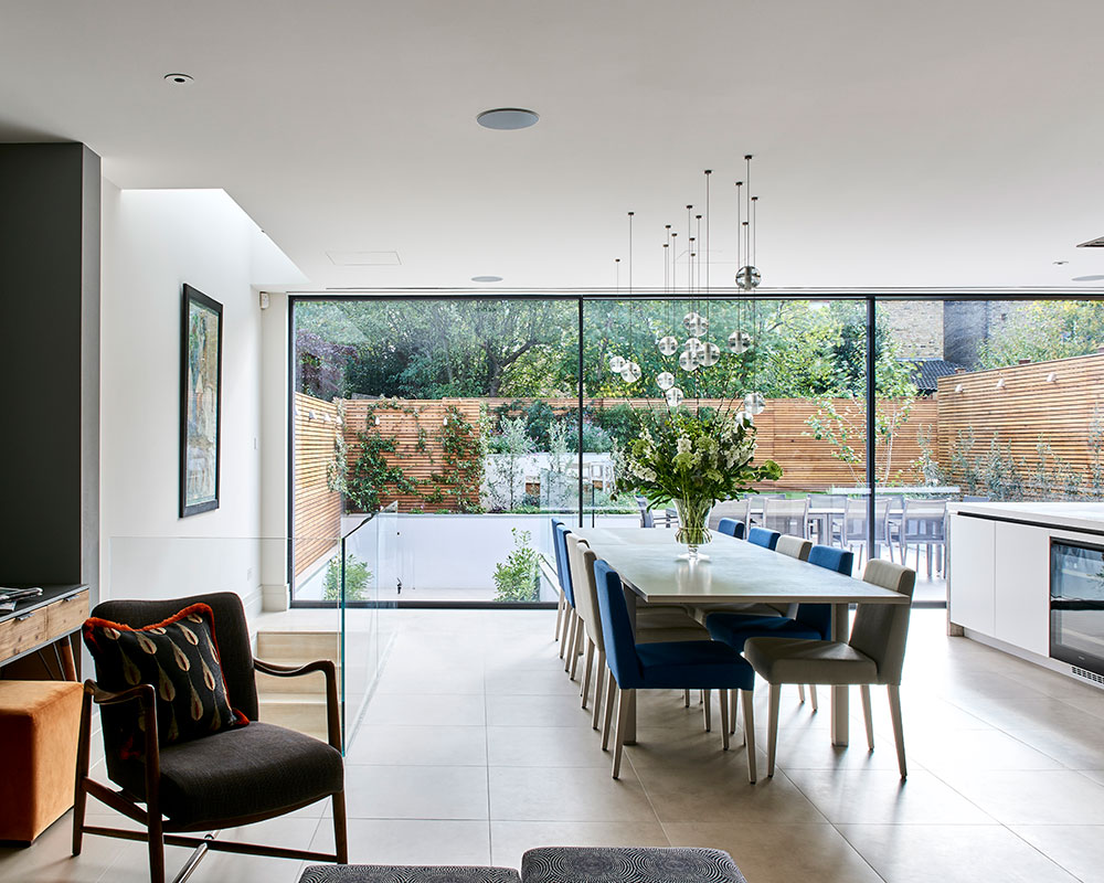
DINING ROOM
Natural light floods the new open-plan living space at ground floor and basement levels, thanks to the glazed rear wall and lightwell. For artificial light, the homeowner opted for multiple pendants. ‘We carefully mapped out the combination of lamps needed to light the table evenly without sacrificing the beauty of the random arrangement,’ explains the owner.
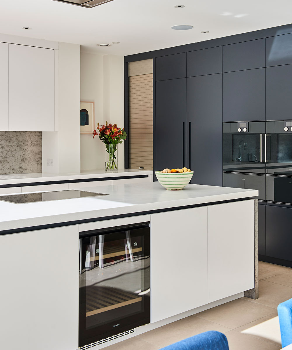
KITCHEN
Interior designer Marilyn worked with Holloways of Ludlow to create the bespoke splash back and island unit sides. ‘They are made of a metal wall covering that has been laminated onto the base construction material and then lacquered, making a washable and very durable finish.’
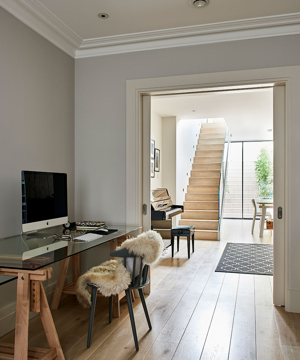
HOME OFFICE
The homeowner’s kept this area for home working light and airy by opting for simple trestles and a glass top instead of a traditional desk.
Design expertise in your inbox – from inspiring decorating ideas and beautiful celebrity homes to practical gardening advice and shopping round-ups.
MEDIA AREA
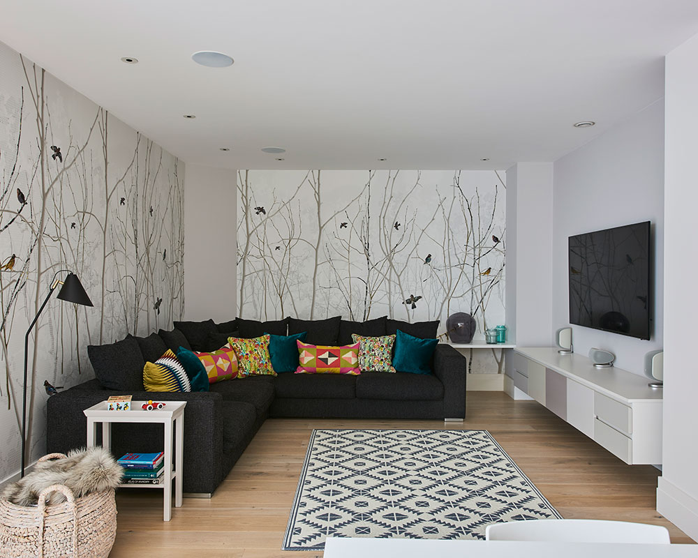
The sleek glass-sided staircase to the basement is one of the most successful features of the redesign, linking it to the kitchen upstairs. A striking contemporary wallpaper defines the living area, where paint colours were chosen with grey care to customise the media unit.
KITCHEN-DINING ROOM
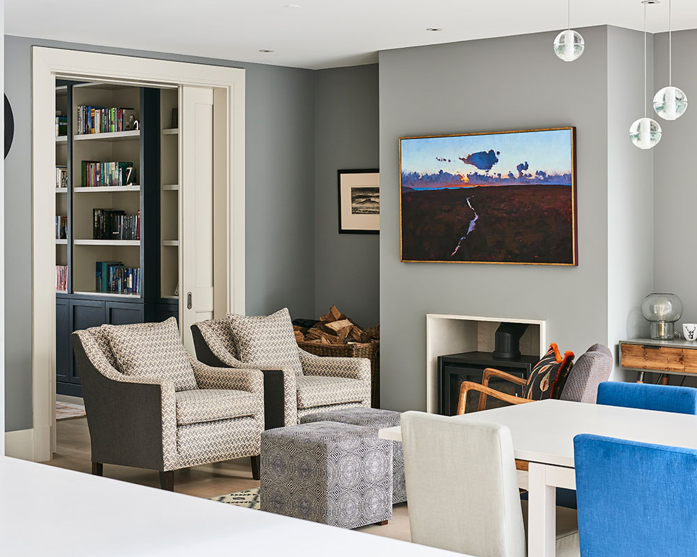
The owner decided the seating area needed to be delineated from the rest of the space. Dark grey was introduced, which also helps to foster a cosier feel.
LIVING ROOM
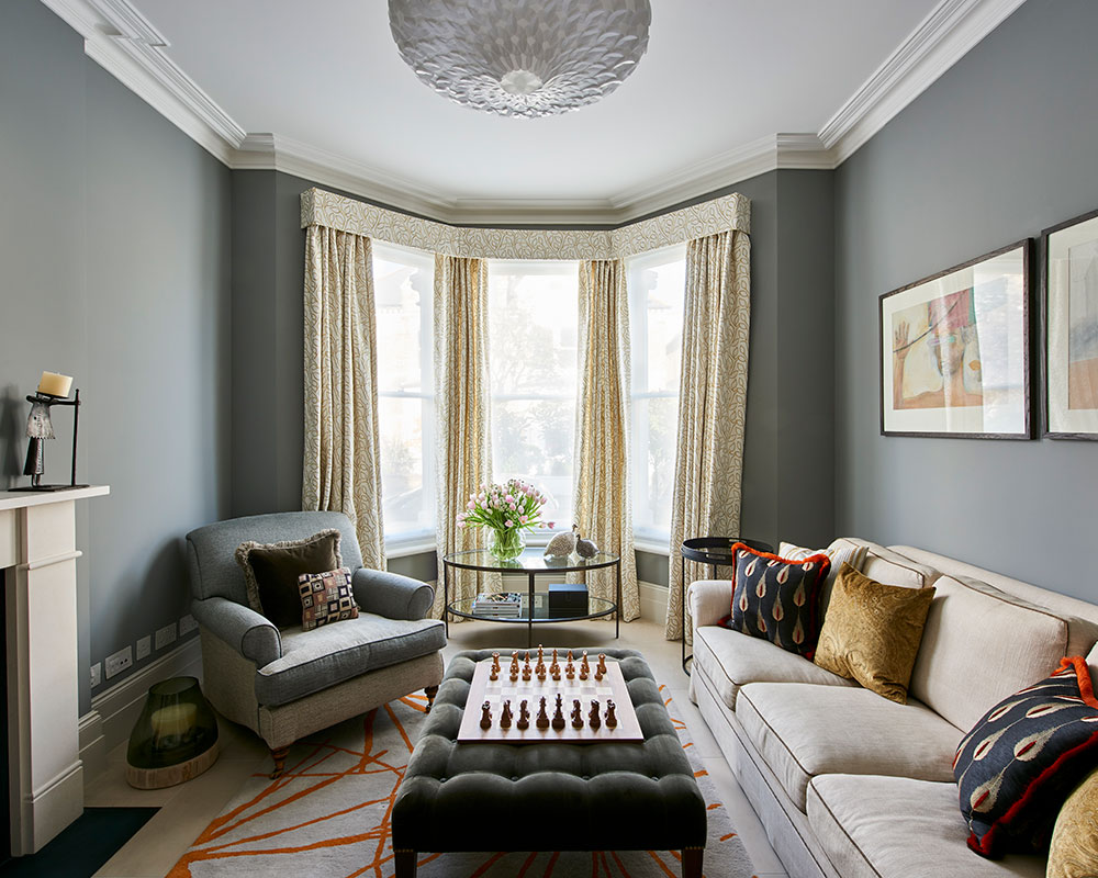
The armchair was a present from the ownerss mother. It was made for a larger house, so Marilyn had it reupholstered in two colourways of the same fabric, using the darker tone on the seat and back to help make it look a better size for this room.
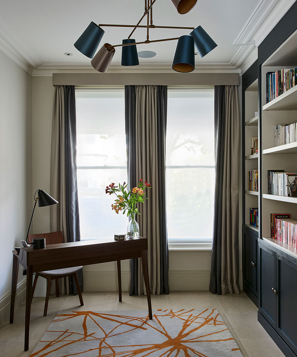
STUDY
Warm metallics and orange hues add a subtle glow to this elegantly restrained scheme.
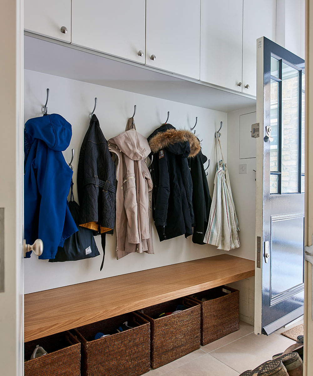
BOOT ROOM
The layout on the ground floor was, in part, planned around the owner’s request for a boot room with access from the street. The space is perfectly positioned between the kitchen and the stairs leading to the bedrooms.
See:An urban retreat in London, owned and designed by Louise Bradley
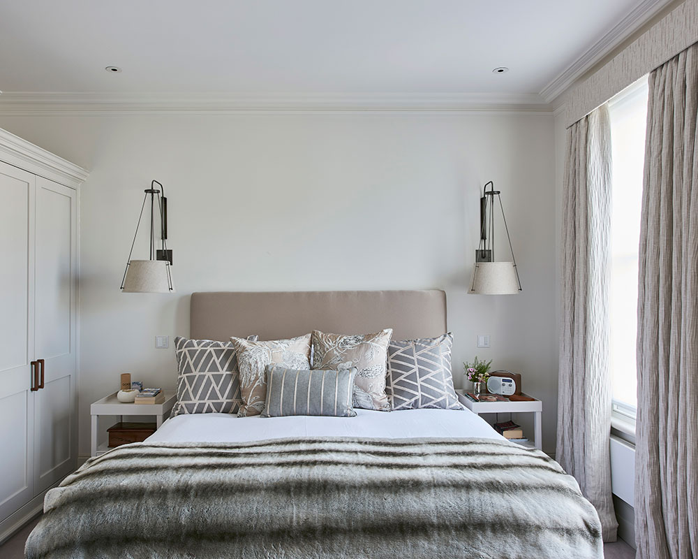
MAIN BEDROOM
‘I don’t like cluttering bedside tables with lamps,’ says the owner. ‘I intended to have pendant lights on either side of our bed, but I forgot to specific this in my brief, so the wiring wasn’t suitable. I’m glad this happened, though, because I’ve fallen in love with these wall lights.’
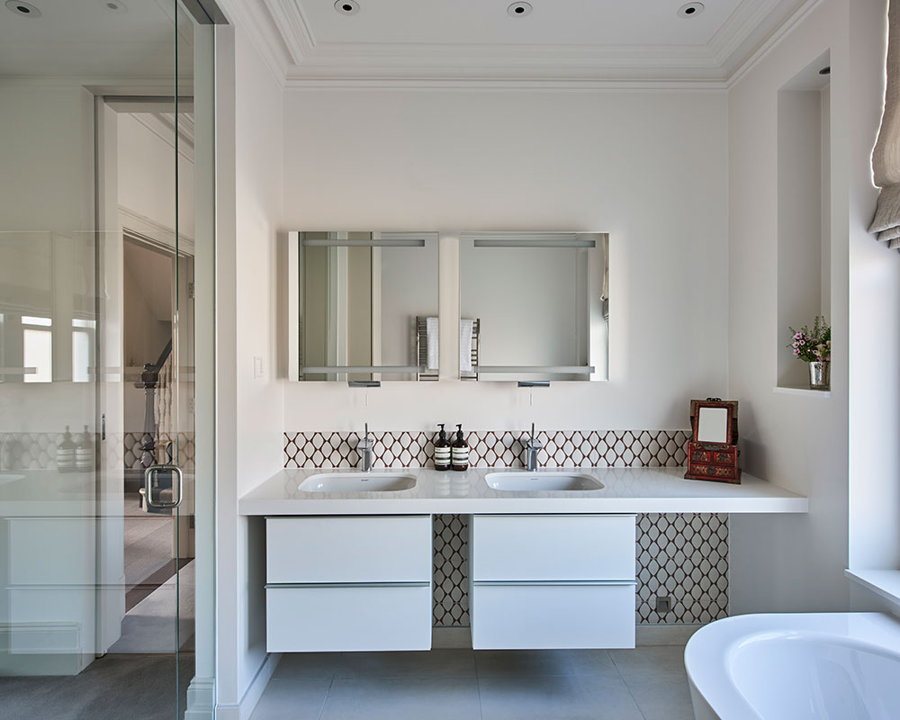
MAIN BATHROOM
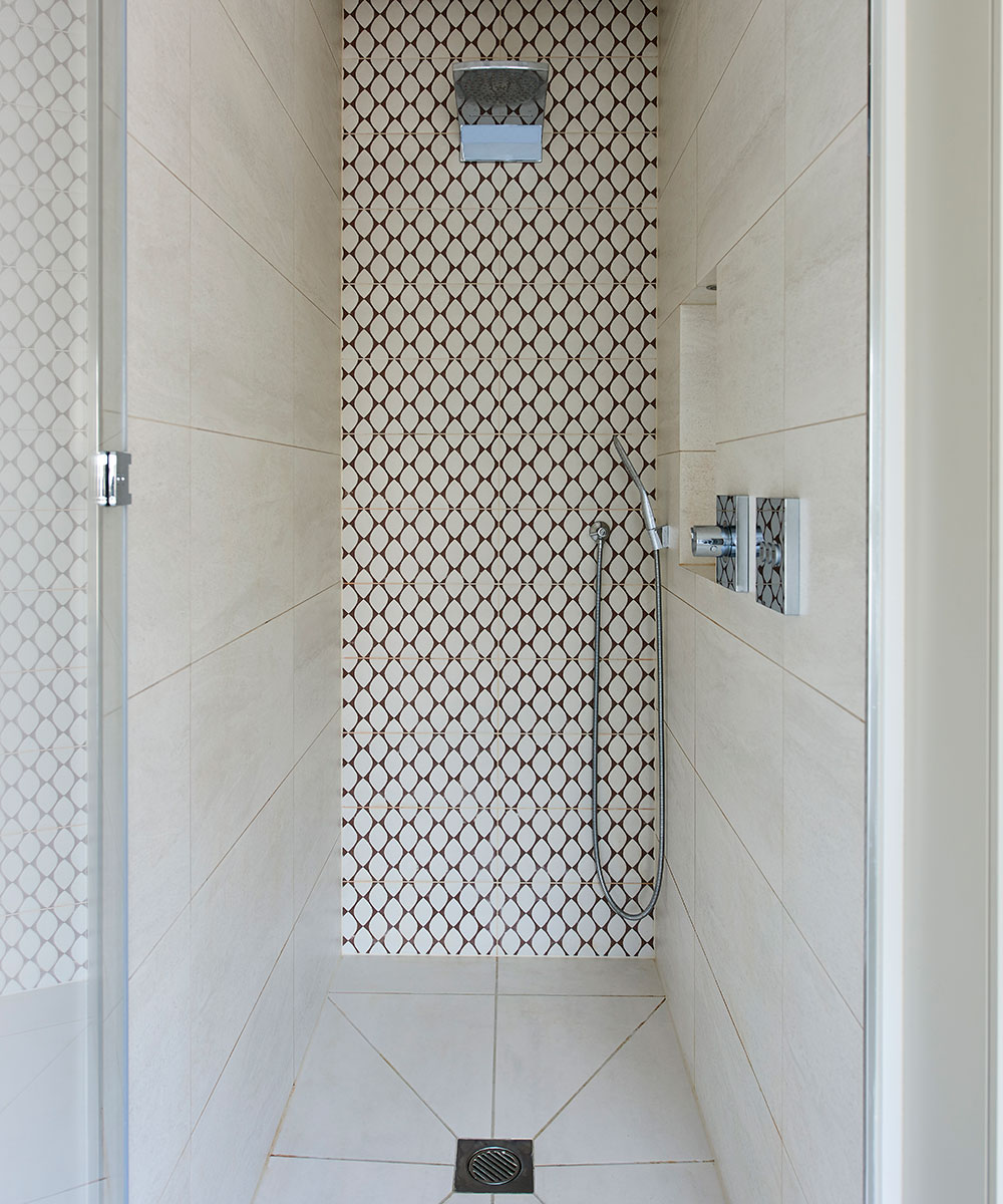
An almost invisible glass wall and pivot door separate this space from the dressing room while allowing natural light to flow through.
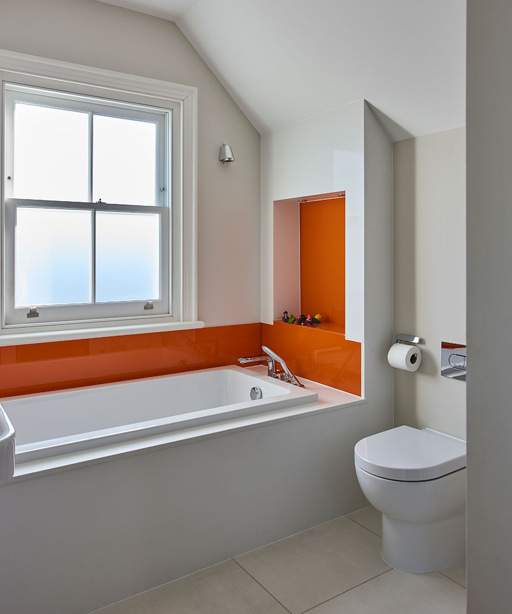
BOYS’ BATHROOM
Keen to keep the look here simple yet cheerful, the owner requested that the glass splash backs be back-painted in a deep orange hue.
See:A beautifully renovated Georgian home in London
DAUGHTER’S BEDROOM
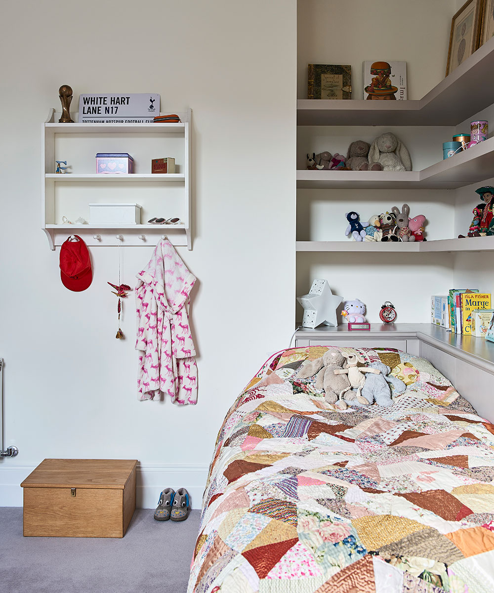
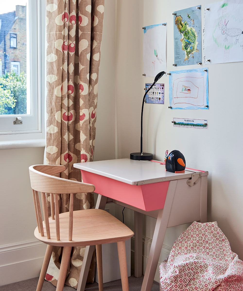
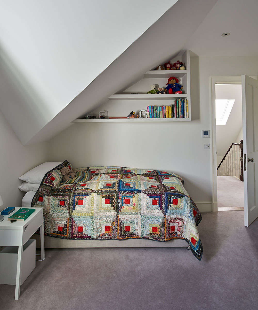
The shelving behind the bed was the owner’s idea, as she has the same arrangement in her bedroom as a child and loved it. The desk was found on eBay; the legs were cut down to make it child-friendly and it was painted to suit the scheme.
BOYS’ BEDROOMS
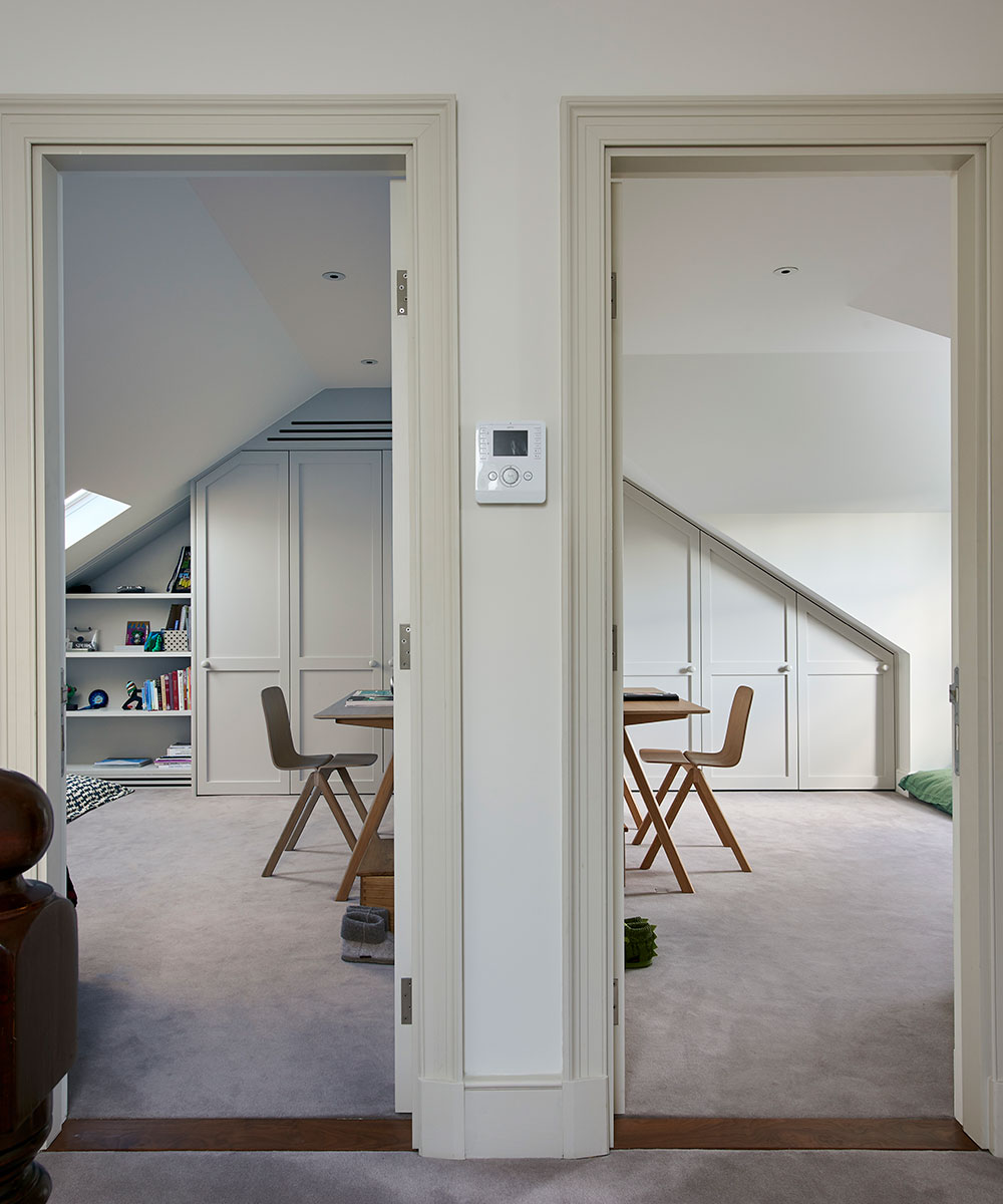
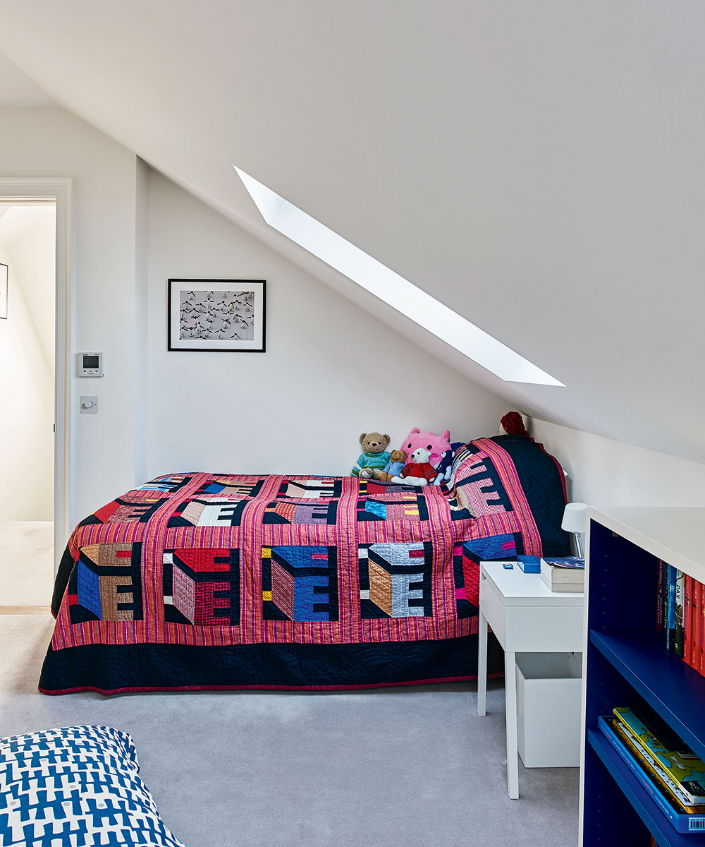
Colour differentiates the boys’ almost identical bedrooms, with quilts adding vibrancy to the simple schemes.
Photography/ Jonathan Gooch
Interior designer/ Marilyn Johnson
Architect/ Alex Tart

Jennifer is the Digital Editor at Homes & Gardens, bringing years of interiors experience across the US and UK. She has worked with leading publications, blending expertise in PR, marketing, social media, commercial strategy, and e-commerce. Jennifer has covered every corner of the home – curating projects from top interior designers, sourcing celebrity properties, reviewing appliances, and delivering timely news. Now, she channels her digital skills into shaping the world’s leading interiors website.