Why I Hardly Ever Use Pattern, And If You Want a Timeless Home You Should Focus On This Instead
I tend to avoid prints in my designs because they date quickly, whereas palettes last and last
Design expertise in your inbox – from inspiring decorating ideas and beautiful celebrity homes to practical gardening advice and shopping round-ups.
You are now subscribed
Your newsletter sign-up was successful
Want to add more newsletters?
Interior designer Katie Harbison is one of Homes & Gardens' new Editors-At-Large for By Design, sharing her thoughts on decor. See the rest of her articles here.
I want to be clear – this isn’t a criticism of the pattern. Used thoughtfully, it can bring charm, personality, and narrative to a space. Pattern can energize a room, introduce playfulness, or create a visual moment that feels personal to the end user. But if you’re familiar with my work, you’ll know that I approach design through a lens of longevity, always asking myself: How will this space feel ten years from now?
Patterns are beautiful, but palettes are enduring. For me, a home that feels timeless and relaxed relies more on the harmony of color, tone, and materiality than on print alone. In this piece, I want to explore how I think about color, materiality, and atmosphere – and why choosing palette over pattern can be one of the most transformative decisions in the design process.
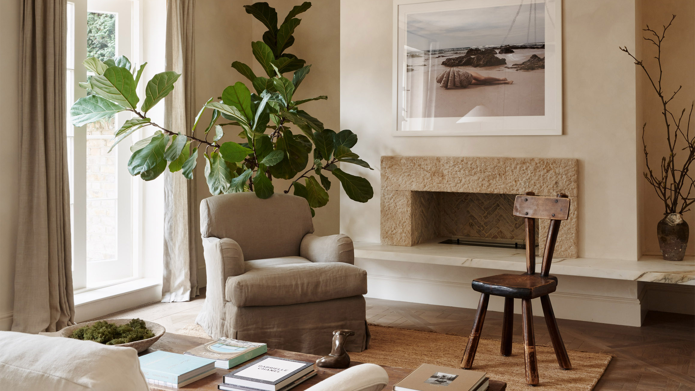
Article continues belowIn my previous article on the three materials that make a room look magical, I discussed three materials I return to again and again: linen, oak, and stone. These form the foundation of nearly every project we undertake – materials that age gracefully, feel authentic, and deepen in character over time rather than fade or visually overwhelm. They offer a quiet, neutral base for the palette – something you can build on, layer, and repeat throughout a home with subtlety and intent. This is where the philosophy of ‘palette over pattern’ truly begins. I choose materials that are real, that last, and that invite calm rather than demand attention.
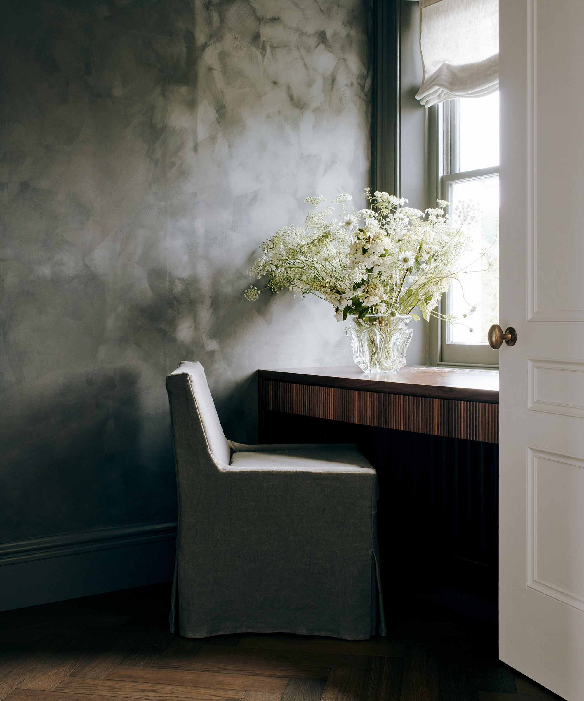
When a home feels cohesive, it’s almost always because a clear palette is quietly anchoring every space. That doesn’t mean every room needs to look the same, but there should be a unifying thread – a sense of continuity that carries you from one room to the next. Clients often tell us their home feels ‘more grounded’ after we’ve completed a project. It’s not that we’ve dimmed their personality; rather, we’ve distilled it – creating clarity, and with it, a sense of calm.
Repetition of room color ideas offers what I often call visual rest. It allows the eye to move through the home without abrupt transitions or competing statements. A restrained, harmonious palette lets the architecture and materials take centre stage. Moldings, joinery, flooring transitions, sightlines into the next room – they all read more beautifully when supported by a controlled palette. It’s the difference between a home that feels curated and one that feels chaotic. Pattern, when used sparingly, becomes a feature rather than a distraction.
Most importantly, a cohesive palette creates emotional calm, which is ultimately what we aim to achieve in every project. As a designer, it’s the feeling I want our clients to experience in their home: a place to reset, to exhale, to rest. Homes are not only physical, but they are also emotional. When you define a palette and stay consistent, you’re building an emotional foundation – designing spaces where the mind can settle, where daily life feels softer, where breathing feels easier.
Design expertise in your inbox – from inspiring decorating ideas and beautiful celebrity homes to practical gardening advice and shopping round-ups.
This, I believe, is exactly how home should feel.
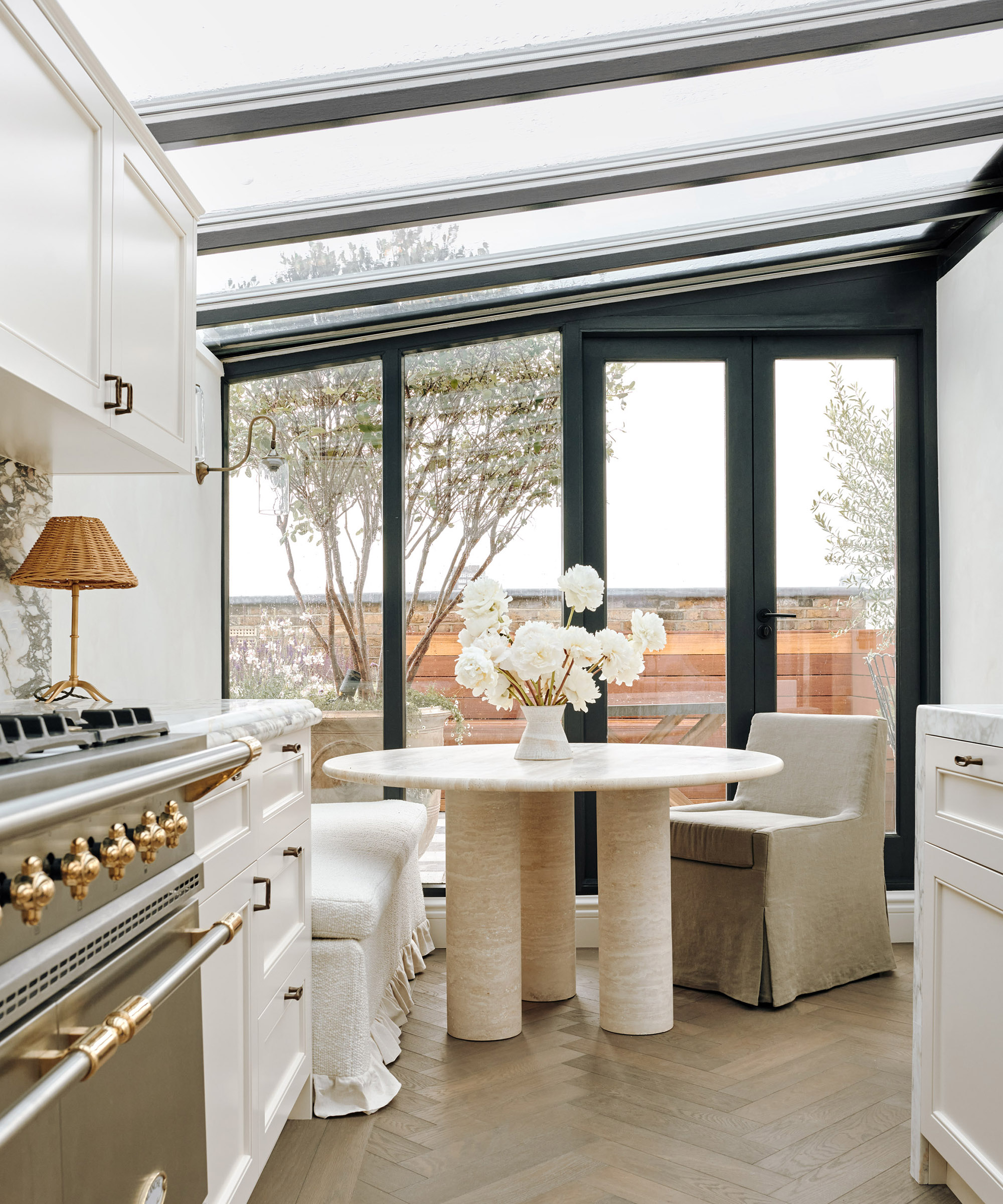
Trends often lean heavily into patterns because they are expressive and immediately noticeable. But trends are temporary, and pattern-led schemes can date quickly. My goal is always to design homes that will feel as relevant in ten years’ time as they do today.
A well-chosen palette - thoughtful, layered, tonal – is what creates longevity. It remains elegant as years pass, even as furniture changes, families grow, and the home naturally gathers memories and personal layers of its own.
I often draw on my time in Florence when I think about timelessness. Italian interiors possess a relaxed confidence; they don’t shout. They rely on tone, texture, and materiality. Colors drift effortlessly from room to room, creating serenity without needing pattern to hold the interest. That layered, tonal ease is what I strive to bring into every project.
Pattern isn’t the enemy. It simply needs a disciplined framework in order to shine. When a room is already busy – with competing colours, heavy tones, or too many statements – the pattern loses its impact. But within a controlled palette, it becomes a moment of intrigue. Some of my favorite places to use pattern – where personality and story can unfold – are powder rooms, Persian-style rugs, marble veining, timber flooring patterns, and wallpaper for children’s rooms. Even then, I keep the foundation quiet, so the pattern speaks softly.
When the palette is controlled, the materials get to do the talking. Veining in stone becomes more pronounced. Reclaimed wood feels richer. Linen and wool appear more tactile. The subtleties of craftsmanship – bespoke joinery, decorative plasterwork, stone detailing – come forward with clarity. In my work, materiality is the main event. Pattern is secondary. Palette is primary – the foundation of our designs.
Because ultimately, ‘palette over pattern’ is not about avoiding pattern – it is about designing with intention. It is about shaping a home that feels cohesive, calm, and deeply personal.
A palette-led approach supports everything I believe about design: timelessness over trend, materiality over ornament. When you ground your home in tone, texture, and natural materials, you give yourself room to live freely within it – without ever feeling overwhelmed. You create a space that supports you, reflects you, and evolves with you.
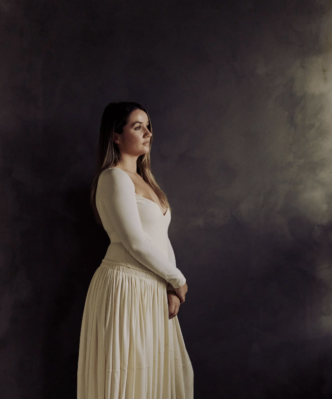
Katie Harbison is the founder and creative director of Katie Harbison Studio, a New York-based interior design practice known for its refined yet characterful spaces that balance timeless elegance with considered detail. With a background in both design and fine art, Katie brings a layered, intuitive approach to every project, marrying architectural sensitivity with personal storytelling.
Her work has garnered national attention and has been featured in leading publications such as Homes & Gardens, House & Garden, Elle Decoration, The Modern House Journal, and The Sunday Times Style. With a growing client base across the UK and internationally, Katie is quickly becoming recognised for her ability to translate mood and memory into richly layered rooms that feel both intimate and enduring.