Martha Stewart’s 1980s Powder Blue Kitchen Is the Design Blueprint for the Modern Maximalist Movement – It's Never Felt More Inspiring
Decades on, Martha's confident use of color still inspires, and we've noticed this vintage tile idea making a comeback


Design expertise in your inbox – from inspiring decorating ideas and beautiful celebrity homes to practical gardening advice and shopping round-ups.
You are now subscribed
Your newsletter sign-up was successful
Want to add more newsletters?
Martha Stewart has been shaping the way we think about home design for decades, and even her earliest interiors continue to offer a wealth of inspiration. The queen of domestic arts clearly knows a thing or two about timeless design, and her 1980s kitchen is a perfect example of how a well-considered space can stand the test of time.
In a throwback snapshot shared on Instagram, Martha is pictured making pancakes in her vintage kitchen – but it wasn’t her recipe that caught our attention. Instead, it was the powder blue kitchen tiles that wrapped the countertop and oven. While the kitchen undeniably reflects its era, it also feels surprisingly current, serving as a reminder of the cyclical nature of interior trends and the lasting appeal of confident color.
If you’re looking for ways to introduce vintage charm and personality into your kitchen, Martha’s 1980s space offers plenty of inspiration. Here's why interior designers continue to admire this timeless tile idea now more than ever.
Article continues belowA post shared by Martha Stewart (@marthastewart)
A photo posted by on
Shop the Look

Inspired by Martha's retro kitchen? Get the look with these pastel blue tiles from The Home Depot. Choose white grout like Martha for a classic finish, or go modern with a bold, contrasting shade.
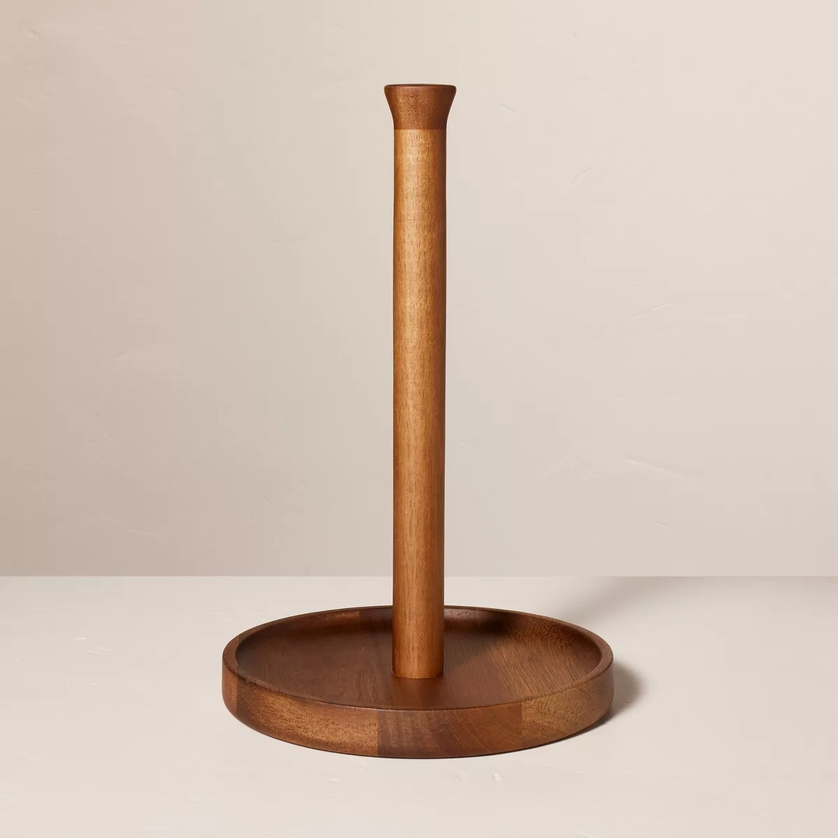
Besides the blue tiles, brown tones feature prominently in Martha's '80s kitchen. Dark wood offsets the powdery tone of the tiles so effectively, helping to create a balanced color scheme.
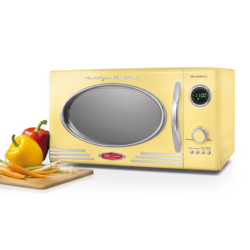
Commit to the retro theme with some vintage-style appliances, like this nostalgic microwave from Wayfair. If the 70s resurgence was the most prominent trends in 2025, then 2026 is sure to see a new decade transpire
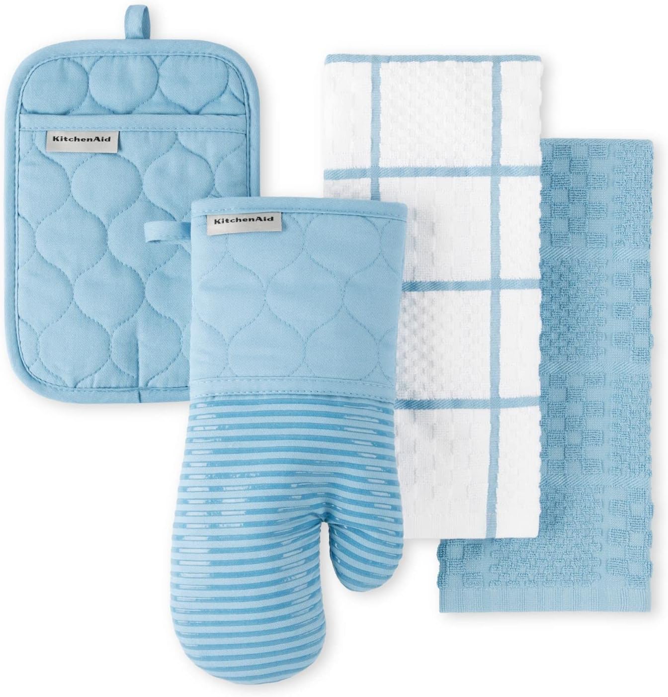
Upgrade your kitchen with the KitchenAid 4-Piece Pale Blue Set, inspired by the timeless sophistication of the 1980s. Its soft blue hue brings a refined, classic charm while seamlessly combining elegance with everyday practicality.
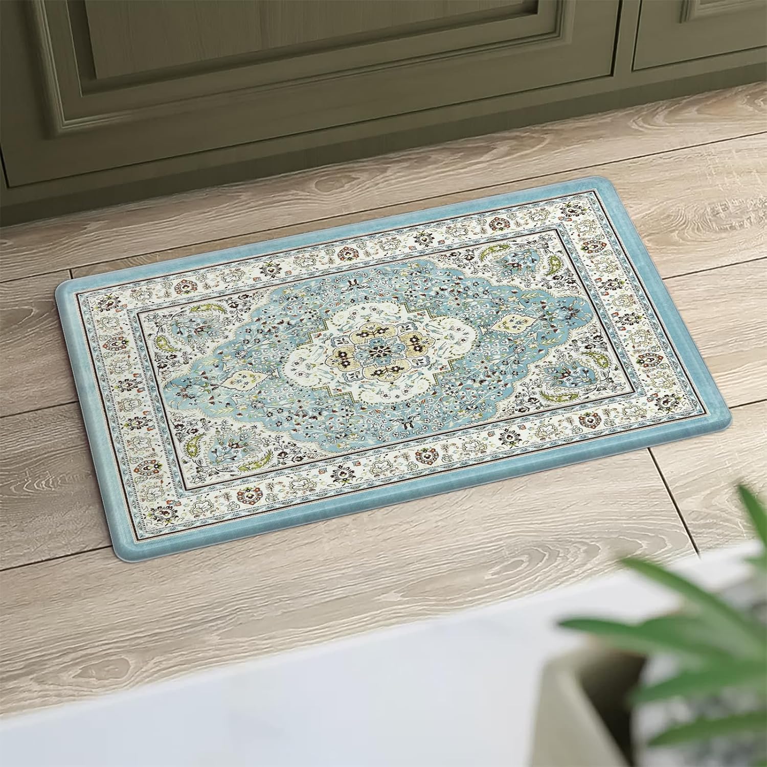
Designed to comfort tired feet, this waterproof, non-slip mat features a delicate pale blue floral medallion that brings a touch of elegance to any space. Ideal for kitchens, bathrooms, or laundry rooms, it blends supportive cushioning, safety, and timeless style.
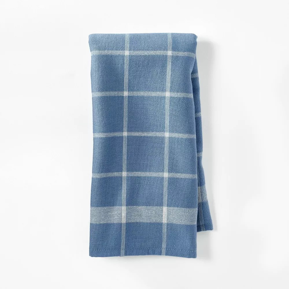
Made from 100% soft cotton, it offers a flat weave on one side and plush terry on the other for versatile everyday use. A handy hanging loop and machine-washable construction deliver easy care, practicality, and enduring kitchen style.
Square tiles are such a classic choice for a kitchen. Laid in a simple stack, they make a utilitarian tile option, but by choosing powder blue instead of white, Martha's brave use of color feels far more invigorating. Seen in a robin's-egg blue shade, they bring punchy pastel tones to the humble 80s kitchen.
'This particular shade in Martha Stewart’s kitchen is a very pale sky blue and is a great, tranquil choice, ideal for your beachside homes and coastal-style interior design, or in traditional homes when matching with pale beiges,' says Isy Jackson of Chelt Interiors. 'Nowadays, instead of white grouting, you can match the grout to the tile and achieve more of a color-drenching effect, which you may prefer as a more contemporary yet timeless look.'
If you've been tempted by the rise of vintage kitchens with charming, cottage-core-inspired decor, these tiles are a great way to get the look. As well as pairing with beiges, Isy says these robin’s egg blue-inspired tiles would look great with pastel lemony yellow, pastel coral pinks, and very light gray. 'For a sleek and refined look, combine blue ceramic tiles with grays, whites, and brushed nickel to create a sophisticated and balanced palette,' she says.
To recreate the look, search for 'milk tiles' in a 6-inch by 6-inch format. Follow Martha's lead and use them for a tile countertop idea, or use them to create a simple backsplash or windowsill. 'The calming tones of Robin’s Egg Blue will add a soft and soothing character to your home, and they pair so well with natural stone and neutrals as well as other pastel colors for those that are more daring with color palettes,' explains Isy.
Design expertise in your inbox – from inspiring decorating ideas and beautiful celebrity homes to practical gardening advice and shopping round-ups.
Simple and enduring, square tiles have a rare ability to transcend decades, promising to feel just as relevant 40 years from now as they do today. As Martha Stewart’s 1980s kitchen proves, this classic format brings an effortless balance of practicality and charm, lending spaces a vintage-inspired character that feels warm rather than dated.

Lilith is a freelance homes and interiors writer. As well as contributing to Homes & Gardens she's written for various other titles homes titles including House Beautiful and Livingetc.