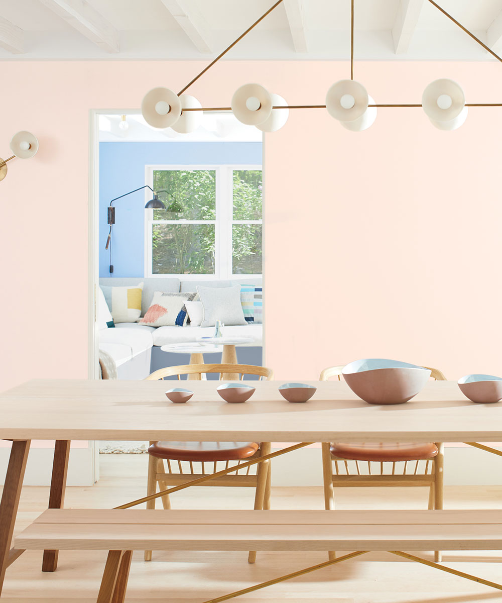
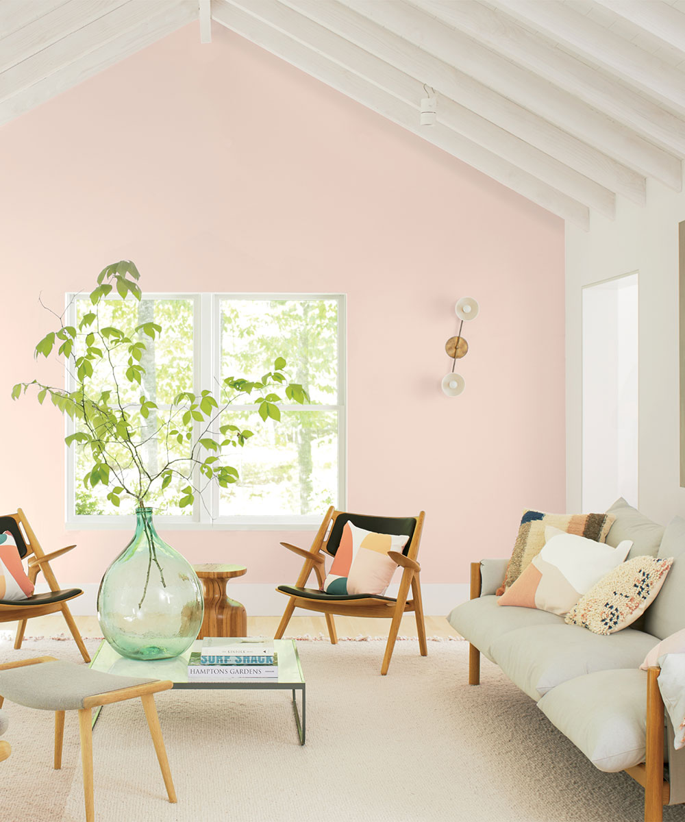
With the new decade fast approaching, this year’s choice for Colour of the Year was more important than ever for leading paint brand, Benjamin Moore. ‘What does 2020 mean? And how can we express that with a colour?’ These are the questions Andrea Magno, Benjamin Moore’s Director of Colour Marketing and Development and her team have been asking as they peruse the brand’s 3,500 shades – picking just one single hue is no mean feat.
See our news section for more exciting new launches

In an effort to reflect how the concept of a happy home will evolve in the years ahead, the experts have settled on First Light. A stark contract to last year’s more subdued choice (cool grey Metropolitan), this soft pink is both flattering and fun – not to mention projects a timely sense of positivity:
‘We selected First Light as our Colour of the Year 2020 to represent a new dawn of idealism, design and living,’ said Andrea Magno, Benjain Moore’s Director of Colour Marketing and Development. ‘It reflects a new definition of the home – a shift in mindset from the material to satisfying the core needs in life: community, comfort, security, self-expression, authenticity and ultimately, optimism’.

SeeFarrow & Ball introduces Colour By Nature... a collaboration with the Natural History Museum
There’s no denying love is in the air when it comes to pink. Once associated with cotton candy and reserved only for little girls’ rooms, it’s now evolved to become a mainstream colour usable in any space – whether as an accent or on all four walls. One might even go so far as to say it’s the new neutral:
‘Over the last few seasons, we’ve gradually seen neutrals with pink and red undertones taking over from our traditionally cooler greys’, says Helen Shaw, Director of Benjamin Moore UK. ‘First Light is a soft and dusky rose tone that flatters any space and reflects our desire to introduce more colour overall into our environment’.
Design expertise in your inbox – from inspiring decorating ideas and beautiful celebrity homes to practical gardening advice and shopping round-ups.
Benjamin Moore has also created a larger grouping of nine hues that perfectly compliment First Light. From dark and mysterious Cushing Green to soft and playful Golden Straw – which palette pairing will you go for?

For 10 years, Tara King worked as a Content Editor in the magazine industry, before leaving to become freelance, covering interior design, wellbeing, craft and homemaking. As well as writing for Ideal Home, Style at Home, Country Homes & Interiors, Tara’s keen eye for styling combined with a passion for creating a happy – and functional – family home has led to a series of organization and cleaning features for H&G.

