Kelly Wearstler's entryway decor tip will give you a dramatic look you can create in a day
How your entryway can make a vibrant first impression, the Kelly Wearstler way


Design expertise in your inbox – from inspiring decorating ideas and beautiful celebrity homes to practical gardening advice and shopping round-ups.
You are now subscribed
Your newsletter sign-up was successful
Want to add more newsletters?
Often the first room that guests see when they enter your home, an entryway requires serious wow factor – and nothing transforms this space's appearance as quickly and dramatically as paint.
With a host of hallway paint ideas and color combinations available, it can be hard to know which shades work best in your space. However, with Kelly Wearstler on hand, the decision is simple.
After teaming up with paint powerhouse Farrow & Ball, the master of contemporary Californian design showed us her favorite way to make this often small space feel energized and instantly more stylish.
Article continues below 
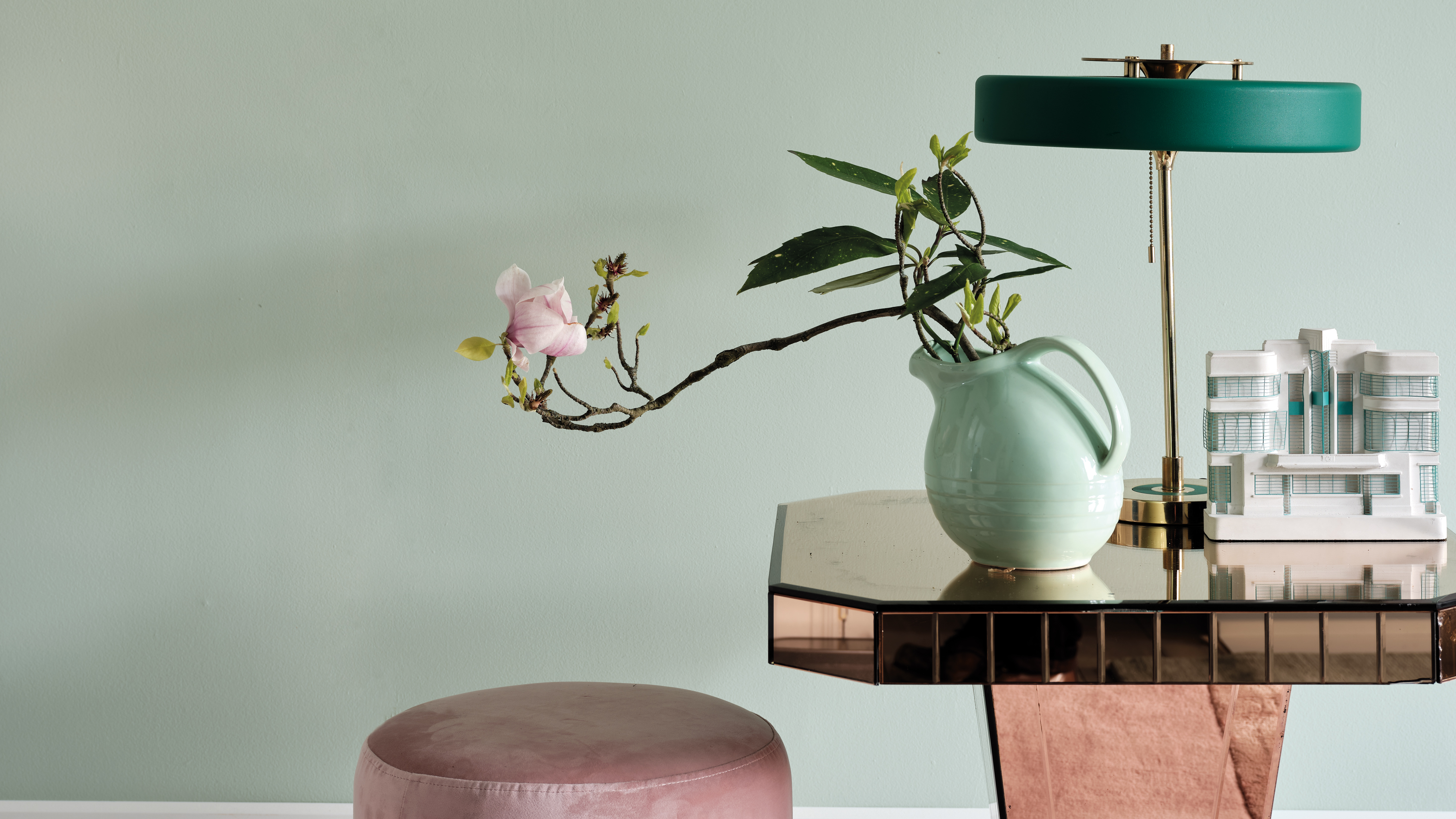
Palm by Farrow & Ball
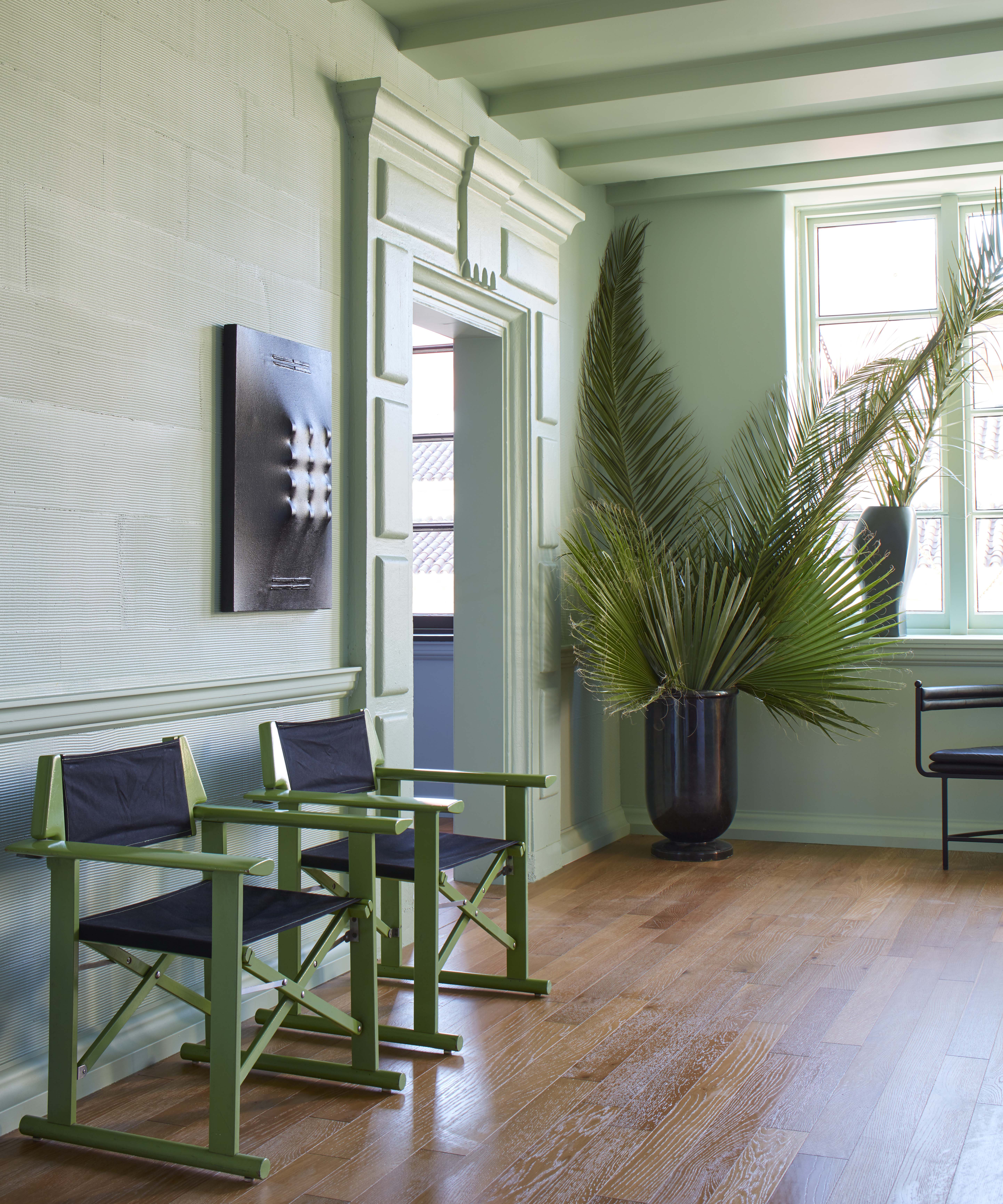
In a Q&A for Farrow & Ball, Kelly explained that you should use Palm – their fresh green hue – to color drench an entryway.
'Firstly, paint everything – the ceiling and all the molding,' Kelly shares.
While the prospect of painting every surface can feel a step too far for some, this method of decorating is quickly becoming a favorite amongst designers and paint experts alike.
'The beauty of color drenching is that it can be applied to such a variety of different spaces… You can embrace the size of the space to create something that feels really engaging, inviting, and contemporary,' emphasizes Little Greene's Director, David Mottershead.
Design expertise in your inbox – from inspiring decorating ideas and beautiful celebrity homes to practical gardening advice and shopping round-ups.
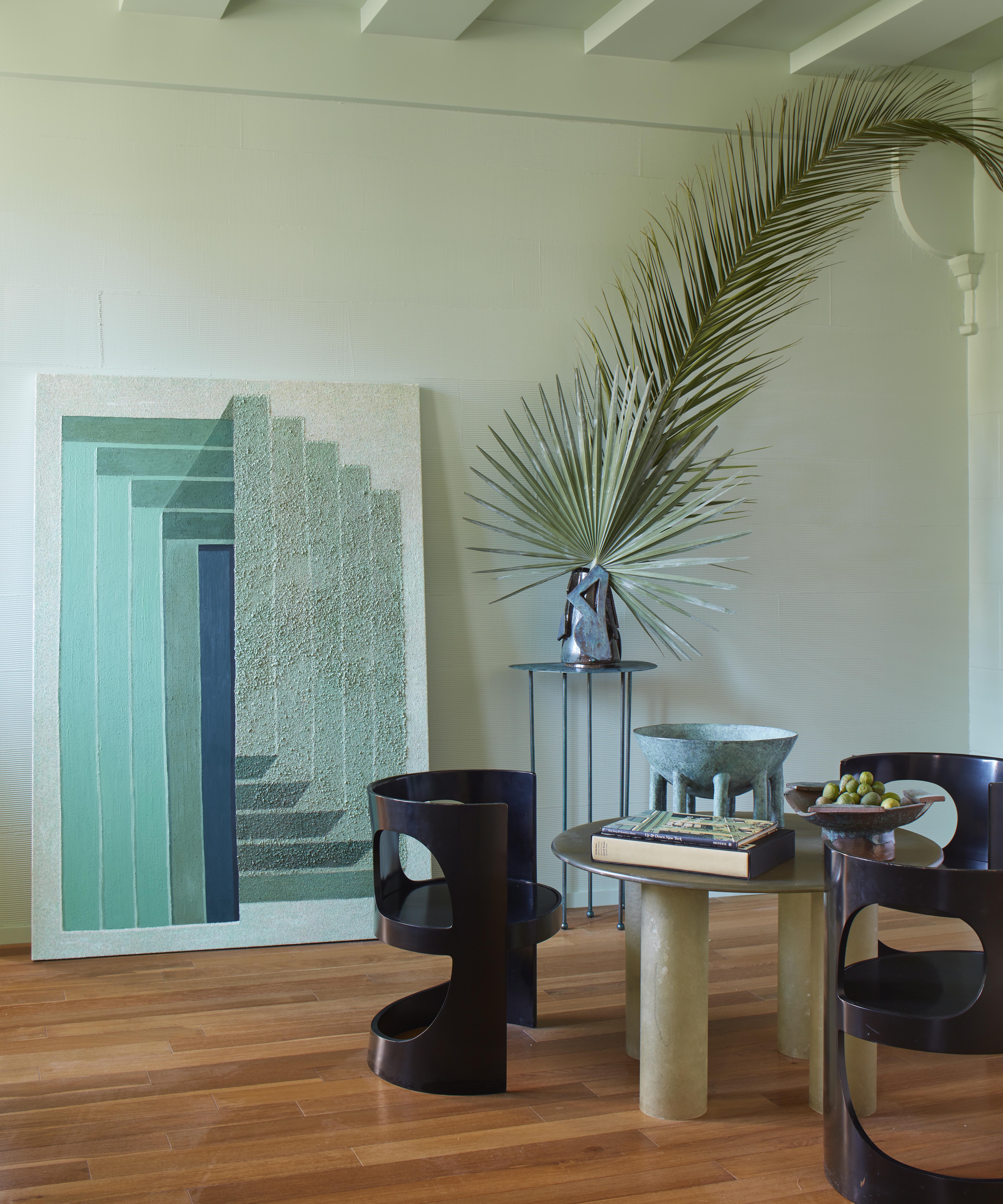
After color drenching your hallway? Kelly recommends styling the space with a monochromatic palette – for a timeless aesthetic that will 'make the paint pop.'
'Working in a monochromatic palette is a great way to guide a color scheme if you are nervous,' Kelly adds.

Palm by Farrow & Ball
Kelly explains further how she starts a project – by curating a tray of different fabrics and tones to offer inspiration and serve as a reminder of the pieces that fit effortlessly in the space.
If the thought of drenching your space in one color is slightly too overwhelming, you can still achieve the desired effect by painting similar tones together. David recommends selecting 'a group of tonally coordinating colors and utilizing them across the room' as this showcases the color-drenched style without the bold commitment.
But which shade works well with Palm?

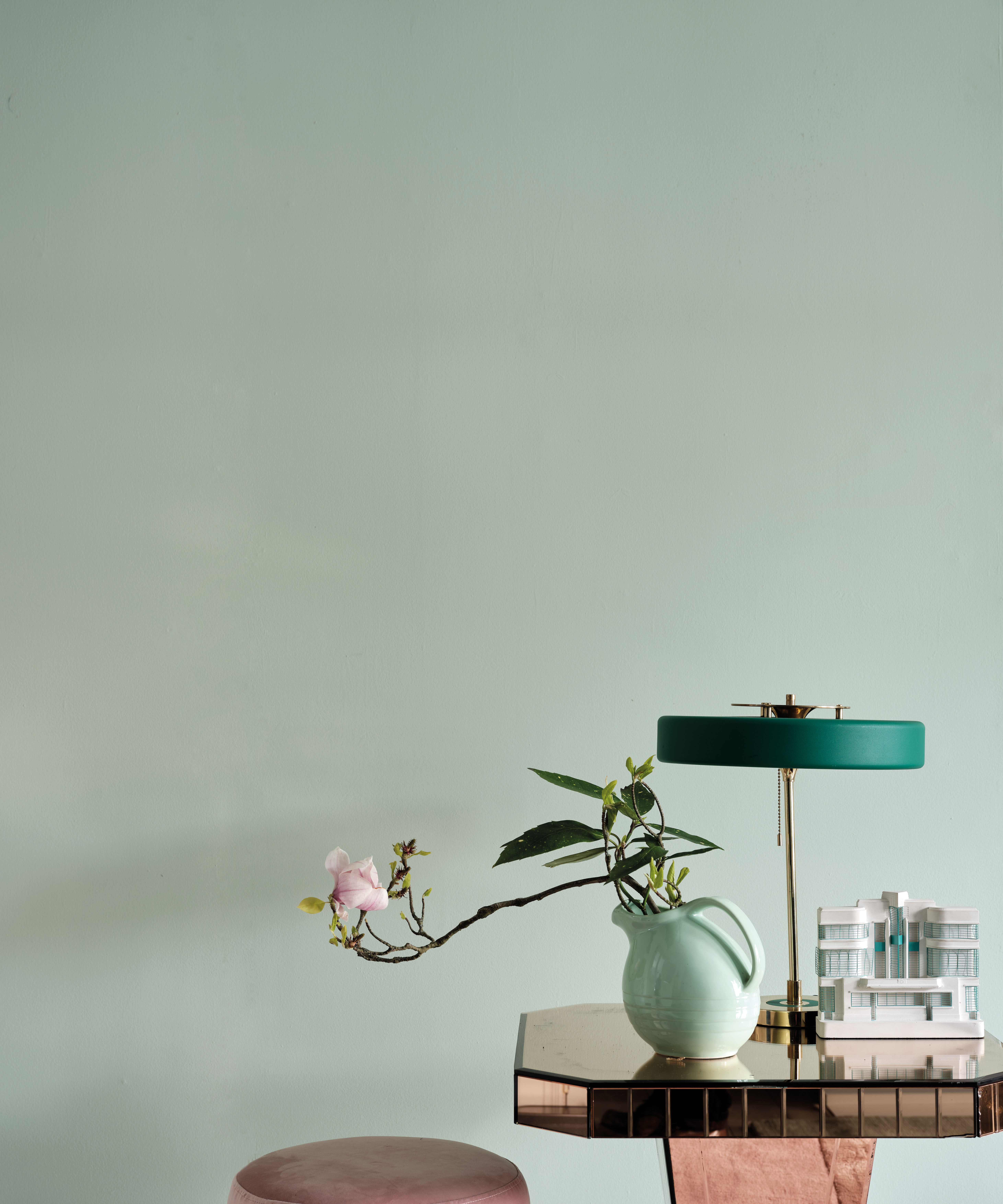
Palm by Farrow & Ball
Whilst exploring color combinations for rooms, Kelly looks towards Hazy, a subtle blue-gray also from Farrow & Ball's California Collection. This is the So-cal cool combo that will allure all who pass through your entryway because, of course, Kelly Wearstler knows best.

Megan is the Head of Celebrity Style News at Homes & Gardens, where she leads the celebrity/ news team. She has a history in interior design, travel, and news journalism, having lived and worked in New York, Paris, and, currently, London. Megan has bylines in Livingetc, The Telegraph, and IRK Magazine, and has interviewed the likes of Drew Barrymore, Ayesha Curry, Michelle Keegan, and Tan France, among others. She lives in a London apartment with her antique typewriter and an eclectic espresso cup collection, and dreams of a Kelly Wearstler-designed home.