This interior designer asked her neighbor to redesign her house – the result is a modern light-filled family home
The innovative addition to designer Lauren Sparber's historic Washington DC home was the work of her talented neighbor

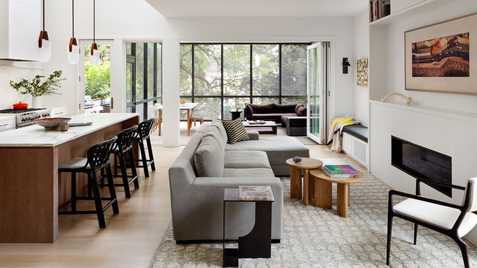
This historic Tudor-style home in Washington DC was in need of an update. Its 1920s design had period charm in abundance but the home had its share of aesthetic and practical challenges too, that owners Lauren and Josh were more than ready to take on. They wanted to extend the footprint, increase the light levels across the living space, and improve the way the house design worked on a practical level for a family of four.
Lauren Sparber, an interior designer and co-owner of Jodi Macklin Interior Design, has redesigned numerous living spaces for other people so when it came to renovating her own family home she had some specific goals in mind. To create extra space she knew they would have to extend the existing footprint, but on a relatively narrow plot with neighboring properties close by building an addition that also improved light levels was a big ask.
Luckily, one of Lauren's neighbors is architect Colleen Healey, who not only had first-hand knowledge of the location but also understood exactly what Lauren and Josh were hoping to achieve, and most importantly how to help them succeed. It was a textbook collaboration between designer-homeowner and architect, and we caught up with Colleen and Lauren to get their perspectives on the new-look family home.
Article continues below 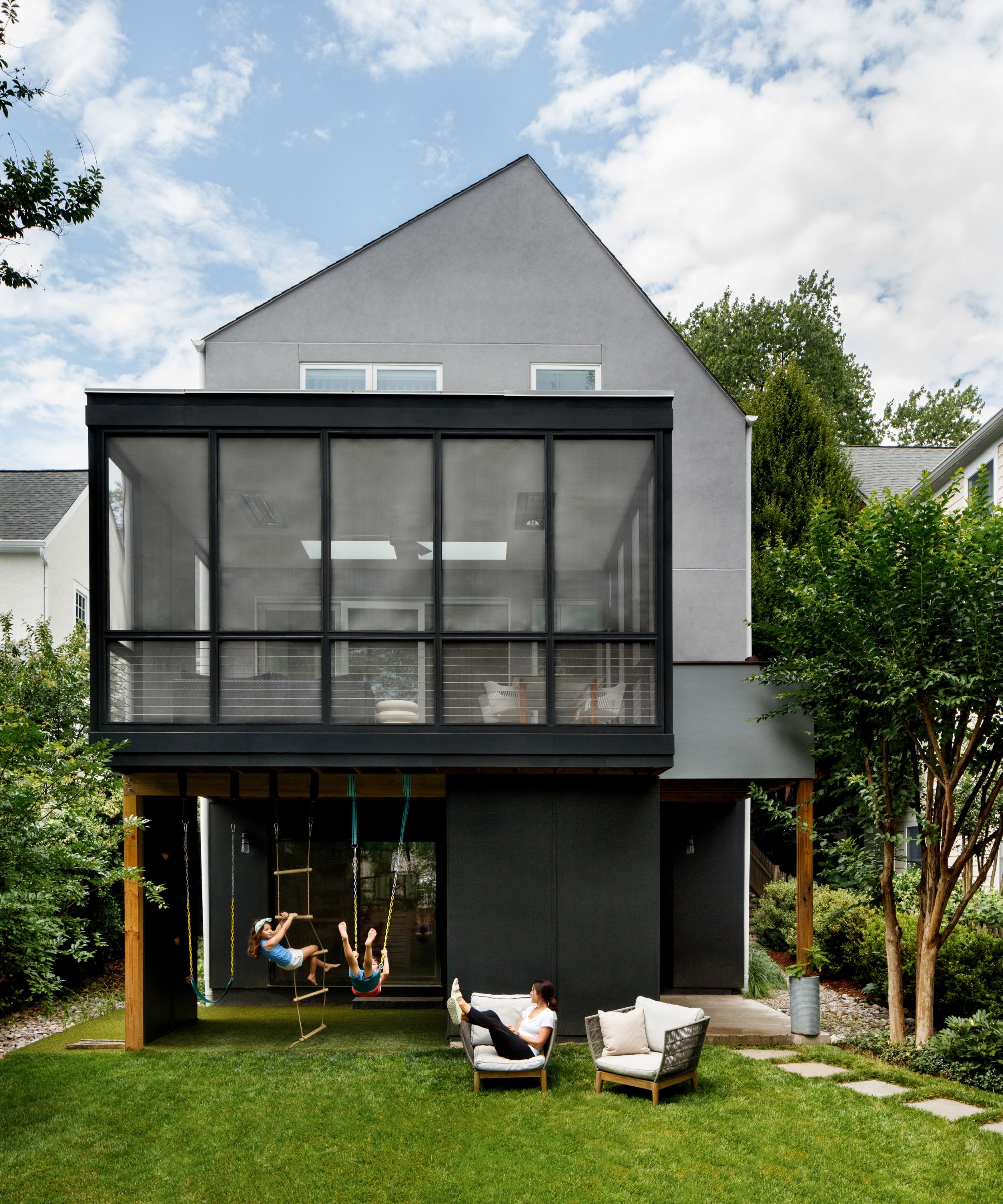
In addition to expanding the existing footprint of the house Lauren and Josh wanted a large screened-in porch, explains architect Colleen. 'Unfortunately, following sun studies of the site, we found that the porch blocked a significant amount of light coming into the new expanded living space,' she says. 'And with neighbors so close on both sides of the house, first floor window light was limited too.'
Read on to discover the ingenious way Colleen overcame that issue to bring more light into the kitchen and family room, AND still provide the porch space Lauren and Josh wanted.
The striking porch addition at the back of the house has large doors that tuck away for a seamless integration between the porch and the new living spaces. An open area under the porch provides a place for kids' play equipment and storage. The flat roof above the porch is prepped for a future green roof.
'We eat dinner on the porch in spring, summer and most of fall with fans and heaters incorporated into the ceiling to keep us the perfect temperature. The dining table and chairs are made to be outdoors year-round, while a Dedon sectional draws guests to the back porch when we are entertaining as much as it pulls us to sit out there for coffee on a quiet Saturday morning.'
Design expertise in your inbox – from inspiring decorating ideas and beautiful celebrity homes to practical gardening advice and shopping round-ups.

Colleen Healey Architecture is a national award winning design firm focused on timeless modern residential design, which represents each individual client. 'We strive to energize a space through creative design solutions that are well crafted, functional and light filled,' says the firm's founder Colleen Healey. 'We offer complete architectural services for renovations and new homes from schematic design through construction administration, furniture and finishes.'
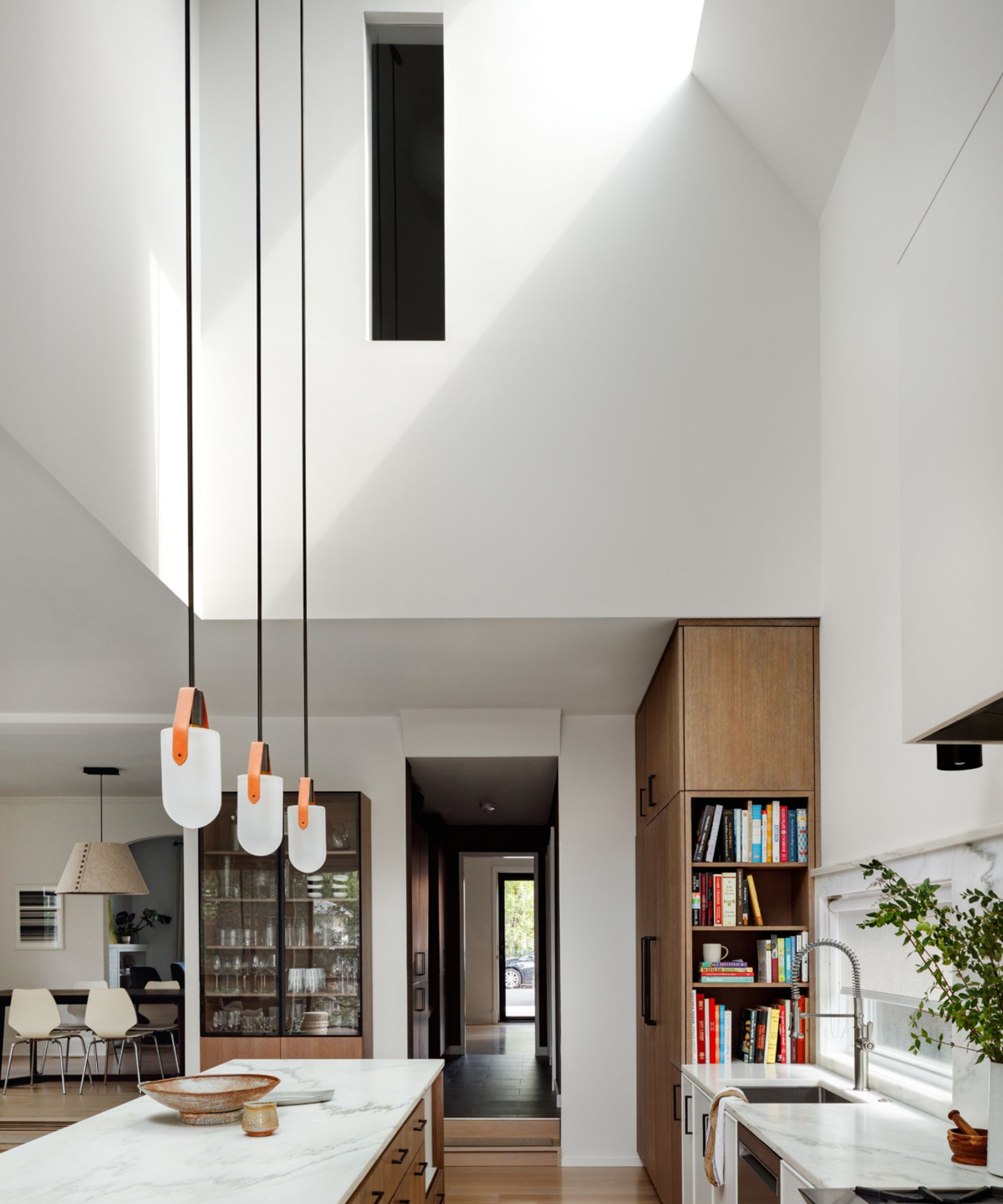
Moving inside, new skylights have made all the difference to the look and feel of the family's living space. Kitchen ideas have been designed around the new roofline to make the most of the additional daylight.
'Our challenge was to light the first floor from above,' says architect Colleen, 'ideally bringing in both morning and afternoon light to keep the space naturally lit throughout the day. The solution was skylights split along an asymmetrical ridge line that allowed us to direct morning light into the new primary bedroom space and carve out some of the second floor to bring afternoon light into the double-story kitchen. A strategically placed east-facing skylight was also added deeper into the addition to bounce off the white walls and down into the kitchen below.'
'The existing kitchen was tiny and cramped,' adds designer-owner Lauren Sparber, 'so we were excited to design a space that was light, airy and a functional workspace since my husband and I enjoy cooking and entertaining. We now have triple the amount of kitchen storage and counter space than we were used to and the large island is central to our entertaining.'
Lauren considered various kitchen cabinet ideas, before arriving at her selection of earthy warm oak full-height cabinets and an island. 'Combined with the painted white lower cabinets these add layers of color without drawing too much attention,' she explains.

Lauren Sparber is a partner at Jodi Macklin Interior Design, a full service interior design firm in Washington DC. With a clean and classic aesthetic, Lauren brings expertise and creativity from concept to completion on every project. She tailors her designs to her clients lifestyles, with a unique ability to use their needs as building blocks to a greater vision of their home. Her spaces are warm and livable blending organic colors, textures and tones that stand the test of time.
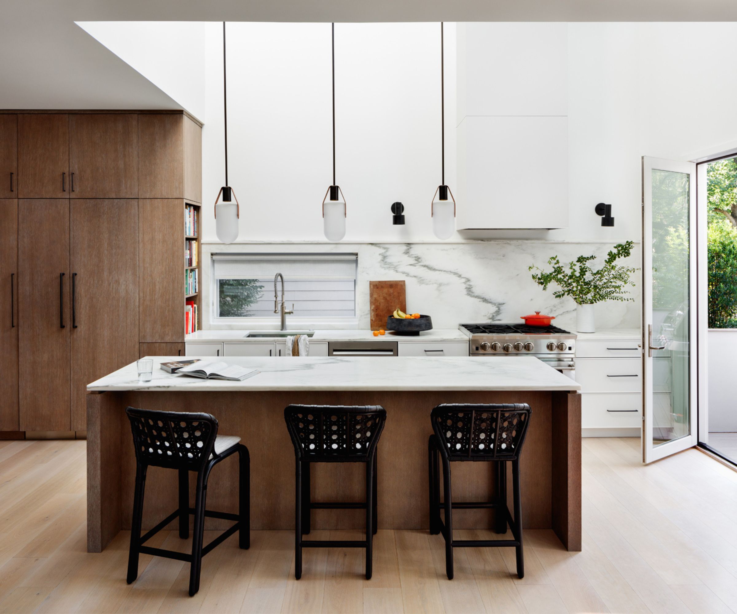
Narrowing down the kitchen countertop ideas was easier, says Lauren. 'I knew I wanted a natural stone but was exploring the more durable options. We found Vermont Danby at Imagine Surfaces and Josh and I both fell in love with the slabs. Its rough texture is more forgiving than other marbles and the green and black accents in the natural stone ended up setting the tone for other accents in the space.'
Doing a great job of drawing the eye up to the kitchen's striking new skylights and high ceilings are three Allied Maker pendant lights over the island. Their design really complements Colleen's thoughtful architectural details. The laced leather and rattan barstools from McGuire help highlight the other black accents in the room.
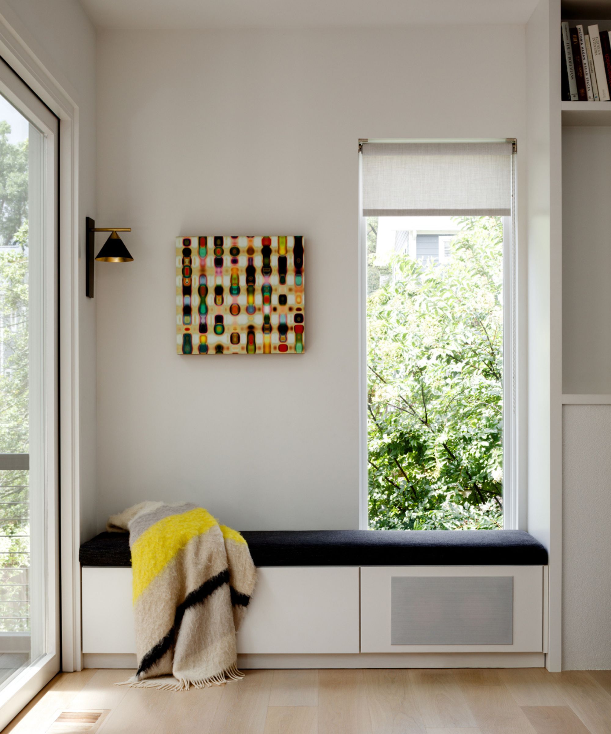
This window seat between the family room and the new glass porch is proving a big hit. 'Our family loves to read,' says Lauren. 'I knew if we built a nook, the kids would use it. The cushion is made of a chunky Pollack woven linen, the cozy blanket by Mantas Escaray pulls the electric yellow out of the artwork (by Colby Caldwell through Hemphill Gallery). While our kids enjoy snuggling there, our dog has really taken to the spot the most of anyone!'
A reading light by Visual Comfort gives the space the perfect glow at night and a linen roller shade from Everett Design Inc provides privacy but still allows the right amount of sunlight to enter the space.
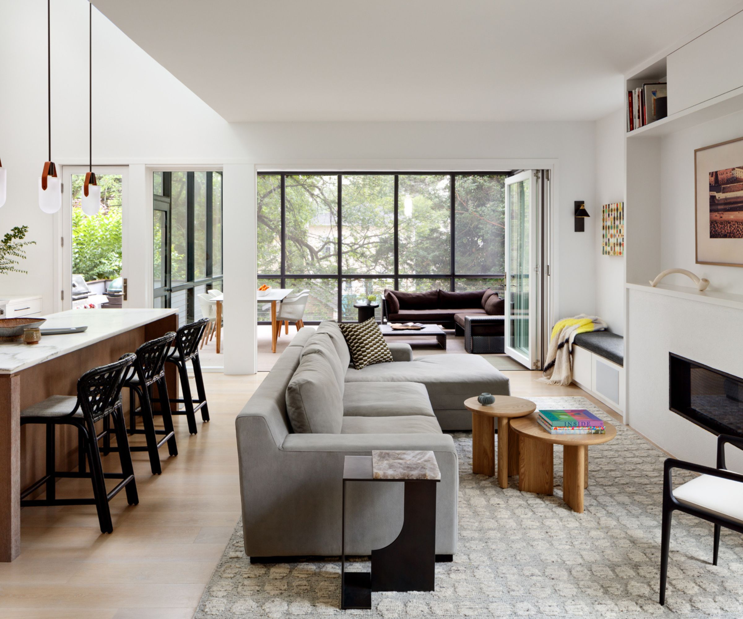
Family room ideas for the reworked space were restricted by the home's footprint, so although the new room feels large visually, this is down to its well considered layout and carefully placed furniture. Hardwearing furnishings were a practical consideration too for this young family.
'It was a challenge to design a very narrow family room, keeping in mind that we wanted to keep the large triple glass folding doors to the screened porch open as often as possible,' explains Lauren. 'The sectional is close but comfortable to our fireplace and TV so we can sit together as a family to watch a movie. I selected a high-low mix to furnish the space using a West Elm sectional that our children often use as a parkour course much to my dismay!'
A Holly Hunt chair and side table add a more sophisticated note, along with custom coffee tables and a luxurious Matt Camron wool rug. TimberTech flooring on the screened porch flows well with the light oak interior floors.
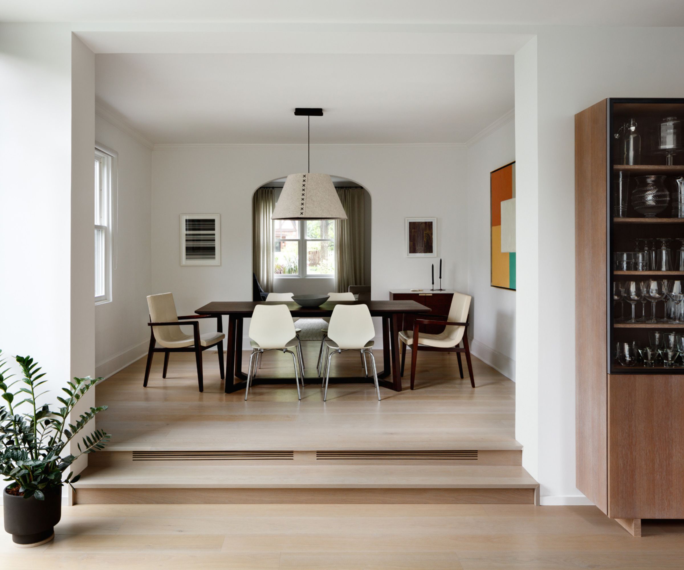
Although the dining room is in the same location as it previously was, it has taken on a new life now that one wall opens to the addition.
The dining room has only one small single window, one that existed in the old house but was replaced in the renovation. Because of the large openings into both the living and family rooms, the room is hit with lots of natural light and gives the illusion of being much larger.
Explaining her dining room ideas for furnishings and furniture, Lauren says: 'I fell in love with the stitching of the BuzziSpace light fixture using that same dark color to select the ebonized oak finish of the Camerich dining table. The Holly Hunt host chairs are covered in leather, the CB2 side chairs in molded wood, both very easily cleaned of sticky handprints each night.'
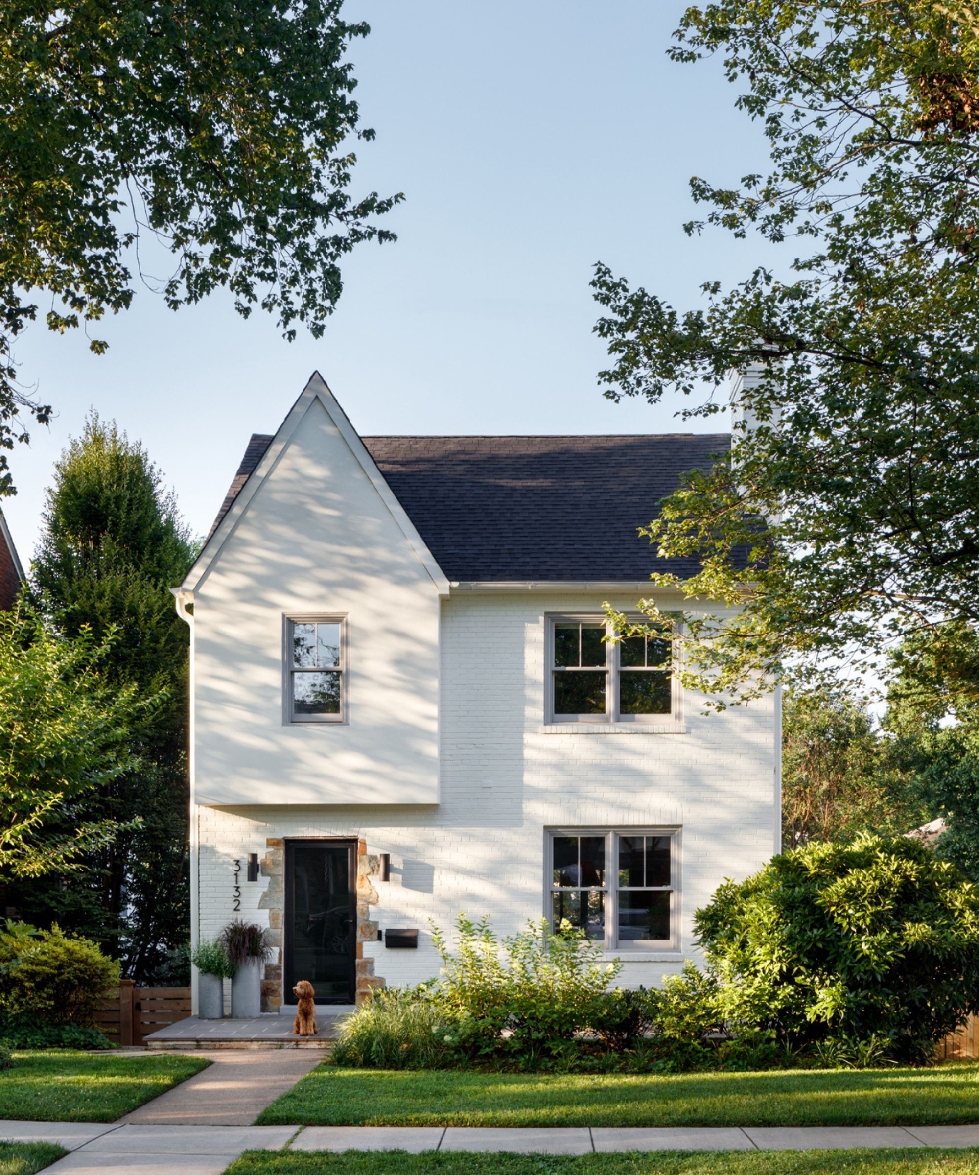
With the back of the house upgraded and extended with its contemporary glass extension, it was only right that the front also got a new look.
'An existing porch that made the front rooms of the house very dark was removed, and windows were replaced in a soft grey finish with a simple mullion pattern,' says architect Colleen. 'The heavy Tudor elements from the front facade were replaced with a clean stucco finish.'
How does designer Lauren feel about her new-look family home and what are her favorite elements of the redesign? 'The double-height ceiling portion of the kitchen is such a special architectural detail. I love it,' she says. 'And the screened porch has been a game changer with the way we live eating most dinners outside for most of the year.'
Karen sources beautiful homes to feature on the Homes & Gardens website. She loves visiting historic houses in particular and working with photographers to capture all shapes and sizes of properties. Karen began her career as a sub-editor at Hi-Fi News and Record Review magazine. Her move to women’s magazines came soon after, in the shape of Living magazine, which covered cookery, fashion, beauty, homes and gardening. From Living Karen moved to Ideal Home magazine, where as deputy chief sub, then chief sub, she started to really take an interest in properties, architecture, interior design and gardening.
