These Benjamin Moore 'cafecore-inspired' paint colors are cozy and neutral – 6 shades to bring this trend to your home
Add warmth to your neutral scheme with these cafecore-esque paint colors

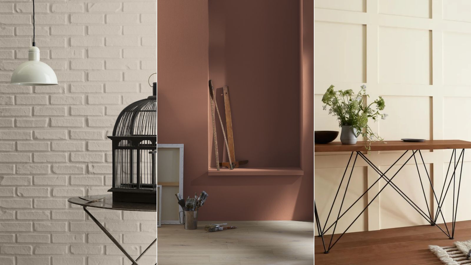
The cafecore trend has made its mark on our homes this year; with kitchens becoming coffee-shop-esque spaces, complete with impressive coffee stations and cozy seating nooks.
But beyond the cafe-inspired setups, this trend extends to paint colors too. Warming neutrals reminiscent of the cafecore aesthetic allow our spaces to feel both calming and cozy, and their appeal extends well beyond kitchens.
So much so, Benjamin Moore has rounded up a selection of its 'cafecore-inspired' paint colors, ranging from warm whites to richer brown tones. If you're looking to curate your very own cafecore color scheme, read on to learn all you need to know about these cozy paint colors.
A post shared by Benjamin Moore (@benjaminmoore)
A photo posted by on
Swiss Coffee OC-45
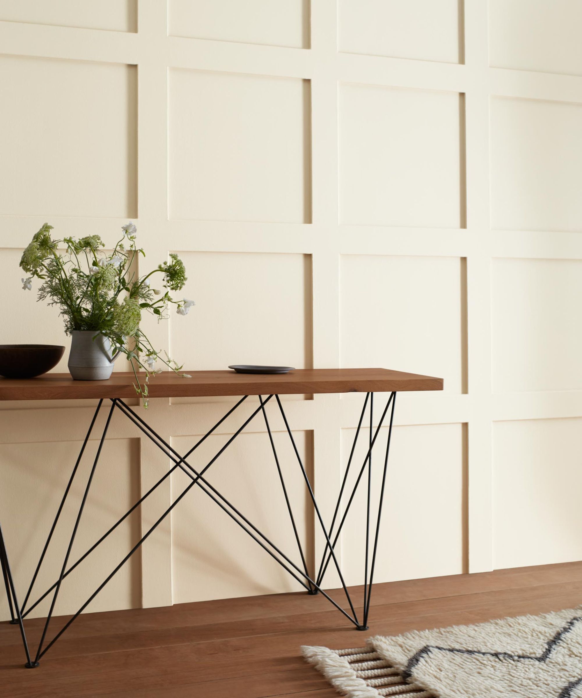
'Swiss Coffee OC-45 is an essential white with just the right amount of warmth,' explains Hannah Yeo, Senior Manager of Color Marketing at Benjamin Moore. A firm favorite Benjamin Moore shade amongst designers, decorating with Swiss Coffee is a timeless choice that adds subtle warmth while maintaining a light and airy look, whether in kitchens or bathrooms.
'From farmhouse to boho chic, this creamy light white feels soft and elegant while being casually inviting. This rich off-white pairs well with other soft neutrals – think of Revere Pewter HC-172 or Fairway Oaks 1075, as well as greens like Lush AF-475 and Newburg Green HC-158,' adds Hannah.
Mocha Cream 995
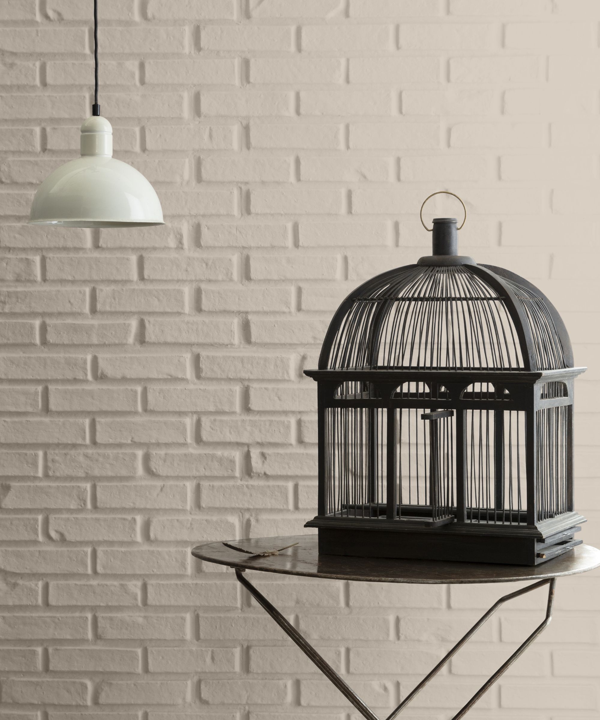
'Mocha Cream 995 is warm, creamy, and soothing, and feels effortlessly refined. With an earthy neutral undertone, this hue shifts between a soft gray under cool lighting and a taupe tone in warm light. The overall effect is inviting and calm, making it an ideal choice for spaces that promote relaxation, such as bedrooms and living rooms,' suggests Hannah.
While white paints can sometimes feel too stark or uninspiring, a hue such as Mocha Cream has more depth for a cozy neutral color scheme.
Design expertise in your inbox – from inspiring decorating ideas and beautiful celebrity homes to practical gardening advice and shopping round-ups.
Cappuccino Froth CSP-1055
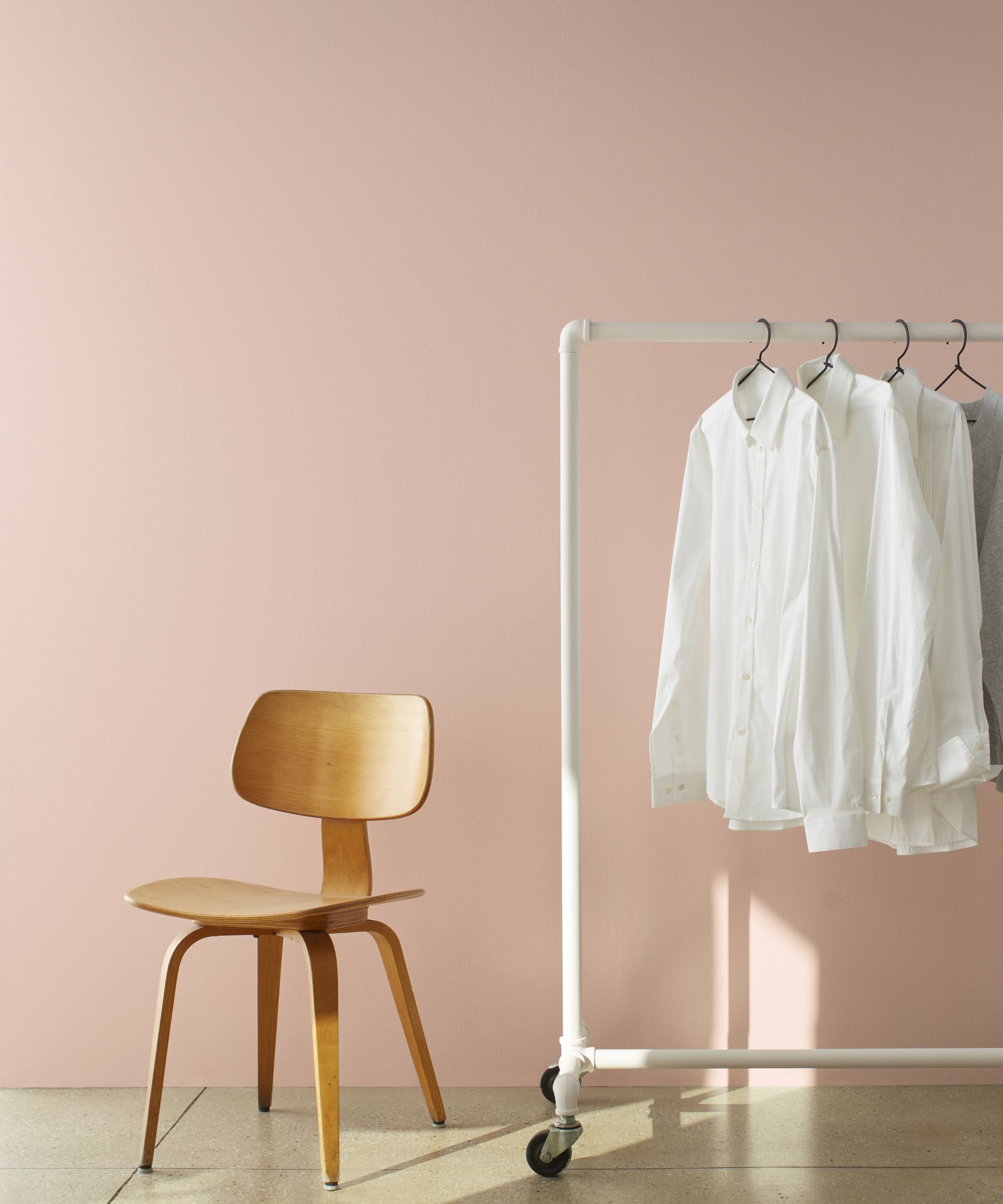
Although it appears more like a pink paint color here, Cappuccino Froth is actually a light neutral paint that warms spaces. Below, Hannah explains that it makes a good backdrop color choice for the whole home:
'Reminiscent of taking the first sip of the frothy beverage on a cold winter day, Cappuccino Froth CSP-1055 is a delicate off-white with a subtle amber undertone. It instantly adds a soft warm glow to any room, making it an ideal neutral base color throughout the entire home. Layer in other colors, textures, and patterns to create visual depth and interest.'
Café Mocha 2099-50
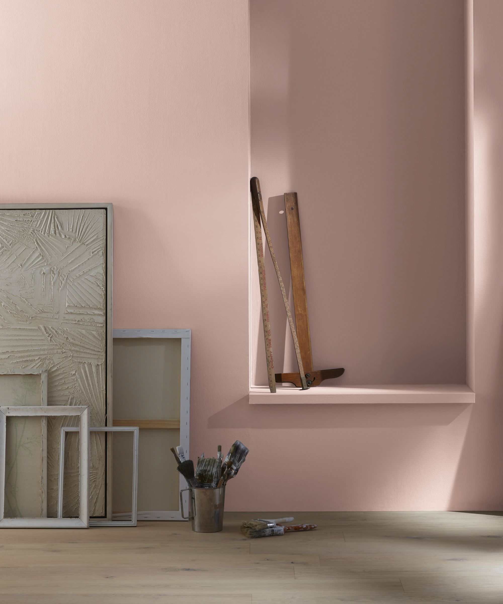
If you're looking for a slightly richer neutral paint, Café Mocha is a warming light pinkish-brown that maintains a liveable feel thanks to its muted appearance.
'A harmonious blend of warm brown and dusty gray, Café Mocha 2099-50 is romantic, cozy, and comforting. This rosy taupe strikes the perfect balance between soft elegance and casual comfort, ideal for cozy spaces especially when paired with creamy off-whites and soft textures. For added sophistication, incorporate golden accents and off-black details to elevate the space with understated grace,' Hannah advises.
Espresso 2099-30
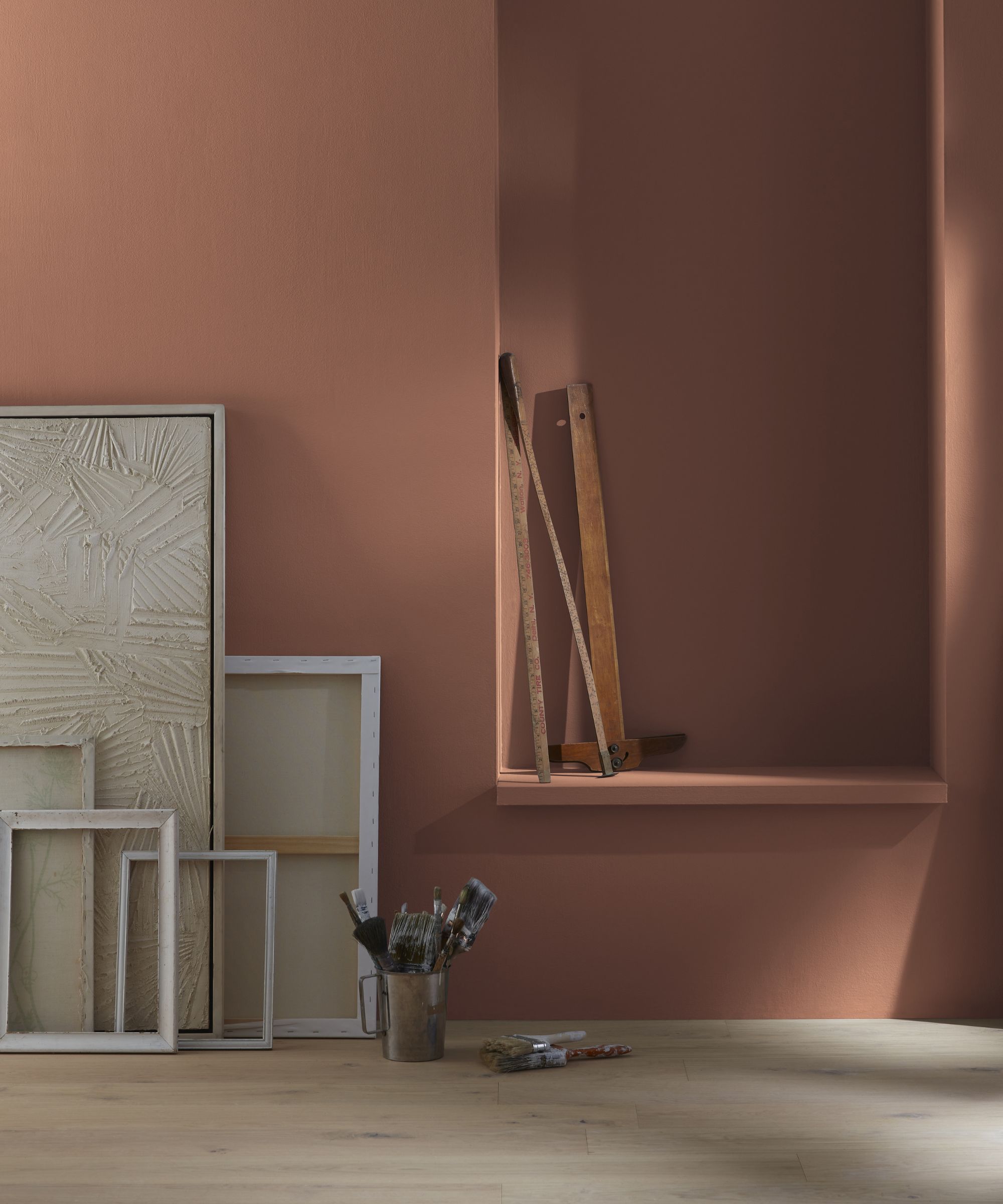
Dark brown paints are an on-trend way to go right now, and Benjamin Moore's Espresso adds plenty of drama with its rich tones. 'Like a fresh, hot morning coffee, Espresso 2099-30 is rich and sumptuous,' says Hannah. 'Whether drenched across the entire room for a cozy, enveloping feel or layered with lighter shades, this soothing hue adds depth and richness to any interior.'
As Hannah suggests, color drenching with bold hues like this is a great way to make a statement, working especially well in rooms where you want to feel cozy and snug.
Toasted Brown 2097-10
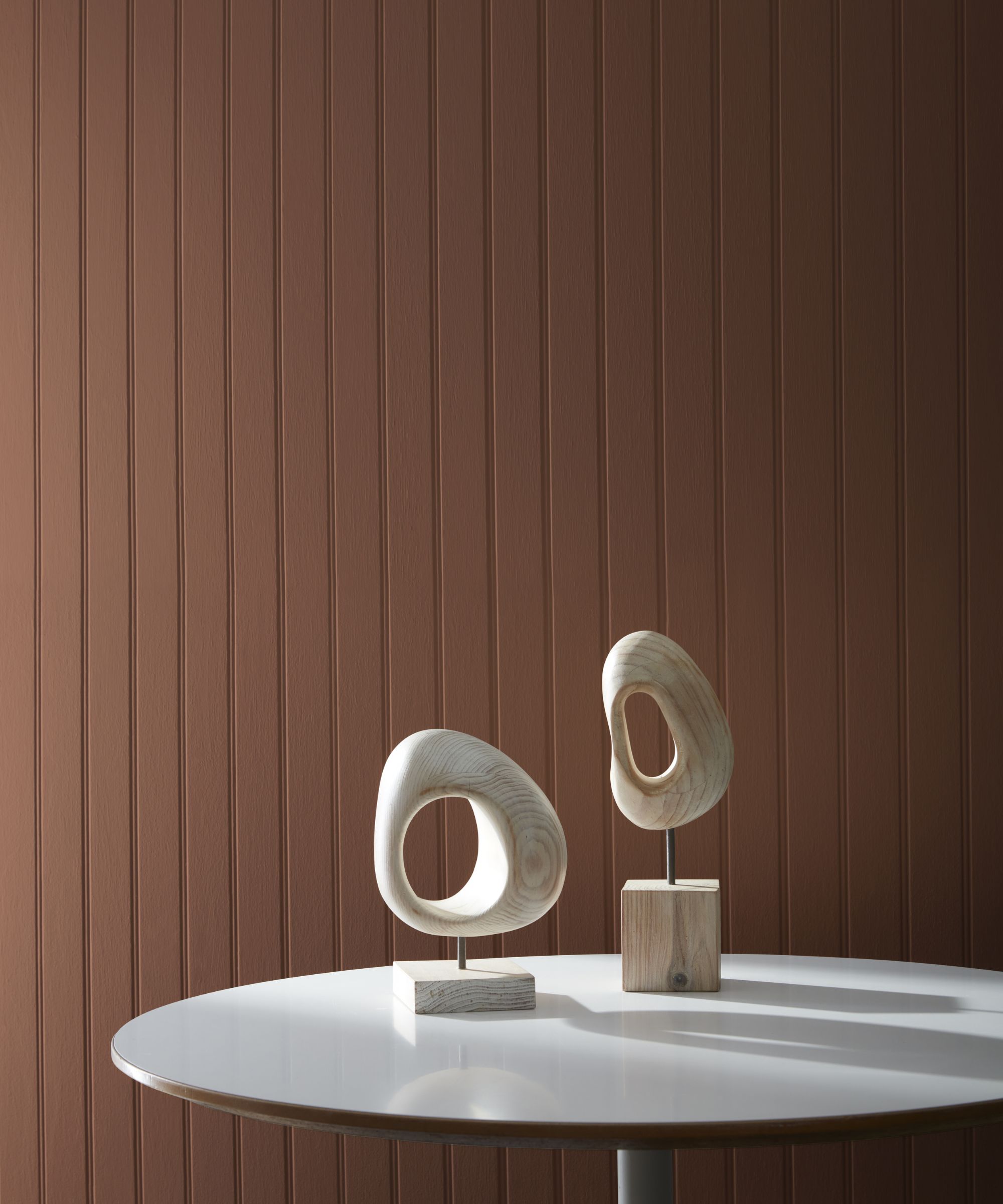
Lastly, Toasted Brown is another dark brown paint that feels sophisticated and enduring. While you may think of bold paint colors like this one as daunting to incorporate into your home, they can add a lot more depth than lighter neutrals and even feel calming:
'Toasted Brown 2097-10 is a deeply grounding, earthy hue that exudes both calm and sophistication. Its rich, elegant tone makes it an ideal choice for a wide range of interior spaces, offering a timeless, refined ambiance. This versatile shade also works beautifully for exterior applications, adding warmth and style to front doors, decks, and outdoor living areas,' explains Hannah.
Whether you're looking to refresh your home with a warming light neutral paint or want to add more impact with a darker, rich brown, these colors are a timeless and sophisticated way to decorate with neutrals.

Emily is a freelance interior design writer based in Scotland. Prior to going freelance in the spring of 2025, Emily was Homes & Gardens’ Paint & Color Editor, covering all things color across interiors and home decor for the Homes & Gardens website. Having gained specific expertise in this area, Emily is well-versed in writing about the latest color trends and is passionate about helping homeowners understand the importance of color psychology in home design. Her own interior design style reflects the simplicity of mid-century design and she loves sourcing vintage furniture finds for her tenement flat.
