This downsizers' home was reconfigured to create a stylish, bright space that's perfect for entertaining
Improving this Greensboro home's layout added style, space and light to its previously cramped and outdated floorplan

With an enviable location, in historic downtown Greensboro, NC, this 1980s-built townhouse had many advantages. It was a downsizing move for the homeowners who wanted to be close enough to enjoy city living, yet still enjoy a garden and green space. The property has a compact footprint, however, and presented many interior design challenges, including: bringing in more light; updating the tired kitchen and bathrooms, improving the whole flow of the house and carving out sufficient indoor space for entertaining friends and family in comfort.
Interior designers Emma Legg and Sydney Foley of Kindred Interior Studios were brought in to give the home a new look and improve its flow, concentrating their efforts in the reception spaces on the home's main level. 'The home was simple and tasteful from the exterior, but inside it lacked character and sophistication,' says designer Sydney Foley, and so the design team prepared to make some dramatic changes to transform the dated, traditional home, introducing a curated modern aesthetic much more in keeping with its new owners' style.
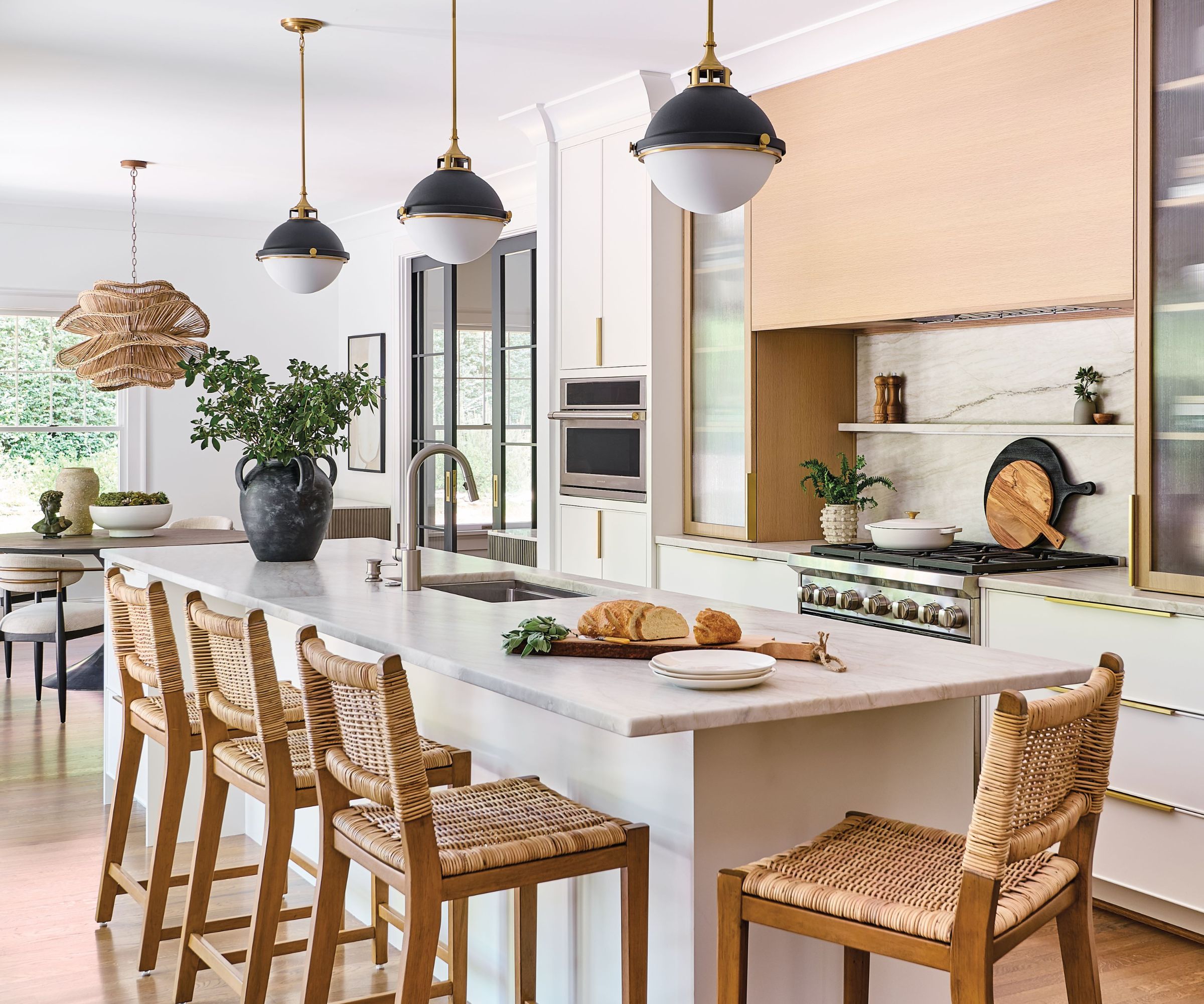
'As the pièce de resistance of the whole renovation, the kitchen is where we invested the most time and energy in making sure every detail was perfected,' says designer Emma Legg. 'Due to the smaller footprint and truly only having one wall, we had to be extremely creative on how to incorporate necessary functions and modern day features.'
Kitchen ideas were planned down to the smallest detail. Each kitchen cabinet was meticulously reviewed and assigned specific storage functions. Bakeware dividers, layered utensil storage, a specialized knife drawer, and small ledge above the range were all designed to give everything a home.
The large custom rift sawn oak hood makes an understated and sophisticated focal point, and hides motorized spice racks to keep cooking elements close. Reeded glass cabinets add another texture and level of interest to the kitchen while reflecting light.
The biggest challenge, in the kitchen and elsewhere in the home was increasing the levels of natural light. The longest side of the home is a shared wall with no windows. But the Kindred team maximized light in a few different ways. First, removing the walls between the kitchen and dining room, and kitchen and den, which had the added benefit of increasing the circulation space. Second, adding four additional windows in the kitchen, dining and den. This significantly increased the level and flow of natural light throughout the back of the house.
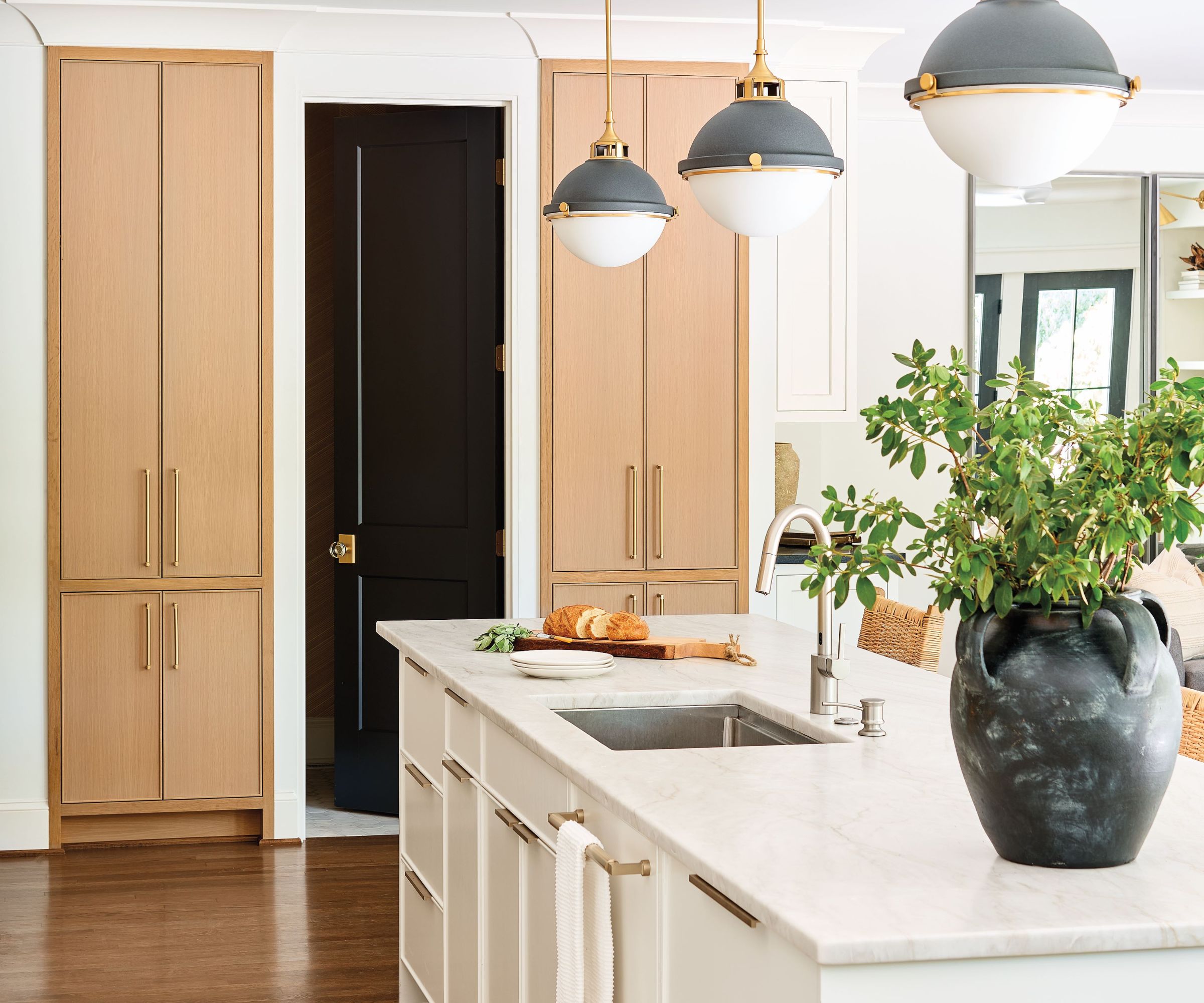
The oversized island serves as the main work surface and houses the sink, dishwasher, and more customized storage. Symmetrical sawn-oak fronted cabinets (to match the cooker hood) house a coffee station on one side and a pantry on the other, with the powder room door between them.
Design expertise in your inbox – from inspiring decorating ideas and beautiful celebrity homes to practical gardening advice and shopping round-ups.
'Aesthetically, it was crucial to incorporate natural elements that layer and contrast with the white walls and cabinetry,' adds Legg. 'We used opaque sky leathered quartzite and worked with the fabricators to book match the island and create a feature backsplash under the range hood. We played with scale and proportion as the larger island and hood not only lengthen the room but create visual cues to lead your eye to the neighboring dining space and den.'
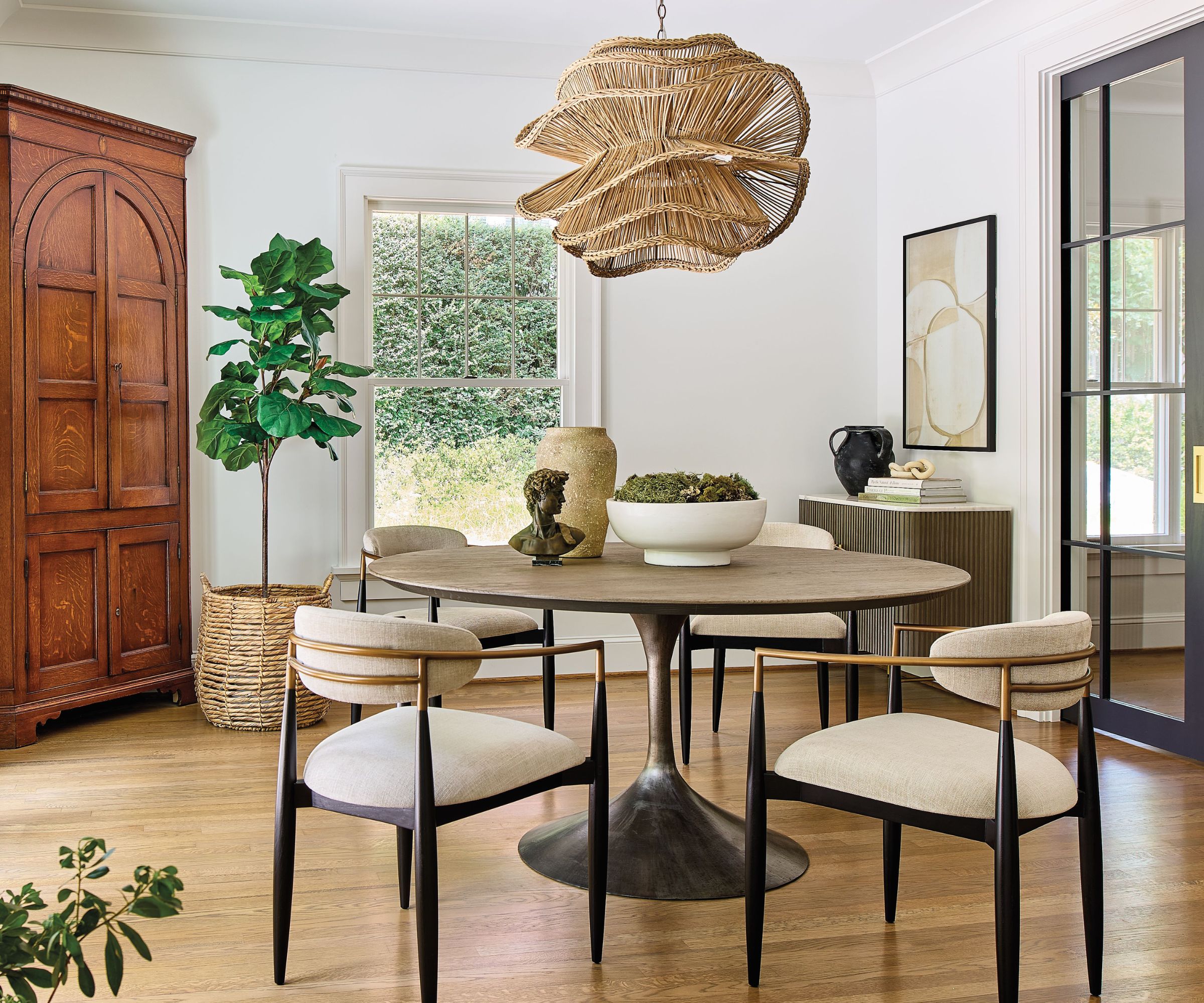
This stunning dining nook is now open plan to the kitchen. 'Our boldest room is defined by large contrast,' says designer Sydney Foley, explaining the studio's dining room ideas. 'The abstract woven chandelier is an unexpected showstopper that balances the new dining furniture. The French doors were enlarged and painted black for an architectural emphasis on the view of the courtyard, while mirroring black glass pocket doors were also added to close off the room for intimate dinner parties.
'All of these modern elements set the stage for the owners’ most beloved piece, the antique corner cabinet. A warmer color palette was used to blend existing antique finishes to preserve their original character.'
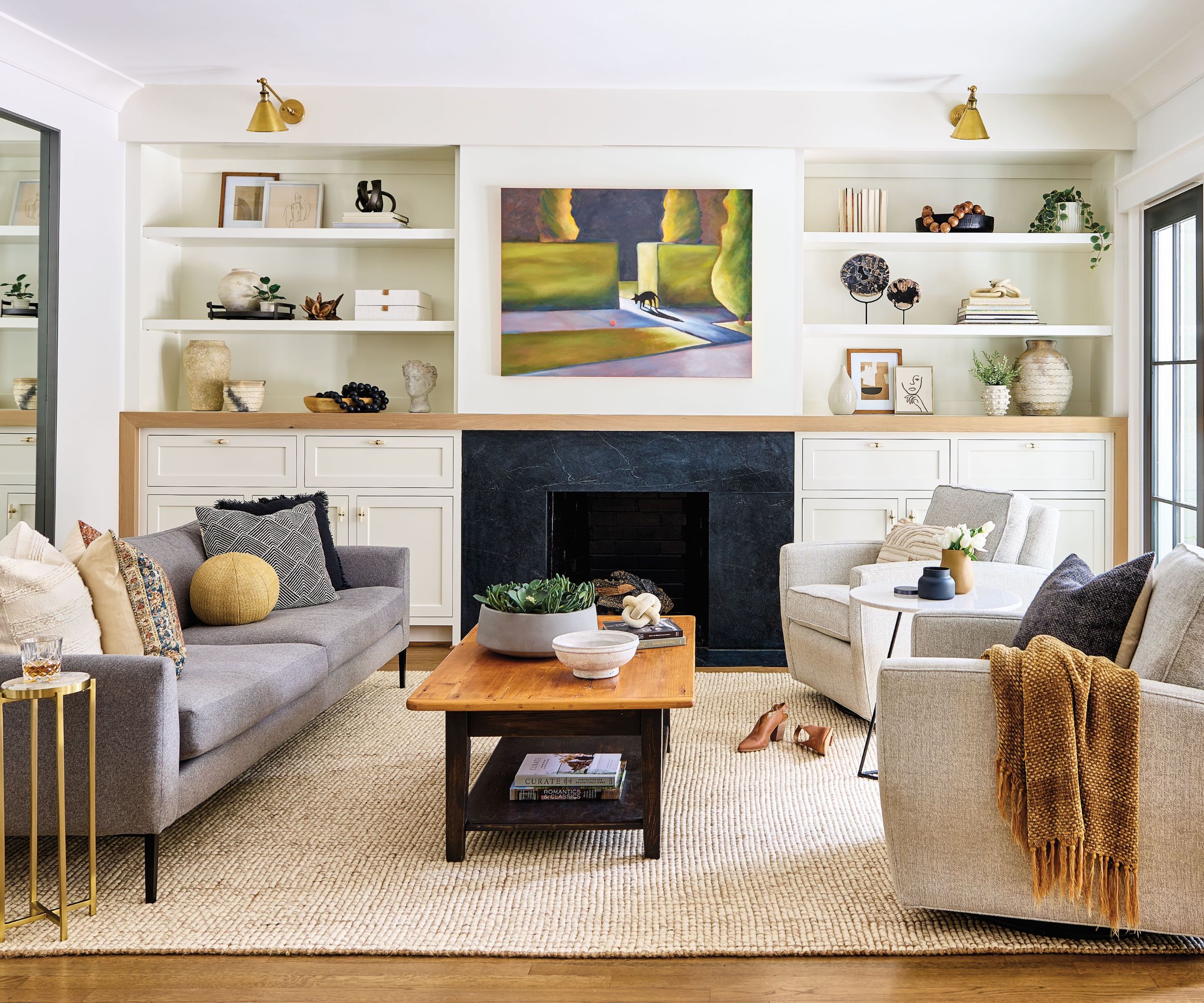
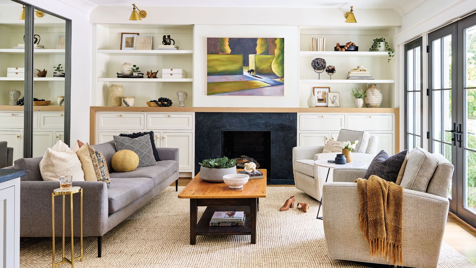
Living room ideas were again focused on making the most of the space available. Plus, offering a fresh perspective on an age-old problem, making the TV visible, but not the main focal point.
'We took out the existing fireplace and shelving to make way for a new custom wall,' says designer Emma Legg. 'A sliding panel showcasing the owner’s art hides the TV when not in use. Honed black soapstone surrounds the fireplace and is repeated on the opposing bar. This plays off of the black architectural doors and keeps the room grounded. Clean furniture is paired with an existing cocktail table and textured rug.'
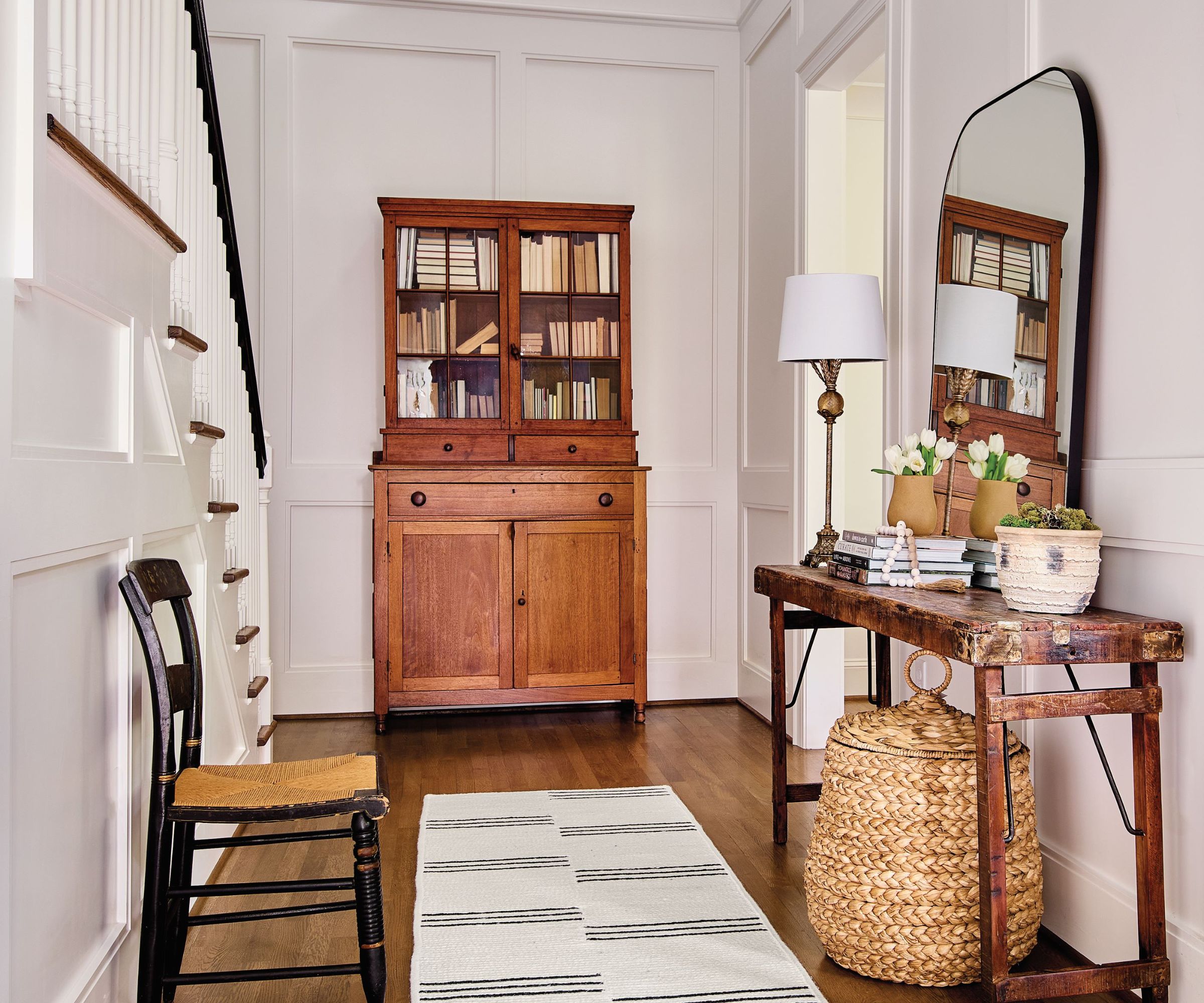
Explaining the entryway ideas, Sydney Foley says that the original foyer lacked the detail and character of the rest of the house. 'A pure white backdrop with new architectural molding now highlights several of the owners' existing pieces such as the tall cabinet, console table and chair. This gives them a feeling of home when walking through the front door.'
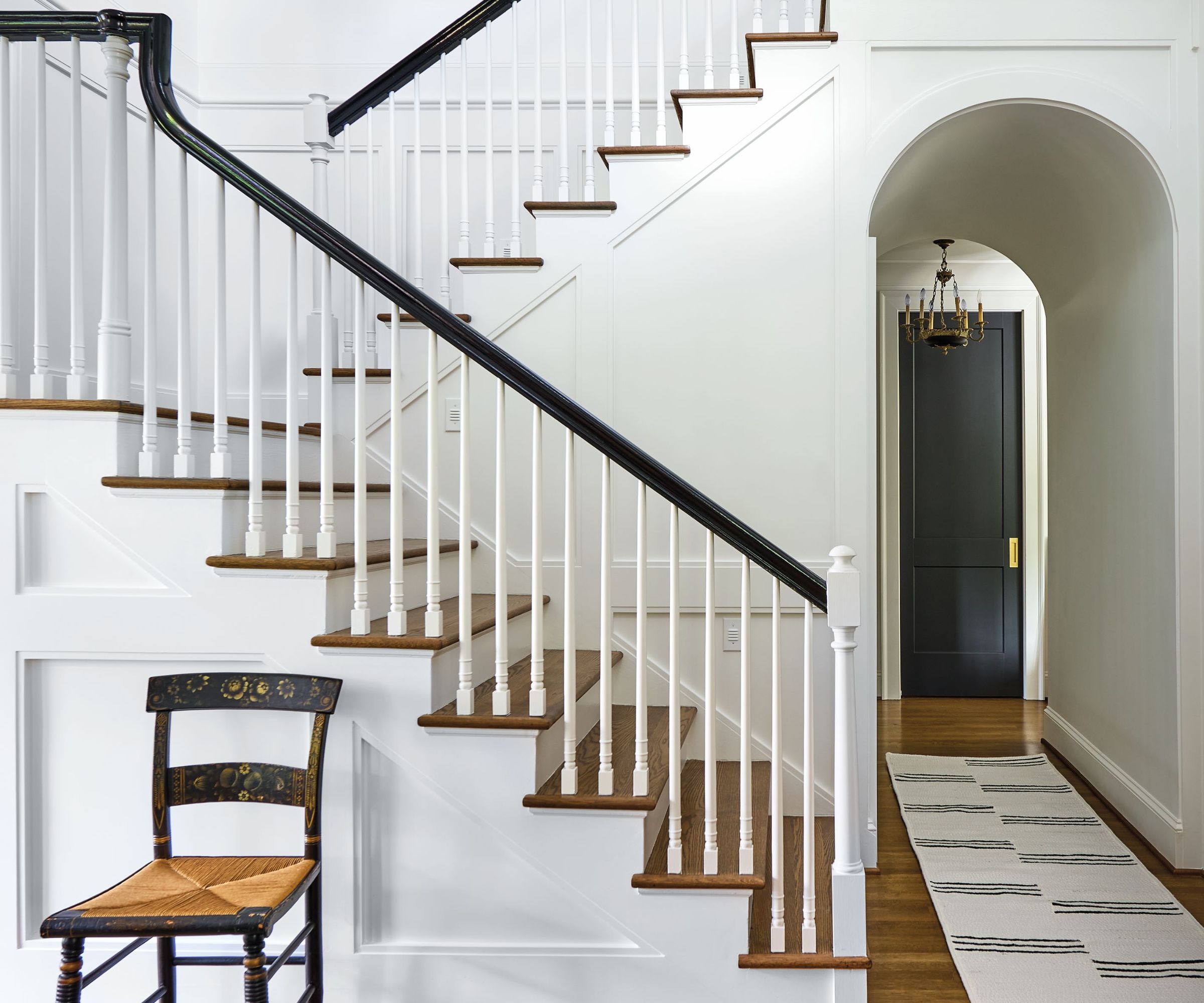
There's no need for fancy staircase ideas here, as the simple white walls and paneling make a smart contrast with the wooden treads and the dark wood vintage chair to create a space which revels in the simple architectural details.
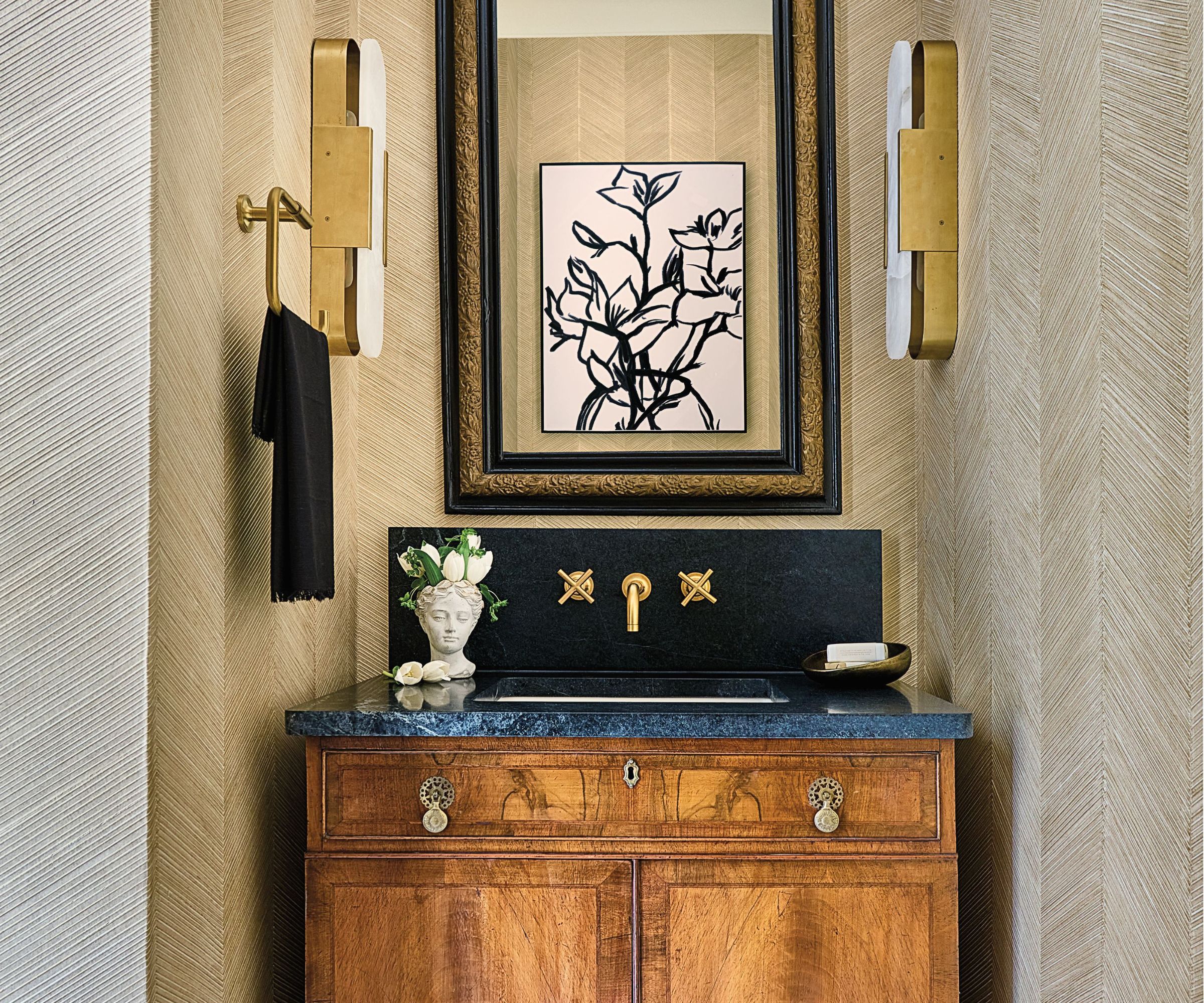
Part of the design team's ingenious space planning for the house involved shrinking the powder room floorplan to add to the pantry and coffee station in the kitchen. It may have shrunk in its footprint, but the powder room ideas are big on style.
'The starting point for the design of this space is the antique vanity and mirror combination,' says designer Emma Legg. 'The vanity used to be a chest in their old house and the mirror is a family heirloom. We contrasted those two sentimental items with a new marble floor, textured wallpaper and alabaster sconces. Brass accents pop off of the honed soapstone countertop and backsplash which also grounds the space.'
Interior designers: Emma Legg & Sydney Foley of Kindred Interior Studios. Photography: Dustin and Susie Peck
Karen sources beautiful homes to feature on the Homes & Gardens website. She loves visiting historic houses in particular and working with photographers to capture all shapes and sizes of properties. Karen began her career as a sub-editor at Hi-Fi News and Record Review magazine. Her move to women’s magazines came soon after, in the shape of Living magazine, which covered cookery, fashion, beauty, homes and gardening. From Living Karen moved to Ideal Home magazine, where as deputy chief sub, then chief sub, she started to really take an interest in properties, architecture, interior design and gardening.
