


Why Your Neutral Kitchen Feels ‘Cold’ – And the 3 Undertones Designers Are Using to Fix It
Discover how designers choose the right undertones for a neutral kitchen

You've just finished painting your kitchen in that seemingly perfect neutral shade, yet something feels off. Perhaps it feels a bit dull, reading the wrong shade, or even making the whole room feel cold.
It's a common occurrence in a neutral kitchen, and the problem is almost always the undertone of our chosen paint color. Just because a shade looks beautiful and warm in one kitchen, doesn't mean it will read the same in yours.
The direction your kitchen faces, the amount of natural light it gets, and the other colors and finishes in the room all impact how a neutral color reads. Here's how designers get it right, and the undertones they are using to fix cold kitchen color schemes.

Why Your Neutral Kitchen Feels Cold

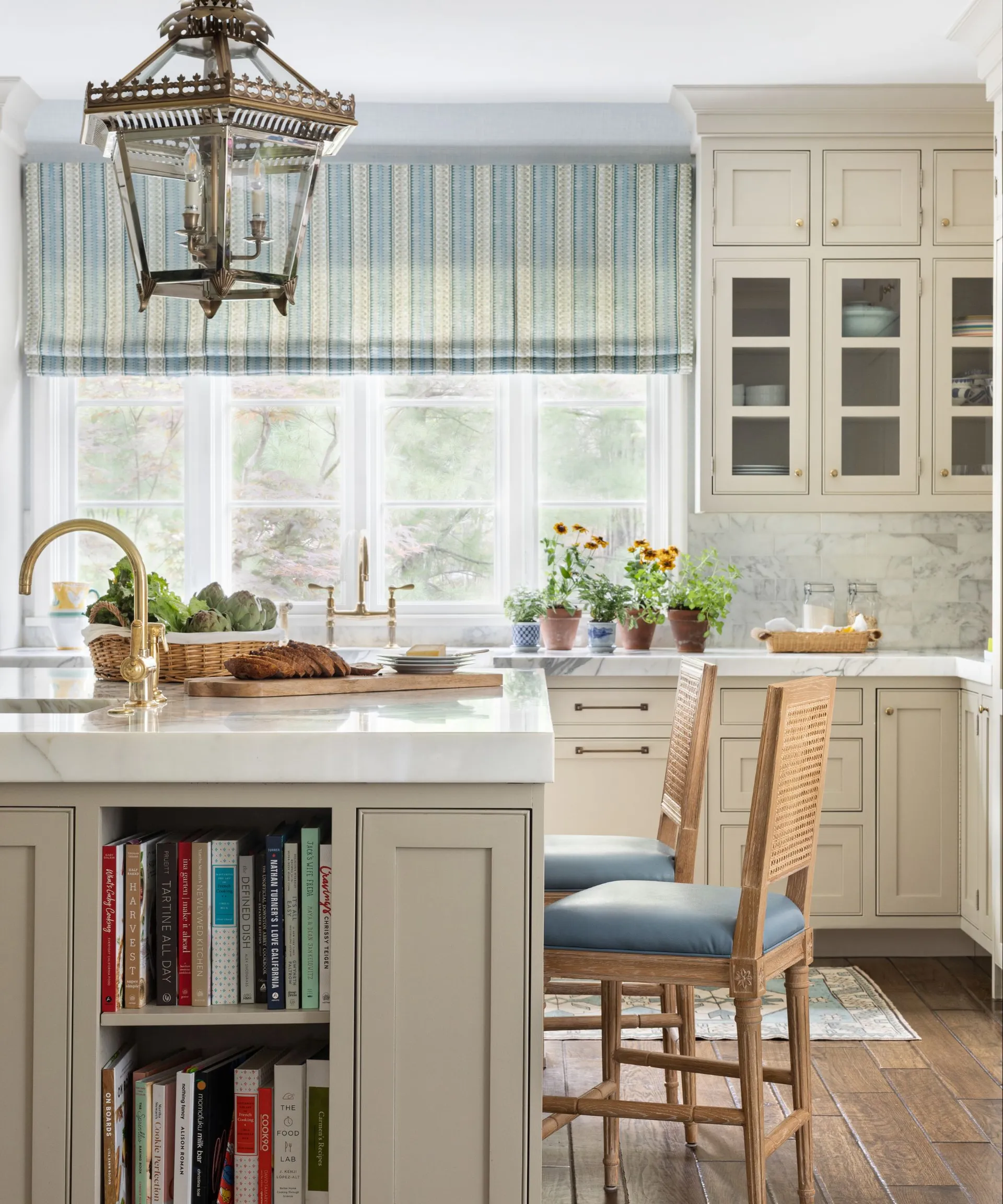
'In this kitchen, we used Farrow & Ball’s All White, which they describe as their most sympathetic white. What makes it so effective is the absence of cooler blue undertones that can cause a space to feel stark or flat. Instead, it sits within a family of architectural neutrals that read softly against natural materials,' says Kimberly.
Color can instantly transform the look and feel of a kitchen scheme. And we're not talking about bringing in bright, bold, vibrant shades – even within the neutral color palette, certain shades can read warm and inviting, while others instantly feel cold and slightly sterile.
And usually it comes down to undertones. Different neutral shades have slightly different base tones that dictate how they read in a room. And while some external factors will impact the shades that work in your kitchen, there are a few undertones designers say always give off a sense of coldness.
'Undertone is often what determines whether a neutral kitchen feels calm and cohesive or slightly off,' says interior designer Kimberly Oxford, who says if you want to avoid a cold kitchen, there are a few undertones to stay clear of.
'I would steer them away from whites and neutrals that carry a strong blue base. Those tones can feel crisp on a paint chip, but in a lived space, especially one layered with wood, stone, and warm metals, they often create a disconnect,' she explains.
Emily Kantz, Color Marketing Manager at Sherwin-Williams, agrees, explaining: 'If the goal is to avoid a cold or stark feel, it’s best to be mindful of neutrals with strong blue or green undertones, as these can appear cooler in certain lighting conditions. Cooler grays and crisp whites may feel less inviting depending on the space and natural light.'
How to Choose the Right Undertones For Your Kitchen

The kitchen color in this deVOL scheme has subtle yellow undertones to counteract any sense of coldness.
Understanding which undertones are best to create a warm atmosphere in your kitchen is a little bit more complex than just choosing a color based on formulas. You also need to look at how the particular undertones read in your kitchen.
'Start with your fixed elements. Your floor, your window frames, and most importantly, your light. Natural light is inherently warm. Think of any beautiful day outside and the golden quality it casts on everything. It’s only on gray overcast days that light turns cool and flat. So a kitchen flooded with natural light will always lean warm, and your undertones should work with that rather than fight it,' says interior designer Ami McKay.
Lighting really is the most important factor when choosing the right undertones to bring warmth to your kitchen, as the amount of daylight the room receives and the direction it faces will have a huge impact on how undertones read. Warm, direct sunlight means neutrals will read warmer, while cooler, indirect sunlight will give the whole room a colder look.
Subtle beige and yellow undertones in the cabinet color here help the color to read warm and inviting.
'Lighting plays a major role, so it’s important to test samples in the actual space and observe how they shift throughout the day,' says Emily. 'Consider fixed elements like cabinetry, countertops, and flooring, and choose undertones that complement those finishes. Sampling a few options side by side is the best way to ensure a cohesive result.'
The existing materials in your kitchen should never be overlooked. 'A lot of the time, we see people wanting to tone down the warmth in a tile or countertop and end up picking a cooler cabinet color. Often, that will make the tile and countertop look even warmer because there is a stronger contrast between the two. You want there to be cohesion among the undertones of all the colors in the space,' explains Arianna Barone, Color Marketing Manager at Benjamin Moore.
'The principle we come back to: warm light needs less help. Cool or north-facing light needs warm undertones deliberately built in through wood, brass, or a linen-toned cabinet paint. And if you’re ever unsure, bring samples home. Live with them through a full day. Morning light and afternoon light will tell you everything a showroom never can. The kitchen that feels right at noon and still feels right at dusk. That’s the one,' says Ami.
3 Undertones Designers Use For a Warm Neutral Kitchen
Beige and Greige

Gray and beige undertones in this neutral kitchen paint color are key to the warmth of the greige cabinetry.
Beige has become one of the most coveted neutrals, and even greige tones feel warmer than stark whites and blue undertones. They soften a pure white, but be really careful about gray undertones – cool gray will create that sense of cold, while greiges are far warmer.
'Warmer undertones tend to create a more welcoming and livable kitchen. Soft beige, taupe, and creamy white undertones add subtle warmth and depth without overpowering the space,' says Emily.
- Beige undertones: Accessible Beige SW 7036 by Sherwin-Williams
- Taupe tones: Joa's White by Farrow & Ball
- Greige undertones: Fossil AF-65 by Benjamin Moore
Yellow

Yellow undertones in this cream kitchen bring a warmth while still feeling bright and inviting.
Yellow is another undertone that naturally brings out a warmer finish in neutral paints. Just think of those warm white and cream shades that you naturally gravitate towards for a softer finish.
You'll often find yellow undertones in some beige and light brown colors, bringing a soft, warm, and welcoming atmosphere. Paint colors with yellow undertones are great for kitchens that receive a lot of cooler, flatter light throughout the day, as it introduces the warmth of sunlight.
'We prefer warm beige, honey, and soft organic tones that feel alive rather than flat. The sweet spot: creamy whites with yellow or linen undertones, woods with amber or honey in them, stone that reads more taupe than blue,' says Ami.
- Yellow/greige undertone: Natural Linen SW 9109 by Sherwin-Williams
- Soft yellow undertones: Standish White HC-32 by Benjamin Moore
- Warm yellow undertones: Wimborne White by Farrow & Ball
Pink and Red

'Pristine OC-75 on the cabinets brings a soft, but warm touch of color to the otherwise neutral space,' says Arianna.
Neutral colors with pink or red undertones are among the warmest hues, offering the opposite finish to shades with blue undertones. 'For a warm and inviting look, lean into warmer hues like reds, pinks, and oranges,' suggests Arianna.
'These types of hues have an inherent welcoming feeling, so they don’t often feel cold or sterile. Color is subjective and comes down to personal preference, so lean into the types of hues that you prefer.'
- Pink undertones: Cocoa Butter 1023 by Benjamin Moore
- Dusty pink undertones: Dusty Road 1017 by Benjamin Moore
- Peach undertones: Pristine OC-75 by Benjamin Moore
The key thing to understand about kitchen paint color undertones is that there is no single approach that works in every space. You have to understand the natural light your space receives, as well as how different paint colors present against the other materials in your design. Having a few options will give you a clearer picture.
'We usually begin with three carefully considered options and meet on site to study them in place. Seeing everything in situ, under the actual light of the home, is what allows us to make a confident and informed decision,' Kimberly notes.
'A well-chosen neutral should feel like it belongs to the room before you even notice it.'
Love beautiful design ideas, expert advice, and inspiring decor trends? Sign up for our newsletter and get the latest features delivered straight to your inbox.
