This Farrow & Ball shade is set to be the most popular color of the season
Fall’s fiery hues are expected to make way for a rosé-infused tone with a mustard pigment

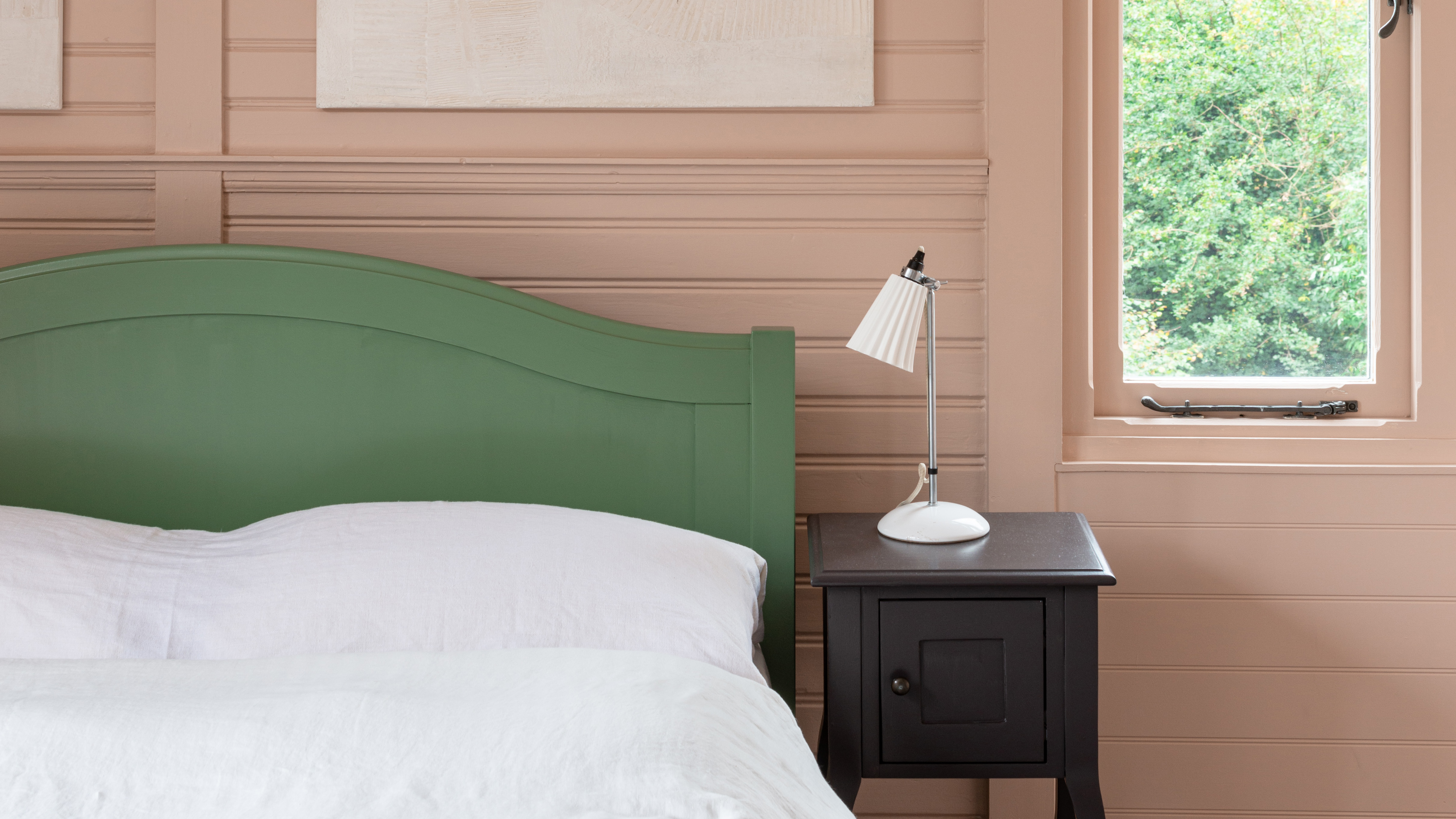
Fall may traditionally provoke visions of blazing leafy hues – but this year – a blushing new tone will rewrite all your fall color scheme favorites.
The shade in question is Setting Plaster, a dusty pink designed to recreate the ambiance of a freshly plastered house from paint powerhouse Farrow & Ball. New research* has forecast the shade will set the tone in the most fashionable of schemes this season – and throughout 2022.
However, despite its evident allure, this color is not the only shade expected to set color trends over the coming months. Instead, we’re also turning to three other flushing hues – and a vivid yellow – that will ensure your home is filled with eternal sunshine as the nights grow increasingly longer.
Here are the five shades predicted to reshape the most stylish paint ideas of the near future.
1. Setting Plaster by Farrow & Ball
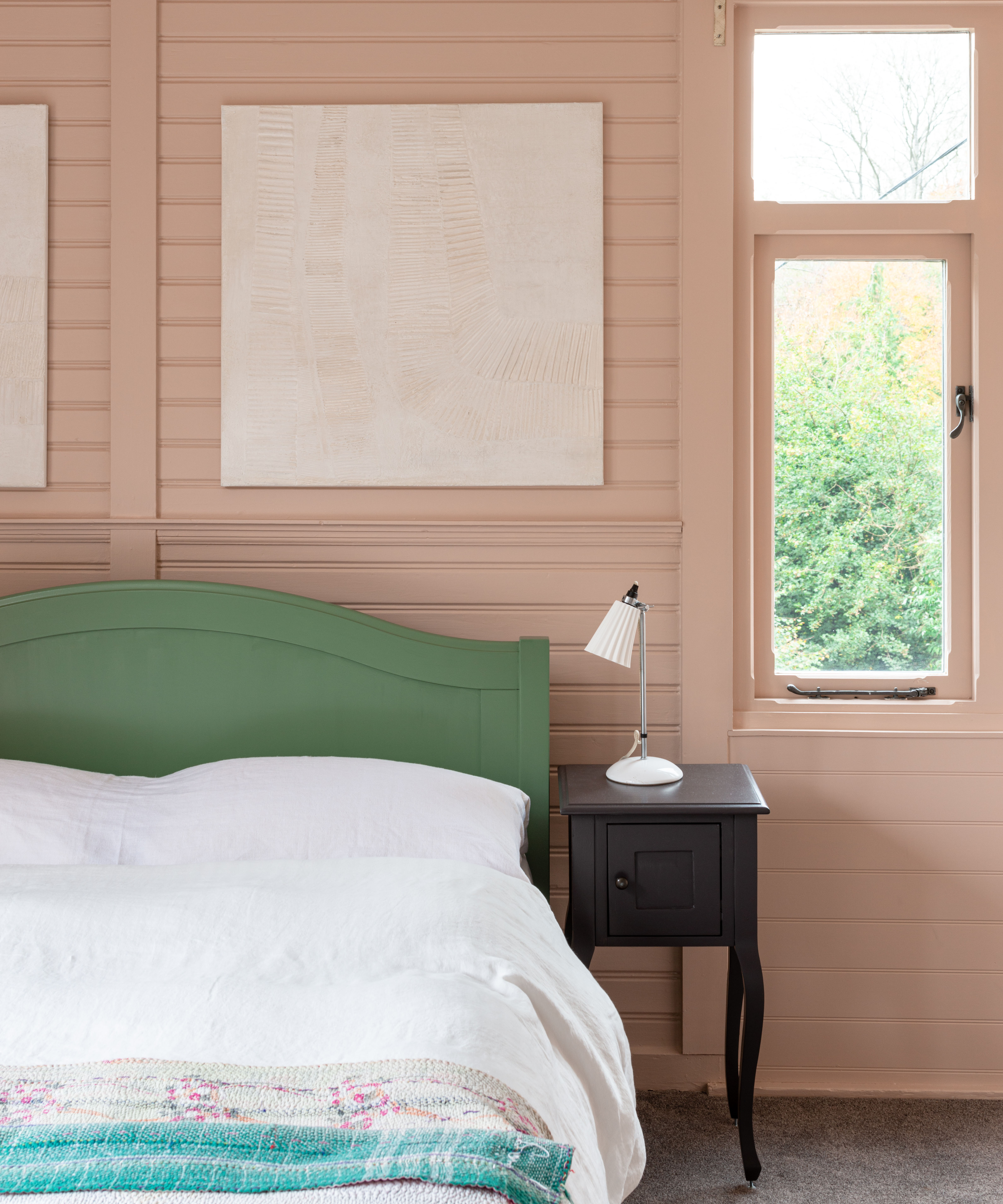
You’re about to see a lot of Setting Plaster. This pink shade is officially the color with the highest volume of monthly searches globally – and it’s easy to see its appeal. While the shade is defined as ‘pink,’ Farrow & Ball note its ‘inclusion of yellow pigment,’ which gives the color a unique allure that will warm your home as the cooler days draw closer.
Its somewhat timeless aesthetic also makes Setting Plaster a beautiful backdrop to your favorite antique furniture – whilst also standing as a statement in the most contemporary of homes.
2. Dead Salmon by Farrow & Ball
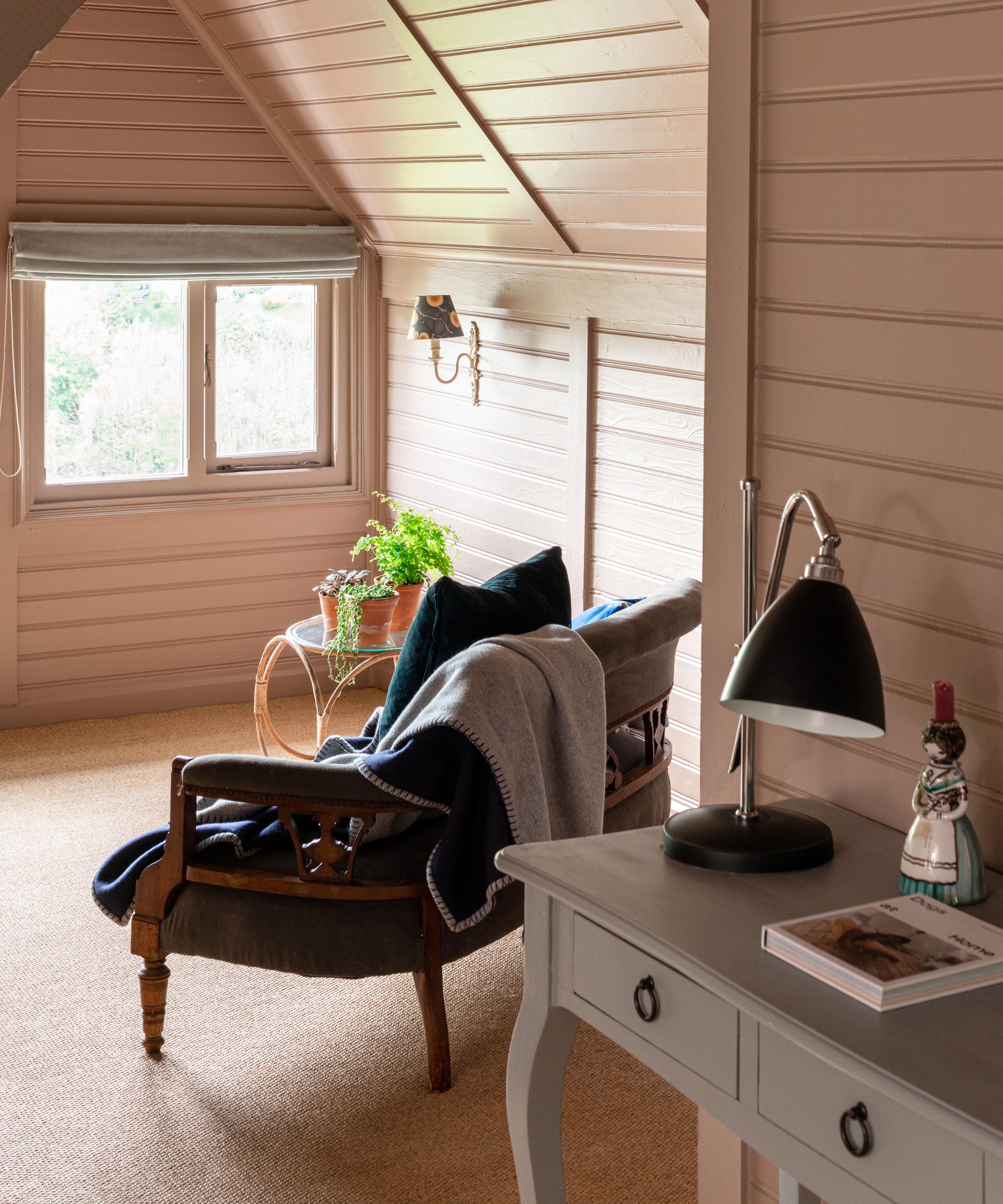
Following in the footsteps of its sought-after sister, Dead Salmon similarly showcases the best of Farrow & Ball’s pink palette through its rich salmon tones. The name is a nod to the flat finish of an ‘aged pink’ painted at Kedleston Hall in the early nineteenth century – but despite its roots in the past – Dead Salmon has never felt so contemporary.
Design expertise in your inbox – from inspiring decorating ideas and beautiful celebrity homes to practical gardening advice and shopping round-ups.
And what is the proof of its enduring charm? It’s second place in the study, which suggests this is among the most desired shades of the year.
3. India Yellow by Farrow & Ball
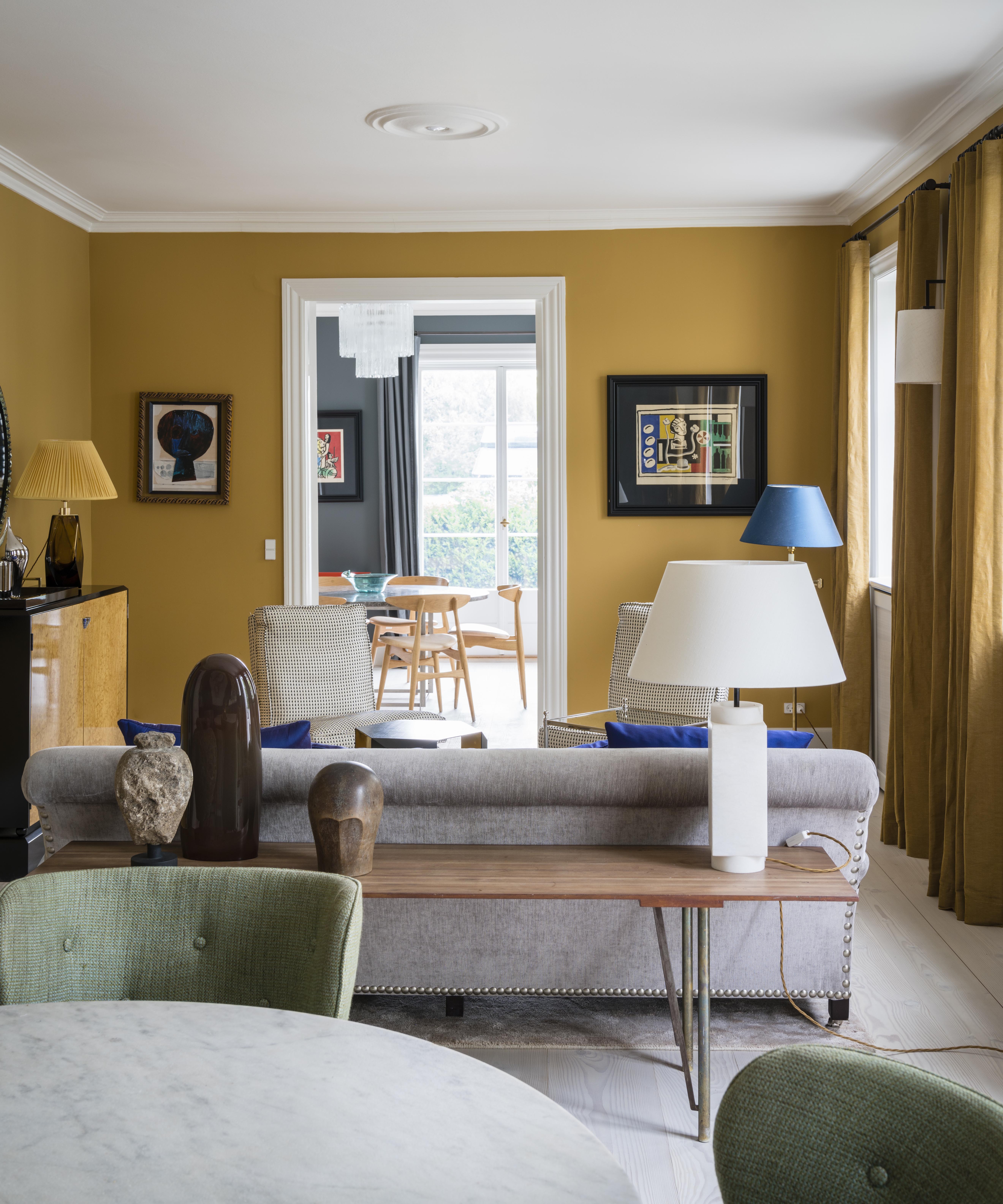
In celebration of Farrow & Ball’s hat-trick, the third most popular shade pauses the vast desire for pink – and introduces yellow into the mix.
This deep mustard hue is an alternative for those who want to experiment with yellow without overpowering their scheme – especially when paired alongside darker tones to create a contrast that will balance the scheme – and act as a soothing hallway paint idea.
4. Sulking Room Pink by Farrow & Ball
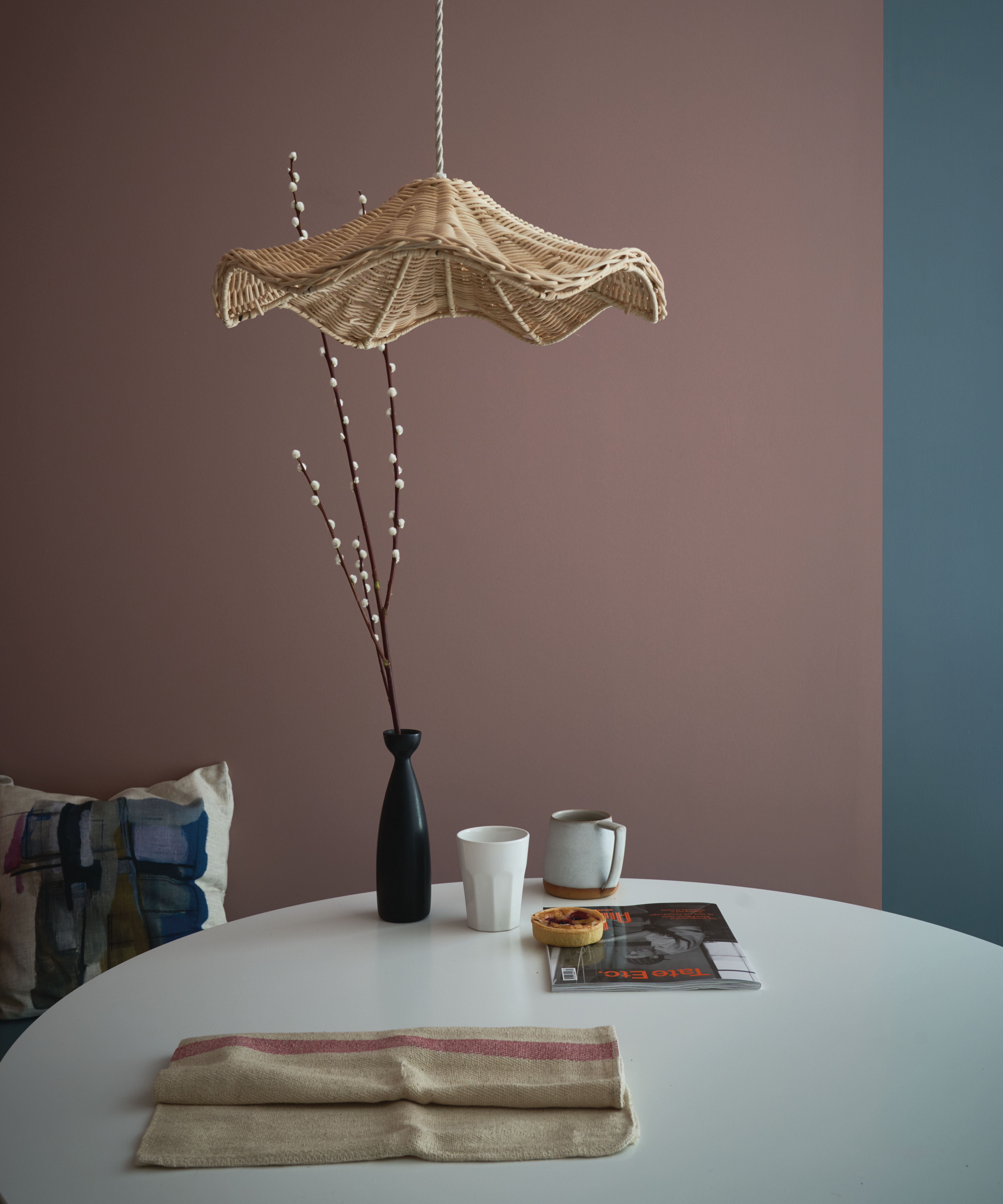
While India Yellow interrupted pink’s winning streak, Sulking Room Pink replaces the emphasis on this rosy hue. Its attraction may be pinpointed to its subtle qualities – meaning the shade is more muted and warm than overtly pink.
This contemporary coolness means Sulking Room Pink works well alongside other shades – whilst also making a chic statement of its own.
5. Copper Blush by Dulux
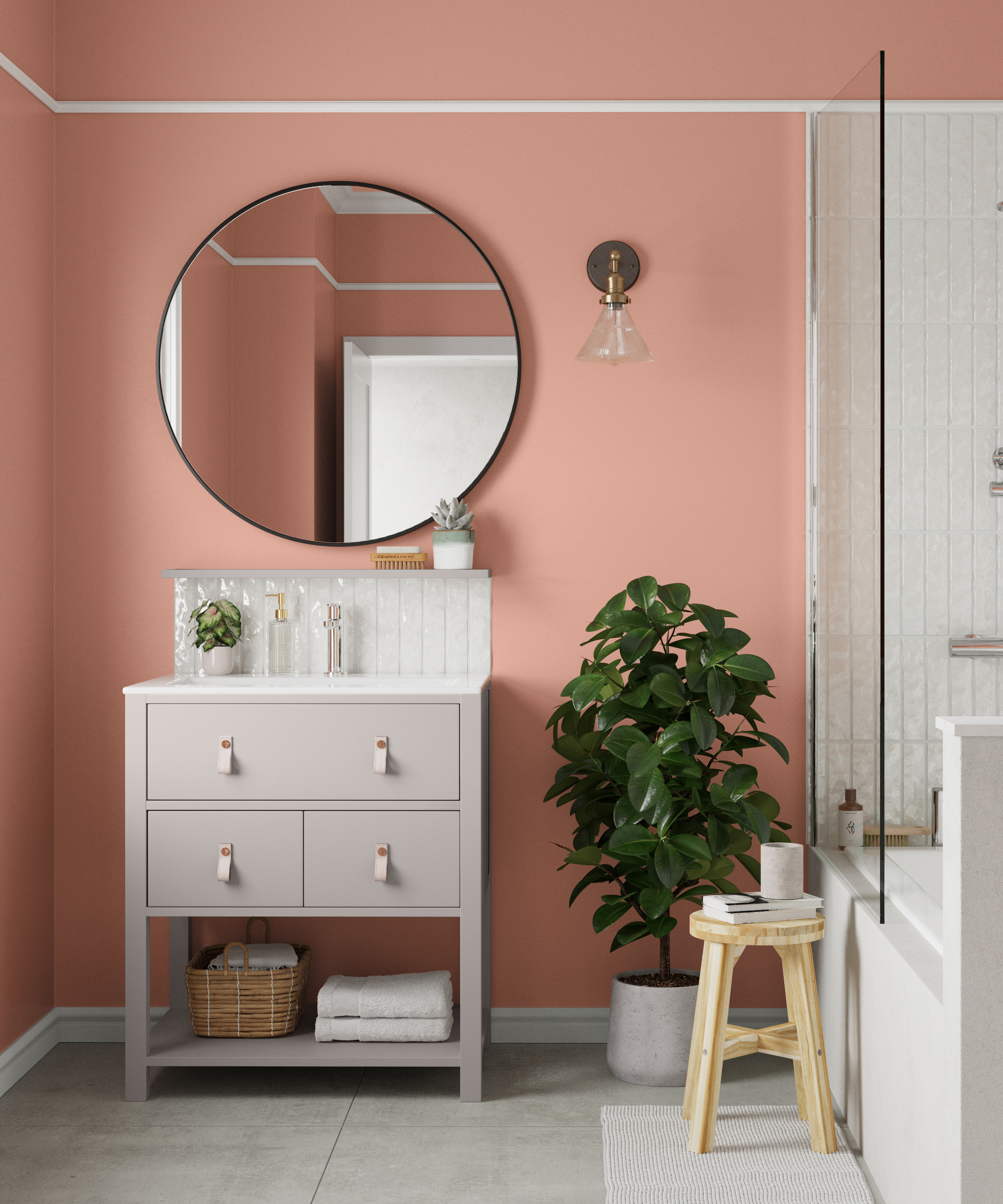
Dulux’s combination of coral pink and organic neutrals was enough to take fifth place in the top five most popular shades this fall – in a study that reinforces pink’s appeal with a natural twist.
This blooming shade pays homage to the brighter days gone by whilst staying right on trend with its bright pink characteristics. It’s the living room paint idea that will keep the vibrancy of summer’s palette alive throughout the rest of the year and long into 2022.
*Study by Homedit.com.

Megan is the Head of Celebrity Style News at Homes & Gardens, where she leads the celebrity/ news team. She has a history in interior design, travel, and news journalism, having lived and worked in New York, Paris, and, currently, London. Megan has bylines in Livingetc, The Telegraph, and IRK Magazine, and has interviewed the likes of Drew Barrymore, Ayesha Curry, Michelle Keegan, and Tan France, among others. She lives in a London apartment with her antique typewriter and an eclectic espresso cup collection, and dreams of a Kelly Wearstler-designed home.
