The 3 colors to decorate with this year – Geraldine Tan shares how pastel colors are changing
The award-winning interiors blogger predicts how the pastel color trend is going to be made over for the new season

Design expertise in your inbox – from inspiring decorating ideas and beautiful celebrity homes to practical gardening advice and shopping round-ups.
You are now subscribed
Your newsletter sign-up was successful
Want to add more newsletters?
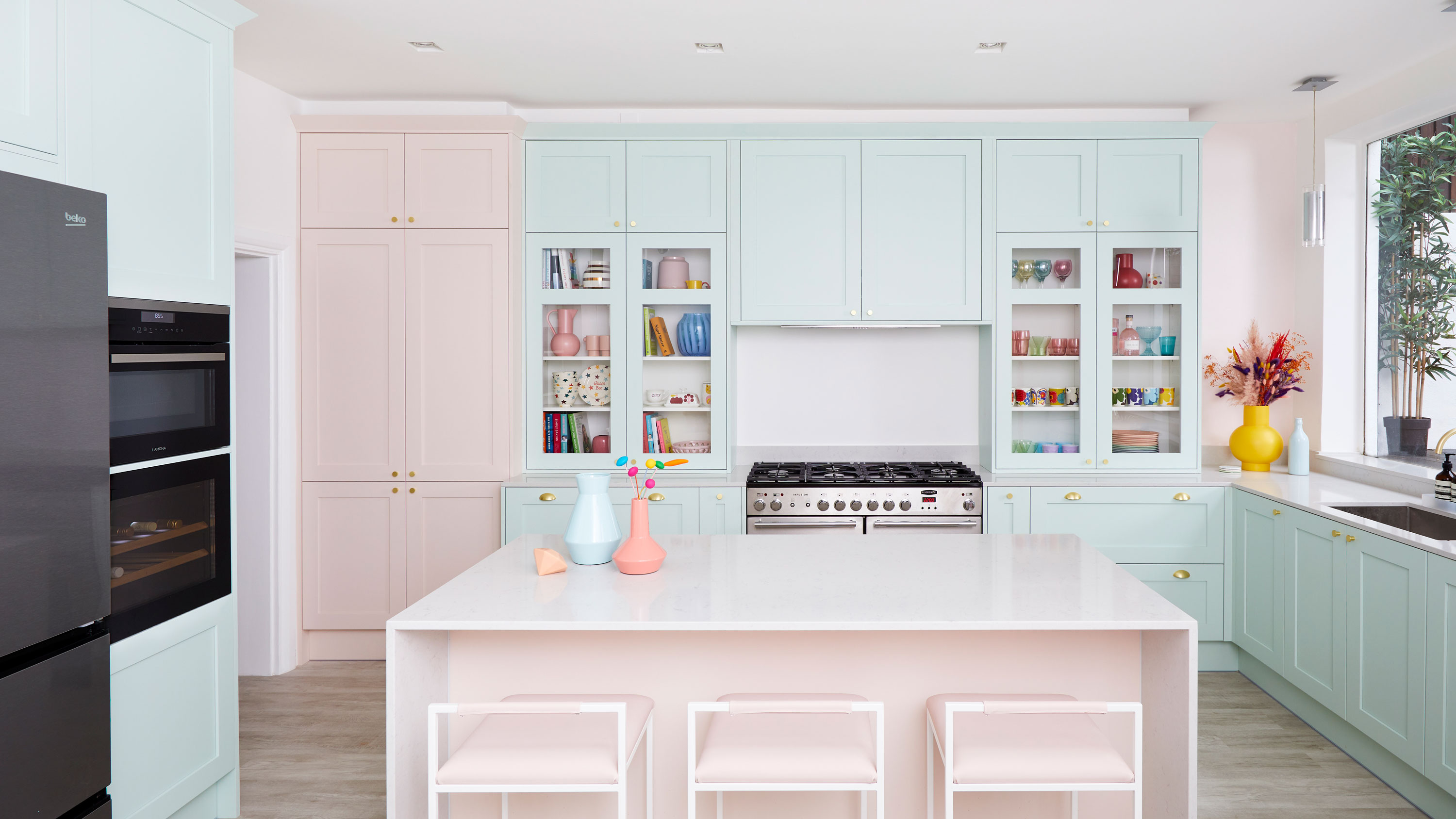
Pastel shades have been big news this year, and nobody does pastels better than interiors expert Geraldine Tan. However, despite championing the sugary shades long before they were trending, the award-winning blogger predicts there will be a change in tone for the pastel color trend this year.
See: Color trends – the latest key trends you will see this year
As a medical consultant working in A&E during the day, Geraldine has honed her design skills as a stylist and homeware photographer in her spare time. She built up an incredible résumé as the founder of the award-winning blog Little Big Bell, an Instagram content creator, and an established part of the interior design community. She has been invited to judge twice at Paris' Maison et Objet fair and was also one of the five founding contributors for Instagram’s @design account.
Article continues below 
Geraldine Tan's living room
Speaking exclusively to Homes & Gardens as part of the OPPO Color Counsel, she revealed her predictions for how the colors used in our home are going to change this year.
'Pastel hues have been very huge with light pinks, bright yellows, lilac shades and minty greens,' she explains. 'I think going forward to autumn, winter and the next season, a lot of these similar bright pastel hues are going to go down a tone.'
How the pastel colour trend will change
According to Geraldine this new change in tone is influenced by our longing to feel protected at home.
'I want to feel protected, it's almost like a cocooning effect about how I can feel well in myself. I think a lot of these pastel hues that are quite on-trend at the moment for spring-summer will still be there – but I think the colors will take a deeper tone.'
Design expertise in your inbox – from inspiring decorating ideas and beautiful celebrity homes to practical gardening advice and shopping round-ups.
The new colors to watch out for in late 2021
These are Geraldine's color predictions beyond summer 2021.
1. Olive green
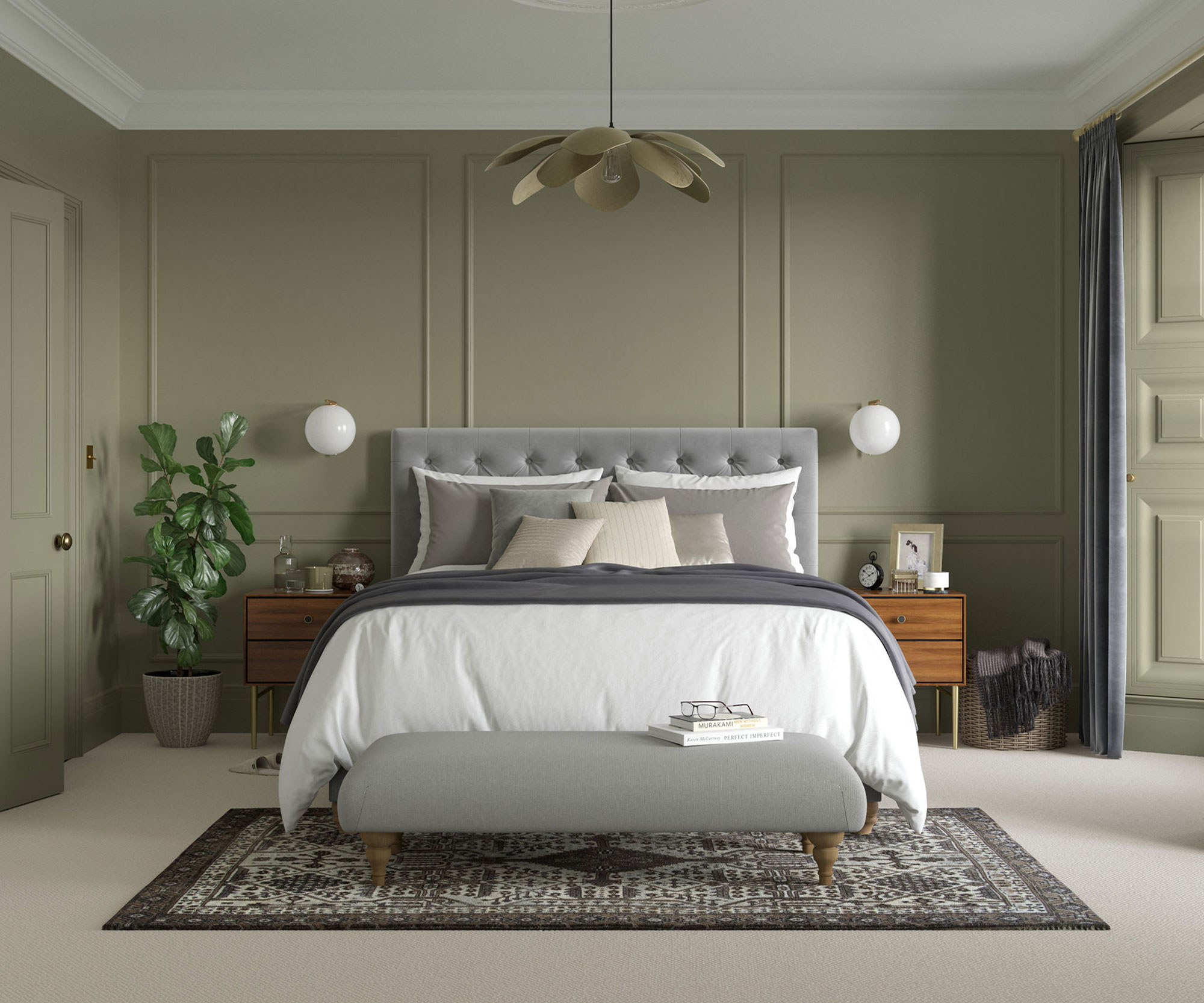
Drab by Dulux Heritage
According to Geraldine, we should expect to see the minty green that is popular at the moment toned down to olive green when we move into fall – 'but not too dark' Geraldine insists.
'I think a lot of longing for the outdoors and travel will also have an impact on how we use color in the coming seasons as well. So I think trying to embrace nature with color and earthy tones,' she adds.
2. Milky latte beige
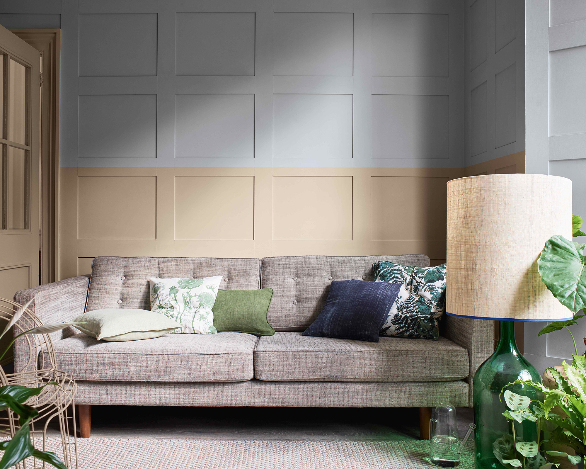
Brave Ground by Dulux
This is beige but not as you know it. To complement the new color palette Geraldine is betting on beige resurfacing but without the yellow tones.
'I think beige-like tones will come in, but I don't think they will have that yellow tone, I think they will be more kind of a light milk latte tone, and these will complement the other colors really well,' she explains.
For more inspiration explore our neutral room ideas feature.
3. Plaster pink
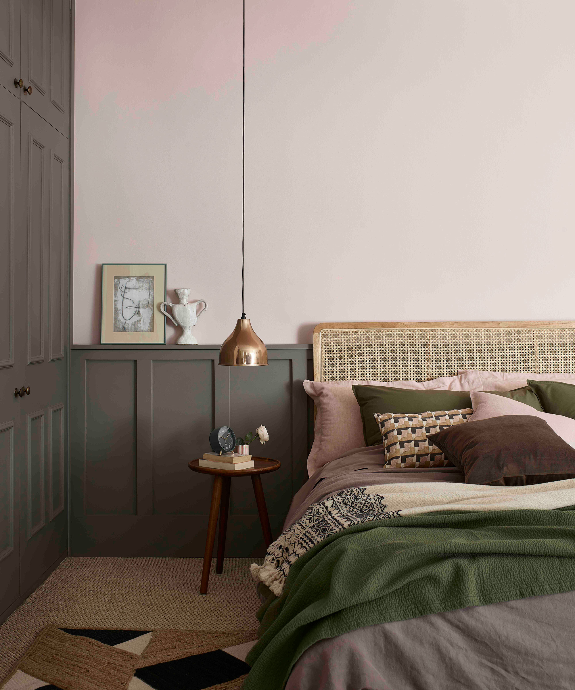
Potters Pink by Dulux heritage
While Geraldine plans to embrace these new toned down, chalkier shades there is still space for her iconic pink. However, rather than a bright pink, she predicts we'll be turning to a more earthy shade.
'I quite like plaster pink, so it almost has that cement and lighter shades, so not too orangey,' she explains.
See: Living room color schemes – the best color ideas for living spaces
Geraldine might be famed for the pastel-hued home that she has documented on Little Big Bell, however, she plans to adopt this tonal shift when decorating her latest project.
'I've got a two-bedroom flat in the west end of London and I'm going to be refurbishing it, so it's going to be slightly more grown-up decor. So it will have those colors that I'm predicting,' she explains.
'All the milky latte tones with the pastel tones that are a little more chalky, more grey tones. So it is kind of like a more grown-up version of my Little Big Bell which is very bright pastel hues, but it will still be in line with my aesthetic.'

Rebecca has been working as a homes and interiors journalist for over four years. She first discovered her love of interiors while interning at Harper's Bazaar and Town & Country during my Masters in Magazine Journalism at City, University of London. After graduating she started out as a feature writer for Women's Weekly magazines, before shifting over to online journalism and joining the Ideal Home digital team covering news and features. She is passionate about shopping for well-crafted home decor and sourcing second-hand antique furniture where possible.