Kendall Jenner Just Convinced Me To Put This Daring Farrow & Ball Shade on My Bathroom Mood Board – it's Bold, Eclectic, and Timeless
Kendall's bathroom showcases a spectacular paint shade – it's risky, but it looks effortless

Design expertise in your inbox – from inspiring decorating ideas and beautiful celebrity homes to practical gardening advice and shopping round-ups.
You are now subscribed
Your newsletter sign-up was successful
Want to add more newsletters?
When it comes to bathroom design, two trends have begun to dominate – and they couldn't be more different.
Recently, a preference for spa-like bathroom ideas has beckoned the return of gleaming, all-white spaces, usually clad in swathes of marble or finished in breezy neutral shades. Yet just as popular is a rather different approach: maximalist, color-drenched bathrooms showcasing rich, moody hues.
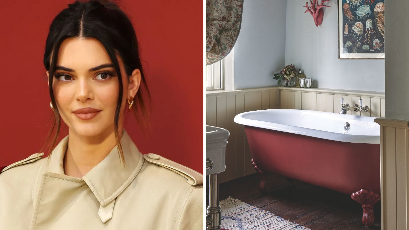
Take a look at Kendall Jenner's bathroom, and it's clear that a neutral palette wasn't the goal. Instead, designer Heidi Caillier chose to paint both the double vanity and the wood-panelled walls in a striking color: Farrow & Ball's Brinjal.
Article continues belowA post shared by Frank Frances (@frankfrancesstudio)
A photo posted by on
Recreate Kendall's Burgundy Bathroom
If Kendall's bold and beautiful bathroom is making you want to start decorating with burgundy, I've curated a Kendall-inspired bathroom edit below.
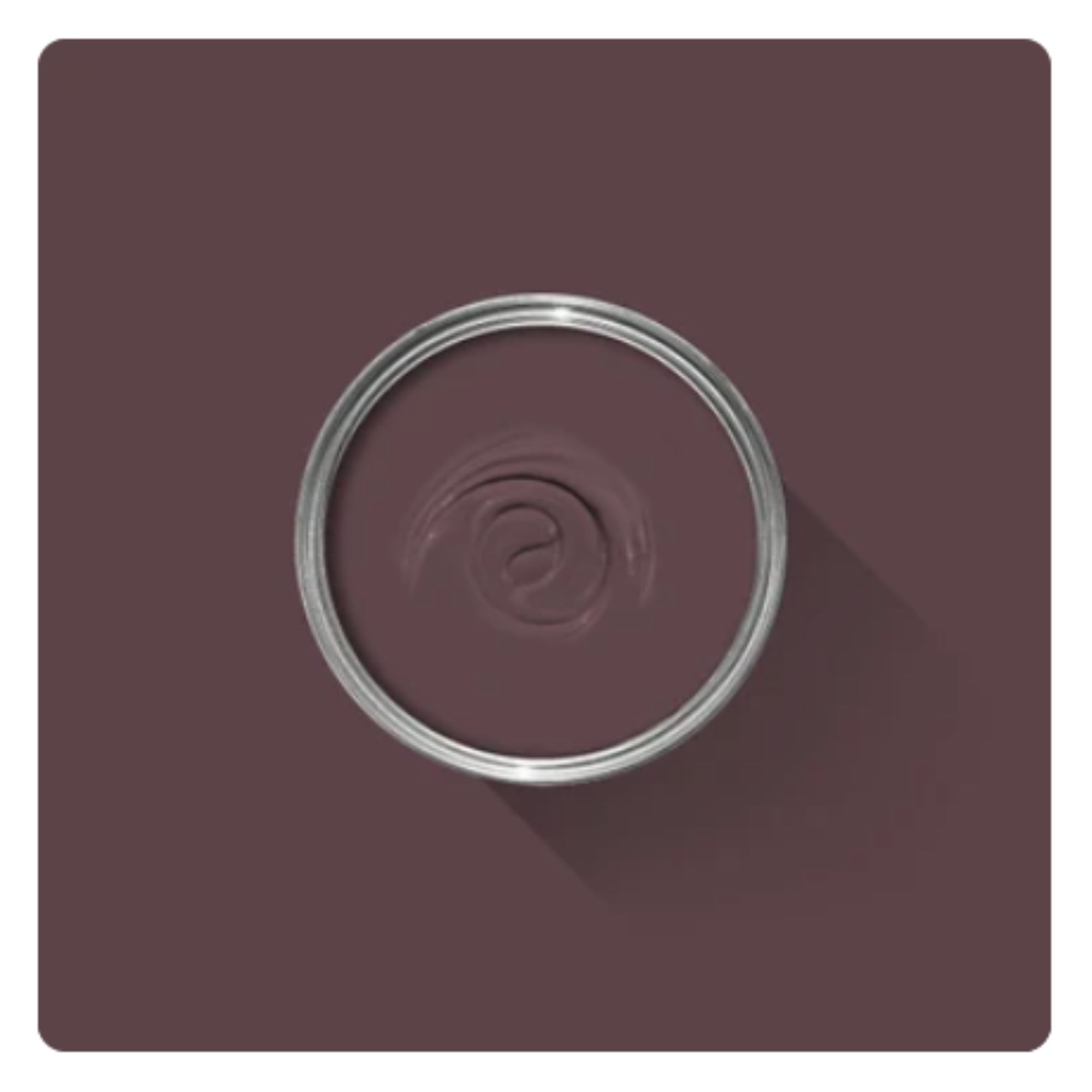
If you want to recreate Kendall's look, it all starts with this luxurious shade. It might look like burgundy, but it's actually a purple shade with undertones of red.
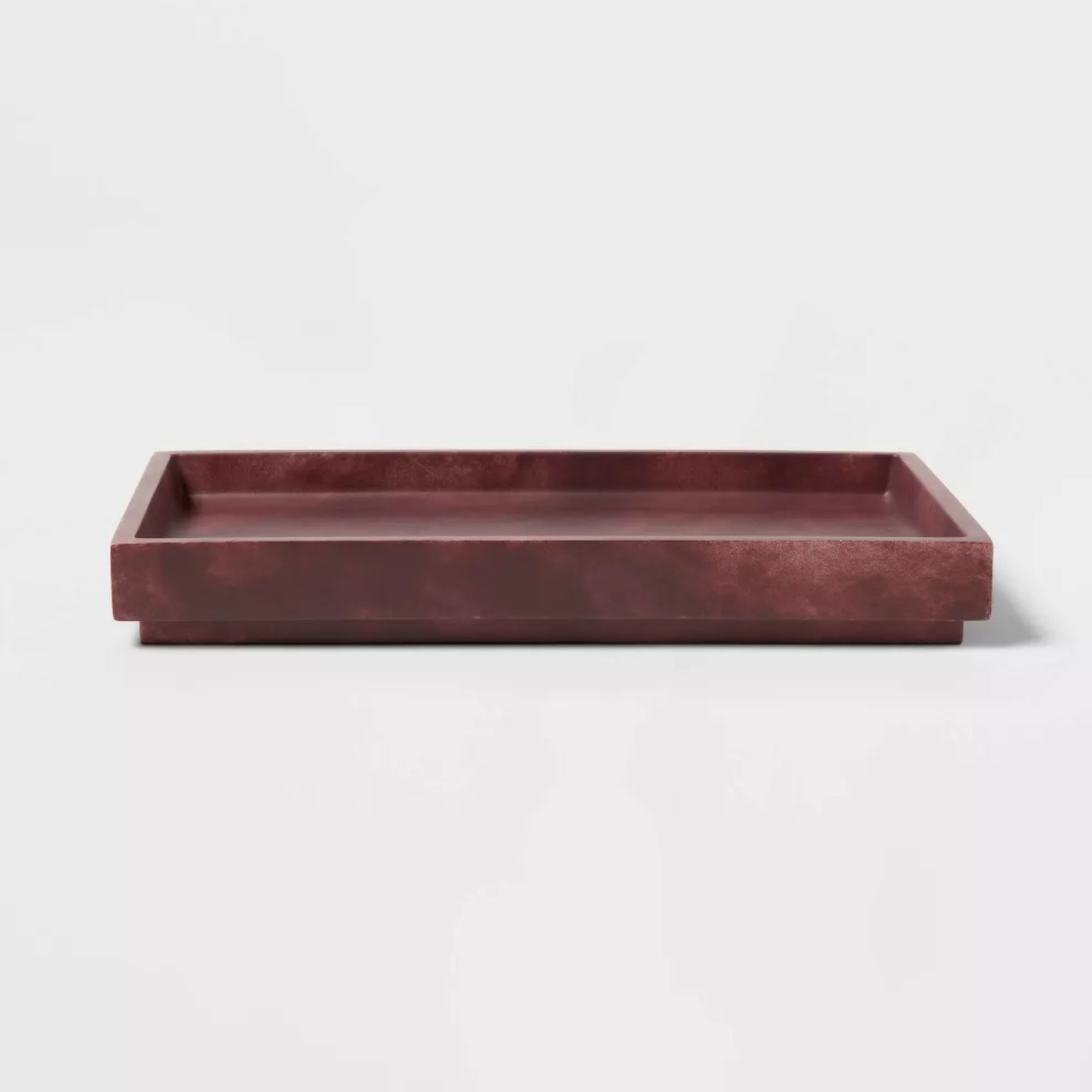
Bring a touch of opulence to your bathroom with this tray. The deep red tone adds a dash of color, while the faux marble offers texture and visual interest.
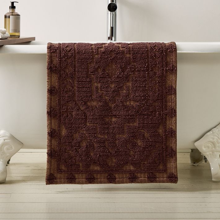
Kendall's bathroom features a Persian rug in shades of red – but if you don't have the space, you can show off the same colors using a bath mat instead.
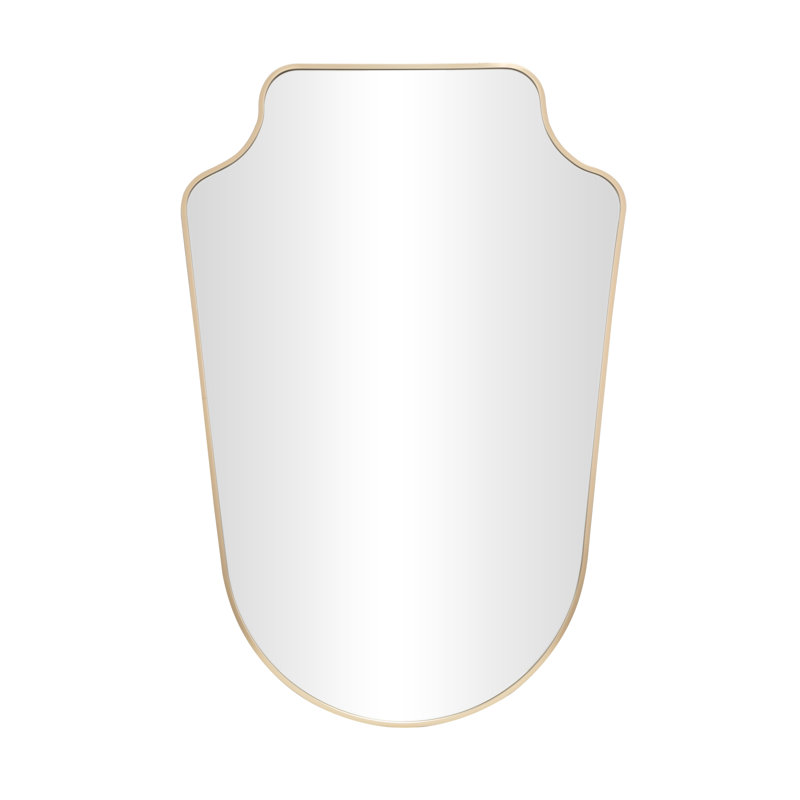
In a space decorated with darker paint, it's crucial to bring in as much light as possible – and this means plenty of mirrored surfaces. I love the curved silhouette of this mirror.
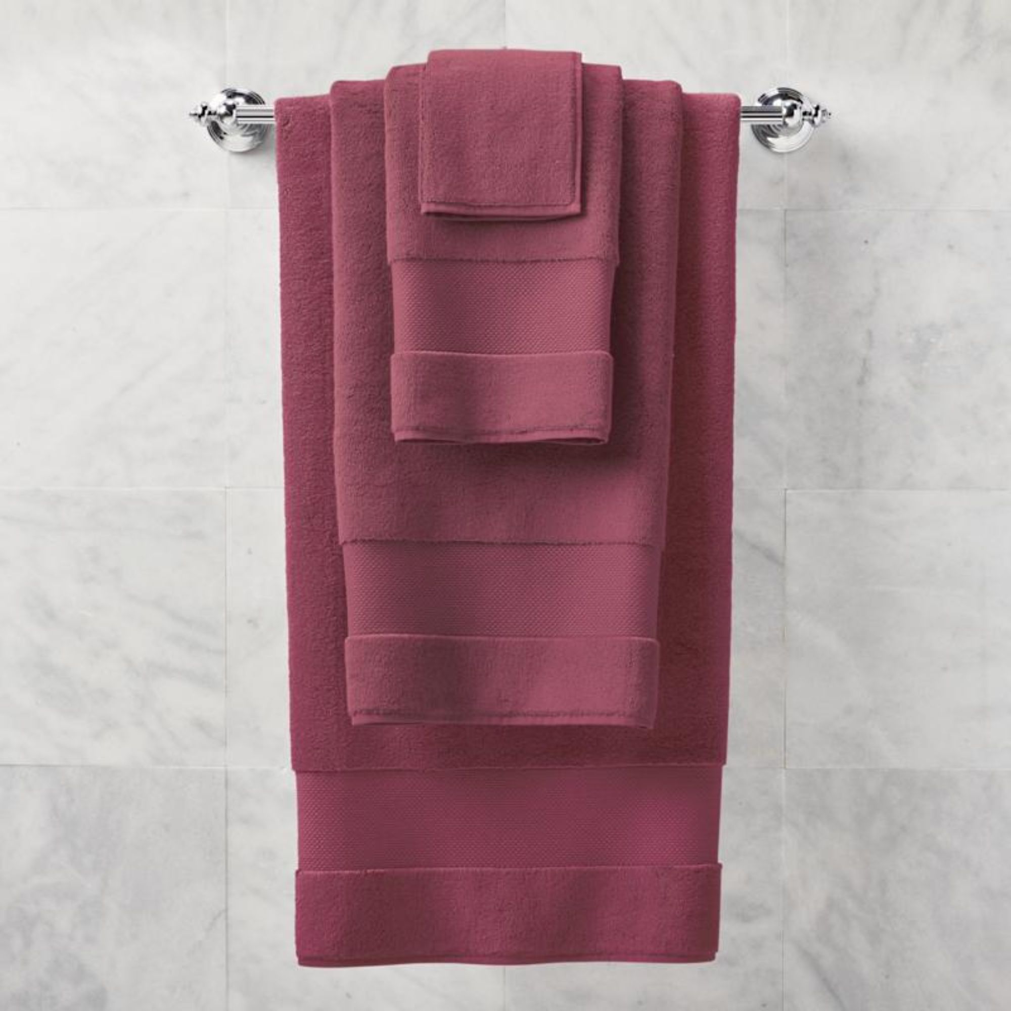
If you don't fancy repainting your bathroom, you can easily introduce pops of color using essentials like bath towels. These are some of the best bath towels you can buy if you're looking for affordable luxury.
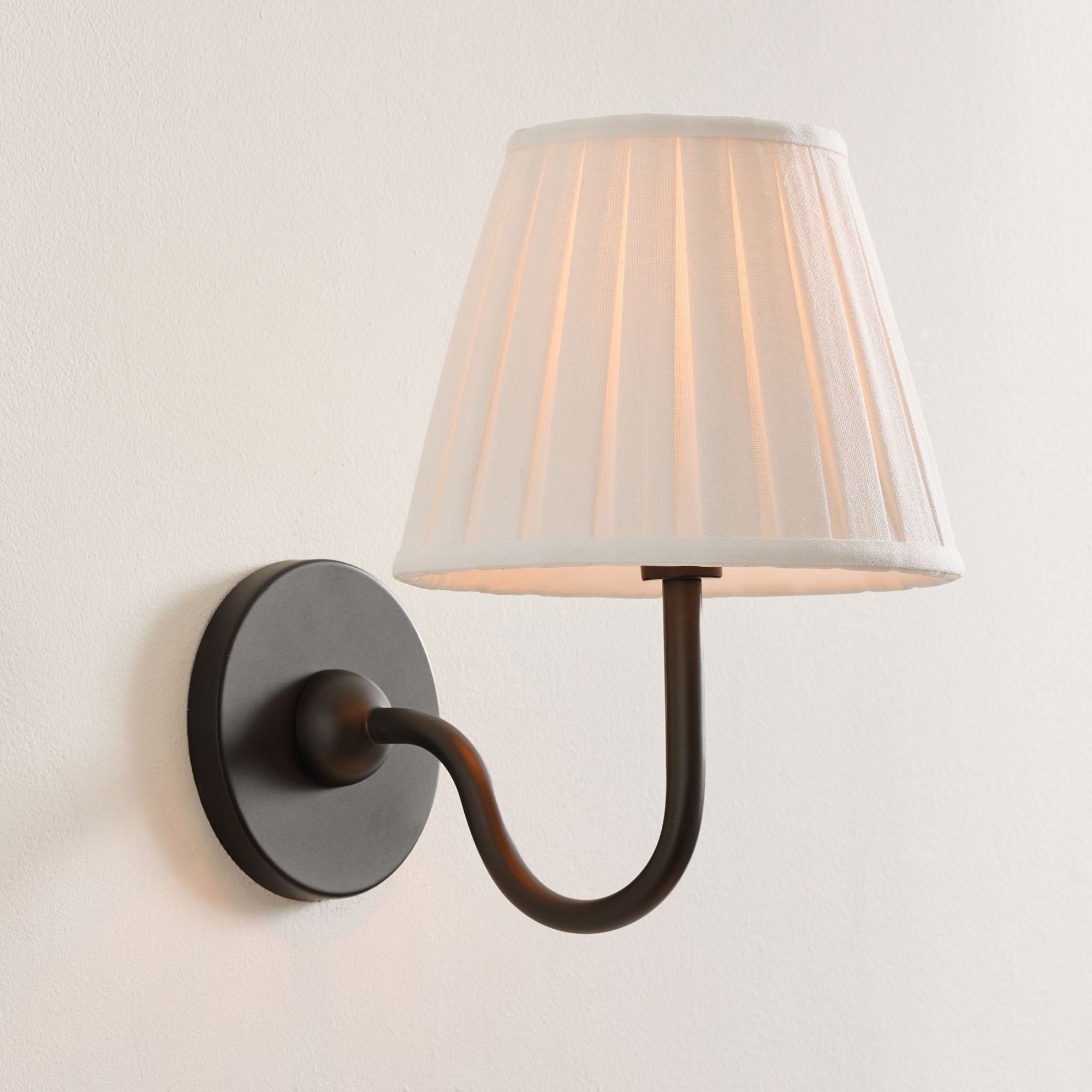
Kendall adds brightness to her bathroom with delicate sconces like these. The bronze finish compliments the deep wall color, while the cream shades provide an elegant contrast.
Brinjal is, in fact, a regional name for the eggplant. (You'll largely hear it used in Singapore, Malaysia, India, and South Africa.) With this in mind, the Farrow & Ball shade isn't a simple burgundy; instead, it's a deep, striking purple with red undertones.
Upon first glance, the coordinating vanity and walls look like a classic example of the color-drenching trend. Yet a closer inspection reveals that the room's weathered stone floors and rustic ceiling beams remain untouched – an ingenious decision which guarantees that the paint color makes a statement without overwhelming the space.
While a bathroom color idea like this one is guaranteed to be impactful, it doesn't darken the room. Kendall proves that deep shades won't always look lurid or harsh; in fact, the paint's glossy finish reflects the light and helps the entire space feel warm and cocooning.
Design expertise in your inbox – from inspiring decorating ideas and beautiful celebrity homes to practical gardening advice and shopping round-ups.
If you're a fan of maximalism, it can be tempting to take paint right up to the ceiling or across the floor – but preserving the integrity of natural materials like stone and wood allows the character of a room to really shine. Kendall's mountain home is brimming with rustic touches and whimsical details, and her bathroom remains faithful to this aesthetic while adding a playful pop of color.
I'll always be a fan of an experimental color palette, but I'm often wary about bringing it to life: lean too far into the trend, and a room risks feeling one-dimensional.
In Kendall's bathroom, however, texture is key. The vanity is topped with a magnificent slab of white marble which helps to break up the scheme, and antique-inspired brass hardware lends further depth and visual interest. Even the casually-placed potted plant adds contrast, while echoing the organic feel of the stone and wood.
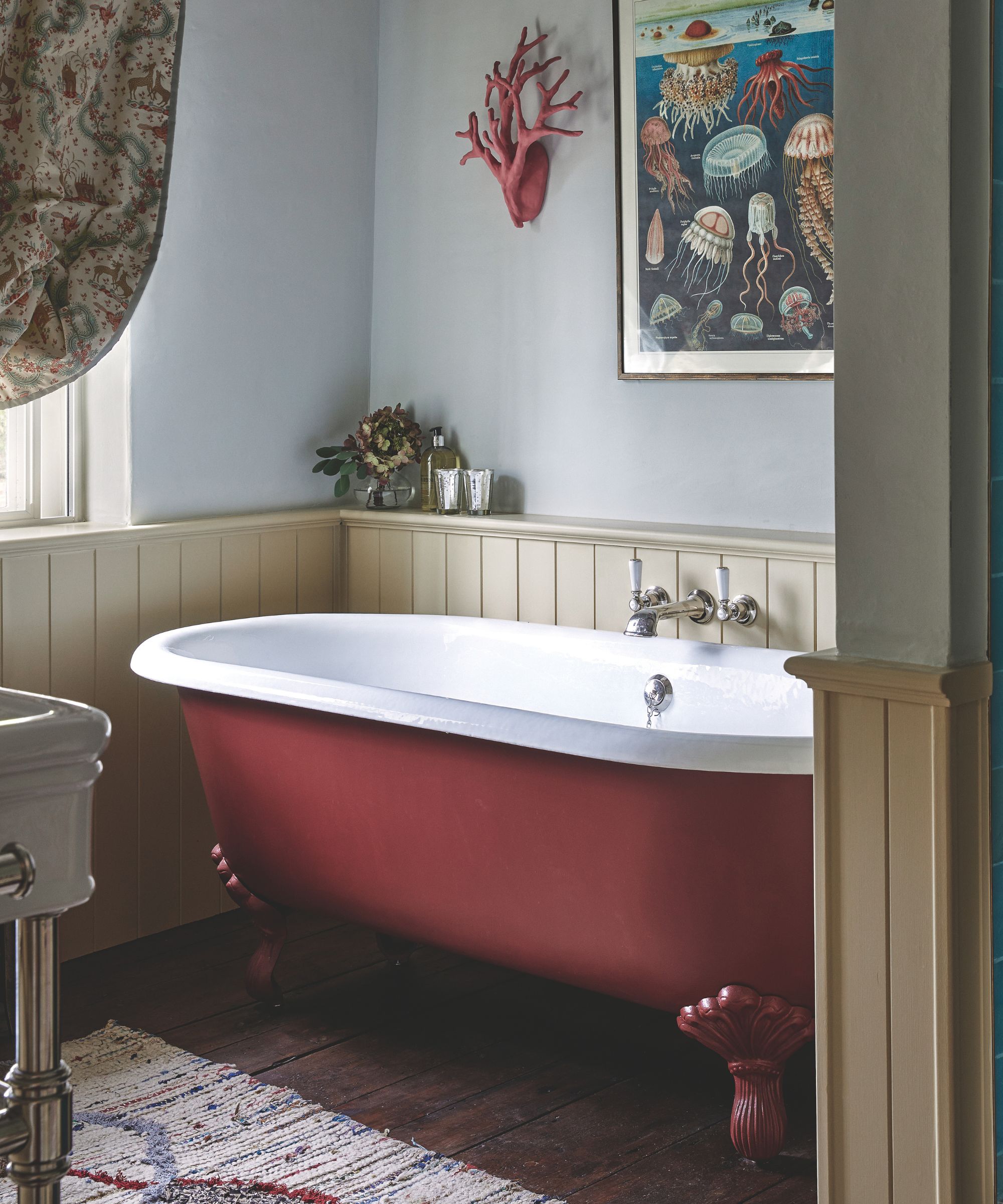
Burgundy can bring a sense of drama and elegance to bathrooms
Block colors often seem like a distinctly contemporary design choice, but Kendall proves that even the boldest spaces can still be emanate heritage charm. (Her entire home is, in fact, a masterful approach to the 'grandma chic' aesthetic.)
Plus, I'm just as obsessed with the wall decor in Kendall's bathroom. I love the sweeping silhouette of the mirrors – the curved shapes soften the more rigid lines of the vanity and vertical paneling – while the sconces bring an old-world elegance to the room.
The brass and marble certainly give a subtle nod to the spa-like bathroom trend, but Kendall creates a more traditional feel – and her bathroom feels both unique and utterly timeless.
According to designers, a rich burgundy shade like this one can help a space feel both dramatic and inviting.
'A color like Benjal carries a warmth that immediately softens stone, plaster, and metal, so the room feels atmospheric rather than hard edged,' explains interior designer Angela Reynolds. 'The effect is cocooning and intentional, not dark for the sake of drama. Architectural lines blur a bit, corners recede, and the space feels immersive.'
While this 'immersive' effect can be impressive, variation is the secret to maintaining depth – and this means choosing both materials and lighting carefully.
'You want layered light sources at different heights, not just overhead light,' says Angela. 'Wall sconces at eye level, warm temperature bulbs, and reflective surfaces such as mirrors and polished fixtures help move light around the room. Textures like natural stone, unlacquered brass and warm wood tones will also keep a saturated room alive and dimensional.'
Hotel-style luxury might often translate to cloud-white color palettes and soft neutrals, but Kendall proves that bold hues can feel just as opulent. If character-driven maximalism is on the rise, it looks like I'm ready to embrace bathroom trends in 2026 – starting with a daring color choice like this one.
If you enjoy our celebrity news and interior design advice, why not sign up to our newsletter so you never miss the latest features?

Martha is a Content Editor on the Gardens team. Her love for lifestyle journalism began when she interned at Time Out Dubai when she was 15 years old; she went on to study English and German at Oxford, before covering property and interior design at Country & Town House magazine. To Martha, living beautifully is all about good food and lots of colorful home decor.